What is Vision Pro Spatial UI (2030)?什么是 Vision Pro Spatial UI (2030)?
Vision Pro Spatial UI 2030 is not a flat interface — it is structured light suspended in actual space, where glass panels glow at the edge of a prism and the real world is the background.Vision Pro 空间界面 2030 不是平面界面——它是悬浮于真实空间中的结构化光,玻璃面板在棱镜边缘发光,真实世界即是它的背景。
Vision Pro Spatial UI (2030) in briefVision Pro Spatial UI (2030) 速览
Vision Pro Spatial UI 2030 is the mature design language of head-worn mixed reality — a visual system built entirely for three-dimensional space rather than adapted to it. Its defining elements are clear glass panels floating at varying depths, aurora-iridescent edge lighting in a signature lavender-cyan-mint gradient, ultra-light typography that appears woven from luminescence, and a dark ground that is not a designed backdrop but the actual environment around the wearer.Vision Pro 空间界面 2030 是头戴式混合现实的成熟设计语言——一套为三维空间而生、而非被动适配空间的视觉体系。其核心元素是漂浮于不同深度的透明玻璃面板、以薰衣草-青色-薄荷为特征的极光虹彩边缘光晕、轻如发光丝线般编织的超细字体,以及作为背景的深色环境——那不是设计出来的底面,而是佩戴者身处的真实世界。
The language originated with visionOS 1.0, launched by Apple in 2024, and this 2030 extrapolation imagines the grammar fully refined over several product generations. Where earlier spatial interfaces borrowed conventions from flat screens — borders, drop shadows, opaque backgrounds — the mature form abandons all of these in favor of translucency, depth parallax, and iridescent detail that responds to the viewer's position. The result is an interface that behaves like a physical material rather than a digital layer.这套语言源于苹果 2024 年发布的 visionOS 1.0,而 2030 年的推演设想了数代产品迭代后这套语法的完全成熟。早期空间界面从平面屏幕借用惯例——边框、投影、不透明背景——而成熟形态将这一切全部放弃,转而以半透明、视差深度和随观看者位置变化的虹彩细节取而代之。最终呈现的界面表现得像一种物理材料,而不是数字图层。
What distinguishes Spatial UI 2030 from the broader glassmorphism trend of the early 2020s is intentionality of depth. Glassmorphism applied frosted-glass aesthetics to flat surfaces as decoration; Spatial UI 2030 uses depth as the primary organizational dimension. Foreground panels contain interactive content, mid-depth panels carry contextual information, and deep-background elements recede into the environment. Hierarchy is spatial, not chromatic or typographic alone.将空间界面 2030 与 2020 年代初期泛滥的磨砂玻璃风格(glassmorphism)区分开来的,是对深度的刻意经营。磨砂玻璃风格将毛玻璃美学作为装饰叠加在平面上;空间界面 2030 则将深度作为首要的组织维度。前景面板承载交互内容,中景面板传递上下文信息,背景层元素退入环境之中。层级是空间性的,而不仅仅是色彩性的或排印性的。
See the Vision Pro Spatial UI (2030) design system查看 Vision Pro Spatial UI (2030) 完整设计系统
Where does Vision Pro Spatial UI (2030) come from?Vision Pro Spatial UI (2030) 从何而来?
The lineage of Spatial UI 2030 begins with Apple's introduction of the Apple Vision Pro headset in February 2024 — the first consumer mixed-reality device designed from the ground up around a spatial operating system. The hardware arrived with visionOS, a platform whose core UI metaphor was the window as a floating glass pane: translucent, borderless on three sides, and able to coexist with the user's physical environment rather than occlude it. Alan Dye, Apple's Vice President of Human Interface, led the team responsible for establishing these foundational principles. The design challenge was without direct historical precedent: how do you create an interface that reads clearly against an infinitely variable real-world background?空间界面 2030 的谱系始于 2024 年 2 月苹果发布 Apple Vision Pro——这是第一款从零开始围绕空间操作系统设计的消费级混合现实设备。硬件随 visionOS 一同到来,这个平台的核心界面隐喻是将窗口作为漂浮的玻璃面板:半透明、三侧无边框,能够与用户的物理环境共存而非遮蔽它。苹果人机界面副总裁 Alan Dye 领导了建立这些基础原则的团队。设计挑战是前所未有的:如何创造一套在无限多变的真实世界背景中依然清晰可读的界面?
The immediate visual ancestor is Apple's 'Liquid Glass' design language announced at WWDC 2024, which brought spatial metaphors — translucency, refraction, iridescent highlights — to flat iOS and macOS surfaces for the first time. Liquid Glass itself drew from a longer tradition. Apple's earlier skeuomorphic phase in the late 2000s and early 2010s had used simulated materials to create familiarity; Jonathan Ive's flat redesign from 2013 onwards stripped those simulations away in favor of pure color and geometry. Liquid Glass represented a third position: materiality without simulation, where surfaces behave like real physical substances — glass, water, crystal — but never pretend to be objects from the non-digital world.最直接的视觉前身是苹果在 WWDC 2024 上发布的「液态玻璃」设计语言——它首次将空间隐喻(半透明、折射、虹彩高光)引入平面的 iOS 与 macOS 表面。液态玻璃本身也有更长的历史渊源:苹果在 2000 年代末至 2010 年代初的拟物化阶段曾使用模拟材质创造亲切感;乔纳森·伊夫自 2013 年起主导的扁平化重设计将那些模拟全部剥除,转向纯粹的色彩与几何。液态玻璃代表了第三条路:有材质感而无模拟,表面像真实物理材料——玻璃、水、水晶——般运作,但从不假装自己是来自非数字世界的物体。
Imran Chaudhri, who led interaction design at Apple for two decades before co-founding Humane, contributed foundational thinking about how wearable computing interfaces should behave differently from screen-mediated ones. His public writings and presentations articulated a principle that became central to Spatial UI: the interface should be a guest in the user's physical environment, not a host demanding the user's full visual attention. This guest-mode philosophy shaped the translucency and depth hierarchy of visionOS — surfaces that are present without being imposing, that yield to the real world when the user's attention moves elsewhere.Imran Chaudhri 在苹果主导交互设计长达二十年,后联合创办 Humane,他对可穿戴计算界面应如何有别于屏幕媒介界面贡献了基础性思考。他的公开文章与演讲阐明了一个后来成为空间界面核心的原则:界面应当是用户物理环境中的「访客」,而非要求用户全神贯注的「主人」。这种访客模式哲学塑造了 visionOS 的半透明性与深度层级——表面有所存在却不咄咄逼人,当用户注意力移向别处时能够退让于真实世界。
Bret Victor's decades of research into dynamic, spatial representations of information — particularly his explorations of 'seeing spaces' in which computational models exist in physical environments rather than on screens — provided a theoretical framework that influenced how the visionOS team thought about depth and interactivity. Victor's work asked what it would mean for a computational system to truly inhabit space rather than represent it. The answer, in Spatial UI terms, is an interface whose organizational grammar is the grammar of architecture: near and far, above and below, overlapping and occluded, rather than left and right, top and bottom, foreground color and background color.Bret Victor 数十年来对信息的动态空间表征的研究——尤其是他对「观察空间」的探索,即计算模型存在于物理环境而非屏幕之中——提供了一套理论框架,深刻影响了 visionOS 团队对深度与交互性的思考方式。Victor 的研究追问:让一个计算系统真正「栖居」于空间而非「再现」空间,意味着什么。以空间界面的语言来回答:这是一种界面,其组织语法就是建筑学的语法——近与远、上与下、叠压与遮挡——而不是左与右、上方与下方、前景色与背景色。
What defines the Vision Pro Spatial UI (2030) look?Vision Pro Spatial UI (2030) 的视觉特征是什么?
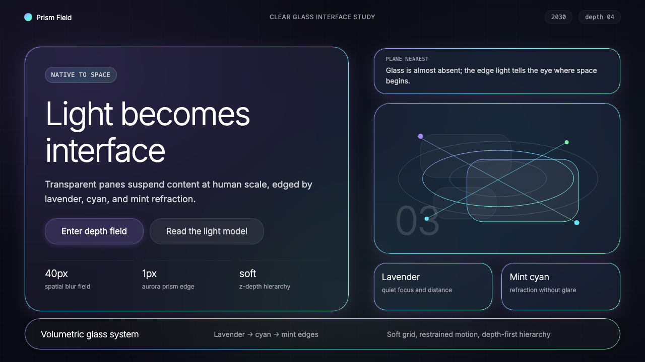
Translucent Glass Panels半透明玻璃面板
The foundational surface of Spatial UI 2030 is a panel that transmits rather than blocks. Content sits on a layer of clear glass whose transparency allows the real world — or deeper virtual layers — to show through, tinted and softened. The glass is not uniformly transparent: denser regions gather toward interactive areas, while peripheral zones become nearly invisible. This graduated translucency creates a natural focal gradient without requiring any explicit frame or border.空间界面 2030 的基础表面是一种透光而非遮挡的面板。内容置于透明玻璃层之上,其透明性允许真实世界——或更深层的虚拟层次——透过来,带有色调且被柔化。这种玻璃并非均匀透明:更致密的区域汇聚于交互区,而边缘区域则接近不可见。这种渐变透明度创造了自然的焦点梯度,无需任何明确的边框。
Aurora-Iridescent Edge Lighting极光虹彩边缘光晕
The signature detail of the system is a hairline edge that shimmers with a lavender-to-cyan-to-mint gradient — reminiscent of aurora borealis or the edge of a glass prism catching oblique light. This iridescent border does not delineate panels as a design choice so much as reveal their physical nature: a glass object in light always has a colored edge. The gradient shifts subtly with the viewer's head position, reinforcing the sense that the panel is a real material in real space.该体系最具标志性的细节是一道发丝般的边缘,以薰衣草-青色-薄荷的渐变闪烁——令人联想到极光或玻璃棱镜在斜射光线下的边缘色彩。这道虹彩边框与其说是设计选择,不如说是对面板物理本质的揭示:处于光线中的玻璃物体,边缘总是有色的。渐变随观看者头部位置的变化而微妙移动,强化了面板是真实空间中真实材料的感知。
Depth Hierarchy深度层级
In Spatial UI 2030, organizational hierarchy is expressed through depth rather than through color, size, or weight alone. The most immediate interactive elements occupy the nearest depth plane; supporting information occupies a mid-plane; ambient or background elements recede into the far field, where they become nearly one with the environment. This depth grammar is legible without instruction because it mirrors the natural way humans parse three-dimensional scenes: closer means more important, farther means contextual.在空间界面 2030 中,组织层级通过深度而非单纯依赖色彩、尺寸或字重来表达。最直接的交互元素占据最近的深度平面;支撑性信息占据中景平面;环境性或背景性元素退入远景,在那里它们几乎与环境融为一体。这种深度语法无需说明即可被解读,因为它镜射了人类解析三维场景的自然方式:更近意味着更重要,更远意味着语境性的。
Ultra-Light Typography超细字体排印
Typography in Spatial UI 2030 is set at weights far lighter than those used in conventional flat interfaces. Because the type floats against a real-world background with no opaque backing, it must achieve legibility through optical size and careful luminance contrast rather than through a high-contrast background color. The result is text that appears almost printed in light — thin strokes that remain readable because they are precisely sized relative to the viewing distance, not because they are heavy.空间界面 2030 中的字体排印采用远比传统平面界面更细的字重。由于文字漂浮于真实世界背景前方而无不透明底面支撑,其可读性必须通过光学字号和精心控制的亮度对比来实现,而非依赖高对比度背景色。结果是文字看起来几乎像用光书写——细腻的笔划之所以保持可读,是因为它们相对于观看距离被精确地调整了尺寸,而非因为它们粗重。
Soft-Shadow Blur and Focal Gradient柔焦模糊与焦点梯度
Behind each panel, a softly diffused shadow extends into the environment — not the hard-edged offset shadows of flat design, but an atmospheric blur that mimics how real three-dimensional objects cast light and shadow in space. This blur is purposeful: it separates the panel visually from whatever lies behind it without requiring an opaque backing, and it creates a sense of dimensional weight. Elements that are out of focus at the perimeter of the visual field behave like elements seen through peripheral vision — suggesting presence without demanding attention.每个面板背后,柔和漫射的阴影延伸进环境之中——不是平面设计中的硬边偏移阴影,而是模拟真实三维物体在空间中投射光影方式的大气感模糊。这种模糊是有意义的:它在不需要不透明底面的情况下,将面板从其身后的一切视觉上分离出来,并创造出立体重量感。位于视野边缘的失焦元素,其行为就像通过余光所见的事物——暗示存在,而不强求注意。
Dark-World Ground and Luminous Accent暗世界底色与发光强调
The background of Spatial UI 2030 is not designed — it is the real environment, which at night or in dim conditions appears as a deep, near-black field. Against this ground, the luminous panels and iridescent edges read with exceptional clarity. When the system needs to add designed accents, they take the form of glowing, softly haloed elements — a notification pulse, an active-state indicator, a selection highlight — that borrow their visual language from bioluminescence and fiber optics rather than from solid color fills.空间界面 2030 的背景并非设计而成——它是真实环境,在夜间或昏暗条件下呈现为深沉、接近黑色的底域。衬托这一底色,发光的面板与虹彩边缘以极高的清晰度显现。当系统需要添加设计性强调时,它们以发光、带有柔和光晕的元素形式出现——一个通知脉冲、一个激活状态指示器、一个选择高亮——其视觉语言借鉴自生物发光与光纤,而非实心色块填充。
Parallax and Motion as Structure视差与运动作为结构
In a head-worn interface, the user's physical movement is constant and unavoidable — Spatial UI 2030 treats this not as a complication but as a structural tool. Panels at different depth planes shift at different rates as the user moves, creating a natural parallax that continuously communicates depth relationships without requiring explicit visual cues. Transitions between states use motion that feels physically grounded: panels drift, recede, and surface rather than appearing and disappearing, and the motion arc always suggests the depth plane from which each element originates.在头戴式界面中,用户的物理运动是持续且不可避免的——空间界面 2030 将这不视为麻烦,而作为结构性工具。不同深度平面上的面板随着用户的移动以不同速率位移,创造出自然的视差,无需明确的视觉提示即持续传达深度关系。状态间的过渡使用感觉上有物理依据的动效:面板漂移、退入或浮现,而非凭空出现或消失,动效弧线始终暗示每个元素所源自的深度平面。
See the Vision Pro Spatial UI (2030) design system查看 Vision Pro Spatial UI (2030) 完整设计系统
Who shaped Vision Pro Spatial UI (2030)?谁塑造了 Vision Pro Spatial UI (2030)?
Alan Dye served as Apple's Vice President of Human Interface from 2012, overseeing the transition from skeuomorphic to flat design under Jony Ive, and later leading the creation of visionOS — the operating system that defines the baseline of Spatial UI. His central design challenge for visionOS was legibility against an unpredictable real-world background, a problem that no mainstream interface design discipline had previously encountered at scale. His team's solution — translucent panels with iridescent edges, depth hierarchy, and atmospheric shadow — established the grammar that the 2030 projection refines.Alan Dye 自 2012 年起担任苹果人机界面副总裁,在 Jony Ive 领导下主导了从拟物化到扁平化的设计过渡,后来又领导了 visionOS 的创建——这一操作系统定义了空间界面的基础。他在 visionOS 上面临的核心设计挑战是:在不可预测的真实世界背景前确保可读性,这是此前任何主流界面设计学科都未曾在如此规模上遭遇的问题。他的团队提出的解决方案——带虹彩边缘的半透明面板、深度层级与大气感阴影——确立了 2030 年推演所精化的视觉语法。
Imran Chaudhri led interaction design at Apple for over twenty years, contributing to the original iPhone interface and the foundational interaction vocabulary of iOS. After leaving Apple, he co-founded Humane and developed the Ai Pin, a screenless wearable that projects information onto the user's palm — a device premised on the idea that interfaces should occupy the world without demanding screen real estate. His published thinking about ambient, guest-mode interfaces, where computation is present but not intrusive, directly informed how visionOS and its successors conceptualize the relationship between the digital layer and the physical environment.Imran Chaudhri 在苹果主导交互设计逾二十年,参与了最初的 iPhone 界面和 iOS 基础交互词汇的创建。离开苹果后,他联合创办了 Humane 并开发了 Ai Pin——一款将信息投影至用户手掌的无屏幕可穿戴设备——该设备的前提是界面应当栖居于世界之中而不占用屏幕面积。他关于环境性、访客模式界面的公开思考——计算存在但不具侵入性——直接影响了 visionOS 及其后继者构想数字层与物理环境之间关系的方式。
Bret Victor is a human-computer interaction researcher whose work at Apple, Viewpoints Research, and Dynamicland has consistently explored representations of information that exist in physical space rather than on screens. His concept of the 'seeing space' — an environment in which computational models are materialized as physical objects that people can walk around and touch — anticipates many of the spatial organization principles of visionOS. Victor's influence on the theoretical foundations of spatial computing is oblique but pervasive: his public demonstrations and essays reached a generation of interface designers who went on to build the first wave of spatial operating systems.Bret Victor 是人机交互研究者,其在苹果、Viewpoints Research 和 Dynamicland 的工作始终探索存在于物理空间而非屏幕上的信息表征。他的「观察空间」概念——一种计算模型被物化为人们可以绕行和触摸的实体对象的环境——预见了 visionOS 的许多空间组织原则。Victor 对空间计算理论基础的影响是间接但无处不在的:他的公开演示与文章影响了整整一代界面设计师,这些设计师后来构建了第一批空间操作系统。
Jonathan Ive, Apple's Chief Design Officer from 1996 to 2019, established the material philosophy from which Spatial UI ultimately descends. His flat redesign of iOS 7 in 2013 stripped away simulated textures and established translucency and layering as the primary depth metaphors in the Apple visual system. The frosted-glass panels, depth blur, and vibrancy effects introduced in iOS 7 and expanded through subsequent years represent a direct typological ancestor of the visionOS glass panel. Ive's later work on the Apple Vision Pro hardware itself — establishing the physical form and the optical design of the pass-through lens system — created the hardware context within which the Spatial UI language operates.乔纳森·伊夫,苹果 1996 至 2019 年间的首席设计官,确立了空间界面最终所承继的材质哲学。他在 2013 年对 iOS 7 的扁平化重设计剥除了模拟纹理,确立了半透明与分层作为苹果视觉系统中首要的深度隐喻。iOS 7 中引入并在后续年份持续扩展的毛玻璃面板、深度模糊和活力效果,是 visionOS 玻璃面板的直接类型学前身。伊夫后来在 Apple Vision Pro 硬件本身上的工作——确立其物理形态和透视镜头系统的光学设计——创造了空间界面语言赖以运作的硬件语境。
Mike Rockwell led Apple's Technology Development Group, the internal team responsible for the research and engineering behind Apple Vision Pro's display, optical, and sensor systems. The feasibility of Spatial UI as a visual language depends entirely on the underlying hardware: the ultra-high-resolution micro-OLED displays that make ultra-light type legible, the eye-tracking system that enables gaze-based interaction, and the spatial audio system that anchors virtual objects in physical space. Rockwell's engineering decisions set the resolution and latency parameters within which the design language operates — in a real sense, the design and the engineering are inseparable in this system.Mike Rockwell 领导苹果技术开发集团,这一内部团队负责 Apple Vision Pro 显示、光学与传感器系统背后的研究与工程。空间界面作为视觉语言的可行性完全依赖于底层硬件:超高分辨率微型 OLED 显示屏让超细字体清晰可读,眼部追踪系统实现基于注视的交互,空间音频系统将虚拟对象锚定于物理空间。Rockwell 的工程决策设定了设计语言所在的分辨率与延迟参数——在真正意义上,这套系统中的设计与工程是不可分割的。
How do you use Vision Pro Spatial UI (2030) today?今天怎么用 Vision Pro Spatial UI (2030)?
The visual language of Spatial UI 2030 translates to flat-screen design work — slides, web interfaces, and editorial layouts — not by pretending to be a three-dimensional interface but by extracting the governing aesthetic principles: deep dark grounds, translucent layered surfaces, iridescent thin-line accents, ultra-light type, and soft atmospheric depth. When these principles are applied to a flat medium, the result is an interface that feels expensive, contemporary, and spatially intelligent without requiring an actual depth axis.空间界面 2030 的视觉语言可以转化到平面屏幕设计中——幻灯片、网页界面和编辑版面——不是通过假装成三维界面,而是提取其支配性的美学原则:深暗底色、半透明分层表面、虹彩细线强调、超细字体和柔和的大气深度感。当这些原则被应用于平面媒介时,结果是一套感觉昂贵、当代、在空间上富有智识的界面,而无需真正的深度轴。
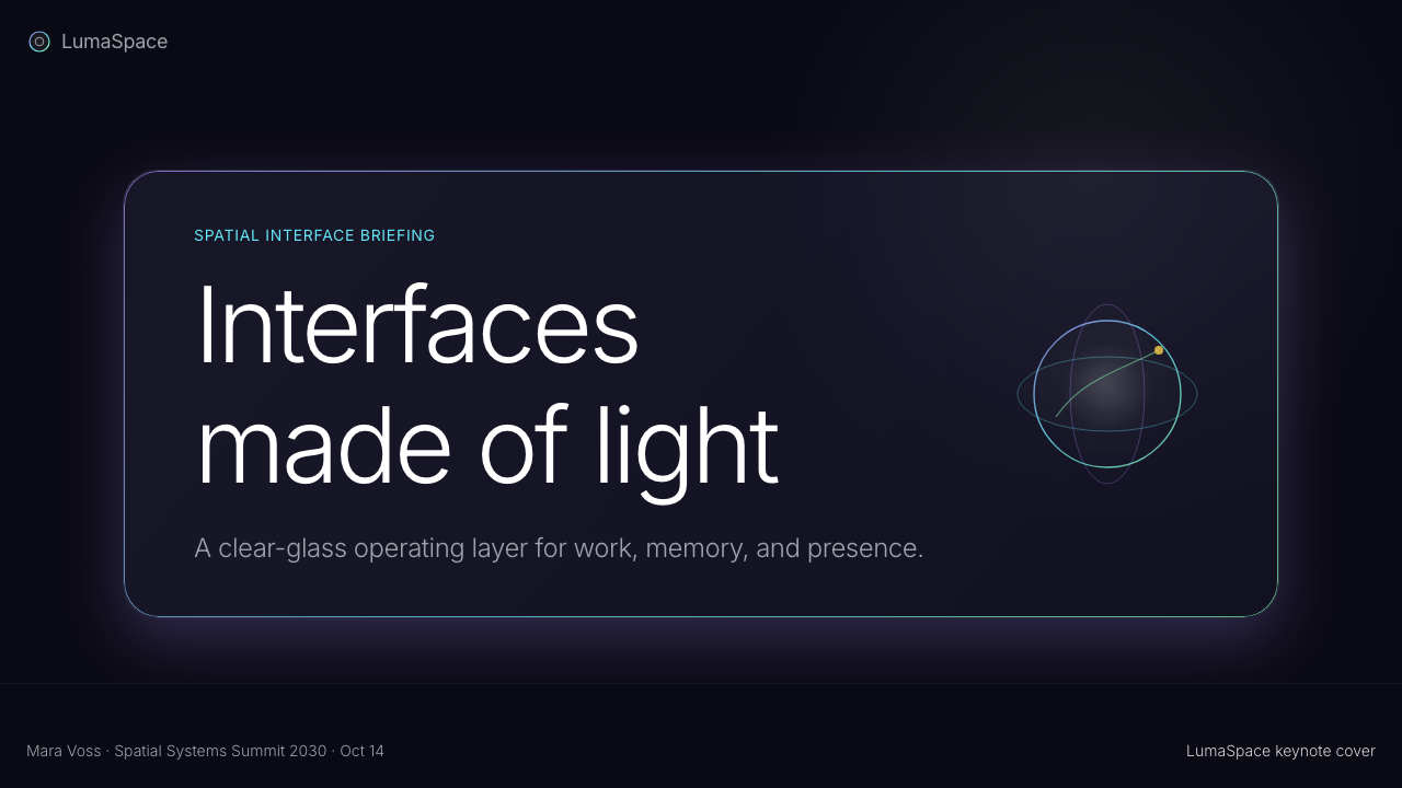
For presentation slides, the style works with exceptional force on both cover and section divider pages. A cover should establish a deep near-black ground — not pure black, but the particular depth of a dim real environment — and float a single translucent panel slightly off-center, with the lavender-to-mint edge shimmer as the only accent color. Title type should be set at a very light weight, large in optical size, with generous breathing room around it. Data and content slides benefit from a consistent depth vocabulary: one primary panel at high clarity for the core content, a secondary ghost panel behind it for supporting context, and labels in ultra-light type. Avoid competing accents; the iridescent edge should be the only color moment on content slides.在演示文稿中,这套风格在封面页与章节分隔页上效果尤为强烈。封面应当建立一个深沉的接近黑色的底色——不是纯黑,而是昏暗真实环境的那种特定深度——并将单一半透明面板略微偏离中心地漂浮其上,以薰衣草到薄荷的边缘光晕作为唯一的强调色。标题字体应选用极细字重,光学字号宽大,周围有充裕的呼吸空间。数据与内容页受益于一致的深度词汇:一个高清晰度的主面板承载核心内容,其后一个幽灵面板提供支撑语境,标签以超细字体呈现。避免相互竞争的强调;虹彩边缘应当是内容幻灯片上唯一的色彩时刻。
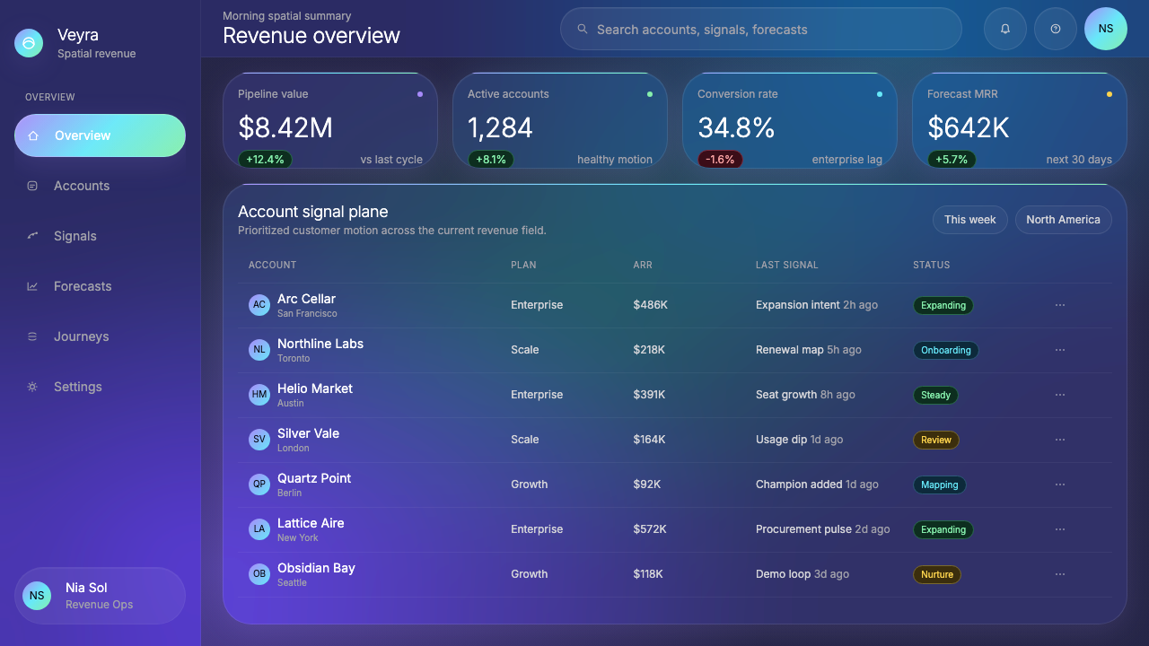
For web UI — dashboards, pricing pages, product landing pages — Spatial UI 2030 provides a distinctive dark-mode framework with a visual hierarchy that reads as technically advanced. The ground should be the deepest tone in the palette, nearly but not quite black. Cards and panels use a matte glass-like surface with very low opacity, allowing the background gradient to show through. Active or selected states use the aurora gradient as a glow at the component's edge rather than a fill color. Typography should lean heavily toward the lighter end of the weight scale for body content, reserving slightly heavier — but still not bold — weights for headings. Navigation and structural elements should appear nearly weightless, distinguishing the interface from conventional dark-mode design patterns.对于网页界面——仪表板、定价页面、产品落地页——空间界面 2030 提供了一套独特的深色模式框架,其视觉层级读起来具有技术先进感。底色应是调色板中最深的色调,接近但不完全是纯黑。卡片与面板使用哑光玻璃般的表面,透明度极低,允许背景渐变透过。激活或选中状态以极光渐变作为组件边缘的发光效果,而非填充色。字体排印在正文内容上应大幅偏向字重刻度的较细一端,为标题保留略重——但仍然不是粗体——的字重。导航与结构性元素应显得几乎没有重量,与常规深色模式设计模式区别开来。
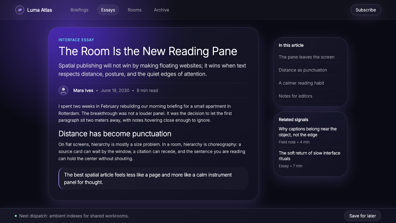
For editorial and marketing applications, the style supports a premium, forward-looking aesthetic suited to technology brands, spatial computing products, concept launches, and any context where communicating that the product exists in an advanced moment is part of the message. Full-width feature sections work well with a wide translucent panel over a dark environment photograph — real landscape or architecture — allowing the image to read through the panel while the type sits above. Marketing headlines should be wide-tracked and very light in weight. The aurora gradient accent, used sparingly as an underline or a dividing hairline, is more powerful than block color fills and more distinctive than conventional brand-color applications.对于编辑与营销应用,这套风格支持一种高端、前瞻性的美学,适合科技品牌、空间计算产品、概念发布,以及任何「传达产品存在于一个先进时刻」本身就是信息一部分的场合。全宽特性区块适合在深色环境照片——真实风景或建筑——上铺设宽幅半透明面板,让图像透过面板透出,文字置于上方。营销标题应宽字距、极细字重。极光渐变强调色,作为下划线或分割发丝线条节制使用,比色块填充更有力量,也比惯常的品牌色应用更具辨识度。
A common mistake when applying this aesthetic is confusing it with generic dark-mode design or with the earlier glassmorphism trend. Generic dark mode uses gray backgrounds and white type without the depth logic; generic glassmorphism applies frosted blur without the iridescent edge or the depth hierarchy. The specific character of Spatial UI 2030 comes from the combination of near-black depth, graduated translucency, the signature lavender-cyan-mint edge accent, and ultra-light typography — any one element alone does not produce the effect. A second common mistake is using the aurora gradient as a background fill or a large decorative element; at scale, it reads as decorative and undermines the restraint that gives the system its authority. The gradient belongs at hairline width, at panel edges, and in subtle glow states — not as a hero image or full-screen wash.应用这套美学时最常见的错误,是将其与泛化深色模式设计或更早期的磨砂玻璃风格混淆。泛化深色模式使用灰色背景和白色文字,缺乏深度逻辑;泛化磨砂玻璃风格应用毛玻璃模糊,却没有虹彩边缘或深度层级。空间界面 2030 的特定性格来自于近黑深度、渐变透明度、标志性的薰衣草-青色-薄荷边缘强调与超细字体的组合——任何单一元素单独使用都无法产生这种效果。第二个常见错误是将极光渐变用作背景填充或大型装饰元素;在大尺寸下,它读起来是装饰性的,破坏了赋予该体系权威感的那种克制。渐变属于发丝般的线宽、面板边缘和微妙的发光状态——而非主视觉图像或全屏底纹。
See the Vision Pro Spatial UI (2030) design system查看 Vision Pro Spatial UI (2030) 完整设计系统
Vision Pro Spatial UI (2030) — FAQVision Pro Spatial UI (2030) · 常见问题
Is Spatial UI 2030 the same as glassmorphism?空间界面 2030 和磨砂玻璃风格(glassmorphism)是同一回事吗?
They share surface similarities — translucent panels, background blur — but their underlying logic is entirely different. Glassmorphism, as popularized in the early 2020s, applied frosted-glass aesthetics to flat surfaces as a decorative treatment: the blur was present to look appealing, not to communicate depth or hierarchy. Spatial UI 2030 uses translucency and blur as structural tools within a genuine three-dimensional space — each level of opacity and each blur radius communicates a specific depth relationship. When translated to flat screens, Spatial UI retains this depth logic and adds the iridescent edge accent and ultra-light typography that glassmorphism never included. The distinction is not aesthetic but intentional.两者有表面上的相似——半透明面板、背景模糊——但其底层逻辑完全不同。磨砂玻璃风格在 2020 年代初流行时,是将毛玻璃美学作为装饰处理施加于平面表面:模糊的存在是为了好看,而非传达深度或层级。空间界面 2030 则在真正的三维空间中将半透明与模糊作为结构工具使用——每一个透明度级别和每一个模糊半径都传达具体的深度关系。当被转化到平面屏幕时,空间界面保留了这种深度逻辑,并加入了磨砂玻璃风格从未包含的虹彩边缘强调与超细字体。这种区别不是美学上的,而是意图上的。
Can this aesthetic work on a light background, or does it require a dark ground?这套美学能在浅色背景上使用吗,还是必须要深色底色?
The deep dark ground is not merely a stylistic preference — it is the optical condition that makes the system's other elements legible. Ultra-light type, iridescent hairline edges, and soft atmospheric glow all depend on high contrast against a dark or very deep background to read clearly. On a light background, the iridescent gradient loses its luminous quality and becomes a subtle tint; ultra-light type becomes difficult to read; and the sense of panels floating in space collapses into a conventional layered card layout. A light-mode adaptation of this aesthetic is possible but requires substantial adjustments — heavier type, more saturated accents, reduced blur — that move the result away from the source language. If a light background is required, consider a different design style that was built for that ground.深暗底色并非仅仅是风格偏好——它是让系统其他元素清晰可读的光学条件。超细字体、虹彩发丝般边缘和柔和的大气发光效果,都依赖于与深色或极深背景的高对比度来清晰显现。在浅色背景上,虹彩渐变失去其发光品质,变成微妙的色调;超细字体变得难以阅读;面板漂浮于空间中的感知也会崩溃为常规的分层卡片布局。这套美学的浅色模式改编是可能的,但需要大量调整——更重的字体、更饱和的强调色、减弱的模糊——这些调整会将结果推离源语言。如果必须使用浅色背景,考虑选择一种为那种底色而构建的不同设计风格。
How does this style handle data visualization and charts?这套风格如何处理数据可视化和图表?
Data visualization in Spatial UI 2030 treats chart elements as luminous objects rather than flat filled shapes. Line charts use hairline strokes with a subtle glow; area fills use low-opacity translucent surfaces rather than solid color. Bar charts and dot plots work well because their discrete geometry is compatible with the depth-object vocabulary. The aurora gradient can be used selectively to encode one data dimension — progress, positive trend, or a highlighted series — but should not be used to fill all elements simultaneously. Axes and gridlines should be nearly invisible — extremely low opacity against the dark ground — to allow the data shapes to read as the primary objects. Labels use the same ultra-light type as the surrounding interface; they should annotate rather than compete.空间界面 2030 中的数据可视化将图表元素视为发光对象而非平面填充形状。折线图使用发丝般的细线条,带有微妙发光效果;面积填充使用低不透明度的半透明表面而非实心色块。柱状图与散点图效果好,因为其离散几何形与深度对象词汇兼容。极光渐变可以选择性地用于编码一个数据维度——进度、正向趋势或高亮系列——但不应同时填充所有元素。坐标轴与网格线应接近不可见——在深色底面上极低不透明度——以允许数据形状作为主体对象被解读。标签使用与周围界面相同的超细字体,它们应当是注解性的,而非与图表竞争。
What kinds of products or brands suit this aesthetic, and where does it struggle?哪些类型的产品或品牌适合这套美学,它在哪里表现欠佳?
Spatial UI 2030 communicates technical sophistication, premium positioning, and a forward orientation — it is most natural for spatial computing products and platforms, developer tools, AI interfaces, high-end consumer electronics, financial data products, and any brand that wants to signal that it lives at the frontier of what interfaces can be. It struggles in contexts that require warmth, accessibility, or cultural specificity. Children's products, food and wellness brands, community platforms, and any context where approachability is more important than precision will find the aesthetic cold, demanding, and alienating. The style's very specific visual signature — the aurora edge, the near-black depth — also makes it a poor choice for brands that need to accommodate the full spectrum of light and dark mode, or that must work across a wide range of display environments and visual abilities.空间界面 2030 传达技术精密感、高端定位与前瞻取向——它最自然地适合空间计算产品与平台、开发者工具、人工智能界面、高端消费电子、金融数据产品,以及任何想要标示自己身处界面所能达到的前沿的品牌。它在需要温暖感、易用性或文化特殊性的场合表现欠佳。儿童产品、食品与健康品牌、社区平台,以及任何亲切感比精准感更重要的场合,都会发现这套美学冷漠、苛求且疏离。这套风格极为特定的视觉特征——极光边缘、接近黑色的深度——也使其不适合需要同时适应浅色和深色模式全谱的品牌,或必须在各种显示环境和视觉能力范围内正常工作的场合。
How is the iridescent edge accent used without becoming decorative excess?虹彩边缘强调色如何使用才能不沦为装饰过剩?
The aurora gradient accent earns its place in this system because it describes something physically true: glass objects in light always have colored edges. When the accent is used at hairline width along the actual boundary of a panel, it reinforces the material logic of the design rather than decorating it. It becomes excess when it is scaled up — used as a background gradient, a wide divider, or an oversized glow element. The discipline is: accent color only at the edge of things, only at the weight of a hairline, only where a real glass panel would actually catch light. If the accent is visible from a distance rather than discovered at close reading, it is too prominent. Used correctly, the iridescent edge is a quality detail that rewards attention without demanding it.极光渐变强调色在这个体系中占有一席之地,是因为它描述了物理上真实的事物:处于光线中的玻璃对象,边缘始终是有色的。当这种强调色以发丝般的线宽沿面板实际边界使用时,它强化了设计的材质逻辑,而非装饰它。当它被放大时——用作背景渐变、宽幅分隔线或过大的发光元素——它就成为了过剩。这里的纪律是:强调色只在事物的边缘,只以发丝的粗细,只在真实玻璃面板确实会折射光线的地方。如果强调色从远处就清晰可见而非需要近距离细看才能发现,那它就太突出了。正确使用时,虹彩边缘是一个细节品质,回报注意却不强求注意。
Related design styles相关设计风格
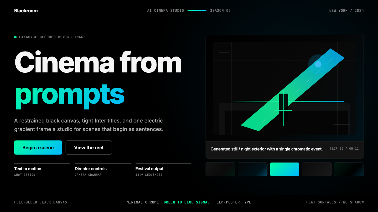 Runway MLCinema, not dashboard. Deep black frames tight Inter type and one green-blue…不是仪表盘,是电影感:纯黑画布、紧排 Inter 与绿蓝电光。
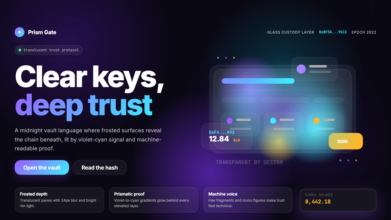 Web3 Glass Morphism (2022)Midnight trust in glass. Onyx, violet-cyan glow, and mono hashes make transpa…午夜玻璃信任:玛瑙黑、紫青辉光与等宽哈希,透明而高级。
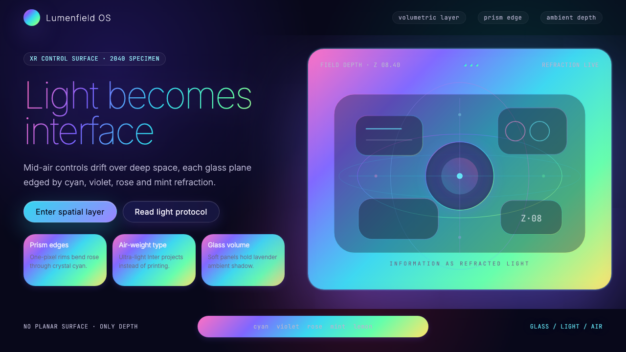 Holographic UI 2040Information made of light. Deep-space black, ultra-light Inter and prismatic…信息由光构成:深空黑、极细 Inter 与棱镜玻璃边缘。
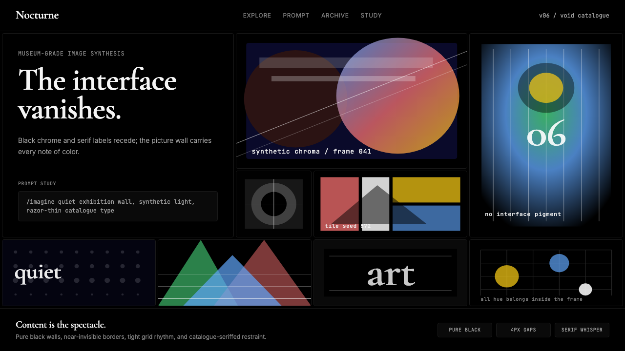 MidjourneyInvisible chrome, visible art. Pure black grid and Cormorant serif give color…界面隐身,图像发声。纯黑网格与细衬线让色彩只属于作品。
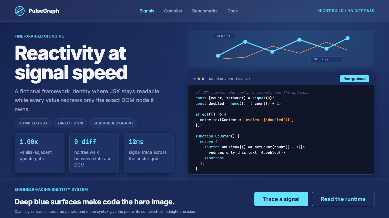 SolidJS Reactive FrameworkCode is the hero. Deep indigo panels, cyan signal arcs, and mono JSX carry th…代码就是主角:深靛蓝面板、青色信号弧与等宽 JSX 托起品牌。
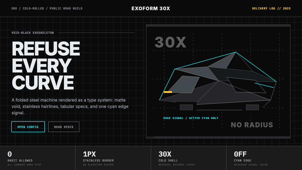 Tesla Cybertruck Stainless (2023)Refusal made material. Void black, stainless hairlines, cyan edges, faceted I…拒绝曲线:虚空黑、不锈钢发丝线、电子青边与棱面 Inter。