What is Web3 Glass Morphism (2022)?
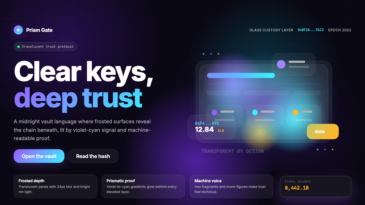
Web3 Glass Morphism is the visual language that gave the decentralized web its signature midnight luxury — frosted surfaces, prismatic edge glows, and monospace addresses floating over deep onyx darkness.
Web3 Glass Morphism (2022) in brief
Web3 Glass Morphism is a dark-mode interface aesthetic that emerged from the cryptocurrency and NFT ecosystem in the early 2020s. Its defining visual logic rests on a single powerful metaphor: transparency as trust. By letting users see through interface surfaces to the background beneath — a gradient void or a softly lit depth — the style communicates openness, as if the application has nothing to hide. Frosted panels hover over rich, deep backgrounds tinted with violet, indigo, or cyan, and every edge catches a thin chromatic glow that references both the prismatic quality of light passing through glass and the neon-lit palette of cyberpunk futurism.
The style is unmistakably nocturnal. Backgrounds sink into near-black depths, and the entire composition depends on light sources that emanate from behind the glass panels rather than above them — a fundamentally different logic from traditional UI design, which draws shadows and highlights as if lit from above. In Web3 Glass Morphism, surfaces glow; they are lit from within or from behind. This quality gives the aesthetic its sense of weightlessness, as if every panel is a window floating in space rather than a card resting on a surface.
Crucially, the style is not pure decoration. It carries a coded vocabulary that its original audience — crypto-native users — could read immediately. Monospace typefaces render wallet addresses and transaction hashes exactly as they appear in terminal output, asserting authenticity and technical credibility. Pill-shaped buttons filled with gradient light signal affordance without ornamentation. Every design choice doubles as a trust signal: I show you through the interface because the protocol beneath is verifiable.
Where does Web3 Glass Morphism (2022) come from?
The aesthetic has roots that predate the NFT boom by several years. The glassmorphism concept — translucent, blurred surfaces layered over colorful backgrounds — was popularized in broader UI design circles around 2020, drawing on Apple's long-running experiments with frosted glass in iOS and macOS. But the crypto design community took this substrate and pushed it into much darker, more chromatic territory, driven by the particular values of the Web3 movement: decentralization, cryptographic verification, and midnight-hour trading sessions.
MetaMask, which launched in 2018 as a browser extension for interacting with the Ethereum network, was an early anchor point for the aesthetic. Its fox logo set a precedent for a kind of playful-serious duality, and its interface established that crypto applications could be visually expressive rather than purely utilitarian. As the NFT market heated in 2020 and exploded in 2021, a new wave of applications — wallets, marketplaces, and minting platforms — competed for users through design differentiation, and the dark glass aesthetic became the dominant convention.
Rainbow Wallet, founded by Mike Demarais and launched in 2020, brought the aesthetic to its sharpest expression. Its interface placed translucent card surfaces over gradient backgrounds saturated with violet and cyan, used monospace type for address display, and introduced the pill button as the action element of choice. The app became widely cited as a design reference by other crypto teams. OpenSea, Coinbase Wallet, and dozens of smaller projects adopted variations of the same visual vocabulary through 2021 and 2022, cementing the look as the recognizable face of the Web3 moment.
The geographic origin of this aesthetic is not a single city but a distributed diaspora — Brooklyn, San Francisco, and Berlin were all significant nodes of crypto-native design work in this period. Jacob Horne and Tom Brown, associated with the Zora protocol and NFT infrastructure work, contributed to shaping the editorial and interface design conventions around NFT culture. The aesthetic also absorbed influences from the rave and electronic music poster tradition, the darknet browser aesthetic, and the cyberpunk visual lineage running from William Gibson's prose to Blade Runner's production design — all of which shared the conviction that advanced technology should look like it operates in the dark.
What defines the Web3 Glass Morphism (2022) look?
Frosted Glass Surfaces
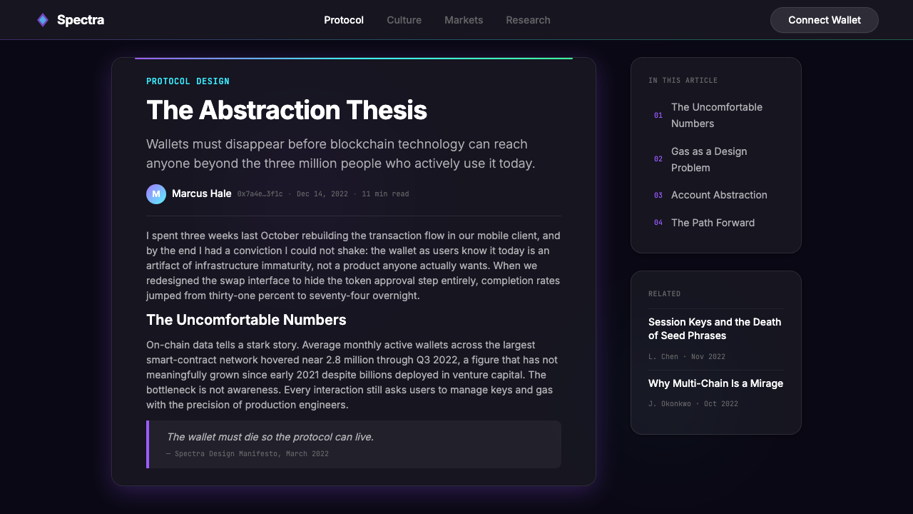
The central visual device of the style is the translucent panel — a surface that appears to be made of frosted or smoked glass, partially see-through, with the background behind it softened into a blur. These panels are layered at varying degrees of opacity, creating a sense of stacked depth. The blur is not decorative but structural: it separates content layers from the background while maintaining the visual connection between them, making the interface feel simultaneously bounded and open.
Deep Onyx Backgrounds
The ground beneath the glass panels is almost never neutral black. Instead it is a rich, near-black depth tinted with deep violet, indigo, or midnight blue, often animated with a subtle radial gradient that suggests a distant light source deep within the composition. This chromatic darkness is what gives the glass surfaces their prismatic quality — without color in the background, the translucency would read as flat gray rather than as depth.
Chromatic Edge Glows
Glass panels in this style are defined not by hard borders but by luminous edges — thin halos of violet, cyan, or gradient light that trace the perimeter of each surface element. These glows reference the physical behavior of light refracting through glass while serving a functional purpose: they separate layered elements from each other without the visual noise of opaque dividers. The glow intensity is typically calibrated so that primary interactive elements — cards, modals, action buttons — carry the most visible edge light.
Monospace Type for Data
Wallet addresses, transaction hashes, contract IDs, and any other machine-generated string are rendered in monospace typefaces — the same fixed-width letterforms used in terminal output and code editors. This is not purely a technical convention but a deliberate cultural signal. Monospace type anchors the interface in the technical reality of what blockchain actually is: strings of cryptographic output. It makes verification feel possible and the underlying protocol feel present, visible, and honest.
Gradient-Lit Action Elements
Buttons and primary call-to-action elements in this style do not use flat solid fills. Instead they carry a gentle gradient — typically flowing from violet toward cyan, or from a saturated indigo to a brighter accent — that suggests the element is itself luminous rather than merely colored. The most common shape is the pill: a rectangle with fully rounded ends that conveys softness and approachability without the severity of sharp corners. This shape, combined with the gradient fill, became the signature interactive affordance of the Web3 era.
Prismatic Violet-to-Cyan Color Range
The palette of Web3 Glass Morphism is narrow but intensely specific: deep violet, electric indigo, luminous cyan, and the gradient arc between them. These hues were not chosen arbitrarily — violet and cyan sit at opposite ends of the visible light spectrum and, when placed adjacent or blended, produce a prismatic, refracted quality that reads as the edge of a hologram or a glass prism. The palette also carries cultural associations with electronic music, rave visuals, and the cyberpunk tradition, all of which the crypto community was consciously or unconsciously drawing on.
Weightless Spatial Composition
Unlike card-based UI conventions where elements feel like physical objects resting on a surface, Web3 Glass Morphism compositions place panels as if they are floating in three-dimensional space with no visible means of support. There is no ground plane. Elements overlap and layer but do not cast hard shadows on each other — instead they emit glows. This spatial logic creates a sense of immersion that suits the Web3 context: you are not looking at an application on a screen, you are navigating something ambient and pervasive, like a heads-up display projected into the world.
Who shaped Web3 Glass Morphism (2022)?
Demarais co-founded Rainbow Wallet, the application most widely credited with crystallizing the Web3 Glass Morphism aesthetic into a coherent, imitable system. Under his product direction, Rainbow's interface became the design reference that other crypto teams explicitly cited — its translucent card surfaces over gradient-saturated backgrounds, monospace address display, and pill-shaped action buttons were studied and copied across the ecosystem. Rainbow's influence extended beyond wallet design into the broader NFT and DeFi interface conventions of 2021 and 2022.
Horne was a foundational figure at Zora, the NFT protocol and marketplace that positioned itself as the infrastructure layer for the NFT economy. His work on Zora's interface and editorial aesthetic contributed to defining the design language around NFT creation tools — combining the glass aesthetic with strong editorial typography and a curatorial sensibility that differentiated Zora from purely financial trading platforms. His influence shaped the way NFT culture thought about presentation, not just transaction.
Brown's contributions to the visual and product design of Web3 infrastructure projects helped establish the editorial standards around how crypto projects communicate about themselves — a kind of design credibility that signaled seriousness to technically sophisticated audiences. His work contributed to the understanding that crypto products could aspire to the same visual rigor as leading consumer software, not just the utilitarian interfaces typical of financial tools.
Mason's work on Web3 design systems and the visual communication of decentralized finance products contributed to formalizing the aesthetic conventions that the broader ecosystem was developing organically. His contributions helped articulate a design rationale for the glass morphism approach — explaining why translucency and luminous edges were not arbitrary fashion choices but expressions of the transparency values central to the Web3 ideology.
How do you use Web3 Glass Morphism (2022) today?
Web3 Glass Morphism is a highly specific aesthetic — it signals nighttime digital culture, cryptographic trust, and the visual vocabulary of decentralized finance. Using it well requires understanding that it carries cultural meaning beyond its surface appearance. Applied outside its native context, it can feel like cosplay rather than design. The most successful applications either operate genuinely in the Web3 space or consciously borrow the aesthetic's sense of depth and luminosity for contexts — gaming, entertainment, AI products — where those same values of immersive darkness and glowing surfaces are culturally legible.
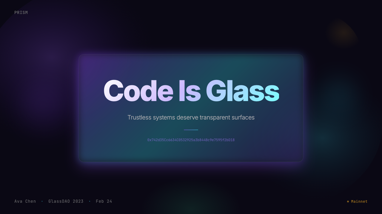
For presentation slides, the style works powerfully on cover pages and transition slides where full-bleed darkness and floating glass panels can create drama. A cover built on this aesthetic positions a title in clean sans-serif type against a deep violet-to-onyx background, with a single frosted panel as the compositional anchor and a chromatic glow tracing its edge. Data slides require more care: the glass treatment can overpower charts if applied uniformly — reserve the frosted panel for the data container and keep chart elements themselves clean and high-contrast against the dark ground. The aesthetic suits pitch decks for technology products where an impression of technical sophistication is the goal.
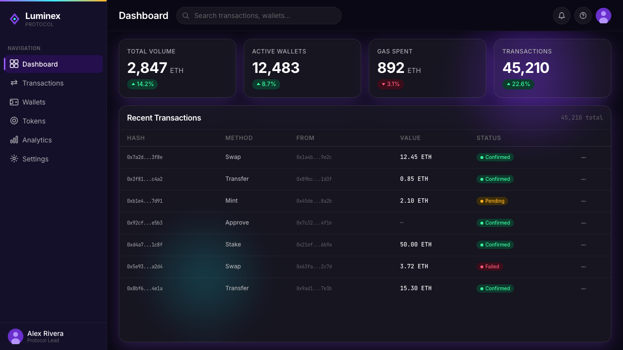
For web interfaces, the style is natural for dark-mode dashboards, portfolio sites, digital product launches, and any application that benefits from a sense of immersive depth. The key discipline is layering: background gradient, then a mid-layer of larger glass panels defining section structure, then foreground elements — buttons, badges, type — that sit above the glass with maximum contrast. Navigation in this style should be minimal and transparent, with labels rather than icons, and should never compete visually with the content it frames. The monospace convention for any alphanumeric data — addresses, codes, transaction IDs — should be observed even in applications that are not technically blockchain products, as it grounds abstract digital content in the logic of machine output.
For editorial and marketing work, the aesthetic has strong poster potential. Full-bleed compositions with a single centered glass panel and a radial glow behind it can anchor product launches and event promotions. The violet-to-cyan color arc reads immediately as technology-forward, and the combination of frosted depth and luminous edges communicates premium positioning without the need for photography. Marketing applications should resist the temptation to add too many glass layers — one or two are sufficient; more than three creates visual noise that reads as clutter rather than depth.
The most common mistake when applying this aesthetic is treating it as a collection of surface effects rather than a coherent spatial logic. Designers sometimes add frosted overlays, gradients, and glows to interfaces that do not have a genuine depth structure underneath — and the result looks like stickers applied to a flat image. The style requires that the depth be real: there must be a genuine background layer visible through the glass, the glass panels must have a consistent sense of elevation relative to each other, and the light sources must be coherent. Without that underlying spatial logic, the glass effects read as decoration rather than architecture, and the style's credibility — which depends on the glass feeling like actual glass — dissolves.
Web3 Glass Morphism (2022) — FAQ
Is Web3 Glass Morphism the same as general glassmorphism?
They share a technical substrate but diverge significantly in application. General glassmorphism — as popularized by Apple's iOS and macOS design and widely adopted across consumer software after 2020 — uses frosted surfaces on light or neutral backgrounds, treating translucency as a way to soften and layer UI elements. Web3 Glass Morphism is a darker, more chromatic variant: it requires the near-black, violet-tinged background to work, adds the chromatic edge glow that standard glassmorphism omits, and incorporates the specific cultural vocabulary of crypto interfaces — monospace type, pill buttons, gradient-lit CTAs. Removing the dark background and the glow from Web3 Glass Morphism produces something closer to standard glassmorphism; the Web3 variant is the high-contrast, nocturnal edition.
Can this style work on a light background?
Not in its authentic form. The entire optical logic of Web3 Glass Morphism depends on the dark, chromatically rich background: the frosted panels appear translucent because the background behind them is deep and colorful, the edge glows are visible because they are brighter than the surrounding darkness, and the monospace addresses read as technical because they sit against darkness the way code appears in a terminal. On a white or light background, frosted surfaces become pale gray panels, the chromatic glows disappear, and the composition loses the sense of depth and luminosity that defines the aesthetic. A light-background project wanting some of the same spatial layering should look to standard glassmorphism or neumorphism rather than this variant.
Why did this aesthetic become so closely associated with Web3 specifically?
Several forces converged. The Web3 community was operating at a moment of intense visual identity formation — new protocols, new applications, and new cultural norms were all being established simultaneously, and design was doing ideological work alongside technical work. The translucent aesthetic matched the stated values of the movement: transparency (you can see through the interface), depth (there is something real underneath), and luminous credibility (the system glows with its own authority). Practically, the dark aesthetic also suited the behavioral reality of many crypto users — night-mode trading, global time zones, and the association of late-night screen time with serious engagement. And once Rainbow Wallet demonstrated that the aesthetic could feel genuinely premium rather than merely dark, it spread rapidly through competitive imitation.
Has the style aged well, or does it feel dated now?
Like most peak-moment aesthetics, Web3 Glass Morphism carries the mark of its cultural moment — the 2021–2022 NFT boom — and that association makes it read as a period piece when used without modification. The individual elements (dark backgrounds, frosted surfaces, gradient-lit buttons) have each individually moved into broader design culture and can be used independently without triggering the full Web3 association. The specific combination — deep violet backgrounds, chromatic edge glows, monospace addresses, pill buttons all together — still signals Web3 circa 2022 with some precision. For projects that want the aesthetic without the era association, the most effective approach is to desaturate the palette, move the glow color toward warmer tones, and apply the glass treatment more sparingly.
Does this style work for products that have no connection to blockchain or crypto?
It can, with selective borrowing. The spatial depth logic — layered translucent surfaces over richly colored dark backgrounds — is transferable and appears in gaming interfaces, AI product dashboards, music applications, and entertainment platforms where immersive darkness and a sense of ambient depth are fitting. What does not transfer cleanly is the monospace convention and the specific violet-to-cyan chromatic arc, which still read as crypto-adjacent. A product outside Web3 that wants the depth and luminosity of the style but not its ideological associations should experiment with alternative accent colors, drop the monospace convention entirely, and treat the glass surfaces as a spatial device rather than a cultural marker.
Related design styles
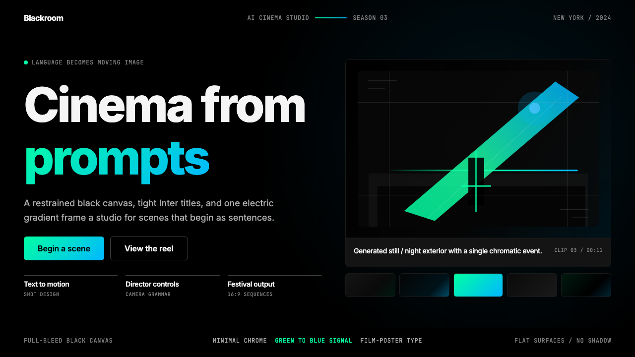 Runway MLCinema, not dashboard. Deep black frames tight Inter type and one green-blue…
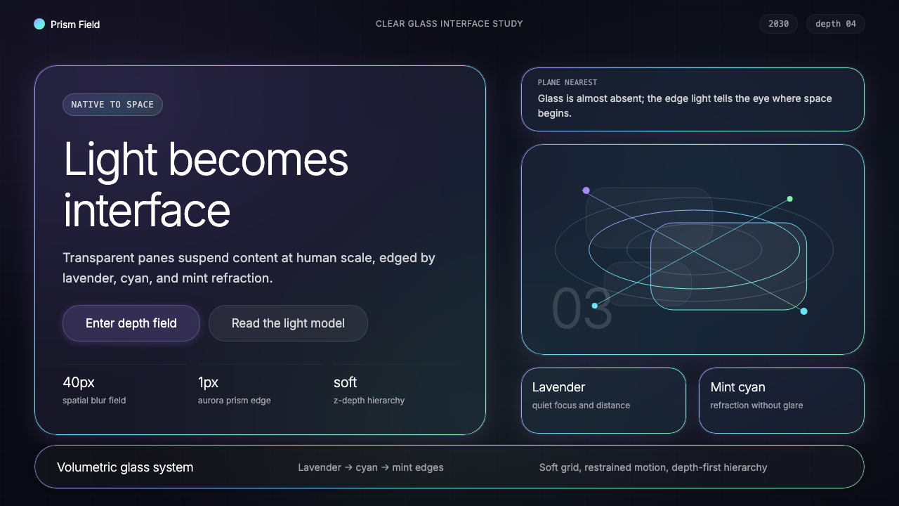 Vision Pro Spatial UI (2030)Structured light, not software. Deep navy glass panels glow with lavender-cya…
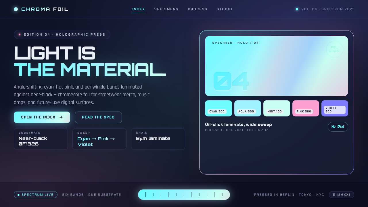 Holographic IridescentLight as material. Cyan-pink-violet foil sweeps anchored against near-black,…
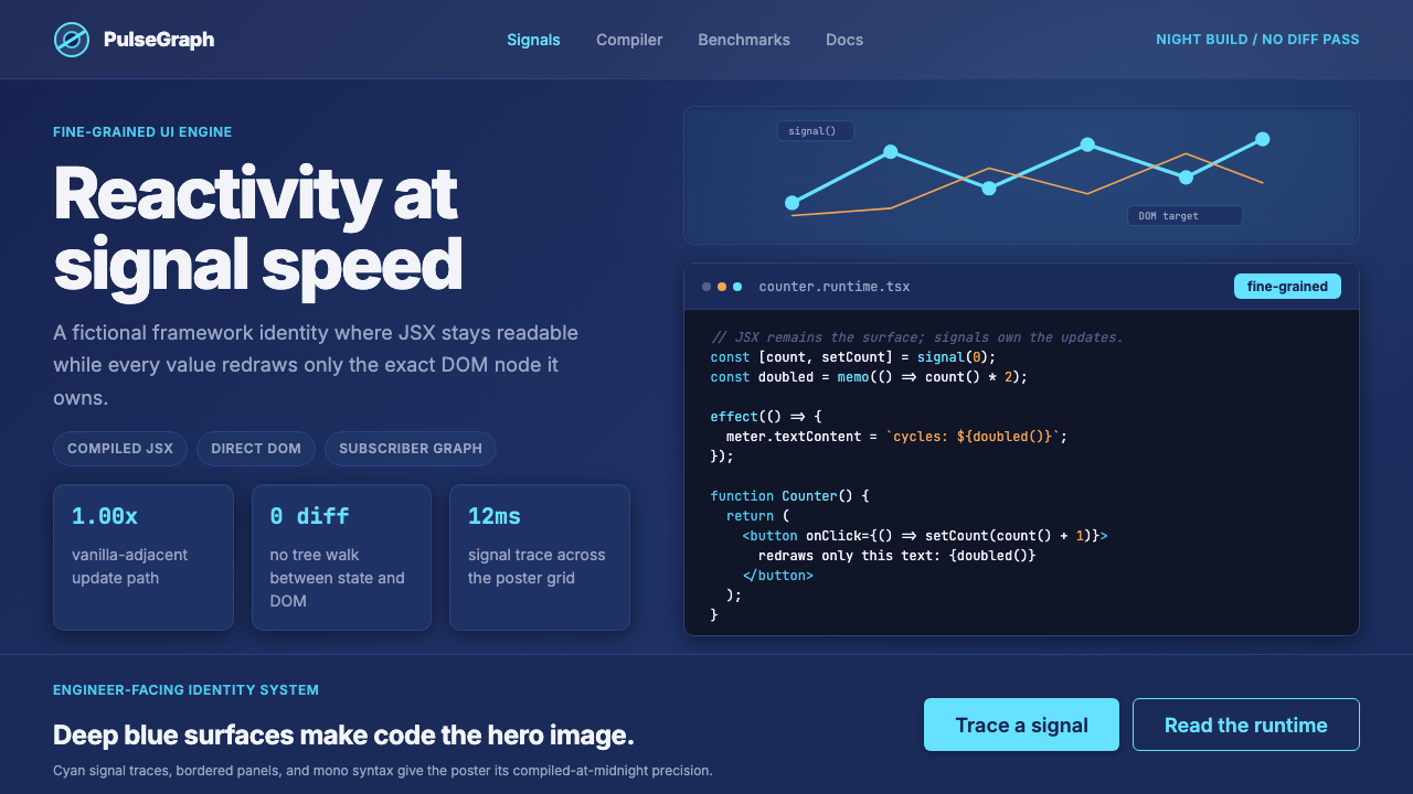 SolidJS Reactive FrameworkCode is the hero. Deep indigo panels, cyan signal arcs, and mono JSX carry th…
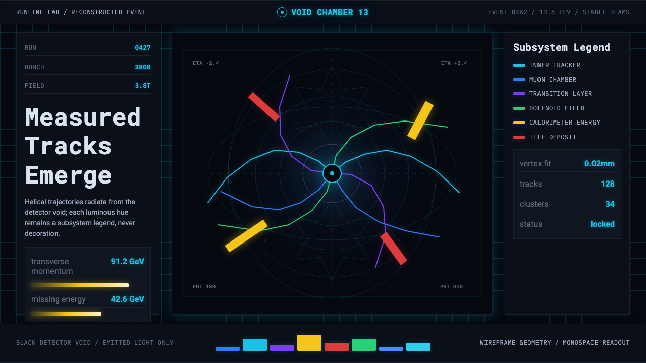 CERN CollisionData, not spectacle. Cyan tracks on black wireframes make every subsystem col…
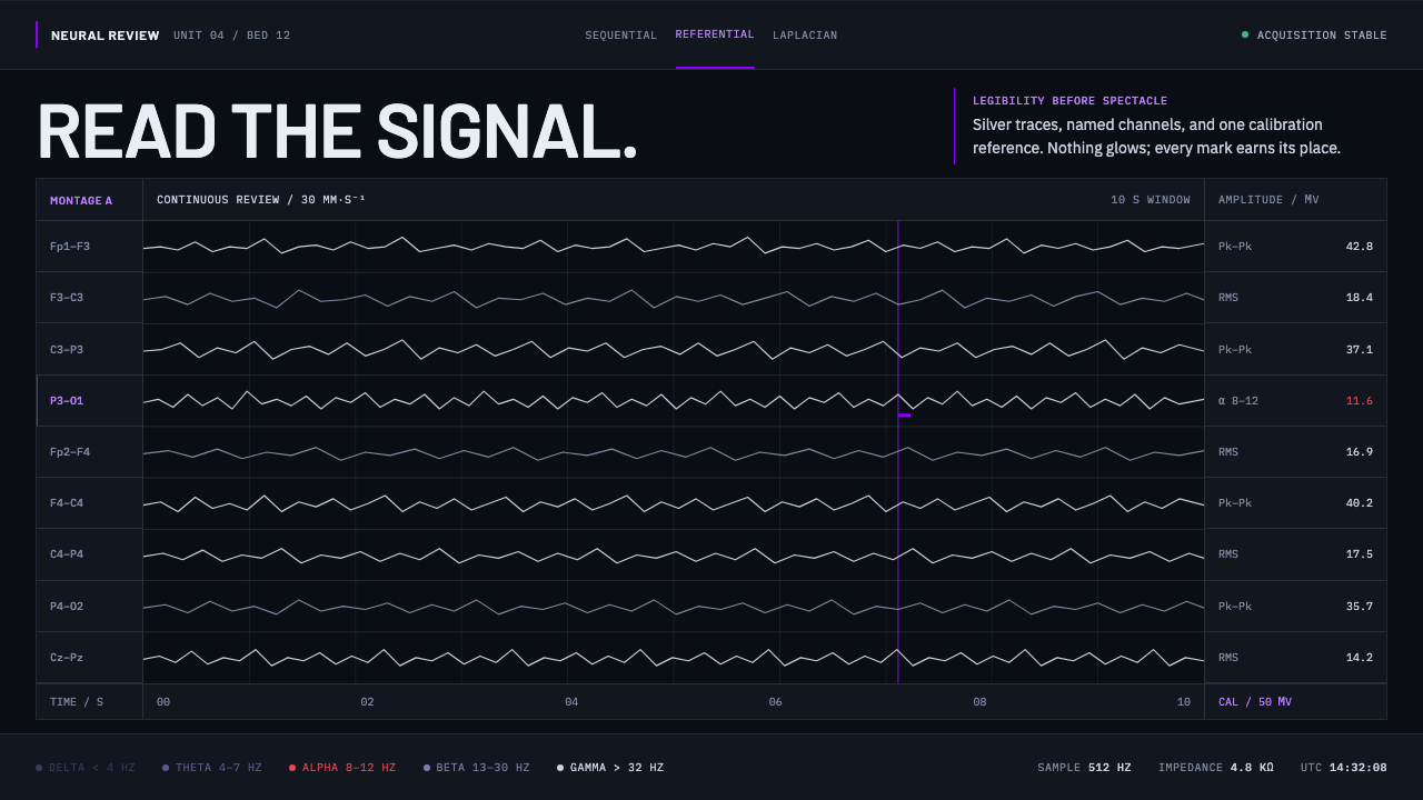 Neural Interface ClinicalClinical restraint makes signals legible. Silver traces cross near-black; vio…