What is SolidJS Reactive Framework?
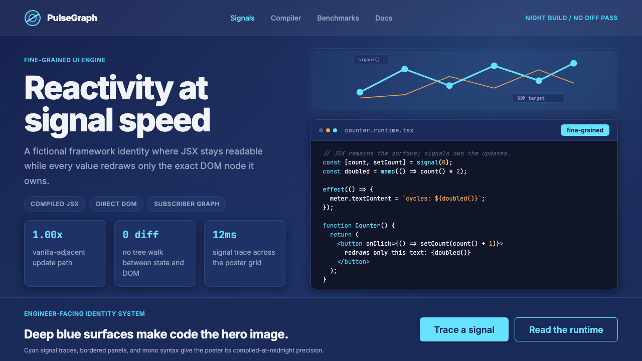
SolidJS built a framework where the code itself is the visual hero — deep indigo darkness, cyan signal arcs, and monospaced JSX treated as first-class design material.
SolidJS Reactive Framework in brief
SolidJS Reactive Framework is the visual identity system that emerged from the solidjs.com website circa 2023–2025, translating a radically efficient JavaScript runtime into a cohesive brand language. Where most developer-tool brands reach for neutral grays and thin sans-serifs as a sign of professional restraint, SolidJS committed to something bolder: a deep indigo-blue field that evokes late-night engineering sessions, solid-cyan accents that trace the shape of the framework's spiraling S-mark logo, and a typographic hierarchy that elevates code samples to the same visual rank as headlines.
The system occupies a specific corner of the technical brand landscape — neither the cold precision of purely monochrome developer aesthetics nor the rainbow exuberance of some open-source projects. It is a dark-mode-first identity built around two chromatic poles: the deep blue of an IDE at full saturation, and the bright cyan of an oscilloscope signal reading. Between those two tones, the brand communicates engineering depth, reactive speed, and the particular satisfaction of a benchmark that runs alongside vanilla JavaScript.
What makes the SolidJS visual language distinctive among framework brands is that it treats JSX code samples not as supporting documentation but as designed objects in their own right. Syntax highlighting becomes a deliberate palette extension. Comment lines carry visual weight. The formatted block of reactive primitives on the marketing page is composed with the same intentionality as a typographic poster. The result is a system that looks as though it was built by engineers who also cared deeply about how the thing looked — which, historically, it was.
Where does SolidJS Reactive Framework come from?
SolidJS began in 2018 as a personal research project by Ryan Carniato, a frontend engineer working in Toronto, Canada. Carniato had spent years studying the performance characteristics of frameworks like Knockout, Marionette, and eventually React, and had become convinced that the virtual DOM — React's core innovation for reconciling component state with the rendered page — was a fundamentally unnecessary abstraction. His insight was that signals, the reactive primitive at the heart of spreadsheet engines and some earlier JavaScript libraries, could replace the virtual DOM entirely if implemented at the compiler level. A component would not re-render; instead, the specific DOM nodes that depended on a changed signal would update directly.
The 1.0 release arrived in 2021 after three years of refinement, accompanied by benchmark results that placed SolidJS consistently at the top of the js-framework-benchmark suite — a community-maintained performance comparison that tracks DOM operation throughput across dozens of frameworks. Reaching near-vanilla-JavaScript performance while maintaining a component model that React developers could read without retraining was a significant engineering achievement, and it generated substantial attention from the frontend community almost immediately.
The visual identity that became recognizable solidified around the 2023 website redesign, when the project had matured from a technical curiosity into a genuine community with conferences, a core team, and commercial users. The deep indigo-and-cyan palette was not incidental: it connected to the color of the spiral-S logo, which had become one of the most recognizable marks in the open-source JavaScript ecosystem. Contributors including Milo, Atila Fassina, and Nikhil Saraf played central roles in building out the ecosystem of tools, documentation, and community infrastructure that gave the brand context beyond the core library.
The broader movements that SolidJS belongs to — fine-grained reactive frameworks, signal-based reactivity, and the framework benchmark wars of the early 2020s — shaped not just its technical architecture but its visual positioning. At a moment when much of the JavaScript community was debating whether signals were preferable to the virtual DOM, SolidJS needed to communicate both technical legitimacy and architectural confidence. The design system answered that challenge by committing to depth and precision rather than friendliness and approachability — a deliberate alignment of visual language with engineering values.
What defines the SolidJS Reactive Framework look?
Color Palette
The palette is anchored by a very deep indigo-blue — darker than navy, closer to the color of a terminal screen at maximum brightness in a dim room. Against this ground, a vivid cyan serves as the sole accent, used for interactive elements, logo marks, and highlights. Text appears in near-white or light gray tones that maintain legibility without the harshness of pure white against deep blue. The palette has almost no mid-tones: it operates through high contrast between the dark field and the luminous accent, with very little room for secondary colors or neutral grays in decorative roles.
Code as Visual Composition
The defining characteristic of the SolidJS visual system is its treatment of code blocks as designed typography rather than utilitarian inserts. JSX samples are formatted with deliberate line breaks, syntax coloring that extends the brand palette, and generous surrounding space. Comment lines are visually present and weighted. The reactive primitive syntax — createSignal, createEffect, and similar constructs — appears large enough to read comfortably from a distance, positioned as the conceptual anchor of a page section rather than a supporting detail. This approach makes the technical content the aesthetic content.
Typography with Engineering Logic
Heading type is set in a clean geometric sans-serif at generous scale, creating bold contrast against the dark ground without relying on color. Monospace type — for all code — is treated as equally important, appearing at scales comparable to display type in some contexts. The system avoids mixing many different type styles; instead it relies on size, weight, and the distinction between proportional and monospace to create hierarchy. In marketing contexts, a large heading might share a compositional zone with an equally prominent code block, placing conceptual explanation and technical syntax in direct visual dialogue.
Depth and Layering
Across the dark background, interface elements are differentiated not through color shifts but through subtle luminosity layers. A panel sits slightly lighter than the page ground; a modal or active state lighter still; the accent color then sits at the top of the luminosity stack. This creates a sense of depth that feels structural rather than decorative — like looking into a well-organized system rather than at a stack of decorative cards. Borders are fine and low-contrast, used to define regions without adding visual noise.
Motion and Signal Metaphors
The SolidJS visual language borrows from the metaphor of signal transmission: arcs, curves, and traces that suggest reactive data flowing from source to dependent. The spiral S-mark is itself a dynamic form — more arc than letter. In marketing illustrations and animated states, elements appear as if driven by reactive updates, fading or appearing in response to a source change rather than animating independently. The overall effect reinforces the product's core proposition: reactivity that originates at a signal source and propagates precisely, without wasted motion.
Precision over Warmth
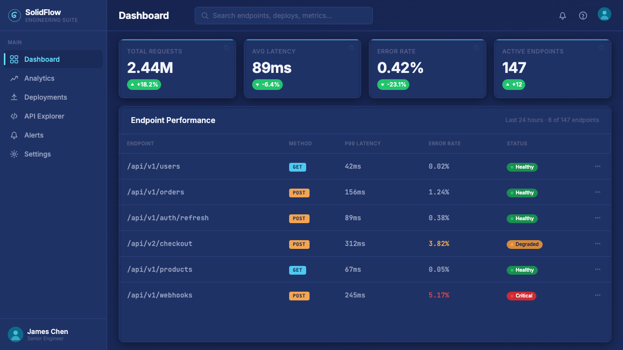
Every compositional decision in the SolidJS system leans toward engineering precision rather than consumer warmth. Spacing is consistent and generous. Icon work is precise and geometric. Illustrations, where they appear, are diagrammatic rather than illustrative — they explain system relationships rather than evoke emotion. The brand does not attempt to be approachable or friendly in the conventional consumer-product sense; it aims instead to communicate competence and depth to an audience that values those qualities above softness.
Dark-mode-first Construction
Unlike design systems that treat dark mode as an inversion of a light-mode primary, SolidJS was conceived from the start as a dark-first identity. The deep indigo ground is the canonical state; any light-mode contexts are secondary or exceptional. This means the system's logic — contrast ratios, layer hierarchies, accent deployment — was worked out for dark conditions, and the visual experience degrades gracefully rather than elegantly in light contexts. For users working in dark-mode development environments, the website feels continuous with their tooling, not like a context switch.
Who shaped SolidJS Reactive Framework?
Carniato created SolidJS and remains its principal architect and most public voice. His years of studying fine-grained reactivity in production environments — including extensive work on media streaming interfaces that needed to update hundreds of DOM nodes per second — gave him both the technical insight and the empirical confidence to build a framework that dispensed with the virtual DOM entirely. His writing and conference talks on signals and reactivity have influenced not only SolidJS but the broader conversation about framework architecture across the JavaScript ecosystem, including discussions within the React and Vue core teams.
Milo is a core team contributor who became central to SolidJS's ecosystem expansion, particularly around the SolidStart meta-framework — the project's answer to Next.js and Remix that brought routing, server functions, and deployment adapters into the SolidJS ecosystem. Their work on the tooling layer helped translate SolidJS from a raw library into a complete application development environment, and their contributions to the community infrastructure gave the project the organizational coherence it needed to attract long-term commercial adoption.
Fassina joined the SolidJS core team and became a leading voice in the project's documentation, education, and developer relations. His work translating the conceptual model of signals and fine-grained reactivity into accessible explanations helped the project reach developers who found the original technical papers dense. As a developer advocate, he was instrumental in establishing SolidJS's presence at major JavaScript conferences and in building the community feedback loops that shaped the ergonomics of SolidStart.
Saraf contributed significantly to the SolidJS ecosystem, particularly in the area of server-side rendering and the integration patterns that allowed SolidJS applications to work efficiently with streaming HTML delivery. His technical contributions helped address one of the core practical challenges for any non-React framework attempting to compete in production environments: the ability to deliver fast initial page loads through server rendering while maintaining the fine-grained reactivity model that makes SolidJS distinctive on the client.
How do you use SolidJS Reactive Framework today?
The SolidJS design language is well-suited to technical product contexts where the audience is developers or technically sophisticated product users who read dark-mode interfaces as a signal of engineering seriousness. Applied correctly, it communicates depth, precision, and performance — qualities that a framework brand cultivated but that translate effectively to any product positioned at the intersection of technical excellence and design care.
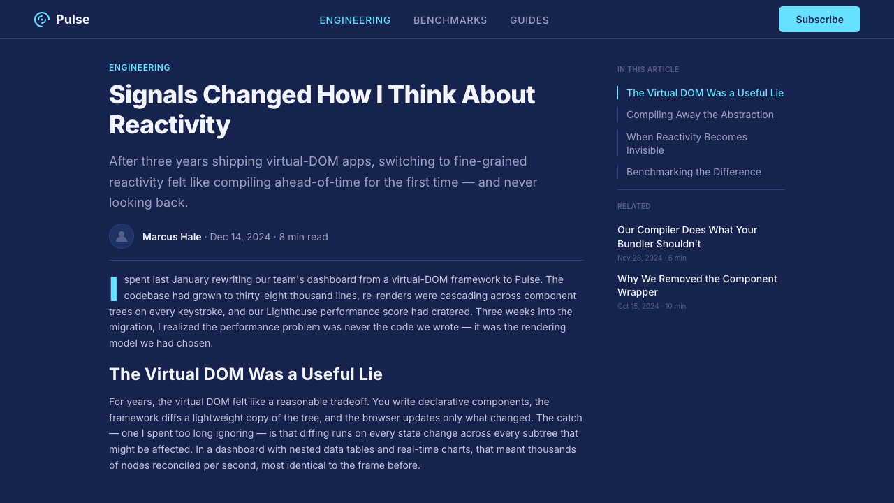
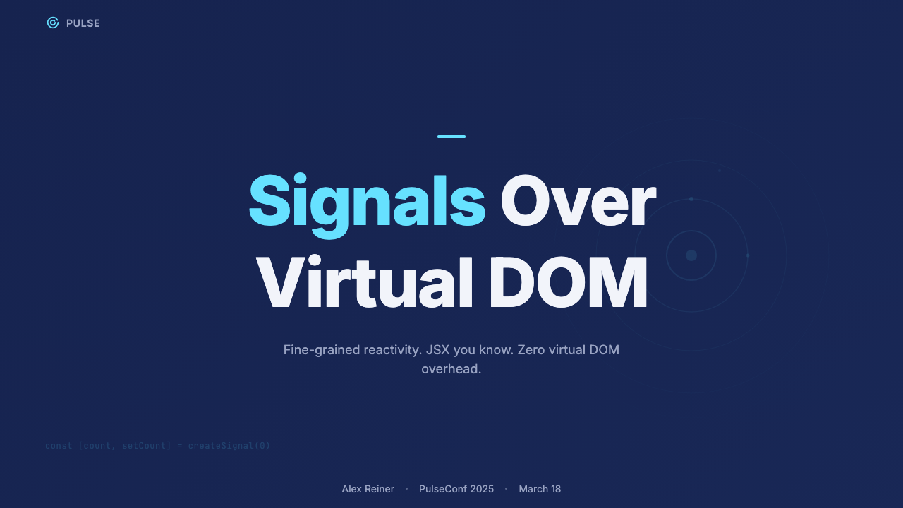
For presentation slides, the style works exceptionally well when code is part of the story. A cover built in this system leads with the deep indigo ground and a single headline in high-contrast near-white, with the framework's spiral motif or a minimal geometric element in cyan as the sole accent. Content slides lean on the code-as-composition principle: a slide introducing a concept might pair an explanatory headline with a formatted code block at equal visual scale, allowing the syntax itself to carry some of the communicative weight. Data slides take on a dark dashboard quality — charts with cyan as the primary data color against the indigo ground, axis labels in muted gray, and no decorative elements beyond the data geometry itself. Avoid using the full palette on every slide; the system works through restraint and through the drama of the cyan accent appearing sparingly.
For web interfaces, the style is especially strong for developer documentation, API reference pages, technical dashboards, and any interface where the user is spending extended time in the product. The dark-first palette reduces eye strain in prolonged sessions and signals that the interface was built by and for technical users. Navigation in this system is typographic and minimal — labels with precise sizing, no icon decoration beyond functional indicators. Form elements are fine-bordered and subtle. Interactive states shift luminosity rather than color, using the cyan accent only for primary calls to action and selected states. Pricing pages work well in this system: a tiered layout with the dark ground lets a highlighted tier stand out through luminosity difference rather than a disruptive color change.
For editorial and marketing content aimed at developer audiences, the SolidJS aesthetic supports strong technical authority. An article or landing page in this register might open with a full-width dark header containing the headline and a prominent code sample, with the body running in a lighter reading environment below. Section breaks can be marked by a thin cyan rule or by a shift to a slightly elevated panel background rather than by decorative dividers. The style translates well to developer newsletter designs and technical blog headers, where the dark palette and monospace code-forward composition signal that the content is for people who ship code rather than consume it.
A common mistake when applying this visual language is treating it as simply a generic dark theme. Dark mode alone is not the identity; the identity lies in the combination of the specific indigo depth, the single cyan accent used with great restraint, and the deliberate elevation of code as a typographic element. Applying the palette to a design that does not foreground code or technical precision produces a result that looks like a dark-mode template rather than a system with engineering character. Similarly, using the cyan accent liberally across many elements dilutes the impact it has when used sparingly — in the source system, the most powerful moments are those where the cyan appears once, precisely, against the deep indigo field.
SolidJS Reactive Framework — FAQ
Is this design language only appropriate for developer tools?
Not strictly, but it is well-suited to technical and precision-oriented contexts. Beyond developer tools, the system works for technical documentation platforms, data engineering dashboards, quantitative finance interfaces, and any product where the user associates darkness and precision with expertise and trust. It is less suited to consumer products, wellness or lifestyle brands, food and beverage, or children's applications — contexts where warmth, softness, and approachability are primary signals. The key question to ask is whether your audience reads the depth of a dark, precise interface as a positive signal (sophistication, engineering seriousness) or a negative one (cold, unwelcoming, difficult to use).
How does this system differ from other dark-mode developer brand identities, like GitHub or Vercel?
GitHub's dark mode is a utility inversion of a light-mode primary identity — it was added to serve user preference, not conceived as the canonical visual experience. Vercel's dark aesthetic is closer in intent but relies on a monochrome palette — black, white, and grays — with no saturated accent, creating a more austere and stripped-back quality. SolidJS is distinctive in its commitment to a specific chromatic identity (the indigo-plus-cyan pairing) and in its elevation of code as a designed typographic element. Where Vercel reads as luxury minimalism and GitHub reads as utilitarian infrastructure, SolidJS reads as engineering-forward and signal-driven — it wants you to feel the reactivity in the visual language itself.
Can this visual language work in a light-mode context?
It can, but it requires significant reinterpretation rather than simple color inversion. On a white or near-white ground, the deep indigo becomes an accent or heading color rather than the page field, and the cyan must be used even more sparingly because it can appear garish against white at high saturation. The code-as-composition principle transfers well regardless of background — a light-mode implementation might use a very slightly warm off-white for the page ground and a cool white panel background for code blocks, maintaining the visual distinction without the dramatic contrast of the dark version. The overall character in light mode is less immersive and less distinctive, since the personality of the system is deeply tied to the experience of the dark ground.
How should the cyan accent be rationed to maintain its impact?
Treat the cyan as a signal, not a palette. In the SolidJS source material, it appears on the logo mark, on primary interactive elements (the most important call-to-action button or link on a given view), on selected or active states, and occasionally in code syntax for specific token types. It does not appear on borders, secondary text, decorative elements, or as a background fill for any component larger than a small indicator or badge. A useful discipline: count the cyan-colored elements in a completed design. If the number exceeds three or four on a typical viewport, the accent has been diluted. The power of the system comes from the moment when the cyan appears against the indigo — that single point of vivid color is the signal, and its value depends entirely on everything around it staying dark and quiet.
Does the SolidJS design language conflict with existing brand guidelines when applied to a different product?
The SolidJS identity as described here is a source system — a coherent aesthetic with identifiable principles — not a proprietary trademark. Adopting its visual logic (dark indigo ground, single vivid accent, code-forward typography, engineering-precision composition) does not require using SolidJS's specific logo, spiral motif, or proprietary assets. What transfers is the underlying design philosophy: depth over surface, signal over decoration, code as a designed artifact. Any brand that shares those values can adopt the same register without conflict, adjusting the specific accent hue or heading typeface to align with their own identity while maintaining the structural and compositional logic that gives the system its character.
Related design styles
 Runway MLCinema, not dashboard. Deep black frames tight Inter type and one green-blue…
 Neural Interface ClinicalClinical restraint makes signals legible. Silver traces cross near-black; vio…
 Astro Islands Architecture 2022Warm cosmic devtools. Deep violet, magenta glow, Inter clarity, and island ge…
 Cursor IDEAI-first code editor. Pure dark surfaces, off-white text, electric blue reser…
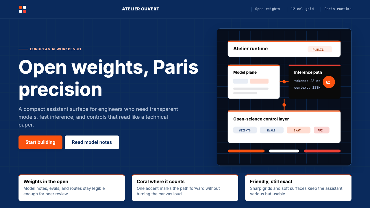 Mistral Le Chat French AIOpen science feels engineered. Navy panels, Inter grids, and coral stripes ke…
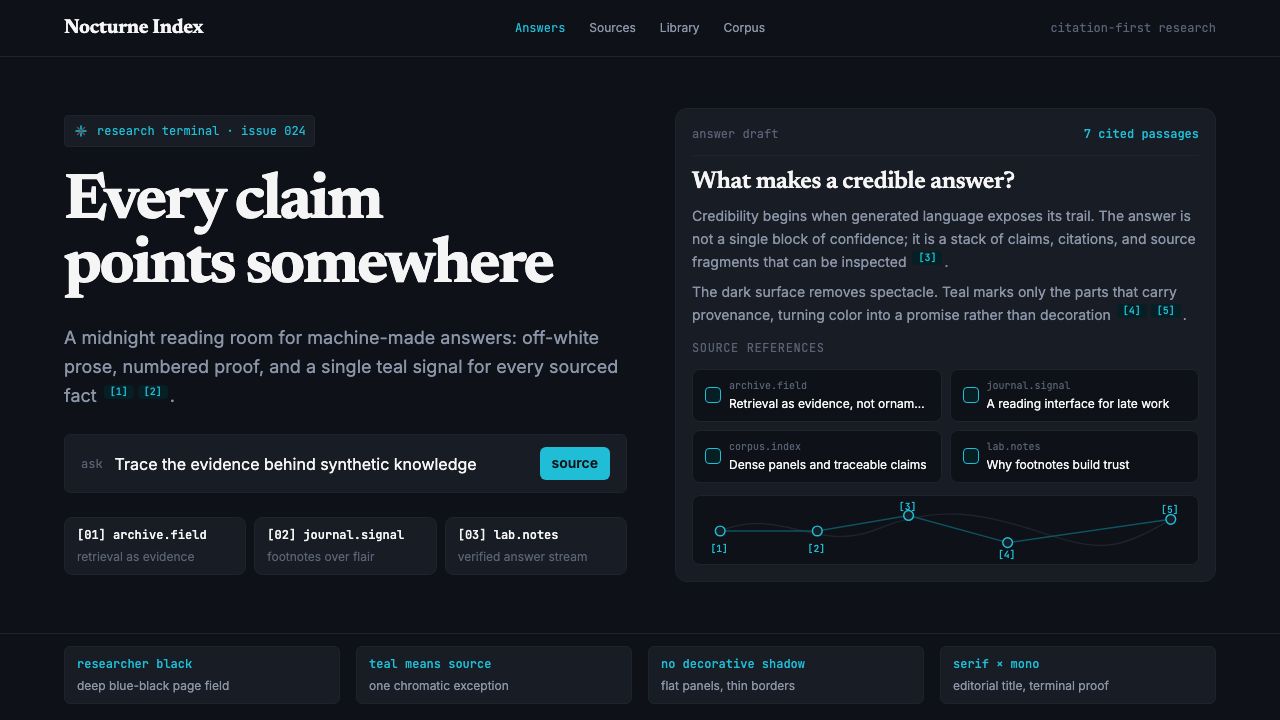 Perplexity AISerious search after midnight. Teal citations cut through black panels and de…