Design style guide设计风格指南
What is Astro Islands Architecture 2022?什么是 Astro Islands Architecture 2022?
Astro Islands Architecture 2022 fuses deep-violet cosmic gradients with developer-first clarity, proving that a technical framework can carry genuine warmth and personality.Astro 岛屿架构 2022 将深紫宇宙渐变与开发者优先的清晰感融为一体,证明一个技术框架也可以拥有真正的温暖与个性。
Astro Islands Architecture 2022 in briefAstro Islands Architecture 2022 速览
Astro Islands Architecture 2022 is the visual identity that accompanied the release of Astro 1.0 in August 2022 — a design language born inside a developer tool that ended up influencing how an entire generation of documentation sites, framework landing pages, and open-source brand identities look. At its center is a bold tension: cosmic depth rendered in saturated indigo and violet gradients, held in check by the crisp, utilitarian clarity that developer audiences expect and demand.Astro 岛屿架构 2022 是伴随 Astro 1.0 于 2022 年 8 月发布而诞生的视觉识别体系——一套在开发者工具内部孕育的设计语言,最终影响了整整一代文档站点、框架落地页与开源品牌形象的面貌。其核心是一种大胆的张力:以饱和靛紫渐变呈现的宇宙深邃感,与开发者受众所期待并要求的简洁实用清晰感相互制衡。
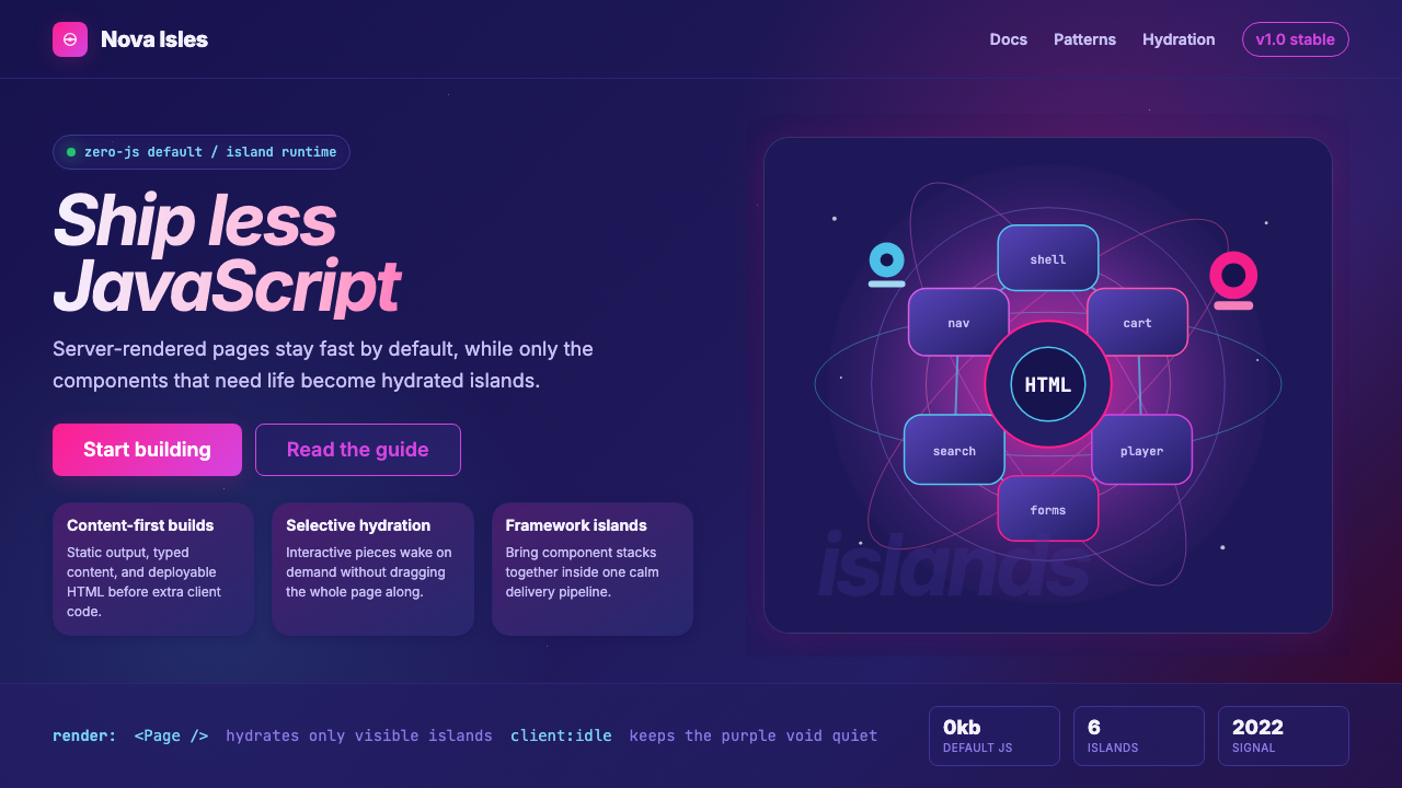
The style takes its name from the Islands Architecture pattern itself — a philosophy of shipping zero JavaScript by default and hydrating only the interactive components a page actually needs. That philosophy of restraint and purposefulness is embedded in the visual language: every glowing accent has a reason to be there, every soft nebula of color serves as a stage for sharp, readable information. The result is an aesthetic that feels simultaneously futuristic and trustworthy.这种风格得名于岛屿架构模式本身——一种默认零 JavaScript、只对页面真正需要交互的组件进行水合的哲学。这种克制与目的性的哲学根植于视觉语言之中:每一处发光强调都有其存在的理由,每一片柔和的色彩星云都作为清晰可读信息的舞台而存在。最终呈现的美学同时具有未来感与可信度。
What makes this style distinctive among developer brand identities is its emotional register. Most technical documentation defaults to cold neutrality — white backgrounds, system-default type, muted accent colors. Astro's 2022 identity chose the opposite: warm magenta glows against deep violet fields, playful astronaut illustrations that give the framework a mascot-like personality, and a visual richness usually reserved for consumer products. It demonstrated that technical credibility and visual warmth are not mutually exclusive.这种风格在开发者品牌识别中独树一帜,在于其情感基调。大多数技术文档默认采用冷静中立的面貌——白色背景、系统默认字体、低饱和强调色。Astro 的 2022 年视觉识别走向了相反的方向:深紫色场域上的热洋红发光效果、赋予框架吉祥物般个性的俏皮宇航员插图,以及通常只保留给消费品的视觉丰富性。它证明了技术可信度与视觉温暖感并不相互排斥。
See the Astro Islands Architecture 2022 design system →查看 Astro Islands Architecture 2022 完整设计系统 →
Where does Astro Islands Architecture 2022 come from?Astro Islands Architecture 2022 从何而来?
Astro was created by Fred K. Schott and launched publicly in 2021, emerging from a community of developers frustrated with the JavaScript weight that had accumulated in modern web frameworks. The core insight — that most website content is static and should not require client-side JavaScript to render — predated Astro, but Astro was the project that gave Islands Architecture a name, a coherent implementation, and a brand capable of communicating the idea to a broad audience.Astro 由 Fred K. Schott 创建,于 2021 年公开发布,诞生于一批对现代 Web 框架中积累的 JavaScript 重量感到沮丧的开发者社区。核心洞察——大多数网站内容是静态的,不应需要客户端 JavaScript 来渲染——早于 Astro 就已存在,但 Astro 是第一个给岛屿架构命名、提供连贯实现,并建立起能够向广泛受众传达这一理念的品牌的项目。
The visual identity took shape alongside the 1.0 release campaign in 2022. The design decisions were made within a distributed remote team spanning the United States and Europe, and they reflected the sensibilities of a community that had grown up on dark-mode code editors, terminal emulators with neon syntax highlighting, and the science-fiction aesthetics of space exploration imagery. Deep violet and indigo recalled the interface palettes of popular development environments; the magenta glow referenced the hot-pink accent colors popularized by vaporwave and the lo-fi aesthetic movements that had been circulating through developer culture for several years.视觉识别在 2022 年 1.0 发布活动期间成形。设计决策由一支跨越美国与欧洲的分布式远程团队共同完成,反映了一个在深色模式代码编辑器、带有霓虹语法高亮的终端模拟器,以及太空探索图像的科幻美学中成长起来的社区的感性。深紫与靛紫让人联想到流行开发环境的界面配色;洋红色的光晕效果则借鉴了蒸汽波与低保真美学运动中流行的热粉色强调色——这些运动在开发者文化圈中流传已有数年。
The astronaut mascot was a deliberate departure from the abstract logo marks that dominate the developer tooling space. Where most frameworks communicate through wordmarks and geometric symbols, Astro gave itself a character — a spacefarer in a helmet, surrounded by stars, connoting adventure and exploration rather than mere technical utility. This mascot decision aligned the brand with the spirit of the Islands Architecture pattern itself: something new and different from the incumbent JavaScript-heavy mainstream.宇航员吉祥物是对主导开发者工具领域的抽象标志的刻意背离。大多数框架通过文字标识与几何符号传达品牌,Astro 则给自己塑造了一个角色——一位头戴头盔、置身繁星之中的太空旅行者,传递的是探险与冒险的精神,而非单纯的技术实用性。这一吉祥物决策使品牌与岛屿架构模式本身的精神相契合:与以 JavaScript 为重的主流框架截然不同的新事物。
By 2022, Astro had attracted contributors including Matthew Phillips, Nate Moore, and Ben Holmes, each of whom helped shape both the technical direction and the community culture that the visual identity expressed. The 2022 brand became a template that influenced dozens of subsequent open-source framework identities, demonstrating that the developer tooling space had developed its own coherent aesthetic vocabulary — one that borrowed from space exploration, retro-futurism, and the expressive possibilities of modern CSS, rather than defaulting to the corporate minimalism that had dominated the preceding decade.到 2022 年,Astro 已吸引了 Matthew Phillips、Nate Moore 与 Ben Holmes 等贡献者,每位都在技术方向与社区文化的塑造中发挥了作用,而视觉识别正是这种文化的表达。2022 年的品牌成为影响数十个后续开源框架视觉识别的模板,证明开发者工具领域已形成了自己连贯的美学词汇——这套词汇借鉴自太空探索、复古未来主义与现代 CSS 的表达可能性,而非延续此前十年主导该领域的企业极简主义。
What defines the Astro Islands Architecture 2022 look?Astro Islands Architecture 2022 的视觉特征是什么?
Color — Cosmic Violet Depth色彩:宇宙紫罗兰深度
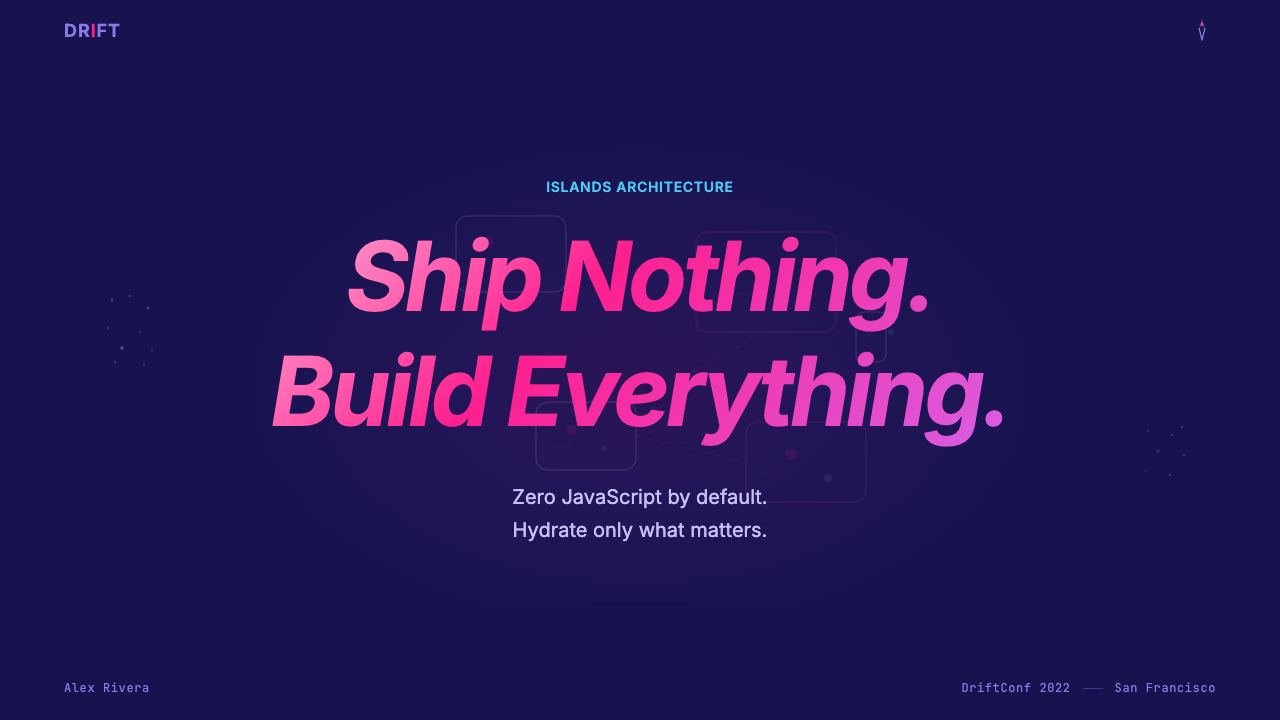
The palette anchors on a rich, saturated indigo-violet that occupies the full background, evoking the depth of outer space without tipping into generic darkness. Against this field, hot-magenta accents glow with a luminous quality — less like painted shapes and more like light sources embedded in the composition. This glow effect creates a sense of warmth that is unusual for deep-dark backgrounds. Secondary neutrals are cool-toned and desaturated, reserving the full saturation budget for the magenta accent and the violet field itself.配色以饱和的靛紫蓝为底色贯穿全局,唤起外太空的深邃感而不流于普通的暗色调。在这片色域之上,热洋红色强调以发光的品质呈现——与其说是涂抹的形状,不如说是嵌入构图的光源。这种发光效果在深色背景中制造出不寻常的温暖感。次级中性色调偏冷且低饱和,将全部饱和度预算保留给洋红强调与紫罗兰底色本身。
Typography — Developer Clarity字体排印:开发者式清晰
Type is set in a geometric sans-serif that prioritizes legibility at the large sizes required by hero headings and at the small sizes required by code snippets and metadata. The contrast between headline weight and body weight is deliberately amplified — headings are bold and expansive, while body copy sits at a modest weight that does not compete. Monospace type for code samples is treated with the same visual respect as the display type, appearing in distinctly styled code blocks rather than inline interruptions.字体排印采用几何无衬线字体,在大标题所需的大字号和代码片段与元数据所需的小字号两端均优先保证易读性。标题字重与正文字重之间的对比被刻意放大——标题粗重而舒展,正文则以谦逊的字重呈现,不与标题竞争视觉。代码示例所用的等宽字体获得与展示字体同等的视觉尊重,以独特样式的代码块而非行内中断的形式呈现。
Gradients — Purposeful Nebulae渐变:有目的的星云
Unlike the hard-edged flatness of modernist styles, this aesthetic embraces gradients as a primary expressive tool — but with restraint. Gradients serve as backgrounds for compositional zones rather than decorative fills for individual elements. The transitions typically move from a deep violet anchor through an indigo mid-range into suggestions of teal or pink at the edges, creating a sense of atmospheric depth. Radial gradients — centered on key focal points — reinforce the glow effect of accent colors and create soft vignettes that guide the eye toward interactive elements.与现代主义风格的硬边平面性不同,这种美学将渐变作为主要的表达工具来拥抱——但保持克制。渐变服务于构图区域的背景,而非单个元素的装饰填充。过渡通常从深紫锚点穿越靛蓝中间调延伸至边缘的青色或粉色意象,制造出大气深度感。以关键焦点为中心的径向渐变强化了强调色的发光效果,并形成柔和的晕影引导视线指向交互元素。
Illustration — Warmth Through Character插图:通过角色传递温暖
The astronaut mascot is the most distinctive element of the identity and the one that sets it apart from every competing developer brand. The illustration style is clean vector work — smooth curves, a limited palette drawn from the brand colors, and enough detail to convey personality without photographic realism. The character appears in multiple contexts: floating in space, interacting with interface elements, exploring abstract geometric landscapes. This illustrative presence communicates approachability and adventure, lowering the perceived barrier to entry for developers who might find a purely technical brand cold.宇航员吉祥物是这套识别体系中最具辨识度的元素,也是使其区别于所有竞争开发者品牌的核心特征。插图风格是简洁的矢量作品——流畅的曲线,一套从品牌色中提取的有限色板,以及足够传达个性而不追求摄影写实主义的细节度。这个角色出现在多种语境中:漂浮在太空中、与界面元素互动、探索抽象的几何风景。这种插图存在感传递出亲切感与探险精神,为可能觉得纯技术品牌过于冷淡的开发者降低了心理门槛。
Layout — Islands of Content版式:内容的岛屿
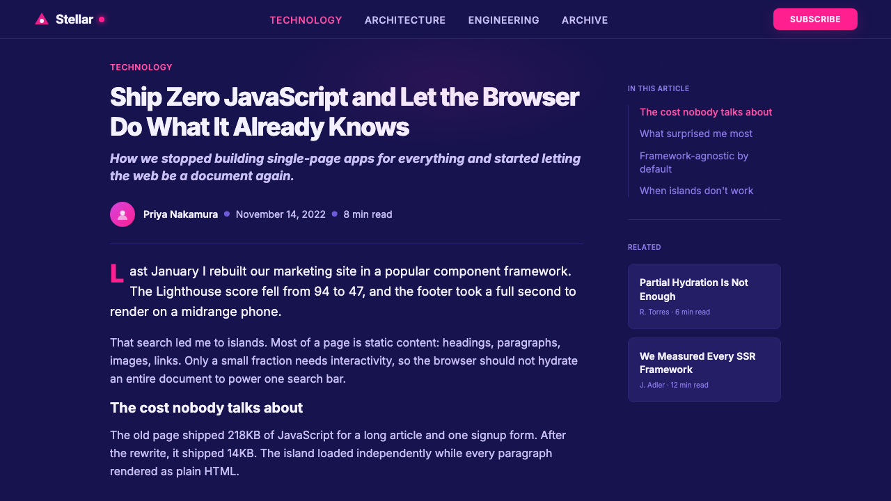
Layout reflects the Islands Architecture principle at a visual level. Blocks of content are treated as distinct, self-contained units — each with its own background treatment, padding, and visual boundary — rather than as continuous flowing columns. This island-like quality means that sections of a page can be visually distinct from their neighbors while still reading as part of a coherent whole. Feature grids use generous whitespace between cards; hero sections are full-viewport-width compositions with centered focal points; documentation areas switch to a clean, high-contrast light mode to prioritize readability over atmosphere.版式在视觉层面呼应了岛屿架构的原则。内容块被视为独立的、自足的单元——各自拥有独特的背景处理、内边距与视觉边界——而非连续流动的栏目。这种岛屿化品质意味着页面的各个区域可以在视觉上与相邻区域截然不同,同时仍作为连贯整体的一部分被阅读。特性网格在卡片间使用充裕的留白;英雄区是以视口宽度为满幅、焦点居中的构图;文档区域则切换至简洁的高对比度浅色模式,将易读性置于氛围感之上。
Motion — Purposeful Orbital Energy动效:有目的的轨道能量
Animated elements in this style tend toward slow, orbital movements — particles drifting through a star field, gradient orbs that shift position subtly over time, constellation-like connection lines that expand and contract. The motion vocabulary reinforces the cosmic theme without becoming distracting. Transitions between states favor smooth easing curves rather than snappy spring animations; the overall tempo is measured and calm, suggesting the quiet vastness of space rather than the reactive urgency of an action-oriented interface.这种风格中的动态元素倾向于缓慢的轨道运动——粒子漂流穿越星域、随时间微妙移动位置的渐变光球、星座般伸缩的连接线条。动效词汇在强化宇宙主题的同时不产生干扰。状态间的过渡偏好平滑的缓动曲线而非弹性的弹簧动画;整体节奏从容而平静,传递的是太空的宁静浩瀚,而非动作导向界面的即时反应感。
Dark-Mode Primacy深色模式优先
This style is fundamentally dark-mode first — the deep violet background is not a variant of a light theme but the canonical, primary experience. Switching to a light mode (where it exists at all, typically in documentation subsections) feels like leaving the brand's emotional core and entering a functional utility zone. This inversion of the usual light-first convention is a deliberate signal that the style belongs to developer culture, where dark interfaces have been standard for decades, and to a generation that associated darkness not with gloom but with focus and craft.这种风格从根本上是深色模式优先的——深紫背景不是浅色主题的变体,而是规范的、主要的体验。切换至浅色模式(若存在,通常只在文档子区域)感觉像是离开了品牌的情感核心,进入了功能实用区。这种对通常浅色优先惯例的反转,是一个刻意的信号:这种风格归属于开发者文化——在那里,深色界面已是数十年的标准,也归属于一代将暗色与专注和工匠精神联系在一起而非与阴郁联系在一起的人。
See the Astro Islands Architecture 2022 design system →查看 Astro Islands Architecture 2022 完整设计系统 →
Who shaped Astro Islands Architecture 2022?谁塑造了 Astro Islands Architecture 2022?
Schott is the creator of Astro and the primary architect of the Islands Architecture pattern as Astro implements it. He authored the founding vision of zero-JavaScript-by-default and led the project through its public beta and 1.0 release in 2022. His background in web standards and his work on earlier projects informed the technical philosophy that the 2022 visual identity was designed to communicate — a framework that respected the web's fundamentals while offering a modern developer experience.Schott 是 Astro 的创建者,也是 Astro 实现岛屿架构模式的主要架构师。他撰写了「默认零 JavaScript」的创始愿景,并带领项目完成了公开测试版与 2022 年 1.0 发布。他在 Web 标准方面的背景以及在早期项目上的工作,塑造了 2022 年视觉识别所要传达的技术哲学——一个在提供现代开发者体验的同时尊重 Web 基础的框架。
Phillips joined the core team and became one of Astro's most prolific contributors during the critical period leading to 1.0. His work on Astro's build pipeline and integration system helped define the framework's scope and capability, which in turn informed what the brand needed to communicate. The visual identity's emphasis on being an orchestration layer — rather than a competing runtime — reflects the architectural decisions that Phillips and the broader core team made.Phillips 加入了核心团队,并在通往 1.0 的关键时期成为 Astro 最高产的贡献者之一。他在 Astro 构建管道与集成系统上的工作帮助定义了框架的范围与能力,进而影响了品牌需要传达的内容。视觉识别对作为编排层——而非竞争性运行时——的强调,正是 Phillips 与更广泛核心团队所做架构决策的反映。
Moore contributed extensively to Astro's component model and its integrations with popular UI frameworks, helping make the Islands Architecture approach practical for real-world projects. His work on enabling developers to mix components from different frameworks within a single Astro project was central to the framework's appeal — and to the brand narrative of Astro as a meta-framework that transcended the framework wars rather than joining them.Moore 在 Astro 的组件模型及其与主流 UI 框架的集成方面贡献颇丰,帮助使岛屿架构方法在实际项目中切实可行。他在让开发者能够在单个 Astro 项目中混用来自不同框架的组件方面所做的工作,是框架吸引力的核心所在——也是 Astro 作为超越框架之争而非加入其中的元框架这一品牌叙事的核心。
Holmes joined the team during the pre-1.0 period and became closely associated with developer education and community outreach. His contributions to Astro's documentation, tutorial content, and developer-facing communications helped translate the framework's technical philosophy into language that a broad audience could engage with. The warmth and approachability of the 2022 brand identity — particularly its illustrative character and its community-first messaging — owes much to the culture that Holmes and others built around the project.Holmes 在 1.0 发布前期加入团队,并与开发者教育及社区推广工作密切相关。他在 Astro 文档、教程内容与面向开发者传播方面的贡献,帮助将框架的技术哲学转化为广泛受众能够理解的语言。2022 年品牌识别的温暖感与亲切感——尤其是其插图角色与社区优先的信息传递——很大程度上归功于 Holmes 等人围绕项目所建立的文化。
How do you use Astro Islands Architecture 2022 today?今天怎么用 Astro Islands Architecture 2022?
Astro Islands Architecture 2022 is one of the most transferable developer-brand aesthetics of its era, but it carries strong contextual associations. Used in the right context — technical frameworks, developer tools, documentation sites, open-source project landing pages — it immediately signals credibility within developer culture while providing a visual warmth that distinguishes the product from cold corporate technical brands. Used outside this context, the cosmic depth and magenta glow can read as theatrical or genre-specific in ways that undermine rather than support the message.Astro 岛屿架构 2022 是其时代中可移植性最强的开发者品牌美学之一,但它携带着强烈的语境关联。在正确的语境中使用——技术框架、开发者工具、文档站点、开源项目落地页——它立即在开发者文化中传递出可信度,同时提供视觉温暖感,使产品区别于冷漠的企业技术品牌。在这一语境之外使用,宇宙深度与洋红光晕可能呈现出戏剧性或类型特定的特质,反而削弱而非支撑信息传达。
For presentation slides, this style works especially well for conference talks aimed at developer audiences, framework comparison presentations, and architectural overview decks. A cover slide benefits from the full cosmic treatment: deep violet background, a centered composition with a large glowing accent element, and the title set in a generous, high-contrast display size. Content slides should switch to a cleaner treatment — lighter backgrounds for body text sections, with the cosmic palette reserved for accent elements, code block backgrounds, and slide-end callout panels. Data slides work best when charts are built from the brand's limited accent palette against a neutral dark background, giving data a gemstone-like vividness.对于演示文稿,这种风格在面向开发者受众的会议演讲、框架对比演示和架构概述幻灯片上效果尤为出色。封面幻灯片适合全面的宇宙处理:深紫背景、以发光强调元素为核心的居中构图,以及以大号高对比度展示字体排布的标题。内容幻灯片应切换至更简洁的处理——正文区段采用较浅的背景,将宇宙配色保留给强调元素、代码块背景与幻灯片末尾的标注面板。数据幻灯片在中性深色背景上用品牌有限的强调配色构建图表时效果最佳,赋予数据宝石般的鲜活感。
For web UI, the style is most effective on landing pages, documentation homepages, and feature announcement pages. A landing page built on this aesthetic should open with a full-viewport hero — deep violet gradient background, a heading with significant visual weight, and a subheading that sets up the value proposition. Below the fold, feature sections can use a card-island layout: each card as a self-contained content unit with a slightly lighter or more saturated background than its surroundings. Pricing pages benefit from the style's capacity for visual hierarchy; tier cards should use brightness and saturation rather than borders to signal emphasis.对于网页界面,这种风格在落地页、文档首页和特性发布页上最为有效。基于这种美学构建的落地页应以全视口英雄区开场:深紫渐变背景、具有显著视觉分量的大标题,以及建立价值主张的副标题。折叠线以下,特性区段可采用卡片岛屿版式:每张卡片作为自足的内容单元,背景比周围环境稍浅或稍更饱和。定价页面适合利用这种风格对视觉层级的表达能力;等级卡片应通过亮度和饱和度而非边框来传达强调。
For editorial and marketing materials — blog post headers, social media graphics, email header treatments, and event banners — the most useful application of this style is the glow-on-dark formula: a deep violet or near-black background with one or two luminous accent shapes that frame the central typographic message. The astronaut mascot, if licensed, can anchor an entire editorial identity. Without it, a strong geometric shape rendered in the magenta accent — a circle, a ring, a burst — functions as a stand-in focal point.对于编辑与营销材料——博客文章头图、社交媒体图形、邮件头部处理和活动横幅——这种风格最实用的应用是「深色发光」公式:以深紫或近黑为背景,以一两个发光强调形状框定核心排印信息。如果宇航员吉祥物获得授权,它可以锚定整套编辑视觉识别。若无吉祥物,以洋红强调色渲染的强烈几何形状——圆形、环形、爆发形——可作为替代的焦点。
The most common mistake when applying this style is treating the glow effect as decoration rather than structure. Authentic applications of this aesthetic use glowing accents to direct attention — they mark the entry point, the interactive element, the primary call to action. When every element glows, nothing stands out, and the cosmic depth becomes visual noise. A second common error is importing the violet-magenta palette into contexts that call for different emotional registers: medical, legal, or financial interfaces where the science-fiction associations of this palette may undermine rather than support trust.应用这种风格时最常见的错误是将发光效果当作装饰而非结构来处理。这种美学的真正应用使用发光强调来引导注意力——它们标记入口点、交互元素与主要行动号召。当每个元素都在发光时,没有任何东西突出,宇宙深度便沦为视觉噪音。第二种常见错误是将紫罗兰-洋红配色引入需要不同情感基调的语境:医疗、法律或金融界面,在这些场合,这套配色的科幻联想可能削弱而非支撑信任感。
See the Astro Islands Architecture 2022 design system →查看 Astro Islands Architecture 2022 完整设计系统 →
Astro Islands Architecture 2022 — FAQAstro Islands Architecture 2022 · 常见问题
Is this style limited to developer products, or can it work elsewhere?这种风格仅限于开发者产品,还是也能用于其他场合?
The style works beyond developer products, but it requires intentional recontextualization. The cosmic violet and magenta glow palette reads naturally as futuristic and exploratory — qualities that suit gaming interfaces, science communication, space and astronomy products, creative tools aimed at digital artists, and forward-looking financial or fintech brands that want to signal innovation. It struggles in contexts that call for organic warmth (food, wellness, home), classical authority (legal, institutional), or conventional consumer trust (insurance, healthcare). The astronaut mascot is specific to Astro and should not be borrowed; the palette and glow aesthetic, however, are public visual territory.这种风格适用范围超出开发者产品,但需要刻意的重新语境化。宇宙紫罗兰与洋红光晕配色自然传递出未来感与探索性——这些特质适合游戏界面、科学传播、太空与天文产品、面向数字艺术家的创意工具,以及希望传递创新信号的前瞻性金融或金融科技品牌。它在需要有机温暖感(食品、健康、家居)、古典权威感(法律、机构)或传统消费者信任感(保险、医疗)的语境中力不从心。宇航员吉祥物是 Astro 的专属形象,不应借用;但配色与发光美学属于公共视觉领域。
How does this style relate to vaporwave and synthwave aesthetics?这种风格与蒸汽波和合成波美学有何关联?
The family resemblance is real but the lineage is distinct. Vaporwave and synthwave both use neon accents on dark backgrounds, gradient skies, and a retro-futurist register. Astro's 2022 identity draws on the same cultural substrate — developer culture absorbed these aesthetics through terminal color schemes, code editor themes, and lo-fi playlists — but applies them with a more contemporary, functional restraint. Where vaporwave embraces excess and nostalgia (grid floors, glitching imagery, Roman busts), Astro's palette is edited and purposeful. The magenta glow is a single accent, not a field of competing neons. The result is closer to the considered darkness of modern design systems than to the maximalism of the retro aesthetic movements that influenced it.视觉上的家族相似性是真实的,但谱系是截然不同的。蒸汽波和合成波都在深色背景上使用霓虹强调色、渐变天空与复古未来主义基调。Astro 的 2022 年视觉识别借鉴了同一文化基底——开发者文化通过终端配色方案、代码编辑器主题和低保真播放列表吸收了这些美学——但以更当代、更克制的功能性方式加以运用。蒸汽波拥抱过剩与怀旧(网格地板、故障图像、罗马半身像),Astro 的配色则经过筛选且目的明确。洋红光晕是单一的强调色,而非相互竞争的霓虹色场。最终结果更接近现代设计系统的克制暗色处理,而非影响它的复古美学运动的最大主义。
Can this style work in print or physical materials?这种风格能用于印刷品或实体材料吗?
Print application is possible but demanding. The style's core effects — glow, gradient depth, luminous accent colors — depend on additive light and are produced by screens; printing relies on subtractive color, which cannot reproduce the glowing quality of backlit violet and magenta. A print adaptation needs to commit to either a very dark, ink-heavy background that approximates the screen feel, or a simplified light-mode interpretation that preserves the geometric structure and typographic clarity while abandoning the glow. Conference materials, branded merchandise, and event signage have been produced in this style, but they typically work best when they simplify to the mascot illustration, the logotype, and the most saturated flat version of the palette rather than attempting to faithfully reproduce the screen-native gradient and glow effects.印刷应用是可能的,但要求颇高。这种风格的核心效果——光晕、渐变深度、发光强调色——依赖加法光色并由屏幕生成;印刷依赖减法色彩,无法再现背光紫罗兰与洋红的发光品质。印刷适配需要做出选择:要么采用非常深重、油墨饱满的背景来近似屏幕感觉,要么采用简化的浅色模式诠释——保留几何结构与排印清晰度,同时放弃发光效果。这种风格已被用于会议材料、品牌周边与活动标牌,但通常在简化为吉祥物插图、字标与最饱和的平涂版本配色时效果最佳,而非尝试忠实再现屏幕原生的渐变与发光效果。
What makes the astronaut illustration so effective for a technical brand?为什么宇航员插图对技术品牌如此有效?
The astronaut works because it resolves a tension that technical brands typically fail to address: the need to signal competence and warmth simultaneously. A purely abstract logo or a geometric wordmark signals seriousness but offers no emotional entry point. A cartoon mascot offers warmth but risks undercutting technical credibility. The spacesuit-clad astronaut occupies a middle ground: the helmet and suit carry the connotations of precision engineering, systematic training, and high-stakes performance; the posture and context (floating freely, exploring) carry the connotations of wonder and adventure. Together they communicate that the product is rigorous AND fun — a combination that is genuinely rare in developer tooling.宇航员之所以有效,在于它化解了技术品牌通常无法解决的张力:需要同时传递能力与温暖感。纯粹的抽象标志或几何字标传递严肃性,却没有情感入口。卡通吉祥物提供温暖感,却有损害技术可信度的风险。身着太空服的宇航员占据了中间地带:头盔与太空服承载着精密工程、系统训练与高风险表现的内涵;姿态与语境(自由漂浮、探索)则承载着惊奇与冒险的内涵。两者合在一起传递出产品严谨而又有趣——这在开发者工具领域是真正罕见的组合。
How should the glow effect be used to maintain visual hierarchy?如何使用发光效果来维持视觉层级?
The glow effect is the style's most powerful — and most easily misused — tool. The rule is simple: glow marks importance, so it must be rationed. A single glowing call-to-action button on a page reads as unmissable; five glowing elements compete with one another and cancel each other out. In practice, the hierarchy should run: one primary glow (the most important interactive element or focal point), one secondary glow at reduced intensity (a supporting element or section anchor), and no glow at all on tertiary elements. Background gradient glows — the radial bloom in the hero, the nebula behind a feature section — operate at a scale and diffusion that does not compete with element-level glows; they are environmental rather than directional. Keeping these two categories of glow distinct is what separates polished applications of this style from cluttered imitations.发光效果是这种风格最强大——也最容易被误用——的工具。规则很简单:发光标记重要性,因此必须定量分配。页面上单个发光的行动号召按钮让人无从错过;五个发光元素相互竞争并相互抵消。在实践中,层级应如此运行:一个主要发光(最重要的交互元素或焦点),一个强度降低的次要发光(辅助元素或区段锚点),三级元素完全不使用发光。背景渐变光晕——英雄区的径向光晕、特性区段后方的星云——以不与元素级发光竞争的尺度与扩散度运作;它们是环境性的而非方向性的。保持这两类发光的清晰区分,正是精良的风格应用与杂乱的模仿品之间的分界线。
Related design styles相关设计风格
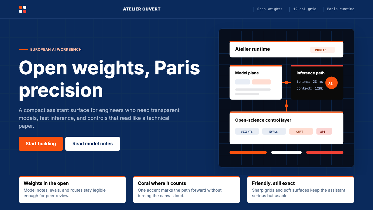 Mistral Le Chat French AIOpen science feels engineered. Navy panels, Inter grids, and coral stripes ke…开放科学也很精密:海军蓝面板、Inter 栅格与珊瑚橙细线定调。
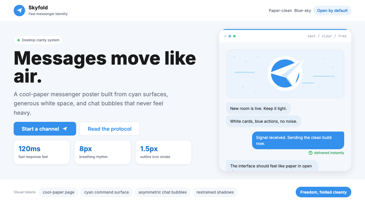 Telegram Blue Paper PlanePaper-clean speed. Cyan planes, white cards, and chat bubbles carry the ident…纸面般清爽快速:青蓝飞机、白卡片与气泡撑起识别度。
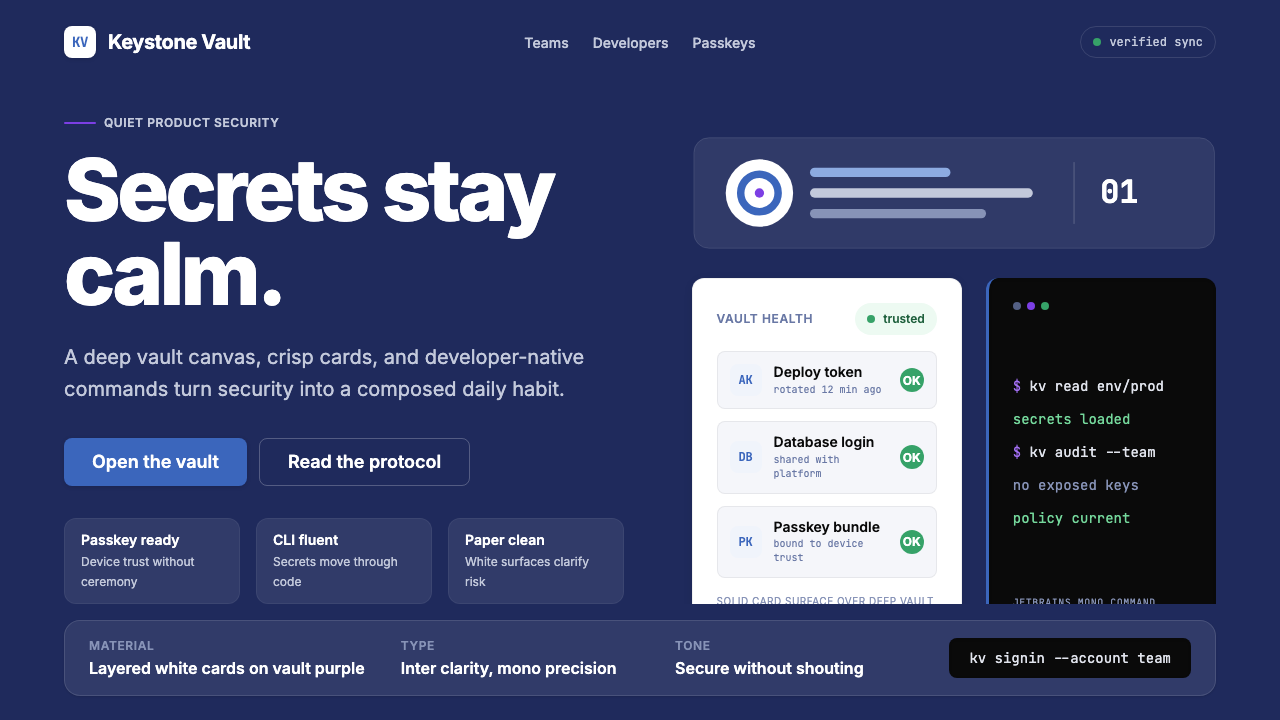 1Password Purple VaultSecurity stays quiet. Vault purple, Inter type, and crisp white cards do the…安全保持安静:保险库紫、Inter 字体与白卡片完成表达。
 Stripe 2024Trust earns its glow. Indigo mesh, neutral type, and whisper cards float on n…信任自带微光:近白底上的靛蓝渐变、中性字体与轻影卡片。
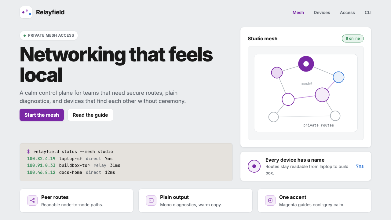 Tailscale Mesh VPN 2024Friendly infrastructure. Cool grey cards, magenta mesh nodes, and mono CLI bl…亲切的基础设施:冷灰卡片、品红节点和等宽命令行。
 AsanaCalm productivity breathes. Cream canvas, lavender panels, coral-blue-yellow…安静生产力会呼吸:奶油画布、薰衣草面板与三色圆点。