What is Telegram Blue Paper Plane?
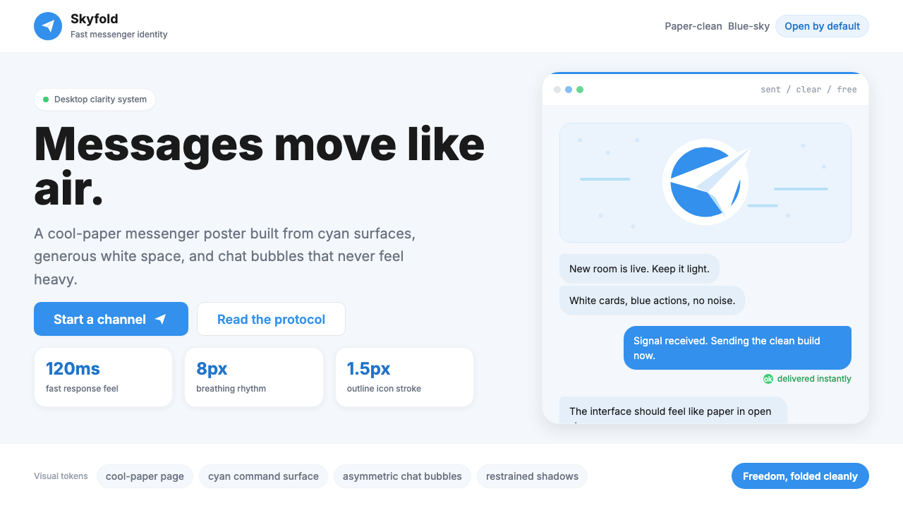
Telegram's paper-plane identity proves that a single confident color, a clean white surface, and a carefully chosen icon can carry an entire global brand.
Telegram Blue Paper Plane in brief
Telegram Blue Paper Plane is the visual design system derived from the Telegram messaging platform — a language built on sky-blue cyan, cool white surfaces, and the paper-plane icon that communicates speed, lightness, and openness in a single stroke. It is one of the most recognizable digital product identities of the 2010s and 2020s, instantly legible across every screen size and cultural context where the app has taken hold.
The system is not a fashion statement or a historical reference: it is a functional identity engineered for a product that competes on trust and velocity. Every visual decision — the particular coolness of the cyan, the generous whitespace around chat bubbles, the flat white card surfaces — reinforces the platform's core promise of messages that travel fast, arrive reliably, and feel private. The aesthetic consequence is a kind of paper-clean clarity: nothing weighs it down, nothing distracts.
In practical terms, the Telegram aesthetic translates into a design vocabulary of cyan-blue interactive elements floating above white or very lightly tinted backgrounds, chat-bubble layouts that organize conversational content without visual noise, and an overall restraint that keeps the user's actual content — text, images, links — at the center of attention. It is a product-first visual system, functional in exactly the way that good messenger design should be.
Where does Telegram Blue Paper Plane come from?
Telegram was founded in 2013 by Pavel Durov and his brother Nikolai Durov, who had previously built VKontakte — the dominant social network in Russia. After Pavel was forced out of VKontakte following a dispute with investors backed by state-aligned interests, he and Nikolai built Telegram first from Berlin, then relocating the operation multiple times before settling the headquarters in Dubai in 2017. The context of the founding — a deliberate departure from institutional control — shaped the product's identity from the start: freedom and speed were not marketing copy but founding convictions.
The paper-plane icon arrived with the earliest versions of the app and was never replaced. Its choice was deliberate: a paper plane is light, fast, and made by hand — it carries connotations of playfulness and effortlessness, but also of precision folding and intentional direction. The cyan-blue color that anchors the identity reads as sky blue, reinforcing the icon's aerial logic. Together, the two elements — icon and color — tell a coherent story without a single word of copy.
Through the mid-2010s, as Telegram grew from a niche privacy-focused tool into a mass-market platform used for everything from activist coordination to fan communities to broadcast channels, the design language remained remarkably stable. The Telegram Desktop client, updated through successive versions culminating in the 2023–2025 redesigns, maintained the blue-white palette and bubble-centric layout while refining details: smoother message timestamps, more generous padding in the sidebar, subtle differentiation between sent and received bubbles.
The 2024 version of the Telegram Desktop interface, which this design system captures, represents the aesthetic at its most resolved. By this point the platform had surpassed 950 million monthly active users, and the visual identity had been stress-tested across Android, iOS, macOS, Windows, and web clients in dozens of languages and scripts. The result is a system that has proven itself at genuine global scale — a rare achievement for any visual language, and one that gives designers working with it a degree of confidence in its universal legibility.
What defines the Telegram Blue Paper Plane look?
Cyan-Blue as Identity Color
The defining hue is a cool, saturated cyan-blue — closer to sky than to ocean, and distinctly cooler than the royal blue used by Facebook or the warmer navy used by Twitter. It appears on the primary button, the header background in the mobile app, and the iconic paper-plane send button. The color is not decorative: it marks the primary interactive surface and functions as an instant brand signal. All other colors in the palette are either white, light neutral grays, or the specific dark tone used for read text. The cyan never competes for attention — it simply marks where action happens.
White and Near-White Surfaces
The background of the conversation view and the primary chrome surfaces are white or very slightly cool-tinted off-white — never warm cream, never beige. This deliberate coolness reinforces the cyan's character and prevents the interface from feeling domestic or cozy. The flatness of these surfaces is total: no texture, no gradient, no paper simulation. White functions as the neutral that makes the cyan legible and gives chat bubbles their visual weight without any additional shadow or border.
Chat Bubble Layout Logic
The sent-and-received bubble pattern is the core organizational unit. Sent messages appear on the right in a lightly cyan-tinted bubble; received messages appear on the left in a white or very pale bubble. The distinction is spatial and tonal rather than dramatic — no heavy borders, no strong color contrast between the two states. Rounded corners on the bubbles soften what would otherwise be a very structured grid, signaling conversation rather than transaction. The bubbles have generous internal padding and clear vertical rhythm, producing a layout that remains readable even in long threads.
The Paper-Plane Logomark
The paper plane is always rendered as a flat, single-color silhouette — no shading, no stroke, no dimensional treatment. In the send-button context, it sits in white against the cyan circle, angled upward and to the right to imply trajectory and speed. The simplicity of the mark is strategic: it works at any size from a browser favicon to a billboard. It also resists dating — while other messenger app icons have cycled through gradient phases and dimensional makeovers, the Telegram plane has stayed flat and geometrically resolved since the beginning.
Generous Whitespace and Breathing Room
Every element in the Telegram interface is given room to breathe. The sidebar contact list, the message input bar, the bubble groupings — all carry noticeably more space around them than strictly necessary for information density. This is a deliberate quality signal: cramped interfaces feel anxious and untrustworthy, while generous spacing communicates that the product is confident and unhurried. The whitespace is also functional: it prevents touch targets from clustering in ways that cause accidental taps on mobile, and it keeps the visual hierarchy readable without requiring color-coded labels or heavy dividing lines.
Flat Iconography and Minimal Illustration
Icons throughout the interface are flat, outline-style glyphs drawn at a consistent weight. They use the same cyan-blue or a neutral dark tone depending on context — active or selected states receive the cyan, inactive states receive a muted gray. There is no use of decorative illustration in core product screens; when illustration does appear (onboarding, empty states), it follows the same flat, two-color logic as the icon set. Photographs and user-uploaded images appear at full fidelity, but they are always contained within defined boundary areas rather than bleeding into the chrome.
Understated Depth: Subtle Shadows and Layering
Unlike the hard offset shadows of Bauhaus or the flat zero-depth of early material design, the Telegram system uses very soft, very low-opacity shadows to lift cards and modal sheets slightly above the background. The effect is barely perceptible — more of an implied elevation than a dramatic shadow. This micro-depth serves a purely functional purpose: it tells the user which surface is interactive and which is background, without relying on color contrast alone. The shadows are cool-toned to match the overall palette rather than the warm-brown shadows common in older card-based interfaces.
Who shaped Telegram Blue Paper Plane?
Co-founder and CEO of Telegram, Pavel Durov established the product's foundational philosophy: freedom from institutional control, uncompromising encryption, and a commitment to speed that was encoded into every layer of the product — including its visual identity. Having built and lost VKontakte under political pressure, Durov understood that trust was the product, and the design language of Telegram reflects that conviction: nothing in the interface should feel heavy, monitored, or institutional. His decision to keep the paper-plane icon unchanged through more than a decade of growth is itself a design decision — a refusal to chase visual trends in favor of consistency and recognition.
Nikolai Durov, Pavel's older brother and a mathematician of considerable ability, was responsible for the core protocol and cryptographic architecture of Telegram. While he did not direct the visual design, his engineering commitments shaped it indirectly: a system built for speed and minimal overhead produces an interface culture where efficiency is valued over decoration. The MTProto protocol's focus on lightweight data transport is philosophically consistent with the interface's commitment to clean surfaces and purposeful whitespace — both reject unnecessary load.
Listed among the key creative contributors to Telegram's visual direction, Axel Neff represents the design craft layer that translated the product's values into specific visual decisions — the precise tone of the cyan, the corner radius of the chat bubbles, the weight of the iconographic line, the spatial rhythm of the sidebar. His work demonstrates the challenge particular to messenger product design: every visual decision must survive the infinite variety of user-generated content — avatars, media, link previews, stickers — while still holding its own visual logic.
Telegram's client-side code has been open-source from early in its history, which means the visual system has been scrutinized, forked, and rebuilt by thousands of independent developers across all platforms. The fact that the core design language survived this level of external implementation — being independently reconstructed by developers who were not part of the original team — is evidence of its structural clarity. A visual system that is ambiguous or poorly resolved tends to diverge in unauthorized implementations; Telegram's relative consistency across third-party clients indicates a design that communicates its own rules.
How do you use Telegram Blue Paper Plane today?
The Telegram aesthetic is highly portable precisely because it is functional rather than decorative. Its visual logic — a dominant brand color marking interactive surfaces, white grounds, clean type hierarchy, generous spacing — can be applied across many different contexts without losing coherence. The key to applying it correctly is understanding that the cyan serves as a semantic signal, not a palette accent: it should appear where action happens, not as a background tone or decorative wash.
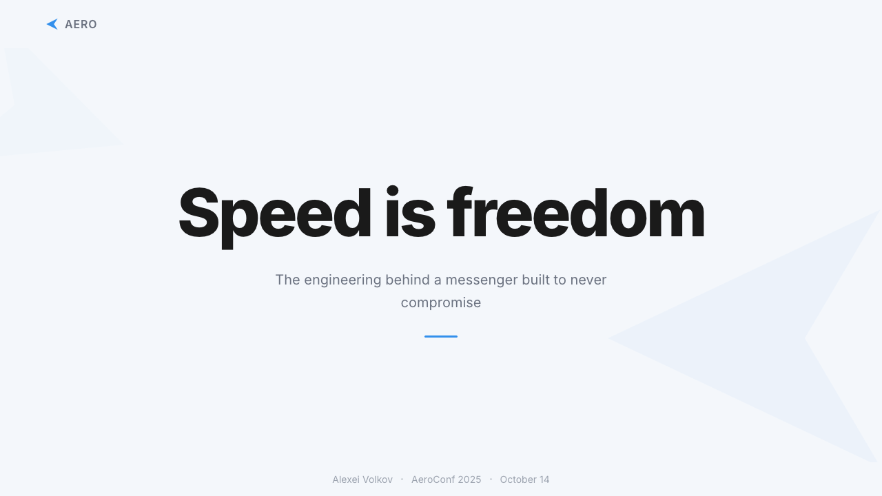
For presentation slides, the style works particularly well for product pitches, technology presentations, and anything where the subject matter calls for an impression of speed and clarity. A cover slide in this language typically uses the brand cyan for a large background block or geometric shape, with white type set cleanly against it. Content slides lean white, with the cyan used sparingly for key numbers, call-out boxes, or section headers. Data slides benefit from the approach's simplicity: bars and lines rendered in the brand blue against a white field, with muted gray used for secondary data series. The paper-plane motif can appear as a thematic device without being overused — once on the cover or section dividers is enough.
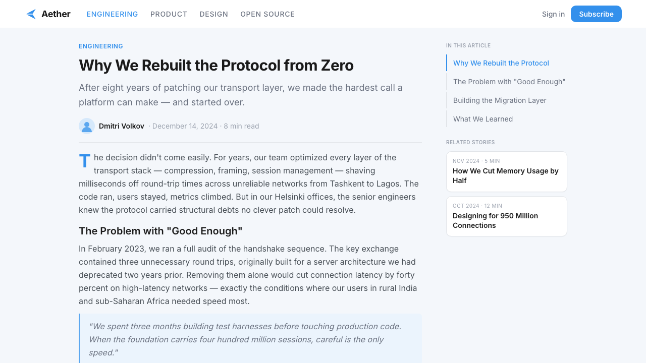
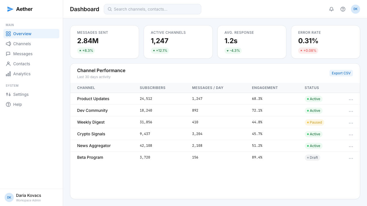
For web interfaces, the style is well-suited to dashboards, SaaS product marketing pages, and any interface where users need to move through information quickly. The structural approach: a white or very slightly cool-tinted background, the brand cyan reserved exclusively for primary calls to action and active states, a clean sans-serif type system with no more than two or three weights, and card components that use very soft shadows to establish hierarchy without heavy borders. Sidebar navigation should be typographic, with the active item distinguished by the cyan rather than by a filled background. Pricing pages benefit from the style's natural tier differentiation — the primary plan naturally inherits the cyan treatment while others stay in neutral territory.
For editorial design and marketing applications, the Telegram aesthetic functions as a clean and confident canvas for content-heavy work. Long-form articles or reports can use the system's spatial generosity to create layouts that breathe: a wide margin for pull quotes or metadata, the brand color appearing only in section headings or highlighted callouts, and a type hierarchy that distinguishes between levels purely through size and weight rather than decoration. Marketing pages can employ the paper-plane icon as a compositional device, and the cyan can be used at full saturation in hero sections as long as it is balanced by substantial white ground rather than deployed wall-to-wall.
A common mistake when applying this aesthetic is treating the cyan as an all-purpose accent and deploying it throughout the interface at multiple weights of importance. The power of the Telegram visual language depends on the cyan being reserved — when it appears, it means something. A layout where everything is cyan-accented is a layout where nothing is. Similarly, adding warmth to the palette (warmer neutrals, any hint of yellow or orange) works against the system's core character: the cool-clean feeling is load-bearing, not optional. The other common error is adding decorative elements — subtle texture backgrounds, gradient overlays, illustrated flourishes — that soften the system's directness. This style communicates trust through austerity; decoration undermines that signal.
Telegram Blue Paper Plane — FAQ
How is this design system different from generic flat design or material design?
Generic flat design, popularized around 2012 to 2014, stripped interfaces of shadow and depth as an aesthetic choice — the result was often visually undifferentiated, with every element on the same invisible plane. Material Design (Google, from 2014) reintroduced depth through an explicit elevation model — soft shadows, layers, defined z-axis — but applied it systematically across all components. The Telegram system sits between these: it uses flat surfaces as its primary language but employs very light shadows to communicate elevation only where functionally necessary, not as a universal system. The defining characteristic is not the shadow behavior but the brand color's semantic role: in Material, color signals material type; in Telegram's system, the single cyan marks interactive intent.
Can the paper-plane icon be used as a motif in non-messaging contexts?
Yes, but with care. The paper-plane has acquired strong Telegram brand associations, so using it in contexts adjacent to messaging, communication, email, or sending of any kind will feel natural. In completely unrelated contexts — a medical app, a financial dashboard, a food platform — it risks reading as either a Telegram reference or a visual non-sequitur. When the motif does work in a non-messaging context, it functions best as a directional element or as an expression of lightness and speed rather than as a literal communication icon. The key is that the icon's meaning needs to align with what the product actually does.
Does this style work in dark mode?
Telegram itself ships with a dark mode, and the visual language adapts reasonably well. In the dark variant, the white surfaces become very dark cool grays rather than black — a choice that preserves the cool-clean character of the light version. The cyan shifts slightly in perceived saturation against the dark ground and typically gains a touch of luminosity that it lacks on white. The key principle for a dark adaptation is that the brand color should remain the lightest and most saturated element in the composition — it still needs to mark interactive intent. Where dark Telegram differs from a generic dark-mode conversion is the deliberate maintenance of cool undertones throughout: warm grays undermine the system just as much in dark as in light.
Is there a risk of this style looking like a Telegram clone?
The risk is real but manageable. The system's most distinctive elements — the specific cyan, the paper-plane icon, and the bubble layout — should not all be present simultaneously in a non-messaging product. However, the broader principles — a single saturated blue-family color as the interactive signal, white grounds, generous spacing, flat iconography, minimal depth — are general enough that a product using them while substituting its own brand color and iconography will feel clean and modern without reading as a Telegram imitation. The most Telegram-specific elements are the bubble layout and the paper-plane; applications in other categories can safely adopt the color approach and spatial logic without triggering recognition.
How should this style handle illustration and user-generated media?
The Telegram system handles illustration sparingly and user-generated media gracefully. Original illustration — when used for onboarding screens, empty states, or decorative moments — should follow the same flat, limited-palette logic as the rest of the system: two or three colors maximum, no gradients, no volumetric rendering. The brand cyan can appear in illustration but should not dominate, since illustrations often carry more visual noise than iconography and can overwhelm the color signal if the brand hue saturates them. User-generated media — photographs, video thumbnails, forwarded images — should be contained within defined boundary shapes (rounded rectangles are canonical) and never allowed to bleed into the interface chrome. The containment preserves the interface's visual logic even when the content inside the boundaries is visually chaotic.
Related design styles
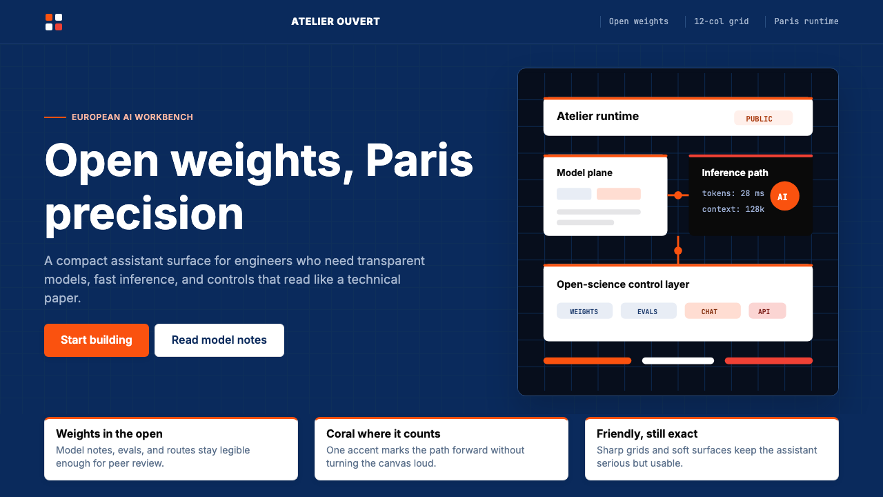 Mistral Le Chat French AIOpen science feels engineered. Navy panels, Inter grids, and coral stripes ke…
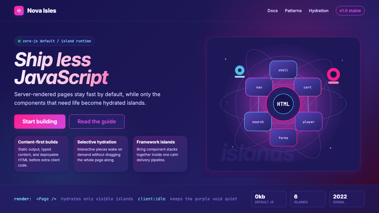 Astro Islands Architecture 2022Warm cosmic devtools. Deep violet, magenta glow, Inter clarity, and island ge…
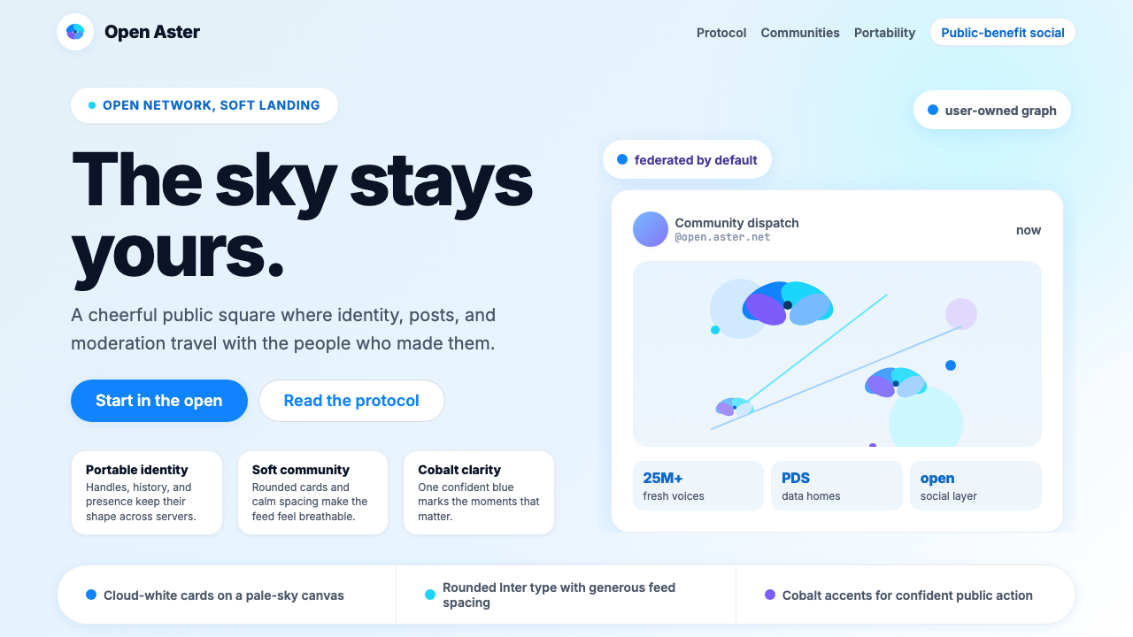 Bluesky AT Protocol 2024Open tech feels warm. Pale sky, cloud cards, Inter, and one cobalt accent car…
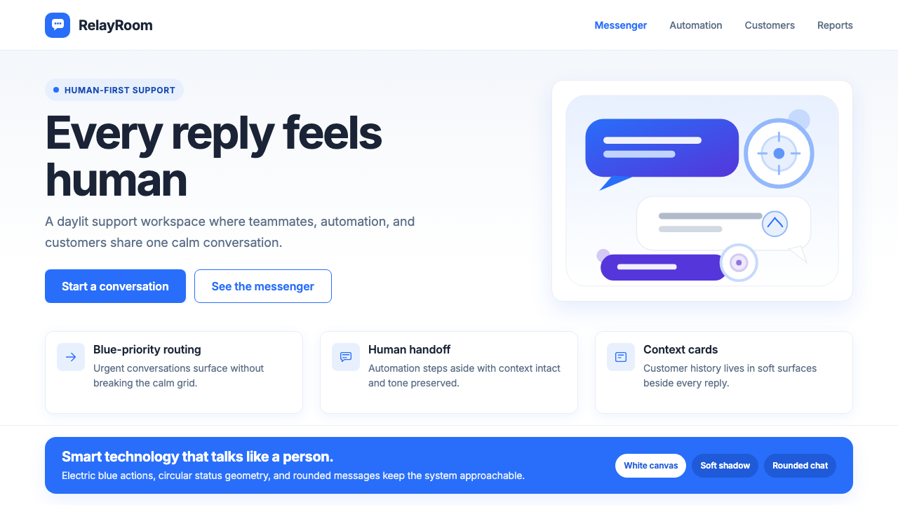 Intercom ModernWarm chat, sharp software. Electric blue bubbles on a daylit white grid.
 LinkedInCorporate trust, digitized. Authoritative blue frames white cards on warm cre…
 Signal Encrypted MessengerCalm privacy, plainly stated. Cobalt Inter type and white space carry the tru…