Design style guide设计风格指南
What is Signal Encrypted Messenger?什么是 Signal Encrypted Messenger?
Signal's visual identity proves that radical privacy and radical restraint are the same design decision.Signal 的视觉语言证明了一件事:极端的隐私保护与极端的克制,本是同一个设计决定。
Signal Encrypted Messenger in briefSignal Encrypted Messenger 速览
Signal Encrypted Messenger is a non-profit secure communications tool whose design language is as principled as its cryptography. The visual identity built around Signal's release of its current brand circa 2023–2025 distills the organization's mission into a single, immediately legible statement: we are a public-interest infrastructure project, not a consumer entertainment platform. Every design decision — the specific cobalt-blue, the generous white space, the essay-driven editorial voice — exists to communicate trustworthiness without theatrics.Signal 是一款非营利安全通讯工具,其设计语言与加密算法同样充满原则性。这套品牌视觉体系——以其2023至2025年间的当前版本为基准——将组织的使命浓缩为一句即刻可读的陈述:我们是公共利益基础设施项目,不是消费娱乐平台。每一个设计决定——那个特定的钴蓝、宽阔的留白、评论文体的编辑语气——都为了在不借助戏剧化手段的前提下传达可信赖感。
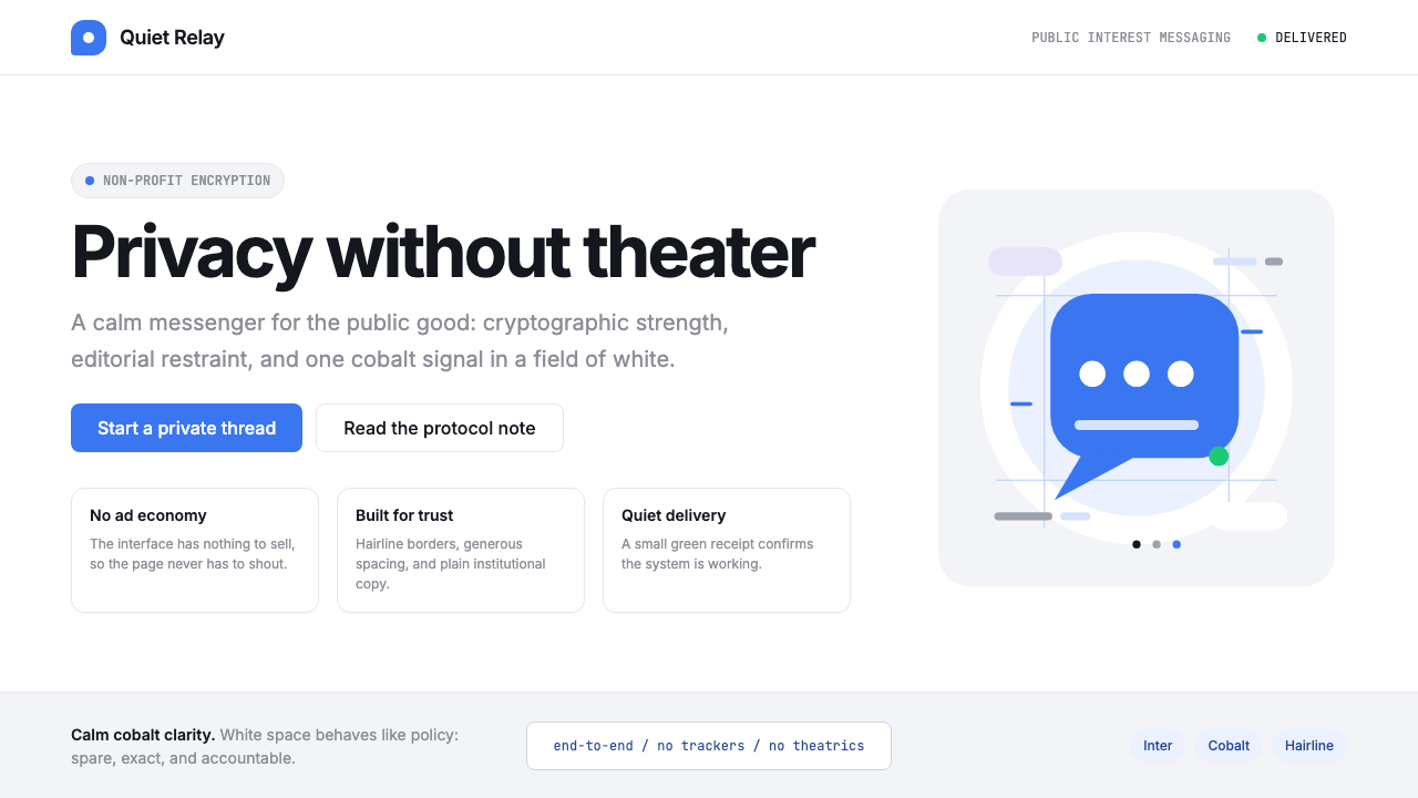
The system is built on a foundation of calm clarity. White backgrounds dominate, punctuated by a distinctive cobalt-blue that functions as the brand's entire personality: not the corporate blue of enterprise software, not the friendly blue of social networks, but something colder, more deliberate, suggestive of policy documents and open-source repositories. Cool-grey card surfaces provide depth without warmth. The speech-bubble logomark — geometric, instantly recognizable — doubles as both product icon and privacy metaphor.这套系统建立在冷静清晰的基础之上。白色背景占主导,被一种独特的钴蓝色贯穿其中——它是品牌全部个性的载体:不是企业软件的公司蓝,不是社交网络的亲切蓝,而是更冷、更审慎的某种东西,让人联想到政策文件与开源代码仓库。冷灰卡片表面提供深度而不带温度。那个几何形的对话气泡标识——简洁而辨识度极高——同时是产品图标与隐私隐喻的双重存在。
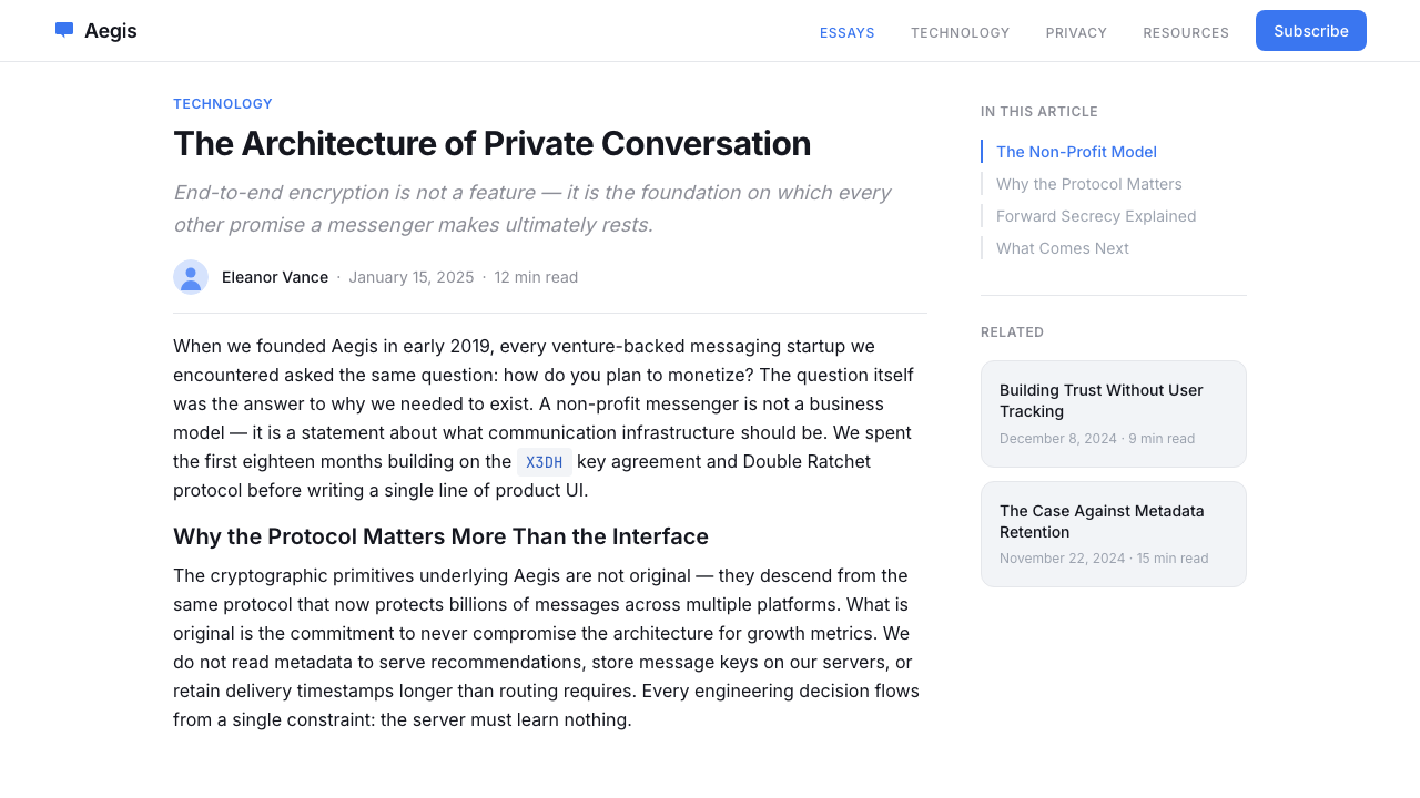
What makes Signal's design system distinctive is not any single element but the discipline of the whole. It reads like a well-edited magazine produced by cryptographers: long-form prose is given room to breathe, interface elements are stripped of all decoration that does not serve function, and the typographic hierarchy communicates authority without condescension. The overall effect is institutional confidence — the visual equivalent of a calm, measured statement of principles.Signal 设计系统的独特之处不在于任何单一元素,而在于整体的自律性。它读起来像一本密码学家主持的精编杂志:长篇文字被给予充分的呼吸空间,界面元素剥去了一切非功能性的装饰,字体层级以权威而不失平等的方式传递信息。整体效果是机构式的自信——视觉上等同于一份冷静、克制的原则声明。
See the Signal Encrypted Messenger design system →查看 Signal Encrypted Messenger 完整设计系统 →
Where does Signal Encrypted Messenger come from?Signal Encrypted Messenger 从何而来?
Signal's roots reach back to 2010, when cryptographer Moxie Marlinspike and researcher Stuart Anderson founded Whisper Systems. Their early encrypted SMS and voice applications attracted attention from the security community but remained niche tools. In 2011, Twitter acquired Whisper Systems for its talent and technology, and Marlinspike subsequently released the core encryption protocols as open-source. In 2013, he co-founded Open Whisper Systems with Trevor Perrin, producing the Signal Protocol that now underpins encrypted messaging across WhatsApp, Facebook Messenger, and Google Messages — though most of those platforms implement it without Signal's visual or organizational commitments.Signal 的根源可追溯至2010年,当时密码学家 Moxie Marlinspike 与研究员 Stuart Anderson 共同创立了 Whisper Systems。他们早期的加密短信与语音应用引起了安全社区的关注,但仍是小众工具。2011年,Twitter 以人才与技术为由收购了 Whisper Systems;此后,Marlinspike 将核心加密协议以开源形式发布。2013年,他与 Trevor Perrin 共同创立了 Open Whisper Systems,推出了 Signal 协议——这一协议如今支撑着 WhatsApp、Facebook Messenger 和 Google Messages 的端到端加密,尽管这些平台在实现时并不附带 Signal 的视觉语言或组织承诺。
The Signal Foundation as a non-profit entity was established in 2018 when WhatsApp co-founder Brian Acton departed Facebook following disagreements over monetization and privacy, taking with him a fifty-million-dollar founding donation. Acton's involvement gave Signal both financial stability and a pointed organizational statement: here was someone who had built one of the world's largest messaging platforms and walked away on principle. The foundation model — no advertising, no data harvesting, funded entirely by donations — became inseparable from the brand's visual identity, which had to communicate that ideological stance at a glance.Signal 基金会作为非营利实体的正式成立发生在2018年:WhatsApp 联合创始人 Brian Acton 因与 Facebook 在变现与隐私问题上存在分歧而离职,随行带来了五千万美元的创始捐款。Acton 的加入赋予了 Signal 财务稳定性,也带来了一个鲜明的组织声明:这里有一个曾经打造了全球最大通讯平台之一、又出于原则毅然离开的人。非营利模式——无广告、不收集数据、完全依靠捐款运营——与品牌视觉身份变得不可分割,这套视觉语言必须在瞬间传达出这种意识形态立场。
Meredith Whittaker joined Signal as president in 2022, bringing with her a background as a tech policy scholar, AI ethics researcher, and one of the organizers of the 2018 Google Walkout. Her presence reshaped Signal's public communications toward long-form essay writing and direct engagement with surveillance capitalism debates. This editorial voice — precise, unhurried, willing to engage complexity — is reflected in the design system's generous typography and its preference for prose over bullet points.Meredith Whittaker 于2022年出任 Signal 主席,她的背景是科技政策学者、AI 伦理研究者,也是2018年 Google 罢工的组织者之一。她的到来将 Signal 的公共传播方式重塑为长篇论文写作与对监控资本主义议题的直接介入。这种编辑语气——精准、从容、愿意直面复杂性——体现在设计系统宽阔的排版风格与对散文胜于列表要点的偏好之中。
The visual identity in its current form coalesced around 2023 to 2025, as Signal underwent brand refinement to bring its public face into alignment with its organizational maturity. The cobalt-blue became more consistently applied across product and marketing surfaces. The Inter typeface — open-source, designed for screen legibility at small sizes — became the typographic standard. The overall system moved away from any remaining consumer-app softness toward something closer to editorial publication design: structured, spacious, and unambiguous in its value proposition.当前形态的视觉识别在2023至2025年间逐渐定型,Signal 在此期间进行了品牌提炼,使其公众形象与组织成熟度相匹配。钴蓝色在产品与营销界面上的应用变得更为一致。Inter 字体——开源设计、专为小尺寸屏幕可读性优化——成为排版标准。整体系统从任何残余的消费应用柔软感中脱离,转向更接近编辑出版物设计的面貌:结构清晰、空间宽阔、价值主张毫不含糊。
What defines the Signal Encrypted Messenger look?Signal Encrypted Messenger 的视觉特征是什么?
Cobalt Blue as Mission Statement钴蓝即使命宣言
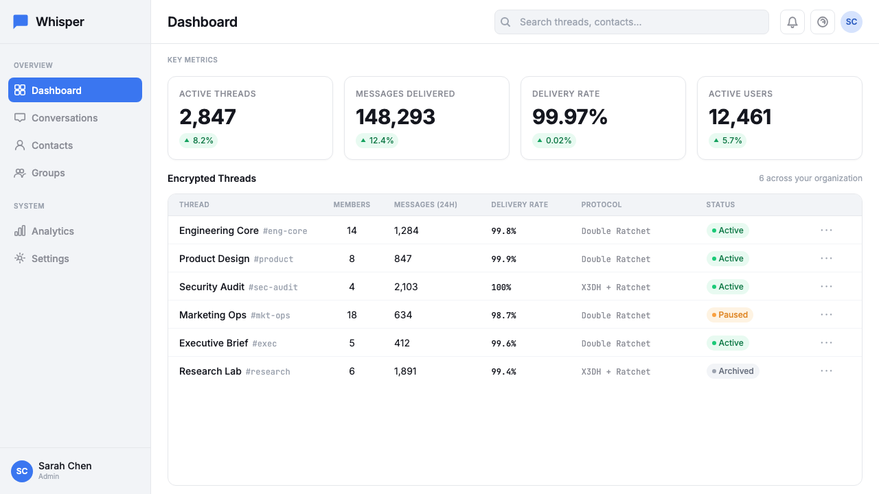
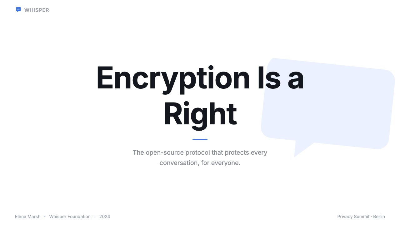
Signal's primary color is a specific cobalt-blue that occupies a deliberate position in the color spectrum: cool enough to read as institutional and trustworthy, saturated enough to be unmistakable. It is not the warm blue of consumer platforms, nor the muted steel-blue of enterprise software. It carries connotations of precision, technical competence, and civic purpose. In practice, it is used sparingly — on calls to action, on the logomark, on key interactive elements — with large expanses of white doing the structural work around it.Signal 的主色是一种特定的钴蓝,在色谱中占据经过审慎选择的位置:足够冷以读出机构感与可信赖感,又足够饱和以辨识无误。它不是消费平台的暖蓝,也不是企业软件的哑光钢蓝。它携带着精准、技术能力与公民目的的内涵。在实际应用中,它被克制地使用——出现在行动号召、标识、关键交互元素上——周围大片的白色承担着结构性工作。
Editorial White Space编辑式留白
Generous white space is not an accident or an aesthetic preference but a functional commitment: it signals that Signal has nothing to hide, no need to fill the frame with product claims or engagement hooks. Margins are wide. Line spacing is open. Sections breathe between them. This is white space that communicates organizational character — the visual equivalent of measured, unhurried speech.大量的留白不是偶然,也不是美学偏好,而是一种功能性承诺:它表明 Signal 无所隐瞒,不需要用产品声明或参与诱饵填满画面。边距宽阔,行距开敞,段落之间有呼吸空间。这是一种传达组织性格的留白——是从容、不慌不忙的言语在视觉上的等价物。
Typographic Hierarchy as Structure字体层级即结构
The typographic system relies on a single typeface — Inter — deployed at dramatically contrasting scales to create hierarchy. Headlines are large and confidently set. Body text is generously sized for reading comfort rather than information density. Pull quotes and policy statements occupy an intermediate scale. The effect is closer to a serious magazine or government publication than to a typical app interface: the typography tells you this is a place for ideas, not just tasks.字体系统依托单一字体——Inter——以戏剧性对比的尺度部署,形成层级。标题尺寸大、落笔有力。正文字号宽大,优先考虑阅读舒适度而非信息密度。引语与政策声明占据中间尺度。整体效果更接近严肃杂志或政府出版物,而非典型的应用界面:排版告诉你,这是一个为思想而存在的地方,不只是执行任务的界面。
Cool-Grey Surfaces冷灰界面
Where white alone would create too little visual differentiation, Signal introduces cool-grey card and surface tones. These are neutrals shifted slightly toward blue — not warm beige or stone, but the grey of overcast northern light. They provide container structure without introducing emotional warmth or consumer-friendliness. The palette as a whole — white, cool grey, cobalt — has the tonal character of a well-lit archive or reading room.在单纯的白色不足以提供视觉区分的地方,Signal 引入了冷灰卡片与界面色调。这些中性色略偏向蓝——不是温暖的米黄或石灰色,而是阴天北方光线的灰。它们提供容器结构,却不引入情感温度或消费友好感。整套色板——白、冷灰、钴蓝——具有光线充足的档案馆或阅读室的色调特质。
The Speech Bubble Logomark对话气泡标识
Signal's logomark is a speech bubble rendered in cobalt-blue — a geometric, near-perfect form whose simplicity is deceptive. As a product icon, it immediately communicates messaging. As a privacy symbol, it frames communication as something bounded, contained, and protected. The logomark functions at every scale from app icon to billboard without losing legibility, which reflects the discipline of its construction: no decorative detail, no gradient fill, no drop shadow.Signal 的标识是一个钴蓝色的对话气泡——几何形态,近乎完美,其简洁性具有欺骗性。作为产品图标,它即刻传达出通讯的含义。作为隐私符号,它将通信框定为有边界、被包裹、受保护的东西。这个标识在从应用图标到广告牌的任何尺寸下都保持可读性,这折射出其构造的自律:无装饰细节,无渐变填充,无投影。
Prose Over Bullet Points散文胜于列表要点
Marketing and editorial copy in the Signal system is written as full prose paragraphs, not fragmented bullet points or slogan stacks. This is a deliberate signal: the brand trusts its audience to read and to think. Feature descriptions are explanatory rather than promotional. Policy positions are argued, not asserted. The writing register shaped by Meredith Whittaker's influence treats the audience as capable adults engaged in serious decisions about their digital lives.Signal 系统中的营销与编辑文案以完整的散文段落写成,而非碎片化的列表要点或口号堆叠。这是一个审慎的信号:品牌信任其受众去阅读,去思考。功能描述是解释性的,而非促销性的。政策立场是经过论证的,而非简单断言的。受 Meredith Whittaker 影响塑造的写作格调,将受众视为对自己数字生活做出严肃决定的、有能力的成年人。
Flat, Shadow-Free Surfaces平面、无投影界面
Signal's interface components avoid the soft drop shadows and layered depth effects common in contemporary application design. Surfaces are flat and clearly delineated by edge and tone rather than simulated elevation. This is not technological limitation but philosophical consistency: an interface that does not perform depth is harder to read as theatrical or manipulative. The flatness reinforces the trustworthiness narrative — what you see is what there is.Signal 的界面组件回避了当代应用设计中常见的柔和投影与分层深度效果。界面元素是平面的,通过边缘与色调而非模拟高度来清晰界定。这不是技术限制,而是哲学上的一致性:一个不表演深度的界面,更难被解读为戏剧化或操控性的。这种平面感强化了可信赖性叙事——所见即所有。
See the Signal Encrypted Messenger design system →查看 Signal Encrypted Messenger 完整设计系统 →
Who shaped Signal Encrypted Messenger?谁塑造了 Signal Encrypted Messenger?
Marlinspike is the founding technical architect of Signal's encryption infrastructure. He developed the Signal Protocol — the double-ratchet algorithm that provides forward secrecy and break-in recovery — and co-founded Open Whisper Systems in 2013. His decision to release the protocol as open-source transformed Signal from a product into a public utility: the same cryptography now protects billions of messages daily across platforms that are not Signal. His 2022 departure from the CEO role was announced in a characteristically understated blog post, maintaining the brand's editorial tone to the end.Marlinspike 是 Signal 加密基础设施的创始技术架构师。他开发了 Signal 协议——提供前向保密与入侵后恢复能力的双棘轮算法——并于2013年共同创立了 Open Whisper Systems。他将该协议以开源方式发布的决定,将 Signal 从一个产品转变为公共基础设施:同样的密码学技术如今在非 Signal 的平台上每天保护着数十亿条消息。他于2022年卸任 CEO 的宣告,以一篇一贯低调的博客文章发出,将品牌的编辑语气保持到最后。
Acton co-founded WhatsApp in 2009 and sold it to Facebook in 2014 for nineteen billion dollars. He stayed through the acquisition but resigned in 2017 amid conflicts over monetization, later tweeting the phrase 'It is time. #deletefacebook.' In 2018 he donated fifty million dollars to establish the Signal Foundation, making the non-profit model financially viable and providing Signal with both resources and a narrative: the person who had built one of the world's largest messaging services had chosen a different path. Acton's involvement gave the brand a credibility that no amount of marketing copy could manufacture.Acton 于2009年共同创立 WhatsApp,并于2014年以190亿美元将其出售给 Facebook。他留任至收购完成后,但于2017年因变现冲突辞职,随后在推特上发文「是时候了。#deletefacebook。」2018年,他捐款五千万美元创立 Signal 基金会,使非营利模式在财务上具有可行性,并为 Signal 提供了资源与叙事:一个曾经打造了全球最大通讯服务之一的人,选择了另一条路。Acton 的参与赋予了品牌任何营销文案都无法制造出的可信度。
Whittaker became Signal's president in 2022, bringing a background as an AI ethics researcher, founder of the AI Now Institute, and one of the principal organizers of the 2018 Google Walkout — a protest by twenty thousand employees over sexual harassment handling and military contract ethics. Her arrival at Signal aligned the organization's public voice with her own: long-form, policy-engaged, willing to directly name adversaries. Signal's blog posts and public statements under her leadership read more like academic essays or advocacy briefs than product announcements, and this editorial register is reflected directly in the design system's typographic choices.Whittaker 于2022年出任 Signal 主席,带来了 AI 伦理研究者、AI Now 研究所创始人的背景,以及作为2018年 Google 罢工主要组织者之一的经历——那场罢工有两万名员工参与,抗议性骚扰处理方式与军事合同伦理。她的到来使 Signal 的公共声音与她本人对齐:长篇、关注政策、愿意直接点名对手。在她的领导下,Signal 的博客文章与公开声明读起来更像学术论文或倡导简报,而非产品公告,这种编辑格调直接体现在设计系统的字体选择之中。
Perrin co-developed the Signal Protocol alongside Marlinspike, designing the cryptographic mechanisms that give the system its security properties. While less publicly visible than his co-founders, Perrin's technical contributions are embedded in the foundation of the entire Signal design system: the reason Signal can position itself as trustworthy is that the cryptography beneath the interface genuinely delivers on that promise. The restrained visual language is in some sense the surface expression of the protocol's mathematical elegance.Perrin 与 Marlinspike 共同开发了 Signal 协议,设计了赋予该系统安全属性的密码学机制。虽然他在公众面前的曝光度低于联合创始人,但他的技术贡献嵌入了整个 Signal 设计系统的基础之中:Signal 之所以能将自身定位为可信赖,是因为界面之下的密码学真正兑现了这一承诺。那套克制的视觉语言,在某种意义上是这套协议数学优雅性的表面表达。
How do you use Signal Encrypted Messenger today?今天怎么用 Signal Encrypted Messenger?
Signal's design language is one of the most directly applicable contemporary brand systems for any product that needs to communicate trustworthiness, institutional credibility, or principled restraint. The challenge is applying it precisely rather than loosely — the cobalt-blue's exact emotional register is easy to lose if you drift toward warmer or more saturated blues, and the white-space discipline requires genuine commitment to resisting the urge to fill emptiness with content.Signal 的设计语言是当代品牌系统中最可直接移用的之一,适用于任何需要传达可信赖感、机构公信力或有原则的克制感的产品。挑战在于精准应用而非松散借用——钴蓝色精确的情感调性很容易在偏向更暖或更饱和的蓝色时丧失,而留白的自律需要真正的承诺:抵抗用内容填满空白的冲动。
For presentation slides, the Signal aesthetic works particularly well for cover pages that need to establish authority immediately. A pure white ground with the cobalt-blue used for a single typographic element — a title, a year, an organization name — set in a clean sans-serif at generous scale communicates seriousness without aggression. Content slides should maintain the same discipline: wide margins, ample line spacing, and a clear typographic hierarchy that distinguishes heading from body from supporting detail through scale alone, without resorting to colored text boxes or decorative dividers. Data slides in this register should use the cobalt sparingly — one category highlighted, the rest rendered in cool grey — letting structure rather than color variety carry the analytical weight.在演示文稿中,Signal 美学对于需要即刻建立权威感的封面页尤为有效。纯白底面配合钴蓝仅用于单一字体元素——标题、年份、组织名——以整洁的无衬线字体大号呈现,传递出严肃性而不带攻击性。内容页应保持同样的自律:宽阔边距、充足行距、以及通过尺度而非彩色文字框或装饰性分割线来区分标题、正文与辅助细节的清晰字体层级。在这种格调下,数据页应克制地使用钴蓝——突出一个类别,其余以冷灰呈现——让结构而非色彩多样性承载分析性重量。
For web UI and dashboards, Signal's approach is well-suited to any interface where trust is a primary user concern: financial dashboards, health data applications, legal platforms, privacy-focused tools. The flat, shadow-free surface treatment communicates transparency in the visual sense — nothing is layered in ways that obscure what lies beneath. Navigation should be typographic and minimal, using the cobalt only for active states. Cool-grey containers organize content zones; white remains the dominant ground. Pricing pages benefit particularly from this register: the combination of generous white space and restrained cobalt calls-to-action signals that the product is confident in its value without needing to perform urgency.对于网页界面与仪表板,Signal 的方式适用于任何以信任为首要用户关切的界面:金融仪表板、健康数据应用、法律平台、注重隐私的工具。平面、无投影的界面处理在视觉层面传达出透明性——没有任何东西以遮蔽底层内容的方式分层叠加。导航应当是字体性的、极简的,仅对激活状态使用钴蓝。冷灰容器组织内容区域;白色保持为主导底色。定价页面在这种格调下尤其受益:宽阔留白与克制的钴蓝行动号召的组合,表明产品对自身价值有信心,无需表演紧迫感。
For editorial and marketing materials, the system supports a voice that is substantive and direct. Long-form articles and policy documents should use the full typographic range — large, confidently weighted headlines; comfortable body text with open line spacing; wider outer margins for marginal notes or pull quotes. Marketing pages can take the poster-like quality of the brand further: full-width blocks that alternate between white-ground and cobalt-ground sections, with the reversal used sparingly to mark structural transitions rather than decorative rhythm. Photography, where used, should be treated coolly — desaturated, straightforwardly composed, never warm or heavily stylized.对于编辑与营销材料,这套系统支持一种实质性、直接的声音。长篇文章与政策文件应充分使用字体层级——大号、自信的粗重标题;舒适的正文配以开放行距;更宽的外侧边距供旁注或引语使用。营销页面可以进一步发挥品牌的海报感:全宽区块在白底与钴蓝底之间交替,倒置用法应克制使用以标记结构性转折而非装饰性节奏。摄影图像若被使用,应以冷静方式处理——去饱和、构图直接,绝不温暖或过度风格化。
A common mistake when applying this system is confusing its restraint with minimalism. Signal's design is not spare because it is fashionably simple; it is spare because every element is doing specific work and none is admitted that does not. Adding soft shadows, warm accent colors, or friendly rounded corners to this system does not make it more accessible — it undermines the institutional sincerity that is the entire point. Similarly, using multiple typefaces or introducing illustrative elements that soften the system's edges pulls it toward generic consumer app territory and away from the principled editorial character that makes it distinctive.应用这套系统时最常见的错误,是将其克制误解为极简主义。Signal 的设计之所以精简,不是因为追求时髦的简单;而是因为每个元素都在做特定的工作,没有一个不承担职责的元素被允许存在。在这套系统中加入柔和投影、暖色调强调色或友好的圆角,并不会让它更具亲和力——而是会破坏机构真诚感,而那恰恰是整套系统存在的意义。同样,使用多种字体或引入柔化系统棱角的插画元素,会把它拉向泛化的消费应用领域,远离使其独特的那种有原则的编辑气质。
See the Signal Encrypted Messenger design system →查看 Signal Encrypted Messenger 完整设计系统 →
Signal Encrypted Messenger — FAQSignal Encrypted Messenger · 常见问题
Is Signal's design system appropriate for commercial products, or does it only work for non-profits?Signal 的设计系统适合商业产品吗,还是只适用于非营利机构?
The system is appropriate for any product whose value proposition centers on trust, integrity, or principled operation — regardless of whether it is non-profit or commercial. Security tools, legal platforms, financial services, healthcare applications, and privacy-focused consumer products all share the same need to establish credibility at first glance. The risk is that using this design language without the organizational substance to back it up can feel hollow or even deceptive. Signal earns its visual restraint through its actual product commitments; a commercial product applying the same aesthetic needs to have comparable commitments to substantiate the claim.这套系统适用于任何以信任、诚信或有原则的运营为核心价值主张的产品——无论是非营利还是商业性质。安全工具、法律平台、金融服务、医疗应用以及注重隐私的消费产品,都有同样的需求:在第一眼就建立公信力。风险在于,在没有组织实质支撑的情况下使用这套视觉语言,可能显得空洞甚至具有欺骗性。Signal 通过真实的产品承诺赢得了其视觉克制的资格;应用同样美学的商业产品,需要有类似的承诺来支撑这一主张。
How does Signal's visual identity differ from other privacy-focused brands?Signal 的视觉识别与其他注重隐私的品牌有何不同?
Most privacy-focused brands in the consumer technology space reach for dark themes, heavy locks-and-shields iconography, or aggressive security aesthetics — visual language borrowed from cybersecurity that signals danger-avoidance rather than trustworthiness. Signal does the opposite: bright white grounds, calm cobalt, editorial typography, and long-form prose. It positions privacy as a civic value and a public good rather than as a defensive posture. This makes the visual system feel closer to a policy institute or a public broadcaster than to a security product, which is precisely the distinction Signal wants to draw.消费科技领域中大多数注重隐私的品牌,会选择深色主题、沉重的锁与盾牌图标,或激进的安全美学——这是借自网络安全领域的视觉语言,传达的是规避危险而非可信赖感。Signal 反其道而行:明亮的白底、冷静的钴蓝、编辑式排版、长篇散文。它将隐私定位为公民价值与公共利益,而非防御姿态。这使这套视觉系统感觉更接近政策研究机构或公共广播机构,而非安全产品——这恰恰是 Signal 想要划定的区别。
Can this system work in dark mode?这套系统能在深色模式下运作吗?
Yes, Signal itself implements a dark mode in its messaging application, and the system translates well when the inversion is handled with the same discipline. The key is maintaining the cobalt-blue as the primary accent rather than allowing it to shift warmer under dark backgrounds. Dark surfaces should be genuinely dark and cool — shifted toward the blue end of neutral — rather than warm charcoal. The white-space discipline inverts to dark-space discipline: generous background between elements, never cluttered. The institutional character is preserved as long as the tonal relationships — cobalt accent against a cool, near-black ground — mirror the logic of the light version.可以。Signal 本身在其通讯应用中实现了深色模式,只要以同样的自律处理反转,这套系统的转换效果良好。关键是保持钴蓝作为主要强调色,而不让它在深色背景下向更暖的色调偏移。深色界面应当是真正的深冷色调——偏向中性色的蓝端——而非温暖的炭灰色。留白的自律转化为暗空间的自律:元素之间保持充裕的背景空间,绝不拥挤。只要色调关系——钴蓝强调色衬托在冷、近黑的底色上——映照出浅色版本的逻辑,机构性格就能得以保留。
What kinds of products should avoid this design system?哪些类型的产品应当回避这套设计系统?
Products that depend on warmth, pleasure, or sensory richness should look elsewhere. Food and beverage brands, social entertainment platforms, children's applications, wellness products, and anything where the user relationship is built on joy or comfort will find Signal's aesthetic too cold and institutional. Similarly, brands that need to communicate approachability, playfulness, or informality will struggle to make this system work — the editorial restraint that communicates trustworthiness in one context reads as standoffish in another. The system's strength is also its constraint: it speaks in one emotional register, and that register is deliberate, serious, and principled.依赖温暖感、愉悦感或感官丰富性的产品应当另寻他途。食品饮料品牌、社交娱乐平台、儿童应用、健康产品,以及任何建立在快乐或舒适感上的用户关系,都会发现 Signal 的美学过于冷峻和机构化。同样,需要传达亲切感、趣味性或非正式感的品牌,会发现这套系统难以为其所用——在一个语境中传达可信赖感的编辑克制,在另一个语境中会被解读为冷漠疏离。这套系统的力量也是它的约束:它以一种情感调性发言,而那种调性是审慎的、严肃的、有原则的。
How does the system handle illustration and iconography?这套系统如何处理插画与图标?
Signal uses minimal iconography — the speech-bubble logomark is the primary figurative element, and interface icons are simple, geometric, and functional. The system resists decorative illustration almost entirely. Where imagery appears in marketing contexts, it tends to be documentary or photographic rather than illustrated, and treated with the same cool restraint as the rest of the palette. This is deliberate: decorative illustration introduces warmth and narrative ambiguity that would undercut the brand's institutional directness. If a design application requires illustration, the appropriate register is diagrammatic and geometric — flat forms in the cobalt-grey palette — not organic or expressive.Signal 使用极少的图标——对话气泡标识是主要的具象元素,界面图标简洁、几何、功能性。这套系统几乎完全抵制装饰性插画。在营销语境中出现图像时,倾向于纪实性或摄影性,而非插画性,并以与整套色板相同的冷静克制加以处理。这是经过审慎选择的:装饰性插画引入了温暖感和叙事模糊性,这会削弱品牌的机构式直接性。如果设计应用需要插画,恰当的格调是示意图式的和几何性的——钴蓝灰色板中的平面形态——而非有机或表现性的。
Related design styles相关设计风格
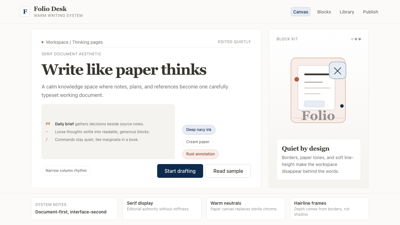 Notion ModernWriting feels papery. Source Serif on warm cream, navy ink, and hairline bord…书写像纸页:暖米白、衬线标题、深蓝墨色与细边框。
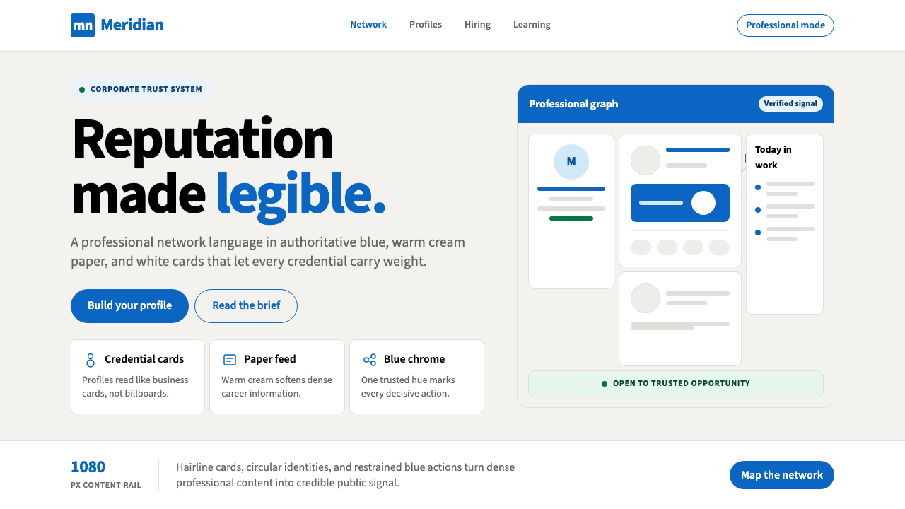 LinkedInCorporate trust, digitized. Authoritative blue frames white cards on warm cre…企业信任数字化:权威蓝框住暖奶油纸面上的白卡。
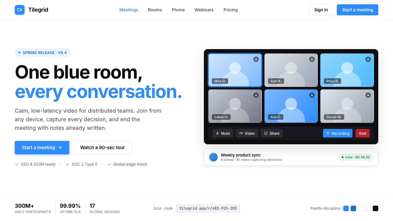 Zoom Meeting BlueRemote work's default discipline. One saturated cobalt on pure white, Inter s…远程办公的默认纪律:饱和电子钴蓝压在纯白底上,Inter 无衬线,4px 柔角。
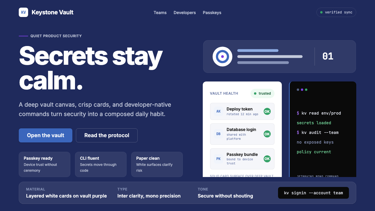 1Password Purple VaultSecurity stays quiet. Vault purple, Inter type, and crisp white cards do the…安全保持安静:保险库紫、Inter 字体与白卡片完成表达。
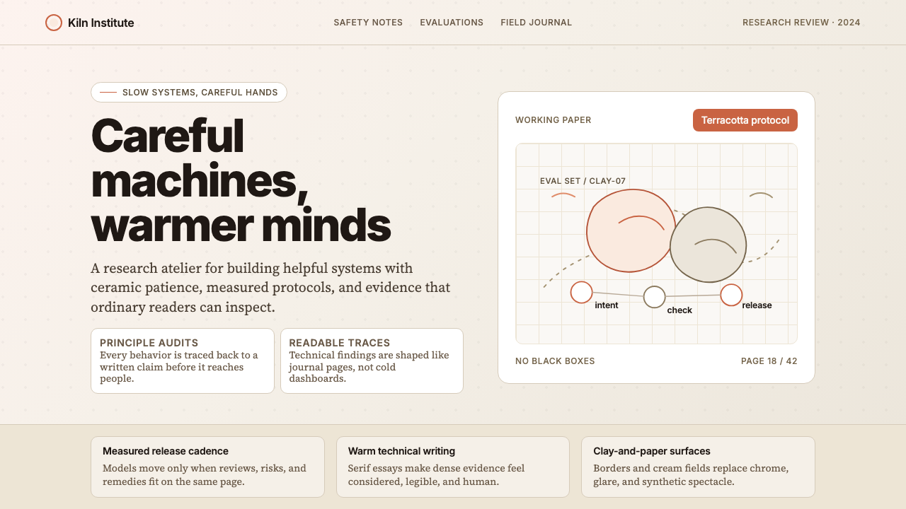 Anthropic ClayAI safety in handmade clay. Sand backgrounds, terracotta accents, serif body…用手工陶土包裹的 AI 安全感:沙色背景、赤陶点缀、衬线正文——缓慢、刻意、有…
 AsanaCalm productivity breathes. Cream canvas, lavender panels, coral-blue-yellow…安静生产力会呼吸:奶油画布、薰衣草面板与三色圆点。