What is Anthropic Clay?什么是 Anthropic Clay?
Anthropic Clay dresses AI safety research in warm earth — sand grounds, terracotta accents, and unhurried serif text that says we build slowly, with intention.Anthropic Clay 用温暖的泥土色包裹 AI 安全研究——沙色底面、赤陶点缀、从容的衬线字体,无声宣告:我们缓慢而有意地构建。
Anthropic Clay in briefAnthropic Clay 速览
Anthropic Clay is the visual identity language developed by Anthropic, the AI safety company, and crystallized between 2023 and 2024. Where most technology brands reach for cold, monochromatic palettes to project competence and speed, Anthropic made the opposite choice: sand-and-cream backgrounds, terracotta-rust accent tones, and generous serif body text that together produce a surface closer in feeling to a craft-pottery studio or an academic press than to a Silicon Valley software company.Anthropic Clay 是 Anthropic(一家专注 AI 安全的公司)的视觉识别语言,在 2023 至 2024 年间逐步成型。大多数科技品牌选择冷峻、单色的色板来传达能力与速度,Anthropic 却做出了相反的选择:沙色与奶油色的底面、赤陶锈色的点缀色调、以及宽松优雅的衬线正文——这些元素合在一起,营造出一种更接近手工陶瓷工坊或学术出版社的气质,而非硅谷软件公司。
The style is defined by an organic warmth that is rare in technology branding. Every color decision whispers paper and earth rather than glass and chrome. The typographic choices signal editorial seriousness — an industry more accustomed to rushing than reflecting. And the deliberately unhurried pace communicated through generous whitespace and restrained ornamentation carries an implicit message: this organization thinks carefully before it acts.这套风格的核心是一种在科技品牌中极为罕见的有机温度。每一个色彩决策都低声诉说着纸张与泥土,而非玻璃与铬钢。字体选择传递出编辑级的严谨——那是一种更习惯于深思而非赶路的行业气质。而宽裕的留白与克制的装饰所营造出的从容节奏,承载着一个隐含的信息:这个组织在行动之前会深思熟虑。
Anthropic Clay is not nostalgia for its own sake. The warmth is strategic, rooted in a genuine philosophical position about how transformative technology should present itself. The aesthetic bridges two worlds — it is technically sophisticated enough to credibly represent frontier AI research, and human enough to communicate that the people doing the research take its implications for real human lives seriously.Anthropic Clay 并非单纯的怀旧。这份温度是经过策略性考量的,植根于一个关于变革性技术应如何呈现自身的真实哲学立场。这套美学跨越两个世界——它在技术层面足够精密,能可信地代表前沿 AI 研究;在人文层面足够温暖,能传达出:这里的研究者认真对待技术对真实人类生活的深远影响。
See the Anthropic Clay design system查看 Anthropic Clay 完整设计系统
Where does Anthropic Clay come from?Anthropic Clay 从何而来?
Anthropic was founded in San Francisco in 2021 by Dario Amodei and Daniela Amodei, along with several colleagues who had previously worked at OpenAI. The founding premise was a concern: that large-language-model development was moving faster than the field's collective ability to understand and ensure the safety of those models. This concern shaped not only the research agenda — constitutional AI, interpretability, alignment — but eventually the company's entire public identity.Anthropic 由达里奥·阿莫迪与达尼拉·阿莫迪于 2021 年在旧金山创立,同行者还有数位此前就职于 OpenAI 的同事。公司成立的前提是一种担忧:大型语言模型的发展速度,正在超越这个领域集体理解并确保这些模型安全性的能力。这种担忧不仅塑造了研究议程——宪法式 AI、可解释性、对齐——最终也塑造了公司整体的公共身份。
From the beginning, Anthropic positioned itself as a company that regarded speed and safety as genuinely in tension, and that chose to sit on the safety side of that tension. That positioning demanded a visual language that felt different from the ambient aesthetic of AI commercialization: the dark interfaces, neon accents, and kinetic logos that dominated the space around 2022 and 2023. The Clay identity, developed by Anthropic's internal brand team, emerged as a deliberate counterstatement — a rejection of the visual vocabulary of urgency.从一开始,Anthropic 就将自己定位为一家认为速度与安全存在真实张力、并选择站在安全一侧的公司。这一定位要求一套视觉语言,与 AI 商业化的主流美学拉开距离:那种在 2022 至 2023 年间主导这一领域的深色界面、霓虹点缀与动态标识。Clay 视觉系统由 Anthropic 内部品牌团队开发,作为一种刻意的反陈述而诞生——对紧迫感视觉词汇的拒绝。
The organic, earth-derived palette draws on a longer tradition of brands that use natural materials and warm tones to signal craft, patience, and responsibility. The specific combination of sand grounds, cream midtones, and terracotta accents evokes ceramics, aged paper, and the textures of the physical world — associations that feel antithetical to the abstracted, disembodied quality of most technology aesthetics. This was not accidental. Anthropic's research is fundamentally about keeping AI grounded in human values; the visual identity literalizes that groundedness.这套有机的、源自泥土的色板,承接了一段更悠久的品牌传统:那些使用天然材料与暖色调来传递工艺、耐心与责任感的品牌。沙色底面、奶油中调与赤陶点缀的特定组合,唤起了陶瓷、泛黄纸张与物质世界肌理的联想——这些联想与大多数科技美学所拥有的那种抽象、去身体化的品质截然相悖。这并非偶然。Anthropic 的研究从根本上关乎将 AI 锚定于人类价值观;而视觉识别将这种锚定字面化了。
The typographic dimension of the identity — the commitment to serif body text and to layouts with generous reading rhythm — aligns with the company's published communication style. Anthropic publishes substantial technical writing: papers, policy documents, model cards, interpretability research. A visual system anchored in editorial typography signals that this is an organization comfortable with long, careful arguments rather than one optimized for five-second attention spans. The Clay identity thus serves both as a brand differentiator and as a coherent expression of an organizational philosophy about time, attention, and care.这套视觉系统的字体维度——对衬线正文的坚守,以及对宽阔阅读节奏布局的偏好——与公司已发表的传播风格一脉相承。Anthropic 发布大量实质性的技术写作:论文、政策文件、模型卡、可解释性研究报告。以编辑排版为锚点的视觉系统,传达出一个信号:这是一个坦然面对长篇、严谨论证的组织,而非一个为五秒注意力优化的机构。Clay 视觉识别因此同时承担两重功能:既是品牌差异化手段,也是关于时间、注意力与关怀的组织哲学的连贯表达。
What defines the Anthropic Clay look?Anthropic Clay 的视觉特征是什么?
Earth-Warm Palette大地暖色调
The color system is built around sand and cream as primary grounds — warm neutrals that recall unbleached paper, aged linen, and raw clay. Terracotta and rust tones serve as the primary accent register, chosen for their associations with handmade objects and natural materials rather than the electric, screen-optimized hues of conventional tech branding. The overall palette reads as warm without being vivid, muted without being gray — a deliberate middle register that feels considered rather than default.色彩系统以沙色和奶油色为主要底色——温暖的中性色,令人联想到未漂白的纸张、陈旧的亚麻布与原始陶土。赤陶色与锈色调担任主要点缀层级,因其与手工物件和天然材质的联想而被选中,而非惯用科技品牌那种为屏幕优化的电气感色彩。整体色板温暖而不鲜艳,柔和而不灰沉——一种刻意的中间状态,给人以深思熟虑而非随意默认的感受。
Editorial Serif Typography编辑级衬线字体排印
Serif typefaces anchor the body text, establishing a reading rhythm associated with books, long-form journalism, and academic publishing rather than digital interfaces optimized for scanning. Display type introduces contrast through scale and weight rather than switching to geometric sans-serifs. The result is a typographic voice that feels unhurried and authoritative — one that invites sustained reading rather than quick skimming. Line lengths and leading are generous, reinforcing the sense that the content is meant to be thought through.衬线字体锚定正文,建立一种与图书、长篇新闻及学术出版相关联的阅读节奏,而非为扫视优化的数字界面节奏。展示性标题通过尺度与字重的对比引入变化,而非切换为几何无衬线字体。结果是一种从容而权威的字体声音——邀请深入阅读,而非快速浏览。行长与行距都颇为宽裕,强化了内容值得细细思考的感受。
Tactile Surface Quality触觉化表面质感
Where other technology brands favor pristine, glossy digital flatness, Anthropic Clay suggests the slight imperfection of physical materials — paper grain, ceramic matte, uncoated stock. This tactility is expressed through tonal choices rather than literal texture overlays: colors that read as pigment-based rather than backlit, warm off-whites rather than pure screen-white, accent tones that recall dyed fabric or fired clay. The effect is an interface that feels like it has weight.其他科技品牌青睐一尘不染的光滑数字平面,Anthropic Clay 则暗示物质材料的微微不完美——纸张的纹理、陶瓷的哑光、无涂层纸的质感。这种触觉感通过色调选择而非字面纹理叠加来表达:色彩读起来像颜料而非背光,暖白而非纯净屏幕白,点缀色令人联想到染色织物或烧制陶土。最终效果是一个感觉有重量的界面。
Measured Whitespace从容的留白
Layouts breathe. Generous margins, open paragraph spacing, and unhurried section pacing give every element room to exist without crowding. This is not minimalism in the reductive sense — the pages are substantive and information-dense — but the arrangement communicates patience. The whitespace carries meaning: it says that the content has been given time to settle, and the reader is expected to bring the same quality of attention.版面会呼吸。宽阔的页边距、开放的段落间距、从容的段落节奏,给每个元素提供了不被拥挤的存在空间。这不是极简主义意义上的削减——页面内容翔实、信息密度不低——但这种排布传递着耐心。留白本身承载意义:它说明内容已被给予足够的时间沉淀,而读者也被期待带着同等品质的专注前来。
Restrained Ornamentation克制的装饰
Decorative elements are sparse and purposeful. When illustrative or ornamental graphic elements appear, they tend toward organic, hand-drawn or softly geometric forms — gentle curves, loose botanical shapes — rather than the sharp icons and rigid pictograms common to most software interfaces. Any illustration is subordinate to text; its role is to warm the page, not to compete for attention. Rules, borders, and dividers appear only when they serve a clear structural purpose.装饰性元素稀少而有目的。当插图或装饰性图形元素出现时,它们倾向于有机的、手绘感或柔和几何的形态——温柔的曲线、松散的植物形状——而非大多数软件界面惯用的锐利图标和刚硬象形符号。任何插图都从属于文字;其作用是温暖页面,而非争夺注意力。直线、边框与分隔线只有在服务于明确结构目的时才出现。
Human-Scale Imagery人文尺度的图像
Photography and illustration, when used, favor human presence, craft, and tangible physical materials over abstract data visualizations and the disembodied glows of AI-themed stock imagery. The visual world of Anthropic Clay includes hands at work, paper, physical objects, and natural light — imagery that anchors the abstract subject matter of AI research in recognizable human experience. This is a significant departure from the dark, cosmic, and machine-aesthetic imagery that pervades most AI brand communications.摄影和插图在使用时,偏向人的存在、手工劳作与有形物质材料,而非抽象数据可视化和 AI 主题图库惯用的那种无实体的发光感。Anthropic Clay 的视觉世界包括劳作的双手、纸张、实体物件与自然光——将 AI 研究这一抽象主题锚定在可辨认的人类经验中的图像。这是对大多数 AI 品牌传播中泛滥的黑暗、宇宙感与机器美学图像的重大偏离。
Calm Structural Hierarchy平静的结构层级
Information hierarchy is established through type scale, weight, and tonal contrast rather than through competing colors, heavy rules, or aggressive visual containers. The eye is guided gently rather than directed sharply. Primary content sits in the warmest, clearest zone of the page; supporting information recedes without disappearing. The hierarchy feels logical and calm — a structure that rewards careful reading rather than one optimized for first-glance impact.信息层级通过字号比例、字重与色调对比来建立,而非依靠相互竞争的色彩、粗重线条或强势视觉容器。视线被温和引导,而非被强硬指向。主要内容位于页面最温暖、最清晰的区域;辅助信息退后但不消失。层级感觉合乎逻辑而平静——一种奖励细心阅读的结构,而非为第一眼冲击优化的结构。
See the Anthropic Clay design system查看 Anthropic Clay 完整设计系统
Who shaped Anthropic Clay?谁塑造了 Anthropic Clay?
As CEO and co-founder of Anthropic, Dario Amodei has been the primary articulator of the organization's philosophy that AI development should be slow, careful, and accountable. His public communications — lengthy essays, policy testimony, technical papers — established the intellectual register that the Clay visual identity was built to match. The brand's commitment to editorial depth and unhurried typography directly reflects the communication style of the organization he leads.作为 Anthropic 的 CEO 与联合创始人,达里奥·阿莫迪是该组织核心理念的主要阐述者——AI 的发展应当缓慢、审慎且负责任。他的公开传播——长篇文章、政策听证、技术论文——确立了 Clay 视觉识别被设计来匹配的智识基调。品牌对编辑深度与从容排版的坚守,直接映照出他所领导的组织的传播风格。
As President and co-founder, Daniela Amodei has shaped Anthropic's commercial and public-facing identity. Her background in business operations and her role in building the company's go-to-market strategy meant that the Clay brand needed to function not only as a philosophical statement but as a commercially credible design system capable of representing enterprise products, research publications, and consumer-facing applications coherently. The brand's ability to stretch across these registers without losing its character reflects her influence.作为总裁兼联合创始人,达尼拉·阿莫迪塑造了 Anthropic 的商业与公众形象。她在商业运营方面的背景,以及在构建公司市场推广策略中的角色,意味着 Clay 品牌不仅需要作为哲学陈述,更需要作为一套具备商业公信力的设计系统,能够连贯地呈现企业产品、研究出版物与面向消费者的应用。这套品牌跨越这些场景而不失自身特质的能力,折射出她的影响力。
The internal brand team responsible for developing and stewarding the Clay visual system made a series of consequential choices that distinguish this identity from superficially similar warm-palette tech rebrands. The decision to anchor the system in serif typography rather than geometric sans-serifs, to use earth tones derived from ceramic and natural material traditions rather than muted pastels, and to build the layout language around editorial breathing room rather than content density — these choices give Clay its specific character and make it genuinely difficult to replicate without understanding its underlying logic.负责开发和守护 Clay 视觉系统的内部品牌团队做出了一系列关键选择,使这套身份识别有别于表面相似的暖色调科技品牌重塑。将系统锚定于衬线字体而非几何无衬线字体,采用源自陶瓷与天然材料传统的大地色调而非柔和粉彩,以及围绕编辑式呼吸空间而非内容密度来构建版面语言——这些选择赋予了 Clay 其独特的性格,使其在不理解底层逻辑的情况下极难被复制。
Though not a person, Anthropic's constitutional AI research — the methodology by which a model is trained with a set of explicit principles, or a 'constitution', governing its behavior — is the intellectual project that the Clay brand was built around. The idea that an AI system should have internalized values, not just external guardrails, has a visual analog in Clay's design philosophy: an aesthetic that does not impose restrictions on top of a neutral base but rather builds warmth and care into the foundational material itself.虽非具体人物,Anthropic 的宪法式 AI 研究——一种通过给模型提供一套明确原则(即「宪法」)来约束其行为的训练方法论——是 Clay 品牌得以建立的智识项目。AI 系统应当内化价值观而非仅依赖外部护栏的理念,在 Clay 的设计哲学中有其视觉对应物:一套不在中性底面之上强加限制,而是将温度与关怀建入基础材质本身的美学。
Clay's visual language consciously invokes two historical craft traditions: the ceramics aesthetic, with its organic earth tones, matte surfaces, and preference for the handmade over the industrially perfect; and the tradition of independent academic and artisan publishing, with its editorial typography, generous margins, and slow-reading rhythm. Neither tradition is directly quoted or imitated — instead, they function as tonal references that give Clay its particular quality of warm authority, distinct from both corporate tech branding and from retro-styled artisan brands.Clay 的视觉语言有意唤起两个历史手工艺传统:陶瓷美学,以其有机大地色调、哑光表面,以及对手工制作超越工业完美品的偏好;以及独立学术与工艺出版的传统,以其编辑排版、宽阔页边距和缓慢阅读节奏。这两个传统都没有被直接引用或模仿——它们作为音调参照而运作,赋予 Clay 其特有的温暖权威品质,有别于企业科技品牌,也有别于复古风格的工艺品牌。
How do you use Anthropic Clay today?今天怎么用 Anthropic Clay?
Anthropic Clay translates to designed artifacts most successfully when the underlying content itself calls for the same qualities the aesthetic communicates: care, depth, and a long view. The style works because it is honest — it suits organizations and products that genuinely want their audience to slow down and read carefully. Applying it to content that is actually fast-paced, alert-driven, or transactional will create dissonance rather than distinction.Anthropic Clay 在底层内容本身呼唤同种品质时,最能成功转化为设计成果——那种被这套美学所传递的关怀、深度与长远视野。这套风格之所以有效,是因为它是诚实的——它适合那些真诚希望受众放慢脚步、细心阅读的组织和产品。将其应用于实际上节奏紧张、以提醒为驱动或以交易为导向的内容,只会产生矛盾感,而非独特性。
For presentation slides, Clay performs well on both cover and content pages, but the approach differs by page type. A cover benefits from the palette's warmth used broadly — a sand or cream field occupying most of the slide, the title in a substantial serif at generous scale, and a single terracotta or rust accent providing the only chromatic punctuation. Content slides should be treated as lightly formatted editorial pages: one organizing idea per slide, text at a legible scale with real line spacing, and any data presented in simple bar or line form with warm-neutral fills rather than high-saturation color coding. The overall deck should feel like a well-designed annual report, not a pitch deck.对于演示文稿,Clay 在封面页和内容页均有出色表现,但不同页面类型的处理方式有所差异。封面适合广泛运用色板的温度——沙色或奶油色占据幻灯片的大部分区域,标题以宽阔尺度的衬线字体呈现,单一的赤陶色或锈色点缀提供唯一的色彩标点。内容页应被当作轻度排版的编辑页面处理:每张幻灯片一个核心观点,以合理行距呈现的可读字号文字,以及以简单条形或折线呈现的数据,使用暖中性填色而非高饱和度色码。整套文稿应感觉像一份设计精良的年报,而非融资路演材料。
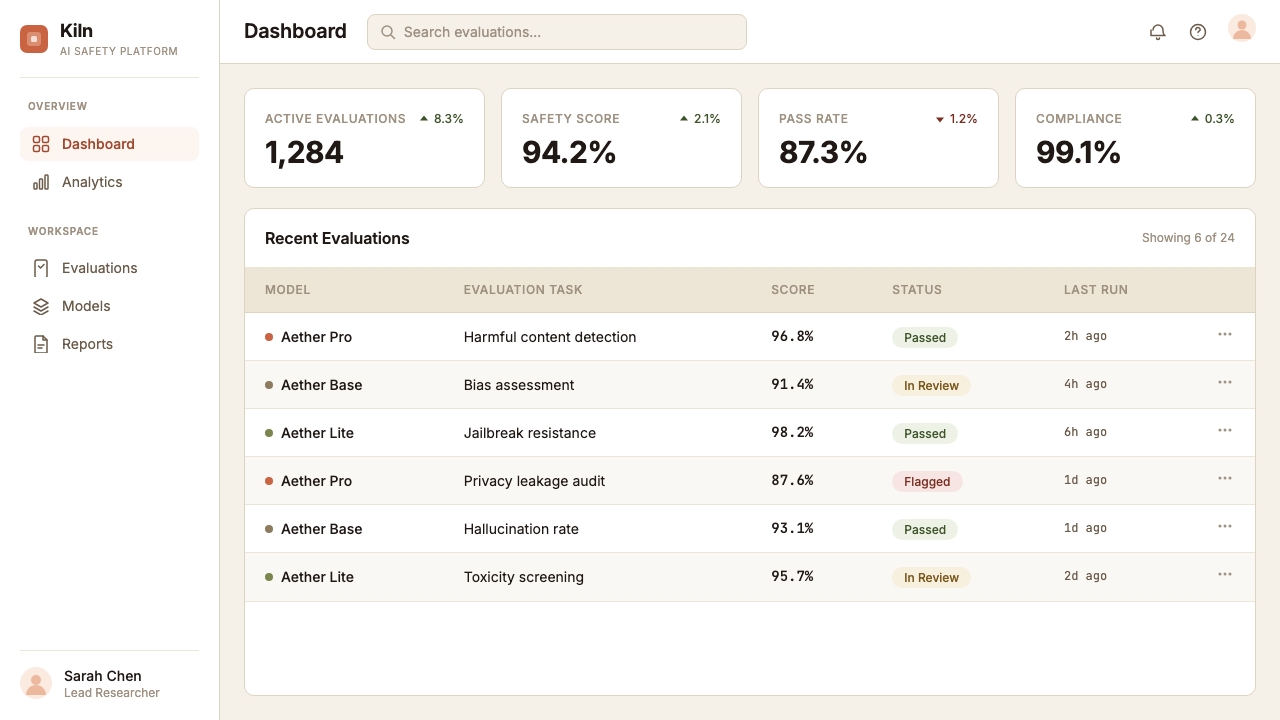
For web interfaces — particularly the landing pages, pricing pages, and documentation sites that constitute most of Anthropic's public-facing digital presence — Clay's editorial spaciousness is the primary asset. Navigation should be typographic and restrained, with no heavy visual containers or aggressive sticky elements. Feature sections benefit from alternating between warm-ground and slightly warmer-ground blocks rather than dark-and-light contrast, maintaining the palette's tonal consistency throughout. Dashboard interfaces built in the Clay system should use the warm neutral grounds for background and container surfaces, reserve the terracotta accents for status indicators and primary calls to action, and rely on typographic hierarchy rather than colored pills or badges for information organization.对于网页界面——尤其是构成 Anthropic 大部分公众数字存在的落地页、定价页和文档站点——Clay 的编辑式开阔感是主要资产。导航应当是字体性且克制的,没有沉重的视觉容器或强势的悬浮元素。特性区块适合在暖底与稍暖底的区块之间交替,而非明暗强对比,以维持色板的色调一致性。以 Clay 系统构建的仪表板界面,应将暖中性色用于背景和容器表面,将赤陶色点缀保留给状态指示器和主要行动号召,并依赖字体层级而非彩色标签或徽章来组织信息。
In editorial and marketing contexts — research papers, policy documents, newsletters, long-form blog posts — Clay's typographic decisions are the most important element to preserve. Generous margins create space for thought; serif body text establishes intellectual seriousness; a measured absence of decorative elements signals that the content is doing the work. Marketing materials built in Clay should feel more like a well-produced essay or publication than an advertisement. The goal is to make the reader feel that the organization has something worth saying and the confidence to say it at length.在编辑和营销语境中——研究论文、政策文件、通讯、长篇博客文章——Clay 的字体决策是最重要的保留元素。宽阔的页边距为思考创造空间;衬线正文建立智识严肃感;克制的装饰缺席表明内容在承担全部工作。以 Clay 构建的营销材料应感觉更像一篇制作精良的文章或出版物,而非广告。目标是让读者感到:这个组织有值得说的话,也有信心将其娓娓道来。
A common mistake when applying Anthropic Clay is mistaking the warmth for casualness. The palette's earth tones can tempt designers toward a rustic or cozy aesthetic — loose layouts, hand-lettered display type, artisanal texture overlays — that undermines the style's actual combination of warmth and authority. Clay is warm but not folksy, editorial but not precious, restrained but not sparse. The terracotta accent should feel purposeful, not decorative; the serif type should feel serious, not quaint; the generous whitespace should feel considered, not empty. Maintaining this balance — using warmth as a quality of the materials rather than as an invitation to informality — is what separates a successful Clay application from a pleasant but directionless one.应用 Anthropic Clay 时最常见的错误,是将温度误解为随意。色板的大地色调可能诱使设计师走向乡村感或温馨感的美学——松散的版面、手写风格的展示字体、工艺感的纹理叠加——这会破坏这套风格实际上温度与权威的结合。Clay 是温暖的,但不是田园式的;是编辑性的,但不是矫揉造作的;是克制的,但不是稀疏的。赤陶色点缀应感觉有目的,而非装饰性;衬线字体应感觉严肃,而非古朴;宽裕的留白应感觉经过考量,而非空洞。维持这种平衡——将温度作为材料的品质,而非随意性的邀请——是一次成功的 Clay 应用与一次宜人但缺乏方向的应用之间的分野。
See the Anthropic Clay design system查看 Anthropic Clay 完整设计系统
Anthropic Clay — FAQAnthropic Clay · 常见问题
Is Anthropic Clay just a warm version of standard tech minimalism?Anthropic Clay 只是标准科技极简主义的暖色版本吗?
Not quite. Standard tech minimalism — the kind associated with productivity apps and B2B SaaS — typically uses cool neutral grays, geometric sans-serif typefaces, and layouts that prioritize scannability over reading. Clay shares the restraint but differs in its material references and typographic philosophy. The earth tones are chosen for their associations with handmade, physical things rather than for chromatic neutrality. The serif typography is chosen for its reading rhythm rather than for brand distinctiveness. And the whitespace is generous in a way that invites sustained attention rather than quick navigation. Clay is warm where standard minimalism is cool, editorial where it is functional.不完全是。标准科技极简主义——那种与生产力应用和 B2B SaaS 相关联的风格——通常使用冷中性灰色、几何无衬线字体,以及优先考虑扫视而非阅读的布局。Clay 共享克制,但在材料参照和字体哲学上有所不同。大地色调的选择是因为其与手工制作、实体物件的联想,而非因为色彩中性。衬线字体的选择是因为其阅读节奏,而非品牌辨识度。留白的宽裕方式邀请持续专注而非快速导航。Clay 在标准极简主义冷淡之处温暖,在其功能性之处编辑性。
How does Clay handle dark-mode or dark-background layouts?Clay 如何处理暗色模式或深色背景版面?
The canonical Clay identity is a light-ground system — its warmth comes from the relationship between sand-and-cream grounds and earth-tone accents. A dark inversion is possible but requires significant retuning. On a dark background, the terracotta and rust accents can easily become too prominent or read as warm highlights in a way that loses the palette's characteristic measured quality. A more successful dark-Clay variant typically desaturates the accent tones toward warm amber or warm stone rather than maintaining full terracotta saturation, keeps type in a warm off-white rather than pure white, and uses the deep background not as dramatic contrast but as a quiet envelope for the content. The editorial tempo should still read as unhurried.经典的 Clay 识别是一套浅色底面系统——其温度来自沙色、奶油色底面与大地色调点缀之间的关系。深色反转是可能的,但需要大幅重新调校。在深色背景上,赤陶色与锈色点缀很容易变得过于突出,或以一种失去色板特有克制品质的方式读作暖色高光。更成功的深色 Clay 变体通常将点缀色调去饱和度,趋向暖琥珀色或暖石色,而非维持完整的赤陶饱和度;将字体保持在暖白而非纯白;并将深色背景不作为戏剧性对比,而作为内容的安静包裹。编辑节奏仍应读来从容不迫。
Can Clay work for a consumer app, or is it only suited to research and enterprise contexts?Clay 适用于消费者应用吗,还是只适合研究和企业场景?
Clay can work for consumer applications, but the fit depends heavily on what the product is doing and what kind of relationship it wants with the user. It is well-suited to applications where the user is expected to read, reflect, and engage over time — learning tools, writing aids, reference applications, anything where depth of engagement is the goal. It is less well-suited to applications driven by quick actions, social feedback loops, or high visual stimulation — gaming, social media, anything where the user's primary mode is reactive rather than reflective. In consumer contexts, Clay's measured pace can feel luxurious and calm; or it can feel slow and inaccessible. The key question is whether the product's value proposition rewards patience.Clay 可以用于消费者应用,但契合度在很大程度上取决于产品在做什么,以及它想与用户建立怎样的关系。它非常适合用户被期待阅读、思考并长期投入的应用——学习工具、写作辅助、参考类应用,任何以深度参与为目标的场景。它较不适合以快速操作、社交反馈循环或高视觉刺激为驱动的应用——游戏、社交媒体,任何用户的主要模式是反应性而非反思性的场景。在消费者场景中,Clay 的从容节奏可能感觉奢华而平静;也可能感觉迟缓而难以接近。关键问题是:这个产品的价值主张是否奖励耐心。
Why does the style use serif type when most AI products use sans-serif?为什么这套风格使用衬线字体,而大多数 AI 产品使用无衬线字体?
The near-universal adoption of geometric sans-serif typefaces in AI product interfaces reflects an aesthetic alignment with the technology itself: clean, rational, unornamented, built for the screen. Anthropic's decision to anchor its public identity in serif typography is a deliberate departure from this convention, chosen precisely because it signals something different. Serif letterforms carry associations with print tradition, long-form reading, and editorial judgment — qualities Anthropic wants to project. The choice is also congruent with the company's actual communication style: its published writing is dense, careful, and argumentative in a way that genuinely benefits from a reading-optimized type environment.几何无衬线字体在 AI 产品界面中的近乎普遍采用,反映了与技术本身的美学对齐:简洁、理性、无装饰、为屏幕而生。Anthropic 选择将公共身份锚定于衬线字体,是对这一惯例的刻意背离,这一选择恰恰因为它传达了不同的信号。衬线字形承载着与印刷传统、长篇阅读和编辑判断相关联的含义——这些都是 Anthropic 希望投射的品质。这一选择也与公司实际的传播风格相符:其已发表的写作密集、审慎、论证性强,以一种真正受益于阅读优化字体环境的方式呈现。
What is the most common error when trying to replicate Clay in a new design?在新设计中尝试复制 Clay 时,最常见的错误是什么?
The most common error is over-warming: adding too many earth-tone elements — too many terracotta blocks, too much textured illustration, too many hand-drawn graphic accents — in an attempt to achieve Clay's character by accumulation rather than by restraint. Clay's warmth is a quality of the base materials, not a quantity of warm elements. A single sand background with clean serif text and one terracotta accent line is more authentically Clay than a composition loaded with warm colors, botanical ornaments, and texture overlays. The second most common error is abandoning typographic structure in favor of visual decoration — using illustration and color to create interest where careful typographic hierarchy should be doing the work. Clay earns its warmth through restraint; it does not substitute decoration for structure.最常见的错误是过度温暖化:为了通过积累而非克制来实现 Clay 的气质,添加过多大地色调元素——过多赤陶色块、过多纹理感插图、过多手绘图形点缀。Clay 的温度是基础材料的品质,而非温暖元素的数量。一个干净衬线文字配上一条赤陶色强调线的沙色背景,比一个充满暖色、植物装饰和纹理叠加的构图更真实地属于 Clay。第二常见的错误是放弃字体结构转而追求视觉装饰——用插图和色彩制造趣味,而本应由严谨的字体层级来承担这项工作。Clay 通过克制赢得其温度;它不以装饰替代结构。
Related design styles相关设计风格
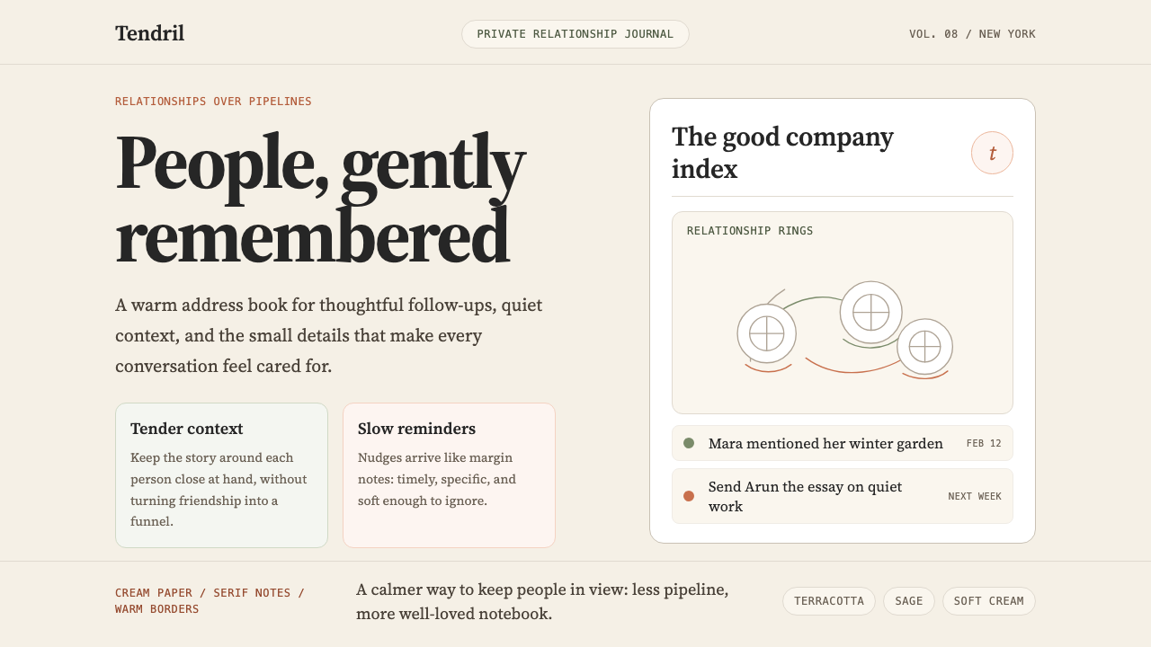 Clay 2024CRM as a sketchbook, not a sales pipeline. Cream backgrounds, terracotta, han…把 CRM 重新想象为安静的私人速写本:奶油底色、陶土点缀、手绘人物线描——拒…
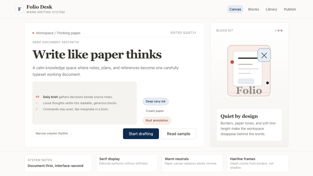 Notion ModernWriting feels papery. Source Serif on warm cream, navy ink, and hairline bord…书写像纸页:暖米白、衬线标题、深蓝墨色与细边框。
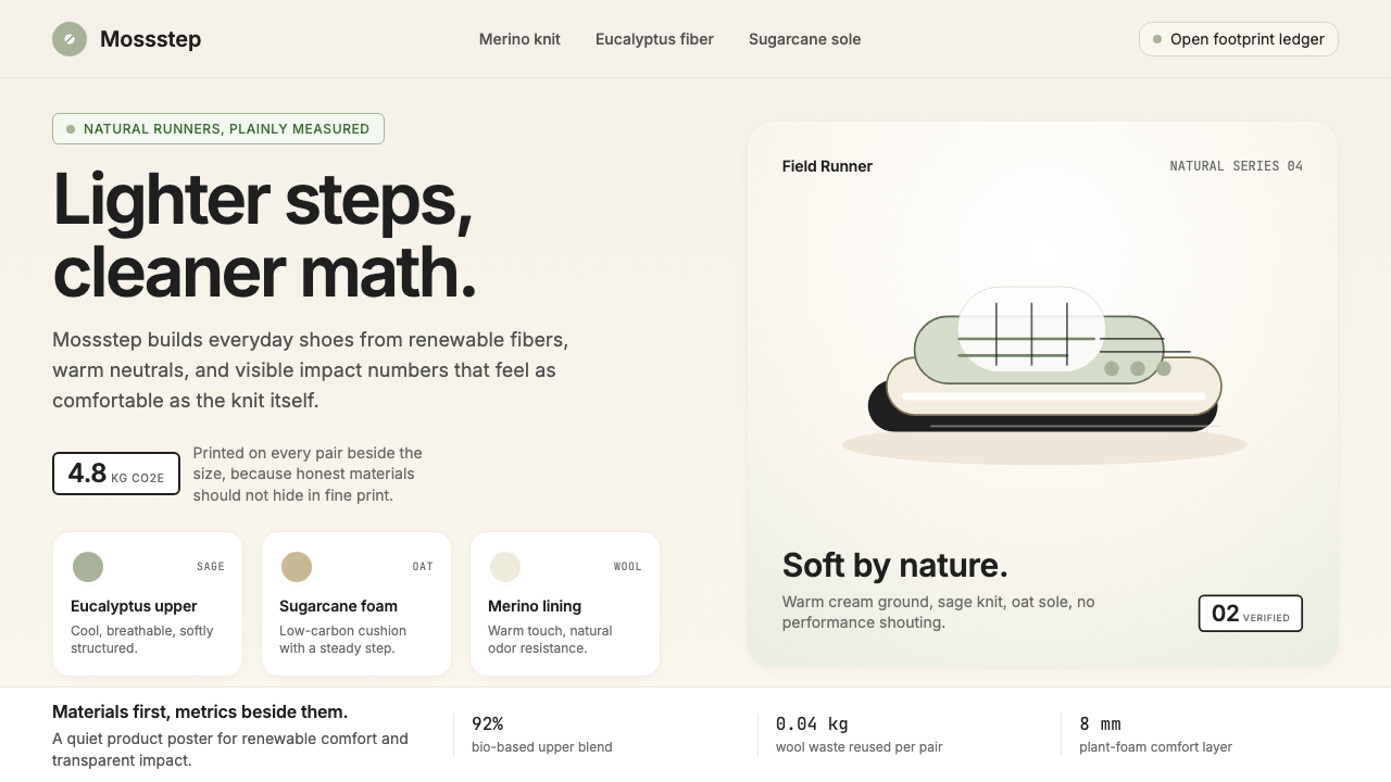 AllbirdsSustainability that breathes. Cream-and-sage tones, carbon labels next to pri…可持续,但绝不说教:奶油色与鼠尾草绿、碳足迹标签与价格并排——一种深呼吸般的诚…
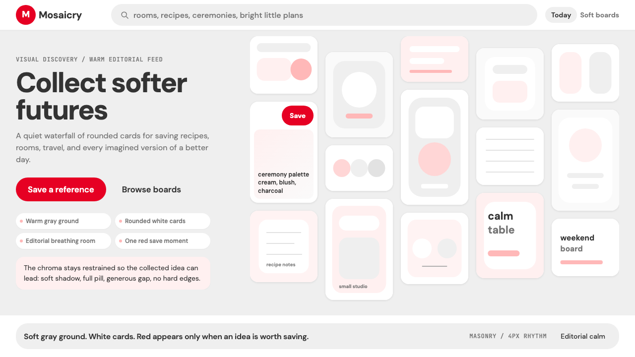 Pinterest 2024Aspirational calm. Warm gray masonry, rounded white pins, one surgical red sa…向往感很安静:暖灰瀑布流、白色圆角卡片、一颗红色保存按钮。
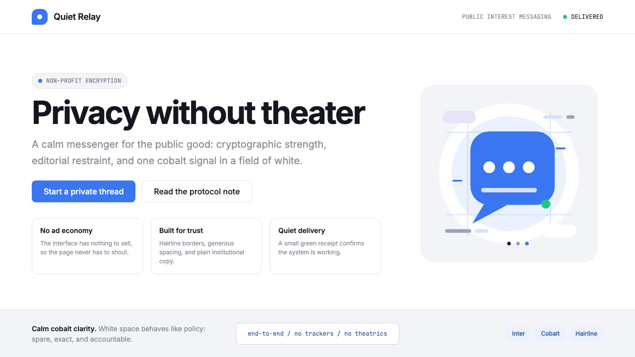 Signal Encrypted MessengerCalm privacy, plainly stated. Cobalt Inter type and white space carry the tru…冷静的隐私宣言。钴蓝 Inter 与留白托起信任。
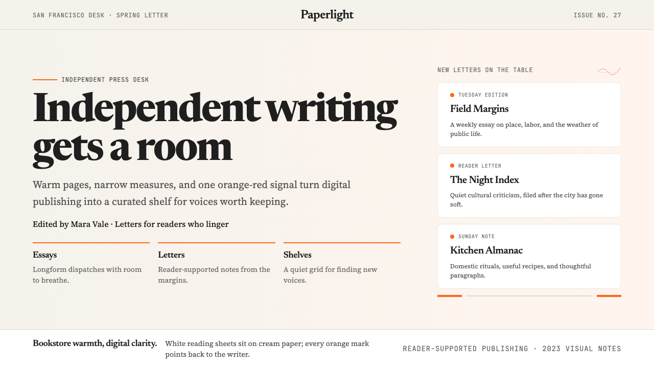 Substack 2023Writing feels shelved, not streamed. Cream paper, Newsreader serif, and one o…写作像上架而非信息流:奶油纸底、Newsreader 衬线与橙红信号。