What is Pinterest 2024?什么是 Pinterest 2024?
Pinterest's visual language is aspirational calm — a warm masonry waterfall where editorial softness, rounded cards, and one precise red button quietly invite you to imagine your best life.Pinterest 的视觉语言是向往感的安静——暖灰瀑布流、编辑感柔光与一颗克制的红色按钮,无声地邀请你去想象最好的生活。
Pinterest 2024 in briefPinterest 2024 速览
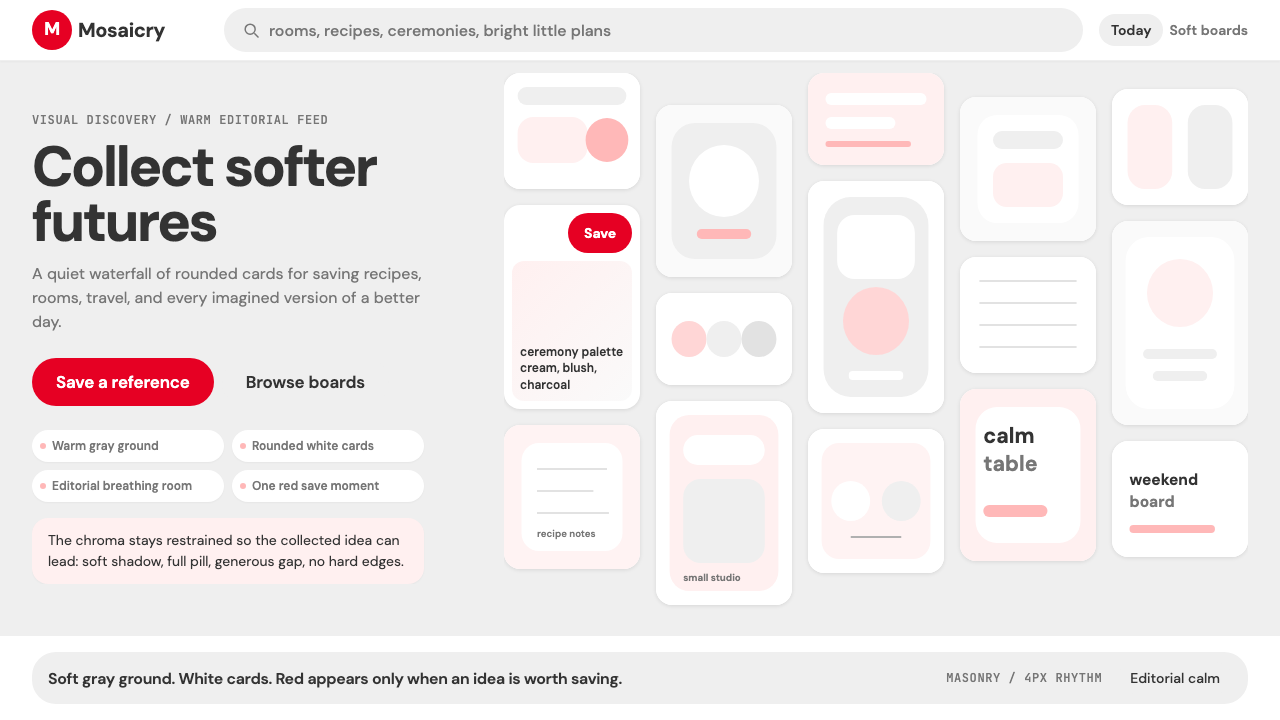
Pinterest 2024 is the refined visual identity of one of the internet's most distinctive platforms — a mood-board service built around the idea that images, not text, are the primary language of aspiration. The design language is warm, soft, and deliberately editorial: masonry grids of rounded pin cards float over near-white backgrounds, photography leads every composition, and a single assertive accent color appears only where saving and action are invited.Pinterest 2024 是互联网上最具辨识度的平台之一的精炼视觉语言——这是一个以图像而非文字作为向往感首要语言的灵感剪贴板服务。它的设计语言温暖、柔和、刻意带有编辑感:错落的圆角卡片漂浮在近乎纯白的背景之上,摄影作品主导每一处构图,只有一种强烈的强调色在引导保存与行动的地方才会出现。
The palette is intentionally neutral and quiet. Warm off-white grounds and gentle gray tones exist to recede, making user-contributed imagery the true protagonist of every page. Shadows are soft and diffuse rather than hard and graphic, giving cards a gentle lifted quality without asserting themselves over the content they frame. Rounded corners on every card soften the geometry and reinforce the platform's mood of warmth and approachability.这套色板在设计上有意保持中性与克制。暖调米白色底面和轻柔的灰色调存在的目的,是主动退让——让用户上传的图像成为每个页面真正的主角。投影柔和漫射而非硬边锋利,赋予卡片一种轻盈的悬浮感,而不会凌驾于它所承托的内容之上。每张卡片的圆角柔化了几何感,强化了平台温暖亲切的整体气质。
What unifies the system is restraint in the application of brand color. The distinctive Pinterest red — saturated, confident, unmistakably itself — appears almost exclusively on the save action, making it a highly charged signal in an otherwise calm visual field. Everything else yields. This surgical economy of color is what gives the single red element its emotional authority: in a sea of warm neutrals and beautiful photography, the save button is always the loudest thing in the room.统一整个系统的,是品牌色在使用上的极度克制。标志性的 Pinterest 红——饱和、自信、无可混淆——几乎只出现在保存操作上,使它成为一片平静视觉场域中极具分量的信号。其余一切都在退让。这种对色彩近乎外科手术式的经济运用,赋予了那颗红色按钮特有的情绪权威:在暖调中性色与美丽摄影的海洋里,保存按钮永远是房间里最响亮的那样东西。
See the Pinterest 2024 design system查看 Pinterest 2024 完整设计系统
Where does Pinterest 2024 come from?Pinterest 2024 从何而来?
Pinterest was founded in San Francisco in 2010 by Ben Silbermann, Evan Sharp, and Paul Sciarra. Silbermann, who had worked at Google before, was drawn to the idea of digital collecting — an online analog to the physical pinboards that architects, designers, and hobbyists had long used to gather reference images. The name itself joined 'pin' (the act of fixing an image to a surface) with 'interest,' signaling a platform organized around personal taste rather than social connection.Pinterest 于 2010 年在旧金山由 Ben Silbermann、Evan Sharp 和 Paul Sciarra 共同创立。Silbermann 在此之前曾任职于 Google,他着迷于数字收藏这个概念——一种与建筑师、设计师和爱好者长期使用的实体图钉板相对应的线上形式。平台名称将「pin」(将图像固定于某处的动作)与「interest」(兴趣)合并,意在打造一个围绕个人品味而非社交关系来组织的平台。
The early interface was functional but rough, relying on browser-installed bookmarklets and desktop-oriented layouts. The visual design in those first years prioritized density over polish: masonry grids appeared because they packed the most imagery per scroll, not because of any deliberate aesthetic manifesto. The platform grew explosively among audiences — predominantly women in the United States — who used it for wedding planning, interior decoration, recipe collection, and fashion inspiration. This user base shaped the platform's visual evolution as profoundly as any design decision made internally.早期界面功能性有余、打磨不足,依赖浏览器书签工具和以桌面端为主的布局。那几年的视觉设计优先考虑信息密度而非精致感:瀑布流的出现是因为它能在每次滚动中塞入最多的图像,而非出于任何刻意的美学宣言。平台在美国女性用户群体中爆炸性地增长——她们将其用于婚礼筹备、室内装饰、食谱收集与时尚灵感。这一用户群体对平台视觉演进的塑造,与任何内部设计决策同样深刻。
The period from roughly 2016 to 2020 saw Pinterest refine its mobile experience significantly, smoothing card proportions, softening shadows, and establishing a more consistent type hierarchy. Evan Sharp, who served as Chief Design Officer before departing in 2022, was a central force in translating the platform's aspirational mood into systematic visual decisions. Under his tenure, Pinterest moved from an informal aggregator toward a more intentional editorial presence — one where the platform's own design language did not compete with the content but instead created a calm, framed environment for it.大约在 2016 至 2020 年间,Pinterest 对移动端体验进行了大幅打磨:卡片比例更加圆润,投影变得更柔和,字体层级也更加一致。曾任首席设计官、于 2022 年离职的 Evan Sharp,是将平台向往感气质转化为系统性视觉决策的核心力量。在他任职期间,Pinterest 从一个非正式的聚合器演变为更具意图的编辑性存在——平台自身的设计语言不再与内容竞争,而是为内容构建一个平静、有框架感的展示环境。
The 2020–2024 visual iteration represents the most mature statement of the Pinterest design philosophy. It coincided with broader industry trends — rounded corners, warmer neutral palettes, softer shadow systems — but Pinterest's version is distinguished by its consistency and its disciplined application of the single brand-color accent. Albert Pereta, who joined Pinterest as a design leader during this period, helped shape the systematic approach to product design that brought greater coherence to the platform's many surfaces across web, iOS, and Android. By 2024, the visual language had become one of the most widely imitated in consumer web design — studied for its particular balance of editorial calm and commercial directness.2020 至 2024 年的视觉迭代代表了 Pinterest 设计哲学最成熟的表达。这一时期与更广泛的行业趋势不谋而合——圆角、更暖调的中性色板、更柔和的投影系统——但 Pinterest 的版本以其一致性和对单一品牌色强调的严格克制而独树一帜。设计负责人 Albert Pereta 在这一时期加入 Pinterest,协助构建了系统化的产品设计方法论,使平台在网页、iOS 和 Android 等众多界面上呈现出更高的视觉统一度。到 2024 年,这套视觉语言已成为消费端网页设计中被模仿最多的体系之一——以其编辑感的宁静与商业感的直接之间那种特殊的平衡,被广泛研究与借鉴。
What defines the Pinterest 2024 look?Pinterest 2024 的视觉特征是什么?
Warm Neutral Ground暖调中性底色
The background of any Pinterest-style composition is never stark white or cool gray — it carries a subtle warmth, somewhere between cream and light stone, that makes imagery feel cradled rather than clinically presented. This tonal warmth extends to card backgrounds and interface chrome alike, creating a unified atmospheric quality throughout the layout. The neutrality of the ground is what makes the diversity of user content feel harmonious even when pins from wildly different sources sit side by side.任何 Pinterest 风格构图的底色都不是冷白或冷灰——它带有一丝微妙的暖意,介于奶油色与浅石色之间,让图像感觉是被温柔托举而非被冷峻展示。这种色调上的温暖延伸至卡片背景与界面框架,在整个版面中营造出统一的氛围质感。正是底色的中性克制,使来自截然不同来源的 pin 卡片并排陈列时仍能感觉和谐。
Masonry Grid Rhythm瀑布流网格节奏
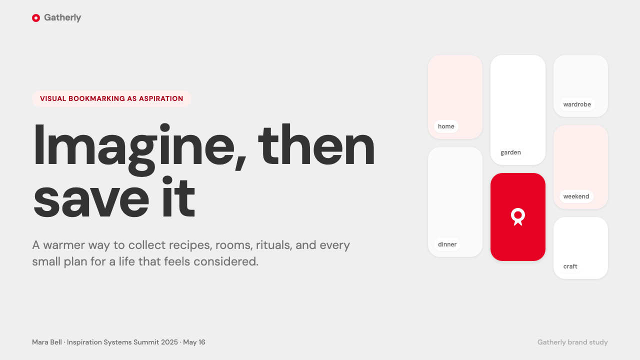
The masonry grid is both the platform's signature layout and its most deliberate visual choice. Unlike a strict rectangular grid, masonry allows cards of varying heights to pack tightly without uniform rows, creating a sense of abundant, almost infinite imagery. The rhythm is irregular enough to feel alive and editorial — closer to a curated magazine spread than a database table — while the consistent card width and gutter spacing provide enough structure to prevent visual chaos.瀑布流网格既是平台的标志性布局,也是最经过深思熟虑的视觉选择。与严格的矩形网格不同,瀑布流允许不同高度的卡片紧密排布而无需整齐成行,营造出一种丰盛的、近乎无限的图像感。这种节奏不规则到足以显得生动而富有编辑感——更像一个策展精良的杂志跨页,而非一张数据库表格——而一致的卡片宽度与间距又提供了足够的结构,防止视觉上的混乱。
Rounded Card Language圆角卡片语言
Every pin card carries generous rounded corners that soften the geometry of the grid and reinforce a mood of approachability. The rounding is substantial enough to be clearly intentional — not a barely-perceptible refinement but a character-defining choice. Combined with soft diffuse shadows that lift cards slightly off the background plane, the cards read as tactile objects rather than flat frames, inviting the hand gesture of saving or sharing. This physicality is important to Pinterest's promise of a collectable, ownable visual world.每张 pin 卡片都有明显的圆角,既柔化了网格的几何感,也强化了平台亲切可触的整体气质。这种圆角幅度相当大,足以让人感受到这是刻意为之——不是几乎感知不到的细微打磨,而是定义整体风格的特征性选择。结合将卡片轻微托离背景平面的柔和漫射投影,卡片呈现出触感对象而非平面框架的质感,邀请用户做出保存或分享的手势动作。这种物质感对于 Pinterest 所承诺的「可收藏、可拥有的视觉世界」至关重要。
Surgical Red Accent克制的红色强调
The Pinterest red is saturated and confident — a color with clear family resemblance to classic brand reds, warm rather than cool in its undertone. What makes it distinctive in practice is not the hue itself but the discipline of its deployment. It appears almost exclusively on the save action — the platform's most important conversion moment — and occasionally on a small number of high-priority interface elements. Everywhere else, the interface withholds it deliberately. The effect of this restraint is that the red commands attention without effort: users learn quickly that wherever red appears, something actionable and important is present.Pinterest 红是饱和而自信的——一种与经典品牌红有明确家族感的色彩,底调偏暖而非冷。但让它在实践中独特的,不是色调本身,而是使用上的纪律性。它几乎只出现在保存操作上——平台最重要的转化时刻——以及少量高优先级的界面元素上。其余地方,界面有意将其收起。这种克制的效果是:红色不费力气就能指挥注意力——用户很快就学会,红色出现的地方,就有可操作的、重要的事情。
Photography as Content摄影即内容
Pinterest's design language is unusual in that its primary visual richness comes not from interface design but from user-contributed imagery. The system is designed to disappear, to become a neutral, beautiful vessel for photography of all kinds — fashion editorials, food styling, interior photography, illustration, and DIY project documentation. This means the design must be flexible enough to hold wildly divergent imagery while maintaining visual coherence. The answer is the palette and structural choices: when the frame is consistently warm-neutral and softly rounded, almost any image can sit within it without aesthetic collision.Pinterest 的设计语言有其独特之处——其主要的视觉丰富性来自用户上传的图像,而非界面设计本身。整个系统的设计目标是自我隐退,成为各种摄影作品的中性而美好的容器——时尚大片、食物造型、室内摄影、插画、DIY 项目记录,无所不容。这意味着设计必须足够灵活,既能承托截然不同的图像,又要保持视觉上的一致性。解决方案在于色板与结构选择:当框架始终保持暖调中性、柔和圆润时,几乎任何图像都能置于其中,而不产生美学上的冲突。
Generous Whitespace and Scroll Invitation充裕留白与滑动邀请
Pinterest compositions breathe. Gutters between cards are wide enough to give each pin room to exist as a discrete object rather than merging into a continuous texture. Above and below content sections, spacing is ample and unhurried. This generosity of negative space does important work: it slows the visual tempo enough for imagery to register emotionally before the eye moves on, and it creates the sensation of leisurely, pleasurable browsing rather than information retrieval. The scroll becomes an invitation rather than a necessity.Pinterest 的构图会呼吸。卡片之间的间距足够宽裕,让每张 pin 都有空间作为独立的对象存在,而不是融合成连续的纹理。内容区块的上下留白也是充分而从容的。这种大方的负空间起到了重要作用:它足以放慢视觉节奏,让图像在目光转移之前能够在情感上留下印象;同时营造出一种悠闲、愉悦的浏览感受,而非信息检索的紧迫感。滑动成为一种邀请,而非一种必要。
Minimal Typographic Intervention极简字体介入
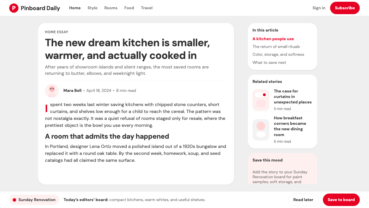
Text in the Pinterest system is kept deliberately subordinate to imagery. Card titles and metadata appear in clean, unpretentious type — neither bold display typography nor delicate script, but a legible workhorse that registers without competing. Type hierarchy is achieved through modest size differences and weight contrast rather than through dramatic scale jumps. The platform's navigation and interface labels follow the same logic: clear enough to be understood instantly, restrained enough to disappear when imagery is present. This typographic modesty is itself an aesthetic statement — the platform has the confidence to let its content speak.Pinterest 系统中的文字有意保持从属于图像的地位。卡片标题与元数据以干净、不张扬的字体呈现——既不是粗重的展示型排版,也不是纤细的手写体,而是一种可读的工具性字体,传达信息而不竞争注意力。字体层级通过适度的尺寸差异和字重对比来实现,而非戏剧性的尺度跳跃。平台的导航与界面标签遵循同样的逻辑:清晰到可以即时理解,克制到在图像存在时能够隐退于背景。这种排版上的谦逊本身就是一种美学声明——平台有信心让内容自己说话。
See the Pinterest 2024 design system查看 Pinterest 2024 完整设计系统
Who shaped Pinterest 2024?谁塑造了 Pinterest 2024?
Silbermann co-founded Pinterest and served as CEO through its formative years and beyond. A former Google product manager, he brought an obsessive attention to the collecting experience — studying physical pinboards, stamp collections, and natural history cabinets to understand what made a collection emotionally satisfying. His insistence on quality over growth in the early years allowed the platform's visual identity to develop organically around its actual use patterns, which is why the design feels genuinely fitted to its purpose rather than imposed. Silbermann stepped down as CEO in 2022, handing leadership to Bill Ready.Silbermann 是 Pinterest 的联合创始人,并在平台的成长期及之后担任 CEO。作为前 Google 产品经理,他对收藏体验有着执念般的关注——研究实体图钉板、邮票收藏和自然历史陈列柜,以理解是什么让一个收藏在情感上令人满足。他在早期坚持质量优先于增长,使平台的视觉身份能够围绕真实的使用模式有机生长,这也是为什么这套设计感觉真正贴合其目的,而非强加于外。Silbermann 于 2022 年卸任 CEO,将领导权交给了 Bill Ready。
Sharp co-founded Pinterest and served as Chief Design Officer, making him the figure most directly responsible for translating the platform's aspirational promise into a coherent visual system. Trained as an architect before moving into digital product design, Sharp brought a spatial sensibility to the platform — thinking about how users would move through images and collections rather than simply how individual screens would look. He championed the warm-neutral palette, the editorial card system, and the disciplined use of brand color that define the mature Pinterest aesthetic. Sharp departed the company in 2022.Sharp 是 Pinterest 的联合创始人,曾担任首席设计官,是将平台向往感承诺转化为连贯视觉系统的最直接责任人。在进入数字产品设计之前,他接受过建筑学训练,并将一种空间感性带入了平台设计——思考的是用户将如何在图像与收藏中移动,而非单纯某个页面应该呈现什么样子。他倡导了暖调中性色板、编辑感卡片系统,以及定义成熟 Pinterest 美学的品牌色克制用法。Sharp 于 2022 年离开公司。
Pereta joined Pinterest as a design leader and played a significant role in systematizing the visual language across the platform's many product surfaces during the 2020–2024 refinement period. His contribution was less about inventing new aesthetic directions and more about creating the design infrastructure — component libraries, spacing systems, color application guidelines — that allowed a large design team to maintain visual coherence at scale. This kind of systematic design leadership is often invisible in the finished product but is entirely responsible for why a mature platform feels unified rather than assembled.Pereta 以设计负责人身份加入 Pinterest,在 2020 至 2024 年的视觉打磨阶段,对平台众多产品界面的视觉语言系统化工作起到了重要作用。他的贡献不在于发明新的美学方向,而在于构建设计基础设施——组件库、间距系统、色彩使用规范——使一个庞大的设计团队能够在规模化条件下保持视觉一致性。这种系统化的设计领导力在成品中往往是隐形的,但正是它让一个成熟平台呈现出统一感,而非拼凑感。
Ready joined Pinterest as CEO in 2022, bringing a commercial and technology background from his previous roles at Google and PayPal. While not a designer, his leadership coincided with Pinterest's effort to evolve its shopping and discovery features without compromising the visual calm that users associated with the platform. The tension Ready had to manage — between commerce and aspiration, between conversion pressure and editorial restraint — is essentially a design tension, and the 2024 visual system can be read partly as the resolution his tenure produced.Ready 于 2022 年出任 Pinterest CEO,带来了他在 Google 和 PayPal 积累的商业与技术背景。尽管非设计出身,他的任期恰好与 Pinterest 努力升级购物与发现功能、同时不损害用户熟悉的视觉宁静感这一过程重合。Ready 需要管理的张力——商业与向往感之间、转化压力与编辑克制之间——本质上是一种设计张力,而 2024 年的视觉系统在某种程度上可以被读作他任期内所达成的一种平衡解答。
How do you use Pinterest 2024 today?今天怎么用 Pinterest 2024?
Pinterest 2024's visual language transfers well to any context where the primary goal is to make content — particularly imagery — feel aspirational, discoverable, and quietly luxurious. The key principle to internalize before applying the style is that Pinterest's design is a frame, not a statement. Every decision — the warm neutrals, the soft shadows, the rounded cards, the restrained accent — exists to serve the content it contains, not to express the interface designer's personality. This orientation makes it fundamentally different from more assertive visual systems and requires a different kind of discipline to execute correctly.Pinterest 2024 的视觉语言适用于任何以让内容——尤其是图像——显得充满向往感、易于探索、低调奢华为首要目标的场合。在应用这套风格之前,最重要的一条原则是:Pinterest 的设计是一个框架,而非一种声明。每一个决定——暖调中性色、柔和投影、圆角卡片、克制的强调色——存在的目的都是服务于它所承托的内容,而非表达界面设计师的个人风格。这种取向使它与更具主张性的视觉系统有着本质区别,需要一种不同的纪律感才能正确执行。
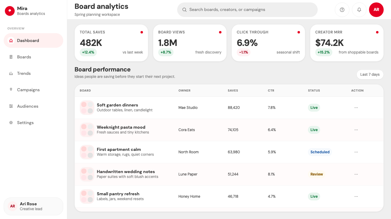
For presentation slides, the Pinterest style works best when imagery is central to the narrative. Cover slides benefit from a single strong photographic image set against a warm-neutral ground, with the title in clean, legible type that does not compete for attention. Content slides should adopt the card-grid logic: multiple visual references arranged in a loose masonry pattern convey abundance and editorial curation simultaneously. Data slides can borrow the card motif — each metric or statistic presented within a softly rounded container that gives it visual breathing room. The disciplined use of the brand-color accent should be reserved for the single most important call to action on any given slide.在演示文稿中,Pinterest 风格最适合图像是叙事核心的场合。封面幻灯片适合用一张强有力的摄影图像搭配暖调中性底色,标题以干净可读的字体呈现,不与图像争夺注意力。内容幻灯片可以采用卡片网格的逻辑:以松散瀑布流排列的多个视觉参考,同时传递出丰盛感与编辑策展感。数据幻灯片可以借用卡片母题——每个指标或数据都呈现在一个柔和圆角的容器内,给它视觉上的呼吸空间。品牌强调色的克制使用应保留给每张幻灯片上最重要的单一行动号召。
For web interfaces, dashboards, and pricing pages, the Pinterest approach rewards consistency above all. Establish a warm off-white background as the canvas, set all structural chrome in light gray tones, and keep body text in deep charcoal rather than pure black — this preserves the warmth of the system. Card components with soft shadows and rounded corners provide the primary organizational unit. Use the accent color — whatever your brand equivalent of Pinterest red might be — for primary actions only: the subscribe button, the upgrade CTA, the save or bookmark state. Pricing tiers can be differentiated through card elevation and background warmth rather than through competing accent colors.在网页界面、仪表板与定价页面中,Pinterest 的做法首先奖励的是一致性。以暖调米白色为背景画布,以浅灰色调呈现所有结构性框架,正文用深炭灰而非纯黑——这保留了整个系统的温暖感。带柔和投影与圆角的卡片组件提供主要的组织单元。将强调色——无论你的品牌中相当于 Pinterest 红的是什么颜色——只用于主要操作:订阅按钮、升级 CTA、保存或收藏状态。定价层级可以通过卡片的层次感与背景色调的温度差异来区分,而非依赖相互竞争的强调色。
For editorial and marketing work, the style's editorial calm makes it well-suited to lifestyle, wellness, food, fashion, and home-decor contexts — categories where Pinterest itself is most culturally relevant. Article layouts benefit from wide gutter margins that give imagery room to breathe, with body text set in a comfortable reading measure and pull quotes presented in clean, slightly enlarged type rather than decorative callout boxes. Marketing landing pages can adopt the masonry aesthetic directly: a grid of lifestyle images above the fold, followed by feature sections that alternate a warm-background zone with a slightly richer tonal zone to create rhythm without resorting to high-contrast color blocking.在编辑与营销内容中,这套风格的编辑感宁静使其非常适合生活方式、健康、美食、时尚与家居场景——这也正是 Pinterest 自身最具文化相关性的品类。文章版面适合宽裕的边距留白,给图像充足的呼吸空间;正文设置舒适的行宽;引语以干净、略微放大的字体呈现,而非装饰性引用框。营销落地页可以直接采用瀑布流美学:首屏一组生活方式图像网格,随后的特性区块在暖色调区块与略微丰富的色调区块之间交替,在不诉诸高对比度色块的情况下制造节奏感。
A common mistake when applying this visual language is to mistake neutrality for emptiness and attempt to add visual interest through additional colors, gradients, or decorative elements. The Pinterest system's apparent simplicity is the product of very deliberate subtractive decisions — every element that might compete with imagery has been removed. Adding it back in, even with good intentions, collapses the careful hierarchy. A second frequent error is rounding every corner uniformly regardless of context: the rounded-card vocabulary works because it is applied to contained, discrete objects. Rounding navigation bars, full-width banners, and typographic elements indiscriminately produces a style that reads as juvenile rather than warm. Apply the rounding selectively, to card and container elements, and allow the supporting structure to remain clean and rectilinear.应用这套视觉语言时最常见的错误,是将「中性」误解为「空洞」,并试图通过增加颜色、渐变或装饰元素来增添视觉趣味。Pinterest 系统表面上的简洁,是一系列非常刻意的减法决定的产物——所有可能与图像竞争的元素都已被移除。即使出于好意将它们加回去,也会瓦解那个精心构建的层级关系。另一个常见错误是不加区分地将所有角落统一圆化:圆角卡片的视觉语汇之所以有效,是因为它被应用于独立的、有边界的容器对象。对导航栏、全宽横幅和字体元素不加选择地做圆角处理,会产生一种幼稚感而非温暖感。将圆角选择性地应用于卡片与容器元素,让支撑性结构保持干净的直角,才是正确的做法。
See the Pinterest 2024 design system查看 Pinterest 2024 完整设计系统
Pinterest 2024 — FAQPinterest 2024 · 常见问题
Is Pinterest 2024 style the same as general 'warm minimalism'?Pinterest 2024 风格和泛泛所说的「温暖极简」是同一回事吗?
They overlap significantly but are not identical. Warm minimalism is a broad design tendency that includes a wide range of typographic, architectural, and product design approaches united by muted palettes and restrained ornamentation. Pinterest 2024 is more specifically defined: it has a masonry grid structure, a card-based organizational logic, a specific application of one saturated accent color against neutral grounds, and a philosophy that the interface should serve photography rather than assert its own presence. You can be warm-minimal without any of those features; Pinterest style requires most of them.两者有很大的重叠,但并不完全相同。「温暖极简」是一种宽泛的设计倾向,涵盖了广泛的字体、建筑与产品设计方法,其共同点是柔和的色板与克制的装饰性。Pinterest 2024 则定义更为具体:它有瀑布流网格结构、基于卡片的组织逻辑、在中性底色上使用单一饱和强调色的特定方式,以及界面应当服务于摄影而非彰显自身存在的设计哲学。你完全可以做到温暖极简而不具备上述任何特征;但 Pinterest 风格需要其中的大部分。
How do you handle dark mode in Pinterest-style design?Pinterest 风格的设计如何处理深色模式?
Pinterest's canonical expression is light-ground — the warm neutrals are fundamental to the system's emotional quality. A dark-mode inversion is technically possible but requires careful recalibration. The background should shift to a deep warm gray rather than pure black, preserving the warmth that defines the aesthetic. Card surfaces then need to read as distinctly lighter than the background to maintain the card-lift effect, using a mid-tone warm gray rather than white. The accent red requires particular attention in dark contexts: it tends to feel more aggressive against dark grounds and may need to be applied even more sparingly than in the light version. Soft shadows become nearly invisible on dark backgrounds and may need to be replaced by subtle borders or slight background lightness differentials.Pinterest 的经典表达以浅色底面为基础——暖调中性色是整个系统情绪质量的根本。深色模式的反转在技术上可行,但需要仔细重新校准。背景应当转向深暖灰而非纯黑,以保留定义这套美学的温暖感。卡片表面需要明显浅于背景,以维持卡片悬浮的视觉效果,使用中间调暖灰而非白色。强调红在深色语境中需要特别注意:它在深色底面上往往感觉更具攻击性,可能需要比浅色版本使用得更加克制。柔和投影在深色背景上几乎不可见,可能需要被细微的描边或轻微的背景亮度差异所取代。
Can Pinterest-style design work for B2B or enterprise software?Pinterest 风格的设计适合 B2B 或企业软件吗?
It depends heavily on the nature of the enterprise product. For tools where the primary interface is gallery-like — asset management systems, creative libraries, e-commerce catalog tools, real estate platforms, media organization software — the masonry card approach translates directly and brings significant usability benefits. For dense analytical dashboards, financial reporting tools, or data-heavy interfaces where the user needs to scan tabular information quickly, the warm-neutral card approach can create a pleasant surface layer but the masonry layout structure is likely to feel inefficient. In those contexts, it is often better to borrow the palette and the soft-shadow card motif selectively while defaulting to a more rectilinear grid structure for data-dense areas.这在很大程度上取决于企业产品的性质。对于主要界面类似画廊的工具——资产管理系统、创意素材库、电商目录工具、房产平台、媒体整理软件——瀑布流卡片方式可以直接迁移并带来显著的可用性收益。对于密集的分析仪表板、财务报告工具或用户需要快速扫描表格信息的数据密集型界面,暖调中性卡片方式可以营造一个令人愉悦的表面层,但瀑布流布局结构可能会感觉低效。在这些场景中,通常更好的做法是选择性地借用色板与软投影卡片母题,而在数据密集区域回归更规整的矩形网格结构。
What makes Pinterest's accent-color discipline worth emulating?Pinterest 在强调色使用上的克制为什么值得效仿?
Because it creates a reliable, learned signal hierarchy. When a color appears in only one functional context — the save action, in Pinterest's case — users rapidly internalize its meaning without conscious instruction. The color becomes a navigational tool rather than a decorative choice. This is more effective than distributing an accent color across many interface elements, where it loses its signal value and becomes mere decoration. The practical implication for designers is that the fewer contexts in which a brand color appears, the more authority it carries in each of those contexts. Pinterest's red saves because it never does anything else.因为它创造了一套可靠的、经过学习的信号层级体系。当一种颜色只出现在单一功能语境中——对 Pinterest 来说是保存操作——用户会在没有明确指引的情况下迅速将其意义内化。这种颜色成为导航工具,而非装饰性选择。这比将强调色分散应用于众多界面元素要有效得多——后者会使其失去信号价值,沦为纯粹的装饰。对设计师的实践启示是:品牌色出现的功能语境越少,它在每一个语境中所拥有的权威感就越强。Pinterest 的红色之所以有效,是因为它从不做别的任何事情。
Where does Pinterest 2024 style struggle or feel out of place?Pinterest 2024 风格在哪些场合会显得吃力或格格不入?
The style underperforms in contexts that require urgency, authority, or high information density. News and media platforms, financial trading interfaces, emergency or safety systems, and any context where the user must process complex structured data quickly will find the warm-neutral, soft-shadow aesthetic creates the wrong emotional register — too relaxed, too browsing-oriented, insufficiently directive. The style also struggles when applied to content that is primarily textual rather than visual: long-form reading, legal documents, technical documentation, and code-heavy developer tools all suffer when the card-and-masonry logic is applied, because these content types benefit from linearity and predictable reading flow rather than the browsing and discovery mode that masonry encourages.这套风格在需要紧迫感、权威性或高信息密度的场合表现欠佳。新闻媒体平台、金融交易界面、紧急或安全系统,以及任何用户需要快速处理复杂结构化数据的场合,都会发现暖调中性、柔和投影的美学制造了错误的情绪基调——过于放松、过于偏向浏览模式、指引性不足。当被应用于以文字为主而非以视觉为主的内容时,这套风格同样力不从心:长篇阅读、法律文件、技术文档,以及代码密集型的开发者工具,在套用卡片与瀑布流逻辑后都会受损,因为这些内容类型受益于线性与可预测的阅读流,而非瀑布流所鼓励的浏览与发现模式。
Related design styles相关设计风格
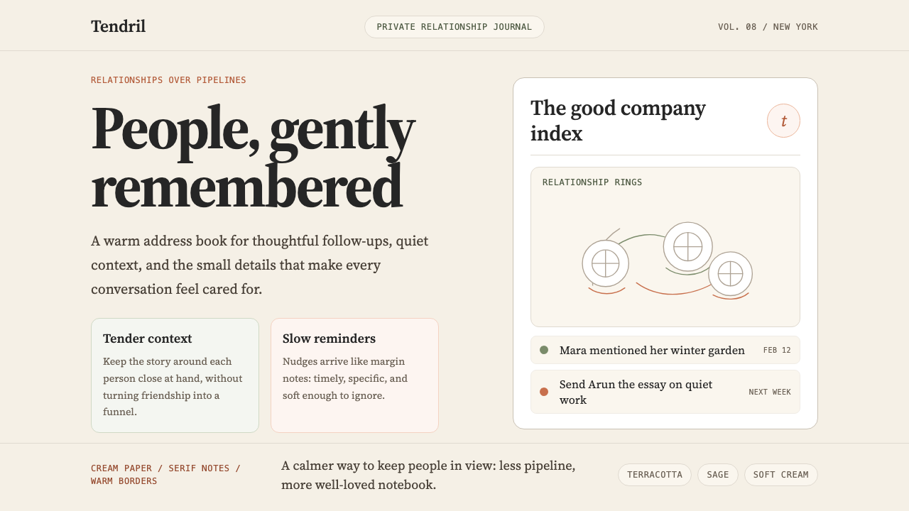 Clay 2024CRM as a sketchbook, not a sales pipeline. Cream backgrounds, terracotta, han…把 CRM 重新想象为安静的私人速写本:奶油底色、陶土点缀、手绘人物线描——拒…
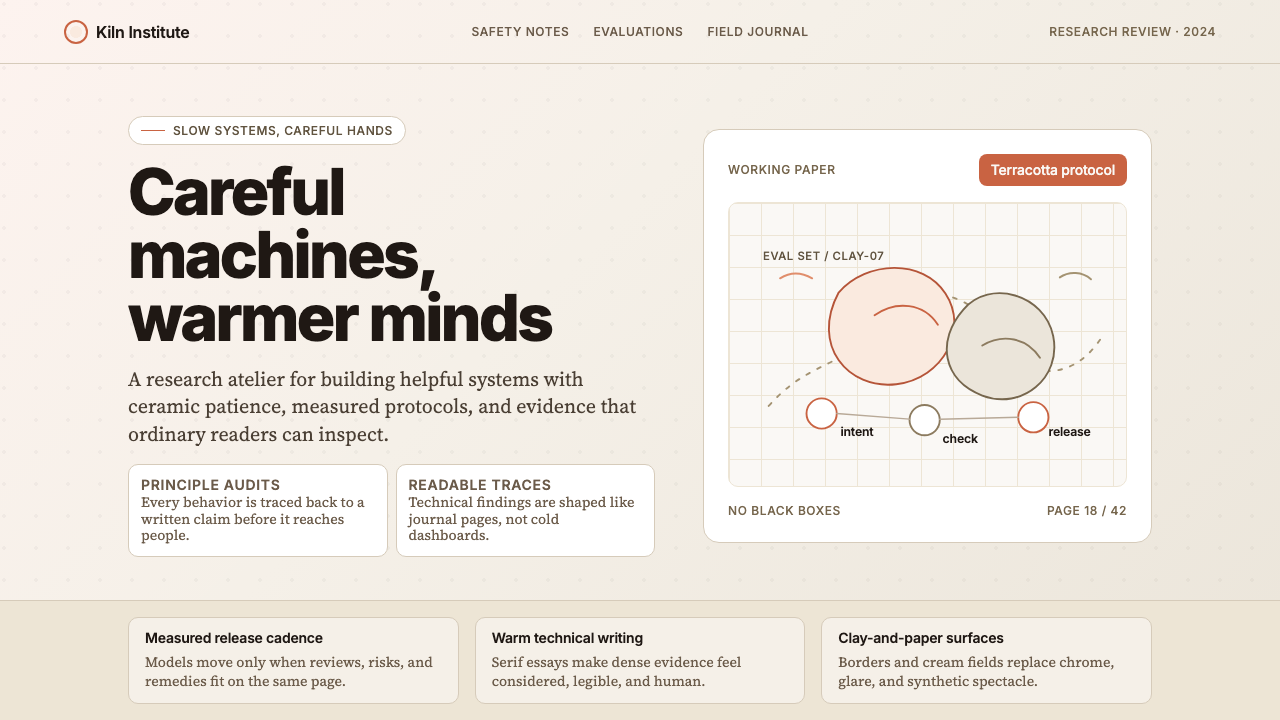 Anthropic ClayAI safety in handmade clay. Sand backgrounds, terracotta accents, serif body…用手工陶土包裹的 AI 安全感:沙色背景、赤陶点缀、衬线正文——缓慢、刻意、有…
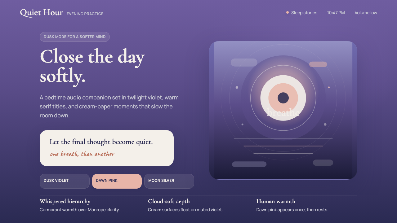 Calm App Purple MeditationWhispers at bedtime. Dusk-purple gradients, cream serif type, and dawn-pink w…睡前低语。暮紫渐变、奶油衬线与黎明粉暖意。
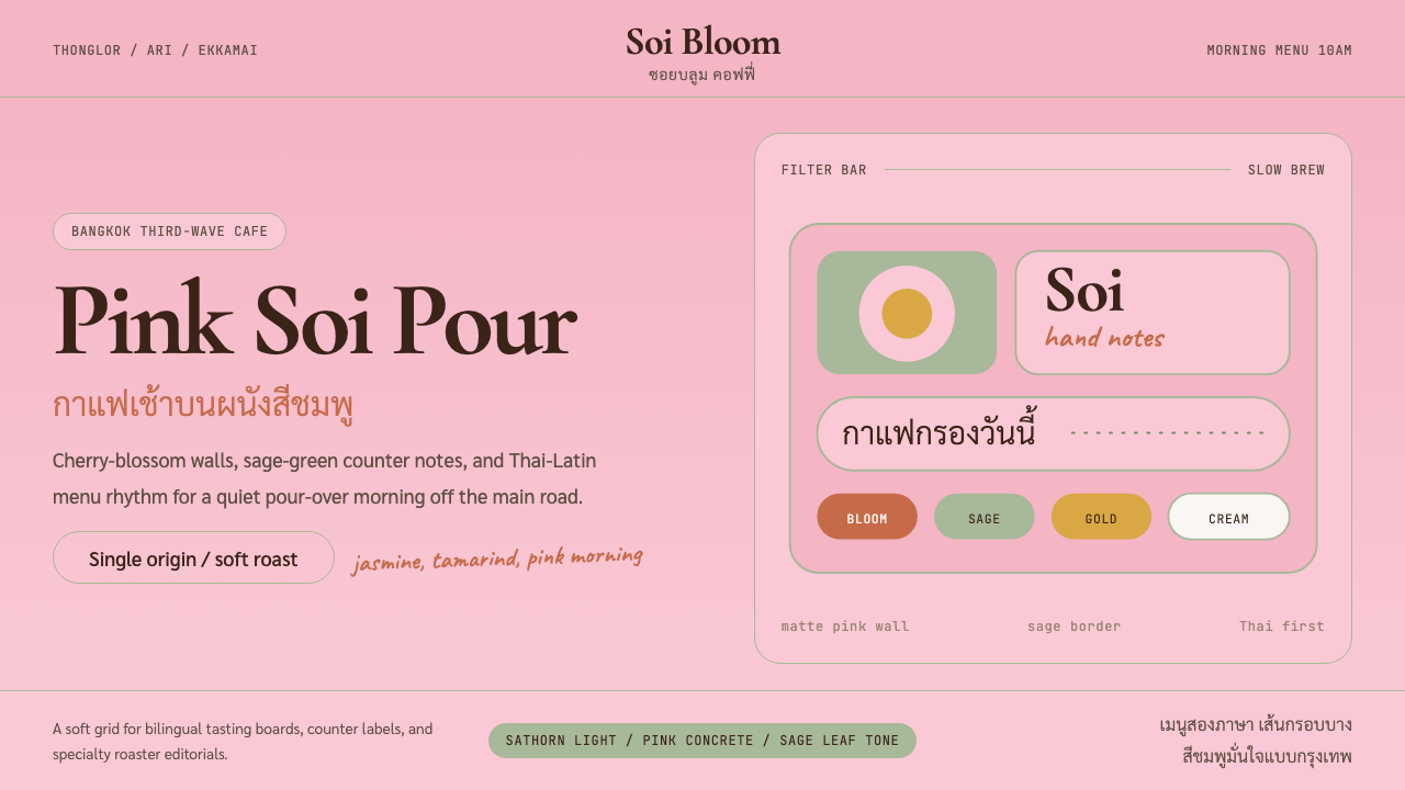 Bangkok Third-Wave CafeBangkok feels soft but sure. Cherry pink, sage borders, and Thai-Latin menu r…曼谷柔和却自信:樱花粉、鼠尾草边框与泰英菜单节奏。
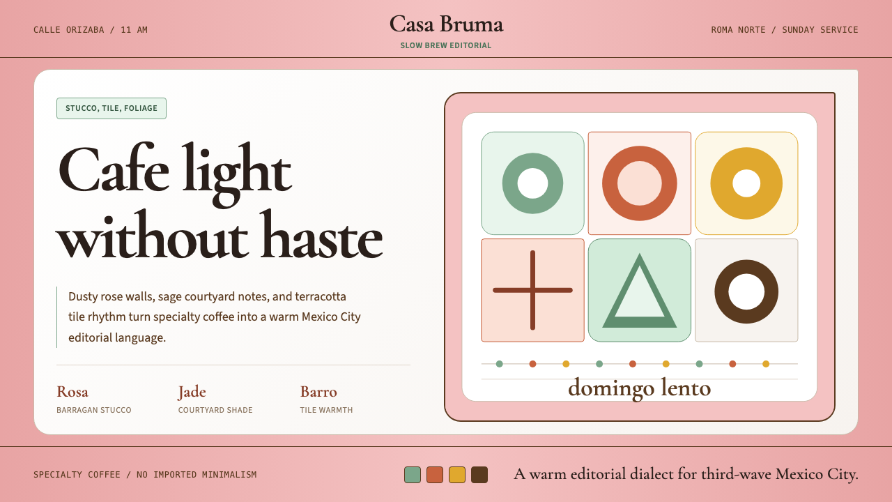 CDMX Roma Norte CafeMexico City coffee, unhurried. Dusty rose, sage jade, and serif rhythm carry…从容的墨城咖啡感:灰玫瑰、鼠尾草绿与衬线节奏传递温度。
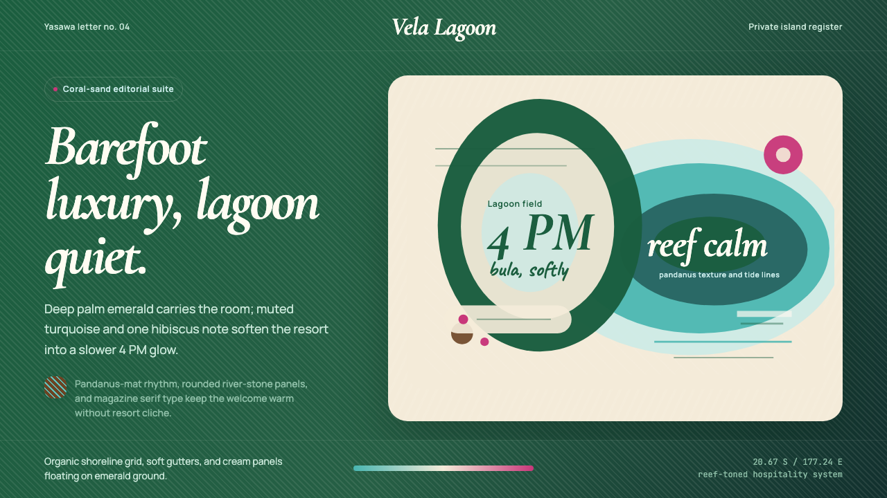 Fiji Tropical Resort Luxe ModernBarefoot luxury breathes slowly. Emerald field, cream panels, and lagoon curv…赤足奢华慢下来。深绿底、奶油面板与泻湖曲线定调。