What is Clay 2024?什么是 Clay 2024?
Clay turns the CRM into a sketchbook — warm cream pages, hand-drawn portraits, and terracotta accents that make every contact feel like a person worth remembering.Clay 把 CRM 变成一本速写本——奶油暖页、手绘人像、陶土点缀,让每一位联系人都像一个值得被记住的真实的人。
Clay 2024 in briefClay 2024 速览
Clay is a personal CRM product and the visual design system that grew around it, originating in New York and reaching its mature form between 2022 and 2024. Its aesthetic makes a deliberate argument: that software for managing human relationships should look and feel like an analog artifact — a well-worn journal, an editorial magazine spread, a sketchbook kept by someone who notices people. The result is a visual language built on warm, cream-toned backgrounds, generous serif typography, hand-drawn portrait illustrations, and a carefully limited palette anchored by terracotta and muted earth tones.Clay 是一款个人 CRM 产品,及其周围生长出来的视觉设计系统,诞生于纽约,在2022至2024年间趋于成熟。它的美学表达了一个刻意的主张:管理人际关系的软件,应当看起来、感受起来像一件模拟物件——一本被翻阅过无数次的日记、一个杂志编辑版面、一本由某个观察人的人所保存的速写本。由此形成的视觉语言,以温暖的奶油色底调、宽松的衬线字体、手绘风格的人物线描插图为基础,以陶土色和静默的大地色调为核心点缀。
Where most productivity and CRM software reaches for cool grays, tight sans-serif type, and the clinical efficiency of enterprise dashboards, Clay moves in the opposite direction. Every design decision reinforces the idea that relationships deserve warmth. Generous whitespace lets content breathe. Serif letterforms carry the same unhurried authority as a printed broadsheet. Illustrations render people as sketched outlines rather than geometric avatars or stock photographs — a choice that signals individuality over data-point legibility.大多数生产力与 CRM 软件追求冷灰色调、紧凑的无衬线字体和企业仪表板式的临床效率,Clay 则向相反方向走去。每一个设计决定都在强化同一个观念:人际关系值得温度。宽裕的留白让内容得以呼吸。衬线字形承载着宽卷纸质报刊一般不急不躁的权威感。插图以素描轮廓呈现人物,而不是几何头像或图库照片——这个选择传递出个体性,而非数据点的可读性。
The style sits at an interesting intersection: it is technically sophisticated (the underlying product handles complex contact enrichment and automation) while the surface reads as intimate and handmade. This tension is intentional. Clay belongs to a broader moment in digital product design — post-Notion warm minimalism — where tools for knowledge and relationship work began rejecting the visual vocabulary of enterprise software in favor of something closer to paper.这种风格处于一个有趣的交叉点:其底层产品技术上相当复杂(处理复杂的联系人信息补全与自动化流程),而表面却透出一种亲密与手工的质感。这种张力是刻意为之的。Clay 属于数字产品设计中一个更宏观的时刻——后 Notion 时代的温暖极简主义——在这个时刻,知识与人际关系工具开始拒绝企业软件的视觉词汇,转而趋近纸张的质感。
Where does Clay 2024 come from?Clay 2024 从何而来?
Clay was founded in 2018 by Matthew Achariam and Zachary Hamed in New York City. The founding premise was a personal one: the two founders had accumulated hundreds of professional and personal contacts in disparate systems — email, LinkedIn, phone — with no coherent way to maintain genuine relationships across them. The product they built was designed to serve as a kind of second memory for relationships, surfacing context at the right moment and reducing the friction of staying connected to people who matter.Clay 由 Matthew Achariam 与 Zachary Hamed 于2018年在纽约市共同创立。创立的出发点是个人性的:两位创始人在电子邮件、LinkedIn、手机通讯录等各自独立的系统中积累了数百位职业与私人联系人,却没有连贯的方式去维系这些真实的人际关系。他们所构建的产品,旨在充当一种人际关系的「第二记忆」——在合适的时机浮现上下文,降低与重要的人保持联系的摩擦。
The visual identity that would come to define Clay emerged more gradually. The earliest versions of the product were functional but relatively conventional in their interface design. Between 2022 and 2024, the Clay brand team undertook a significant visual rethinking, asking a foundational question: if a CRM is supposed to make relationships feel more human, why does every CRM look like a spreadsheet? The answer they arrived at drew inspiration from two traditions that had nothing to do with software — editorial magazine design, with its confident use of serif type and white space, and the analog journal, with its association with personal record-keeping and the handmade.最终定义 Clay 的视觉身份,是更为渐进地浮现出来的。早期版本的产品在界面设计上功能完善,但相对常规。2022至2024年间,Clay 的品牌团队进行了一次深入的视觉重思,提出了一个根本性的问题:如果 CRM 应该让人际关系感觉更像人,为什么每款 CRM 看起来都像一张电子表格?他们给出的答案,从两个与软件毫无关联的传统中汲取灵感——编辑杂志设计,以其对衬线字体与留白的自信运用;以及手写日记,以其与个人记录和手工质感的关联。
The hand-drawn portrait illustration style became the visual centerpiece of this redesign. Rather than using photographs of real people (which raise privacy questions) or generic geometric avatars (which feel impersonal), the team commissioned a distinctive illustration language: loose, expressive line drawings of faces and figures that suggest individuality without claiming documentary accuracy. This choice gave Clay an immediately recognizable visual signature and aligned the product's surface with its core proposition — that each contact is a full person, not a data record.手绘人像插图风格成为这次视觉重设计的视觉核心。团队没有使用真实人物照片(引发隐私问题),也没有使用通用的几何头像(感觉非人化),而是委托创作了一套独特的插图语言:松弛而富有表现力的面部与人物线描,暗示个体性,却不声称具有纪录片式的精确。这个选择赋予了 Clay 一个立刻可辨认的视觉签名,并将产品的外观与其核心主张对齐——每一位联系人都是一个完整的人,而非一条数据记录。
The warm color palette — cream backgrounds, terracotta accents, and a deliberate avoidance of the blue-gray spectrum that dominates enterprise software — was chosen to communicate approachability and personal scale. Terracotta in particular carries associations with handmade ceramics, earth, and warmth; it had become a widely used accent color in interior design and lifestyle branding in the years preceding Clay's visual evolution, and the design team's adoption of it positioned the product alongside consumer lifestyle tools rather than business infrastructure. The result was a CRM that looked, at first glance, like it might belong on a design studio's inspiration board — and that was precisely the intention.温暖的色彩方案——奶油色底调、陶土色点缀,以及对企业软件惯用的蓝灰色谱的刻意回避——是为了传达亲近感与个人化尺度。陶土色尤其带有手工陶器、泥土与温暖的联想;在 Clay 视觉演变的前几年,它已成为室内设计与生活方式品牌中被广泛使用的点缀色,设计团队对它的采用将产品定位于消费者生活方式工具一侧,而非企业基础设施。最终的成果是一款 CRM,乍看之下像是属于某个设计工作室的灵感板——而这正是刻意为之的意图。
What defines the Clay 2024 look?Clay 2024 的视觉特征是什么?
Color Palette色彩方案
The Clay palette is built around a warm cream or off-white ground that functions as a neutral field without the clinical coolness of pure white. Against this ground, terracotta — a muted, reddish-brown tone reminiscent of unglazed pottery and sun-warmed earth — serves as the primary accent, used sparingly on calls to action, highlights, and illustration details. The system deliberately avoids the blue-gray spectrum that dominates enterprise software, and cool or saturated tones appear rarely if at all. The overall effect is warm, calm, and personal — a palette that reads as handmade rather than generated.Clay 的色彩方案以温暖的奶油色或米白色为底调,作为一块中性场域,却没有纯白的临床冷感。在这个底色之上,陶土色——一种哑光的红棕色调,令人联想到未上釉的陶器与被阳光晒暖的泥土——作为主要的点缀色,克制地出现在行动号召、高亮与插图细节上。这套体系刻意回避了企业软件惯用的蓝灰色谱,冷色或高饱和色调几乎不出现。整体效果温暖、平静而私人——一套读起来像手工制作而非机器生成的色彩方案。
Typography字体排印
Serif typefaces carry the typographic weight of the Clay visual system, a choice that connects it to editorial print culture — newspapers, literary magazines, quality books — rather than to digital-native interfaces. The serifs used tend toward the classical and legible: generous letter spacing, open apertures, and a reading rhythm suited to longer texts. Headlines are set with authority but not aggression; the type feels considered rather than declarative. Body text sits in a comfortable measure that encourages reading rather than scanning, reinforcing the sketchbook-and-journal register of the overall design.衬线字体承担了 Clay 视觉系统的排版重量,这个选择将其与编辑印刷文化——报纸、文学杂志、优质书籍——相连接,而非与数字原生界面相关联。所使用的衬线字体倾向于古典且易读:宽松的字间距、开放的字形开口,以及适合较长文本的阅读节奏。标题设置得有权威感,但不咄咄逼人;字体感觉是经过深思熟虑的,而非宣示性的。正文以舒适的行宽呈现,鼓励阅读而非扫视,强化了整体设计的速写本与日记的语调。
Hand-Drawn Illustration手绘插图
The most distinctive element of the Clay visual system is its portrait and figure illustration style: loose, expressive line drawings that render people with personality rather than precision. Lines are slightly imperfect in the way a careful pencil drawing is imperfect — varied in weight, occasionally searching — suggesting a human hand rather than a geometric algorithm. Faces have expression; figures have posture. This illustration language makes a philosophical argument: the people in your CRM are individuals with character, not interchangeable data points. The style also sidesteps the privacy and representational issues of using real photographs.Clay 视觉系统中最具辨识度的元素是其人像与人物插图风格:松弛而富有表现力的线描,以个性而非精确度呈现人物。线条带有铅笔素描特有的轻微不完美——粗细有变化,偶尔有寻找感——暗示一只人手而非一个几何算法。面孔有表情,姿势有个性。这套插图语言提出了一个哲学主张:你 CRM 中的人是有性格的个体,而非可互换的数据点。这种风格也回避了使用真实照片的隐私与再现问题。
Whitespace and Breathing Room留白与呼吸感
Clay layouts are generous with space. Margins are wide, line heights are relaxed, and individual elements are given room to exist as discrete objects rather than packed into a dense information grid. This spatial generosity is not arbitrary — it communicates that each piece of content, each contact entry, each notification has value and deserves attention. The whitespace also softens the boundary between designed interface and printed page, making interactions feel less like form-filling and more like turning the pages of a well-designed book.Clay 的版面对空间慷慨。页边距宽阔,行高宽松,每个元素都有空间以独立个体而非密集信息网格中的一员存在。这种空间慷慨性不是任意的——它传达出每条内容、每个联系人条目、每条通知都有价值、值得关注。留白也柔化了设计界面与印刷页面之间的边界,让交互感觉不像填表,而更像翻阅一本设计精良的书。
Surface Texture and Material Feel表面质感与材质触感
While Clay is a digital product, its visual language consistently references physical materials — the cream of uncoated paper stock, the roughness of a sketchbook page, the warmth of natural linen or cork. Backgrounds may carry a subtle paper-like quality rather than being mechanically flat. This material warmth is achieved through color temperature and illustration choice rather than literal texture overlays, which would feel gratuitous. The goal is that surfaces feel touched rather than generated — a quality that digital tools rarely achieve and that Clay treats as a core differentiator.尽管 Clay 是一款数字产品,其视觉语言却持续引用物理材料——未涂布纸张的奶油色、速写本页面的粗糙感、天然亚麻或软木的温度。背景可能带有一种微妙的纸质感,而非机械式的平整。这种材质温度是通过色温与插图选择达成的,而非字面意义上的纹理叠加(那样会显得矫揉造作)。目标是让表面感觉像被触碰过,而非被生成——这是数字工具极少能实现的品质,也是 Clay 将其视为核心差异化点的特质。
Restrained Decoration克制的装饰
Clay does not achieve its warmth through decorative excess. Borders, when present, are thin and understated. Dividers are light and used sparingly. Interface elements — cards, inputs, toggles — are simple and clean, with enough visual interest to feel designed without ever feeling ornate. The warmth comes from the palette and illustration, not from layered embellishments. This restraint keeps the system scalable: because no single component carries heavy decorative load, additional screens and features can be added without the design feeling cluttered.Clay 并非通过装饰过剩来实现温度。边框(若存在)细而低调。分割线轻且克制地使用。界面元素——卡片、输入框、开关——简洁干净,有足够的视觉趣味让人感到经过设计,却绝不华丽繁复。温度来自色彩方案与插图,而非层叠的装饰。这种克制让系统具有可扩展性:因为没有哪个单独组件承载过重的装饰负担,额外的页面与功能可以被加入,而设计不会显得杂乱。
Editorial Hierarchy编辑式层级
Information hierarchy in Clay is organized editorially rather than bureaucratically. Rather than strict grids of equal-weight cards, layouts use varying text sizes, visual weights, and spatial relationships to guide the eye naturally — the way a magazine page leads you through a feature article, pulling you from headline to standfirst to body to pull-quote. Names and faces are prioritized; metadata and dates are secondary. This hierarchy reflects the product's values: the person is the primary entity, not the deal stage or the last-contacted timestamp.Clay 中的信息层级以编辑化的方式组织,而非科层式的。版面不采用等权重卡片的严格网格,而是通过变化的字号、视觉重量与空间关系自然引导视线——就像一个杂志版面引导你穿越一篇专题文章,从标题到导语再到正文再到引语。姓名与面孔被优先呈现;元数据与日期居次。这种层级反映了产品的价值观:人是首要的实体,而非交易阶段或最后联系时间戳。
Who shaped Clay 2024?谁塑造了 Clay 2024?
Co-founder of Clay, Achariam brought a background in community and network-building to the product's founding vision. His perspective that relationships should be treated as living, contextual connections rather than static database records shaped the core product philosophy. The decision to build something that felt genuinely personal rather than merely efficient traces back to this founding orientation, which ultimately drove the design direction toward warmth and the analog aesthetic.Clay 的联合创始人,Achariam 将社群与关系网络建设的背景带入了产品的创立愿景。他认为关系应当被视为鲜活的、有上下文的连接,而非静态数据库记录——这一视角塑造了产品的核心哲学。做出一款感觉真正私人化而非仅仅高效的产品这一决定,源于这种创立取向,并最终驱动设计方向走向温度与模拟美学。
Co-founder and technical lead of Clay, Hamed's engineering background anchors the product's ability to perform complex contact enrichment, data aggregation, and automation beneath a deliberately unhurried surface. The juxtaposition of technical depth with visual warmth — automation hiding behind hand-drawn portraits — is one of Clay's most unusual product decisions, and it reflects a design philosophy in which surface and substance are treated as equally important.Clay 的联合创始人与技术负责人,Hamed 的工程背景支撑了产品在刻意不急不躁的表面之下执行复杂联系人信息补全、数据聚合与自动化的能力。技术深度与视觉温度的并置——自动化藏在手绘人像背后——是 Clay 最不寻常的产品决定之一,它反映了一种将外观与实质同等重要对待的设计哲学。
The design and brand team responsible for the 2022–2024 visual evolution gave Clay its current aesthetic identity. The specific choices — serif typography over sans-serif, hand-drawn illustration over photography or geometric avatars, terracotta over the enterprise blue-gray default — represent a coherent series of decisions that run against the grain of prevailing SaaS visual conventions. These choices established Clay as one of the more visually distinctive productivity tools of its generation, cited widely in design discussions about warm minimalism and post-Notion aesthetics.负责2022至2024年视觉演变的设计与品牌团队赋予了 Clay 当前的美学身份。具体的选择——衬线字体而非无衬线、手绘插图而非摄影或几何头像、陶土色而非企业默认的蓝灰色——代表了一系列与主流 SaaS 视觉惯例背道而驰的连贯决定。这些选择确立了 Clay 作为其时代中视觉上最具辨识度的生产力工具之一的地位,在关于温暖极简主义与后 Notion 美学的设计讨论中被广泛引用。
Clay's design belongs to a broader movement among productivity and knowledge tools that emerged in the early 2020s as a reaction against the prevailing visual language of enterprise SaaS. Tools including Notion, Craft, and Bear established that users of knowledge-work software were willing to care about how their tools looked and felt — not just what they did. Clay extended this sensibility into the CRM category, demonstrating that the relationship between design warmth and user trust is not limited to notes or documents but applies equally to professional network management.Clay 的设计属于一个更宏观的生产力与知识工具运动,该运动在2020年代初兴起,作为对企业 SaaS 主流视觉语言的反应。Notion、Craft、Bear 等工具证明,知识工作软件的用户愿意在意工具的外观与感受——而不仅仅是功能。Clay 将这种感性延伸到了 CRM 类别,证明设计温度与用户信任之间的关系并不局限于笔记或文档,对专业人际网络管理同样适用。
How do you use Clay 2024 today?今天怎么用 Clay 2024?
Clay's visual language is most naturally at home in contexts where human connection, personal relationships, and trust are the primary subject matter. The style transfers well across slides, digital interfaces, and editorial materials, but its power comes from coherence — any application that cherry-picks isolated elements (terracotta alone, or serif type alone) without adopting the overall warmth and spatial generosity will feel like a style reference rather than a considered design system.Clay 的视觉语言在人际连接、个人关系与信任感是核心主题的语境中最为自然。这种风格在幻灯片、数字界面与编辑材料中都有良好的迁移性,但其力量来自连贯性——任何只摘取孤立元素(单独使用陶土色,或单独使用衬线字体)而不采纳整体温度与空间慷慨性的应用,都会感觉像是一次风格引用,而非一套经过深思的设计系统。
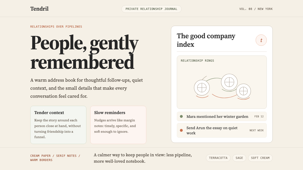
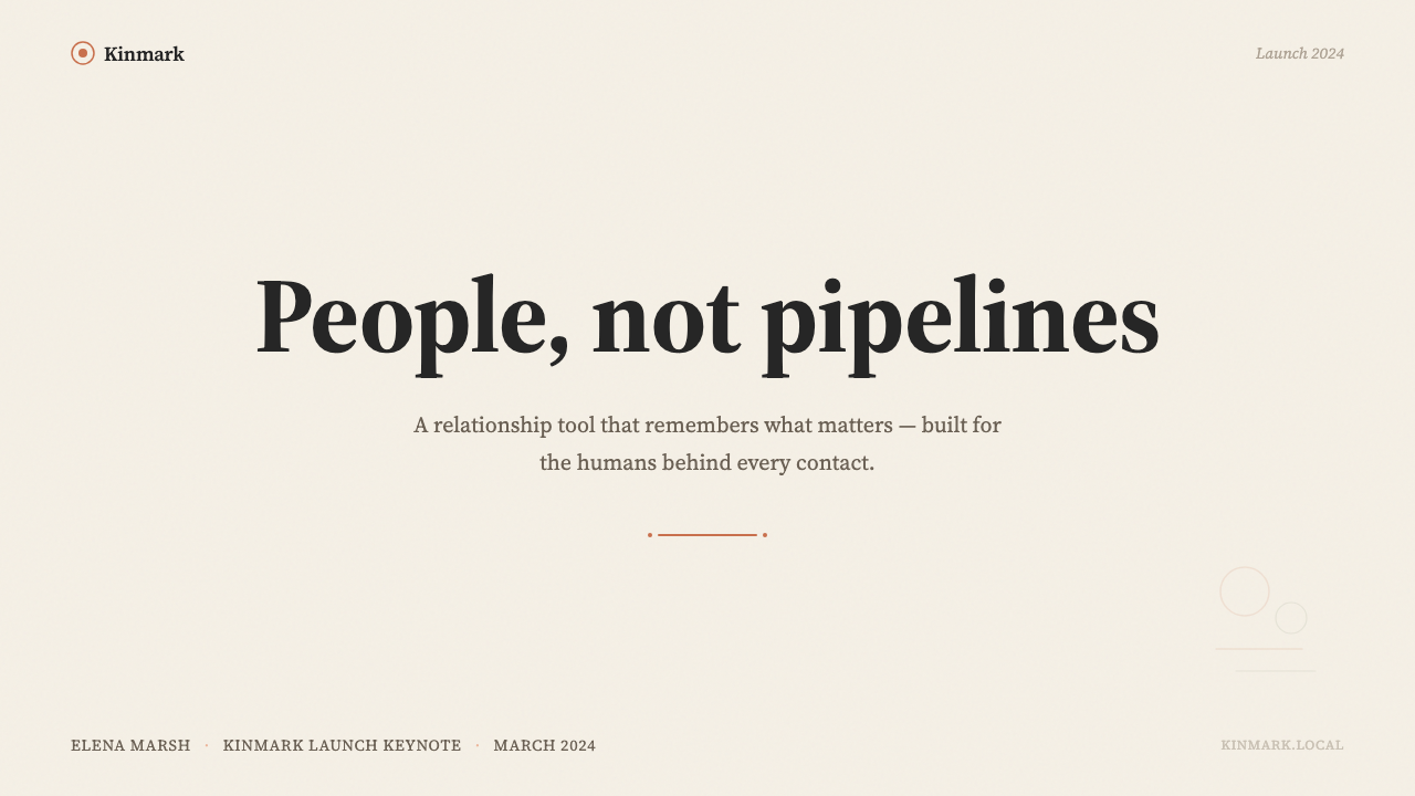
For presentation slides, the Clay aesthetic works particularly well on covers and narrative-driven content pages. A cover benefits from a centered or gently asymmetric composition: an illustration or hand-drawn figure as the focal point, a serif headline set at a generous scale, and warm cream as the page ground. Content slides should resist the impulse to densify — the style's power depends on breathing room, so each slide should carry fewer points than a standard business template would. Data slides are the most challenging context; when using Clay for charts and graphs, choose earth-toned bar fills over saturated palette colors, keep grid lines light and airy, and let the surrounding whitespace do the work of separating data from annotation.对于演示文稿,Clay 美学在封面和叙事驱动的内容页上表现尤为出色。封面适合居中或轻柔非对称的构图:一幅插图或手绘人物作为视觉焦点,衬线标题以宽松的字号设置,温暖的奶油色作为页面底调。内容页应当抵制信息密集化的冲动——这种风格的力量依赖呼吸感,每张幻灯片承载的要点应少于标准商务模板。数据页是最具挑战性的语境;在 Clay 风格下使用图表时,选择大地色系的柱填充而非高饱和色,保持网格线轻盈通透,让周围的留白去完成分隔数据与标注的工作。
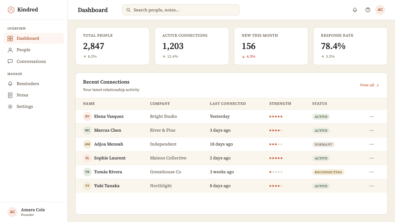
For web and product interfaces, Clay's style is well suited to dashboards, profile pages, onboarding flows, and any surface where the user is dealing with individual records or relationships. The approach: use a warm off-white or cream background as the page ground, structure content with generous padding and vertical rhythm, and use terracotta or warm amber tones only for primary interactive elements — links, active states, key call-to-action buttons. Card components should feel paper-like: a light, warm border or a very subtle warm shadow is more in character than the flat cards or cool-gray elevation shadows common in material-design systems. Avoid cool blues and greens entirely; these pull the palette back toward the enterprise register the style is actively rejecting.对于网页和产品界面,Clay 的风格适合仪表板、个人资料页、引导流程以及任何用户需要处理个人记录或关系的页面。方法是:以温暖的米白色或奶油色作为页面底调,以宽松的内边距与垂直节奏组织内容,仅对主要交互元素——链接、激活状态、关键行动号召按钮——使用陶土色或暖琥珀色调。卡片组件应当有纸质感:轻盈的暖色边框或极其微妙的暖色阴影,比扁平卡片或 Material Design 系统中常见的冷灰色层叠阴影更契合风格气质。完全避免冷蓝色与绿色;这些颜色会将色彩方案拉回该风格正在主动拒绝的企业语调。
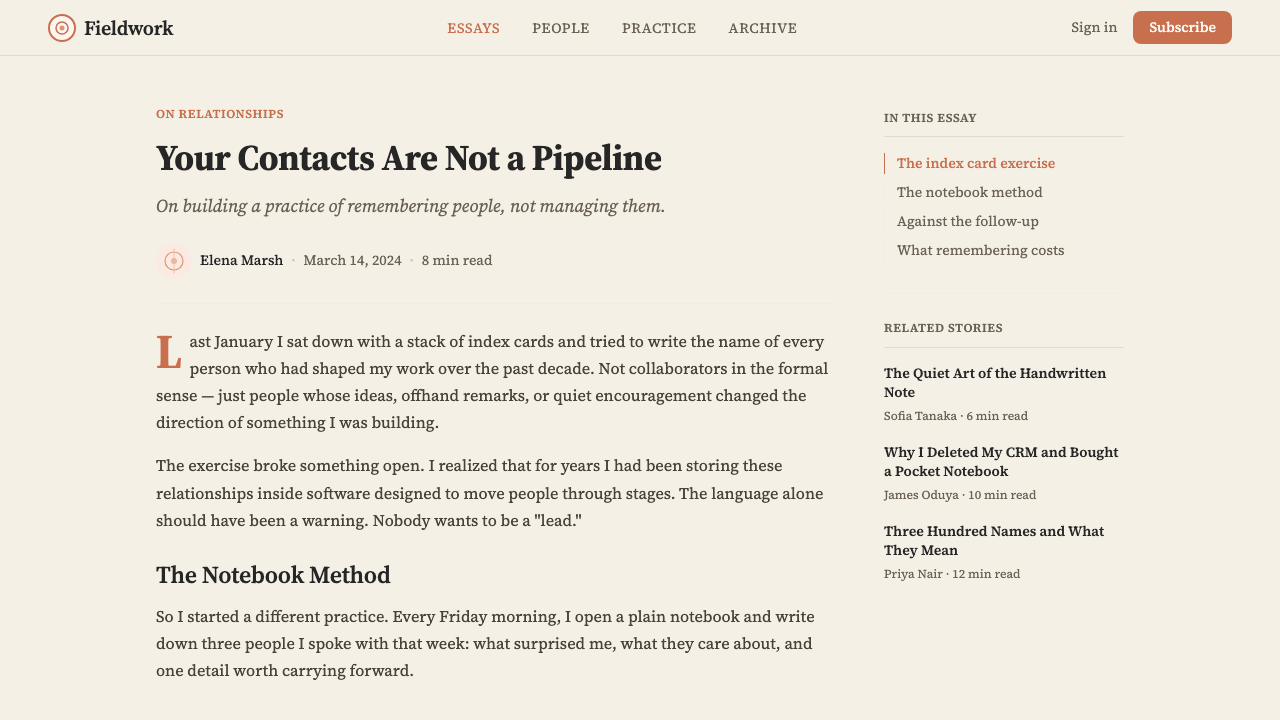
For editorial and marketing materials — landing pages, newsletters, printed collateral — the Clay aesthetic supports a magazine-quality reading experience. Body text should sit in a comfortable narrow-to-medium column measure with generous line height. Section breaks are best marked by spatial generosity (extra vertical spacing) rather than ruled lines or decorative dividers. Pull quotes and callouts work well when set in a larger serif size against a warm accent background. Marketing headlines benefit from the confident, unhurried quality of well-set serif display type rather than bold sans-serif constructions. Use illustration as the primary visual element rather than photography; where photography is necessary, warm-toned images with soft natural light align better with the overall palette than high-contrast or studio-lit shots.对于编辑和营销材料——落地页、电子邮件通讯、印刷品——Clay 美学支持杂志品质的阅读体验。正文应以舒适的中等偏窄行宽与宽松的行高呈现。段落分隔最好用空间慷慨性(额外的垂直间距)而非直线或装饰性分隔符来标记。引语与标注在较大的衬线字号配合暖色调背景下效果良好。营销标题适合使用经过精心设置的衬线展示字体所具有的自信而不急不躁的气质,而非粗黑无衬线的构造。使用插图作为主要视觉元素而非摄影;若摄影必不可少,暖色调、自然柔光的图像比高对比度或棚拍照片更契合整体色彩方案。
A common mistake when applying the Clay aesthetic is reaching for warmth through color saturation — adding more terracotta, more orange, more richness — when the style's warmth actually comes from restraint and spatial intelligence. Saturating the palette produces something closer to boho or artisanal branding than to the quiet editorial confidence Clay projects. Similarly, the hand-drawn illustration style is frequently imitated badly by applying a rough-texture filter to otherwise conventional vector illustrations; authentic character comes from the line quality and compositional looseness of genuine drawing, not from a post-process effect. Another frequent error is combining the warm palette with cool-toned or geometric sans-serif type — the resulting visual tension undermines the system's coherence and produces something that reads as merely eclectic rather than considered.应用 Clay 美学时最常见的错误,是通过提高色彩饱和度来追求温度——加入更多陶土色、更多橙色、更多丰富感——而这种风格的温度实际上来自克制与空间智慧。色彩饱和化产生的效果更接近波西米亚或手工匠人品牌,而非 Clay 所投射的那种静谧编辑自信。同样,手绘插图风格常常被拙劣地模仿——对本质上普通的矢量插图应用粗糙纹理滤镜;真实的性格来自真实绘画的线条质量与构图的松弛感,而非后处理效果。另一个常见错误是将暖色调与冷色调或几何形无衬线字体组合——由此产生的视觉张力破坏了系统的连贯性,让结果读起来只是杂折而非深思熟虑。
Clay 2024 — FAQClay 2024 · 常见问题
Is Clay style the same as warm minimalism?Clay 风格和温暖极简主义是同一回事吗?
Clay belongs to the warm minimalism family but is more specific than the general category. Warm minimalism describes a broad sensibility — cream grounds, restrained palettes, organic forms, generous whitespace — that spans interior design, graphic design, and digital product design. Clay's contribution to this category is the hand-drawn portrait illustration system and the particular terracotta accent that gives it its identity. Remove those two elements and you have generic warm minimalism; include them and you have something distinctly Clay. The distinction matters when applying the style: you can borrow the warmth without borrowing the specific illustration vocabulary, or you can lean fully into both and claim the full visual identity.Clay 属于温暖极简主义的家族,但比这个宽泛的类别更为具体。温暖极简主义描述了一种跨越室内设计、平面设计与数字产品设计的宽泛感性——奶油色底调、克制的色彩、有机形态、宽裕的留白。Clay 对这个类别的贡献在于手绘人像插图系统,以及赋予其身份的特定陶土色点缀。去掉这两个元素,你得到的是通用的温暖极简主义;加上它们,你得到的是明确属于 Clay 的东西。这个区别在应用风格时很重要:你可以借用温度而不借用具体的插图词汇,也可以完全融入两者,接收完整的视觉身份。
Can Clay's visual language work for a B2B SaaS product that is not a CRM?Clay 的视觉语言能用于非 CRM 类的 B2B SaaS 产品吗?
Yes, with careful consideration of fit. Clay's visual language is appropriate for any B2B product where the end user is a person managing relationships with other people — recruitment tools, investor relations platforms, advisory or consulting dashboards, community management tools. It is less appropriate for products where the primary content is quantitative data, technical infrastructure, or highly procedural workflows; in those contexts, the warmth can feel like a mismatch between the visual promise and the actual product experience. The most important question is whether the product's core value proposition is about human connection — if yes, the style can reinforce that; if not, it risks creating a tone mismatch.可以,但需要仔细考量适配性。Clay 的视觉语言适合任何以人管理与他人关系为核心的 B2B 产品——招聘工具、投资者关系平台、顾问或咨询仪表板、社群管理工具。对于主要内容是定量数据、技术基础设施或高度程序化工作流的产品,则不那么适合;在这些语境中,温度感可能让视觉承诺与实际产品体验之间产生错位。最重要的问题是:产品的核心价值主张是否与人际连接有关——如果是,这种风格可以强化它;如果不是,则存在制造语调错位的风险。
How do I handle dark mode with the Clay palette?如何在 Clay 色彩方案下处理深色模式?
Clay's visual identity is built for a light ground; dark mode is a genuine challenge for this style. A direct inversion — swapping cream for dark brown or near-black — loses most of the warmth because the palette's warmth is largely carried by the background tone itself. A more successful approach is to use a very dark warm brown (leaning toward chocolate or espresso rather than cool charcoal) as the dark ground, maintain terracotta and warm amber as accent colors, and keep the illustration style present but adjust line weights so they remain legible at low contrast. The risk is that dark Clay can slide toward a generic dark-warm look unless the illustration language is preserved intact.Clay 的视觉身份是为浅色底调而生的;深色模式对这种风格是真正的挑战。直接反转——用深棕色或近黑色替换奶油色——会失去大部分温度,因为色彩方案的温度在很大程度上由背景色调本身承载。更成功的方法是使用非常深的暖棕色(趋向巧克力色或浓缩咖啡色,而非冷炭灰色)作为深色底调,保留陶土色与暖琥珀色调作为点缀色,保留插图风格但调整线条粗细以确保在低对比度下仍可辨读。风险在于,如果插图语言未能完整保留,深色 Clay 可能滑向通用深色温暖外观。
What separates Clay from other editorial-inspired product design styles?Clay 与其他受编辑设计启发的产品设计风格有何区别?
Several editorial-influenced product styles exist — Notion's clean sans-serif document feel, Linear's dense typographic precision, Craft's paper-like layering. Clay's specific differentiators are the portrait illustration vocabulary and the terracotta-anchored earth palette. Editorial styles tend to prioritize content density and reading efficiency; Clay prioritizes the representation of individual people. The illustrations are the most distinctive marker: other editorial-influenced tools use photography, geometric icons, or simple monochrome illustration, while Clay's loose-line portrait style is tied specifically to its product premise — that each contact is a person worth depicting. This makes the style difficult to decontextualize from its origin without losing the feature that makes it memorable.存在几种受编辑设计影响的产品风格——Notion 干净的无衬线文档感、Linear 密集的排版精确性、Craft 的纸质层叠感。Clay 的具体差异化点在于人像插图词汇和以陶土色为核心的大地色彩方案。编辑风格倾向于优先考量内容密度与阅读效率;Clay 优先考量个体人物的呈现。插图是最具辨识度的标志:其他受编辑设计影响的工具使用摄影、几何图标或简单的单色插图,而 Clay 松弛的线描人像风格与其产品前提紧密绑定——每位联系人都是一个值得被描绘的人。这使得这种风格很难在不失去其最令人难忘的特征的情况下脱离原始语境被借用。
Does Clay's aesthetic require custom illustration, or can it be approximated with stock assets?Clay 的美学是否需要定制插图,还是可以用素材库资源近似替代?
The authentic Clay aesthetic depends heavily on the specific character of its illustration style — the looseness of line, the particular way faces are suggested rather than fully rendered, the variety of posture and expression across the contact portraits. Stock illustration libraries occasionally offer similar loose-line portrait styles, but they tend toward either greater polish (more finished, uniform line quality) or lesser personality (generic faces without the sketchbook quality). If custom illustration is not an option, the closest approximation is to select a single stock illustration family with consistent loose-line style and commit to it throughout — mixing styles, or alternating between illustration and photography, undermines the coherence that makes the system work. The palette and typography can carry significant warmth even without illustration, but the distinctive Clay identity depends on the portraits.真实的 Clay 美学在很大程度上依赖其插图风格的特定性格——线条的松弛感、面孔被暗示而非被完整描绘的特定方式、联系人人像之间姿态与表情的多样性。素材库偶尔提供类似的松弛线描人像风格,但它们倾向于更高的抛光度(线条质量更完成、更统一)或更低的个性感(缺乏速写本质感的通用面孔)。如果定制插图不可行,最接近的近似方法是从素材库中选取一个具有一致松弛线条风格的插图家族,并在整体中坚持使用——混用风格,或在插图与摄影之间交替,会破坏让系统发挥作用的连贯性。即使没有插图,色彩方案与排版也能承载相当的温度,但 Clay 的独特身份依赖于人像。
Related design styles相关设计风格
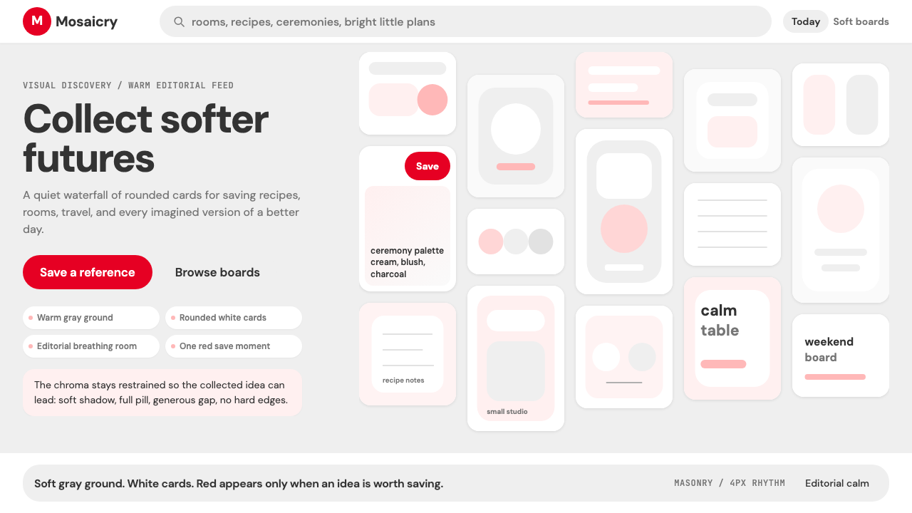 Pinterest 2024Aspirational calm. Warm gray masonry, rounded white pins, one surgical red sa…向往感很安静:暖灰瀑布流、白色圆角卡片、一颗红色保存按钮。
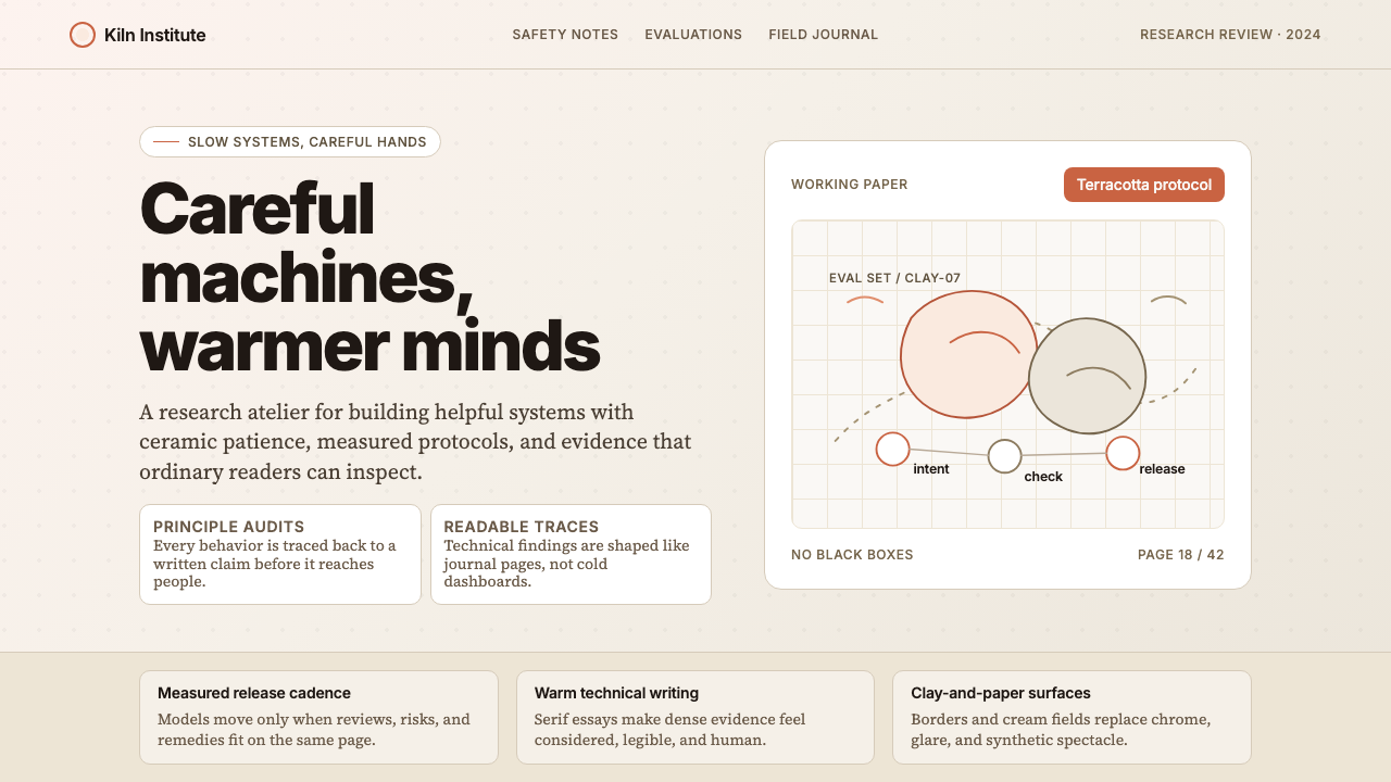 Anthropic ClayAI safety in handmade clay. Sand backgrounds, terracotta accents, serif body…用手工陶土包裹的 AI 安全感:沙色背景、赤陶点缀、衬线正文——缓慢、刻意、有…
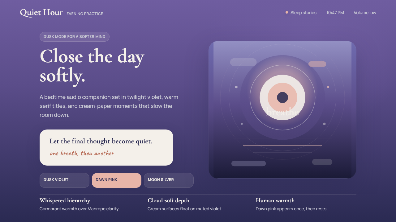 Calm App Purple MeditationWhispers at bedtime. Dusk-purple gradients, cream serif type, and dawn-pink w…睡前低语。暮紫渐变、奶油衬线与黎明粉暖意。
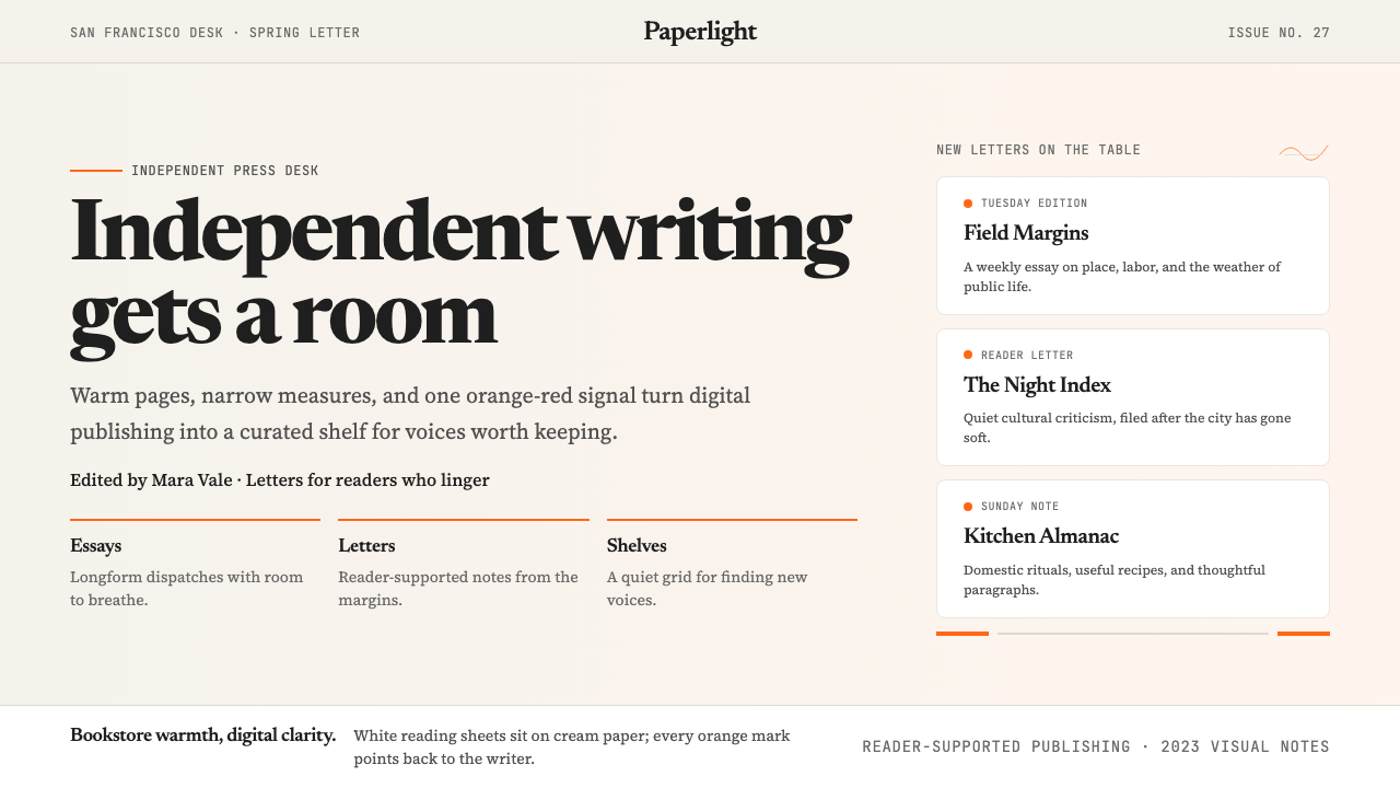 Substack 2023Writing feels shelved, not streamed. Cream paper, Newsreader serif, and one o…写作像上架而非信息流:奶油纸底、Newsreader 衬线与橙红信号。
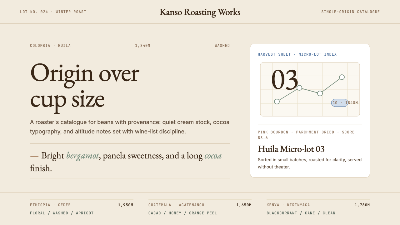 Third Wave CoffeeCoffee as catalogue. Cream paper, cocoa serif, mono origin specs, one sage no…咖啡如图录:奶油纸底、可可衬线、等宽产地规格与鼠尾草绿。
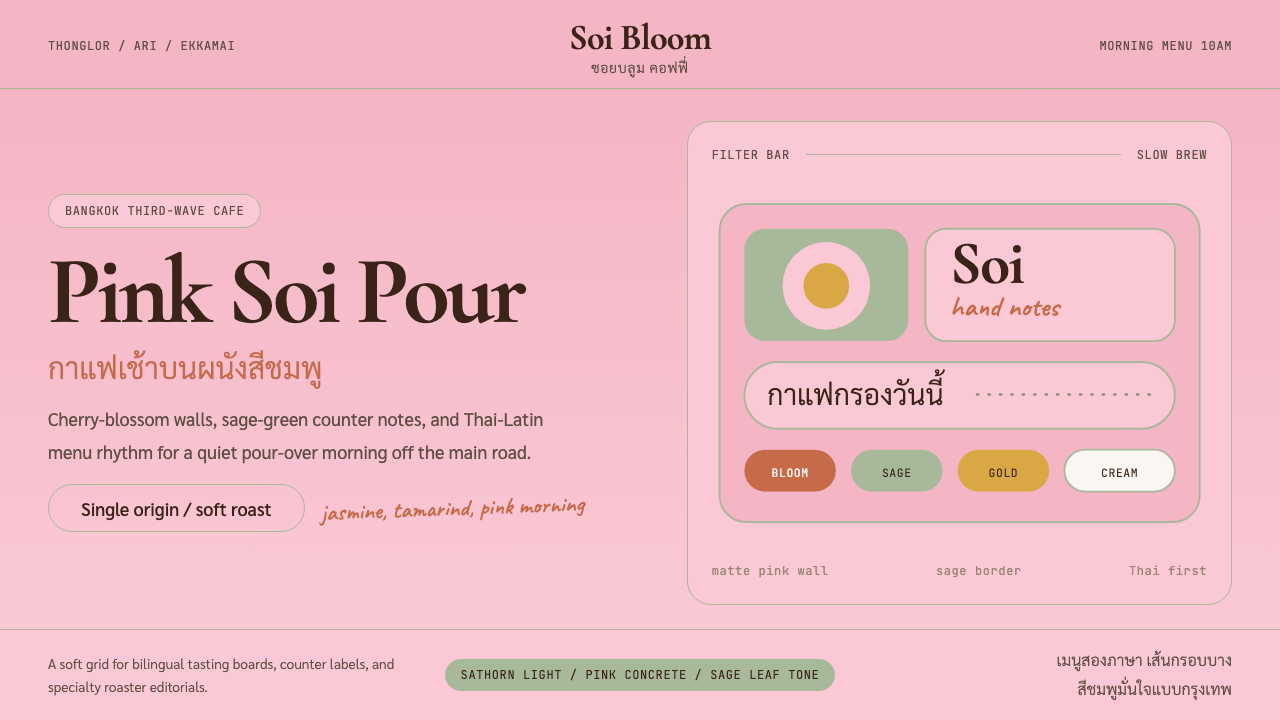 Bangkok Third-Wave CafeBangkok feels soft but sure. Cherry pink, sage borders, and Thai-Latin menu r…曼谷柔和却自信:樱花粉、鼠尾草边框与泰英菜单节奏。