What is Third Wave Coffee?什么是 Third Wave Coffee?
Third Wave Coffee turned the café into a catalogue — single-origin reverence, pour-over ritual, and the quiet confidence of a design language borrowed from fine-art publishing.第三波咖啡把咖啡馆变成了图录——单一产地的敬意、手冲的仪式感,以及从精装艺术出版物借鉴而来的沉静设计语言。
Third Wave Coffee in briefThird Wave Coffee 速览
Third Wave Coffee is a specialty-coffee philosophy and its attendant aesthetic — an artisanal counter-reformation to the second-wave model of standardized roasts, drive-through convenience, and branded scale. Where second-wave chains offered familiarity, the third wave offered specificity: the altitude at which a bean was grown, the farmer who picked it, the exact processing method that shaped its flavor. That commitment to origin and craft required a new visual language, one that could communicate connoisseurship without condescension.第三波咖啡是一种精品咖啡哲学及其附带的美学——对第二波模式(标准化烘焙、得来速便利、品牌化规模)的工艺化回应。第二波连锁店提供的是熟悉感,第三波提供的是具体性:一粒豆子生长的海拔、采摘它的农民、塑造其风味的确切处理法。对产地与工艺的这种承诺需要一套新的视觉语言——一套能够传达鉴赏力而不带傲慢的语言。
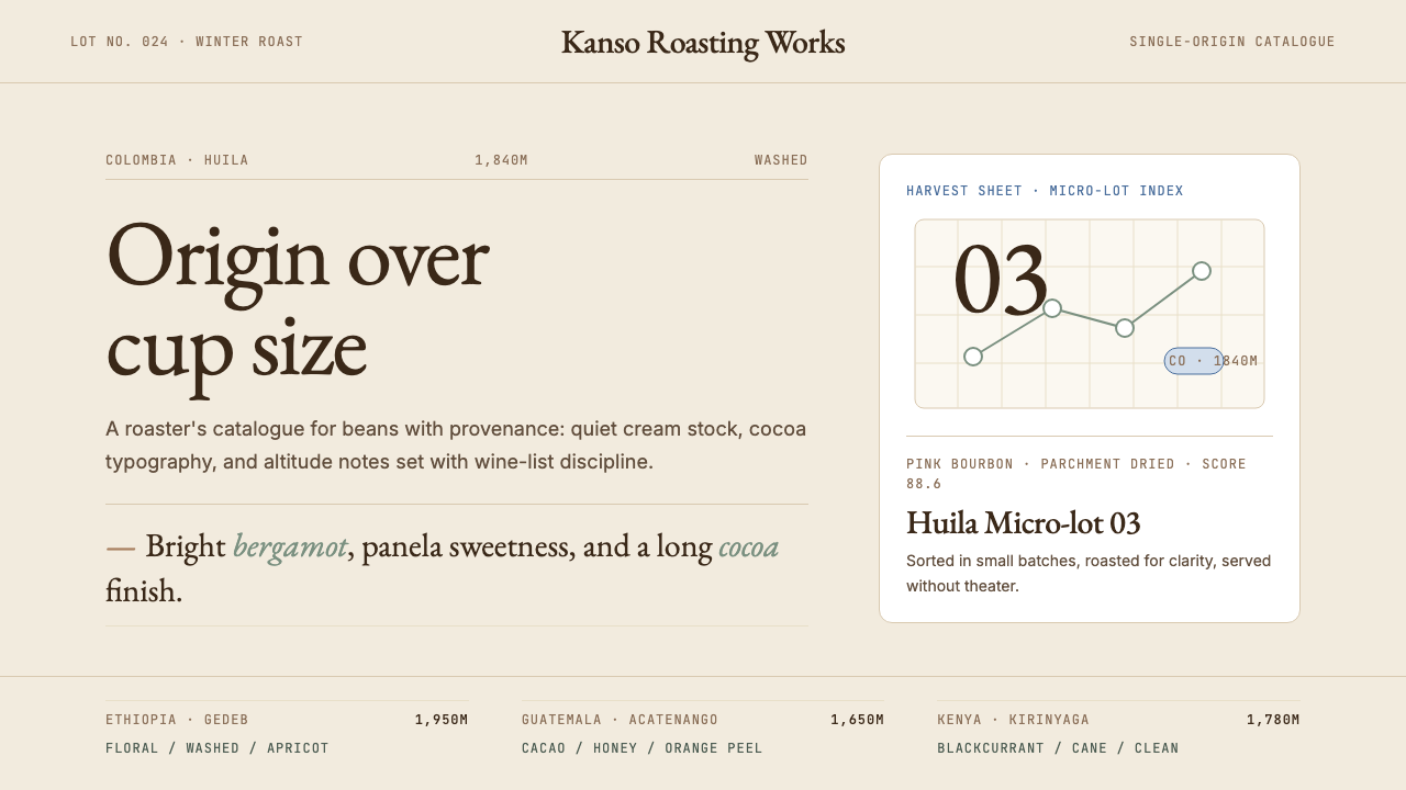
Visually, the style reads like a fine-art catalogue rather than a café menu. Oat-milk cream serves as the ground. Deep cocoa brown carries body text and labeling. A muted sage or olive accent — a single, restrained note — marks category or distinction without demanding attention. Monospace type lists varietal, altitude, and processing data with the precision of scientific notation. Generous whitespace creates breathing room that signals there is nothing superfluous here, that everything present was chosen.在视觉上,这种风格读起来像一份精装艺术图录,而非咖啡菜单。燕麦奶奶油色作为底色,深可可棕承载正文与标注,一抹静默的鼠尾草绿或橄榄绿——单一而克制的点缀——标示类别或区别,却不抢夺注意力。等宽字体以近乎科学记法的精准度排列品种、海拔与处理法数据。充裕的留白制造呼吸空间,传达出一种信号:这里没有任何多余之物,所有出现的元素都经过了选择。
The aesthetic owes a deliberate debt to Japanese design culture — the influence of single-object presentation, extreme material care, and the discipline of omission. Blue Bottle's visual identity, developed after its 2002 Oakland founding, became the most widely recognized expression of this grammar: a round logo, cream stock, classical serif headings, and a layout philosophy closer to a museum gift-shop catalogue than to a commercial menu board.这套美学对日本设计文化怀有刻意的借鉴之情——单一物品呈现的影响、极致的材料关怀,以及省略的自律。Blue Bottle 于 2002 年在奥克兰创立后逐步发展出的视觉识别,成为这套语法最广为人知的表达:圆形标志、奶油色纸张、古典衬线标题,以及比起商业菜单板更接近博物馆礼品店图录的版面哲学。
See the Third Wave Coffee design system查看 Third Wave Coffee 完整设计系统
Where does Third Wave Coffee come from?Third Wave Coffee 从何而来?
The phrase 'third wave' was coined by Trish Rothgeb in a 2002 trade journal essay. She mapped coffee's trajectory: the first wave was commodification — canned supermarket coffee, coffee as a utility. The second wave, represented by Starbucks and Peet's, introduced café culture, espresso drinks, and the concept of 'premium' coffee, but ultimately systematized that premium into another form of mass production. The third wave, Rothgeb argued, was a return to the bean itself — its growing region, its varietal genetics, its processing, its roaster relationship. Coffee was to be understood and discussed the way wine had been for decades.「第三波」这个短语由 Trish Rothgeb 在 2002 年的一篇行业期刊文章中创造。她描绘了咖啡的轨迹:第一波是商品化——罐装超市咖啡,咖啡作为日用品;第二波以星巴克和 Peet's 为代表,引入了咖啡馆文化、意式浓缩饮品和「优质」咖啡的概念,但最终将这种优质也系统化为另一种大规模生产;第三波,Rothgeb 认为,是回归豆子本身——它的产区、品种遗传、处理法、与烘焙师的关系。咖啡应该像葡萄酒数十年来被理解和讨论的方式那样被对待。
The founding institutions emerged from three American cities in roughly a decade. Intelligentsia opened in Chicago in 1995, Stumptown in Portland in 1999, Counter Culture in Durham in 1995, and Blue Bottle in Oakland in 2002 — launched by James Freeman from a kiosk at a farmers' market, roasting in a small garage space. Each developed direct-trade relationships with farmers rather than buying through commodity brokers, and each built a corresponding visual identity that communicated this seriousness. The geography was deliberate: all three cities had active artisan food cultures, design-literate consumer bases, and proximity to the Pacific Rim, which made Japanese influence natural.创立机构在大约十年间从三个美国城市涌现。Intelligentsia 1995 年在芝加哥开业,Stumptown 1999 年在波特兰,Counter Culture 1995 年在达勒姆,Blue Bottle 2002 年在奥克兰——由 James Freeman 从一个农夫市集的摊位起家,在一间小车库里烘焙。每家店都与农民建立了直接贸易关系,而非通过商品经纪商购买,每家也都构建了相应的视觉识别,以传达这种严肃性。地理选择是刻意的:三座城市都拥有活跃的工匠食品文化、设计素养较高的消费群体,以及毗邻环太平洋的地理位置,这使日本影响的渗透顺理成章。
Japan was not merely an influence but a parallel tradition. Tokyo's specialty coffee culture — built around meticulous hand-pour techniques, Hario V60 and Kalita Wave brewers, and a deep respect for single-origin beans — had developed largely independently. When American third-wave practitioners began visiting Japan in the late 1990s and early 2000s, they found a fully realized aesthetic grammar: wooden fixtures, ceramic vessels, unbleached paper filters, chalk-lettered chalkboards, restrained color, and the discipline of extreme slowness. That grammar traveled back and became inseparable from the North American movement's visual identity.日本不仅仅是一种影响,更是一条平行传统。东京的精品咖啡文化——围绕精细手冲技术、Hario V60 与 Kalita Wave 冲煮器、以及对单一产地豆的深切敬重建立起来——在很大程度上是独立发展的。当北美第三波从业者在 1990 年代末和 2000 年代初开始访问日本时,他们发现了一套完整成熟的美学语法:木质装置、陶瓷器皿、未漂白纸质滤纸、粉笔手写黑板、克制的色彩,以及极致缓慢的自律。这套语法被带回并与北美运动的视觉识别融为一体,难以分割。
The design aesthetic coalesced around 2008 to 2012, as the movement matured and its leading brands began working with professional designers and architects. Blue Bottle commissioned minimalist café interiors — exposed wood, white walls, natural light — and developed packaging that looked more like art-book endpapers than food labels. Stumptown's printed materials used letterpress printing, uncoated stock, and hand-drawn illustration with a vintage-apothecary register. By 2015, the Third Wave visual language had become recognizable enough to be replicated: cream backgrounds, monospace origin specs, classical serif type, and a single muted accent color had become shorthand for 'specialty coffee' whether the underlying product justified it or not.设计美学在 2008 至 2012 年间凝固成形,彼时运动已成熟,其领先品牌开始与专业设计师和建筑师合作。Blue Bottle 委托设计了极简主义的咖啡馆室内——裸露的木材、白色墙壁、自然采光——并开发出更像艺术书籍环衬纸而非食品标签的包装。Stumptown 的印刷材料使用活版印刷、无涂层纸张与带有复古药剂师气质的手绘插图。到 2015 年,第三波视觉语言已足够清晰可辨以至于被广泛复制:奶油色背景、等宽产地规格、古典衬线字体、单一静默强调色,成为「精品咖啡」的视觉简写——无论背后的产品是否真正配得上这套语言。
The movement's visual maturity coincided with the broader cultural rise of craft-goods aesthetics — small-batch whiskey, artisan bread, natural wine — all of which developed adjacent visual vocabularies around the same period. Third Wave Coffee distinguished itself within this cluster by its particular debt to catalogue and archival design: the sensibility that a product worthy of study deserves a document worthy of study. The result is a design language unusually comfortable with density of information — origin cards, flavor-note ladders, brew-ratio tables — presented in a format that never feels cluttered because whitespace is treated as structure, not remainder.这场运动视觉语言的成熟,与工匠商品美学的更广泛文化崛起同步——小批量威士忌、手工面包、自然酒——所有这些都在同期发展出相邻的视觉词汇。第三波咖啡在这一族群中凭借其对图录与档案设计的特殊借鉴而自我区分:一件值得研究的产品,理应配备一份值得研究的文件。结果是一套异常自在地承载信息密度的设计语言——产地卡片、风味音阶、冲煮比例表——呈现于一种从不显得拥挤的格式中,因为留白被当作结构而非余量。
What defines the Third Wave Coffee look?Third Wave Coffee 的视觉特征是什么?
Color Palette色彩体系
The palette is anchored by oat-milk cream as the dominant ground — warmer than white, with just enough yellow-beige undertone to evoke paper stock and natural materials. Deep cocoa brown replaces black for body text and borders, keeping the overall register warm and analogue rather than digital and cool. A single muted accent — typically a desaturated sage, olive, or dusty terracotta — marks interactive elements, category indicators, or origin highlights. High-chroma colors are almost entirely absent; saturation is treated as a scarcity resource, spent only where the hierarchy demands a single point of visual arrival.色板以燕麦奶奶油色作为主导底色——比白色更暖,带有足够的黄米色底调以唤起纸质感与天然材料感。深可可棕取代黑色用于正文与边框,使整体气质保持温暖与模拟感,而非数字与冷峻。单一静默的强调色——通常是去饱和的鼠尾草绿、橄榄色或尘土赤陶色——标示交互元素、类别指示或产地高亮。高饱和色几乎完全缺席;饱和度被当作稀缺资源,只在层级要求单一视觉焦点时才被支出。
Typography System字体排印体系
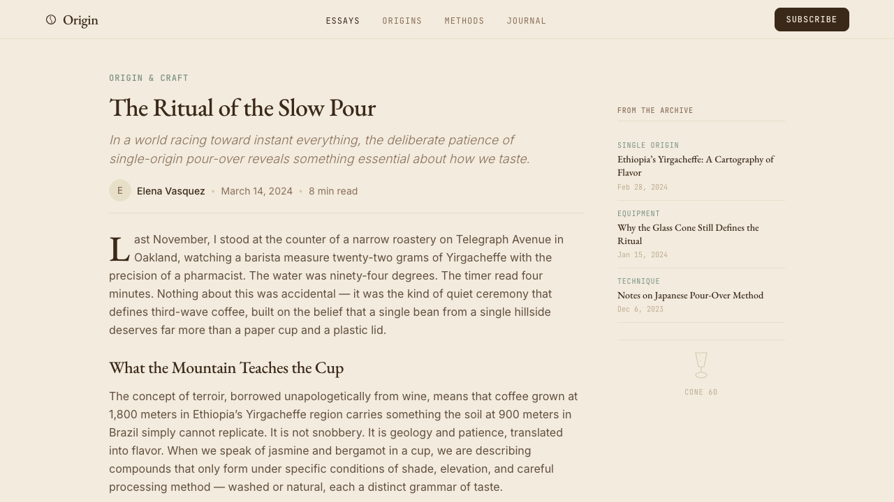
The typographic hierarchy runs on two contrasting registers. Classical serif type — old-style proportions, optical contrast between thick and thin strokes — carries headlines and brand names, lending the authority of fine publishing. Monospace type handles all specification data: varietal names, altitude ranges, processing methods, brew ratios. This pairing is not decorative; it is semantic. The serif says 'this is a brand with a philosophy'; the monospace says 'these are facts that can be verified.' Body text is set at a generous measure with ample line spacing, treating readability as a form of respect for the reader's attention.字体层级在两种对比性字型风格之间运行。古典衬线字体——旧式字体比例、粗细笔画之间的光学对比——承载标题与品牌名称,赋予精装出版物式的权威感。等宽字体处理所有规格数据:品种名称、海拔区间、处理法、冲煮比例。这种搭配并非装饰性的,而是语义性的。衬线字体说的是「这是一个有哲学的品牌」;等宽字体说的是「这些是可以被验证的事实」。正文以充裕的行宽与充足的行距排版,将可读性视为对读者注意力的一种尊重。
Whitespace as Structure留白作为结构
Third Wave Coffee design treats whitespace not as empty space left over after content is placed, but as an active structural element. Margins are unusually generous — often wider than the content column itself on either side. Elements are isolated rather than grouped; a single product specification card floats in a field of cream rather than sitting in a dense grid. This spatial discipline communicates that each item deserves individual consideration, mirroring the philosophy that each bean, each varietal, each farm has a story worth separate attention. The effect on the viewer is one of deliberate slowness — the layout physically paces the reader.第三波咖啡设计将留白视为内容放置后剩余的空白,而是将其视为主动的结构性元素。页边距异常宽裕——两侧通常比内容栏本身还宽。元素是孤立呈现而非聚拢分组的;单张产品规格卡片浮置于奶油色底面,而非坐落在密集网格中。这种空间自律传达出每件物品都值得单独品鉴的信息,映照出每一粒豆子、每一种品种、每一个农场都有着值得独立关注的故事的哲学。对观者而言,其效果是一种刻意的缓慢感——版面在物理层面上引导着读者的节奏。
Photography and Materiality摄影与材料感
Photography is warm-toned, shallow-focused, and material in emphasis. The subject is typically the bean, the vessel, the hand, or the landscape — not the experience or the lifestyle. Shots are often taken in natural side-light that reveals surface texture: the bloom of a freshly poured Chemex, the grain of a wooden bar, condensation on a ceramic. Backgrounds are soft and out of focus but identifiably natural — linen, wood, matte ceramic — never a pure digital white sweep. The result is photographic warmth that contrasts productively with the typographic precision of the specification data alongside it.摄影是暖色调的、浅景深的、以材料感为重心的。拍摄对象通常是豆子、容器、手或风景——而非体验或生活方式。照片常以自然侧光拍摄,揭示表面质感:新倒 Chemex 的绽放、木质吧台的纹理、陶瓷器上的冷凝水。背景是柔焦但可识别为自然材料的——亚麻、木材、哑光陶瓷——绝非纯数字白色背景。结果是一种摄影的温暖,与并置的规格数据的字体精准形成富于生产性的对比。
Origin Labeling as Aesthetic产地标注作为美学
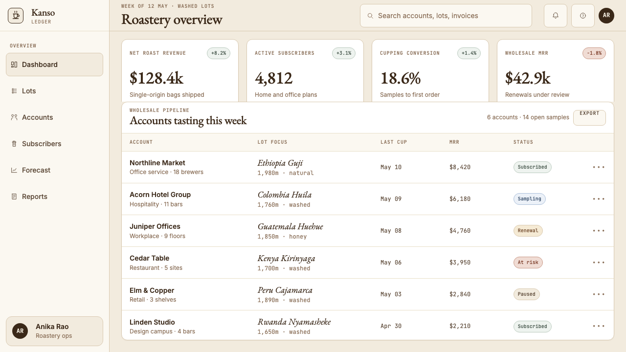
Specification data — farm name, country, region, varietal, altitude, harvest year, processing method, flavor notes — is not tucked away on a side panel but placed prominently as a design element in its own right. Arranged in a clean vertical stack using monospace type, these details function visually like a catalogue entry or a scientific specimen label. The implicit argument is that provenance is as beautiful as the product itself. This treatment was pioneered in the movement's early printed materials and has since become a standard visual signal for quality positioning across the entire specialty food and beverage sector.规格数据——农场名称、国家、产区、品种、海拔、采收年份、处理法、风味注记——不是被塞进侧边栏,而是作为独立的设计元素被显著呈现。以等宽字体整齐地纵向排列,这些细节在视觉上的功能如同图录条目或科学标本标签。其隐含的论点是:溯源本身与产品本身一样美。这种处理方式在运动早期的印刷材料中率先出现,此后已成为整个精品食品与饮料行业质量定位的标准视觉信号。
Craft and Restraint工艺感与克制
Every material choice communicates deliberateness: uncoated or lightly textured paper stock over glossy; letterpress or offset printing over digital inkjet; ceramic or wooden surfaces over plastic or stainless steel. In digital contexts, this translates to matte finishes, restrained interaction patterns, and the absence of decorative motion. Hover states are subtle — a shift in text weight rather than a color flood, a thin underline rather than a highlight box. The aesthetic refuses to be enthusiastic in ways that feel performative; it trusts the quality of the underlying content to carry the experience.每一种材料选择都传达出刻意性:无涂层或轻纹理纸张优于铜版纸;活版印刷或胶版印刷优于数字喷墨;陶瓷或木质表面优于塑料或不锈钢。在数字语境中,这转化为哑光质感、克制的交互模式,以及装饰性动效的缺席。悬停状态是微妙的——字重的移位而非色彩漫溢,细下划线而非高亮盒子。这套美学拒绝以表演性的方式表达热情;它信任底层内容的质量足以承载整体体验。
Japanese Minimalism Influence日本极简主义的影响
The debt to Japanese design — particularly the aesthetics of the kissaten (traditional Japanese coffee house), Japanese packaging culture, and the design philosophy of single-object reverence — is structural rather than superficial. It shows in the commitment to asymmetric, off-center composition; in the use of natural materials presented without treatment or finish; in the discipline of giving each element substantial breathing room; and in the preference for suggestion over declaration. Where Western commercial design often tells the viewer what to feel, Third Wave Coffee aesthetics show the object and trust the viewer to arrive at feeling independently.对日本设计的借鉴——特别是喫茶店(日本传统咖啡馆)的美学、日本包装文化,以及单一物品敬意的设计哲学——是结构性的而非表面性的。它体现在对不对称、偏心构图的坚守;体现在使用未经处理或饰面的天然材料;体现在给每个元素充足呼吸空间的自律;以及体现在对暗示而非宣告的偏好。西方商业设计常常告诉观者应该感受什么,而第三波咖啡美学则呈现物件,信任观者能独立抵达感受。
See the Third Wave Coffee design system查看 Third Wave Coffee 完整设计系统
Who shaped Third Wave Coffee?谁塑造了 Third Wave Coffee?
Freeman founded Blue Bottle Coffee in Oakland in 2002, initially roasting beans in a small garage and selling from a kiosk at a Bay Area farmers' market. His obsessive attention to freshness — refusing to sell beans more than forty-eight hours out of the roaster — and his insistence on clean, minimal visual presentation became the template for the Third Wave café model. Blue Bottle's design sensibility, developed under Freeman's direction, is widely credited with bringing fine-publishing visual standards into specialty coffee retail and influencing how dozens of subsequent roasters positioned their brands.Freeman 于 2002 年在奥克兰创立了 Blue Bottle Coffee,最初在一间小车库烘焙豆子,并在湾区农夫市集的摊位销售。他对新鲜度的执着追求——拒绝销售出炉超过四十八小时的豆子——以及他对简洁极简视觉呈现的坚持,成为第三波咖啡馆模式的模板。Blue Bottle 在 Freeman 主导下发展出的设计感性,被普遍认为将精装出版物式的视觉标准带入了精品咖啡零售领域,并影响了数十家后续烘焙商的品牌定位。
Sorenson founded Stumptown Coffee Roasters in Portland, Oregon in 1999 and pioneered the direct-trade model in which roasters travel to origin countries, develop personal relationships with farmers, and pay substantially above commodity prices for exceptional lots. Stumptown's early visual identity — letterpress-printed packaging, uncoated stock, hand-drawn illustration, and a deliberately rough craft aesthetic — established one branch of the Third Wave visual vocabulary: the artisan-guild register that treated coffee production as skilled hand-craft rather than industrial process.Sorenson 于 1999 年在俄勒冈州波特兰创立了 Stumptown Coffee Roasters,并率先推行直接贸易模式——烘焙商亲赴产地国、与农民建立私人关系,为优异批次支付远高于商品价格的报酬。Stumptown 早期的视觉识别——活版印刷包装、无涂层纸张、手绘插图,以及刻意粗粝的工艺美学——确立了第三波视觉词汇的一个分支:将咖啡生产视为精湛手工而非工业流程的工匠行会风格。
Rothgeb, a roaster and Q Grader who worked across multiple specialty coffee companies, coined the term 'third wave' in her 2002 essay for the Flamekeeper, the newsletter of the Roasters Guild. Her framing gave the movement an intellectual and historical identity that it had previously lacked, enabling practitioners to articulate the distance between their approach and second-wave commercial coffee. The term spread rapidly through the industry and into mainstream food media, providing the conceptual scaffold on which the movement's visual and philosophical identity could cohere.Rothgeb 是一位在多家精品咖啡公司任职过的烘焙师与 Q Grader,她在 2002 年为烘焙师协会会刊《Flamekeeper》撰写的文章中创造了「第三波」这一术语。她的框架赋予这场运动一个此前缺失的知识与历史身份,使从业者得以清晰表达自身方法与第二波商业咖啡之间的距离。这一术语迅速在行业内及主流美食媒体中传播,为这场运动的视觉与哲学身份的凝聚提供了概念脚手架。
Morioka runs Morioka Shoten, a Tokyo bookshop famous for exhibiting only a single title at a time in its spare, white-walled interior. While not directly a coffee figure, Morioka represents the Japanese single-object-reverence aesthetic that Third Wave Coffee absorbed deeply. His model — that one object, given sufficient space and curatorial seriousness, becomes an event rather than a commodity — mirrors precisely the approach Blue Bottle and its peers took to the individual bag of coffee, the single brew recipe, the one farm relationship. His influence on the broader craft-goods aesthetic of the period is foundational.Morioka 经营着东京的森岡书店,以在其简约白墙室内每次只展出单一书目而闻名。他并非直接与咖啡相关,但 Morioka 代表了第三波咖啡深度吸收的日本单一物品敬意美学。他的模式——一件物品,若给予足够的空间与策展认真性,便成为一个事件而非一件商品——恰恰映照了 Blue Bottle 及其同行对待单袋咖啡、单一冲煮配方、单个农场关系的方式。他对这一时期更广泛工艺商品美学的影响是奠基性的。
How do you use Third Wave Coffee today?今天怎么用 Third Wave Coffee?
Third Wave Coffee is a highly transferable style for contexts where craft, transparency, and considered quality are the values being communicated. Applying it successfully requires internalizing its core logic: information density and visual restraint are not in opposition here — they coexist because whitespace is treated as structure, not surplus. The most common failure is importing the surface elements (cream background, monospace type, muted accents) while abandoning the spacing discipline, producing a layout that reads as trendy rather than authoritative.第三波咖啡是在工艺、透明度与深思熟虑的品质是核心传达价值的语境中高度可移植的风格。成功应用它需要内化其核心逻辑:信息密度与视觉克制在这里并不对立——它们共存,因为留白被当作结构而非余量。最常见的失败是引入表面元素(奶油背景、等宽字体、静默强调色)的同时放弃间距自律,产出的版面读起来显得时髦而非权威。
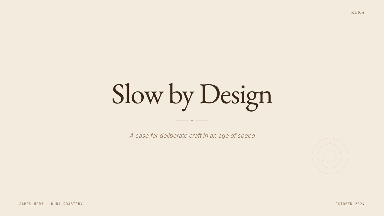
For presentation slides, the style works well across both cover and content pages. A cover built in this register should feel like the opening spread of a fine catalogue: a single strong typographic statement set in a classical serif against a cream field, with substantial breathing room on all sides and perhaps one line of monospace specification copy — a date, a location, a version number — placed with precision below or beside the main title. Content slides should resist the urge to fill the frame. One key idea per slide, communicated through a hierarchy of two type sizes, occasional use of the muted accent for emphasis, and nothing decorative that does not carry semantic weight. Data slides can adopt the origin-card format: a clean vertical stack of labeled figures in monospace, arranged as if the numbers themselves are the product being presented.在演示文稿中,这种风格在封面页与内容页上都表现良好。以这种调性建构的封面应当有精装图录开篇跨页的感觉:单一有力的字体陈述,以古典衬线字体置于奶油色底面,四周保有充裕的呼吸空间,或许在主标题下方或旁边精准放置一行等宽规格文字——日期、地点或版本号。内容页应抵制填满画框的冲动。每页一个核心观点,通过两个字号的层级传达,偶尔使用静默强调色做重点标注,不承载语义重量的装饰性元素一概不出现。数据页可采用产地卡片格式:以等宽字体整齐纵向排列的带标注数字,仿佛数字本身就是被呈现的产品。
For web interfaces, the style is particularly well-suited to product detail pages, pricing tiers, and editorial landing pages where credibility and perceived quality are more important than conversion-rate maximization. The approach: a near-cream background, cocoa-brown body text, generous padding around every component, and an information architecture that trusts the visitor to scroll rather than cramming everything above the fold. Navigation should be text-only — no icon-heavy tab bars — and interactive states should be typographic rather than color-flooded. Dashboards built in this register benefit from treating each metric as a specimen: isolated, labeled precisely, given room to be read as an individual fact rather than part of a dense chart cluster.对于网页界面,这种风格特别适合产品详情页、定价层级,以及可信度与感知品质比转化率最大化更重要的编辑落地页。方法如下:接近奶油色的背景,可可棕正文,每个组件周围给予充裕的内边距,以及信任访客会向下滚动而非将所有内容塞进首屏的信息架构。导航应纯文字——无图标繁重的标签栏——交互状态应以字体变化表达而非色彩漫溢。以这种调性构建的仪表板,受益于将每个指标视为标本:孤立、精准标注、给予空间被作为单一事实阅读,而非密集图表簇的一部分。
For editorial and marketing work, the Third Wave register supports long-form credibility. An article or report layout should use a reading-optimized measure for body text — neither too wide nor too narrow — with a generous margin reserved for pull quotes, annotations, or origin-style metadata. Section breaks are marked by a thin horizontal rule, a shift in type weight, or simply by added vertical space — never by decorative elements or colored dividers. Marketing pages can adopt a catalogue-spread logic: alternating full-width blocks of warm cream and deep cocoa, each block presenting a single product, claim, or value with the confidence that one idea at a time is enough. Calls to action are understated — a bordered text link in the accent color rather than a high-saturation button.对于编辑与营销内容,第三波咖啡调性支持长篇可信度。文章或报告版面应为正文使用针对阅读优化的行宽——不太宽也不太窄——同时保留充裕的页边距用于摘要、注释或产地风格的元数据。段落分隔由细水平线、字重转变或简单地增加垂直间距来标示——绝不使用装饰性元素或彩色分割线。营销页面可采用图录跨页逻辑:交替出现的全宽暖奶油色与深可可棕区块,每个区块以单一产品、主张或价值呈现,相信一次一个观点已经足够。行动号召是低调的——以强调色标示的有边框文字链接,而非高饱和按钮。
A common mistake when applying Third Wave Coffee aesthetics is over-indexing on the cream-and-monospace surface while neglecting the underlying logic of selection and restraint. Adding origin-label typography to a layout that is already dense with competing elements produces something closer to craft-store pastiche than to the style's original authority. The style demands decisions about what not to include at least as much as it demands decisions about what to include. A second common error is using the muted accent color in too many places, diluting its signal value. In an authentic Third Wave layout, the accent appears rarely — it marks a single category, a single interactive state, a single point of arrival — and that rarity is precisely what makes it work.应用第三波咖啡美学时最常见的错误,是过度聚焦于奶油色加等宽字体的表面,同时忽略选择与克制的底层逻辑。将产地标签式排版叠加到一个已经充满竞争元素的密集版面上,产出的结果更接近工艺品商店的仿制品,而非这种风格原本的权威感。这种风格对「不包含什么」的决策要求至少与对「包含什么」的决策同等严苛。第二个常见错误是在太多地方使用静默强调色,稀释其信号价值。在真正的第三波版面中,强调色极少出现——它标示单一类别、单一交互状态、单一视觉焦点——而正是这种稀少性使其发挥作用。
See the Third Wave Coffee design system查看 Third Wave Coffee 完整设计系统
Third Wave Coffee — FAQThird Wave Coffee · 常见问题
Is Third Wave Coffee the same as Scandinavian minimalism or Japanese wabi-sabi?第三波咖啡美学与北欧极简主义或日本侘寂是同一回事吗?
They share family resemblances — restraint, natural materials, generous negative space — but the underlying logic differs. Scandinavian minimalism is rooted in social-democratic functionalism and tends toward the architectural and the abstract. Wabi-sabi finds beauty in imperfection, incompleteness, and transience, actively embracing irregularity. Third Wave Coffee aesthetics are more specifically about the authority of provenance: every visual decision serves the communication of origin information, traceability, and craft seriousness. The style can look Japanese or Scandinavian, but its animating purpose is closer to catalogue design — presenting a product that deserves to be studied.它们共享家族相似性——克制、天然材料、充裕留白——但底层逻辑不同。北欧极简主义植根于社会民主功能主义,倾向于建筑感与抽象性。侘寂在不完美、不完整与无常中发现美,主动拥抱不规则性。第三波咖啡美学更具体地关于溯源的权威性:每一个视觉决策都服务于产地信息、可追溯性与工艺严肃性的传达。这种风格可能看起来偏日本或偏北欧,但其驱动目的更接近图录设计——呈现一件值得被研究的产品。
Can this style work on dark backgrounds?这种风格能用在深色背景上吗?
The canonical Third Wave palette is light-ground — the cream-and-cocoa register is inseparable from its associations with paper, natural light, and analogue warmth. A dark inversion is possible — reversing to a deep espresso brown or slate ground — but it requires careful management. The muted accent colors that work as delicate notes on a cream background tend to read as too faint or muddy on a dark ground; they may need to be lightened toward a sage or dusty gold rather than their darker versions. Monospace specification text loses some of its archival authority when reversed out. Dark variants tend to work better for ambient or evening contexts — a cocktail-bar menu or a café's late-night social content — than for the core product and origin communication the style was designed to carry.经典的第三波色板是浅色底面的——奶油与可可棕的调性与纸张、自然光线和模拟温暖的联想是不可分割的。深色反转是可能的——反转为深浓缩咖啡棕或板岩色底面——但需要谨慎处理。在奶油色背景上作为精致点缀发挥作用的静默强调色,在深色底面上往往显得过于浅淡或混浊;它们可能需要向鼠尾草绿或尘土金色的较亮版本调整,而非其更深版本。等宽规格文字在反白时会失去一些档案权威感。深色变体倾向于在氛围性或夜间语境中更有效——鸡尾酒吧菜单或咖啡馆深夜社交内容——而非这种风格设计用来承载的核心产品与产地传达。
How is Third Wave Coffee different from the broader 'clean and minimal' aesthetic trend?第三波咖啡美学与更广泛的「干净极简」美学趋势有何不同?
Generic clean minimalism tends to use cold whites, thin geometric sans-serif type, and symmetric layouts, often with soft gradients or drop shadows that have crept back in. Third Wave Coffee is specifically warm — the cream ground, the cocoa text, the muted earthy accent — and it pairs visual restraint with information density rather than visual emptiness. The monospace type carrying altitude and varietal data is not present in generic minimalism; it is the style's most distinctive and load-bearing element. The difference is between minimalism-as-absence (removing things to feel clean) and minimalism-as-selection (removing things so that what remains carries full weight).通用干净极简风格倾向于使用冷白色、细线几何无衬线字体与对称版面,常带有已悄然回归的柔和渐变或投影。第三波咖啡是具体地温暖的——奶油色底面、可可棕文字、静默土色强调——并将视觉克制与信息密度配对,而非与视觉空洞配对。承载海拔与品种数据的等宽字体在通用极简风格中并不存在;它是这种风格最具辨识度、承重最强的元素。区别在于极简作为缺席(移除东西以感觉干净)与极简作为选择(移除东西以使留存之物承载全部重量)之间的差异。
Does this style work for products or brands outside of coffee?这种风格适用于咖啡以外的产品或品牌吗?
Yes, and it already has migrated extensively into adjacent craft food and beverage categories: natural wine, specialty tea, small-batch spirits, artisan chocolate, and premium olive oil all use versions of this visual vocabulary. It also translates well to non-food contexts where provenance, transparency, and craft seriousness are genuine brand values: independent publishing, high-end skincare, precision tools, and educational platforms. It struggles where warmth and playfulness are required values — children's products, fast casual food, entertainment — and it can feel exclusionary in consumer contexts where affordability and accessibility are part of the brand promise. The style carries a strong implicit class signal; that signal can be an asset or a liability depending on the audience.可以,而且它已经广泛迁移到相邻的工艺食品与饮料品类中:自然酒、精品茶、小批量烈酒、工匠巧克力和优质橄榄油都在使用这套视觉词汇的变体。它也能很好地迁移到非食品语境,前提是溯源、透明度与工艺严肃性是真实的品牌价值:独立出版、高端护肤、精密工具和教育平台。它在温暖感与趣味性是必要价值的场合中力不从心——儿童产品、快休闲餐饮、娱乐领域——在可负担性与可及性是品牌承诺一部分的消费者语境中也可能显得排他。这种风格携带着强烈的隐性阶层信号;这个信号可以是资产,也可以是负担,取决于受众。
What is the single most important element to get right when using this style?使用这种风格时最需要把握好的单一最重要元素是什么?
Spacing discipline. The cream ground, the serif-and-monospace pairing, and the muted accent are all recognizable surface features, but they can all fail if the spacing is wrong. Third Wave Coffee layouts have margins and internal padding that feel almost excessive by commercial web and slide standards — and that apparent excess is doing the most critical work. It signals that no element is competing for attention, that each piece of content was placed by someone who cared where it landed, and that the viewer's attention is being treated as a precious thing rather than a resource to be maximized. Get the spacing right, and the other elements follow; compromise the spacing to fit more content, and the style collapses into decoration.间距自律。奶油色底面、衬线与等宽字体的配对、静默强调色——这些都是可识别的表面特征,但如果间距出错,它们全都会失效。第三波咖啡版面的页边距与内部填充,以商业网页和幻灯片的标准来看几乎显得过多——而这种表面上的过量正在完成最关键的工作。它传达出没有任何元素在竞争注意力,每一件内容都由一个在意其落点的人放置,观者的注意力被当作珍贵之物而非待最大化的资源。把间距做对了,其他元素自然跟随;为了容纳更多内容而压缩间距,整个风格便坍塌为单纯的装饰。
Related design styles相关设计风格
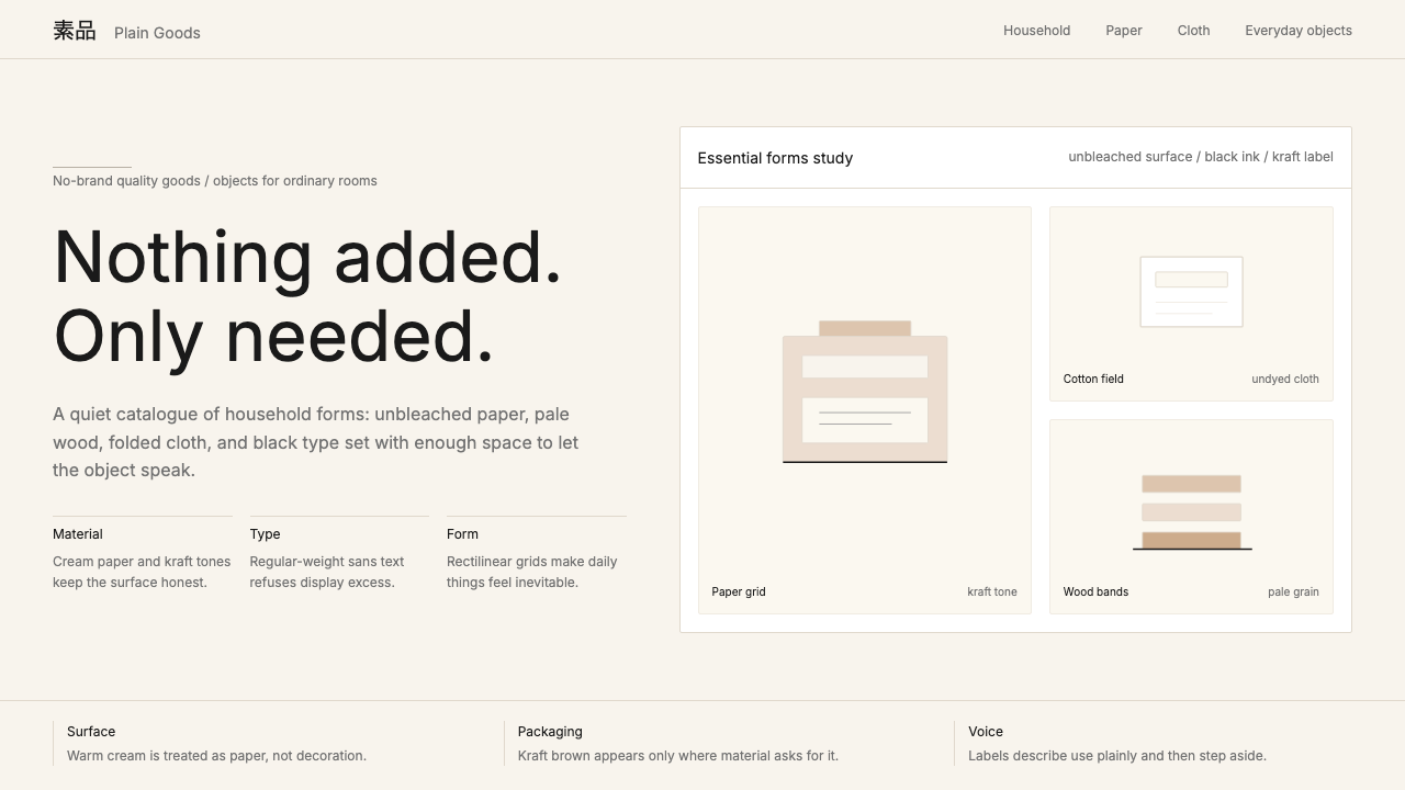 MUJIAnti-brand restraint. Cream paper, kraft brown, and regular Inter leave only…反品牌的克制:米白纸底、牛皮纸棕与常规字重,只留下必要。
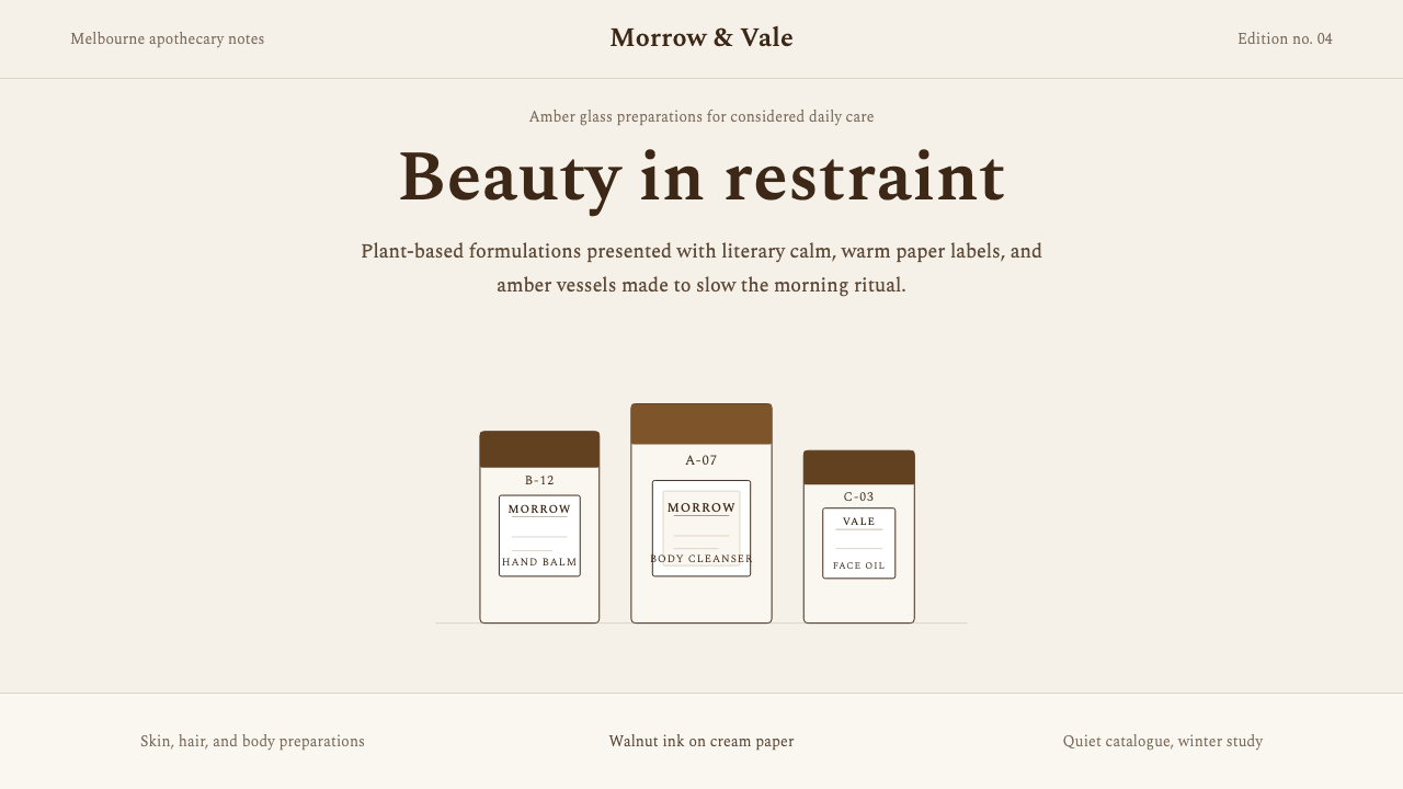 AesopRefuses urgency. Walnut serif on cream paper — every surface paced like a 19t…拒绝急迫的视觉语言:胡桃棕衬线落于奶油纸底,每个界面如 19 世纪药剂房般缓慢…
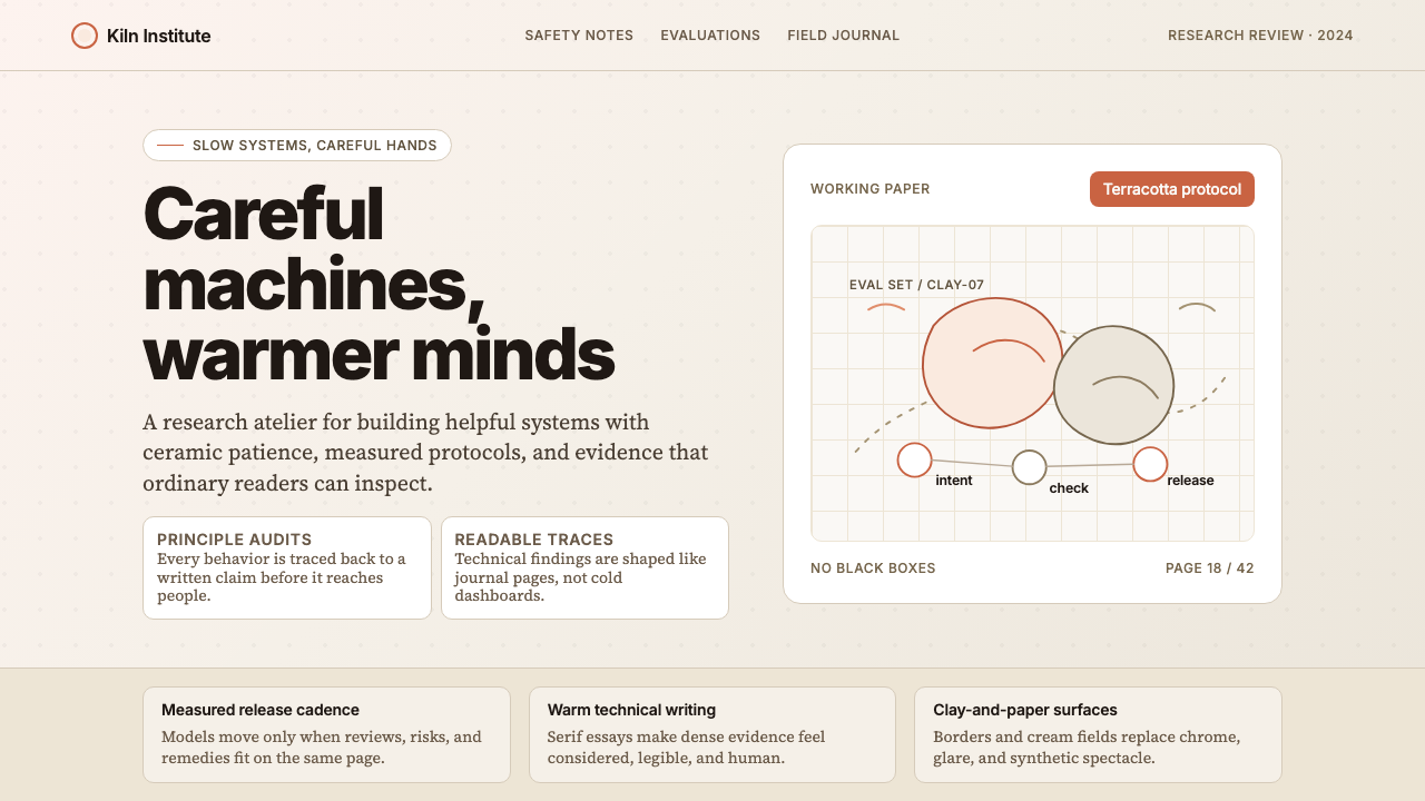 Anthropic ClayAI safety in handmade clay. Sand backgrounds, terracotta accents, serif body…用手工陶土包裹的 AI 安全感:沙色背景、赤陶点缀、衬线正文——缓慢、刻意、有…
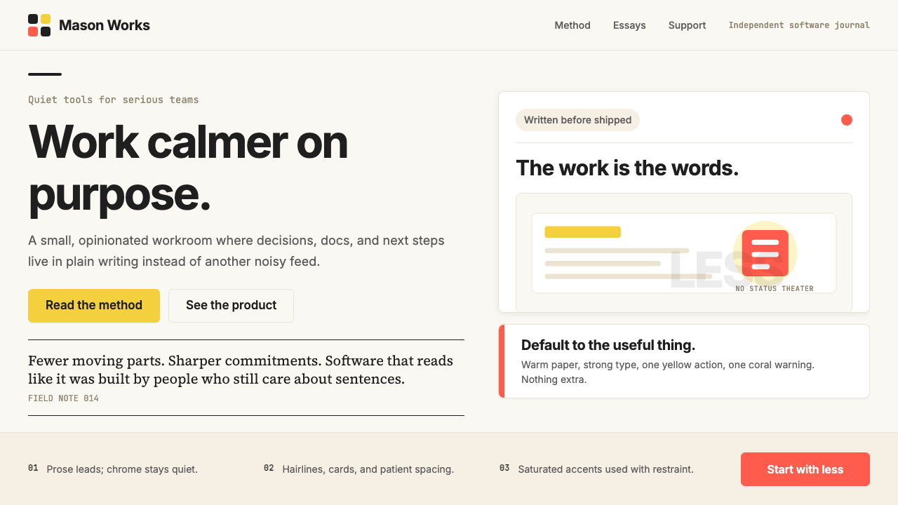 Basecamp / 37signalsQuiet craft, strong opinions. Cream paper, tight sans type, yellow and coral…安静却有主张。米色纸底、紧排无衬线、黄与珊瑚克制点题。
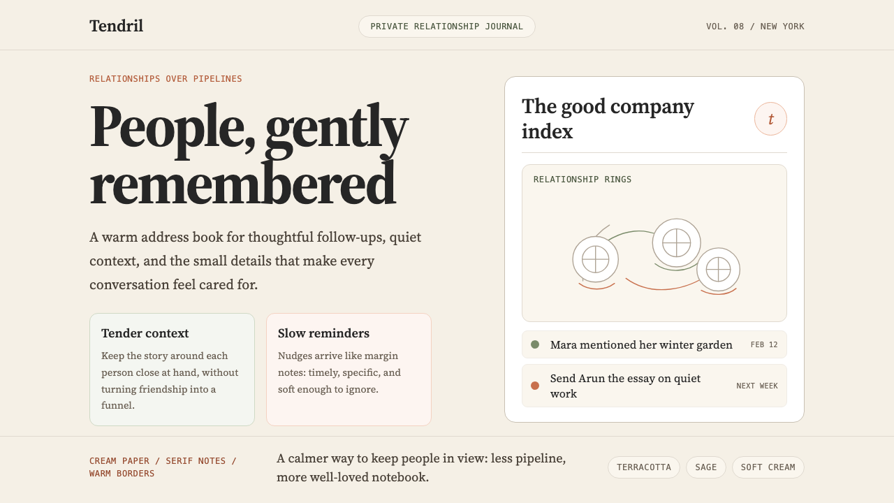 Clay 2024CRM as a sketchbook, not a sales pipeline. Cream backgrounds, terracotta, han…把 CRM 重新想象为安静的私人速写本:奶油底色、陶土点缀、手绘人物线描——拒…
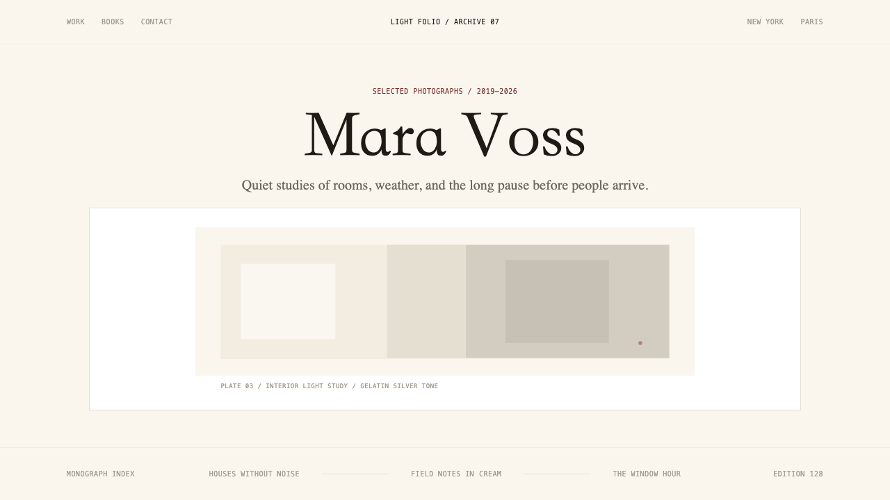 Photographer Light FolioMakes the browser a gallery wall. Warm cream, hairline serif type, and one im…浏览器即画廊墙:暖奶油底、纤细衬线与单幅影像。