What is Photographer Light Folio?什么是 Photographer Light Folio?
Photographer Light Folio turns the browser into a gallery wall — warm cream substrate, hairline serif type, and nothing allowed to compete with the photograph.「摄影师亮色作品集」把浏览器变成画廊墙——暖奶油底色、纤细衬线字体,一切都退让给照片本身。
Photographer Light Folio in briefPhotographer Light Folio 速览
Photographer Light Folio is a complete design system built around a single premise: the photograph is the entire point. Every typographic and spatial decision in the style exists to eliminate visual noise so that a single image can occupy the viewer's full attention. The substrate is paper-warm rather than clinical white, the type is drawn in hairline weights that whisper rather than speak, and navigation is rendered in small monospace capitals so unobtrusive that it seems to apologize for existing.「摄影师亮色作品集」是一套围绕单一前提构建的完整设计系统:照片是全部意义所在。这套风格中每一个排版与空间决策,都是为了消除视觉噪音,让单幅影像能够完全占据观看者的注意力。底色是纸张般的温暖而非临床般的纯白,字体以纤细字重低声呈现,导航以小号等宽大写字母排布——克制到像是在为自己的存在道歉。
The system distills the aesthetic logic of the best photographer portfolio templates — Squarespace's Bedford and Reyes, Format's Lismore and Greystone — into a coherent set of principles that extend beyond templates into any medium: editorial spreads, printed monographs, digital galleries, and personal branding materials. What holds the system together is restraint exercised at every layer simultaneously: color restrained to near-neutrals with one warm accent, type restrained to a single serif family at extreme light weights, layout restrained to generous margins that frame rather than fill.这套系统将最优秀的摄影师作品集模板的美学逻辑——Squarespace 的 Bedford 和 Reyes,Format 的 Lismore 和 Greystone——提炼为一组连贯的原则,并延伸到模板之外的任何媒介:编辑版面、印刷画册、数字图库和个人品牌物料。将系统凝聚在一起的,是在每个层面同时施行的克制:色彩克制于近中性色调加一个暖调点缀,字体克制于单一衬线字族的极细字重,版面克制于以衬托而非填充为目的的宽裕留白。
Unlike modernist styles that use emptiness as a philosophical statement, Photographer Light Folio uses emptiness as a practical service: the white space exists for the image, not for itself. This is a distinction that shows in practice. The style does not read as austere or cold — the warmth of the cream ground and the organic texture implied by hairline serif letterforms give it a quality closer to a fine art book from a respected publisher than to an exercise in reduction.与以空无作为哲学宣言的现代主义风格不同,「摄影师亮色作品集」以空无作为一种实用服务:留白的存在是为了影像,而非为了自身。这一区分在实践中清晰可辨。这套风格不会让人感觉苦涩或冷漠——奶油底色的温度,以及纤细衬线字形所暗示的有机质感,赋予它一种更接近知名出版社精装艺术书籍的气质,而非简化练习的产物。
See the Photographer Light Folio design system查看 Photographer Light Folio 完整设计系统
Where does Photographer Light Folio come from?Photographer Light Folio 从何而来?
The immediate genealogy of Photographer Light Folio runs through the photographer portfolio platforms that consolidated in the late 2010s. Squarespace, Format, and SmugMug each developed template libraries aimed at working photographers who needed a professional web presence without graphic design training. The templates that succeeded commercially were not the most technically sophisticated but the ones that most faithfully translated the visual logic of the printed photography monograph into a browser context. The look that emerged — cream ground, thin serif, single image per viewport, near-invisible navigation — was not designed by any one person; it was the convergence point that the market found when photographers chose among hundreds of options.「摄影师亮色作品集」的直接谱系,穿越了在2010年代末期趋于成熟的摄影师作品集平台。Squarespace、Format 和 SmugMug 各自开发了面向职业摄影师的模板库,帮助那些没有平面设计背景的摄影师建立专业的网络形象。在商业上取得成功的模板,并非技术上最复杂的那些,而是最忠实地将印刷摄影画册的视觉逻辑转化为浏览器语境的那些。由此浮现的外观——奶油底、细衬线、单幅视口图像、近乎隐形的导航——并非出自某一人之手,而是摄影师在数百个选项中做出选择后,市场自然收敛到的那个点。
The deeper roots lie in print monograph publishing, a tradition that stretches from the mid-twentieth century to the present. Publishers like Steidl (Göttingen), Aperture (New York), and MACK Books (London) developed a set of conventions for presenting photographic work in book form: uncoated or lightly coated paper stock that recalled the material of a photographer's workprint, generous page margins that gave each image room to breathe, typography held to a minimum and set in light-weight classical serifs, and a general conviction that any graphic element competing with the photograph was an editorial failure. Gerhard Steidl, who began his publishing house in 1968, brought standards of print quality and typographic restraint to photography books that had previously been treated as commercial rather than fine-art objects. His collaborations with photographers including Robert Frank, Joel Sternfeld, and Nan Goldin established a visual template that the digital portfolio world would eventually absorb.更深的根源在于印刷画册出版的传统,这一传统从二十世纪中叶延伸至今。Steidl(哥廷根)、Aperture(纽约)和 MACK Books(伦敦)等出版商,为以书籍形式呈现摄影作品发展出了一套惯例:非涂布或轻涂布纸张令人联想起摄影师的工作打样,宽裕的页边距给每幅图像留有喘息空间,字体被压缩至最低限度并以细字重的古典衬线字体排布,以及一个普遍信念——任何与照片竞争的图形元素都是编辑上的失败。格哈德·斯泰德尔于1968年创办出版社,将此前被视为商业而非艺术对象的摄影书提升到了印刷质量与排印克制的新高度。他与罗伯特·弗兰克、乔尔·斯滕菲尔德和南·戈尔丁等摄影师的合作,确立了一套视觉范本,而数字作品集世界最终会将其吸收。
Michael Mack of MACK Books represents a slightly younger strain of the same tradition, one that arrived at a moment — the 2000s and 2010s — when art photography was experiencing renewed institutional interest and photographers were increasingly expected to present their practice with the seriousness of a fine-art discipline. MACK's books are typically designed with extreme typographic austerity: the photographer's name appears small and in a light weight, the title is subordinated, and production values — paper choice, binding, the precise registration of ink to stock — communicate that this is an object worthy of sustained attention. The web portfolio platforms that photographers adopted in the same period were attempting, consciously or not, to extend this register of seriousness into a digital context.MACK Books 的迈克尔·麦克代表了同一传统中略为年轻的一支,它诞生在一个特定的时刻——2000至2010年代——艺术摄影正经历制度性关注的复兴,摄影师也越来越被期待以精致艺术学科的严肃态度呈现自己的实践。MACK 的书籍通常以极度排印简朴的方式设计:摄影师姓名以小字号和细字重出现,书名从属于姓名之下,而制作质量——纸张选择、装订、油墨与纸张之间的精确套准——传递着「这是一个值得持续注目的对象」的信息。同期摄影师采用的网络作品集平台,有意识地或无意识地,正是试图将这种严肃性延伸到数字语境之中。
The post-Instagram moment also shaped the style in a specific way. By the middle of the 2010s, photographers had lived through a decade of social media platforms that prioritized rapid scrolling, compressed images, and algorithmic visibility over deliberate viewing. The portfolio site became a deliberate counterpoint: the place where work was shown in full resolution, without interruption, on a ground designed to receive it. The cream-and-serif aesthetic is in part a resistance to the compressed, high-saturation, infinitely scrolling feed — it communicates that this work is to be looked at, not browsed. Tim Walker and Annie Leibovitz, both of whom maintained photographer-centered web presences that emphasized image primacy, exemplify the editorial sensibility the style serves.后 Instagram 时代也以特定方式塑造了这种风格。到2010年代中期,摄影师已经经历了社交媒体平台十年来对快速滚动、压缩图像和算法可见性的优先推崇,而非对深思熟虑的观看。作品集网站成为一个刻意的对位:在那里,作品以完整分辨率呈现,没有打断,底色专为承托而设计。奶油色与衬线字体的美学,在一定程度上是对压缩的、高饱和度的、无限滚动的信息流的抵抗——它传达着「这些作品是用来观看的,不是用来浏览的」。蒂姆·沃克和安妮·莱博维茨都维护着以影像优先为核心的摄影师网络形象,他们体现了这种风格所服务的编辑感性。
What defines the Photographer Light Folio look?Photographer Light Folio 的视觉特征是什么?
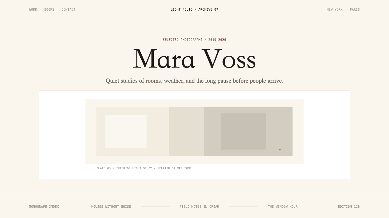
Warm Substrate暖调底色
The ground is never pure white. It holds a warm, paper-like tone that sits between raw linen and a photographic workprint — close enough to white that it reads as neutral in most contexts, but warm enough that photographs placed on it gain the quality of objects presented rather than images displayed. This warmth is the single most important departure from clinical modernist white and from the cold grey fields that dominate tech interfaces. It communicates material rather than digital, permanence rather than refresh.底色从不是纯白。它呈现出一种温暖的纸张质感色调,介于生亚麻和摄影工作打样之间——近到在大多数语境中读来接近中性,又暖到足以让置于其上的照片获得「被呈现的对象」而非「被展示的图像」的气质。这种温度是与临床式现代主义纯白,以及主导科技界面的冷灰色底面,最重要的一个区别。它传递着「材质」而非「数字」,「永恒」而非「刷新」的信息。
Hairline Serif Typography纤细衬线排印
The defining typographic gesture of the style is weight: type is set at the thinnest end of the serif spectrum, where letterforms become almost architectural — a series of fine strokes and bracketed terminals that feel handcrafted rather than mechanical. At display sizes, this hairline quality lends the photographer's name an air of quiet prestige; at small sizes for navigation and captions, it recedes to the point of near-invisibility. The contrast between the delicate type and the full tonal weight of a photograph is the central visual tension of the style.这套风格最具决定性的排印姿态在于字重:文字排在衬线字体谱系最纤细的一端,字形在那里变得近乎建筑性——一系列细笔画和有衬托的末梢,感觉手工而非机械。在展示尺寸下,这种纤细质感赋予摄影师姓名一种静默的声望感;在导航和说明文字的小字号下,它退隐到几乎不可见的程度。纤细字体与照片完整色调分量之间的对比,是这套风格的核心视觉张力。
Image Primacy影像优先
A single photograph occupies the dominant position in any layout. Multiple images are rare on a single view; when they appear, they are sequenced rather than gridded — presented as a curated progression rather than an inventory. The image is never cropped to fit a module; instead, the layout accommodates the image's native proportions. Captions, if they appear at all, appear below the image at minimum size and with a visual weight that does not challenge the photograph's authority.任何版面中,单幅照片占据主导位置。单屏内多幅图像的情形极为罕见;即便出现,也是以序列而非网格的方式呈现——以一种策展式推进而非目录式罗列的形态。图像从不被裁切以适应模块;相反,版面迁就图像的原生比例。说明文字若出现,则以最小字号置于图像下方,视觉分量不与照片的权威相抗衡。
Invisible Navigation隐形导航
Navigation in Photographer Light Folio is treated as necessary infrastructure rather than a design feature. It appears in small monospace capitals — a typographic choice that reads as technical, precise, and deliberately self-effacing compared to the display serif. The spacing between navigation items is generous, but the size and weight are kept to a minimum. No iconography, no hover animations that draw attention to themselves, no persistent navigation bars that compete with the image for vertical territory. Navigation appears when needed and otherwise steps aside.「摄影师亮色作品集」中的导航被视为必要的基础设施,而非设计特征。它以小号等宽大写字母呈现——这一排印选择相比展示衬线字体读来更具技术感、精确感,且刻意地谦逊自退。导航项目之间的间距宽裕,但字号与字重保持在最低限度。没有图标,没有吸引注意力的悬停动效,没有在垂直空间上与图像竞争的固定导航栏。导航在需要时出现,其余时间退居一旁。
Generous Negative Space宽裕的负空间
Margins are wider than conventional web practice, often extending beyond what a grid-focused designer would consider comfortable. This generosity is not an accident or an aesthetic preference — it is a deliberate service to the photograph. A wide margin gives the image a frame; it communicates that what is inside the margin has been selected and placed, not merely uploaded. The negative space between image and edge functions similarly to the mat board in a physical gallery frame: it creates a zone of transition between the object and the surrounding world.页边距比常规网页实践更宽,往往超出以网格为导向的设计师认为舒适的范围。这种宽裕并非偶然或审美偏好——它是对照片的一种刻意服务。宽页边距为图像提供了框架;它传达着「边距内的东西是被选择和摆放的,而不仅仅是被上传的」。图像与边缘之间的负空间,功能类似于实体画廊框架中的衬板:它在对象与周遭世界之间创造出一个过渡地带。
Restrained Color克制的色彩
The chromatic range of the interface is narrow almost to the point of nonexistence: the warm ground, near-black for type, and at most one muted warm accent for interactive states or subtle highlights. Color is deliberately withheld from the chrome so that the full chromatic range of the photograph is not competed with or contextualized by the surrounding interface. A green navigation item or a blue call-to-action button would immediately pull chromatic energy away from the image; the near-monochromatic interface ensures that the photograph remains the only source of color in the viewer's visual field.界面的色彩范围窄到几乎不存在:暖调底色,接近纯黑的文字色,最多一个用于交互状态或微妙高亮的低饱和度暖调点缀。色彩被刻意从界面框架中撤走,以免与照片的完整色域竞争或对其形成语境干扰。一个绿色导航项或一个蓝色行动按钮,会立刻从图像身上夺走色彩能量;近乎单色的界面确保照片始终是观看者视野中唯一的色彩来源。
Monograph-Quality Production Sensibility画册品质的制作感性
Every detail in the style communicates that the work shown is being treated with the same seriousness a fine-art publisher would bring to a printed monograph. This means attention to small decisions that most interface design ignores: the precise vertical spacing between a photograph and its caption, the treatment of the photographer's name relative to the portfolio title, the choice of whether to display image dimensions or shooting data and in what typographic voice. These micro-decisions accumulate into a register of care that the viewer senses even without being able to articulate its sources.这套风格的每一个细节都在传达:所展示的作品正在被以精艺术出版社对待印刷画册同等的认真程度对待。这意味着关注大多数界面设计所忽略的细微决策:照片与说明文字之间精确的垂直间距,摄影师姓名相对于作品集标题的处理方式,是否显示图像尺寸或拍摄数据以及以何种排印声调呈现。这些微观决策积累为一种用心的品质,观看者即便无法说清其来源,也能感受到。

See the Photographer Light Folio design system查看 Photographer Light Folio 完整设计系统
Who shaped Photographer Light Folio?谁塑造了 Photographer Light Folio?
Steidl founded his Göttingen-based publishing house in 1968 and gradually built it into the gold standard for photography book production. His insistence on uncoated or minimally coated paper, his attentiveness to the ink-to-paper relationship, and his collaborative approach to working with photographers on reproduction decisions established the production values that digital portfolio platforms would eventually attempt to evoke. Major collaborations with Robert Frank, Ed Ruscha, and Nan Goldin demonstrated that a photography book could be as carefully authored as the photographs it contained. The Steidl aesthetic — spare typography, warm stock, image as primary object — is the direct print ancestor of Photographer Light Folio.斯泰德尔于1968年在哥廷根创办出版社,逐步将其建设为摄影书制作的黄金标准。他对非涂布或轻涂布纸张的坚持,对油墨与纸张关系的精细把握,以及与摄影师在复制决策上的协作方式,确立了数字作品集平台最终试图唤起的制作标准。与罗伯特·弗兰克、埃德·鲁沙和南·戈尔丁的重要合作证明,一本摄影书可以与其所收录的照片同样精心创作。斯泰德尔美学——简朴排印、温暖纸张、图像作为主要对象——是「摄影师亮色作品集」直接的印刷祖先。
Mack founded MACK Books in London in 2010 and established it as one of the most typographically rigorous photography publishers of its generation. MACK books are notable for the degree to which their graphic design is subordinated to the photographic content — designer and author roles are separated cleanly, and the designer's task is understood as one of service. This philosophy of typographic self-effacement — small names, light weights, spare covers — translated directly into the web portfolio language that emerged in the same decade and that Photographer Light Folio systematizes.麦克于2010年在伦敦创立 MACK Books,将其建设为同代摄影出版商中排印最为严格的一家。MACK 的书籍以平面设计在多大程度上从属于摄影内容而著称——设计师与作者角色被清晰分离,设计师的任务被理解为一种服务。这种排印谦逊的哲学——小字号姓名、细字重、简朴封面——直接转化为同一年代涌现的网络作品集语言,而「摄影师亮色作品集」正是对这种语言的系统化。
Walker, the British photographer whose large-format, elaborately staged imagery has appeared in British Vogue and W Magazine across three decades, represents the editorial sensibility that Photographer Light Folio is built to serve. His personal web presence and the editorial contexts in which his work appears rely on the same logic: generous white space, discreet typography, full-bleed imagery that needs no explanatory apparatus. Walker's work requires a presentation framework that does not compete with the work's own visual density and narrative richness — precisely the problem Photographer Light Folio solves.沃克是英国摄影师,其大画幅、精心布局的影像三十年来持续出现在英国《Vogue》和《W》杂志上。他代表了「摄影师亮色作品集」所服务的编辑感性。他的个人网络形象以及其作品出现的编辑语境,依赖同样的逻辑:宽裕的留白,低调的排印,不需要解释装置的满版图像。沃克的作品需要一个不与作品自身视觉密度和叙事丰富性竞争的呈现框架——这恰恰是「摄影师亮色作品集」所解决的问题。
Leibovitz, whose career spans Rolling Stone, Vanity Fair, and a series of monographs published with book-quality production values, embodies the idea that photographic portraiture at the highest level demands a presentation context equal to its ambition. Her published books — produced with close attention to paper stock, printing quality, and typographic restraint — model the relationship between image and page that the digital folio style attempts to extend into browser context. Leibovitz's practice also underscores the style's implicit audience: not the casual viewer scrolling a feed, but the committed viewer who has chosen to engage with a body of work.莱博维茨的职业生涯横跨《滚石》《名利场》以及一系列以书籍品质制作的画册,她体现了这样一个理念:最高层面的摄影肖像艺术,需要一个与其抱负相称的呈现语境。她出版的书籍——对纸张、印刷质量和排印克制高度关注——为图像与页面之间的关系树立了典范,而数字作品集风格正是试图将这种关系延伸到浏览器语境中。莱博维茨的实践也强调了这套风格隐含的受众:不是滚动信息流的随意浏览者,而是选择深入接触一组作品的专注观看者。
Founded in New York in 1952 by Minor White, Dorothea Lange, Ansel Adams, and others, Aperture established the vocabulary of the serious photography publication decades before digital platforms existed. The Aperture quarterly and the Aperture monograph series defined what photographic seriousness looked like on a printed page: uncoated paper that gave prints a matte, workprint quality; wide margins; minimal sans-serif or light-weight serif type; and a strict editorial line that separated criticism from display. This vocabulary became the template that photographer-platform designers in the 2010s drew on — consciously or through accumulated cultural familiarity — when building the templates that Photographer Light Folio formalizes.Aperture 基金会由迈纳·怀特、多萝西娅·兰格、安塞尔·亚当斯等人于1952年在纽约创立,在数字平台出现的几十年前便确立了严肃摄影出版物的词汇。《Aperture》季刊和 Aperture 画册系列定义了摄影严肃性在印刷页面上的样貌:非涂布纸赋予印刷品亚光的工作打样质感;宽页边距;极简无衬线或细字重衬线字体;以及将评论与展示清晰分离的严格编辑方针。这套词汇成为2010年代摄影平台设计师在构建那些模板时有意识或通过积累的文化熟悉感所参照的范本——而「摄影师亮色作品集」正是对这些模板的正式化。
How do you use Photographer Light Folio today?今天怎么用 Photographer Light Folio?
Photographer Light Folio is a highly specific style, and its specificity is its strength: it communicates one thing very clearly, which is that the images it presents are worth sustained, unhurried attention. Applying it well requires understanding this communicative purpose first and then making every structural decision in service of it. The question to ask at each decision point is not 'does this look good?' but 'does this help or hinder the photograph?'「摄影师亮色作品集」是一种高度特定的风格,而这种特定性正是它的优势:它非常清晰地传达一件事,那就是它所呈现的图像值得持续的、不慌不忙的注目。良好地应用它,首先要理解这个传达目的,然后让每一个结构性决策都服务于这个目的。在每个决策节点要问的问题不是「这看起来好不好?」而是「这对照片有帮助还是有妨碍?」
For presentation slides, the style translates best to portfolio decks, artist statements, and any presentation where the primary content is visual work. A cover slide built in this system should place the presenter's name in hairline serif at modest size, allow significant empty space to breathe around a single strong image, and use the warm ground as the field against which everything else floats. The temptation to fill the cover with a bold headline or a layered composition should be resisted. Content slides carrying multiple images should sequence them as a photographer would — one prominent image supported by smaller contextual images — never as a symmetrical grid. For data slides, the style is less naturally suited, but when used, data visualization should be treated as diagrammatic rather than decorative: clean lines, near-black on cream, no color fills beyond one muted accent for emphasis.对于演示文稿,这套风格最适合作品集展示、艺术家陈述,以及任何主要内容是视觉作品的演示场合。用这套系统制作的封面页,应将演示者姓名以适中字号的纤细衬线字体排布,在单幅强有力的图像周围留有充分的空旷空间,并以暖调底色作为其他一切浮现其上的基底。应当抵制用粗体标题或层叠构图填满封面的冲动。承载多幅图像的内容页,应像摄影师那样对图像进行排序——一幅主要图像辅以较小的语境图像——而绝不是对称网格。对于数据页,这套风格的自然适应性较弱,但若要使用,数据可视化应被视为示意图而非装饰:干净的线条,奶油底上接近纯黑的色调,色彩填充不超过一个低饱和度的点缀色用于强调。
For web interfaces, the style works naturally for portfolio sites, editorial photography sections within larger publications, and gallery or museum digital presences. The homepage pattern is simple: one full-width or near-full-width image, a name in hairline serif positioned to float without competing, and navigation in small monospace capitals tucked at the edge. Dashboard and data-heavy interfaces should approach the style with caution — the generous negative space that serves single images poorly serves dense information. If the style is required for a pricing page or a feature comparison, the solution is to commit to extreme column discipline and treat the page as a sequence of single-image moments rather than a continuous information surface.对于网页界面,这套风格自然适合作品集网站、大型出版物中的编辑摄影板块,以及画廊或博物馆的数字形象。主页模式简单:一幅全宽或近全宽图像,一个以纤细衬线字体浮现而不与图像竞争的姓名,以及以小号等宽大写字母收于边缘的导航。仪表板和信息密集型界面应谨慎使用这套风格——服务于单幅图像的宽裕负空间并不服务于密集信息。如果必须将这套风格用于定价页面或功能对比页,解决方案是极度坚守列纪律,把页面视为一系列单图像时刻的序列,而非连续的信息表面。
For editorial and marketing work, the style is at its most powerful in long-form photographic essays, campaign presentation documents, and brand identity materials for photographers, gallerists, or luxury brands whose positioning depends on implied exclusivity and restraint. A marketing page built in this register should resist the impulse to add calls to action in high-contrast button treatments. Contact forms and booking flows should use bordered, understated inputs; success states and alerts should appear in muted tones rather than standard green or red. The warmth and restraint of the style communicates trustworthiness and selectivity — brand associations that are hard to buy and easy to accidentally disrupt.对于编辑与营销内容,这套风格在长篇摄影专题、活动提案文件,以及摄影师、画廊主或奢侈品牌的品牌识别物料中最为有力——前提是这些品牌的定位依赖于隐含的独特性与克制。以这种语调制作的营销页面,应抵制以高对比度按钮处理行动号召的冲动。联系表单和预约流程应使用有边框的低调输入框;成功状态和提示应以低调色调而非标准绿色或红色呈现。这套风格的温度与克制传递着可信赖感与选择性——这些品牌联想难以购买,却极易在不经意间被破坏。
The most common mistake when applying Photographer Light Folio is importing the look without importing the logic. The look is cream backgrounds and thin serifs; the logic is image primacy enforced at every decision. Designers who borrow the surface aesthetic but then add a bold color accent for the primary button, a gradient hero overlay for readability, or a sticky navigation bar that follows the user through a full-bleed gallery immediately undermine the style's purpose. A secondary common mistake is applying the style to content that it cannot serve — a SaaS onboarding flow, a social media scheduler, a customer support dashboard — where the generous negative space becomes wasted screen real estate rather than meaningful frame. The style communicates that what it contains is worth looking at for a sustained period; only use it when that is true of your content.应用「摄影师亮色作品集」时最常见的错误,是只借用外观而不借用逻辑。外观是奶油背景和细衬线字体;逻辑是在每一个决策中强制执行影像优先。借用了表面美学,却为主要按钮添加高对比度色彩点缀、为满版图库增加可读性渐变遮罩、或添加固定导航栏跟随用户穿越整个图库的设计师,会立刻瓦解这套风格的目的。第二个常见错误是将这套风格应用于它无法服务的内容——SaaS 引导流程、社交媒体排程工具、客服仪表板——在那里,宽裕的负空间成为被浪费的屏幕空间,而非有意义的框架。这套风格传递着「它所包含的内容值得持续审视」的信息;只有当这对你的内容而言是真实的,才使用它。
See the Photographer Light Folio design system查看 Photographer Light Folio 完整设计系统
Photographer Light Folio — FAQPhotographer Light Folio · 常见问题
Is Photographer Light Folio only suitable for actual photographers?「摄影师亮色作品集」只适合真正的摄影师使用吗?
Not exclusively, but the style's logic is so tightly oriented around image primacy that it works best when the primary content is visual. Beyond working photographers, the style suits fine artists, illustrators, architects presenting visual portfolios, and luxury brands whose product imagery is sufficiently strong to carry the weight the style places on it. It can also work for editorial brands — magazines, publishers, cultural institutions — where the association with photographic seriousness is a desired brand value. It is poorly suited to text-heavy content, data-dense applications, or any context where the user's primary task is reading or filling in forms rather than looking.并非只适合摄影师,但这套风格的逻辑如此紧密地围绕影像优先构建,以至于在主要内容是视觉性时它表现最佳。除职业摄影师外,这套风格适合纯艺术家、插画师、展示视觉作品集的建筑师,以及产品图像足够强大到能承担这套风格所施加的重量的奢侈品牌。它也可以适用于编辑品牌——杂志、出版商、文化机构——在那里,与摄影严肃性的关联是期望的品牌价值。它不适合文字密集的内容、数据密集的应用,或任何用户主要任务是阅读或填写表单而非观看的语境。
How does the style handle color photography versus black-and-white work?这套风格如何处理彩色摄影和黑白摄影?
Both work, but in different ways. With color photography, the near-monochromatic interface is essential — the warm ground and near-black type ensure that the chromatic range of the image is read in full without interference from competing interface colors. With black-and-white photography, there is slightly more flexibility in the interface palette, since the image is not bringing its own colors to compete with. Some practitioners introduce a single, very quiet warm accent in the interface when working primarily with monochrome images, as the contrast between a warm ground and a cool-toned black-and-white photograph creates its own quiet tension. In both cases, the substrate's warmth plays a different role: against color work it is neutral; against black-and-white work it functions almost as a warm filter.两者都适用,但方式不同。对于彩色摄影,近乎单色的界面至关重要——暖调底色和接近纯黑的文字确保图像的色域能在没有竞争性界面色彩干扰的情况下被完整读取。对于黑白摄影,界面色板的灵活度略高,因为图像本身没有带来需要与之竞争的色彩。一些实践者在主要处理黑白图像时,会在界面中引入一个非常安静的暖调点缀,因为暖调底色与冷调黑白照片之间的对比本身创造出一种静默的张力。在两种情况下,底色的温度都扮演着不同的角色:对彩色作品而言它是中性的;对黑白作品而言它几乎充当了一层暖滤镜。
Can the style coexist with a dark mode?这套风格能与深色模式共存吗?
A dark inversion of the style is possible but changes its character significantly. The warm cream ground is the style's primary emotional register — it communicates material, warmth, and the quality of a printed object. A dark inversion, where the ground shifts to a deep warm charcoal or near-black and the type moves to a warm off-white, retains the image-first logic but trades the associations of a fine art book for those of a darkroom or a cinema. This is a valid aesthetic choice — particularly for photographers whose work is naturally dark, cinematic, or high-contrast — but it should be understood as a related but distinct mode rather than a direct dark equivalent. The one strong caution: avoid true pure black grounds, which tend to flatten photographs by removing the subtle luminance separation that the warm ground provides.这套风格的深色反转版本是可能的,但会显著改变其气质。暖奶油底色是这套风格的主要情感语调——它传递材质感、温度,以及印刷对象的品质。深色反转版本——底色转为深暖炭灰或接近纯黑,文字转为温暖的非纯白——保留了影像优先的逻辑,但将精艺术书籍的联想置换为暗房或电影院的联想。这是一个有效的美学选择——尤其对于作品本身自然偏暗、具有电影感或高对比度的摄影师——但应被理解为一种相关而有所区别的模式,而非直接的深色等价物。一个强烈的警告:避免使用真正的纯黑底色,它往往会通过消除暖调底色所提供的微妙亮度分离而使照片趋于平淡。
How should text-heavy sections like artist statements or bio pages be handled?艺术家陈述或个人简介等文字较多的板块应该如何处理?
Text-heavy sections require the most discipline in this style precisely because the style was not designed with extended reading in mind. The solution is to treat long-form text as a deliberately narrow column — not full-width — set in a weight that is slightly heavier than the display hairline but still lighter than conventional body text. Wide margins on both sides of the text column perform double duty: they give the reader a calm, focused reading field and they maintain the spatial character of the style even when no image is present. Avoid the instinct to break up long text with subheadings rendered in the same hairline weight — they disappear. Use a clear but subtle hierarchy: the section title at a moderate display size, the body text at comfortable reading weight, and any metadata or captions in the monospace small caps that the navigation uses.文字较多的板块在这套风格中需要最严格的纪律,恰恰因为这套风格并非为延伸阅读而设计。解决方案是将长文本视为一个刻意设置的窄列——而非全宽——以略重于展示用纤细字重但仍比常规正文更细的字重排布。文本列两侧的宽页边距发挥双重作用:为读者提供平静、专注的阅读区域,同时在没有图像出现时也维持这套风格的空间特征。避免用同等纤细字重的小标题分割长文本的本能冲动——它们会消失不见。使用清晰但微妙的层级:以适中展示字号排布的板块标题,以舒适阅读字重排布的正文,以及使用导航所用等宽小型大写字母的任何元数据或说明文字。
What makes this style different from generic minimalism?这套风格与泛化的极简主义有何不同?
Generic minimalism reduces visual complexity as a philosophical or aesthetic end in itself — the goal is the appearance of simplicity. Photographer Light Folio reduces visual complexity as a means to a specific end: making photographs visible. This distinction has practical consequences. A generic minimalist layout might use a cool, neutral grey ground, a geometric sans-serif, and equal attention to all content types — text, image, data — because it is applying a principle of reduction uniformly. Photographer Light Folio uses a warm ground because warmth serves photographs; uses hairline serif rather than geometric sans-serif because the serif implies craft and print tradition rather than digital reduction; and explicitly subordinates text and navigation to image because image primacy is the system's organizing value, not simplicity in the abstract. The warmth, the serif, and the hierarchy are purposeful choices that connect the style to a specific cultural tradition. Minimalism without that tradition is a look; Photographer Light Folio is a language.泛化的极简主义将减少视觉复杂性作为哲学或美学目的本身——目标是简洁的外表。「摄影师亮色作品集」将减少视觉复杂性作为实现特定目的的手段:让照片可见。这一区别有着实践上的后果。泛化的极简主义版面可能使用冷调的中性灰底色、几何无衬线字体,并对所有内容类型——文字、图像、数据——给予同等关注,因为它在均匀地应用减法原则。「摄影师亮色作品集」使用暖调底色,是因为温度服务于照片;使用纤细衬线而非几何无衬线,是因为衬线暗示工艺与印刷传统而非数字减法;并明确地将文字和导航从属于图像,是因为影像优先是系统的组织价值,而非抽象的简洁。温度、衬线和层级,都是将这套风格与特定文化传统连接起来的有目的的选择。没有那种传统的极简主义是一种外观;「摄影师亮色作品集」是一种语言。
Related design styles相关设计风格
 MUJIAnti-brand restraint. Cream paper, kraft brown, and regular Inter leave only…反品牌的克制:米白纸底、牛皮纸棕与常规字重,只留下必要。
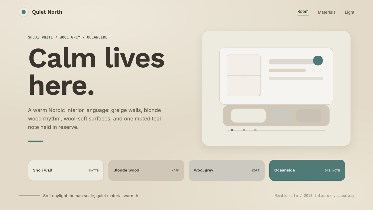 Scandinavian HyggeCalm is the brief. Greige walls, wool-grey cards, and one muted teal line.平静就是命题:灰米墙面、羊毛灰卡片与一抹灰青线。
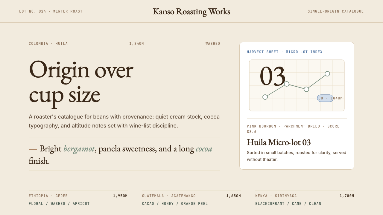 Third Wave CoffeeCoffee as catalogue. Cream paper, cocoa serif, mono origin specs, one sage no…咖啡如图录:奶油纸底、可可衬线、等宽产地规格与鼠尾草绿。
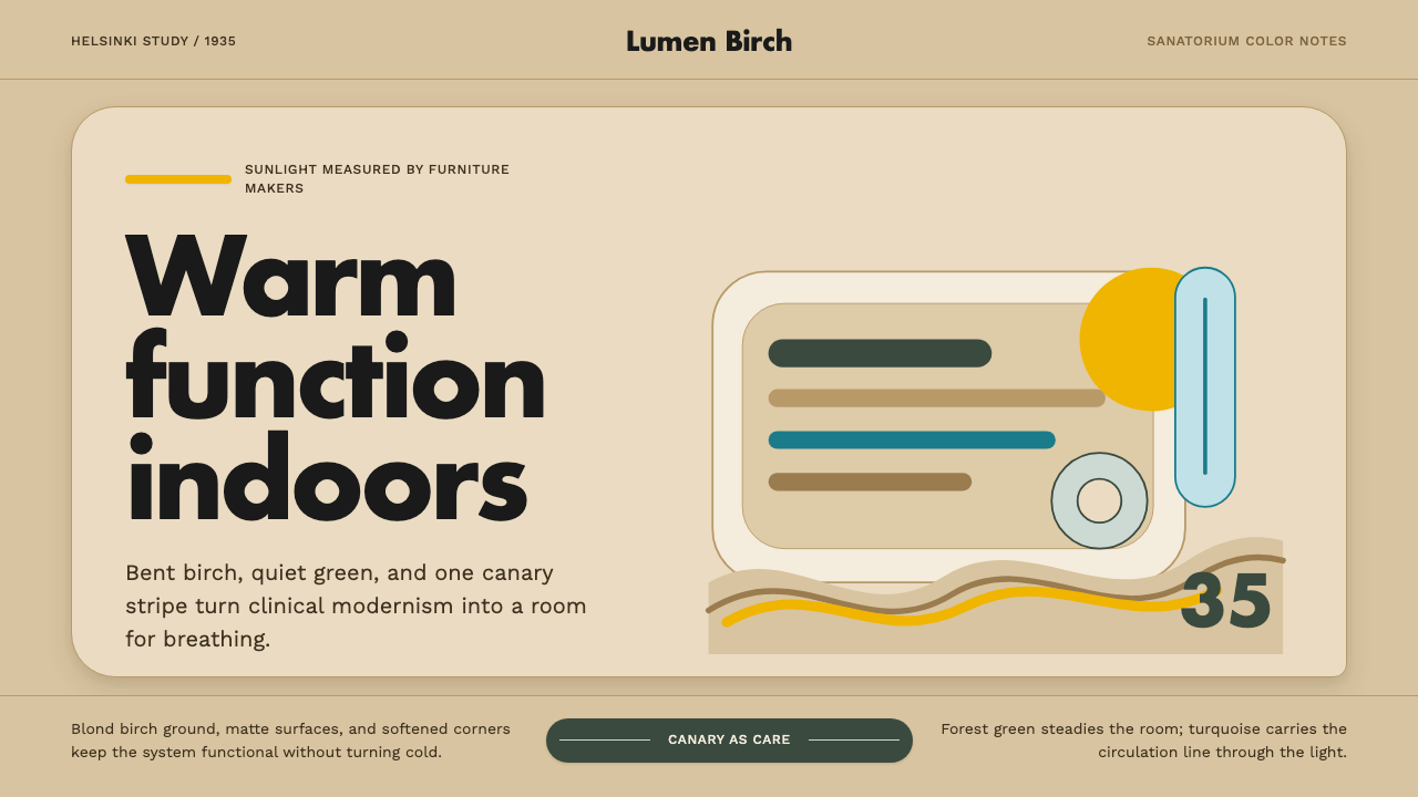 Aalto Finnish ModernModernism made humane. Birch fields, canary yellow, and soft plywood curves b…温柔的现代主义。桦木底、明黄与弯木曲线把阳光带入室内。
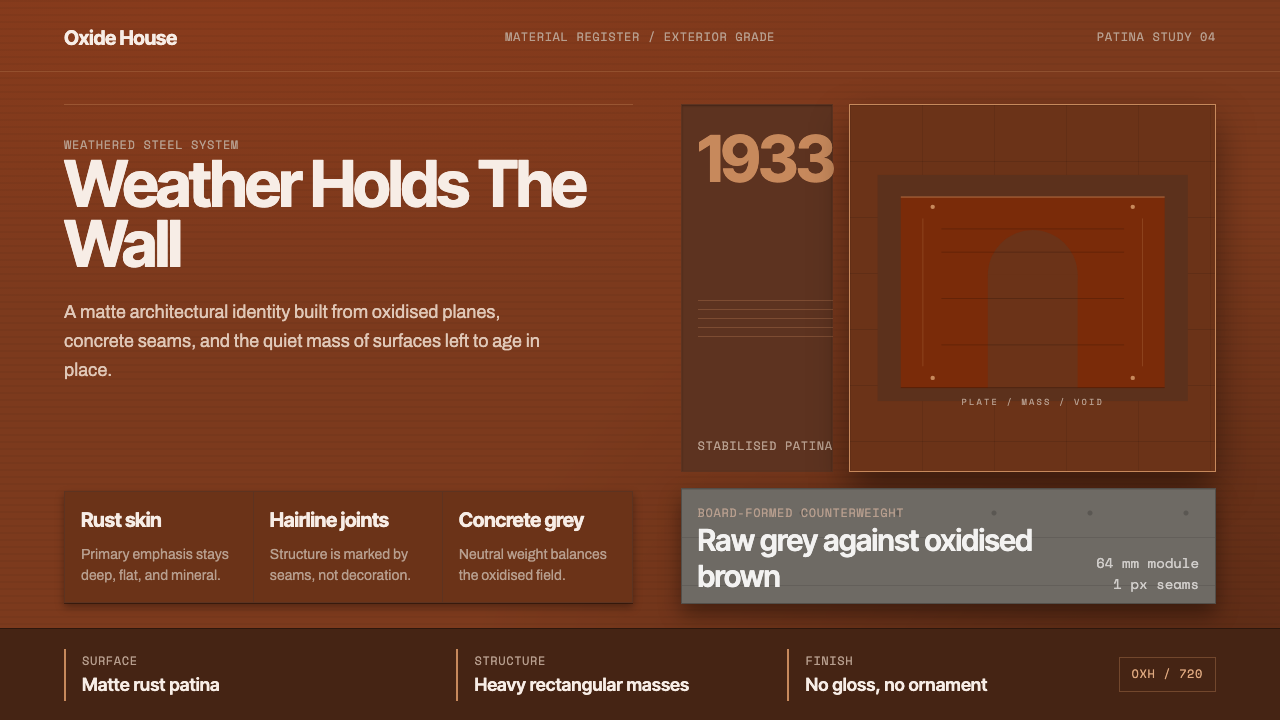 Corten Weathering SteelWeight over ornament. Rust-brown planes and concrete-grey seams make mass vis…重量胜过装饰:锈褐平面与混凝土灰细缝,让体量可见。
 Melbourne Third-Wave Coffee ModernQuiet provenance. Eucalyptus green, cream cards and italic serif tables pace…安静溯源。桉树绿底、奶油纸卡与斜体衬线排出烘焙路线。