What is Corten Weathering Steel?
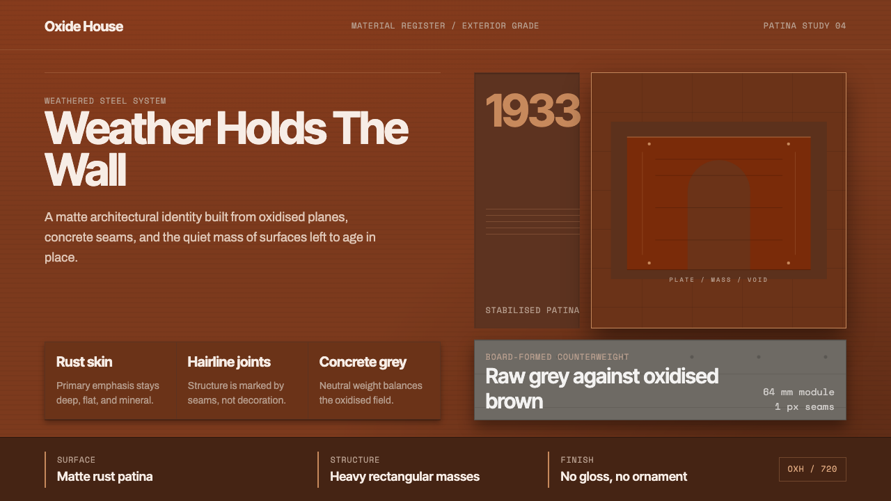
Corten Weathering Steel translates the slow, honest chemistry of oxidising metal into a design language — rust-brown planes, concrete-grey seams, and the quiet authority of mass made visible without ornament.
Corten Weathering Steel in brief
Corten Weathering Steel is a design system rooted in the material logic of a specific alloy: a low-alloy steel developed in the 1930s that forms a stable, adhering oxide layer when exposed to weather. Instead of pitting and flaking like ordinary mild steel, Corten oxidises into a dense matte patina — orange-brown in tone, ranging from warm amber to deep chestnut — that acts as its own protective skin. This material behavior, rather than an applied coating, is the aesthetic and ethical foundation of the style.
Paired with board-formed concrete, it defines the contemporary register of material-honest architecture and design. The visual system is built on large flat planes, weighty rectangular masses, hairline-thin structural lines, and generous undecorated margins. The palette is narrow: the rust spectrum of weathered steel and the cool mid-grey of raw concrete, occasionally anchored by near-black steel fastenings or weathered timber. No gloss, no chrome, no surface ornament of any kind — only the honest weight and texture of materials recording their own life in weather and time.
The style belongs to a lineage that includes Richard Serra's monumental Cor-Ten steel sculpture, Peter Zumthor's tactile, phenomenologically precise buildings, and the broader movement of material-honest contemporary architecture. Unlike Brutalism, which foregrounds concrete's structural logic, Corten Weathering Steel foregrounds the skin — the surface as time-record, the material as autobiography. It is a heavy, restrained system whose apparent simplicity demands rigorous decisions at every scale.
Where does Corten Weathering Steel come from?
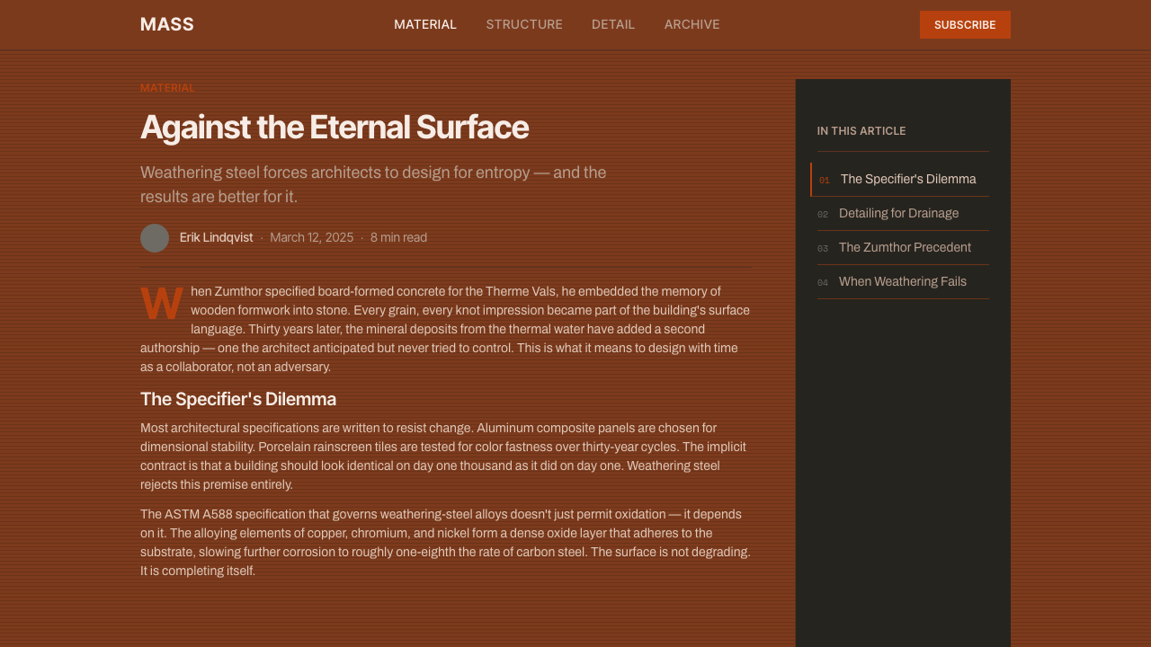
The material itself was developed in the United States in the 1930s by US Steel, initially for railroad freight cars where a rust-resistant, paint-free alloy would reduce maintenance costs. The alloy — copper, chromium, and nickel added to carbon steel — was trademarked as Corten (the name combining Corrosion resistance and Tensile strength). For decades it was primarily an industrial material, used for coal hoppers, bridge structures, and heavy engineering. Its transformation into a prestige architectural and sculptural material began in the 1960s, when the American sculptor John Chamberlain started working with salvaged car body steel, and — more critically — when Richard Serra began his sustained engagement with raw, weathering steel plates in the late 1960s and early 1970s.
Serra's work changed how architects and designers understood the material. His large tilted and standing plates at scales that dwarfed the human body made visible what the material does: it ages in public, its surface a continuous record of time and climate. The orange-brown skin that forms over months and years is not decay — it is the material achieving a kind of stability, a self-sealing equilibrium with its environment. This reading — material as time-process rather than static surface — became the philosophical core of the aesthetic as it moved from sculpture into architecture.
Peter Zumthor's practice, emerging from the 1980s onward, became the most influential architectural translation of this sensibility. Zumthor's buildings — the Bruder Klaus Field Chapel in Germany, the Vals thermal baths, the Kolumba Museum in Cologne — insist that material should be experienced before it is seen, that texture and weight and the quality of light on a surface carry meaning that composition and form alone cannot. Though Zumthor works more with stone, concrete, and timber than with steel specifically, his philosophy of material honesty gave architects and designers the theoretical vocabulary to argue for Corten as more than an industrial choice — as an ethical and phenomenological one.
By the 2000s and 2010s, weathering steel had become a signature material of high-status contemporary architecture worldwide: used for museum facades, cultural pavilions, landscape walls, and landmark public sculpture. Parallel to its use in architecture, Corten's aesthetic was absorbed into graphic design, web design, and digital product design as a palette and visual logic — heavy planes, matte surfaces, industrial weight — abstracted from the material but carrying its cultural associations. It is now one of the most legible visual shorthand codes for authenticity, durability, and material seriousness in contemporary design.
What defines the Corten Weathering Steel look?
Color
The palette is narrow and derived directly from material behavior: the rust spectrum of weathering steel — from warm amber through orange-brown to deep, almost-black oxidised surfaces — set against the cool neutral grey of board-formed concrete. Near-black appears in steel fastenings, shadow gaps, and recessed joints. Aged timber introduces a grey-brown warmth as a third note. The palette contains no bright accent, no clean primary, no white: even the lightest tones are warm or cool greys. This restraint is not minimalism imposed from outside but the natural consequence of using materials that cannot be arbitrary.
Surface and Texture
Surface in this system is not decoration but information. The matte, granular skin of weathered Corten — varying subtly in tone across its face as oxidation depth varies — records the time and weather it has been exposed to. Board-formed concrete carries the grain of its timber formwork: each plank leave, each tie-hole, each pour joint is visible. Neither surface is treated or sealed in the conventional sense. Smoothed, polished, or painted equivalents are antithetical to the style's logic. In digital and print translation, texture is represented through high-resolution material photography or through tonal variation within flat planes — never through synthetic or decorative texture fills.
Mass and Proportion
Elements in this system are heavy. Margins are not tight borders but substantial voids that give mass room to settle. Rectangular forms dominate, and they are proportioned to suggest weight rather than lightness — wide and low, or tall and narrow with substantial visual density. The hairline joint or seam between large planes reads as a precise incision, not a decorative detail. In layouts, this translates to generous white space (or grey space) around compact, dense typographic blocks, with every element carrying sufficient visual weight to justify its presence.
Typography
Type in this system is plain, heavy, and structural — never decorative. Serif or sans-serif typefaces with strong stroke contrast or mechanical regularity suit the material weight of the palette. Type scale is used boldly: a heading is substantially larger than body text, with the scale difference doing the work of hierarchy rather than color or ornament. All-caps settings at large sizes evoke the stamped or engraved lettering on industrial structures. Letter-spacing is generous in headings, tight and dense in body copy. Italics are rare or absent; the voice of the style is declarative, not inflective.
Structural Lines and Joints
Where Bauhaus uses geometric shapes as expressive units, Corten Weathering Steel uses joints and seams — the meeting lines between large planes — as the primary articulating device. A hairline between a Corten panel and a concrete wall is not a design decision overlaid on the structure; it is the structure made visible. In digital and print work, this translates to thin, precise rules used sparingly to separate content zones — never decorative borders, always structural demarcations. The logic is the same: every line must mark where something actually ends and something else begins.
Light and Shadow
Natural, raking light is essential to this material's identity — it is what makes Corten's granular surface visible in its full depth. Shadows in this system are cast and architectural: the deep shadow of a recessed reveal, the thin shadow line of a projecting edge. They are conditions of the material and structure, not applied effects. In digital and print contexts, shadow is used only to establish spatial depth between planes — hard-edged, consistent in direction, and subordinate to the surface rather than decorating it. Soft, diffuse, or decorative shadows are incompatible with the style's logic of honest weight.
Material Honesty
The governing principle is that every surface should tell the truth about what it is. Weathering steel is not painted to simulate another material; it is allowed to do what its chemistry compels it to do. Board-formed concrete is not plastered or polished; it shows its making. In two-dimensional design work, this translates to a strict ban on simulated materials — no fake wood grain, no faux-aged texture applied as a filter, no surface treatment that implies a material the underlying substrate is not. If a gradient or sheen appears, it should represent actual variation in the material being depicted, not a decorative addition.

Who shaped Corten Weathering Steel?
Serra is the central figure in the transformation of weathering steel from industrial material into cultural one. Beginning in the late 1960s with pieces like 'Prop' and continuing through decades of monumental public sculpture, he demonstrated that raw, oxidising steel plates — leaned, stacked, or curved without fastening — could carry sculptural weight, spatial drama, and philosophical seriousness that no polished or painted surface could match. His Cor-Ten works at Storm King, the Guggenheim Bilbao, and public sites worldwide established the visual and conceptual vocabulary that architects and designers drew on when they chose weathering steel for major projects.
Zumthor's architecture — slow, tactile, phenomenologically precise — provided the theoretical framework for how material-honest design should be experienced rather than merely seen. His writing, particularly 'Thinking Architecture' and 'Atmospheres', articulated why the specific weight, temperature, and surface quality of a material matters independently of its formal composition. Though his most celebrated works (Vals, Bruder Klaus, Kolumba) foreground stone and concrete more than steel, his practice demonstrated the dignity of letting materials age in public and established the philosophical lineage to which Corten aesthetic properly belongs.
Chamberlain preceded Serra in demonstrating that salvaged industrial steel — bent, compressed, and welded into sculptural form — could carry aesthetic seriousness. Working with crumpled automobile bodies from the late 1950s onward, he showed that the found industrial surface, with its existing paint, rust, and deformation, was itself a compositional element rather than something to be overcome or concealed. His work shifted American sculpture's relationship to industrial materials and opened the space in which Serra's more systematic and monumental engagement with raw steel became conceivable.
Ando's lifelong investigation of board-formed concrete — its texture, its jointlines, its capacity to hold and distribute natural light — established concrete grey as the indispensable counterpart to Corten's warm rust tones in contemporary material-honest architecture. His Church of the Light, the Pulitzer Arts Foundation building, and dozens of residential and cultural structures demonstrated that raw concrete, when detailed precisely, achieves a meditative weight and dignity that rivals traditional stone. The visual pairing of Ando's grey-concrete sensibility with Serra's Corten-steel vocabulary became one of the defining aesthetic registers of serious contemporary architecture.
The material itself has a provenance worth understanding. US Steel's development of the alloy in the 1930s was a purely industrial decision — longer-lasting freight cars required less maintenance and reduced operating costs. The trademark Corten, registered in 1933, was not conceived as an aesthetic proposition. The leap from freight car to museum facade took thirty years and required the mediation of major sculptors and architects to reframe what the material's aging process meant culturally. Understanding this genealogy is essential to applying the aesthetic honestly: its authority comes from the fact that the surface is the structural material, not a finish applied to something else.
How do you use Corten Weathering Steel today?
Corten Weathering Steel is not a decorative style applied over neutral content — it is a system rooted in a specific philosophical stance about weight, time, and material honesty. Applying it correctly means understanding that every element must earn its presence through structural logic, not surface appeal. The surface is the argument; ornament is a category error.
For presentation slides, this system works best on covers and section breaks where a single weighty image or tonal plane can command the space. A cover slide built on this palette uses a full-bleed material image — a weathered surface, a concrete wall, a joint — at high resolution and high tonal contrast, with title text in a heavy, widely-spaced all-caps setting that reads as stamped rather than designed. Content slides should be spare: a generous grey or warm-white ground, black type at strong hierarchical contrast, no decorative rules. Data visualisations benefit from the palette's neutrality — bar charts in rust brown and concrete grey read as serious rather than emphatic, which suits technical or analytical content. Avoid combining this palette with bright accent colors: the moment a saturated hue appears, the weight and authority of the system collapses.
For web interfaces and dashboards, the palette's matte, heavy character translates well to surfaces that need to project seriousness and durability — infrastructure tools, technical platforms, financial products, or any context where the user should feel confident rather than entertained. The approach: near-black or deep-grey backgrounds with rust-toned accents used only for primary interactive states, generous spacing around all content blocks, heavy typographic hierarchy with minimal color, hairline borders in place of shadows between components. Buttons should be rectangular, without rounded corners, and styled as solid blocks rather than outlined ghost elements.
For editorial and marketing work, the system's weight and restraint work well in long-form contexts: annual reports, architectural monographs, cultural institution materials. The layout logic — wide margins, narrow text measure, section breaks through tonal blocks rather than ornamental rules — produces a reading experience that feels considered and unhurried. For shorter marketing pieces, the style's characteristic poster quality (large material image, single heavy typographic statement, near-zero decoration) translates to social media graphics and digital banners that project authority without loudness.
The most common mistake when applying this system is adding decorative patina: overlaying artificial rust textures, vignettes, or aging filters on otherwise clean content. Authentic Corten aesthetic gets its authority from the actual record of material behavior — the patina is real, or the design admits that it is working from the cultural memory of real patina. Simulating it decoratively undermines the philosophical core of the system and produces work that reads as themed rather than principled. A second common error is treating the rust palette as warmth: the system is not cozy. It is geological in its weight and time-scale. Applying it to contexts that call for approachability or sensory pleasure will produce a mismatch that no amount of typographic warmth can compensate for.

Corten Weathering Steel — FAQ
Is Corten Weathering Steel the same as Brutalism?
Related but distinct. Brutalism (1950s–1970s) is primarily a concrete aesthetic, concerned with the honest expression of structural logic through raw, board-formed concrete, the exposure of mechanical systems, and a compositional boldness that often borders on aggression. Corten Weathering Steel shares the commitment to material honesty but shifts the emphasis from structure to skin — from concrete's capacity to express the logic of load-bearing to steel's capacity to record the passage of time. Brutalism is architecturally confrontational; Corten is more meditative, more geological. They can coexist in the same building, but they have different emotional registers and different relationships to time.
Can this design system work in a light or white-ground context?
Yes, with care. The canonical Corten context is heavy and matte — rust tones against concrete grey, with deep shadows in recessed details. A light-ground variant is possible: rust-brown and warm grey against near-white can retain much of the system's material weight while increasing legibility. The critical constraint is that the light ground must be warm rather than pure white — cool white will break the internal tonal logic of the palette, which is built entirely on warm metal and stone. Similarly, the typographic weight should remain substantial: light or thin type on a white ground contradicts the system's fundamental character.
How do you apply this system in a purely digital context where real materials are absent?
The key is to translate the material's logic, not its surface appearance. In physical Corten, what generates authority is the combination of: mass (large, unbroken planes), surface (a matte, subtly varied texture), structural precision (hairline joints that are exact), and time (a patina that records exposure rather than being applied). In digital work, mass translates to generous empty space around heavy, compact content blocks; surface translates to matte backgrounds and the avoidance of gradients or gloss; structural precision translates to sharp, hairline rules used only where boundaries are structural; and time — the hardest to simulate — translates to a palette chosen from actual material photographs and a typographic voice that is declarative and unhurried. The system fails when any of these four translations becomes ornamental rather than structural.
Does this system work for consumer-facing products, or is it too austere?
It is genuinely austere, and that austerity is not adjustable without abandoning the system's character. Corten Weathering Steel works well for products where authority, durability, and seriousness are desired qualities: architectural services, engineering or construction platforms, financial or analytical tools, cultural institutions, premium material goods, and any context where the user's relationship to the product should feel substantive rather than entertaining. It struggles — and should be avoided — in contexts requiring warmth, playfulness, approachability, or sensory pleasure: children's products, food and wellness brands, consumer social applications, or any context where the user's primary emotional register is comfort or delight. Knowing where to deploy and where to decline is the first design decision.
What is the difference between using this style honestly and using it as a trend?
The honest use of the Corten aesthetic is grounded in its philosophical core: every surface is what it is, every element earns its presence through structural necessity, the passage of time leaves visible marks rather than being concealed. The trendy use takes the visual outputs — rust-brown palette, raw concrete, industrial weight — and applies them as decoration over content that has no structural relationship to those choices. The telltale signs of superficial application: rust textures used as background filters, rounded corners or soft shadows appearing alongside supposedly Corten-derived elements, the palette applied to a product whose values (warmth, playfulness, ease) contradict the system's character. Authentic application requires that the choices be defensible from first principles — that the designer could explain why each element has the weight it does and what would be lost if it were lighter.
Related design styles
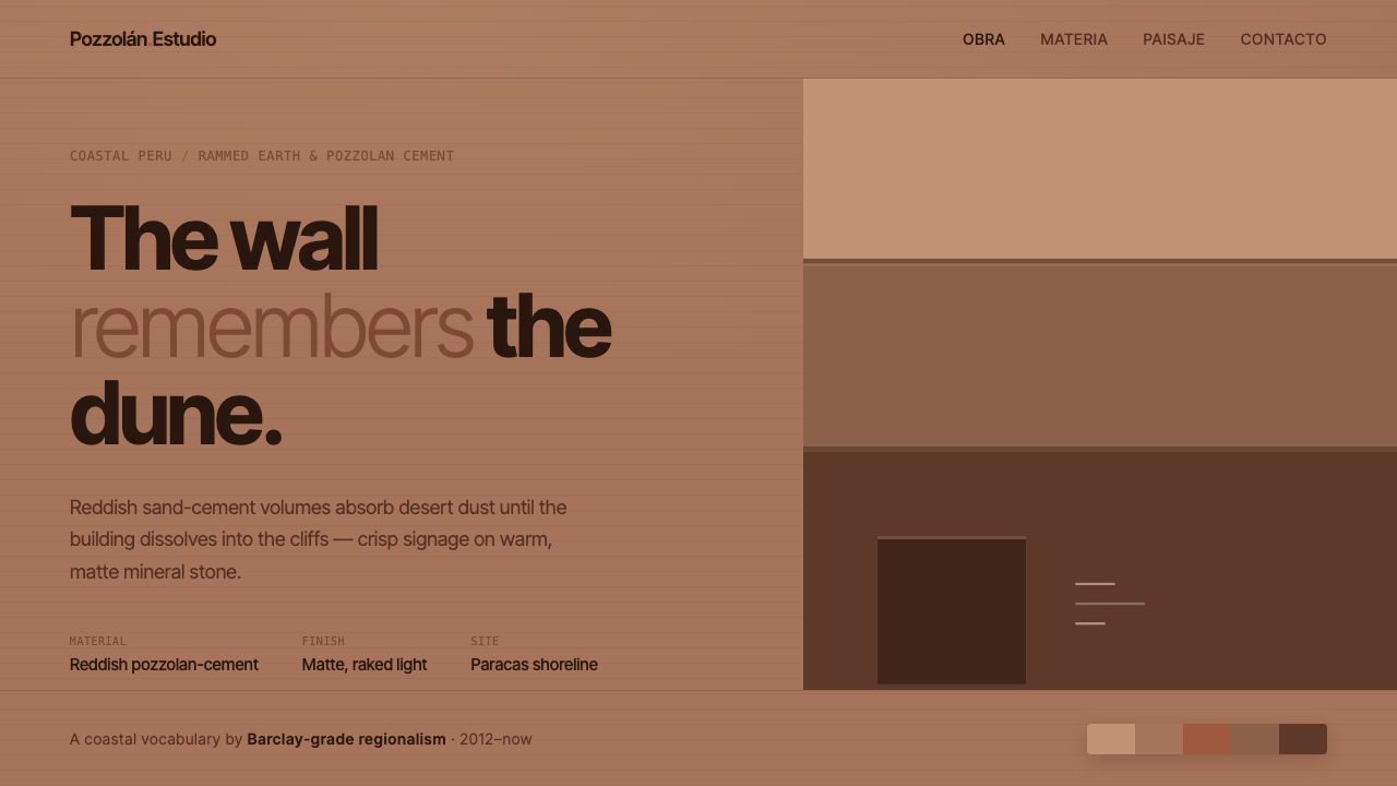 Peruvian Contemporary Adobe-ModernThe building dissolves into the dune. Reddish pozzolan-cement planes, matte r…
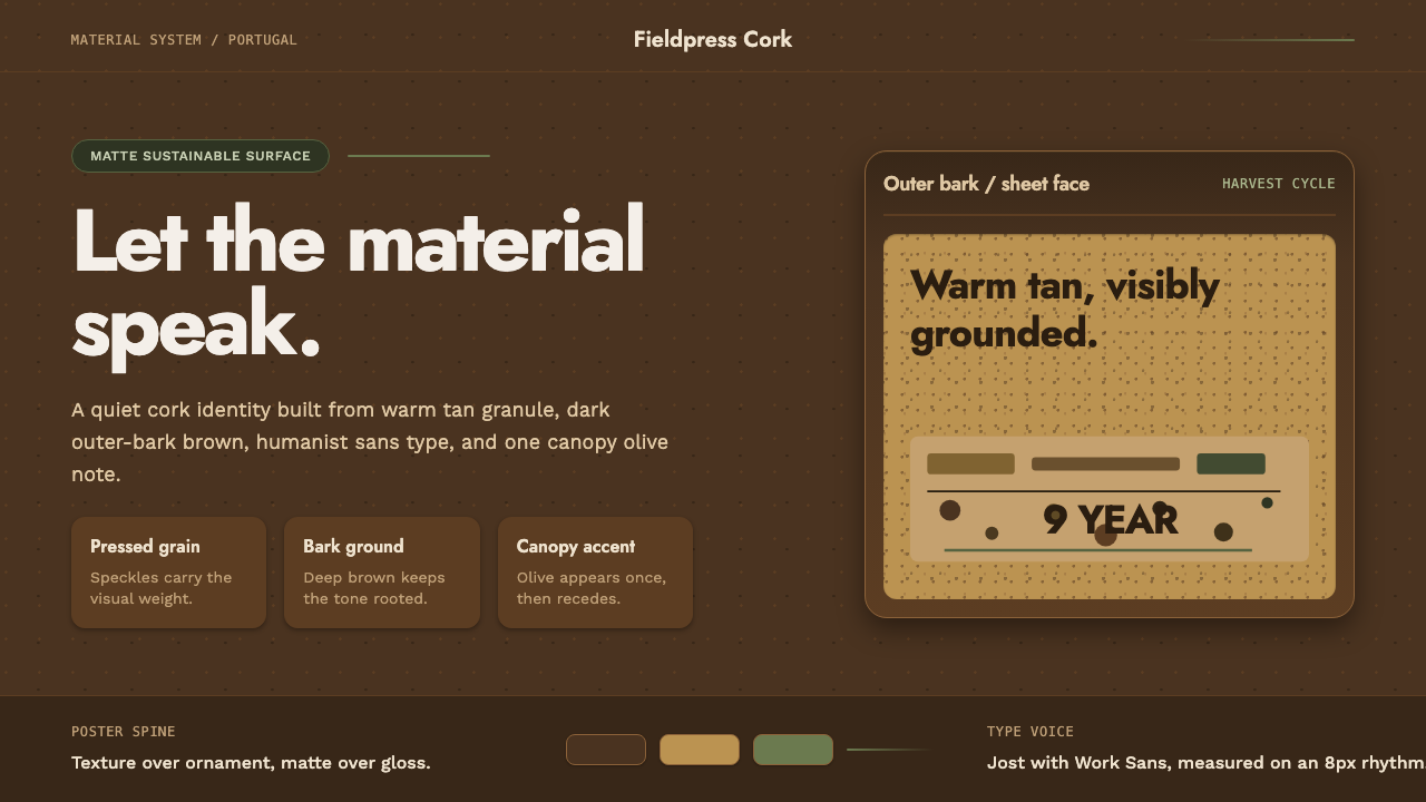 Portuguese CorkGrounded by texture. Cork tan speckles on bark brown, with one olive rule.
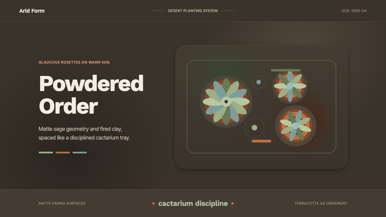 Succulent CactariumQuiet desert order. Sage rosettes and terracotta rings rest on dark warm soil.
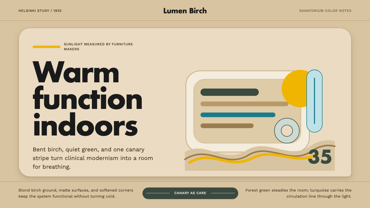 Aalto Finnish ModernModernism made humane. Birch fields, canary yellow, and soft plywood curves b…
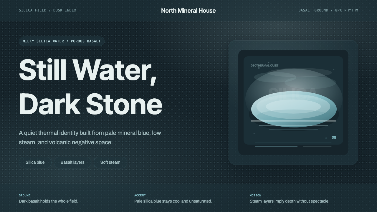 Glacial Teal LagoonQuiet feels elemental. Basalt darks and milky silica blue drift in a low-cont…
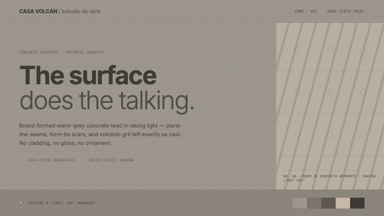 Mexican Concrete BrutalismThe surface does the talking. Board-formed warm-grey concrete, plank seams an…