Design style guide设计风格指南
What is Saudi Vision 2030?什么是 Saudi Vision 2030?
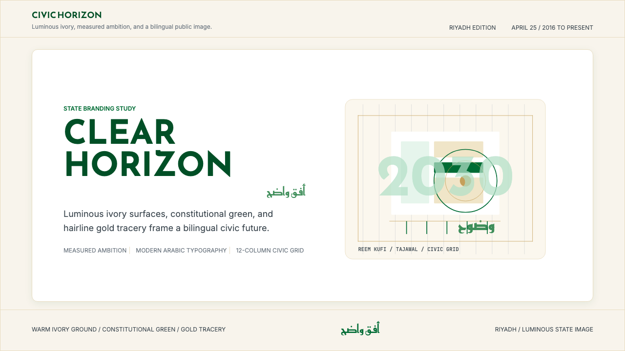
Saudi Vision 2030 is the visual grammar of a nation rewriting its identity on the world stage — luminous ivory surfaces, sage-evolved greens, and hairline gold tracery composing a civic aesthetic as measured and deliberate as the ambition behind it.沙特2030愿景是一个民族在世界舞台上重写自身身份的视觉语法——温暖象牙底面、演化自鼠尾草的绿色,与细腻金线共同构成一套与其背后雄心同样从容而审慎的公民美学。
Saudi Vision 2030 in briefSaudi Vision 2030 速览
Saudi Vision 2030 names both a national reform program and the distinctive visual identity that has accompanied it since the official launch in April 2016. As a design system, it is the most ambitious act of nation-branding in the contemporary Gulf — a comprehensive visual language deployed across government ministries, giga-project developments, tourism campaigns, cultural institutions, and international diplomacy, all united by a palette and typographic sensibility that deliberately departs from the heavy state imagery of earlier Saudi official design.「沙特2030愿景」既指一项国家改革计划,也指自2016年4月正式发布以来伴随该计划的独特视觉识别体系。作为设计系统,它是当代海湾地区最具雄心的国家品牌塑造行动——一套完整的视觉语言,跨越政府部委、超级工程项目、旅游推广、文化机构与国际外交,全部统一在一个有意偏离沙特早期官方设计沉重国家形象的调色板与排印美学之下。
The system's visual character rests on restraint and luminosity rather than grandeur. Where previous Saudi official design leaned on the deep ceremonial green of the national flag and traditional gilded ornament, Vision 2030 evolved these signals: ivory or near-white surfaces replace saturated grounds, a sage-to-emerald green family takes the place of the single national green, and gold is deployed as hairline tracery rather than flood fill. The effect is a palette that reads as modern and internationally legible while remaining unmistakably rooted in Arabian cultural identity.该系统的视觉特质建立在克制与光感之上,而非宏大叙事。以往沙特官方设计倾向于国旗的深礼仪绿与传统鎏金装饰,而2030愿景对这些信号进行了演化:象牙色或近白色的底面取代了饱和底色,从鼠尾草绿到翠绿的色彩家族取代了单一国家绿,金色以细线描摹而非大面积铺填的方式出现。最终效果是一套既具现代感、国际可读性,又根植于阿拉伯文化身份的调色板。
What separates this system from generic Gulf modernism is its integration of Arabic typographic tradition into a contemporary civic grid. Headlines rendered in Reem Kufi or similar modern Naskh-derived letterforms are not decorative flourishes added after the fact — they are structural. The calligraphic curve and the geometric module coexist on the same layout plane, each earning its place through legibility and cultural resonance rather than spectacle. This balance is the system's central design argument: that modernity and heritage are not opposites, that a nation can be both ancient and forward-looking without contradiction.将这套体系与泛海湾现代主义区分开来的,是它将阿拉伯书法传统融入当代公民网格的方式。以Reem Kufi或类似现代纳斯赫体衍生字形呈现的标题,并非事后追加的装饰性点缀——它们是结构性的。书法曲线与几何模块共存于同一版面平面,各自凭借可读性与文化共鸣而非奇观赢得位置。这种平衡是该系统的核心设计论断:现代性与遗产并非对立,一个民族可以同时是古老的与前瞻的,二者之间不存在矛盾。
See the Saudi Vision 2030 design system →查看 Saudi Vision 2030 完整设计系统 →
Where does Saudi Vision 2030 come from?Saudi Vision 2030 从何而来?
The Vision 2030 program was announced publicly on April 25, 2016, by Crown Prince Mohammed bin Salman, then Deputy Crown Prince and Minister of Defence. The initiative was framed as a comprehensive roadmap to reduce Saudi Arabia's economic dependence on oil revenues by diversifying into tourism, entertainment, culture, and technology. The visual identity — developed in coordination with the Vision Realization Office and the Public Investment Fund — was conceived from the outset not as governmental livery but as a public-facing brand capable of speaking to international investors, Saudi youth, and regional neighbours simultaneously.2030愿景计划于2016年4月25日由王储穆罕默德·本·萨勒曼公开宣布,彼时他担任副王储兼国防部长。该计划被定位为一份全面路线图,旨在通过向旅游、娱乐、文化与科技多元化来降低沙特对石油收入的依赖。视觉识别体系——由愿景实现办公室与公共投资基金协同开发——从一开始便被构思为面向公众的品牌,而非政府制服;它需要同时向国际投资者、沙特年轻人与周边邻国发声。
The design language drew on several overlapping sources. The first was the tradition of modern Arabic typography that had been gaining momentum across the Arab world since the 1990s, as type designers and foundries developed Naskh and Kufi letterforms capable of combining classical calligraphic authority with the technical demands of screen rendering and grid-based layout. Typefaces such as those produced by Boutros Fonts — including Tajawal, which became associated with digital-first Saudi government interfaces — brought structured legibility to Arabic headlines without sacrificing the organic rhythm of the script tradition.该设计语言汲取自数个相互交叠的源头。其一是自1990年代起在阿拉伯世界持续积累动能的现代阿拉伯字体传统:字体设计师与铸字公司开发出纳斯赫体与库法体字形,使其在保持古典书法权威的同时,满足屏幕渲染与网格版面的技术要求。Boutros Fonts等公司出品的字体——包括与沙特政府数字界面相关联的Tajawal——为阿拉伯文标题带来了结构化的可读性,同时未失去书写传统的有机韵律。
The second source was the aesthetic language of the giga-projects that Vision 2030 spawned: NEOM, the Red Sea Project, Diriyah Gate, Qiddiya. These developments produced vast quantities of architectural renderings and promotional material, and their visual vocabulary — sun-bleached warm neutrals, crisp angular photography, geometric abstraction of Arabian landscape forms — fed back into the broader Vision 2030 identity. The desert light of the Hejaz and the Najd, the white limestone of old Diriyah, the blues of the Red Sea coast: these regional color associations were absorbed and systematized rather than replaced.第二个源头是2030愿景催生的超级工程项目的美学语言:NEOM、红海项目、迪里耶门户、奇迪亚。这些开发项目产出了大量建筑效果图与推广材料,其视觉词汇——被阳光漂白的暖中性色、清晰的角度摄影、阿拉伯地景形态的几何抽象——反向渗入2030愿景的整体识别。汉志与纳季德的沙漠光线、旧迪里耶的白色石灰岩、红海海岸的蓝色:这些地域色彩联想被吸纳并系统化,而非被取代。
The third influence was the broader shift in Gulf nation-branding that accelerated after the 2010s. Dubai Expo 2020 preparations, Abu Dhabi's cultural district development, and Qatar's FIFA World Cup 2022 identity work all demonstrated that the Gulf could produce world-class design systems that referenced Islamic geometric traditions and Arabic calligraphy while meeting the legibility and scalability standards expected of a contemporary global brand. Vision 2030 entered this conversation as Saudi Arabia's most ambitious contribution — larger in scale, broader in institutional reach, and explicitly tied to a social transformation agenda that had no precedent in the region's brand history.第三个影响是2010年代后加速演进的海湾国家品牌塑造整体转型。迪拜世博2020的筹备工作、阿布扎比文化区的开发,以及卡塔尔2022年国际足联世界杯的视觉识别,均证明了海湾地区有能力产出参照伊斯兰几何传统与阿拉伯书法、同时满足当代全球品牌可读性与可扩展性标准的世界级设计体系。2030愿景作为沙特最雄心勃勃的贡献加入了这场对话——规模更大,机构覆盖范围更广,并明确与该地区品牌史上前所未有的社会转型议程相挂钩。
What defines the Saudi Vision 2030 look?Saudi Vision 2030 的视觉特征是什么?
Palette — Luminous Restraint调色板——光感克制
The core palette evolves the Saudi national green rather than replacing it. The dominant ground is ivory or warm near-white, evoking the high-desert light of the Arabian Peninsula. A family of greens — ranging from a desaturated sage through a mid-emerald to a deeper forest tone — provides institutional authority without the ceremonial heaviness of the traditional flag green. Gold appears as a hairline accent or thin geometric tracery, never as a fill color, allowing it to function as a signal of quality and heritage without tipping into opulence. The palette is warm overall, Mediterranean and Gulf in its associations rather than Nordic or East Asian.核心调色板对沙特国家绿进行了演化,而非替换。主导底色是象牙色或温暖的近白色,唤起阿拉伯半岛高原沙漠的光线质感。从低饱和的鼠尾草绿,经中翠绿,到更深的森林绿,一组绿色家族提供了机构权威感,而无传统国旗绿的礼仪沉重。金色以细线强调或纤薄几何描摹的形式出现,从不作为填充色,使其能够传递品质与遗产的信号,而不滑向浮华。整体色调是温暖的,在联想上属于地中海与海湾气质,而非北欧或东亚。
Arabic Typography as Structure阿拉伯书法排印作为结构
Modern Naskh-derived typefaces serve as the headline voice of the system. These letterforms carry the organic curves of classical calligraphy while meeting the grid alignment and legibility demands of contemporary screen and print contexts. The key distinction from decorative Arabic typography is structural intention: the headline is not ornamented Arabic text superimposed on a Western layout — it is the primary grid anchor, sized and placed with the same logic as a geometric block. Bilingual settings (Arabic and English) are handled through careful optical sizing rather than mechanical scaling, maintaining reading comfort across both scripts.现代纳斯赫体衍生字形是该系统的标题声音。这些字形承载着古典书法的有机曲线,同时满足当代屏幕与印刷语境下的网格对齐与可读性要求。与装饰性阿拉伯字体排印的关键区别在于结构意图:标题不是叠加在西方版面上的装饰性阿拉伯文——它是首要的网格锚点,以与几何块体同等的逻辑定尺寸、定位置。阿拉伯文与英文双语排版通过审慎的视觉尺寸调整而非机械缩放来处理,在两套文字中均保持阅读舒适度。
Geometric Tracery and Pattern几何描摹与图案
Islamic geometric pattern — the centuries-old tradition of interlocking star polygons, arabesque latticework, and muqarnas-derived tessellations — enters the Vision 2030 system in abstracted, reduced form. Pattern is not applied as wallpaper or border decoration; it appears as a single geometric motif at large scale, as a subtle texture on a light ground, or as the organizing logic of a layout grid. This restraint is deliberate: the full complexity of traditional geometric pattern would overwhelm the legibility requirements of a civic communications system. What remains is the structural logic of the tradition, distilled to its essential geometry.伊斯兰几何图案——交错星形多边形、阿拉伯式蔓藤花纹格架与源自蜂巢穹顶镶嵌的数百年传统——以抽象、简化的形式进入2030愿景体系。图案并不作为壁纸或边框装饰应用;它以单个几何母题的大比例形式出现,或作为浅底面上的微妙肌理,或作为版面网格的组织逻辑。这种克制是刻意为之:传统几何图案的完整复杂性会淹没公民传播系统的可读性要求。留存下来的,是传统的结构逻辑——提炼至其本质几何。
Warmth Through Material Reference通过材质参照传递温度
The system consistently references the material and tonal world of the Arabian Peninsula — not through literal texture or skeuomorphic surface, but through color temperature, photographic palette, and spatial proportion. Images favor the warm overexposed look of midday desert light; architectural renderings use the bleached limestone and terracotta palette of Najdi architecture; promotional photography favors golden-hour warmth over blue-hour cool. This material groundedness gives the system a geographic specificity that distinguishes it from generic international design — it is legible as Saudi and as Gulf in a way that pure geometric abstraction would not be.该系统始终参照阿拉伯半岛的材质与色调世界——不是通过字面肌理或拟物化表面,而是通过色彩温度、摄影调色板与空间比例。图像偏好正午沙漠光线的温暖过曝质感;建筑效果图使用纳季德建筑的漂白石灰岩与赤陶色系;推广摄影偏好黄金时刻的暖调而非蓝调时段的冷调。这种材质根植性赋予了该系统地理特殊性,使其有别于泛化的国际设计——它在视觉上可被辨认为沙特的、海湾的,而纯粹的几何抽象无法实现这一点。
Civic Scale and Grid Discipline公民尺度与网格纪律
Vision 2030 communications are consistently designed at what might be called civic scale: generous margins, large headline type, and clear hierarchy that reads from a distance on a billboard as readily as at close range on a phone screen. The underlying grid is disciplined but not rigid — it accommodates both the right-to-left reading direction of Arabic and the left-to-right of English in bilingual documents, using centered compositions or carefully mirrored structures where necessary. The system's grid logic is architectural in ambition: it is designed to coordinate not just posters and presentations but wayfinding systems, exhibition halls, and the facades of entire ministerial campuses.2030愿景的传播设计始终保持在可称之为「公民尺度」的层面:慷慨的边距、大尺度标题字,以及在广告牌远距离与手机屏幕近距离均清晰可读的明确层级。底层网格是有纪律的,但非僵硬——它在双语文件中同时容纳阿拉伯文的从右到左阅读方向与英文的从左到右方向,在必要时使用居中构图或精心镜像的结构。该系统的网格逻辑在抱负上是建筑性的:它被设计用于协调的不只是海报与演示文稿,还包括导向系统、展览大厅以及整个部级园区的立面。
Confident Bilingualism自信的双语并置
Unlike earlier Gulf design systems where Arabic text was often a secondary decorative element subordinated to English, Vision 2030 materials treat Arabic and English as co-equal. Arabic headlines are not smaller or softer than their English counterparts; both languages share the same weight and spatial authority. This bilingual confidence is itself a designed message: the system visually argues that Saudi Arabia can speak Arabic to its own people and English to the world without either voice being diminished. The practical discipline this requires — managing optical weight across two scripts with very different visual densities — is one of the system's most sophisticated technical achievements.与早期海湾设计系统中阿拉伯文常作为从属于英文的次要装饰性元素不同,2030愿景材料将阿拉伯文与英文置于同等地位。阿拉伯文标题在尺寸与柔和度上不弱于其英文对应物;两种语言共享同等的字重与空间权威。这种双语自信本身是一条设计信息:该系统在视觉上论证了沙特阿拉伯能够以阿拉伯语向本国人民发声、以英语向世界发声,而两种声音均不被削弱。这要求管理两套视觉密度截然不同的文字之间的视觉重量——是该系统最精密的技术成就之一。
Aspirational Photography进取性摄影
Photography within the system is consistently aspirational rather than documentary. Images favor sweeping aerial perspectives of architectural developments, portraits of young Saudis in professional or creative settings, and landscape photography that emphasizes the dramatic scale of the Peninsula's geography. Color grading trends warm and high-contrast, consistent with the palette's ivory and gold orientation. Photography does not depict the present state of things so much as the projected ideal — a visual representation of the transformation the program promises. This is not unusual for nation-branding at scale, but the Vision 2030 system deploys it with unusual consistency and technical quality.该系统中的摄影始终是进取性的而非记录性的。图像偏好建筑开发项目的宏阔鸟瞰视角、沙特年轻人在职业或创意环境中的肖像,以及强调半岛地理戏剧性尺度的景观摄影。色彩调整趋向温暖与高对比度,与调色板的象牙与金色取向一致。摄影描绘的与其说是事物的当下状态,不如说是投射出的理想——对该计划所承诺的转型的视觉呈现。这对大规模国家品牌塑造而言并不罕见,但2030愿景体系以不寻常的一致性与技术品质加以运用。
See the Saudi Vision 2030 design system →查看 Saudi Vision 2030 完整设计系统 →
Who shaped Saudi Vision 2030?谁塑造了 Saudi Vision 2030?
As Crown Prince and the primary architect of the Vision 2030 program, Mohammed bin Salman is the political and institutional force that gave the design system its mandate and scale. His 2016 announcement of the program — broadcast across Saudi and international media — was itself a designed communications event, establishing the visual register that the system has maintained since. His patronage of giga-projects including NEOM, the Red Sea Project, and Diriyah Gate created the primary arenas where the Vision 2030 aesthetic has been most extensively developed and tested.作为王储与2030愿景计划的主要设计者,穆罕默德·本·萨勒曼是赋予该设计系统使命与规模的政治与机构力量。他2016年宣布该计划——通过沙特与国际媒体广播——本身就是一次设计过的传播事件,建立了此后该系统始终保持的视觉基调。他对包括NEOM、红海项目与迪里耶门户在内的超级工程的资助,创造了2030愿景美学得到最广泛开发与检验的主要舞台。
The Vision Realization Office (VRO) functions as the institutional guardian of the Vision 2030 design system — coordinating brand standards across hundreds of government entities, supervising the rollout of sub-brand identities for individual programs and giga-projects, and ensuring that the visual language of the initiative remains coherent as it scales across media, languages, and geographies. The VRO's role is analogous to a large corporate brand team: setting standards, reviewing executions, and mediating between the demands of individual program identities and the requirements of the master brand.愿景实现办公室(VRO)作为2030愿景设计系统的机构守护者而运作——协调数百个政府实体的品牌标准,监督各个项目与超级工程子品牌识别的推出,并确保该倡议的视觉语言在跨媒介、跨语言、跨地域的扩展过程中保持连贯。VRO的角色类似于大型企业品牌团队:制定标准、审查执行,并在各项目识别的个性需求与主品牌要求之间进行调解。
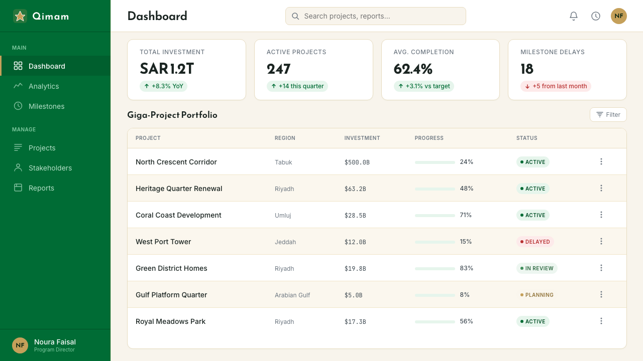
The Public Investment Fund is the sovereign wealth vehicle through which most Vision 2030 giga-projects are financed and developed. Its visual identity work — spanning NEOM, the Red Sea Project, Diriyah Gate Authority, and Qiddiya — constitutes a substantial portion of the broader Vision 2030 design ecosystem. Each PIF-backed project maintains a distinct sub-brand while remaining visually affiliated with the parent system, creating a family of identities that collectively demonstrate the range of the palette and typographic system across very different program types: futuristic urban development, coastal tourism, historical heritage, and entertainment.公共投资基金是大多数2030愿景超级工程得以融资与开发的主权财富载体。其视觉识别工作——涵盖NEOM、红海项目、迪里耶门户管理局与奇迪亚——构成了更广泛的2030愿景设计生态系统的主要部分。每个公投基金支持的项目在保持独特子品牌的同时,在视觉上与母体系统保持关联,创造出一组识别家族,共同展示了调色板与排印体系在迥异项目类型中的覆盖范围:未来主义城市开发、海岸旅游、历史遗产与娱乐。
The Boutros type foundry, and specifically the Tajawal typeface it developed, became closely associated with the digital and screen-facing dimensions of Vision 2030's government interface design. Tajawal represents the generation of Arabic typefaces that emerged to serve the UI needs of digital government services — combining classical Naskh structure with the open apertures and consistent stroke modulation required for rendering at small sizes on screens. Its adoption across Saudi digital government portals gave the Vision 2030 typographic voice a specific, recognizable character in screen contexts, demonstrating how Arabic typography could achieve the same systematic consistency as the best Latin typefaces in interface design.Boutros铸字公司,尤其是其开发的Tajawal字体,与2030愿景政府界面设计的数字端及屏幕端紧密相连。Tajawal代表了为服务数字政务UI需求而涌现的新一代阿拉伯字体——以古典纳斯赫体结构为基础,结合了在屏幕小尺寸渲染中所需的开放字怀与一致的笔画调制。其在沙特数字政务门户中的广泛采用,赋予了2030愿景排印声音在屏幕语境下具体、可辨的特征,证明了阿拉伯字体排印能够在界面设计中实现与最优秀的拉丁字体同等的系统性一致性。
The design and architecture teams behind NEOM — the most visually ambitious of the Vision 2030 giga-projects — have produced a body of imagery and spatial identity work that has significantly shaped the broader aesthetic conversation around the program. NEOM's promotional materials, architectural renderings, and brand communications push the Vision 2030 visual language toward its most speculative and forward-looking register: deep space blues, mirror-finish surfaces, and extreme geometric abstraction sit alongside the broader system's warm neutrals and Islamic pattern references. NEOM's design language functions as the future-forward edge of the Vision 2030 aesthetic family.NEOM背后的设计与建筑团队——2030愿景超级工程中视觉最具雄心者——产出了大量图像与空间识别作品,深刻塑造了围绕该计划更广泛的美学对话。NEOM的推广材料、建筑效果图与品牌传播将2030愿景视觉语言推向其最具推测性与前瞻性的表达:深空蓝、镜面饰层与极端几何抽象,与更广泛体系的温暖中性色和伊斯兰图案参照并置。NEOM的设计语言是2030愿景美学家族中朝向未来的前沿。
How do you use Saudi Vision 2030 today?今天怎么用 Saudi Vision 2030?
Saudi Vision 2030 is one of the most transferable contemporary civic design systems for contexts requiring a blend of institutional authority, cultural specificity, and modern legibility. Applying it well requires understanding its underlying logic: the palette communicates warmth and measured confidence, the typography carries cultural weight without sacrificing readability, and the geometric elements reference a specific tradition rather than generic global modernism. These are intentional signals, not decorative choices, and they work best when the content they frame shares similar ambitions.沙特2030愿景是当代最具可移植性的公民设计系统之一,适用于需要兼顾机构权威、文化特殊性与现代可读性的场景。正确运用它,需要理解其底层逻辑:调色板传递温暖与从容自信,排印承载文化重量而不牺牲可读性,几何元素参照的是特定传统而非泛化的全球现代主义。这些是有意为之的信号,而非装饰性选择,当它们框定的内容怀有类似抱负时,效果最佳。
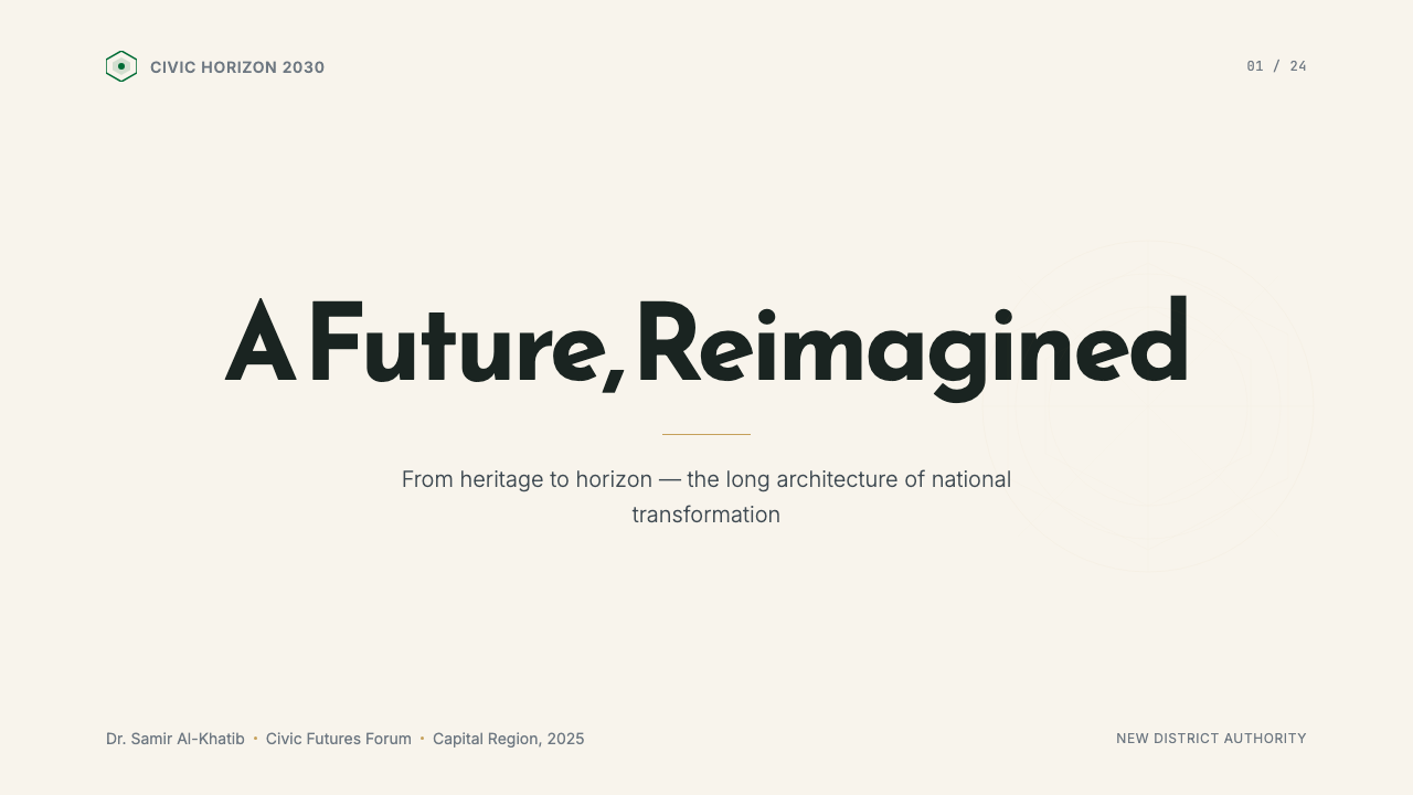
For presentation slides, the system translates naturally to both cover and content contexts. A cover slide benefits from the generous scale and confident typography of the civic aesthetic: a large, warm-ground field with a primary headline in a Naskh-influenced letterform, a thin gold rule or geometric accent, and a secondary English line set in a clean contemporary sans. Content slides should be treated as structured layouts with clear typographic hierarchy — two or three type sizes, generous white space, and restrained use of the green family to mark section headers or key data points. Avoid crowding: the system's civic scale implies breathing room, not density.对于演示文稿,该系统可自然移植到封面与内容页语境。封面幻灯片适合运用公民美学的慷慨尺度与自信排印:宽阔的暖底色场,主标题以纳斯赫体影响的字形呈现,细金线或几何强调,以及以简洁当代无衬线字体排列的英文副行。内容页应当被视为具有清晰排印层级的结构化版面——两到三个字号,慷慨的留白,克制地运用绿色家族标记章节标题或关键数据点。避免拥挤:该系统的公民尺度意味着呼吸空间,而非密度。
For web interfaces and dashboards, the system works well in contexts where institutional credibility and navigational clarity are the primary goals — government portals, civic service platforms, organizational reporting dashboards. The approach: ivory or warm white background, a dominant typographic hierarchy with a modern Arabic-compatible or visually harmonious Latin typeface, green as the primary interactive color, and gold as a sparse accent on premium or highlighted states only. Geometric pattern, if used, should appear as a single motif at reduced opacity in backgrounds or section dividers rather than as a repeating field.对于网页界面与仪表板,该系统在机构可信度与导航清晰度为首要目标的场景中表现出色——政务门户、公民服务平台、组织报告仪表板。方法如下:象牙色或暖白色背景,以兼容阿拉伯文或视觉协调的拉丁字体建立主导排印层级,绿色作为首要交互色,金色仅作为高级或高亮状态的稀疏强调。几何图案如有使用,应以降低透明度的单一母题出现在背景或分区线上,而非作为重复铺满的底纹。
For editorial and marketing communications, the Vision 2030 system supports strong visual hierarchy combined with cultural specificity. Feature spreads benefit from full-bleed aerial photography with the warm, high-contrast grading characteristic of the system, anchored by large headline type. Campaign materials can use the geometric tracery as a primary visual element — a single star polygon or lattice fragment at large scale on an ivory ground creates immediate cultural recognition without resorting to illustration. The mistake to avoid here is over-saturation: using the full green family simultaneously, or stacking pattern on top of warm photography, will quickly collapse into visual noise.对于编辑与营销传播,2030愿景体系支持强烈的视觉层级与文化特殊性的结合。特稿跨页可运用全出血鸟瞰摄影,以该系统特有的温暖高对比度调色,配以大尺度标题字锚定。活动材料可将几何描摹作为主视觉元素——象牙底面上大比例的单个星形多边形或格架片段,无需借助插图即可实现即时的文化辨识度。此处需要避免的错误是过度饱和:同时使用绿色家族的全部色调,或在温暖摄影上叠加图案,会迅速崩解为视觉噪音。
A common error when adopting this aesthetic is conflating it with generic Gulf or Middle Eastern design conventions — adding crescents, domes, and decorative Arabic calligraphy as ornamental overlays. The Vision 2030 system is distinguished precisely by its restraint: Arabic typography is structural, not decorative; geometric pattern is abstracted and reduced, not elaborated. Designers applying the system should ask, with each element they add: does this carry communicative weight, or is it there for cultural signaling alone? If the latter, it likely does not belong.采用这套美学时常见的错误,是将其与泛化的海湾或中东设计惯例混淆——将新月、穹顶与装饰性阿拉伯书法作为装饰性叠加层添加进来。2030愿景体系的独特之处恰恰在于其克制:阿拉伯排印是结构性的,而非装饰性的;几何图案是被抽象与简化的,而非被细化的。运用该体系的设计师应当对每一个添加的元素追问:这个元素承载传达重量,还是仅仅用于文化信号发送?若是后者,它很可能不属于这里。
See the Saudi Vision 2030 design system →查看 Saudi Vision 2030 完整设计系统 →
Saudi Vision 2030 — FAQSaudi Vision 2030 · 常见问题
How does Vision 2030 design differ from traditional Islamic decorative art?2030愿景设计与传统伊斯兰装饰艺术有何不同?
Traditional Islamic decorative art — the Arabesque, the muqarnas, the Iznik tile, the illuminated manuscript border — is characterized by surface elaboration: complexity is the virtue, and the eye is invited to follow interlocking patterns indefinitely. Vision 2030 design inverts this value. It takes the structural logic of Islamic geometric pattern — the mathematical relationships between forms, the principle of infinite extension, the balance between figure and field — and reduces it to its simplest readable unit. A single star polygon replaces a tiled field; a hairline geometry replaces a gilded border. The goal is recognition and cultural resonance achieved through suggestion rather than elaboration.传统伊斯兰装饰艺术——阿拉伯式蔓藤花纹、蜂巢穹顶、伊兹尼克瓷砖、手稿彩饰边框——以表面繁复为特征:复杂性是美德,目光被邀请无尽追随交错图案。2030愿景设计则倒置了这一价值。它汲取伊斯兰几何图案的结构逻辑——形态之间的数学关系、无限延展的原则、图形与底场之间的平衡——并将其简化至最简洁的可读单元。单个星形多边形取代铺满的图案;细线几何取代鎏金边框。目标是通过暗示而非繁复来实现辨识度与文化共鸣。
Can the Vision 2030 aesthetic work in contexts outside Saudi Arabia or the Gulf?2030愿景美学能在沙特阿拉伯或海湾地区以外的场景中使用吗?
The system's core elements — its warm neutral palette, its typographic confidence, its geometric abstraction — are culturally specific but not culturally exclusive. Organizations working in international contexts related to the Gulf region, the wider Arab world, or the Islamic cultural sphere can draw on the system's design logic with clear relevance. For genuinely unrelated contexts, the Arabic typographic elements should be used only if the content genuinely involves Arabic language; without that grounding, the use risks reading as appropriation rather than reference. The palette and geometric elements are more portable — warm neutrals and abstracted geometric pattern are a broadly applicable design vocabulary when deployed without the specifically Arabic typographic dimension.该系统的核心元素——其温暖中性调色板、排印自信、几何抽象——是具有文化特殊性的,但并非文化排他性的。在与海湾地区、更广泛的阿拉伯世界或伊斯兰文化圈相关的国际语境中工作的机构,可以有明确依据地借鉴该系统的设计逻辑。对于真正无关的语境,阿拉伯排印元素应仅在内容确实涉及阿拉伯语时使用;缺乏这一根基,使用可能被解读为挪用而非参照。调色板与几何元素则具有更强的可移植性——在不依赖特定阿拉伯排印维度的情况下,温暖中性色与抽象几何图案是广泛适用的设计词汇。
Is this design system suitable for commercial brands, or is it inherently governmental?这套设计系统适合商业品牌使用,还是本质上属于政府性质?
The Vision 2030 system was purpose-built for civic and governmental communication, but many of its characteristics translate well to commercial contexts: hospitality brands, luxury retail, cultural institutions, professional services, and organizations positioned around heritage and modernity simultaneously. The civic scale and bilingual confidence read well in any context that values legibility and institutional weight. The system is less suited to fast-moving consumer categories — food, youth entertainment, fast fashion — where the measured, aspirational register can feel too formal. The test is whether the brand's own values include the qualities the system communicates: measured confidence, cultural rootedness, and forward ambition without urgency.2030愿景体系是为公民与政府传播专门建立的,但其许多特征可良好移植至商业语境:酒店品牌、奢侈零售、文化机构、专业服务,以及同时以遗产与现代性为定位的机构。其公民尺度与双语自信在任何重视可读性与机构分量的语境中均表现出色。该系统较不适合快速消费品类——食品、青年娱乐、快时尚——在这些场景中,从容而进取的基调可能显得过于正式。检验标准是:该品牌自身的价值观是否包含该系统所传递的品质:从容自信、文化根植,以及不带紧迫感的前瞻雄心。
How should the green and gold elements be balanced to avoid looking ornate?应如何平衡绿色与金色元素以避免显得华丽繁复?
The fundamental rule is that gold is an accent, never a dominant. In the Vision 2030 system at its best, gold appears at hairline weight — as a single rule, a thin geometric frame, or a tracery element — and covers no more than a small fraction of any given layout surface. When gold is expanded beyond accent into area, the result reads as gilded rather than refined. Similarly, the green family works best when a single green from the range is selected for a given document or context, rather than multiple greens used simultaneously. The ivory ground is what makes both gold and green land cleanly: without generous warm neutral space around them, the accents lose their legibility and their sense of measured confidence.基本原则是:金色是强调,永远不是主色。在2030愿景体系最佳状态下,金色以细线重量出现——作为单条细线、纤薄几何框架或描摹元素——在任何给定版面中的覆盖面积不超过很小的比例。当金色从强调扩展为面积时,效果读起来是鎏金的,而非精致的。同样,绿色家族最有效的使用方式是:为给定文件或语境从色域中选取单一绿色,而非同时使用多种绿色。象牙底面是使金色与绿色均能清晰落地的基础:若周围缺乏慷慨的暖中性空间,这些强调色将失去可读性与从容自信的感觉。
How does Vision 2030 design handle the tension between Arabic and English in bilingual layouts?2030愿景设计如何处理双语版面中阿拉伯文与英文之间的张力?
The system resolves the bilingual tension by treating both languages as structurally equivalent rather than by subordinating one to the other. In practice this means: Arabic and English headlines appear at comparable optical sizes adjusted for the visual weight differences between the two scripts; neither language is set significantly smaller or softer than the other; and layout structures are designed to accommodate bidirectional reading rather than assuming a single dominant reading direction. The challenge is that Arabic and English letterforms have very different visual densities at the same point size — Arabic text tends to appear more compact and visually active, English more open. Skilled bilingual layout in this system adjusts for this optically rather than mechanically, producing parity of presence rather than parity of measurement.该系统通过将两种语言视为结构上对等而非将其中一种从属于另一种来解决双语张力。在实践中这意味着:阿拉伯文与英文标题以相当的视觉尺寸出现,并按两套文字之间的视觉重量差异进行调整;任何一种语言都不会被设置得明显更小或更柔;版面结构被设计为能够容纳双向阅读,而非假设单一主导阅读方向。挑战在于:阿拉伯文与英文字形在相同字号下具有截然不同的视觉密度——阿拉伯文往往显得更紧凑、视觉上更活跃,英文则更开阔。该系统中熟练的双语版面设计从视觉而非机械角度进行调整,实现存在感的对等而非测量值的对等。
Related design styles相关设计风格
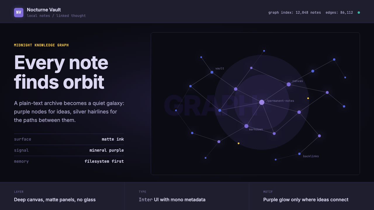 Obsidian Knowledge GraphNetworked thought glows at midnight. Purple nodes and silver hairlines map a…网状思维在午夜发光。紫色节点与银色细线构成星图。
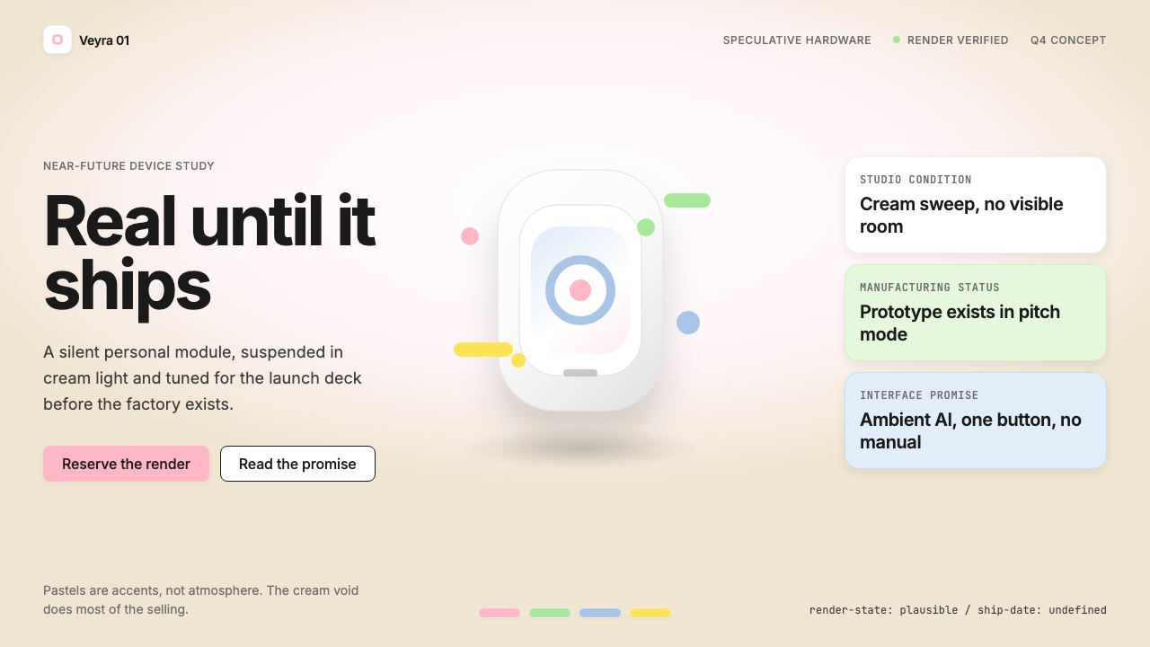 Vaporware Future Product RenderExpensive unreality. Cream sweep, Inter restraint, and pastel chips orbit a f…昂贵的失真感。奶油棚景、Inter 克制排版与粉彩芯片围绕悬浮渲染。
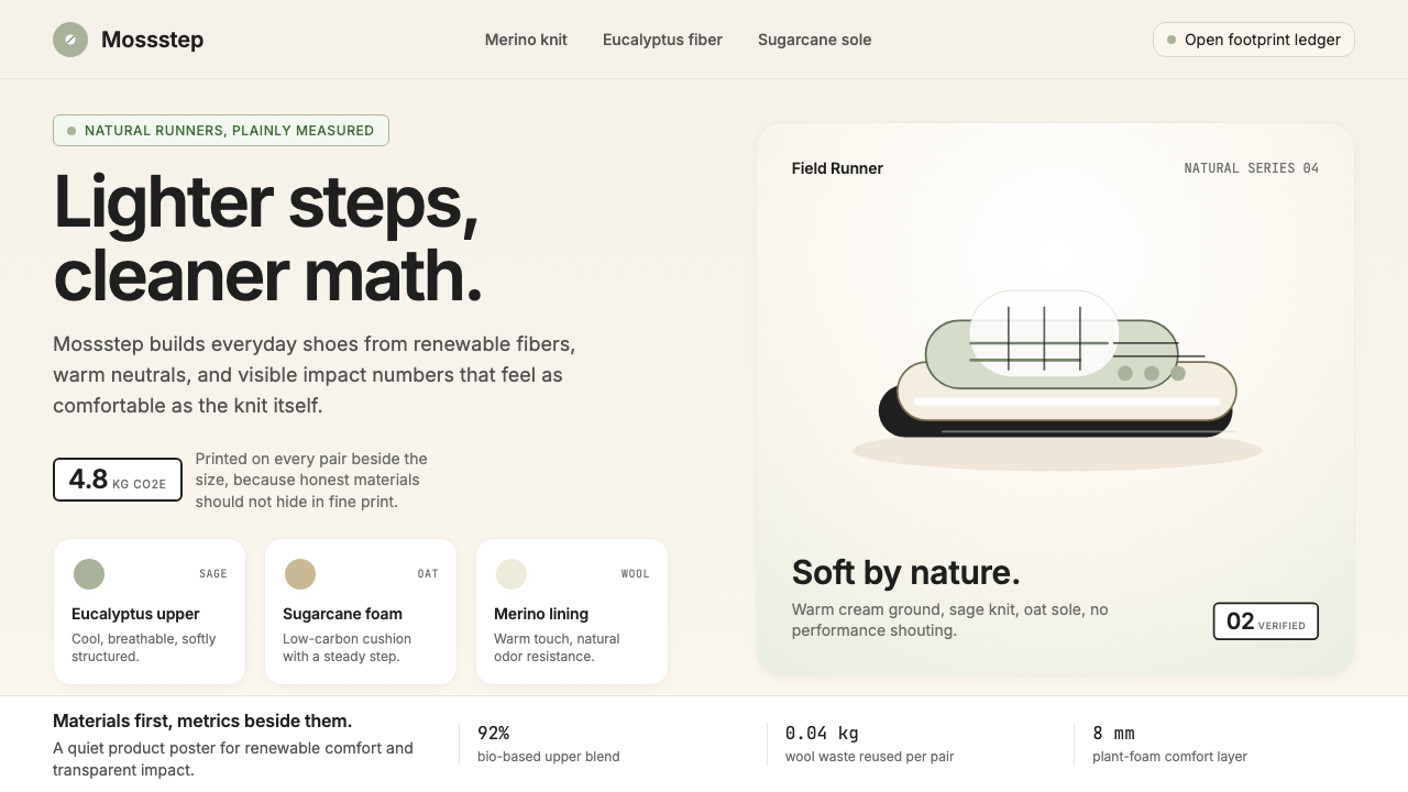 AllbirdsSustainability that breathes. Cream-and-sage tones, carbon labels next to pri…可持续,但绝不说教:奶油色与鼠尾草绿、碳足迹标签与价格并排——一种深呼吸般的诚…
 AsanaCalm productivity breathes. Cream canvas, lavender panels, coral-blue-yellow…安静生产力会呼吸:奶油画布、薰衣草面板与三色圆点。
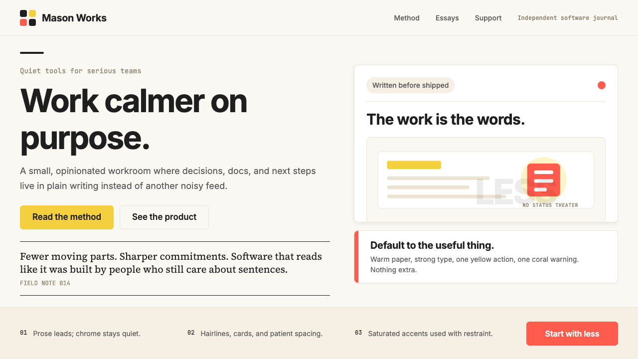 Basecamp / 37signalsQuiet craft, strong opinions. Cream paper, tight sans type, yellow and coral…安静却有主张。米色纸底、紧排无衬线、黄与珊瑚克制点题。
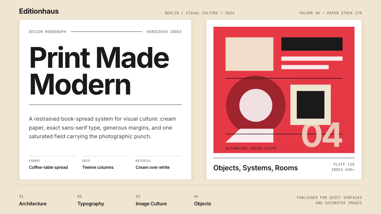 Gestalten Design BookCoffee-table calm. Cream paper, tight sans, one saturated block, and a strict…咖啡桌式冷静。奶油纸、紧凑无衬线、单一高饱和色块与严格网格。