What is Vaporware Future Product Render?什么是 Vaporware Future Product Render?
Vaporware Future Product Render is the visual language of hardware that may not exist yet — a cream studio sweep, a floating object rendered cleaner than reality, and pastel accents borrowed from the UI it promises to run.「未发布产品渲染」是那些也许尚未存在的硬件的视觉语言——奶油色棚景、比现实更干净的悬浮物体,以及从它承诺运行的界面中借来的粉彩点缀。
Vaporware Future Product Render in briefVaporware Future Product Render 速览
Vaporware Future Product Render is the speculative-tech launch aesthetic: a visual system built around the premise that a product render can create desire, attract investment, and establish a brand identity long before any physical unit ships. It combines the surgical stillness of high-end studio product photography with the weightlessness of photoreal three-dimensional rendering, producing images that look more pristine than any photograph of an actual object could ever be.「未发布产品渲染」是硅谷概念科技发布会的视觉美学:一套建立在「渲染图可以在实物出货之前就制造欲望、吸引投资、确立品牌身份」这一前提之上的视觉系统。它将高端棚拍产品摄影的手术刀式静谧与照片级三维渲染的失重感融为一体,产出比任何真实物体的照片都更加纯净的图像。
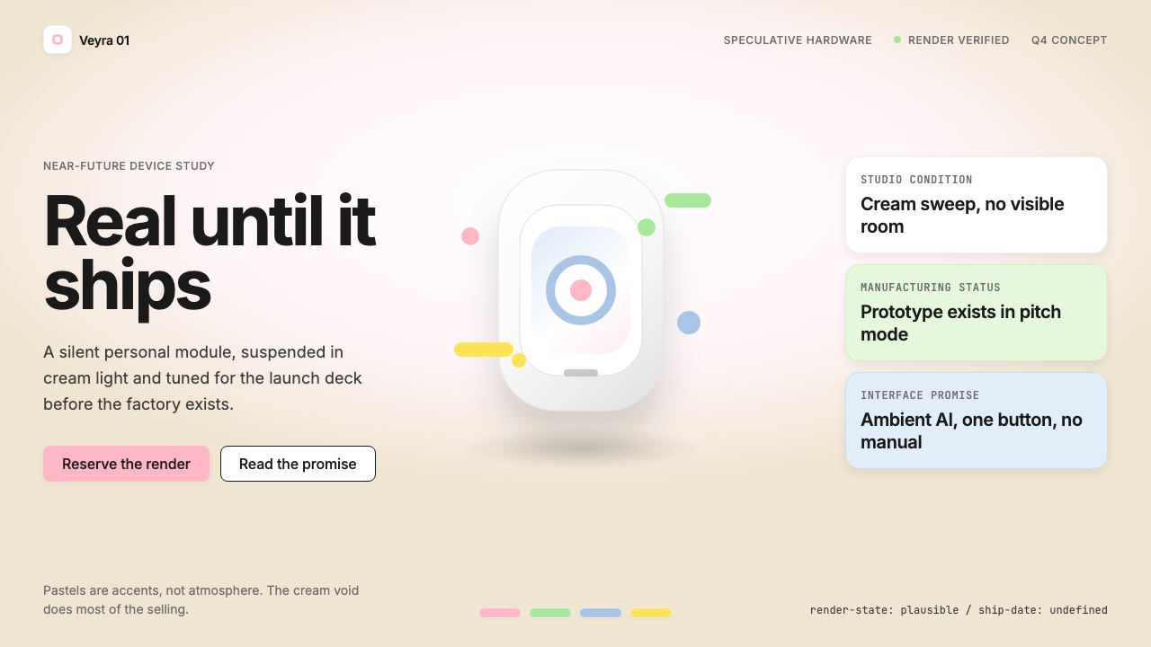
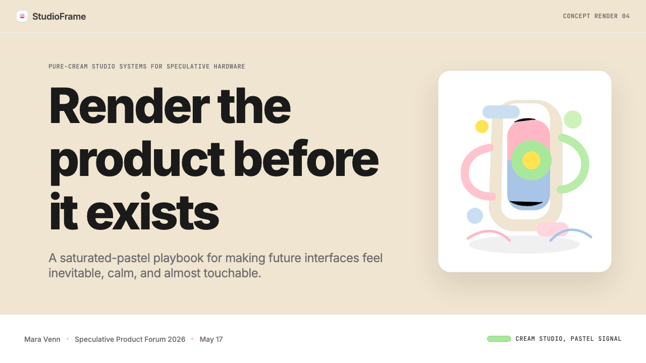
The style is immediately recognizable by its signature elements. A single warm-cream backdrop — neither stark white nor warm beige, but something precisely in between — provides the ground. Against it, one carefully modeled object floats without visible support, casting no distracting shadow, its surfaces catching light that seems to emanate from everywhere and nowhere. Saturated pastel chips — soft pink, icy mint, powder blue, lemon yellow — appear sparingly as interface details, label accents, or environmental reflections. Typography is tight, tracked-in, and whisper-quiet, reinforcing the impression that this object belongs to a world of refined restraint.这种风格凭借几个标志性元素立刻变得可辨认。一片单一的暖奶油色背景——不是刺目的纯白,也不是温热的米色,而是精确落在两者之间的某个点——提供了视觉基底。在它的衬托下,一件精心建模的物体无支撑地悬浮着,不投下任何令人分心的影子,其表面捕捉着一种似乎从四面八方、又从任何地方都不来的光。饱和的粉彩色块——柔粉、冰薄荷、粉蓝、嫩黄——以克制的姿态点缀为界面细节、标签装饰或环境反射。字体紧凑、字距收窄、声量极低,强化了「这件物体属于某个精炼克制的世界」的印象。
What separates this style from ordinary product photography is a quality of deliberate unreality. The geometry is too perfect, the highlights too even, the materials too pristine. This is not a flaw — it is the point. The render asserts that the product occupies a space beyond the contingencies of manufacturing tolerances and surface scratches. It exists, first and foremost, as a promise.将这种风格与普通产品摄影区分开来的,是一种刻意的失真感。几何形态太过完美,高光太过均匀,材质太过洁净。这不是缺陷——这正是重点。渲染图断言这件产品占据着一个超越制造公差与表面划痕的空间。它的首要存在形式,是一个承诺。
See the Vaporware Future Product Render design system查看 Vaporware Future Product Render 完整设计系统
Where does Vaporware Future Product Render come from?Vaporware Future Product Render 从何而来?
The genealogy of this style begins with Apple's product photography practice as developed and refined by Peter Belanger, the San Francisco-based commercial photographer who became Apple's primary product photographer in the 2000s. Belanger's approach — pure white or near-white sweep, carefully controlled rim lighting, no environment, no context, just the object — established the canonical grammar of the premium consumer electronics product image. The object became a jewel displayed against nothing, defined entirely by its own form and surface. Jony Ive's design philosophy, which prized the appearance of effortlessness and material purity above all other virtues, found its perfect photographic complement in Belanger's work.这种风格的谱系始于苹果公司的产品摄影实践,其具体形态由彼得·贝朗热塑造并精炼——这位旧金山商业摄影师在2000年代成为苹果的主要产品摄影师。贝朗热的方法——纯白或接近纯白的背景纸、精心控制的边缘光、无环境、无场景,只有物体本身——确立了高端消费电子产品图像的经典语法。物体成为陈列在虚无之上的珠宝,完全由自身的形态与表面来定义。乔纳森·艾夫的设计哲学将「毫不费力的外观」与「材质纯粹」置于一切美德之上,在贝朗热的作品中找到了其完美的摄影对应物。
The shift from photography to rendering began in earnest with the crowdfunding boom of the early 2010s. Kickstarter campaigns discovered that a high-quality render was both cheaper than a prototype photograph and visually superior: it showed the product in its ideal state, without the blemishes, jigs, and imperfect surface finishes that inevitably mark early prototypes. Founders who had no hardware to photograph could commission renders of hardware they intended to build, maintaining the visual confidence of an Apple-style launch deck while operating months or years away from actual production. The cream sweep migrated from photography studio to three-dimensional scene, and the floating-object composition became a template.从摄影向渲染的转变,随着2010年代初众筹热潮的到来而真正展开。Kickstarter 活动发现,高质量渲染图比原型机照片既更便宜又视觉上更优越:它以理想状态展示产品,没有早期原型上不可避免的瑕疵、工装夹具与不完美的表面处理。没有硬件可拍摄的创始人可以委托制作他们意图打造的硬件的渲染图,在距离实际量产还有数月乃至数年之遥时,依然维持苹果式发布会的视觉自信。奶油色背景从摄影棚迁移到三维场景之中,悬浮物体构图成为一套可复用的模板。
By the early 2020s, a distinct visual language had crystallized around a new wave of AI hardware startups. The Humane AI Pin, launched with considerable fanfare in 2023, exemplified the mature form: cream-warm renders, the device presented against body in lifestyle contexts and against the sweep in product contexts, pastel interface animations, and minimal sans-serif wordmarks. Rabbit Inc.'s R1, revealed the same year, pushed the palette into brighter oranges and reds while retaining the floating-object render logic. The Friend pendant, announced in 2024, stripped the form down further, foregrounding the render's sculptural quality above all else. Each of these products attracted significant preorder revenue from render alone, before hardware was in customers' hands — or, in some cases, before it was fully functional at all.到2020年代初,随着新一波人工智能硬件创业公司的涌现,一套独特的视觉语言已趋于成熟。Humane AI Pin 于2023年高调发布,完美诠释了这种成熟形态:暖奶油色渲染图,产品在生活场景中贴附于人体、在产品场景中衬于背景纸,粉彩界面动画,极简无衬线文字标识。同年发布的 Rabbit R1 在保留悬浮物体渲染逻辑的同时,将色板推向更明亮的橙色与红色。2024年发布的 Friend 吊坠则将形式进一步剥离,将渲染图的雕塑质感置于首位。这些产品中,每一件都在实物到达消费者手中之前——在某些情况下,甚至在它完全可用之前——仅凭渲染图吸引了可观的预订收入。
The style thus carries a double inheritance: the legitimate visual refinement of Apple's product photography tradition, and the promotional optimism of speculative crowdfunding. It is simultaneously the most aspirational and the most contested aesthetic in contemporary consumer technology, because it conflates the representation of a finished product with the product itself. Cultural critics began using the word 'vaporware' — originally a software industry term for announced products that never shipped — to describe both the hardware and the visual language that promoted it.这种风格因此携带着双重遗产:苹果产品摄影传统合理的视觉精炼,以及投机众筹的推广乐观主义。它同时是当代消费科技中最充满抱负、也最具争议的美学,因为它将「一件完成品的视觉呈现」与「产品本身」混为一谈。文化批评者开始用「vaporware」这个词——最初是软件行业对从未发布的已宣布产品的称呼——来同时描述这些硬件及推广它们的视觉语言。
What defines the Vaporware Future Product Render look?Vaporware Future Product Render 的视觉特征是什么?
The Cream Sweep奶油色棚景
The defining ground of this style is a warm, near-neutral background that reads as cream or ivory rather than pure white or gray. In photography this was a physical sweep — a curved seamless paper or acrylic surface that eliminates the horizon line between floor and backdrop. In rendering it is a simulated environment that bathes the subject in soft, directionless ambient light. The tone is specific: cool enough to feel clean and clinical, warm enough to avoid the harshness of pure white, and light enough to keep the product as the only figure. This backdrop is not empty space — it is a precision instrument for making objects appear to exist in a condition of refinement rather than in a physical location.这种风格的决定性基底是一种温暖的近中性背景,读来更接近奶油色或象牙白,而非纯白或灰色。在摄影中,这是一张实体背景纸——弯曲的无缝纸或亚克力表面,消除地面与背景之间的地平线。在渲染中,这是一个模拟环境,将主体沐浴在柔和、无方向性的环境光中。这个色调是精确的:足够冷以显得干净而临床,足够暖以避免纯白的刺眼,足够浅以让产品成为唯一的主角。这片背景不是空洞的空白——它是一件精密仪器,让物体看起来存在于一种精炼的状态之中,而非一个实体地点。
The Floating Object悬浮物体
Objects in this style are always presented without visible support, casting no shadow or only the faintest diffuse suggestion of one. This is a compositional choice with ideological weight: it implies that the product transcends material constraint, that it is lighter than physics allows, that it belongs to a category of objects above ordinary things. The render is typically centered or very slightly above center in the frame, with generous negative space on all sides. Scale cues are deliberately ambiguous — the object could be wallet-sized or room-sized. This ambiguity is not accidental; it removes the object from the mundane specificity of being a thing you would hold in your hand, and elevates it toward the abstract.这种风格中的物体始终以无可见支撑的方式呈现,不投影,或仅投下最轻微的漫反射暗示。这是一个具有意识形态重量的构图选择:它暗示产品超越了物质约束,比物理定律允许的更轻盈,属于一类高于普通事物的对象。渲染图通常在画面中居中或略高于中心,四周留有充裕的负空间。比例线索刻意模糊——物体可能是钱包大小,也可能是房间大小。这种模糊性并非偶然;它将物体从「你会握在手中的某样东西」的世俗具体性中移除,将其提升至抽象的层次。
Saturated Pastel Accents饱和粉彩点缀
Where the Bauhaus tradition uses primary colors at full saturation, this style instead reaches for a palette of pastels that have been pushed toward higher saturation than the word 'pastel' typically implies — soft pink that almost reaches coral, mint that almost reaches aqua, powder blue that almost reaches periwinkle, lemon that almost reaches chartreuse. These accents appear sparingly: as interface chip colors on a rendered screen, as a colored cable against the cream ground, as a glow emanating from a hardware indicator. They communicate friendliness and approachability while the cream ground communicates luxury. The combination produces a tonal warmth that reads simultaneously as premium and inviting — an effect that neither pure pastels nor fully saturated colors could achieve alone.与包豪斯传统使用全饱和三原色不同,这种风格转向一套被推向比「粉彩」这个词通常暗示的更高饱和度的色板——几乎触及珊瑚的柔粉、几乎触及水色的薄荷、几乎触及蓝紫的粉蓝、几乎触及黄绿的嫩黄。这些点缀出现得极为克制:作为渲染屏幕上的界面色片、作为衬于奶油色背景的彩色线缆、作为从硬件指示灯发出的光晕。它们在奶油色基底传递奢华感的同时传递亲切感与可接近性。这种组合产生了一种色调上的温暖,同时读来既高端又具有邀请感——这是纯粉彩或全饱和色彩单独都无法实现的效果。
Surgical Typography手术刀式排版
Text in this style does the minimum required to identify the product and communicate one or two key claims, then disappears. Wordmarks are set in geometric sans-serif typefaces tracked tightly enough to read as a single visual unit rather than a sequence of letters. Point sizes are small relative to the render — the image is the argument; the type is merely the caption. Weight is almost always light or regular rather than bold; the style's confidence comes from composition and materiality, not from heavy type. When a tagline appears, it is a single short line, lowercase or mixed case, never shouting. This quietness is itself a signal: the product is so self-evidently good that it does not need to advertise itself.这种风格中的文字只做识别产品和传达一两个关键主张所需的最低限度工作,然后消隐。文字标识以几何无衬线字体排设,字距收得足够紧,读来像一个视觉整体而非字母的序列。字号相对于渲染图而言偏小——图像是论点,文字不过是说明。字重几乎总是细体或常规,而非粗体;这种风格的自信来自构图与材质,而非沉重的字体。当出现标语时,它是单行短句,小写或混合大小写,从不呐喊。这种安静本身就是一个信号:产品如此不言而喻地出色,以至于它不需要为自己做广告。
Photoreal but Impossible Materials照片级但不可能存在的材质
The surfaces rendered in this style follow the physical rules of light reflection with precision — metal reads as metal, matte reads as matte, glass reads as glass. But the objects themselves exhibit a material perfection that no manufacturing process can actually deliver. There are no micro-scratches, no slight color inconsistencies from batch variation, no tooling marks, no assembly seams that drift by a fraction of a millimeter. Edges are exactly as sharp as they appear in the render file. This is not carelessness — renders of this quality require significant attention to subsurface scattering, fresnel falloff, and environmental lighting. The result is a material register that simultaneously feels credible and impossible: you believe the object could exist, but you sense that the one on screen never has.这种风格中渲染的表面精确遵循光线反射的物理规律——金属读来像金属,哑光读来像哑光,玻璃读来像玻璃。但物体本身展现出任何制造工艺实际上都无法实现的材质完美度。没有微划痕,没有批次差异造成的轻微色彩不一致,没有工具痕迹,没有偏差几分之一毫米的组装缝隙。边缘与渲染文件中呈现的一样精锐。这不是疏忽——这种质量的渲染需要对次表面散射、菲涅尔衰减和环境光照投入大量精力。结果是一种同时令人信服又令人察觉其不可能的材质体验:你相信这件物体可以存在,但你感知到屏幕上的这一件从未真实存在过。
Restrained Spatial Depth克制的空间深度
Despite being three-dimensional in origin, the compositions in this style resist deep spatial recession. The object is typically presented at a three-quarter angle or straight-on, with a field of view that minimizes perspective distortion and keeps lines close to parallel. Backgrounds do not recede to a visible vanishing point — the cream sweep curves away into softness rather than into geometrically defined space. This keeps the image looking more like an icon than a scene, more like a diagram than a photograph. The controlled depth also reinforces the floating effect: without strong spatial cues, the object has no floor to rest on and no context to belong to.尽管在本质上是三维的,这种风格的构图却抗拒深度空间的纵深退缩。物体通常以四分之三角度或正面呈现,视野设置使透视变形最小化,让线条接近平行。背景不退向可见的消失点——奶油色背景纸柔和地曲折消失,而非退向几何定义的空间。这让图像看起来更像图标而非场景,更像示意图而非照片。这种受控的深度也强化了悬浮效果:没有强烈的空间线索,物体既没有可以倚靠的地面,也没有可以归属的场景。
Conceptual Interface Presence概念性界面存在
When the product has a screen, the interface shown on it is never a real working state — it is a curated frame from a hypothetical interaction, designed to communicate the product's promise rather than its actual capability. Screen content in these renders typically features clean card layouts, the product's custom typeface, and the pastel accent palette mirrored back from the hardware. Sometimes the interface is partially revealed through a physical cutout or an edge-lit display, amplifying the sense of looking through a window into a more refined possible world. This layering of rendered hardware and rendered interface creates a recursive loop of speculation: the image of an image of what the product might become.当产品有屏幕时,屏幕上显示的界面从来不是真实的工作状态——它是来自一次假想交互的精选帧,被设计用来传达产品的承诺而非其实际能力。这些渲染图中的屏幕内容通常呈现干净的卡片布局、产品的专属字体,以及从硬件中镜像回来的粉彩点缀色板。有时界面通过物理镂空或边缘发光的显示屏部分展露,放大了「透过窗口窥视一个更精炼的可能世界」的感觉。渲染硬件与渲染界面的这种叠加创造了一个递归的推测循环:一张关于这件产品可能成为什么的图像的图像。
See the Vaporware Future Product Render design system查看 Vaporware Future Product Render 完整设计系统
Who shaped Vaporware Future Product Render?谁塑造了 Vaporware Future Product Render?
Belanger is the San Francisco-based commercial photographer who served as Apple's primary product photographer for much of the 2000s and 2010s. His studio methodology — pure sweep, controlled rim lighting, no environment, and meticulous post-processing to remove any surface imperfection — established the visual vocabulary that the vaporware render aesthetic directly inherited. When three-dimensional rendering replaced photography in speculative product launches, the spatial logic and tonal palette of Belanger's work served as the template. His images set the expectation that a premium technology object, when properly presented, should appear to exist in a state of absolute material purity.贝朗热是旧金山商业摄影师,在2000年代和2010年代的大部分时间里担任苹果的主要产品摄影师。他的棚拍方法论——纯背景纸、受控边缘光、无环境、以及去除任何表面瑕疵的精细后期处理——确立了「未发布产品渲染」美学直接继承的视觉词汇。当三维渲染在投机性产品发布中取代摄影时,贝朗热作品的空间逻辑与色调色板充当了模板。他的图像确立了一种期望:一件高端科技产品,在被适当呈现时,应当看起来存在于绝对材质纯粹的状态之中。
As Apple's Chief Design Officer from 1996 to 2019, Ive presided over the design language that the vaporware render tradition aspires to emulate. His philosophy — materials honest to their nature, surfaces as smooth as human manufacture can achieve, forms that eliminate every element that does not need to exist — created the cultural benchmark against which all premium consumer hardware has since been measured. The floating-object render is, in part, an attempt to assert membership in the category of objects that Ive's work defined. After his departure from Apple, Ive founded LoveFrom, and his influence continued to circulate through the generation of designers who had grown up studying his work.艾夫在1996年至2019年间担任苹果首席设计官,主导了「未发布产品渲染」传统所渴望效仿的设计语言。他的哲学——材料忠于其本质、表面尽人类制造所能达到的最光滑程度、形态消除一切无需存在的元素——创立了此后所有高端消费硬件据此衡量自身的文化标杆。悬浮物体渲染图在某种程度上是一种主张自己属于艾夫作品所定义的那类对象的努力。离开苹果后,艾夫创立了 LoveFrom,他的影响力继续在那些伴随着研究他的作品长大的一代设计师中流传。
Chaudhri and Bongiorno, both former Apple designers, founded Humane and launched the AI Pin in 2023 with a presentation and visual campaign that became the defining example of the mature vaporware render aesthetic at scale. The Humane launch deck, promotional renders, and unveiling video demonstrated how thoroughly the Apple visual inheritance — cream grounds, pristine surfaces, hushed typography — could be translated into a product that had not yet been delivered to customers. The critical reception that followed, including widespread negative reviews of the actual hardware, made Humane's launch materials a reference point in cultural discussions about the gap between render and reality.邱德里和邦乔尔诺均为前苹果设计师,他们创立了 Humane 公司,并于2023年发布了 AI Pin,其发布演示与视觉推广活动成为成熟「未发布产品渲染」美学大规模应用的决定性范例。Humane 发布的幻灯片、宣传渲染图与发布视频展示了苹果的视觉遗产——奶油色基底、纯净表面、低声排版——能够多么彻底地被转化为一件尚未交付给消费者的产品的呈现。随后的批评性反应(包括对实际硬件的大量负面评测)使 Humane 的发布素材成为关于渲染与现实之间差距的文化讨论中的参照点。
Rabbit's R1 device, revealed at CES 2024, demonstrated that the vaporware render vocabulary could absorb a bolder, more saturated color direction without abandoning its core spatial logic. The R1's vivid orange casing, rendered with the same floating-object composition and cream-adjacent background as its contemporaries, showed that the style's framework was flexible enough to support chromatic variation while remaining instantly legible as a member of the same visual family. Rabbit's launch generated significant preorder volume before units reached customers, reinforcing the style's proven ability to generate commercial momentum from rendered imagery alone.Rabbit 的 R1 设备于2024年 CES 上发布,展示了「未发布产品渲染」视觉词汇能够在不放弃其核心空间逻辑的前提下吸纳更大胆、更高饱和度的色彩方向。R1 鲜艳的橙色外壳,以与同期产品相同的悬浮物体构图和接近奶油色的背景进行渲染,表明这套风格框架具有足够的灵活性,能够支持色彩变奏,同时依然立即可辨认为同一视觉家族的成员。Rabbit 的发布在产品到达消费者手中之前产生了可观的预订量,进一步印证了这种风格仅凭渲染图像产生商业动能的已验证能力。
The critical journalism and video review culture that emerged around vaporware-era hardware — exemplified by Fried's Axios coverage and the wave of early adopter reviews that followed the Humane AI Pin, Rabbit R1, and similar devices — became as structurally important to the aesthetic as the renders themselves. The negative review cycle created a cultural grammar for reading the gap between the render and the product: audiences learned to parse the visual confidence of a launch image as a signal requiring skepticism rather than only admiration. This critical framework is now inseparable from the aesthetic — any design that deploys the style inherits awareness of that interpretive layer.围绕「未发布产品渲染」时代硬件涌现的批评性新闻报道与视频评测文化——以弗里德的 Axios 报道和随 Humane AI Pin、Rabbit R1 及类似设备而来的早期用户评测浪潮为代表——在结构上变得与渲染图本身同等重要。负面评测的循环创造了一套解读渲染与产品之间差距的文化语法:受众学会了将发布图像的视觉自信解析为需要怀疑而非仅仅赞赏的信号。这套批评框架现在已与这种美学不可分割——任何部署这种风格的设计都继承了对那个诠释层的意识。
How do you use Vaporware Future Product Render today?今天怎么用 Vaporware Future Product Render?
Vaporware Future Product Render is most naturally at home in pitch decks and launch presentations for hardware products, but its visual logic transfers cleanly to any context that needs to communicate a premium product promise — software, services, and brand identities included. The key is understanding what the style is doing structurally: it creates desire through idealization, not through information density. Every design decision should serve that singular function.「未发布产品渲染」最自然地栖居于硬件产品的路演幻灯片与发布演示之中,但其视觉逻辑能够清晰地迁移到任何需要传达高端产品承诺的场景——包括软件、服务与品牌识别。关键在于理解这种风格在结构上做的是什么:它通过理想化制造欲望,而非通过信息密度。每一个设计决策都应服务于这单一的功能。
For slide decks, the style works differently on cover slides versus content slides. A cover slide should feature the hero render — one object, centered or slightly elevated, against the cream ground, with the product name in tight tracking below or alongside. The render carries the emotional argument; the type does only the minimum. Content slides require more restraint: use the cream or near-white background as the consistent field, introduce a single pastel accent color as a structural device to mark key callouts or data points, and keep typographic hierarchy compressed — the difference between a section header and body copy should be expressed through scale and weight, not decoration. Data visualizations work well in this system when treated as clean diagrammatic forms against the light ground; avoid three-dimensional chart effects that compete visually with any hardware renders on adjacent slides.在幻灯片中,这种风格在封面页与内容页上的运作方式不同。封面页应当呈现主角渲染图——一件物体,居中或略微抬高,衬于奶油色基底,产品名称以紧凑字距排列在下方或旁侧。渲染图承担情感论点;文字只做最低限度的工作。内容页需要更多克制:以奶油色或接近白色的背景作为一致的底面,引入单一粉彩点缀色作为标记关键引文或数据点的结构性装置,并保持排版层级压缩——段落标题与正文之间的差异应通过尺度与字重而非装饰来表达。在这个体系中,数据可视化作为浅色底面上干净的示意形态时效果最佳;避免使用三维图表效果,否则会与相邻幻灯片上的硬件渲染图在视觉上竞争。
For web interfaces, this aesthetic suits product landing pages, pricing pages, and onboarding flows for premium hardware or software products. The most effective applications maintain the cream-warm ground across the full viewport, use full-bleed hardware renders as visual anchors at section transitions, and apply pastel accents only to interactive states — hover effects, active selections, progress indicators — rather than to static decorative elements. Navigation should be typographic and minimal; the render does the selling. Dashboard contexts call for more restraint with the floating-object motif, which can read as decorative excess when surrounded by functional UI. In those contexts, carry only the color palette and typographic discipline into the interface, reserving renders for empty states or onboarding moments.对于网页界面,这种美学适合高端硬件或软件产品的产品落地页、定价页和引导流程。最有效的应用是在全视口范围内保持暖奶油色基底,在板块过渡处使用全出血硬件渲染图作为视觉锚点,并将粉彩点缀色仅用于交互状态——悬停效果、激活选择、进度指示器——而非静态装饰元素。导航应当是字体性的、极简的;渲染图负责销售。在仪表板场景中,悬浮物体母题需要更多克制,当被功能性界面元素包围时,它可能被解读为装饰性过剩。在这些场景中,只将色板和排版纪律带入界面,将渲染图保留给空状态或引导时刻。
For editorial design, marketing materials, and social content, the style's strength lies in its poster-like compositional simplicity. A single marketing image in this style needs only a hero render, the cream ground, and one or two short lines of restrained type to function as a complete visual statement. Long-form editorial contexts — white papers, launch reports, detailed product documentation — can use the style's typographic logic (tight tracking, compressed hierarchy, generous white space) without the photorealistic render, which may feel too promotional for informational content. In those cases, replace the hardware render with a carefully composed lifestyle photograph in a similar tonal register: soft ambient light, warm-neutral backgrounds, precise but unshowy framing.对于编辑设计、营销材料和社交内容,这种风格的优势在于其海报式的构图简洁性。这种风格的单张营销图像只需要一张主角渲染图、奶油色基底,以及一两行克制的短文字,即可作为完整的视觉陈述发挥作用。长篇编辑场景——白皮书、发布报告、详细产品文档——可以在不使用照片级渲染图的情况下采用这种风格的排版逻辑(紧凑字距、压缩层级、充裕留白),因为渲染图在信息性内容中可能显得过于宣传性。在这些情况下,以在类似色调体系中精心构图的生活场景照片替代硬件渲染图:柔和的环境光、暖中性背景、精确但不张扬的取景。
The most common mistake when working in this style is overloading the image with information in an attempt to justify its confidence. A product render page that lists twelve feature callouts, uses all four pastel accent colors simultaneously, and includes a background pattern or gradient has lost the style's defining quality — its willingness to let absence do the work. A second frequent error is applying the cream-and-pastel palette to a product or context that does not yet have a hardware render or a strong formal object to center the composition on; without the floating object as the anchor, the palette reads as generic rather than aspirational. The style requires a strong primary subject to organize around, and that subject must be rendered or photographed with a quality that matches the ambient precision of everything else on the page.在这种风格中工作时最常见的错误,是为了为其自信感提供理由而用信息过载图像。一个列出十二个功能引文、同时使用全部四种粉彩点缀色、并包含背景图案或渐变的产品渲染页面,已经失去了这种风格的决定性品质——让缺席做工作的意愿。第二个常见错误是将奶油色与粉彩的色板应用于尚不拥有硬件渲染图或强烈形式感对象来锚定构图的产品或场景;没有悬浮物体作为锚点,色板读来像通用设计而非有抱负的设计。这种风格需要一个强有力的主体来组织构图,而那个主体必须以与页面上其他所有元素的环境精确度相匹配的质量被渲染或拍摄。
See the Vaporware Future Product Render design system查看 Vaporware Future Product Render 完整设计系统
Vaporware Future Product Render — FAQVaporware Future Product Render · 常见问题
Is this style appropriate for a product that actually exists and ships?这种风格适合用于真实存在且已量产出货的产品吗?
Yes, and in fact some of the most effective uses of this style are for products that do ship — the floating-object render is not inherently dishonest, only aspirational. Apple's own product imagery has used studio renders rather than photographs for many product generations. The style's association with speculation comes from context: if a launch campaign uses it before the product is available, audiences familiar with the aesthetic will apply skepticism. For products that are actually shipping, the key is to balance render imagery with tactile photography that shows the product in use, in real environments, held in real hands. The render communicates the ideal; the lifestyle photograph earns trust by acknowledging the real.可以,事实上这种风格的一些最有效应用正是针对真实存在且出货的产品——悬浮物体渲染图本身并不意味着不诚实,只是充满抱负。苹果自己的产品图像在许多产品世代中都使用棚拍渲染图而非照片。这种风格与投机性的关联来自场景:如果发布活动在产品可用之前使用这种风格,熟悉这种美学的受众会自动施加怀疑。对于真正出货的产品,关键是用展示产品在使用中、在真实环境中、被真实双手握持的触感摄影来平衡渲染图像。渲染图传达理想;生活场景照片通过承认现实来赢得信任。
How do you distinguish this style from ordinary product photography?如何将这种风格与普通产品摄影区分开来?
The surest signal is material impossibility: a real photograph of a real object will always contain micro-imperfections — slight variations in surface finish, tool marks, assembly seams, dust, and the very slight distortions that lens optics introduce. A vaporware-style render eliminates all of these. Edges are geometrically perfect; highlights roll from dark to light in perfect physical simulation; there are no specks, no seams, no scratches. A second distinguishing signal is the ambient lighting environment: real studio photography has directionality — you can always identify where the key light is coming from. A render in this style uses environment lighting that appears to come from everywhere simultaneously, giving the object a glow that no physical lighting rig can replicate. If you are unsure, look at the shadow: a real object casts a real shadow; a floating-object render typically has none at all.最确定的信号是材质的不可能性:一件真实物体的真实照片总会包含微小瑕疵——表面处理的轻微变化、工具痕迹、组装缝隙、灰尘,以及镜头光学引入的极轻微变形。「未发布产品渲染」风格的渲染图消除了所有这些。边缘几何完美;高光从暗到亮以完美物理模拟滚动;没有斑点,没有缝隙,没有划痕。第二个区分信号是环境光照:真实棚拍摄影有方向性——你总能判断出主光来自哪里。这种风格的渲染图使用看起来同时来自四面八方的环境光,赋予物体一种任何真实灯光装置都无法复制的光晕。如果你不确定,看投影:真实物体投下真实阴影;悬浮物体渲染图通常完全没有投影。
Can the style work in a dark-background or night-mode context?这种风格能在深色背景或夜间模式场景中运作吗?
A dark-mode variant exists and is used, but it operates under different logic. On a dark ground, the cream sweep becomes a deep charcoal or near-black, and the product render must carry its own luminosity — typically through glowing edges, emissive screen surfaces, or environmental lighting halos that make the object appear to self-illuminate. The pastel accents shift toward electric or neon intensities to remain readable against the dark field. The floating quality is easier to achieve on a dark ground because the lack of a visible backdrop is more convincing in low-light simulation. However, the style loses some of its core association with the luxury-cream sensibility; dark-mode renders read as more technical and less premium-domestic. They work well for products that want to emphasize power and sophistication over approachability.深色模式变体是存在且被使用的,但它在不同的逻辑下运作。在深色基底上,奶油色棚景变为深炭灰或接近黑色,产品渲染图必须携带自身的发光性——通常通过发光边缘、自发光屏幕表面或使物体看起来自我照明的环境光晕实现。粉彩点缀色向电气色或霓虹强度转变,以在深色底面上保持可读性。在深色基底上实现悬浮感更容易,因为在低光模拟中,看不到背景更加可信。然而,这种风格失去了与奢华奶油色感性的一些核心关联;深色模式渲染读来更加技术性,高端居家感减弱。它们对于希望强调力量感与精密感而非亲切感的产品效果良好。
What is the ethical dimension of using this aesthetic?使用这种美学有哪些伦理层面的考量?
The style carries a reputation risk that designers should engage with honestly. Because it originated in and has been repeatedly associated with products that overpromised and underdelivered — or that took preorder capital without shipping — audiences who recognize the aesthetic have learned to discount the claims that accompany it. Using this style for a product that is genuine and available creates no ethical problem, but it inherits some of the reputational baggage. Using it for a product in early development, before manufacturing readiness is established, invites the comparison. Designers working in this style for speculative products should weigh whether the visual confidence the style projects is proportional to the certainty the team actually has about the product's viability. The style is not deceptive by nature, but it is designed to assert certainty, and that assertion should be made responsibly.这种风格携带着设计师应当诚实面对的声誉风险。因为它起源于并被反复与那些过度承诺、未能兑现——或在未能出货的情况下收取预订款——的产品相关联,认识这种美学的受众已经学会折扣其附带的主张。将这种风格用于真实存在且可购买的产品不会产生伦理问题,但它继承了一些声誉负担。在制造就绪性尚未确立之前、产品处于早期开发阶段时使用它,会招致比较。在投机性产品中运用这种风格的设计师应当权衡:这种风格投射的视觉自信,是否与团队实际上对产品可行性所拥有的确定性相称。这种风格在本质上并不欺骗性,但它被设计用来断言确定性,而那种断言应当负责任地做出。
How do you combine this style with other contemporary aesthetics without losing its character?如何在不失去这种风格特质的情况下将它与其他当代美学结合?
The most compatible adjacent aesthetics are those that share the style's commitment to generous negative space and restrained color: Scandinavian editorial minimalism, Swiss-inflected typographic systems, and the quieter end of brutalist web design. The incompatible ones are those that depend on visual abundance — maximalism, dark glassmorphism, retro-ornamental revivals, and anything that uses texture or pattern as a primary compositional element. The cream-pastel palette and floating-object composition are fragile; introducing a single competing visual logic — a textured background, a heavily drop-shadowed card, a bright red notification badge — can break the system's tonal coherence. When borrowing from another style, take only one element at a time and test whether it reads as an intentional counterpoint or as an inconsistency. If it looks like something arrived from a different page, it probably did.最兼容的相邻美学是那些与这种风格共享「充裕负空间与克制色彩」承诺的风格:斯堪的纳维亚编辑极简主义、受瑞士影响的排版体系,以及粗野主义网页设计中较为安静的一端。不兼容的是那些依赖视觉丰盛感的风格——极繁主义、深色玻璃拟态、复古装饰性复兴,以及任何将纹理或图案作为主要构图元素的风格。奶油色与粉彩色板以及悬浮物体构图是脆弱的;引入单一竞争性视觉逻辑——纹理背景、重投影卡片、鲜艳红色通知标记——都可能打破系统的色调连贯性。从另一种风格借用时,每次只取一个元素,并测试它读来是有意为之的对位还是不一致。如果它看起来像是从另一个页面漂移过来的东西,它可能确实如此。
Related design styles相关设计风格
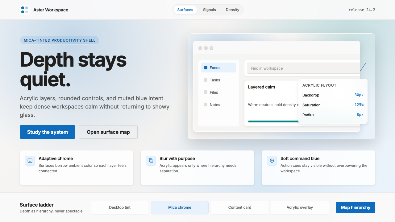 Microsoft Fluent 2Disciplined translucency. Warm Mica neutrals, acrylic blur, and muted blue cr…有纪律的半透明:暖 Mica 中性色、亚克力模糊与低调蓝营造沉稳层次。
 Cursor IDEAI-first code editor. Pure dark surfaces, off-white text, electric blue reser…以 AI 为核心的代码编辑器:近乎纯黑背景、柔白文字、唯一的电光蓝色专为 AI…
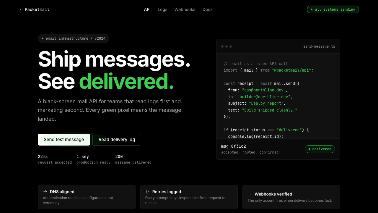 Resend 2024Clean code becomes brand. Pure black, JetBrains Mono, and one green delivered…品牌像 clean code:纯黑、JetBrains Mono、唯一送达绿。
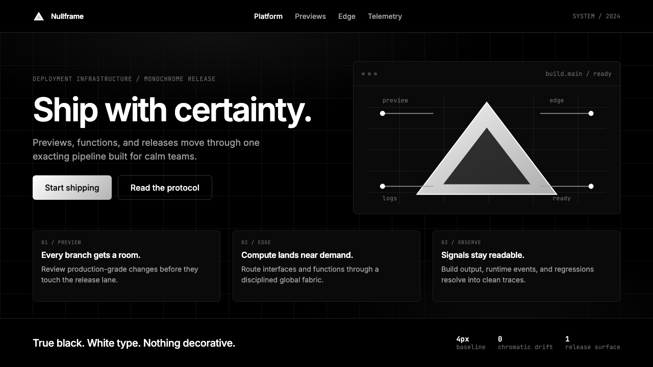 Vercel 2024Developer luxury by subtraction. Pure black, white Inter, rigid grid, triangu…以删减塑造开发者奢侈感:纯黑白、Inter 字体与刚性网格构成三角发布符号。
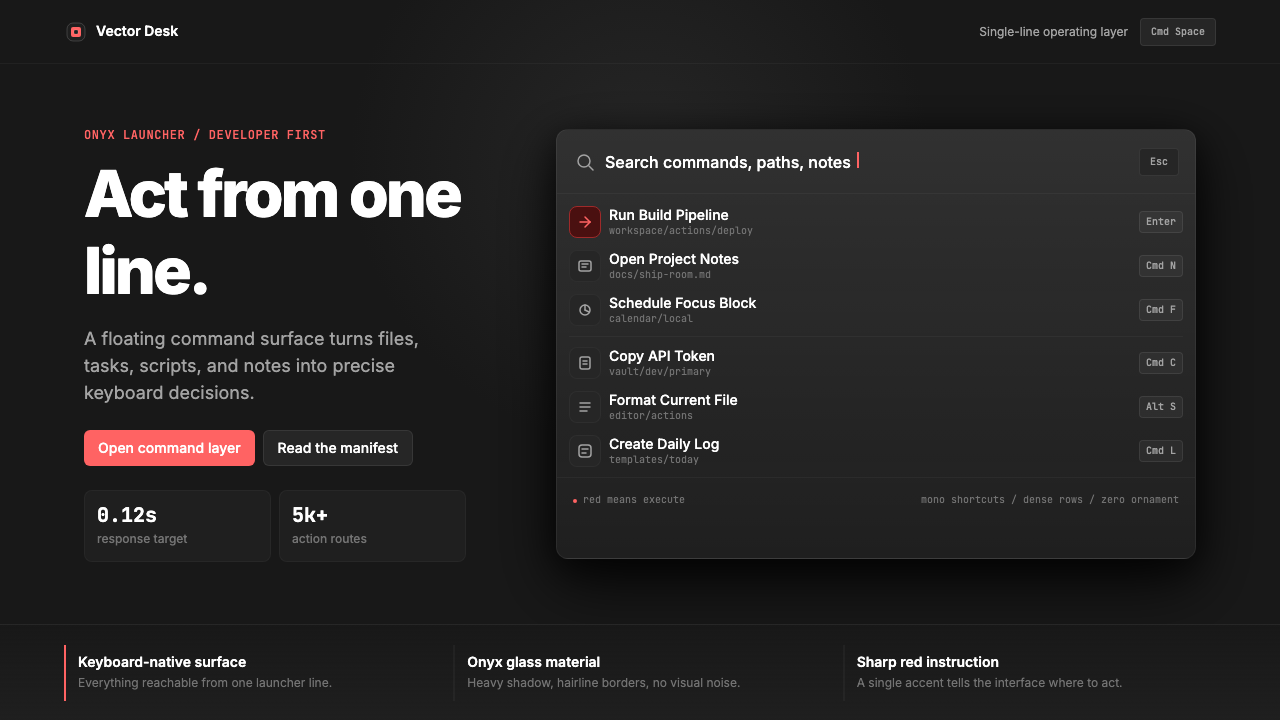 Raycast Spotlight Launcher (2023)Obsidian confidence. Sharp red cuts through Inter rows and mono shortcut chip…黑曜石般自信。锐红切过 Inter 行与等宽快捷键。
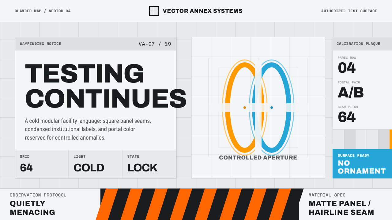 Aperture ScienceSterile authority. Cool panel seams, Archivo signage, and sparse orange-blue…冷峻权威:冷灰板缝、Archivo 标识与稀疏橙蓝光环。