What is Cursor IDE?什么是 Cursor IDE?

Cursor reduced the code editor to near-black surfaces and a single electric blue accent — the only color reserved exclusively for machine intelligence.Cursor 将代码编辑器简化为近乎纯黑的界面与唯一一种电光蓝色——那是专属于人工智能的颜色信号。
Cursor IDE in briefCursor IDE 速览
Cursor IDE is the visual and interaction language of an AI-first code editor: near-black backgrounds, off-white type, and a single chromatic accent color used exclusively to mark every point where artificial intelligence enters the workflow. Where most productivity software distributes color freely across menus, buttons, and status indicators, Cursor withholds it almost entirely — and then spends it all in one place. The effect is that AI features feel genuinely distinct, not merely labeled.Cursor IDE 的视觉与交互语言构建于一套极度克制的体系之上:近乎纯黑的背景、柔白的文字,以及唯一一种专门用于标记人工智能介入点的色彩强调。大多数生产力软件将色彩分散运用于菜单、按钮与状态指示器,Cursor 则几乎全程收回色彩,只在一处释放——所有 AI 功能入口。效果是:AI 特性在视觉上真正独立,而非只是贴了一个标签。
The aesthetic is not minimalism for its own sake. It is a semantic system in which visual restraint carries functional meaning. Every surface that is dark and quiet is human territory — the editor buffer, the file tree, the terminal pane. Every surface or element that glows with the signature blue is AI territory — the inline suggestion overlay, the chat panel, the command interface. The distinction is enforced purely through color, without icons, badges, or secondary labels.这种美学并非为极简而极简,而是一套语义系统——视觉克制承载着功能含义。每一片黑暗而安静的界面区域是人类的领地:编辑器缓冲区、文件树、终端面板。每一个以标志性蓝色发光的元素是 AI 的领地:内联建议叠层、对话面板、命令输入界面。这种区分完全通过色彩来执行,不借助图标、徽章或辅助标签。
Cursor's visual identity also makes a cultural argument. By choosing darkness and restraint over the playful gradients and rounded-corner approachability of mainstream consumer software, it positions itself inside the tradition of professional developer tooling — alongside terminal emulators, debuggers, and version-control interfaces — while simultaneously signaling that AI has been added not as decoration but as a load-bearing structural element.Cursor 的视觉身份同时表达了一种文化立场。它拒绝主流消费软件的活泼渐变与圆角亲和感,选择黑暗与克制,将自身置入专业开发者工具的传统之中——与终端模拟器、调试器、版本控制界面并肩——同时传达出一个信号:AI 的加入不是装饰,而是承重的结构性元素。
Where does Cursor IDE come from?Cursor IDE 从何而来?
Cursor was created by Anysphere, a small startup founded in San Francisco in 2022 by four co-founders — Michael Truell, Sualeh Asif, Aman Sanger, and Arvid Lunnemark — who had met as students at MIT. The company's founding premise was direct: the code editor, as it existed, was not built for a world in which language models could meaningfully assist programming. Rather than building a plugin on top of an existing tool, the team forked Visual Studio Code and redesigned the interface from its foundations around AI-native interaction patterns.Cursor 由 Anysphere 创造,这是一家由四位联合创始人——Michael Truell、Sualeh Asif、Aman Sanger 与 Arvid Lunnemark——于2022年在旧金山创立的小型初创公司,四人均相识于麻省理工学院的求学岁月。公司的创立前提直截了当:现有代码编辑器并非为语言模型能够实质性辅助编程的世界而构建。团队没有选择在现有工具之上构建插件,而是 fork 了 Visual Studio Code,从基础层面重新设计界面,使其围绕 AI 原生交互模式展开。
The product launched publicly in 2023 and grew with unusual speed through 2024, accumulating hundreds of thousands of active users within months. Its growth coincided with — and in part accelerated — a broader shift in how professional developers thought about AI assistance. Where earlier tools like GitHub Copilot operated as tab-completion overlays inside conventional editors, Cursor embedded AI more deeply: inline chat, multi-file composition instructions, codebase-wide context retrieval, and agent-mode task execution all appeared within a single coherent interface.产品于2023年公开发布,并在2024年以异常迅猛的速度增长,在数月内积累了数十万活跃用户。其增长与更广泛的转变同步发生——并在一定程度上加速了这一转变——即专业开发者对 AI 辅助的理解方式正在根本性地改变。早期工具如 GitHub Copilot 以 Tab 补全叠层的形式嵌入传统编辑器,Cursor 则将 AI 更深地融入其中:内联对话、多文件编排指令、全代码库上下文检索与代理模式任务执行,全部汇聚于一个连贯的界面之内。
The visual identity crystallized alongside the product. Because Cursor inherited VSCode's underlying architecture and layout — the familiar split-pane structure of file explorer, editor, and panel — the design challenge was not to build a new interface from scratch but to introduce a new chromatic and tonal logic into an existing spatial grammar. The near-black surface color and the single electric blue accent emerged as the solution: they allowed Cursor to look unmistakably distinct from its VSCode parent while preserving the spatial familiarity that developer users expected.视觉身份随产品一同结晶成形。由于 Cursor 继承了 VSCode 的底层架构与布局——文件浏览器、编辑器与面板组成的熟悉分栏结构——设计挑战并非从零构建新界面,而是在一套既有的空间语法中引入全新的色调与明暗逻辑。近乎纯黑的界面底色与唯一的电光蓝色强调由此浮现为解决方案:它们让 Cursor 在视觉上与 VSCode 母体截然有别,同时保留了开发者用户所期待的空间熟悉感。
By 2024, the Cursor aesthetic had become recognizable enough to be referenced and imitated outside the developer community — in landing pages, pitch decks, and product marketing created by teams with no direct connection to the product. The dark surface, the precise blue, and the stripped-back interface silhouette became shorthand for a particular cultural positioning: AI-native, technically serious, and confident enough in its own logic not to require decoration. This broader influence placed Cursor in a lineage of developer tools — including early terminal interfaces and the sparse UI of Unix-era text editors — whose design restraint was inseparable from their cultural authority.到2024年,Cursor 美学已足够清晰可辨,开始被开发者社区之外的人参考与模仿——出现在与该产品毫无直接关联的团队所制作的落地页、投资演示文稿与产品营销材料中。黑暗界面、精准的蓝色以及极度精简的界面轮廓,成为一种特定文化定位的速记符号:AI 原生、技术上的严肃认真,以及自信到不需要任何装饰。这种更广泛的影响力将 Cursor 置入一个开发者工具的传承谱系之中——包括早期终端界面与 Unix 时代文本编辑器的简朴 UI——这些工具的设计克制与它们的文化权威密不可分。
What defines the Cursor IDE look?Cursor IDE 的视觉特征是什么?
Near-Black Ground近黑底色
The foundational surface is not pure black but a very dark neutral that retains a faint warmth or coolness, giving the interface depth without the harshness of a pure void. This near-black functions as a canvas that absorbs rather than competes with content — code, text, and interface elements appear to rest on it rather than sit in front of it. The choice also has practical roots: long coding sessions in pure black can produce visual fatigue, while a dark neutral sustains focus over hours of work.基础界面底色并非纯黑,而是一种保留了极微弱冷暖倾向的深暗中性色,赋予界面深度而不带纯粹虚空的刺目感。这种近黑色作为画布发挥作用,它吸纳内容而非与内容竞争——代码、文字与界面元素看起来是落于其上,而非浮于其前。这一选择也有实用根源:长时间在纯黑背景下编码会产生视觉疲劳,而深暗中性色能在数小时的工作中持续维持专注。
Single Chromatic Signal单一色彩信号
One electric blue accent is the only color in the palette that carries chromatic weight, and it is reserved without exception for AI-related interface elements. This is not a stylistic choice that happens to align with AI branding — it is a semantic commitment. The color appears on the inline completion ghost text, the chat panel border, the AI command palette, and nowhere else. Users do not need to read labels to know when they are interacting with machine intelligence; the color tells them. This single-accent discipline is rarer than it appears: most software allows accent colors to drift across states and contexts, diluting their signal value.唯一一种电光蓝色强调是色板中唯一承载色度重量的颜色,且无一例外地专属于 AI 相关界面元素。这不是一种碰巧符合 AI 品牌的风格选择,而是一种语义承诺。这种颜色出现在内联补全幽灵文字、对话面板边框、AI 命令面板上,别无他处。用户无需阅读标签即可知晓自己何时在与机器智能交互;颜色本身在告诉他们。这种单一强调色的自律比表面看起来更为罕见:大多数软件允许强调色在各种状态与上下文中游移扩散,从而稀释其信号价值。
Off-White Typography柔白字体色
Body text and code are rendered in off-white rather than pure white, which reduces the luminance contrast with the near-black ground to a level that is comfortable for sustained reading without losing legibility. The hierarchy within text is established through brightness and weight rather than color: primary labels and active elements are brighter, secondary labels and inactive states are dimmer, with no color variation introduced. This restraint keeps the eye from fatigue and ensures that the single blue accent retains its full visual weight when it does appear.正文与代码以柔白而非纯白呈现,将与近黑底色的亮度对比控制在舒适的持久阅读水平,同时不损失可读性。文字内部的层级通过亮度与字重来建立,而非通过颜色:主要标签与活跃元素更明亮,次要标签与非活跃状态更暗淡,不引入色彩变化。这种克制使眼睛免于疲劳,也确保蓝色强调色在出现时保有其完整的视觉重量。
Code as Hero代码即主角
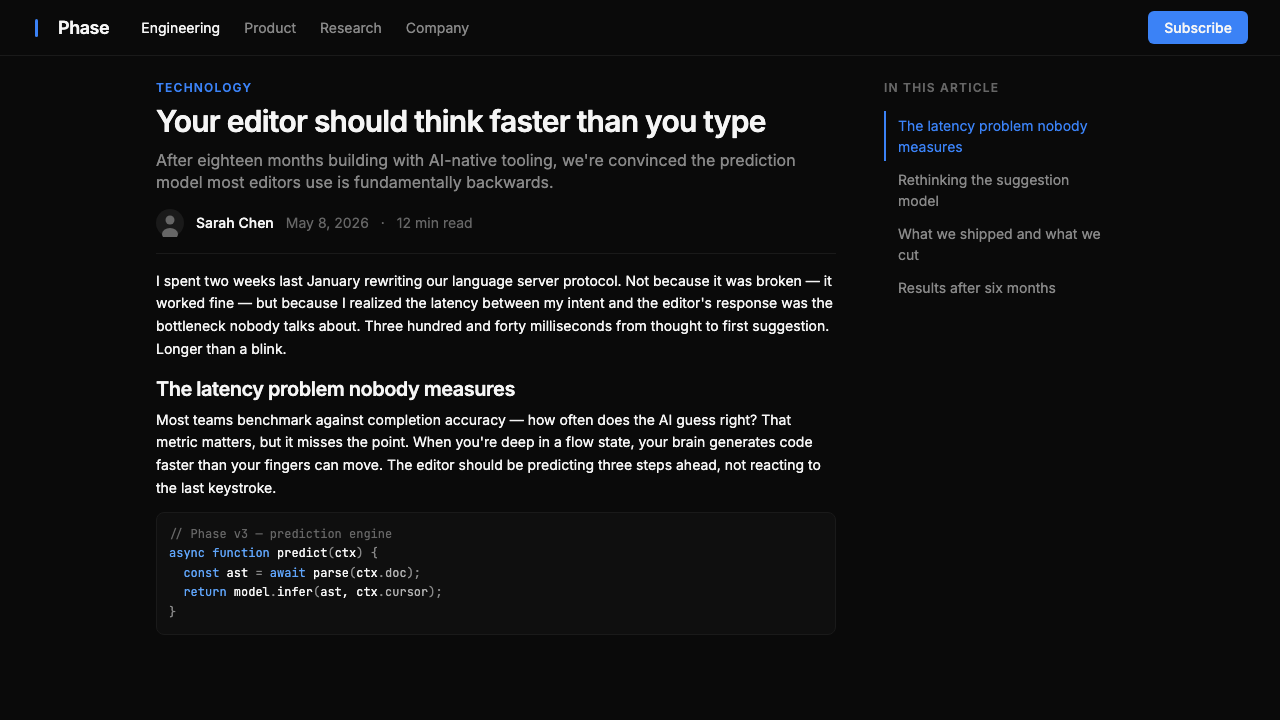
In Cursor's marketing materials, documentation, and interface design alike, code blocks and IDE screenshots are treated as primary visual content — not supporting assets or decorative backgrounds, but the central subject of each composition. Syntax-highlighted code sits large, unframed, and unadorned at the center of landing pages and feature illustrations. This approach argues implicitly that the product's value is so clearly demonstrated by showing it working that no additional persuasion is necessary — a confidence that functions as its own form of brand statement.在 Cursor 的营销材料、文档与界面设计中,代码块与 IDE 截图均被视为主要视觉内容——不是支撑性素材或装饰性背景,而是每个构图的核心主题。语法高亮代码大尺寸、无边框、无装饰地居于落地页与功能插图的中央。这种做法隐含着一个论点:产品的价值通过展示其运行中的状态就已清晰呈现,无需额外说服——这种自信本身就是一种品牌宣言。
Radical Typographic Restraint极度克制的排版
Interface labels, marketing copy, and documentation all use a narrow range of type sizes and weights, with hierarchy communicated through scale alone. There are no decorative typefaces, no script elements, no display fonts chosen for personality. The type system prioritizes legibility and neutrality: labels should not distract from what they label. In marketing contexts, headline type scales up dramatically in weight and size but retains the same neutral sans-serif character as body text, creating hierarchy without introducing visual noise.界面标签、营销文案与文档均使用窄范围的字号与字重,层级仅通过尺度来传达。没有装饰性字体,没有手写体元素,没有以个性为由选择的展示字体。字体系统优先考虑可读性与中立性:标签不应分散对其所标注内容的注意力。在营销场景中,标题字体在字重与字号上会大幅放大,但保持与正文相同的中性无衬线特征,制造层级而不引入视觉噪音。
Flat Depth with Hard Edges硬边扁平深度
Where layering is necessary — panels floating over the editor, dropdown menus, modal dialogs — Cursor uses sharp-edged separation rather than soft shadows or blurs to communicate depth. A border or a small step in background darkness distinguishes a foreground element from its ground. This approach keeps the interface legible at high information density while avoiding the visually busy quality that elaborate drop shadows introduce. The result is a spatial order that reads as hierarchical without requiring the eye to process soft gradients.在需要分层的场合——浮于编辑器上方的面板、下拉菜单、模态对话框——Cursor 使用硬边分割而非软阴影或模糊来传达深度。边框或一步背景明度差异将前景元素与其底色区分开来。这种方式在高信息密度下保持界面清晰可读,同时避免了精细投影阴影所带来的视觉杂乱感。结果是一种空间秩序,它呈现出层级感,而无需眼睛处理柔和渐变。
Purposeful Negative Space有目的的留白
Cursor's layouts — both in the application and in its marketing — use generous empty space not as a luxury signal but as a functional device for directing attention. The near-black ground is not filled: it surrounds code and UI elements with quiet that makes the content breathe and the blue accent, when it appears, unmissable. In marketing pages, wide margins and low content density per screen communicate confidence rather than an anxious need to explain. The negative space is doing work; it is not absence but emphasis.Cursor 的版面——无论是在应用程序内还是营销材料中——慷慨地使用空白,不是作为品质信号,而是作为引导注意力的功能手段。近黑底色不被填满:它以宁静包围代码与 UI 元素,使内容得以呼吸,也使偶尔出现的蓝色强调无从忽视。在营销页面中,宽阔的边距与每屏低内容密度传达的是自信,而非焦虑的解释需求。这种留白在工作;它不是缺席,而是强调。
Who shaped Cursor IDE?谁塑造了 Cursor IDE?
Truell is the CEO of Anysphere and a primary architect of Cursor's product direction. An MIT graduate, he shaped the founding thesis that AI should be embedded structurally into the editing workflow rather than added as a peripheral feature. His public writing and interviews articulate the design philosophy most directly: that the editor interface should make the presence of AI legible at a glance through consistent visual language, not through modal wizards or separate applications.Truell 是 Anysphere 的首席执行官,也是 Cursor 产品方向的主要架构者。作为麻省理工学院毕业生,他塑造了公司的创立论题:AI 应当作为结构性元素嵌入编辑工作流,而非作为外围功能附加其上。他的公开写作与访谈最直接地阐述了设计哲学:编辑器界面应通过一致的视觉语言让 AI 的存在一眼可辨,而非依赖模态向导或独立应用程序。
Asif is a co-founder of Anysphere whose work focused on the core language model integration that powers Cursor's AI features. The technical decisions he and the team made about how AI suggestions are surfaced — as ghost text, as panel conversations, as multi-file instructions — directly determined the interaction patterns that the visual design subsequently had to accommodate. The single-accent color system arose in part from the need to clearly distinguish AI-generated content from human-authored content in a shared editing surface.Asif 是 Anysphere 的联合创始人,其工作聚焦于驱动 Cursor AI 功能的核心语言模型集成。他与团队关于 AI 建议如何呈现的技术决策——作为幽灵文字、作为面板对话、作为多文件指令——直接决定了视觉设计随后必须适配的交互模式。单一强调色系统的形成,部分源于在共享编辑界面中清晰区分 AI 生成内容与人类创作内容的需求。
Sanger co-founded Anysphere and contributed to the early product and engineering decisions that established Cursor's approach to AI-native editing. His background informed the team's perspective on how developers actually move through codebases — navigating files, switching contexts, issuing high-level instructions — which shaped the interface's spatial organization and the decision to keep the editing surface visually quiet so that AI interactions could stand out clearly when they occurred.Sanger 是 Anysphere 的联合创始人,参与了确立 Cursor AI 原生编辑方式的早期产品与工程决策。他的背景使团队对开发者实际如何在代码库中移动——浏览文件、切换上下文、发布高层级指令——形成了深刻认知,这影响了界面的空间组织方式,以及保持编辑界面视觉静默以让 AI 交互在发生时清晰突显的决策。
Lunnemark is the fourth co-founder of Anysphere, rounding out the team of MIT alumni who built Cursor. As the product matured through 2024, the team's collective attention to interface coherence produced a visual system notable for its consistency: the same dark surface, the same accent color, and the same spatial logic appear across the application, the website, the documentation, and conference presentations. This consistency across touchpoints is not accidental — it reflects a shared commitment to treating visual language as an extension of the product's technical logic.Lunnemark 是 Anysphere 的第四位联合创始人,与其他三位麻省理工校友共同构成了打造 Cursor 的核心团队。随着产品在2024年逐渐成熟,团队对界面连贯性的集体关注产生了一套以一致性著称的视觉系统:相同的黑暗界面、相同的强调色、相同的空间逻辑,出现在应用程序、网站、文档与会议演示的每一个触点之上。这种跨触点的一致性并非偶然——它反映了一种共同的承诺:将视觉语言视为产品技术逻辑的延伸。
Cursor's visual identity cannot be understood without acknowledging its inheritance from Visual Studio Code, the open-source editor built by Microsoft whose codebase Anysphere forked as Cursor's foundation. VSCode itself popularized the dark-theme developer aesthetic — particularly its default dark themes and the panel-based spatial layout — that Cursor then pushed further toward monochromatic severity. Cursor's innovation was not to invent a dark editor interface but to rethink the chromatic logic within one: stripping all accent colors except one, and loading that one color with specific semantic meaning.若不承认 Cursor 对 Visual Studio Code 的继承,就无法完整理解其视觉身份。VS Code 是微软构建的开源编辑器,Anysphere 将其代码库 fork 为 Cursor 的基础。VS Code 本身普及了深色主题开发者美学——尤其是其默认深色主题与基于面板的空间布局——Cursor 则在此基础上进一步推向单色调的严峻感。Cursor 的创新不在于发明一种深色编辑器界面,而在于重新思考其中的色度逻辑:剥除所有强调色,只保留一种,并赋予这唯一的颜色特定的语义含义。
How do you use Cursor IDE today?今天怎么用 Cursor IDE?
Cursor IDE style is most at home in contexts where technical seriousness and AI-native positioning are desired values — developer tool landing pages, B2B SaaS pitch decks, AI product marketing, and technical documentation. The aesthetic communicates competence before a single word is read, which makes it particularly effective for products whose audience is skeptical by default and responds to demonstrated capability rather than persuasive copy.Cursor IDE 风格最适合那些以技术严肃性与 AI 原生定位为期望价值的场景——开发者工具落地页、B2B SaaS 投资演示文稿、AI 产品营销,以及技术文档。这种美学在读者阅读第一个字之前就已传达出能力感,这使它对于那些受众默认持怀疑态度、更响应展示能力而非说服性文案的产品尤为有效。
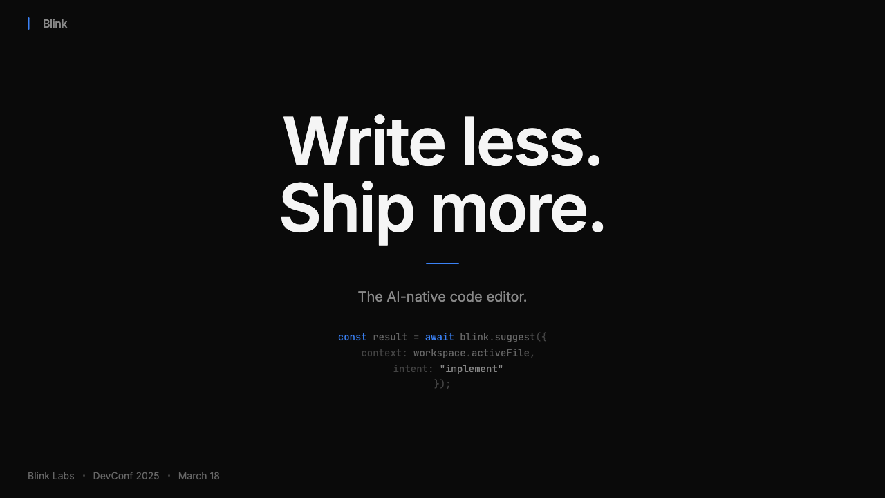
For presentation slides, the style works on both cover and content pages. A cover in Cursor style uses the near-black ground as the base, sets the product name or headline in large off-white type, and introduces the electric blue accent in a single UI element — a code snippet, a terminal prompt, an interface fragment — positioned as the visual anchor. This tells the story without narrating it. Content slides should be typographically spare: one headline, one or two supporting lines, and if data is present, a single chart treated as a flat graphic object against the dark ground. Data visualizations work well in Cursor style when the chart elements themselves are rendered in the blue accent against dark — bar fills, line traces, highlighted cells — with all secondary elements in dim off-white or dark gray.在演示文稿中,这种风格在封面页与内容页上均表现良好。Cursor 风格的封面以近黑底色为基底,以大尺寸柔白字体设置产品名称或标题,并在单一 UI 元素中引入电光蓝色强调——一段代码片段、一行终端提示、一个界面局部——作为视觉锚点。这无需叙述便讲述了故事。内容页应在排版上保持精简:一行标题,一到两行支撑文字;若有数据,则作为一个平面图形对象置于深色底面之上。数据可视化在 Cursor 风格中的效果,在于图表元素本身以蓝色强调对抗深色底面呈现——柱状填充、折线轨迹、高亮单元格——所有次要元素以暗哑柔白或深灰处理。
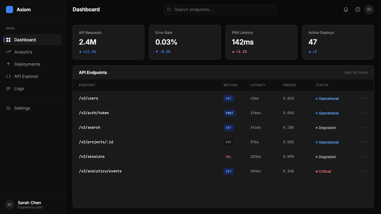
For web interfaces and dashboards, the Cursor aesthetic maps naturally to developer consoles, AI product interfaces, and technical analytics tools. The approach: establish the near-black as the base, use off-white for all primary text and label elements, and deploy the blue accent only for interactive states, active selections, progress indicators, and AI-generated content markers. Avoid introducing additional accent colors for secondary functions — if a second signal color is truly necessary, use a desaturated version of the base or a dim neutral, never a saturated hue. Sidebar navigation, command palettes, and inline overlay elements should follow the same tonal discipline as the main surface. Marketing pages built in this style work well for pricing tiers and feature comparisons, where the dark ground gives plan cards a premium density and the blue accent can mark the recommended tier without additional decoration.对于网页界面与仪表板,Cursor 美学自然地映射到开发者控制台、AI 产品界面与技术分析工具之上。方法如下:以近黑为基底,所有主要文字与标签元素使用柔白,蓝色强调仅用于交互状态、活跃选择、进度指示器与 AI 生成内容标记。避免为次要功能引入额外的强调色——若确实需要第二种信号色,使用底色的去饱和版本或暗哑中性色,绝不使用饱和色相。侧边栏导航、命令面板与内联叠层元素应遵循与主界面相同的色调自律。以这种风格构建的营销页面适合定价层级与功能对比场景,深色底面赋予方案卡片高级密度感,蓝色强调可在无需额外装饰的情况下标记推荐层级。
For editorial and marketing materials — including social cards, banner ads, and printed conference materials — the Cursor style translates effectively when the hero visual is a code block, a terminal output, or an interface screenshot. These elements, rendered at large scale on near-black, require no additional decoration: the syntax highlighting and the electric blue AI indicators within them carry the visual interest. Headlines should be set in a clean, weight-differentiated sans-serif; the goal is to amplify the technical artifact, not compete with it. When copy is necessary, keep it short and set it in off-white at a size that clearly subordinates it to the code or interface visual.对于编辑与营销材料——包括社交卡片、横幅广告与印刷会议材料——当英雄视觉是代码块、终端输出或界面截图时,Cursor 风格能有效转化。这些元素以大尺寸呈现于近黑背景上,无需额外装饰:其中的语法高亮与电光蓝 AI 指示器本身承载了视觉兴趣。标题应以清晰、字重分明的无衬线字体设置;目标是放大技术制品,而非与之竞争。当文案不可或缺时,保持简短,以柔白设置于清晰从属于代码或界面视觉的尺寸上。
The most common mistake when applying Cursor style is treating the dark background as an invitation to add more color. The power of the system depends entirely on the blue accent appearing exclusively in its designated semantic role. Introducing secondary accent colors — even low-saturation ones — immediately breaks the categorical distinction between AI and human interface elements that gives the style its communicative force. A second mistake is using pure black as the background rather than the softer near-black: pure black reads as harsh and flat, losing the subtle depth that makes long-session work comfortable. A third error is allowing the typography to become decorative — adding display typefaces, mixing weights arbitrarily, or using colored type where off-white would suffice. In Cursor style, type is infrastructure; it should be invisible until needed.应用 Cursor 风格时最常见的错误,是将深色背景视为添加更多颜色的邀请。这个系统的力量完全依赖于蓝色强调仅出现在其指定的语义角色中。引入次要强调色——哪怕是低饱和度的——立即打破 AI 与人类界面元素之间的范畴区分,而正是这种区分赋予了这种风格其传达力量。第二个错误是使用纯黑作为背景而非更柔和的近黑:纯黑显得刺目而扁平,失去了使长时工作舒适的微妙深度。第三个错误是让排版变得装饰性——添加展示字体、随意混搭字重、或在柔白便已足够之处使用彩色文字。在 Cursor 风格中,字体是基础设施;它应当隐形,直到被需要。
Cursor IDE — FAQCursor IDE · 常见问题
Can Cursor style be used for non-technical products?Cursor 风格可以用于非技术类产品吗?
It can, but it carries inherent associations that may work against non-technical products. The dark surface, monospace code aesthetics, and technical restraint signal developer culture and AI-native seriousness — values that are assets for B2B software, developer tools, and AI products, but misalign with consumer applications that need warmth, playfulness, or organic sensory quality. A wellness app or a food brand in Cursor style would feel cold and alienating; a fintech platform or a data analytics tool would feel authoritative and competent. The question to ask before applying the style is whether technical credibility is a core emotional value for your product's audience.可以,但它携带的固有联想可能对非技术类产品不利。深色界面、等宽代码美学与技术克制传达着开发者文化与 AI 原生的严肃性——这些价值观对 B2B 软件、开发者工具与 AI 产品是资产,但与需要温暖感、趣味性或有机感官品质的消费者应用不相吻合。以 Cursor 风格呈现的健康应用或食品品牌会显得冰冷疏离;金融科技平台或数据分析工具则会显得权威而有实力。在应用此风格之前,需要自问的问题是:技术可信度是否是你的产品受众的核心情感价值。
How does Cursor style differ from generic dark mode design?Cursor 风格与通用深色模式设计有何区别?
Generic dark mode is an inversion of a light interface — the same layout, the same color system, applied to a dark ground. Cursor style is built dark from the foundation: it is not a light design with the colors switched. The distinction shows most clearly in accent color use. A generic dark mode typically maintains the full range of its light-mode accent colors, now rendered at higher contrast against the dark ground. Cursor eliminates all accent colors except one, and loads that one with specific semantic meaning. The result is not merely darker but fundamentally more restrained and more semantically precise.通用深色模式是对浅色界面的反转——相同的布局,相同的色彩系统,应用于深色底面。Cursor 风格从基础层面就是深色构建的:它不是一个浅色设计换了颜色。这种区别在强调色使用上体现得最为清晰。通用深色模式通常保留其浅色模式强调色的全部范围,只是在深色底面上以更高对比度呈现。Cursor 去除了所有强调色,只保留一种,并赋予那唯一的颜色特定的语义含义。结果不只是更深,而是在根本上更为克制、语义上更为精确。
Is the electric blue accent color essential to the style, or can another color be substituted?电光蓝强调色对这种风格是否不可或缺,还是可以用其他颜色替代?
The specific hue of electric blue carries historical and cultural associations with AI and digital intelligence — it echoes earlier computing interfaces, bioluminescent screen glow, and the broad visual language of machine cognition that has developed in film and commercial design since the 1980s. Substituting a different color is technically possible, but changes the cultural resonance. A warm amber accent on dark ground reads as terminal-era nostalgia rather than AI-native future; a green accent reads as security tooling or matrix-era fiction. If the goal is to communicate AI-native credibility in the specific moment Cursor represents, the blue is difficult to replace. If the goal is to apply the broader visual logic — dark ground, single accent, semantic color discipline — the color itself can flex.电光蓝的特定色相携带着与 AI 和数字智能相关的历史与文化联想——它呼应了早期计算界面、生物荧光屏幕光晕,以及自1980年代以来在电影与商业设计中发展起来的机器认知广泛视觉语言。在技术层面,替换为其他颜色是可行的,但会改变文化共鸣。深色底面上的暖琥珀强调色读起来像终端时代的怀旧,而非 AI 原生的未来感;绿色强调色读起来像安全工具或矩阵时代的科幻。若目标是传达 Cursor 所代表的这一特定时刻的 AI 原生可信度,蓝色难以替代。若目标是应用更广泛的视觉逻辑——深色底面、单一强调、语义色彩自律——颜色本身则可以灵活变动。
How should images and photography be handled in Cursor style?在 Cursor 风格中,图像与摄影应如何处理?
Natural photographic imagery — people, environments, physical objects — is largely incompatible with the Cursor aesthetic at its most rigorous. The style's semantic clarity depends on surfaces being controllable: dark, flat, and tonal. A photograph introduces uncontrolled color, texture, and lighting that competes with the accent color and breaks the quiet that makes the system work. When imagery is unavoidable, the best approach is to treat it as a flat graphic element — rendered in high contrast, desaturated to near-monochrome, or composited as a dark silhouette against the near-black ground. Interface screenshots, terminal outputs, and code renders, by contrast, are native to the style and should be displayed at their full detail.自然摄影图像——人物、环境、实物——在 Cursor 美学最严格的应用中基本不兼容。这种风格的语义清晰度依赖于界面是可控的:深暗、平面、色调统一。摄影图像引入了不受控的色彩、质感与光照,与强调色竞争,并打破使系统有效运作的宁静。当图像不可避免时,最佳方式是将其作为平面图形元素处理——以高对比度渲染,去饱和至接近单色,或作为深色剪影合成于近黑底面之上。相比之下,界面截图、终端输出与代码渲染是这种风格的原生素材,应以完整细节展示。
Does Cursor style work for light backgrounds, or is it inherently a dark-only system?Cursor 风格适用于浅色背景吗,还是它本质上是一个纯深色系统?
Cursor style as practiced is inherently dark — the dark ground is not a mode but the foundational condition of the visual system. A light inversion is technically constructible: near-white ground, dark type, same single accent. But it loses the primary cultural association (developer-tool credibility, late-night coding, machine intelligence) and requires rethinking the accent color's contrast behavior. On a light ground, the electric blue loses some of its luminosity and reads differently against pale surfaces. If a light background is required by context, the safer approach is to treat it as a neutral variant and apply the same single-accent discipline, accepting that the result will feel less distinctly Cursor and more generically modern-minimal.实际应用中的 Cursor 风格本质上是深色的——深色底面不是一种模式,而是视觉系统的基础性条件。浅色反转在技术上是可以构建的:近白底面、深色文字、相同的单一强调色。但它失去了主要的文化联想(开发者工具可信度、深夜编程、机器智能),并需要重新思考强调色的对比行为。在浅色底面上,电光蓝失去了部分发光感,在浅色界面上读起来有所不同。若场景需要浅色背景,更稳妥的方式是将其视为中性变体,应用相同的单一强调色自律,并接受结果将不那么明确地像 Cursor,而更像通用的现代极简风格。
Related design styles相关设计风格
 Resend 2024Clean code becomes brand. Pure black, JetBrains Mono, and one green delivered…品牌像 clean code:纯黑、JetBrains Mono、唯一送达绿。
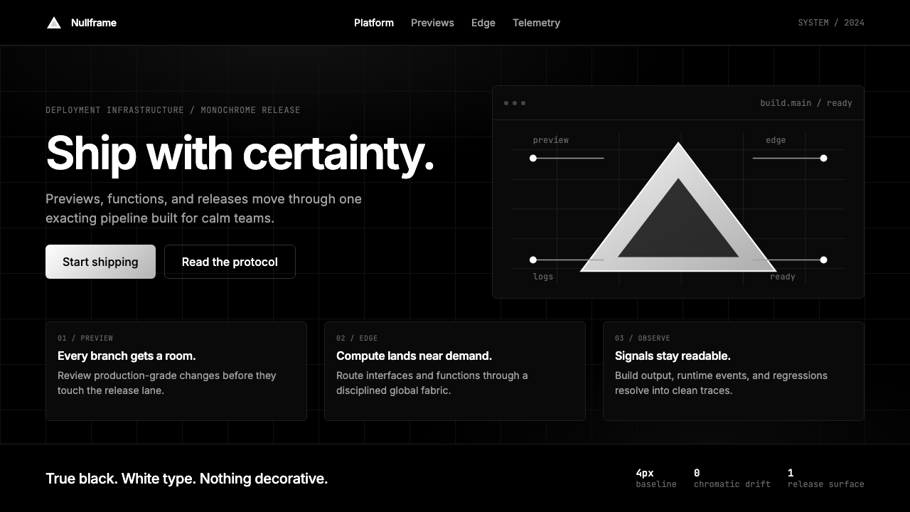 Vercel 2024Developer luxury by subtraction. Pure black, white Inter, rigid grid, triangu…以删减塑造开发者奢侈感:纯黑白、Inter 字体与刚性网格构成三角发布符号。
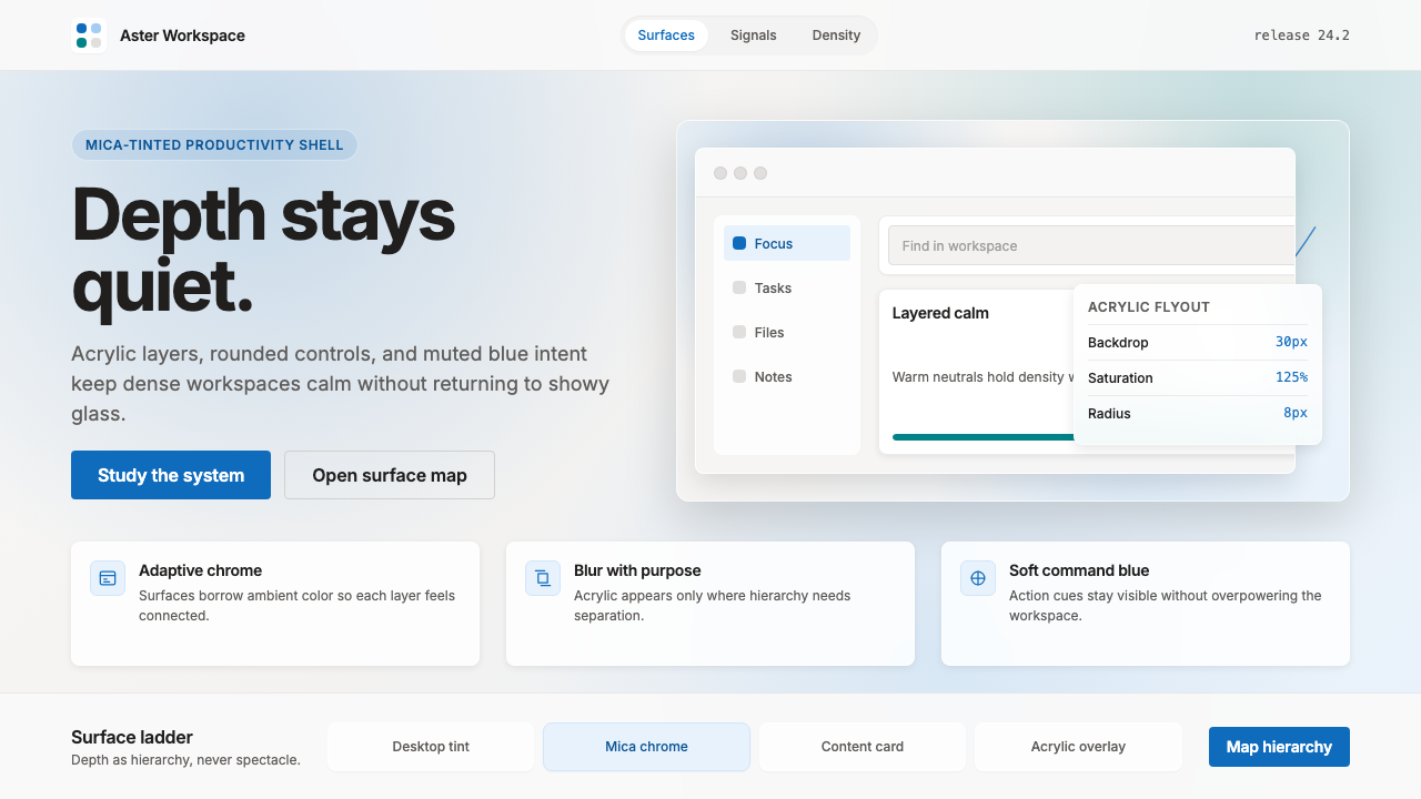 Microsoft Fluent 2Disciplined translucency. Warm Mica neutrals, acrylic blur, and muted blue cr…有纪律的半透明:暖 Mica 中性色、亚克力模糊与低调蓝营造沉稳层次。
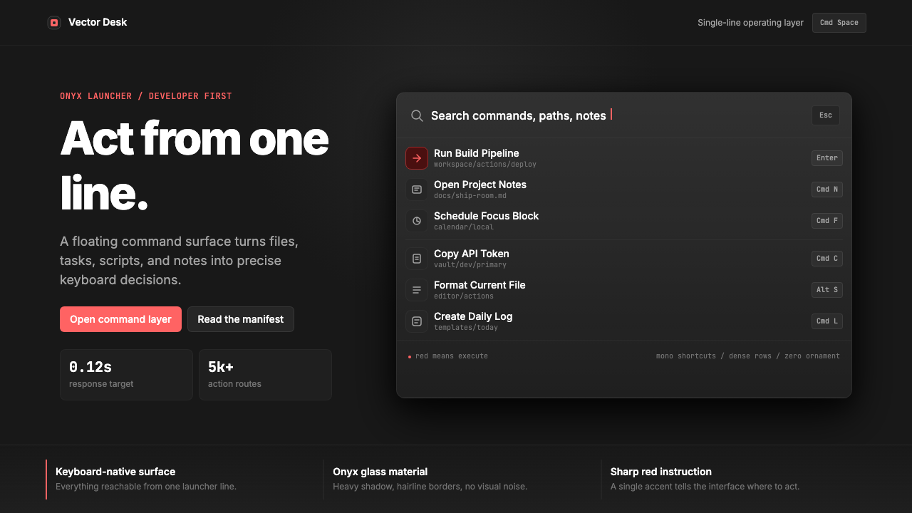 Raycast Spotlight Launcher (2023)Obsidian confidence. Sharp red cuts through Inter rows and mono shortcut chip…黑曜石般自信。锐红切过 Inter 行与等宽快捷键。
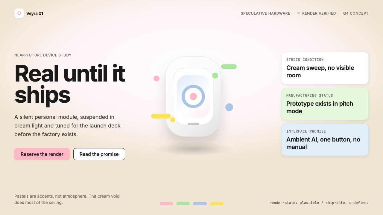 Vaporware Future Product RenderExpensive unreality. Cream sweep, Inter restraint, and pastel chips orbit a f…昂贵的失真感。奶油棚景、Inter 克制排版与粉彩芯片围绕悬浮渲染。
 Android Bugdroid GreenFriendly tech, reduced to geometry. Vivid green pops from Grey 900 and rounde…友好科技化为几何:明绿从 Grey 900 与圆润字形中跃出。