What is Microsoft Fluent 2?什么是 Microsoft Fluent 2?
Fluent 2 is Microsoft's disciplined answer to the question of how depth, warmth, and calm can coexist in a productivity operating system.Fluent 2 是微软给出的答案:如何在一套生产力操作系统中,让层次感、温度与沉静共存。
Microsoft Fluent 2 in briefMicrosoft Fluent 2 速览
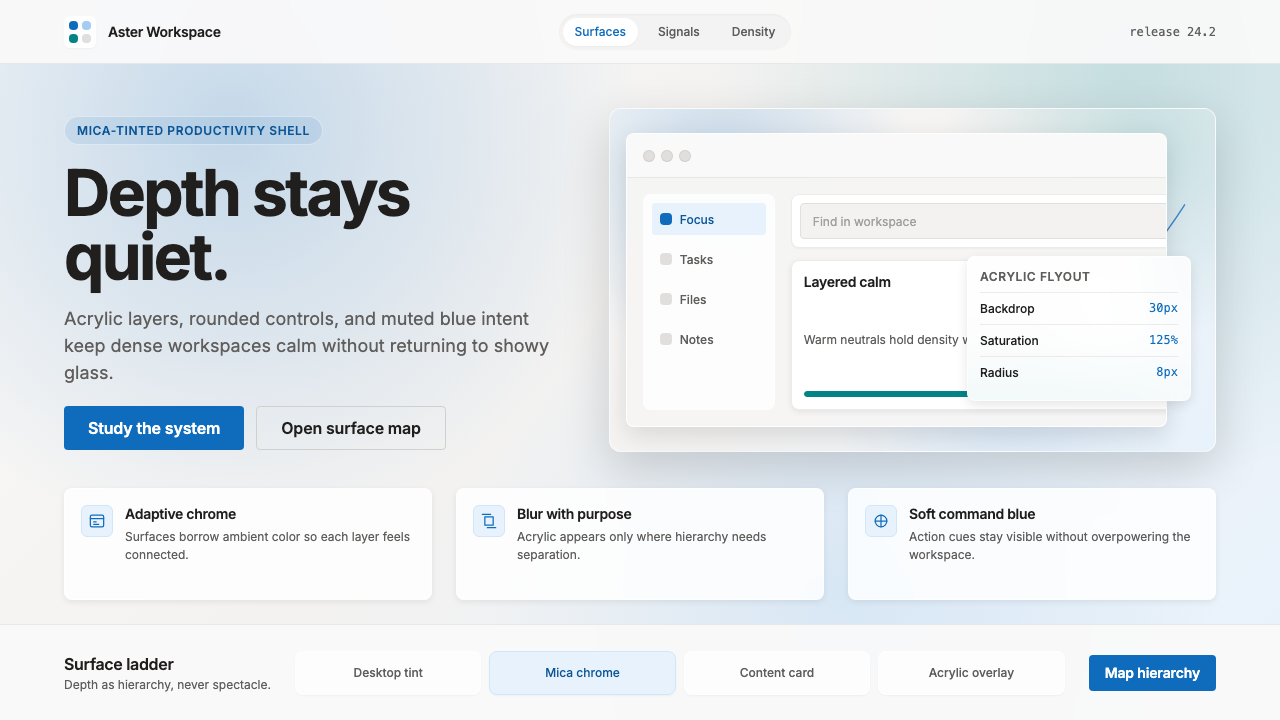
Microsoft Fluent 2 is the design language that unified Windows 11, Microsoft 365, and the Office suite beginning in 2021. It is a system defined by disciplined translucency — surfaces that borrow color and texture from the desktop environment beneath them — alongside rounded geometry, a restrained neutral palette broken by a single muted blue accent, and a hierarchy of layered materials that give interfaces a quiet sense of physical depth.Microsoft Fluent 2 是从2021年起统一 Windows 11、Microsoft 365 与 Office 套件的设计语言。它的核心是有纪律的半透明——界面材质从其下方的桌面环境中借取色彩与质感——同时配以圆润的几何造型、克制的中性色调、唯一一种低饱和度蓝色强调色,以及赋予界面静谧立体感的分层材质体系。
Fluent 2 occupies a precise position in the history of Microsoft's visual identity. It follows Metro, the flat, tile-based language of Windows 8, which stripped the interface down to pure typography and color and deliberately rejected all illusion of physicality. Fluent 2 does not return to the showy translucency of Windows Vista's Aero glass, whose frosted panels existed primarily as visual spectacle. Instead, it finds a disciplined middle ground: materials that respond to context — tinted by the wallpaper through Mica, or blurred by the background through acrylic — without ever becoming theatrical.Fluent 2 在微软视觉身份史上占据一个精确的位置。它接续于 Metro——Windows 8 那套纯平面、磁贴式语言,后者将界面剥离至纯字体与色彩,刻意拒绝一切物理感的幻觉。Fluent 2 并不回归 Windows Vista Aero 玻璃的炫目半透明——那些磨砂面板的存在主要是视觉奇观。它在两者之间找到一条有纪律的中间道路:材质对上下文作出回应——通过 Mica 被壁纸染色,或通过亚克力将背景模糊——却从不流于戏剧化。
The result is an aesthetic that reads as calm, productive, and quietly contemporary. Corners are rounded but not playful. Shadows are soft and layered rather than theatrical. The accent color signals interactivity without competing with content. The overall impression is of a design system built for long hours of work — attentive to comfort, indifferent to ornament.最终的美学效果是沉稳、高效、低调而当代的。圆角柔和却不轻浮,阴影轻柔分层而非舞台化,强调色传递交互意图却不与内容争夺注意力。整体印象是一套为长时间工作而构建的设计系统——关注舒适,对装饰无动于衷。
See the Microsoft Fluent 2 design system查看 Microsoft Fluent 2 完整设计系统
Where does Microsoft Fluent 2 come from?Microsoft Fluent 2 从何而来?
The story of Fluent 2 begins with its predecessor. In 2017, Microsoft publicly introduced Fluent Design System — a framework built around five ingredients: Light, Depth, Motion, Material, and Scale. This initial Fluent aimed to give Windows 10 a sense of physicality and dimensionality that had been deliberately erased by Metro. Acrylic material — a semi-transparent surface that blurs and tints the content behind it — was the most visible expression of this ambition. The system was promising but inconsistent, applied unevenly across Windows 10's own applications and largely ignored by third-party developers working against tight schedules.Fluent 2 的故事始于它的前身。2017年,微软公开推出 Fluent Design System——一套围绕五个要素构建的框架:光感、深度、动态、材质与缩放。最初的 Fluent 旨在为 Windows 10 赋予被 Metro 刻意抹除的物理感与立体感。亚克力材质——一种将其后方内容模糊并染色的半透明表面——是这一抱负最直观的表达。这套系统很有潜力,但应用不一致:在 Windows 10 自身应用中参差不齐,而在日程紧迫的第三方开发者中基本被忽视。
The decisive moment came with Windows 11, announced in June 2021. Under Panos Panay, then Chief Product Officer of Windows and Devices, and Albert Shum, Corporate Vice President of Design, the Windows 11 redesign committed fully to a new version of Fluent that the team would later characterize as Fluent 2. The visible changes were substantial: corners became uniformly rounded, the taskbar moved to the center of the screen, and a new material — Mica — was introduced alongside acrylic. Mica is a desktop-tinted material: it samples a desaturated version of the user's wallpaper and applies it subtly to application chrome, creating a connection between the desktop environment and the applications running on it without being visually intrusive.决定性的转折点是 Windows 11,于2021年6月发布。在时任 Windows 与设备首席产品官 Panos Panay 以及设计副总裁 Albert Shum 的主导下,Windows 11 的重新设计全面投入一个新版本的 Fluent,团队后来将其定性为 Fluent 2。外观变化相当显著:圆角变得统一,任务栏移至屏幕中央,新材质 Mica 在亚克力之外被引入。Mica 是一种桌面染色材质:它对用户壁纸进行去饱和度采样,并将其细腻地应用于应用程序框架,在不干扰视觉的前提下,在桌面环境与运行于其上的应用程序之间建立联系。
The expansion of Fluent 2 beyond Windows was equally significant. Microsoft Design worked to extend the system across web applications — Microsoft Teams, Outlook on the web, and the Microsoft 365 suite — so that the same visual language that governed the operating system would also govern the productivity applications running within it. This cross-platform unification was a departure from earlier Microsoft design history, where Windows, Office, and web applications had operated under largely separate visual regimes. The Fluent 2 tokens — the shared values for corner radius, elevation, color, and type — were published as an open specification, enabling third-party developers to align their applications with the system language.Fluent 2 向 Windows 之外的扩展同样意义重大。微软设计团队将这套系统延伸至 Web 应用——Microsoft Teams、网页版 Outlook 以及 Microsoft 365 套件——使治理操作系统的同一视觉语言也治理其中运行的生产力应用。这种跨平台统一是对微软早期设计历史的重大背离:过去,Windows、Office 与 Web 应用在很大程度上各自运行于独立的视觉体制下。Fluent 2 的设计令牌——圆角半径、层高、色彩与字体的共享数值——作为开放规范公开发布,使第三方开发者能够将其应用与系统语言对齐。
The intellectual lineage of Fluent 2 reaches beyond Microsoft's own design history. The system's comfort with layered translucency and material metaphor connects it to the long tradition of skeuomorphic interface design, while its restraint and emphasis on calm productivity distances it sharply from the decorative excesses of that tradition. Its closest contemporary relatives are Apple's macOS materials — Vibrancy and the frosted-glass sidebars of Sonoma — and the Material You system from Google, which similarly uses wallpaper color to inform surface tones. What distinguishes Fluent 2 is its emphasis on neutrality: where Material You is colorful and expressive, Fluent 2 is quiet and recessive, allowing the content of applications — documents, spreadsheets, email — to remain visually primary.Fluent 2 的知识谱系延伸至微软自身设计史之外。这套系统对分层半透明与材质隐喻的运用,将其与拟物化界面设计的漫长传统相连,而其克制与对沉静生产力的强调,又使其与那一传统的装饰过剩截然区别。与它最接近的当代同类是苹果 macOS 的材质——Sonoma 的毛玻璃侧边栏与 Vibrancy 效果——以及谷歌的 Material You 系统,后者同样以壁纸颜色影响界面色调。Fluent 2 的独特之处在于对中性的强调:Material You 色彩丰富、富于表达,Fluent 2 则静默内敛,让应用内容——文档、电子表格、邮件——在视觉上保持主导地位。
What defines the Microsoft Fluent 2 look?Microsoft Fluent 2 的视觉特征是什么?
Layered Materials分层材质
Fluent 2 organizes surfaces into a deliberate elevation hierarchy: a base layer of Mica that samples and desaturates the desktop wallpaper, an acrylic mid-layer for flyouts and overlapping panels that blurs the content behind it, and opaque card surfaces for focused content areas. This layering gives interfaces a sense of spatial depth without resorting to hard shadows or dramatic gradients. The materials are subtle — visible only at the periphery of awareness — which keeps visual attention on the content rather than the container.Fluent 2 将界面表面组织为有意为之的高度层级:最底层是 Mica,对桌面壁纸进行采样并去饱和;中层是亚克力,用于弹出层和叠加面板,将其后方内容模糊;最顶层是不透明的卡片,用于聚焦内容区域。这种分层赋予界面空间深度感,却无需依赖硬边阴影或戏剧性渐变。材质的存在是微妙的——仅在意识的边缘可见——使视觉注意力停留在内容而非容器上。
Rounded Geometry圆润几何
Windows 11 introduced uniform rounding across all interactive elements — buttons, input fields, cards, menus, and window corners. The rounding is generous enough to soften the clinical feel of earlier Windows interfaces but stops short of the playful bubbliness associated with consumer apps. It signals approachability without sacrificing professional authority. The consistency is the point: every surface in the system shares the same rounding logic, which produces a visual coherence that unifies diverse application types under a single family feeling.Windows 11 在所有交互元素上引入了统一的圆角——按钮、输入框、卡片、菜单与窗口边角。圆角幅度足以柔化早期 Windows 界面的刻板感,却未达到消费类应用那种轻盈气泡感。它传递亲切感,却不牺牲专业权威。一致性本身才是重点:系统中的每一个表面共享同一圆角逻辑,由此产生的视觉连贯性将形态各异的应用类型统一在同一家族感之下。
Muted Accent Color低饱和强调色
The signature blue of Fluent 2 is deliberately desaturated and cooled — it reads as calm and functional rather than urgent or brand-assertive. This accent is applied sparingly: to primary action buttons, selected states, focus indicators, and links. Secondary and tertiary actions are expressed in neutral tones, ensuring the eye is drawn to the most important interaction on each screen. The muted quality of the blue allows it to sit comfortably alongside the warm neutrals of Mica without creating visual tension.Fluent 2 的标志性蓝色是经过刻意去饱和度和降温处理的——它传递沉静与功能感,而非紧迫感或品牌主张。这一强调色被克制地使用:主操作按钮、选中状态、焦点指示符与链接。次级和三级操作以中性色调表达,确保视线被引向每个屏幕上最重要的交互元素。蓝色的低饱和特质使其能够与 Mica 的暖中性色和谐共存,而不产生视觉张力。
Warm Neutral Ground暖中性底色
Beneath the accent and material effects, Fluent 2 rests on a palette of warm neutrals — off-white grounds, light gray surfaces, and dark near-black backgrounds in dark mode — that are perceptibly warmer than pure cool grays. This warmth is subtle but consequential: it keeps the interface from feeling clinical or cold during long working sessions. The neutrals are graduated into a fine elevation scale, so that cards, panels, sidebars, and headers can be differentiated without color, using slight tone shifts alone.在强调色与材质效果之下,Fluent 2 建立在一套暖中性色底色上——近白底面、浅灰表面、深色模式下近黑的背景——这些色调明显比纯冷灰色更暖。这种暖意微妙却有实质意义:它让界面在长时间工作中不显得临床化或冰冷。中性色被分级为细腻的高度刻度,使卡片、面板、侧边栏与标题可以在不使用色彩的前提下,仅凭细微的色调偏移加以区分。
Soft Depth and Elevation柔和深度与层高
Fluent 2 uses shadow with restraint and precision. Floating panels and dialogs cast soft, diffuse shadows that indicate elevation rather than dramatize it — the shadow tells you which layer you are on, not how impressive the interface is. This is the opposite of the hard, offset shadows used in flat design revival styles: Fluent 2 shadows are ambient, barely perceptible at rest, and become more pronounced only when elements are actively dragged or when a popover sits directly above complex content. The softness is a deliberate choice in service of visual calm.Fluent 2 以克制与精确的方式使用阴影。浮动面板与对话框投射柔和、漫射的阴影——用于指示层高,而非将其戏剧化。阴影告诉你你处于哪个层级,而不是界面有多令人印象深刻。这与扁平设计复兴风格中使用的硬边偏移阴影截然相反:Fluent 2 的阴影是环境性的,静止时几乎不可察觉,只有在元素被主动拖拽或弹出层直接悬于复杂内容之上时才变得明显。柔和本身是服务于视觉安宁的刻意选择。
Iconography and Motion图标与动效
The Fluent 2 icon family uses filled and outlined variants with the same rounded character as the surrounding UI. Icons are drawn on a geometric but not rigid grid — organic enough to feel friendly, structured enough to feel systematic. Motion in Fluent 2 is purposeful and brief: transitions communicate spatial relationships — drawers slide in from the edge that makes logical sense, menus expand from the point of invocation — without lingering for the sake of visual delight. The motion system is calibrated to feel immediate and responsive rather than animated.Fluent 2 图标系列使用实心与描边两种变体,与周围界面保持相同的圆润特质。图标基于几何网格绘制,但并不僵硬——有机到足以显得友好,结构化到足以显得系统化。Fluent 2 中的动效是有目的的且简短的:过渡动画传递空间关系——抽屉从逻辑上合理的边缘滑入,菜单从调用点展开——而不因视觉愉悦而流连。动效系统被校准为即时和响应的感觉,而非动画感。
Typography as Hierarchy字体即层级
Fluent 2 typography is built around a single humanist sans-serif typeface scaled across a clear hierarchy of display, title, body, and caption sizes. The type system is restrained — weight and size do the organizational work, while color is used sparingly, primarily to distinguish links and disabled states. Headlines are not aggressive; they are confident and measured. The relative quietness of the type scale reflects the system's overall priority: content legibility over visual spectacle. Long reading sessions — in documents, emails, and dashboards — are the primary use case, and the type hierarchy is calibrated accordingly.Fluent 2 的字体系统围绕单一人文主义无衬线字体构建,跨越展示级、标题级、正文级与说明级的清晰层级进行缩放。字体系统是克制的——字重与字号承担组织性工作,色彩被少量使用,主要用于区分链接与禁用状态。标题并不咄咄逼人,它们自信而有节制。字号层级的相对低调反映了这套系统的整体优先级:内容可读性优先于视觉奇观。文档、邮件与仪表板中的长时间阅读是主要使用场景,字体层级相应加以校准。
See the Microsoft Fluent 2 design system查看 Microsoft Fluent 2 完整设计系统
Who shaped Microsoft Fluent 2?谁塑造了 Microsoft Fluent 2?
As Chief Product Officer of Windows and Devices during the Windows 11 era, Panos Panay was the executive voice behind the platform's visual transformation. His public presentations of Windows 11 in 2021 introduced Fluent 2 to the world as a deliberate and coherent design philosophy, framing the rounded corners, Mica materials, and centered taskbar not as cosmetic updates but as expressions of a renewed commitment to calm, focused productivity. Panay's championship of the redesign within Microsoft's leadership gave the design team the organizational support needed to implement Fluent 2 consistently across the operating system.作为 Windows 11 时代的 Windows 与设备首席产品官,Panos Panay 是这一平台视觉转型背后的高管代言人。他在2021年对 Windows 11 的公开演示,将 Fluent 2 作为一套深思熟虑且连贯的设计哲学呈现于世界,将圆角、Mica 材质和居中任务栏定性为对沉静、专注生产力之新承诺的表达,而非表面更新。Panay 在微软领导层内对这次重新设计的推动,为设计团队在整个操作系统中一致实现 Fluent 2 提供了所需的组织支持。
Albert Shum served as Corporate Vice President of Design at Microsoft during the development and rollout of Fluent 2. Under his leadership, the Microsoft Design team extended the system beyond Windows into the web and mobile surfaces of Microsoft 365, Teams, and Outlook — an ambitious cross-platform unification effort. Shum's team was also responsible for publishing the Fluent 2 design token specification and the open-source component libraries that allowed third-party developers to build applications consistent with the system language. His stewardship of the design organization during this period shaped Fluent 2 as a living, extensible system rather than a static visual refresh.Albert Shum 在 Fluent 2 的开发与推广期间担任微软设计副总裁。在他的领导下,微软设计团队将这套系统从 Windows 延伸至 Microsoft 365、Teams 与 Outlook 的 Web 和移动端——这是一项雄心勃勃的跨平台统一工作。Shum 的团队还负责发布 Fluent 2 设计令牌规范以及开源组件库,使第三方开发者能够构建与系统语言一致的应用程序。他在这一时期对设计组织的管理,将 Fluent 2 塑造为一套活的、可扩展的系统,而非静态的视觉刷新。
The broader Microsoft Design organization — spanning Windows, Office, and web product teams — is responsible for the ongoing evolution of Fluent 2 as a living system. This distributed team maintains the Fluent 2 design kit, the web component library, the icon family, and the motion guidelines that collectively define the system across platforms. Their public documentation and open-source tooling have made Fluent 2 one of the most thoroughly specified enterprise design systems available, influencing not just Microsoft's own products but the visual expectations of enterprise software more broadly.更广泛的微软设计组织——横跨 Windows、Office 与 Web 产品团队——负责 Fluent 2 作为活系统的持续演进。这支分布式团队维护着 Fluent 2 设计套件、Web 组件库、图标系列与动效规范,这些共同定义了跨平台的系统全貌。他们的公开文档与开源工具链使 Fluent 2 成为现有最为详尽规范的企业设计系统之一,不仅影响微软自身的产品,也更广泛地影响着企业软件的视觉期望。
A longtime Windows engineer and author of the widely-read blog 'The Old New Thing,' Raymond Chen represents the deep institutional knowledge that constrains and shapes any design evolution at Microsoft. While not a visual designer, Chen's decades of public writing about Windows internals illuminate the engineering realities — backward compatibility, the breadth of the hardware ecosystem, the legacy of Win32 — that Fluent 2 had to accommodate. Understanding the constraints within which the design team operated helps explain why Fluent 2 is more evolutionary than revolutionary: the material effects and rounding had to coexist peacefully with a platform whose foundations date to the 1990s.作为资深 Windows 工程师与广受阅读的博客「The Old New Thing」的作者,Raymond Chen 代表着在微软制约并塑造任何设计演进的深厚机构知识。尽管不是视觉设计师,Chen 数十年来关于 Windows 内部机制的公开写作——向后兼容性、硬件生态系统的广度、Win32 的历史遗产——阐明了 Fluent 2 必须适应的工程现实。理解设计团队所在的约束条件,有助于解释为何 Fluent 2 是渐进式而非革命性的:材质效果与圆角必须与一个基础可追溯至1990年代的平台和平共存。
How do you use Microsoft Fluent 2 today?今天怎么用 Microsoft Fluent 2?
Fluent 2 translates well beyond operating system interfaces into presentation decks, web UIs, and editorial design — but the translation requires understanding what the system is actually doing: creating calm through layering, using neutrals to let accent color carry meaning, and maintaining generous whitespace so that content remains the visual priority. Applying the aesthetic is not about mimicking Windows 11 chrome; it is about adopting the same values of restraint, hierarchy, and purposeful depth.Fluent 2 的迁移能力延伸至操作系统界面之外,进入演示文稿、网页界面与编辑设计——但这种迁移需要理解这套系统实际上在做什么:通过分层营造沉静,用中性色让强调色承载意义,保持充裕的留白使内容始终是视觉优先项。应用这套美学,不是在模仿 Windows 11 的界面框架,而是在采纳同样的克制、层级与有目的深度的价值观。
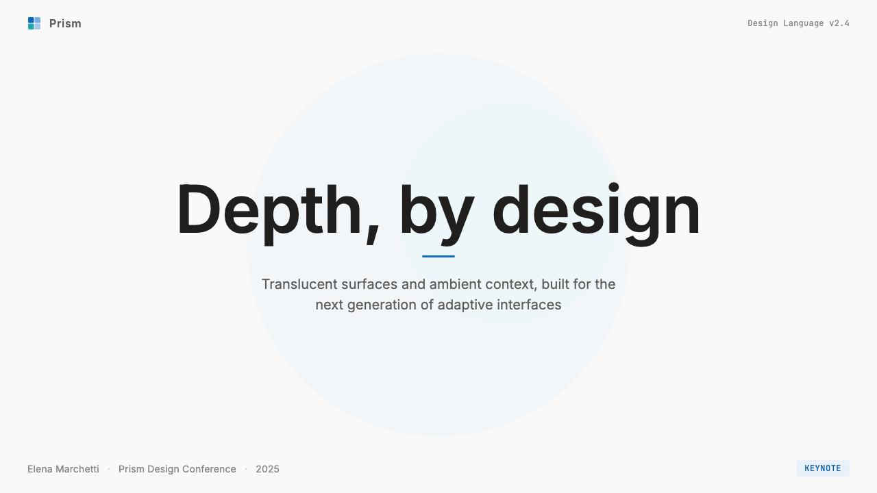
For presentation slides, Fluent 2 works well on cover pages that combine a dark near-black or very deep navy ground with a prominent card or panel rendered in a slightly lighter tone — the material layering implied through tone rather than actual blur. The title sits in a generous humanist sans-serif at a confident but not aggressive scale, with the accent color touching one word or a short descriptor. Content slides benefit from the system's hierarchical clarity: one level of heading, one level of body text, generous line spacing, and data visualizations that use the muted blue accent as the primary data color against near-white grounds. Data slides take on an executive quality — calm, legible from the back of a room, with the information doing the work rather than the decoration.在演示文稿中,Fluent 2 适合在封面页上组合使用深近黑色或深海军蓝底色,搭配以略浅色调呈现的卡片或面板——材质分层通过色调暗示,而非真实模糊效果。标题以自信但不咄咄逼人的字号使用人文主义无衬线字体,强调色点缀某一词语或简短描述语。内容页受益于这套系统的层级清晰性:一个标题级别,一个正文级别,充裕的行距,以及使用低饱和蓝色作为主要数据颜色、衬于近白底色的数据可视化。数据页呈现出一种高管气质——沉静、从会议室后排清晰可读,信息而非装饰在发挥作用。
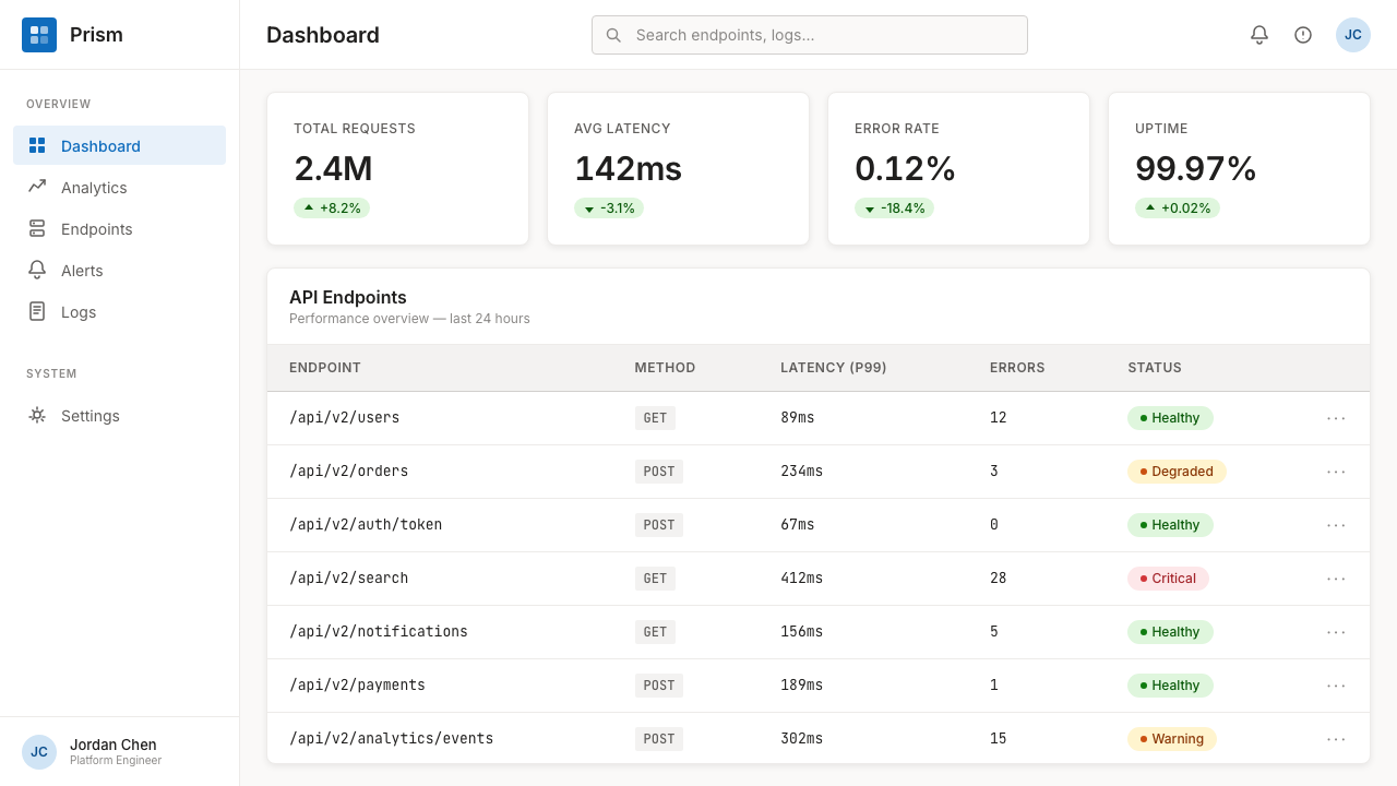
For web interfaces, Fluent 2 is a natural fit for productivity dashboards, internal tooling, enterprise SaaS, and analytics platforms — contexts where users spend hours daily and where cognitive comfort is more valuable than visual excitement. The approach: adopt the elevation hierarchy of base, card, and overlay; use warm near-white grounds rather than pure white; reserve the accent color for primary calls to action and active states; and keep navigation typographic rather than icon-driven. Pricing pages work well with the card-based layout that Fluent 2 implies — each pricing tier expressed as a card at a consistent elevation, with the recommended tier given subtle visual distinction through a lightly tinted background rather than a harsh highlighted border.对于网页界面,Fluent 2 天然适合生产力仪表板、内部工具、企业 SaaS 与数据分析平台——用户每天在此花费数小时、认知舒适度比视觉刺激更有价值的场景。方法如下:采用底层、卡片与覆盖层的高度层级;使用暖近白色底色而非纯白色;将强调色保留给主要行动号召与活跃状态;保持导航以字体为主而非图标驱动。定价页面适合 Fluent 2 所暗示的卡片式布局——每个定价档位表达为统一高度的卡片,推荐档位通过轻微着色背景而非粗突出边框获得细微视觉区分。
For editorial and marketing work, the style supports clean, professional information hierarchy that works particularly well for technology brands, financial services, and enterprise software marketing. A Fluent 2-influenced editorial layout uses a structured column grid with generous outer margins, clear differentiation between heading levels purely through size, and callout elements expressed as lightly tinted background panels rather than colored boxes. Marketing pages can use the material depth metaphor to create visual interest without decoration: full-width sections that shift from warm light grounds to muted dark grounds create a sense of depth and rhythm across the page, with the accent color appearing consistently at points of conversion.对于编辑与营销内容,这种风格支持干净、专业的信息层级,尤其适合科技品牌、金融服务与企业软件营销。受 Fluent 2 影响的编辑版面使用结构化列网格配以充裕外边距,仅通过尺寸清晰区分标题级别,引用元素以轻微着色背景面板而非彩色色块表达。营销页面可以利用材质深度隐喻创造视觉兴趣而不依赖装饰:从暖亮底色到低饱和暗底色交替的全宽区块,在页面上创造深度感与节奏感,强调色在转化节点一致出现。
A common mistake when applying Fluent 2 outside its native context is overusing translucency as a decorative effect rather than a structural one. In the Windows 11 environment, acrylic and Mica have a functional rationale — they spatially locate the application within the broader desktop environment. In a flat medium like a slide or a web page, a simulated blur effect is pure decoration, and it typically makes content harder to read without delivering the spatial depth it implies. The stronger choice is to use tonal layering — slightly different values of the same warm neutral — to imply elevation without the visual noise of actual transparency.在将 Fluent 2 应用于其原生语境之外时,最常见的错误是将半透明当作装饰性效果而非结构性效果来过度使用。在 Windows 11 环境中,亚克力与 Mica 具有功能性依据——它们在更广阔的桌面环境中空间定位应用程序。在幻灯片或网页这样的平面媒介中,模拟模糊效果是纯装饰,通常会使内容更难阅读,同时并不提供其所暗示的空间深度。更有力的选择是使用色调分层——同一暖中性色的细微不同数值——以暗示高度,而不引入真实透明度的视觉噪音。
See the Microsoft Fluent 2 design system查看 Microsoft Fluent 2 完整设计系统
Microsoft Fluent 2 — FAQMicrosoft Fluent 2 · 常见问题
How does Fluent 2 differ from Google's Material You?Fluent 2 与谷歌的 Material You 有何不同?
Both systems use wallpaper or environmental color to inform interface surfaces, but their philosophies diverge sharply in emphasis. Material You is expressive and colorful — it generates a full palette of harmonious tones from a seed color and applies them broadly across the interface, resulting in highly personalized, visually vibrant UIs. Fluent 2 is neutral and recessive — Mica takes a desaturated sample of the wallpaper and applies it minimally, allowing the warm neutral ground to dominate. Where Material You celebrates personal expression, Fluent 2 prioritizes informational clarity and professional calm. The practical consequence is that Material You works best in consumer and personal contexts, while Fluent 2 is optimized for productivity and enterprise use.两套系统都使用壁纸或环境色影响界面表面,但它们的哲学在侧重点上截然分歧。Material You 是表达性的、色彩丰富的——它从种子色生成一整套和谐色调,并将其广泛应用于界面,产生高度个性化、视觉上充满活力的界面。Fluent 2 是中性的、内敛的——Mica 对壁纸进行去饱和度采样,并最低限度地应用,让暖中性底色占主导。Material You 庆祝个人表达,Fluent 2 则优先考虑信息清晰度与专业沉静感。实际结果是:Material You 在消费类与个人场景中效果最佳,而 Fluent 2 针对生产力与企业用途进行了优化。
Can Fluent 2 work in dark mode, and does it change significantly?Fluent 2 能用在深色模式中吗?深色模式下会有明显变化吗?
Fluent 2 was designed from the outset to support both light and dark modes as first-class experiences, and the dark mode variant is genuinely well-considered rather than a simple color inversion. In dark mode, the base Mica surface shifts to a warm near-black that still samples the wallpaper, the card surfaces sit a perceptible step lighter, and the muted blue accent becomes slightly more luminous to maintain contrast without becoming aggressive. The overall character of the system — calm, layered, neutral — translates well to dark mode. The main challenge in applying dark Fluent 2 to non-Windows contexts is that the subtle warmth of the dark grounds is easy to lose if pure cool blacks are substituted, which collapses the material system into a flat dark UI.Fluent 2 从一开始就将浅色与深色模式设计为同等重要的体验,深色模式变体是经过深思熟虑的,而非简单的色彩反转。在深色模式下,Mica 基础表面转变为仍对壁纸进行采样的暖近黑色,卡片表面位于可感知的更亮一级,低饱和蓝色强调色变得略微更加明亮,以维持对比度而不变得咄咄逼人。这套系统的整体特质——沉静、分层、中性——在深色模式下得到良好延续。将深色 Fluent 2 应用于非 Windows 场景的主要挑战是:如果以纯冷黑色替代,深色底面的细微暖意很容易丢失,使材质系统退化为扁平的深色界面。
Is Fluent 2 appropriate for consumer apps, or only productivity software?Fluent 2 适合消费类应用吗,还是只适合生产力软件?
Fluent 2's values — calm, hierarchy, restrained color — are well matched to productivity, enterprise, and professional contexts. It is less well matched to consumer applications that need warmth, playfulness, or strong brand personality. A food delivery app, a social platform, or a children's educational product would find the system's neutrality and restraint working against the emotional register those products need. Fluent 2 is also heavily associated with Microsoft as a brand; using it without modification in a consumer context can feel generic or enterprise-coded rather than distinctive. The system's components and spacing logic can be borrowed productively, but the overall aesthetic tends to read most naturally in contexts where efficiency and professionalism are explicit user expectations.Fluent 2 的价值观——沉静、层级、克制的色彩——与生产力、企业和专业场景高度匹配。它与需要温暖感、趣味性或强烈品牌个性的消费类应用匹配度较低。外卖应用、社交平台或儿童教育产品会发现这套系统的中性与克制与这些产品所需的情感基调相悖。Fluent 2 也与微软品牌高度关联;在消费场景中不加修改地使用,感觉会显得通用或企业化,而非独特。这套系统的组件与间距逻辑可以被有效借鉴,但整体美学在效率与专业性是用户明确期望的场景中,读来最为自然。
How should the acrylic and Mica material effects be referenced in flat design work?在平面设计作品中,应如何引用亚克力和 Mica 材质效果?
In flat media — slides, static web pages, print — the material effects of Fluent 2 should be interpreted rather than literally reproduced. A literal blur effect on a slide background usually makes content harder to read and communicates visual busyness rather than the calm depth Fluent 2 actually achieves. The better interpretation is tonal: use a surface that is one or two steps lighter or warmer than its ground to imply that a card is sitting above the base layer, without any actual transparency. The warmth and slight variation in tone across the neutral palette is what carries the spatial feeling of the material system; the blur itself is a platform-specific implementation detail that does not port cleanly to other media.在平面媒介中——幻灯片、静态网页、印刷品——Fluent 2 的材质效果应被诠释而非字面复制。在幻灯片背景上使用字面模糊效果,通常会使内容更难阅读,传递的是视觉噪杂而非 Fluent 2 实际营造的沉静深度。更好的诠释是色调上的:使用比底色亮一两级或更暖的表面颜色,暗示卡片位于基础层之上,而无需任何实际透明度。中性色调色板中的暖意与细微色调变化,才是承载材质系统空间感的核心;模糊本身是特定平台的实现细节,无法干净地移植到其他媒介。
What are the clearest signs that a Fluent 2 application has been done well versus applied superficially?怎样判断一个 Fluent 2 应用是做得好还是仅流于表面?
A well-executed Fluent 2 design is legible, calm, and hierarchy-clear without any single element demanding attention. The layering reads spatially — you can feel that flyouts sit above cards, which sit above the base — even if you cannot consciously describe why. The accent color appears only where it should and is absent everywhere else. A superficial application typically makes several characteristic errors: the accent color is overused and appears in decorative as well as functional elements; all surfaces are the same flat tone with no sense of elevation; the rounding is applied inconsistently; or translucency effects are added without regard to readability, producing surfaces where text floats uncomfortably over shifting background content. The deepest test is whether removing all the stylistic details — the rounding, the material effects, the accent color — would leave behind a well-structured, readable layout. If it would, the execution is genuine; if it would collapse, the style was doing structural work that the content organization should have done instead.一个执行良好的 Fluent 2 设计是清晰易读、沉静冷静且层级分明的,没有任何单一元素在争夺注意力。分层在空间上是可读的——你能感受到弹出层位于卡片之上,卡片位于底层之上——即使你无法有意识地描述原因。强调色只出现在应该出现的地方,在其他地方缺席。表面化的应用通常会犯几个典型错误:强调色被过度使用,出现在装饰性元素和功能性元素上;所有表面是相同的平调色,没有任何层高感;圆角被不一致地应用;或透明度效果在不考虑可读性的情况下被添加,产生文字在变化背景内容上漂浮得令人不适的表面。最深层的测试是:移除所有风格细节——圆角、材质效果、强调色——是否会留下一个结构良好、易于阅读的版面。如果是,执行是真实的;如果会崩溃,说明风格在做本应由内容组织完成的结构性工作。
Related design styles相关设计风格
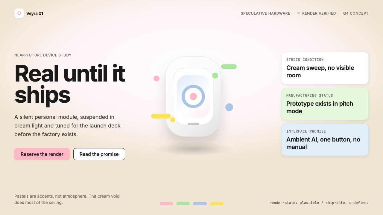 Vaporware Future Product RenderExpensive unreality. Cream sweep, Inter restraint, and pastel chips orbit a f…昂贵的失真感。奶油棚景、Inter 克制排版与粉彩芯片围绕悬浮渲染。
 Cursor IDEAI-first code editor. Pure dark surfaces, off-white text, electric blue reser…以 AI 为核心的代码编辑器:近乎纯黑背景、柔白文字、唯一的电光蓝色专为 AI…
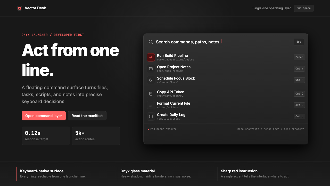 Raycast Spotlight Launcher (2023)Obsidian confidence. Sharp red cuts through Inter rows and mono shortcut chip…黑曜石般自信。锐红切过 Inter 行与等宽快捷键。
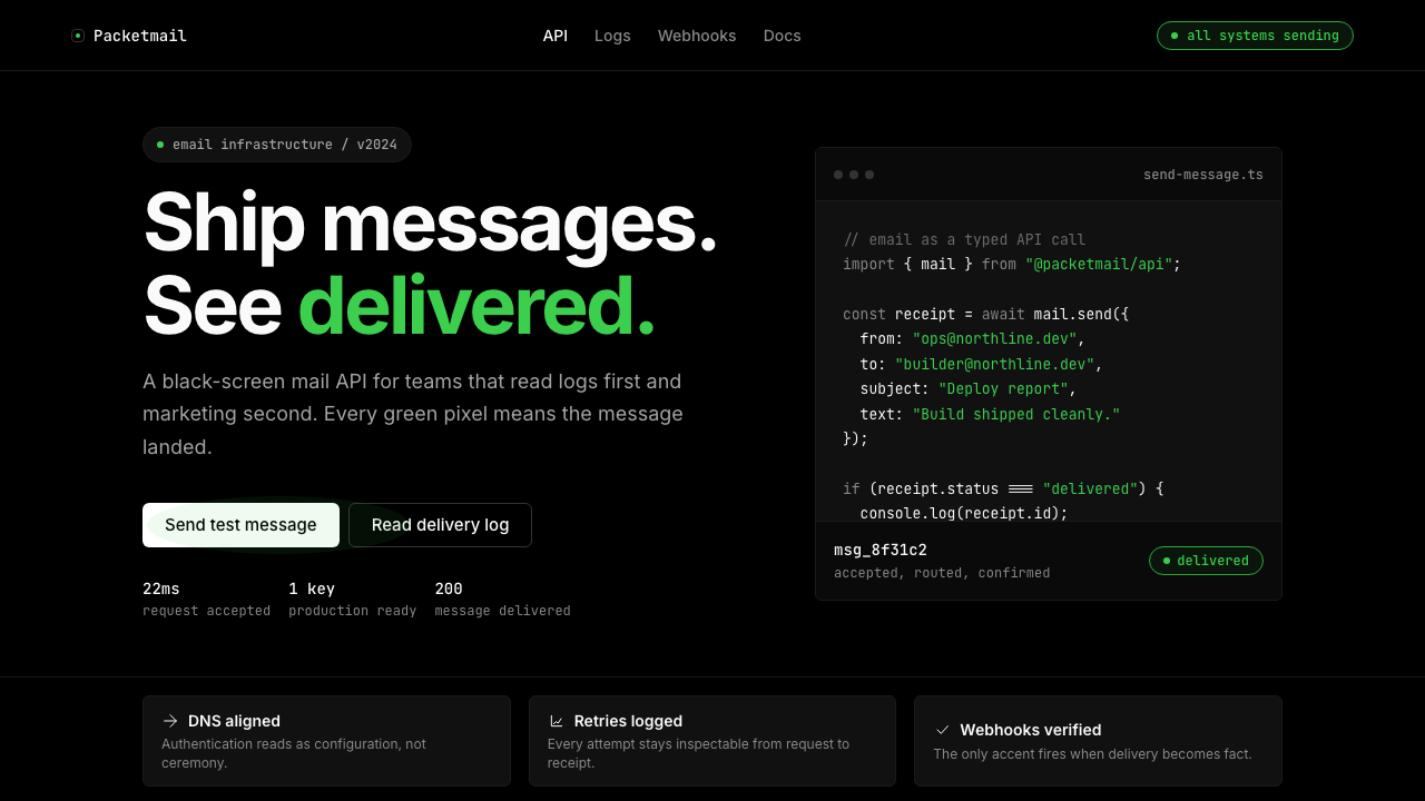 Resend 2024Clean code becomes brand. Pure black, JetBrains Mono, and one green delivered…品牌像 clean code:纯黑、JetBrains Mono、唯一送达绿。
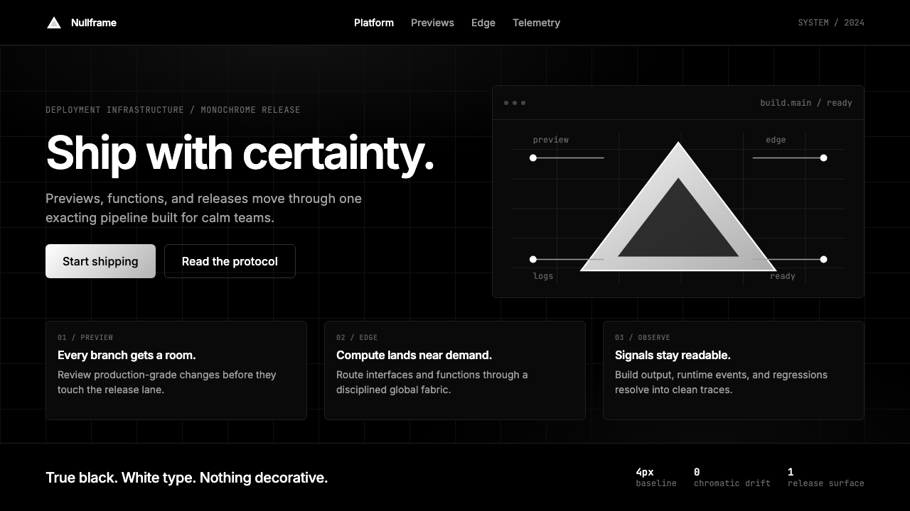 Vercel 2024Developer luxury by subtraction. Pure black, white Inter, rigid grid, triangu…以删减塑造开发者奢侈感:纯黑白、Inter 字体与刚性网格构成三角发布符号。
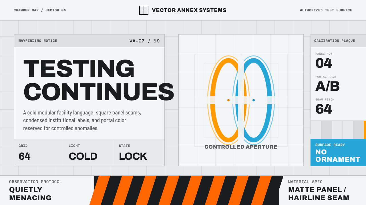 Aperture ScienceSterile authority. Cool panel seams, Archivo signage, and sparse orange-blue…冷峻权威:冷灰板缝、Archivo 标识与稀疏橙蓝光环。