What is Aperture Science?
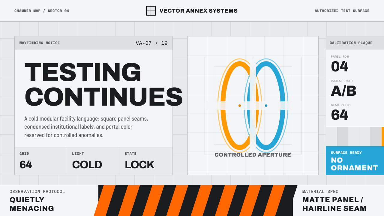
Aperture Science renders a fictional research corporation as cold fluorescent test-chamber walls, where sterile order and a pair of glowing portal rings are the only things breaking the silence.
Aperture Science in brief
Aperture Science is the visual language of Valve's 2007 puzzle game Portal: an interface built entirely from clean modular test-chamber panels, painted concrete, and institutional wayfinding signage, all lit by an even, slightly clinical fluorescent glow. It borrows the vocabulary of a mid-century industrial research facility — the kind of place that would have run classified experiments in the 1960s and never modernized its decor — and applies it with total consistency, panel by panel.
The surfaces are deliberately unglamorous: off-white or pale gray, seamed into repeating squares by visible panel lines, marked here and there with condensed institutional signage that reads like it was stenciled by a facilities department rather than designed by a branding agency. Ornament does not exist in this world. Color is rationed almost to nothing, which is precisely why the system's two accent colors — a warm orange and a cool blue, echoing the game's portal mechanic — feel so charged whenever they appear.
The mood this produces is sterile, procedural, and quietly unsettling. Nothing in the environment is overtly threatening; the menace is entirely a function of restraint — a space so clean, so evenly lit, and so devoid of human warmth that its blankness starts to feel like a kind of pressure. This is a system built to communicate authority and control through the simple absence of anything decorative.
Where does Aperture Science come from?
Portal began life outside Valve, as a student project called Narbacular Drop, built at DigiPen Institute of Technology by a small team that included Kim Swift. The game's core mechanic — walking through one hole in space to emerge from another — impressed Valve enough that the studio hired the entire student team in 2005 specifically to turn the prototype into a shippable product, an unusually direct pipeline from classroom project to commercial release.
Under Valve's direction, the small teleportation demo was rebuilt around a fictional frame: Aperture Science, a rival research company to the Half-Life universe's Black Mesa, run by a malfunctioning artificial intelligence named GLaDOS. Writer Erik Wolpaw, working with the design team, shaped the tone of the piece — dry, deadpan, unnervingly polite — and that tonal choice is inseparable from the visual one. A villain who speaks in calm, helpful corporate language needed a physical environment that looked calm and helpful too, which is why the test chambers read as sterile administrative space rather than an overt dungeon or lair.
Visually, the design drew on the aesthetics of mid-century clinical and industrial architecture — the kind of unadorned, modular, easily-cleaned institutional interior found in period research labs, hospitals, and civil-defense facilities, where function and hygiene outranked any concern for visual warmth. The portal rings themselves, rendered in a bright orange-and-blue pairing, were a practical design solution as much as an aesthetic one: the two colors needed to be instantly distinguishable from each other and from the muted environment around them, so players could always tell which portal was which at a glance.
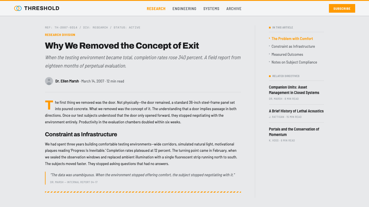
Portal's design proved influential well beyond gaming: its combination of dry institutional signage, mid-century clinical minimalism, and a near-total absence of color became shorthand across web and product design for a very specific mood — a fictional-corporate, slightly dystopian calm — that designers now reach for whenever they want a system to feel controlled, clinical, and quietly ominous rather than warm or organic.
What defines the Aperture Science look?
Color
The base palette is almost entirely neutral — off-white, pale gray, cool concrete tones — so that the two portal accent colors, a warm orange and a cool blue, carry the full weight of visual interest whenever they appear. Because they are used so sparingly, they read as active signals rather than decoration: something to click, something in motion, something that matters right now.
Surface and Seams
Every large surface is broken into repeating squares by visible seam lines, echoing modular test-chamber wall panels. These seams function as a structural grid rather than decoration — content aligns to the same rhythm the panel lines establish, so the interface itself feels assembled from identical, interchangeable units.
Signage and Typography
Labels and wayfinding text use a condensed, institutional sans that reads like stenciled facilities signage rather than branded lettering — evenly weighted, unadorned, and set with generous, even spacing so it stays legible at a glance the way a hazard label or a room number does.
Hazard and Directional Marks
Chevrons, diagonal hazard stripes, and stencil arrows appear only where function demands it — marking an edge, a direction, a boundary. They never accumulate into pattern for its own sake; each mark is doing a specific, legible job, the way real industrial signage never repeats a motif purely for texture.
Light and Atmosphere
Illumination is flat, even, and slightly cold — closer to overhead fluorescent tube lighting than to any dramatic or directional light source. There are no warm pools of light and no soft ambient falloff; the evenness itself is what produces the clinical, faintly institutional mood.
Zero Ornament
Nothing exists on the page that would not exist on the wall of a real test facility. No gradients softening the flat panels, no decorative borders, no illustrative flourishes — the restraint is total, and it is precisely that totality which makes the environment feel controlled rather than merely minimal.

Who shaped Aperture Science?
Swift led the student team behind Narbacular Drop at DigiPen Institute of Technology, whose portal-teleportation mechanic became the foundation of the finished game. Valve hired the entire team in 2005 specifically to develop the prototype into Portal, making Swift a direct link between the game's core idea and its eventual sterile-institutional visual world.
As a writer on Portal, Wolpaw shaped the calm, deadpan, unnervingly polite corporate voice of GLaDOS and the wider Aperture Science fiction — a tonal choice that demanded a physical environment just as composed and administratively calm, which is why the game's visual world reads as sterile office-and-lab space rather than an overt villain's lair.
Valve acquired the Narbacular Drop team and rebuilt their prototype into a full commercial release, embedding it within the studio's existing Half-Life fiction as a rival research entity. Valve's design culture of dry humor and understated environmental storytelling shaped the restraint that defines the system's every surface.
The school where Narbacular Drop was built as a student project provided the unusually direct pipeline from classroom prototype to commercial game — a production history that left its mark on the finished aesthetic, which still carries the plain, unglamorous, functional quality of an academic experiment rather than a polished corporate product.
How do you use Aperture Science today?
Applying Aperture Science well means committing to absence: the discipline is almost entirely about what you leave out. Start from a near-monochrome base — off-white or pale concrete-gray panels seamed into a visible grid — and treat the orange-and-blue accent pair as a strictly rationed resource reserved for the handful of elements that genuinely need to grab attention.
For presentation slides, a cover page works well as a single evenly-lit panel with condensed institutional type and a single accent-colored mark, echoing a stenciled facility sign. Content slides should keep the panel-seam grid as a quiet structural backdrop; data slides suit the system particularly well, since a single orange or blue data point against a field of neutral gray panels reads with immediate, unambiguous emphasis.
For web interfaces, the system is well suited to dashboards, admin tools, and settings panels where a calm, procedural mood signals reliability and control. Use the panel-seam grid as a literal layout grid, keep body copy in the plain institutional sans, and reserve the orange-and-blue pair for status indicators, toggles, or the two states of a binary choice — a natural fit given their origin as a two-color signaling system.
For editorial and marketing work, the aesthetic suits any story about technology, research culture, or institutional bureaucracy told with a dry, slightly unsettling wit — think exposés, satirical technology writing, or speculative-fiction branding. Marketing pages benefit from full-bleed panel-gray sections punctuated by a single accent-colored call to action, letting the rarity of color do the persuasive work.
A common mistake is treating the orange-and-blue pairing as a general-purpose brand palette and spreading it evenly across a layout — doing so collapses the tension the system depends on. The colors should always feel scarce, deliberate, and slightly clinical in their placement, never decorative or evenly distributed.

Aperture Science — FAQ
Does this style require a fictional or gaming context to make sense?
No — its origin is fictional, but its visual grammar is drawn from real mid-century institutional architecture, and it works perfectly well divorced from the game entirely. Any product that wants to feel procedural, controlled, and quietly authoritative — internal tools, technical documentation, research-lab branding — can use it without any reference to its source needing to be legible.
How sparingly should the orange and blue accents really be used?
Treat them as a two-state signaling system rather than a decorative pair: one color for one kind of action or status, the other color for its counterpart, and nothing else competing for attention in between. If more than a small handful of elements on a screen carry accent color, the scarcity that makes them legible as signals has already been lost.
Can this system work with imagery or photography?
Sparingly, and only if the imagery matches the mood — flat, evenly lit, documentary-style photography of interiors or equipment fits, while warm, soft-focus, or emotionally expressive photography breaks the clinical tone immediately. Illustration in general is largely absent from the source material and is best avoided.
Is this style too cold for consumer-facing products?
It can be, depending on the product's emotional goals. The system communicates control, precision, and institutional authority extremely well, but it offers almost nothing in the way of warmth, playfulness, or organic texture. It suits technical, analytical, or satirical contexts far better than hospitality, wellness, or lifestyle products.
What is the biggest risk when adapting this style?
The biggest risk is over-decorating it — adding gradients, drop shadows, extra colors, or illustrative flourishes to make it feel more finished. The style's entire power comes from restraint; any addition that softens or warms the surfaces undoes the sterile, controlled quality that makes it distinctive in the first place.
Related design styles
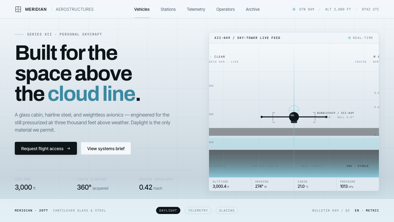 Oblivion Sky TowerSterile daylight futurism. Cool sky-grey glass, hairline steel mullions, a si…
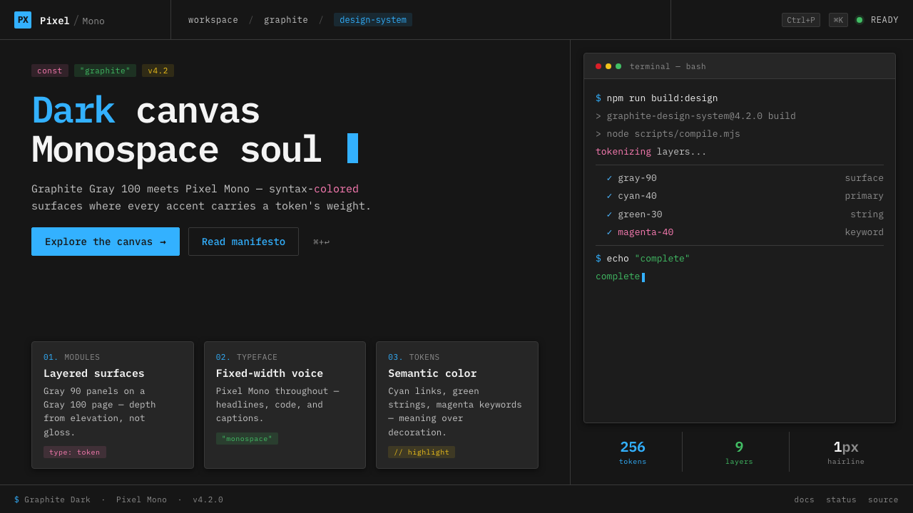 IBM Plex Mono DevColor used like syntax highlighting. Carbon Gray 100 canvas, IBM Plex Mono th…
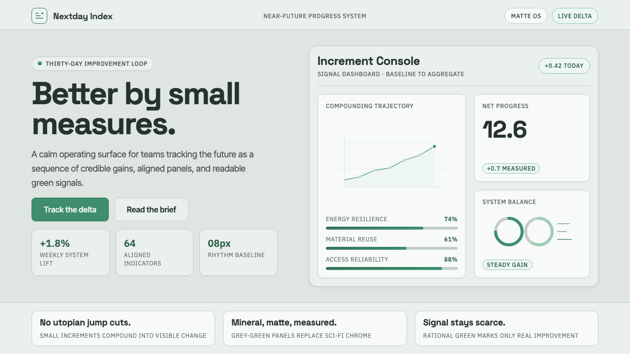 ProtopiaCalm progress, not sci-fi hype. Mineral grey-green grids make every small gai…
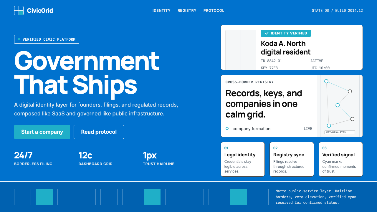 Estonia e-Residency Digital (2014)Trust without weight. Cornflower blue, 12-column grids, and cyan verified sig…
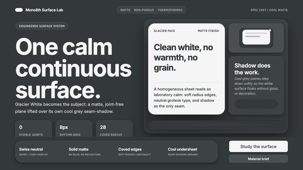 Corian Solid SurfaceSeamless matte calm. Glacier White floats over cool grey shadow with neutral…
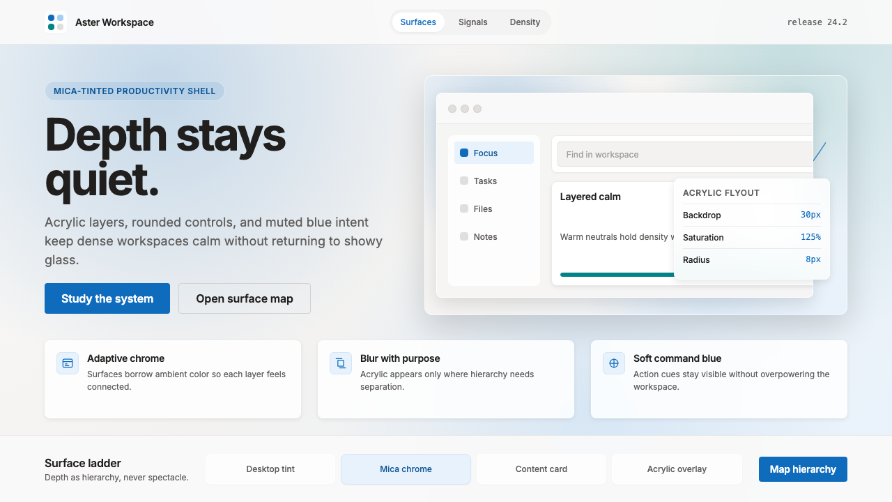 Microsoft Fluent 2Disciplined translucency. Warm Mica neutrals, acrylic blur, and muted blue cr…