What is iOS 7 Flat?什么是 iOS 7 Flat?
In the summer of 2013, Apple erased a decade of digital leather and linen overnight — and every touchscreen interface has been flatter ever since.2013年夏天,苹果一夜之间抹去了十年的数字皮革与亚麻纹理——从此,每一块触摸屏都变得更加扁平。
iOS 7 Flat in briefiOS 7 Flat 速览
iOS 7 Flat is the visual language Apple introduced in September 2013 under the direction of Jony Ive. It replaced skeuomorphism — the design philosophy of making digital interfaces look like physical objects — with a system built on pure color, translucency, and spatial hierarchy expressed through depth and blur rather than simulated materials. Bright tint colors on white or near-white grounds, hairline-weight separators, frosted-glass layering, and content-forward layouts became the defining grammar of touchscreen design for the decade that followed.iOS 7 扁平风格是苹果于2013年9月在乔尼·艾维主导下推出的视觉语言体系。它以纯色、半透明与通过景深和模糊表达的空间层级,取代了拟物设计——那种让数字界面酷似实体物品的设计哲学。明亮的色调点缀在白色或近白色底面上,发丝般的分隔线,毛玻璃式的层叠效果,以及以内容为核心的版面布局,成为此后十年触摸屏设计的核心语法。
The style rests on a clear conceptual split: surfaces are flat and chromatic, but the interface still communicates depth through a layering system. Control panels slide up from beneath, notifications float over content, and background elements bleed through translucent sheets to maintain spatial context. This was not minimalism for its own sake — it was a restructuring of the interface metaphor from objects-in-the-real-world to layers-in-a-luminous-space.这套风格建立在一个清晰的概念分野上:界面表层是扁平而有色彩的,但通过一套层叠系统仍然传达出深度感。控制面板从界面下方滑出,通知浮现在内容之上,背景元素透过半透明磨砂玻璃隐约可见,保持了空间上的情境感。这并非为极简而极简——它是一次界面隐喻的重构:从「现实世界中的物体」转变为「光影空间中的层次」。
What makes iOS 7 Flat historically significant is its velocity of adoption. Within eighteen months, material and formal competitors — from Google's Material Design to Microsoft's Modern UI revision — had absorbed its anti-skeuomorphic premise. The elimination of gradients, drop shadows that simulate weight, and texture-as-chrome became so universal that the baseline expectation for any serious digital product shifted permanently. The style continues to influence interface design well beyond the Apple ecosystem.iOS 7 扁平风格在历史上的意义,在于它被采纳的速度之快。不到十八个月,包括谷歌材料设计(Material Design)和微软现代界面修订版在内的各路竞争者,都吸收了其反拟物化的前提。取消渐变、取消模拟重量感的投影、取消充当装饰的纹理,这些变化变得如此普遍,以至于任何严肃数字产品的基线预期都永久改变。这套风格对界面设计的影响,早已远远超出苹果生态圈。
Where does iOS 7 Flat come from?iOS 7 Flat 从何而来?
The conditions for iOS 7's radical departure were set by a leadership change. In October 2012, Scott Forstall — the primary champion of Apple's skeuomorphic design direction — was asked to leave the company. Jony Ive, whose influence had been largely confined to hardware, was given responsibility over human interface design. The philosophical shift was immediate: Ive had always been suspicious of surfaces that performed an identity they did not structurally possess. Leather that was not leather, wood that was not wood. The iOS redesign became an opportunity to apply to software the same material honesty he had long advocated in physical products.iOS 7 得以实现彻底转变的条件,由一次领导层更迭所奠定。2012年10月,苹果拟物设计路线的主要推手斯科特·福斯托尔(Scott Forstall)离开了公司。此前影响力主要局限于硬件领域的乔尼·艾维,被赋予了人机界面设计的主导权。哲学转变随即而来:艾维历来对那些「表演」一种自身在结构上并不具备的身份的表面心存疑虑——不是皮革的皮革,不是木材的木材。iOS 的重新设计,成为他将长期在实体产品中倡导的材料诚实原则引入软件领域的契机。
WWDC June 2013 was the public unveiling. The demo revealed a system transformed: the green-felt Game Center, the yellow legal-pad Notes app, and the stitched-leather Calendar all vanished. In their place: flat white and near-white surfaces, a new vibrancy system that tinted translucent layers with the colors behind them, and a typeface — the system font updated to a dramatically thinner weight — that looked almost impossibly light on screen. Alan Dye, who led the visual design team, described the goal as letting content be the interface: chrome reduced to a minimum so that photos, text, and apps themselves provided the visual richness.2013年6月的全球开发者大会(WWDC)是公开亮相的舞台。演示揭示了一个面目全非的系统:绿毡台面的 Game Center、黄色法律便笺纸的备忘录应用、皮革缝线的日历,全部消失。取而代之的是:扁平的白色与近白色界面,一套将半透明图层用背后颜色染色的「活力」(Vibrancy)系统,以及一款字重纤细到几乎令人难以置信的系统字体。视觉设计团队负责人阿兰·戴(Alan Dye)将设计目标描述为「让内容成为界面」:将系统框架(chrome)压缩至最低,让照片、文字和应用本身提供视觉丰富性。
The intellectual lineage of the style connects to several antecedents. Microsoft's Metro language, introduced in Windows Phone in 2010 and refined into Windows 8 in 2012, had already proposed a typography-first, flat-surface approach for touchscreen interfaces. The broader flat design movement in web design — a reaction against the excessive drop shadows and gradients of the late-2000s web — had built significant critical mass in the design community by 2012. Swiss International Typographic Style, with its grid discipline and spare use of color, had long been an acknowledged influence on Apple's design culture. iOS 7 arrived at an intersection of these pressures and, by virtue of Apple's market position, made the flat premise mainstream rather than experimental.这套风格的思想脉络可追溯至若干前驱。微软的 Metro 设计语言——2010年在 Windows Phone 中首次亮相,2012年在 Windows 8 中得到深化——已经为触摸屏界面提出了以排版为核心、以扁平表面为载体的方案。网页设计领域更广泛的扁平化运动——对2000年代末网页泛滥的厚重投影与渐变的反动——到2012年已在设计社群中积累了相当大的批评共识。瑞士国际排版风格以其网格纪律和节制的色彩运用,长期以来也被视为苹果设计文化公认的影响来源之一。iOS 7 恰好出现在这些压力交汇的节点上,并凭借苹果的市场地位,将扁平化的前提从实验性选项推向了主流。
The style was refined incrementally through iOS 8, 9, and 10, with the system font replaced by San Francisco — a custom typeface designed in-house with optical size variants for display and text use — in 2015. Some of the more extreme thinness and low-contrast choices from iOS 7's first release were moderated in response to accessibility criticism. The frosted-glass translucency system became more sophisticated, with blur parameters adjusted per context. By iOS 10 in 2016, the language had matured into a stable platform that third-party developers had fully adopted, cementing a global interface standard whose core premises remain visible in mobile design to this day.这套风格在 iOS 8、9、10 的迭代中被逐步打磨:2015年,系统字体被替换为专为苹果内部设计的 San Francisco——一款针对显示与正文场景分别提供视觉尺寸变体的定制字体。iOS 7 首发版本中部分过于纤细、对比度偏低的设计,在无障碍方面的批评声中得到了适度调整。毛玻璃半透明系统也变得更加精密,在不同情境下采用了各异的模糊参数。到2016年的 iOS 10,这套语言已成熟为一个稳定的平台规范,获得了第三方开发者的全面接纳,由此奠定了一套全球界面标准——其核心前提在今天的移动端设计中仍然清晰可见。
What defines the iOS 7 Flat look?iOS 7 Flat 的视觉特征是什么?
Color System色彩体系
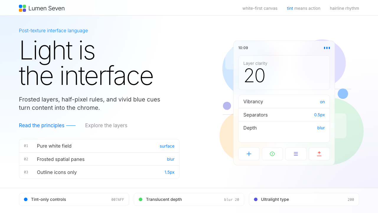
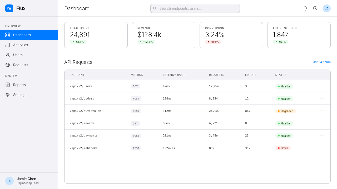
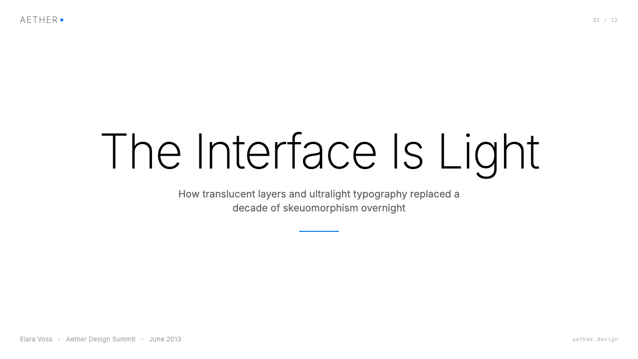
The palette centers on a set of bright, saturated tint colors — vivid blues, greens, oranges, and pinks — deployed against white or near-white backgrounds. Each tint functions as a semantic signal: blue for interactive elements, red for destructive actions, green for affirmative states. The tints are not pastels; they are fully saturated and luminous, chosen to read clearly on backlit screens at high brightness. The white-ground approach maximizes the contrast of these tints and ensures that content — photographs, text, icons — reads as the primary visual matter rather than chrome.这套色彩体系以一组明亮、饱和的色调为核心——鲜艳的蓝、绿、橙和粉——点缀在白色或接近白色的背景上。每种色调承担着语义信号的功能:蓝色用于可交互元素,红色用于破坏性操作,绿色表示确认状态。这些色调并非粉彩;它们是充分饱和、富有光感的,经过筛选以确保在高亮度背光屏幕上清晰可辨。以白色为底面的处理方式最大化了这些色调的对比度,并确保内容——照片、文字、图标——作为主要视觉物质被感知,而非界面框架本身。
Translucency and Layering半透明与层叠
A frosted-glass blur effect defines the iOS 7 Flat spatial system. Panels, sheets, and overlays are not opaque — they blur and tint the content beneath them, creating a sense of physical layers occupying the same screen space. The vibrancy system takes this further: text and icons on translucent surfaces are rendered with a luminosity-blend effect so they appear to be lit from within by the colors behind them. This layering logic replaces the object-and-shadow depth cue of skeuomorphic design with a soft spatial metaphor that feels native to glass-screened devices.磨砂玻璃模糊效果定义了 iOS 7 扁平风格的空间体系。面板、浮层和遮罩并非不透明——它们对下方内容进行模糊和染色处理,创造出多个物理层次共占同一屏幕空间的感觉。「活力」系统将这一点进一步深化:半透明表面上的文字和图标采用了一种发光混合效果,使其看起来像是被背后的颜色从内部照亮。这套层叠逻辑用一种柔和的空间隐喻,取代了拟物设计依赖物体与投影的深度提示,使界面感觉与玻璃屏幕设备天然契合。
Typography as Primary Structure排版作为主要结构
Type weight becomes the primary organizational tool. The system font is used at dramatically varying weights — from very light for large display headings to a standard weight for body text — with a narrow, high-frequency size range that creates clear hierarchy without requiring color or borders to distinguish levels. Hairline-weight separators replace heavy ruled lines and bordered containers. The approach concentrates almost all organizational energy into letterform, treating the typeface as architecture rather than decoration. This demands that every typographic decision carry structural meaning.字重成为主要的组织工具。系统字体以幅度巨大的字重变化来使用——从极细的大标题到标准字重的正文——配以紧凑的高频字号梯度,无需依赖颜色或边框便能建立清晰的层级关系。发丝般的分隔线取代了粗重的横线和有边框的容器。这种方式将几乎全部的组织能量集中于字形之中,把字体当作建筑而非装饰来使用。这要求每一个排版决定都必须承载结构上的意义。
Flat Icons and Silhouette Clarity扁平图标与轮廓清晰度
Icons are rendered as flat filled or outlined shapes with no gradients, no drop shadows, and no three-dimensional modeling. The icon grid ensures consistent visual weight across sizes, with rounded rectangles serving as the standard container shape. Color in icons is used to signal category and state rather than to simulate material — a phone icon might be a solid tint of blue, not a beveled glass badge. Line-weight icons at the system level use a single consistent stroke width, creating a family coherence that feels systematic rather than illustrative.图标以扁平的填充或描边形状呈现,没有渐变,没有投影,没有三维建模。图标网格确保了在不同尺寸下视觉重量的一致性,圆角矩形是标准的容器形状。图标中的颜色用于传达类别与状态,而非模拟材质——一个电话图标可能是一个纯蓝色调的形状,而不是一枚倒角玻璃徽章。系统级线条图标采用单一一致的描边宽度,使整个图标家族呈现出系统性的内聚感,而非插图式的个性化风格。
White Space and Content Priority留白与内容优先
Margins, padding, and interstitial space are generous by the standards of the skeuomorphic era that preceded the style. The elimination of chrome — decorative containers, textured backgrounds, framing elements — means that what remains is almost entirely content. Photographs occupy edge-to-edge cards. Text lines breathe. Lists are separated by hairlines rather than contained in recessed cells. The cumulative effect is a screen that feels less cluttered and more legible at a glance, with the user's own data — their photos, messages, calendar events — as the primary aesthetic experience.与拟物时代的标准相比,这套风格的边距、内填充和间距都相当宽裕。取消了装饰性容器、纹理背景和框架元素之后,留下来的几乎全部是内容本身。照片填满卡片的每一条边缘,文字行间有了足够的呼吸空间,列表以发丝般的细线分隔,而非嵌入凹陷的单元格中。累积的效果是:屏幕看上去更少杂乱,一眼之下更易辨读,用户自己的数据——他们的照片、消息、日历事件——成为主要的审美体验。
Motion as Spatial Communication动效作为空间传达
iOS 7 Flat extended the visual system into animation. Transitions became physics-based: springs and damping replaced linear wipes. Opening an app zooms out from the icon, establishing that apps live behind the home screen rather than replacing it. Parallax effects on the home screen — where icons shift slightly as the device tilts — suggest that the background wallpaper occupies a different physical depth from the icon layer. Motion is not decorative; it is a continuous spatial argument that maintains the user's mental model of where they are in the interface.iOS 7 扁平风格将视觉体系延伸至动画领域。转场变得基于物理:弹簧与阻尼取代了线性划动。打开应用时从图标处向外缩放,暗示应用存在于主屏幕背后而非将其替换。主屏幕上的视差效果——图标随设备倾斜而微微位移——暗示背景壁纸与图标层占据着不同的物理深度。动效并非装饰;它是一个持续的空间论据,维护着用户关于自身在界面中所处位置的心智模型。
Chromeless Navigation无框导航
Navigation bars are translucent or white with no background texture and minimal border treatment. The back button is replaced by a simple arrow and label — a text element, not a button shape. Tab bars use tinted icons without beveling or raised-surface treatment. The overall navigation chrome recedes to near invisibility, prioritizing the content it frames. This restraint requires that the tint colors carry all of the interactivity signaling — tapping a tinted label or icon is the universal call to action — which places enormous reliance on color consistency across the system.导航栏是半透明或白色的,没有背景纹理,边框处理极为克制。返回按钮被简洁的箭头与文字标签所取代——这是一个文字元素,而非按钮形状。标签栏使用带有色调的图标,没有倒角或凸起表面处理。整体的导航框架退缩至几近隐形,让它所框定的内容居于前台。这种克制要求色调颜色承担所有的交互性信号——点击带色调的标签或图标,是通用的行动指引——这对整个系统的颜色一致性提出了极高的要求。
Who shaped iOS 7 Flat?谁塑造了 iOS 7 Flat?
Ive led Apple's design practice for over two decades and was the primary force behind iOS 7's aesthetic transformation. His background was in industrial design — physical objects with material integrity — and he brought that sensibility directly to software when he assumed responsibility for human interface design in late 2012. The iOS 7 redesign was the most consequential design decision in mobile history in terms of adoption speed: within two years, the flat anti-skeuomorphic premise had become the global default for touchscreen interfaces. Ive left Apple in 2019 to found a design firm, but the visual language he established in 2013 remains the recognizable ancestor of every major mobile OS today.艾维主导苹果设计实践逾二十年,是 iOS 7 美学变革的核心驱动力。他的背景是工业设计——具有材料诚实性的实体物品——2012年底接掌人机界面设计责任时,他将这种感性直接带入了软件领域。iOS 7 的重新设计,是移动历史上在采纳速度方面影响最为深远的设计决策:不到两年,反拟物化的扁平前提已成为触摸屏界面的全球默认标准。艾维于2019年离开苹果,创立了自己的设计公司,但他在2013年确立的视觉语言,至今仍是所有主流移动操作系统可辨认的共同祖先。
Dye was Apple's Vice President of Human Interface Design during the iOS 7 era and served as the principal creative director of the visual redesign. Where Ive set the philosophical direction, Dye and his team were responsible for the practical execution: developing the vibrancy system, defining the icon grid and tint logic, specifying the motion language, and ensuring that the redesigned interface worked across every screen size and context in Apple's product line. Dye continued leading Apple's software design through subsequent iOS and macOS releases, overseeing a steady evolution of the language he helped create.戴在 iOS 7 时代担任苹果人机界面设计副总裁,是这次视觉重新设计的首席创意总监。如果说艾维确定了哲学方向,那么戴和他的团队则负责实际执行:开发「活力」系统、定义图标网格与色调逻辑、规范动效语言,并确保重新设计的界面能够在苹果产品线上的每一种屏幕尺寸和使用情境下正常运作。戴继续主导苹果后续 iOS 和 macOS 版本的软件设计,监督他参与创立的这套语言的持续演进。
The Human Interface team at Apple during the iOS 7 redesign was an unusually tight-knit group of interaction designers, visual designers, and prototypers who worked under strict secrecy and compressed timelines. The entire redesign of iOS — affecting thousands of UI states, every system icon, every native application, and the full animation system — was completed in under a year. The team's achievement was not just aesthetic transformation but systemic documentation: the resulting Human Interface Guidelines, updated to reflect the iOS 7 language, became the most widely referenced interface design specification in the industry, shaping the design education of an entire generation of product designers.苹果在 iOS 7 重新设计期间的人机界面团队,是一个由交互设计师、视觉设计师和原型开发者组成的极为紧密的群体,在严格保密和压缩时间线的条件下工作。对 iOS 的整体重新设计——涉及数以千计的界面状态、每一个系统图标、每一个原生应用以及完整的动画系统——在不到一年内完成。这个团队的成就不仅仅是美学上的转变,更是系统性的文档化工作:随之更新以反映 iOS 7 语言的《人机界面指南》,成为业界被引用最广泛的界面设计规范,塑造了整整一代产品设计师的设计教育。
Forstall's departure from Apple in 2012 is inseparable from the iOS 7 story, because it removed the most influential institutional defender of skeuomorphic design. During his tenure as Senior Vice President of iOS Software, Forstall championed the approach of making digital interfaces legible through real-world material analogy — felt textures, stitched leather, wood grain — arguing that these cues reduced the cognitive load of learning new interface conventions. His exit, following a leadership conflict, handed the interface design agenda to Ive and effectively ended one of the most consequential debates in the history of software design.福斯托尔2012年从苹果离职,与 iOS 7 的故事密不可分——因为这一离职消除了拟物设计最具影响力的制度性捍卫者。在担任 iOS 软件高级副总裁期间,福斯托尔力主通过现实世界的材质类比——毡布纹理、皮革缝线、木纹——来让数字界面变得易于理解,认为这些提示降低了学习新界面惯例的认知负荷。领导层冲突后的离职,将界面设计议程交到了艾维手中,也有效终结了软件设计史上最具影响力的争论之一。
How do you use iOS 7 Flat today?今天怎么用 iOS 7 Flat?
iOS 7 Flat is exceptionally well-suited to digital product design contexts — presentations, web dashboards, marketing pages, and editorial layouts — because its principles are structural rather than decorative. Applying it requires understanding what the system is actually doing: using a restrained tint color to signal interactivity, using white space and typography to establish hierarchy, and using translucency sparingly to communicate layer depth. Layering these elements correctly produces the characteristic iOS 7 quality of interfaces that feel simultaneously simple and spatially rich.iOS 7 扁平风格极为适合数字产品设计场景——演示文稿、网页仪表板、营销页面和编辑性版面——因为它的原则是结构性的,而非装饰性的。正确应用它,需要理解这套系统实际上在做什么:用克制的色调信号传达可交互性,用留白与排版建立层级关系,并有节制地使用半透明效果来传达层次深度。正确地将这些元素叠合在一起,才能产生 iOS 7 界面那种同时兼具简洁与空间丰富感的标志性品质。
For presentation slides, the style delivers best when cover pages use a single dominant tint color as a full-bleed background or a large bold shape, with the title in a clean, high-weight sans-serif on white. Content slides should treat the layout as a content-first grid: generous margins, a clear typographic hierarchy using weight contrast, and thin hairline rules as the only decorative elements. Data slides benefit enormously from the flat color approach — chart bars and pie segments in saturated tint colors against white backgrounds read cleanly at distance and project well, without the visual noise of gradients or dimensional styling.对于演示文稿幻灯片,这套风格在封面页使用单一主色调作为全出血背景或大面积粗体形状、标题以高字重无衬线体白色呈现时,效果最为出色。内容页应将版面视为内容优先的网格:宽裕的页边距,通过字重对比建立清晰的排版层级,以发丝细线作为唯一的装饰元素。数据页从扁平色彩方案中获益极大——饱和色调的图表柱条与饼图扇区在白色背景上,在远距离投影时清晰易读,没有渐变或立体造型带来的视觉噪音。
For web UI design — dashboards, SaaS pricing pages, product landing pages — the style provides a clean operational vocabulary. Navigation bars should be white or frosted-glass with tinted interactive labels; call-to-action buttons use the primary tint color as a flat fill with no gradient and minimal border radius. Cards should have light, neutral borders or subtle shadows — never simulated depth or texture. The color system should be restrained: one primary tint for interactive states, a secondary tint used sparingly for alerts or highlights, and neutral grays for secondary text and dividers.对于网页界面设计——仪表板、SaaS 定价页、产品落地页——这套风格提供了一套清晰的操作词汇。导航栏应为白色或毛玻璃质感,配以带色调的可交互标签;行动召唤按钮以主色调作为纯色填充,无渐变,圆角半径最小化。卡片应使用浅色中性边框或极为克制的投影——绝不使用模拟深度或纹理。色彩体系应保持节制:一个主色调用于交互状态,一个次要色调谨慎地用于警示或高亮,中性灰用于次要文字和分隔线。
For editorial and marketing work, the style's boldness is an asset when used with discipline. Full-width feature sections can use the primary tint color as a block background, reversed to white type. Pull quotes and callouts should use tinted text rather than decorative framing. Photography works well in this system when cropped to geometric precision — full-bleed horizontals, square thumbnails, circular avatars — allowing the images themselves to provide textural richness against the otherwise flat surrounding system. The critical editorial mistake is importing complexity from photographic layout traditions: columns of unequal type sizes, ornamental drop caps, decorative borders. None of these belong.对于编辑性内容和营销材料,当以纪律性的克制加以运用时,这套风格的大胆感是一种资产。全宽特性区块可以以主色调作为整块背景色,反转为白色文字。引用语和标注框应使用带色调的文字而非装饰性边框。摄影图片在以几何精度裁切时——全出血的横幅、正方形缩略图、圆形头像——与这套风格相得益彰,让图像本身在周围扁平体系中提供质感丰富性。编辑性工作中的关键错误,是引入来自摄影版面传统的复杂性:参差不齐的多列字号、装饰性首字下沉、花边框线。这些元素都不属于这里。
The most common mistake when applying iOS 7 Flat is misreading its visual simplicity as permission for carelessness. The style requires a high level of precision in spacing, color, and typographic consistency because it has no decorative elements to mask inconsistency. A misaligned grid, an inconsistent tint color, or a typography scale with too many competing sizes will be immediately visible because nothing else in the layout provides visual distraction. A second common error is over-using translucency — the frosted-glass effect works precisely because it is used selectively at genuine layer transitions. Applying blur and transparency everywhere produces visual noise rather than spatial clarity.应用 iOS 7 扁平风格时最常见的错误,是将其视觉上的简洁误读为允许粗心大意的许可。这套风格对间距、颜色和排版一致性要求极高,因为它没有任何装饰元素可以掩盖不一致之处。错位的网格、前后不一的色调、层级过多的字号体系,在这套版面里都会立刻暴露,因为版面中没有其他视觉元素提供干扰。另一个常见错误是过度使用半透明效果——毛玻璃模糊之所以奏效,恰恰是因为它被选择性地用于真实的层次转换处。将模糊和透明效果到处使用,只会制造视觉噪音,而非空间清晰感。
iOS 7 Flat — FAQiOS 7 Flat · 常见问题
Is iOS 7 Flat the same as flat design in general?iOS 7 扁平风格和扁平设计是一回事吗?
They overlap but are not identical. Flat design is a broad movement that emerged across web and graphic design around 2010 to 2013, characterized by the elimination of gradients, drop shadows, and three-dimensional styling in favor of clean, solid-color surfaces. iOS 7 Flat is a specific instantiation of that movement — Apple's version — with particular attributes that distinguish it from other flat systems: the translucency and vibrancy layering system, the extremely thin typographic weight, the saturated tint-on-white color logic, and the physics-based motion language. Google's Material Design, released in 2014, is another distinct instantiation of flat design with its own rules around elevation shadows and color theming. Calling something iOS 7 Flat implies these specific Apple-derived characteristics, not just the absence of gradients.两者有交集,但并不相同。扁平设计是大约2010至2013年间在网页和平面设计领域兴起的广泛运动,以取消渐变、投影和立体造型、转而采用简洁纯色表面为特征。iOS 7 扁平风格是这场运动的一个特定实例——苹果的版本——具有将其与其他扁平体系区别开来的特定属性:半透明与活力层叠系统、极细的排版字重、饱和色调点缀白色底面的色彩逻辑,以及基于物理的动效语言。谷歌于2014年发布的 Material Design,是扁平设计的另一个独特实例,拥有自己关于高度投影和色彩主题的规则体系。将某个作品称为「iOS 7 扁平风格」,意味着具备这些源自苹果的特定属性,而非仅仅是没有渐变。
Was iOS 7 Flat universally praised when it launched?iOS 7 扁平风格发布时是否获得了一致好评?
Far from it. The initial reaction in 2013 was sharply divided. Many designers celebrated the departure from skeuomorphism as long overdue. Critics argued that some of the choices sacrificed legibility for aesthetics: the extremely thin system typeface was difficult to read in bright light or for users with lower visual acuity; some tinted text on white backgrounds produced insufficient contrast for accessibility standards; and the aggressive use of motion effects caused motion sickness in a subset of users — a problem Apple acknowledged by adding a reduce-motion accessibility option in iOS 7.1. The backlash was substantial enough that several of the most extreme design decisions were moderated in iOS 8 and 9. Despite its contentious launch, the language's influence became undeniable within two years.远非如此。2013年的初始反应充满争议。许多设计师对拟物设计的终结表示庆贺,认为这一改变早就应该发生。批评者则认为,部分设计选择牺牲了易读性以成全美学:极细的系统字体在强光下或对于视力较弱的用户而言难以辨读;部分彩色文字在白色背景上的对比度未能满足无障碍标准;激进的动效使用还在部分用户中引发了晕动症——苹果承认了这一问题,并在 iOS 7.1 中新增了「减少动态效果」无障碍选项。反弹足够强烈,以至于若干最为极端的设计决策在 iOS 8 和 9 中得到了调整。尽管发布时饱受争议,这套语言在两年内的影响力已无可置疑。
Can iOS 7 Flat work for brands that are not technology companies?iOS 7 扁平风格适合非科技公司的品牌吗?
Yes, with important caveats. The style's clean, luminous quality translates well to any brand that wants to communicate clarity, modernity, and precision — finance products, healthcare applications, educational platforms, productivity tools. It struggles where warmth, craft, or sensory richness are primary brand values: artisan food, luxury goods with heritage positioning, wellness brands, or children's products. The tint-on-white palette can feel clinical when over-applied without humanizing typographic choices or photography. The key to extending the style beyond technology is to select a tint palette that carries the brand's warmth or identity, and to ensure that photographic content — which the style's white-ground layouts privilege — provides the human texture the flat geometry itself does not.可以,但需要注意重要的前提条件。这套风格简洁、明亮的品质,适合任何希望传达清晰感、现代感和精准感的品牌——金融产品、医疗健康应用、教育平台、生产力工具。但对于以温暖感、手工质感或感官丰富性为核心品牌价值的场景,它就力不从心了:手工食品、具有传承定位的奢侈品、健康养生品牌或儿童产品。如果过度应用而没有以人性化的排版选择或摄影图像加以调和,色调加白底的组合可能显得过于临床化。将这套风格延伸至科技领域之外的关键,在于选择能传递品牌温度或身份认同的色调组合,并确保摄影内容——这套风格的白底版面对此尤为依赖——提供扁平几何形态本身所不具备的人文质感。
How does iOS 7 Flat differ from Google Material Design?iOS 7 扁平风格与谷歌 Material Design 有何不同?
Both systems emerged from the anti-skeuomorphic turn of the early 2010s, but they resolve the problem of depth differently. iOS 7 Flat communicates depth through translucency — surfaces blur what is beneath them, creating a glass-layer metaphor. Material Design communicates depth through elevation shadows — a surface at a higher elevation casts a soft shadow on surfaces below it, using a paper-stacking metaphor. iOS 7 leans toward a luminous, white-ground palette with saturated tints; Material Design uses more varied background colors and a structured color theme system tied to a primary, secondary, and surface color. In motion, iOS 7 uses physics-based spring animations; Material Design uses a more explicit easing-curve system with defined motion categories. For a designer, choosing between them involves deciding whether the brand metaphor is glass and light or paper and elevation.两套体系都源于2010年代初的反拟物化转向,但它们以不同的方式解决了深度感的问题。iOS 7 扁平风格通过半透明传达深度——表面对下方内容进行模糊处理,创造出玻璃层叠的隐喻。Material Design 则通过高度投影传达深度——处于更高高度的表面在下方表面上投射柔和阴影,使用的是纸张叠加的隐喻。iOS 7 倾向于明亮的白色底面搭配饱和色调;Material Design 使用更多元化的背景颜色,以及一套与主色、辅色和表面色挂钩的结构化色彩主题体系。在动效方面,iOS 7 使用基于物理的弹簧动画;Material Design 使用更为明确的缓动曲线体系,并划分了定义明确的动效类别。对于设计师而言,在两者之间做选择,意味着决定品牌隐喻究竟是玻璃与光,还是纸张与高度。
Is iOS 7 Flat still relevant, or has it been superseded?iOS 7 扁平风格现在还有参考价值,还是已经被取代了?
Its specific visual vocabulary has evolved rather than been abandoned. Apple's own design language has continued to develop — iOS 16 and later introduce more expressive lock screen customization, deeper use of color, and increasingly refined blur and vibrancy effects. But the foundational premises of iOS 7 Flat — white-ground surfaces, tint-based interactivity signaling, layered translucency, motion that maintains spatial context — remain the load-bearing structure of mobile interface design as of the mid-2020s. For designers, the style's continued relevance is less about replicating its exact 2013 visual fingerprint and more about understanding the principles that fingerprint expressed: content priority, typographic hierarchy, and spatial depth communicated through light rather than simulated material.它的具体视觉词汇一直在演进,而非被抛弃。苹果自身的设计语言持续发展——iOS 16 及更高版本引入了更具表现力的锁定屏幕定制、更深入的色彩运用,以及日益精密的模糊与活力效果。但 iOS 7 扁平风格的根本前提——白色底面、色调驱动的交互信号、层叠半透明、维护空间情境感的动效——至2020年代中期仍然是移动界面设计的承重结构。对于设计师而言,这套风格的持续参考价值,与其说是复刻其2013年的具体视觉指纹,不如说是理解那枚指纹所表达的原则:内容优先、排版层级,以及通过光线而非模拟材质来传达的空间深度。
Related design styles相关设计风格
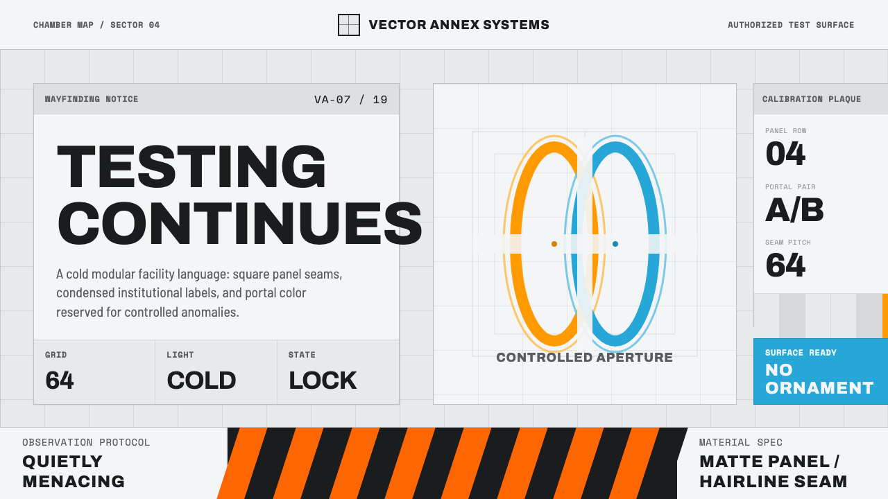 Aperture ScienceSterile authority. Cool panel seams, Archivo signage, and sparse orange-blue…冷峻权威:冷灰板缝、Archivo 标识与稀疏橙蓝光环。
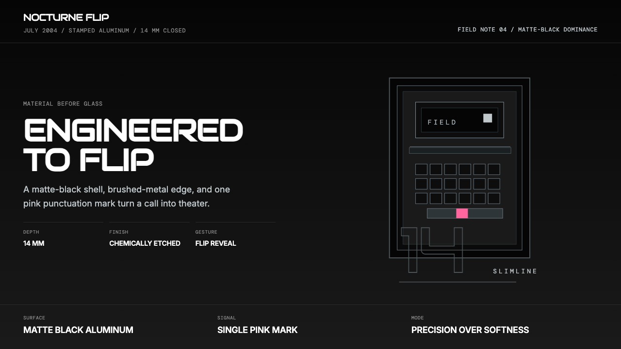 Motorola RAZR Flip (2004)Precision beats glamour. Matte black, brushed steel, and one pink accent.精密胜过炫耀。哑黑金属、拉丝边框与一抹粉色。
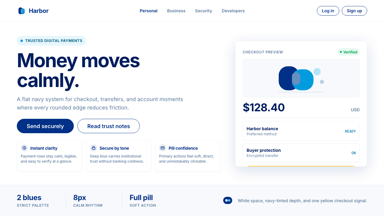 PayPalTrust without coldness. Deep navy, sky cyan, white cards, and pill checkout c…信任却不冰冷:深海军蓝与天青、白卡片和药丸结账提示。
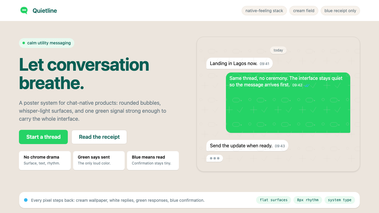 WhatsAppConversation is the interface. Cream wallpaper, green bubbles, and tiny blue…对话就是界面。奶油墙纸、绿色气泡与蓝色小勾让界面退后。
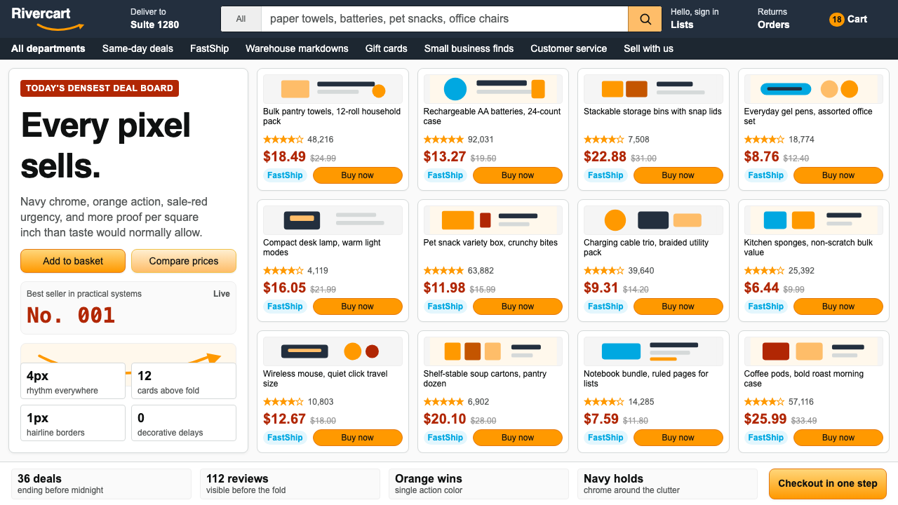 AmazonUgly sells efficiently. Navy chrome, orange buttons, red prices crowd a dense…朴素而高效:深蓝导航、橙色按钮、红价挤满密集网格。
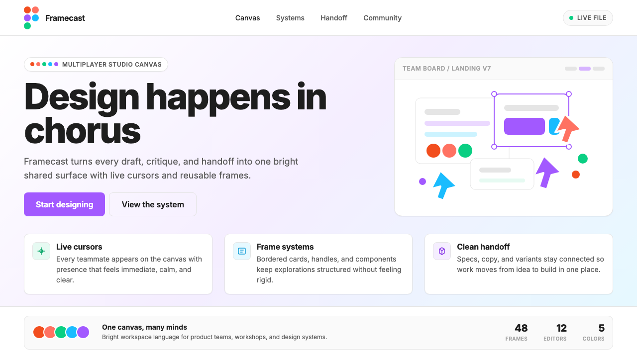 Figma 2024A brand that looks like its canvas. Five dots scatter like cursors, soft card…把产品体验直接变成品牌:五枚标志圆点如共享光标散落、柔和圆角卡片、紫色药丸按钮…