What is Motorola RAZR Flip (2004)?什么是 Motorola RAZR Flip (2004)?
The Motorola RAZR V3 proved that a phone could be a fashion object — all chemically-etched aluminum, matte black restraint, and a single hot-pink accent that conquered a generation.摩托罗拉RAZR V3证明了一部手机可以是时尚单品——化学蚀刻铝壳、哑黑色的克制,以及征服了整整一代人的那抹荧粉色。
Motorola RAZR Flip (2004) in briefMotorola RAZR Flip (2004) 速览
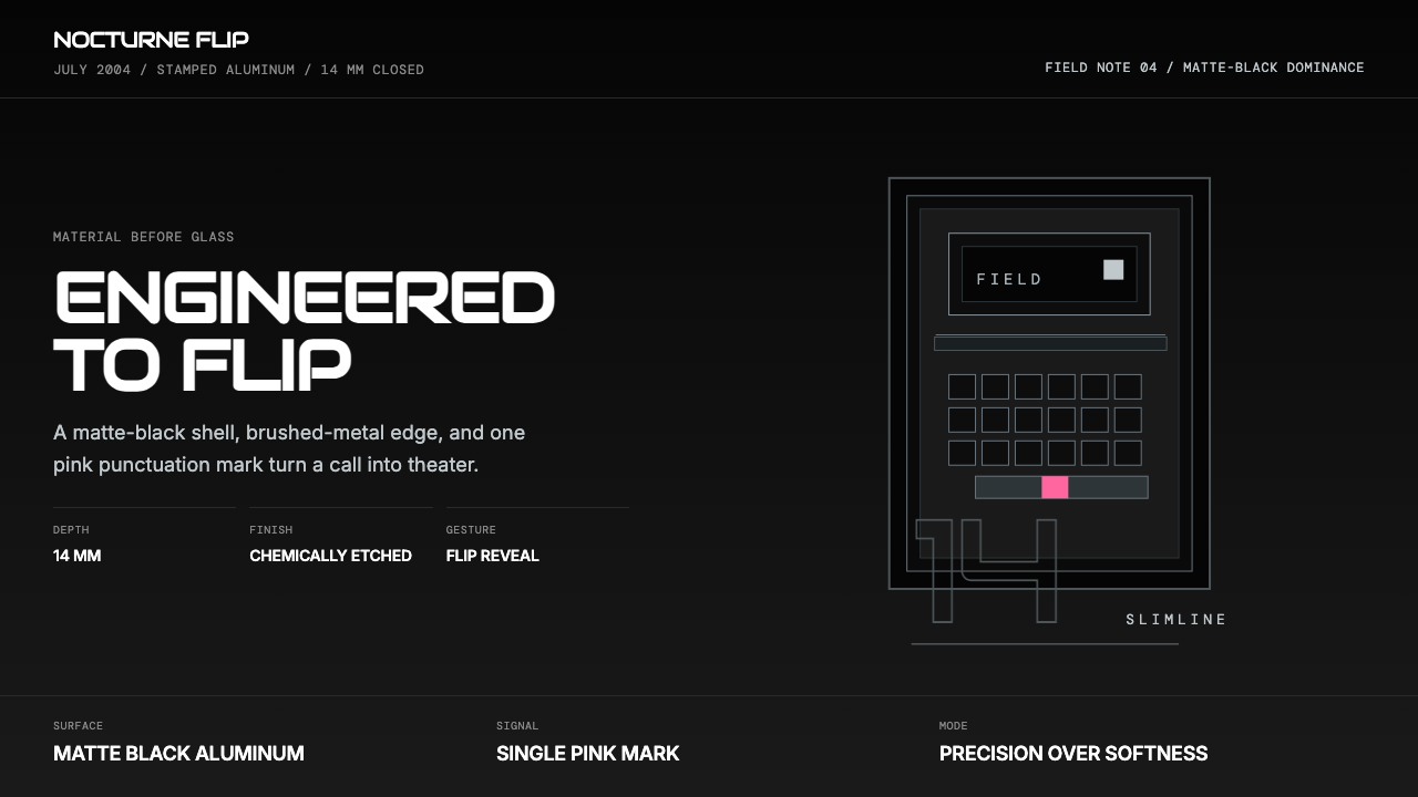
The Motorola RAZR V3 design language is one of the defining visual systems of mid-2000s consumer technology — a deliberate union of industrial precision, fashion restraint, and theatrical hardware drama. Released in 2004, the phone collapsed the entire aspiration of the pre-iPhone era into an object that felt stamped from a single billet of aluminum rather than assembled from plastic parts. Its aesthetic vocabulary is built on three pillars: matte black as the dominant tone, brushed-metal surfaces as tactile accent, and a single saturated hot-pink as the only expressive punctuation.摩托罗拉RAZR V3的设计语言是2000年代中期消费电子领域最具代表性的视觉系统之一——工业精密感、时尚克制力与戏剧性硬件体验的刻意融合。2004年发布时,这部手机将iPhone前夜整个时代的野心压缩进一件从单块铝材中冲压而出、而非由塑料零件组装的物件。其美学语汇建立于三根柱子之上:哑光黑作为主导色调,拉丝金属表面作为触觉性点缀,以及唯一一抹高饱和度荧粉色作为表达性的标点符号。
The design operates through contrast and reveal. The flip mechanism transforms the phone from a closed slab — cool, dark, near-anonymous — into an open sculptural object with a backlit keypad that reads as a luminous grid against the dark chassis. This theater of opening and closing was central to the RAZR's cultural meaning: the phone was never just a communication device but a performed gesture, something you snapped shut for emphasis or flipped open as a statement of arrival.这套设计的核心是对比与揭示。翻盖机制将手机从一块闭合的平板——冷峻、深暗、近乎匿名——变为一件展开的雕塑对象,背光键盘在深色机身的映衬下呈现为发光网格。开合的戏剧性正是RAZR文化意涵的核心:它从不只是一部通讯设备,而是一个被表演出来的手势——用力合上以示强调,或翻开以宣告到场。
Typography in the RAZR world is utilitarian and hard-edged, strictly sans-serif, following the logic of industrial instrument displays rather than consumer softness. Geometry stays rectilinear, hard-cornered, and orthogonal — there are no curves that are not structurally demanded, no radii that exceed the minimum needed for manufacture. This is premium design language before touchscreens softened everything into rounded rectangles and gradients.RAZR世界的字体处理是实用主义的、硬朗的,严格限于无衬线体,遵循工业仪器显示屏的逻辑,而非消费品的柔和感。几何形态保持直角、硬角与正交关系——没有任何非结构性需求的曲线,没有任何超出制造工艺最低要求的圆角。这是触屏时代将一切软化为圆角矩形与渐变之前,最锋利的高端设计语言。
See the Motorola RAZR Flip (2004) design system查看 Motorola RAZR Flip (2004) 完整设计系统
Where does Motorola RAZR Flip (2004) come from?Motorola RAZR Flip (2004) 从何而来?
The RAZR V3 emerged from Motorola's Libertyville, Illinois design studios in the early 2000s, at a moment when the company was fighting to reclaim relevance against Nokia's global dominance and the rising cachet of European fashion phones. The brief, shaped in large part by Geoffrey Frost — Motorola's executive vice president of marketing, who joined from Nike in 2002 — was not to build the most capable phone but the most desirable one. Frost brought the language of athletic fashion branding to consumer electronics: the phone as identity object, the device as self-expression.RAZR V3于2000年代初期诞生于摩托罗拉位于伊利诺伊州利伯蒂维尔的设计工作室。彼时,公司正奋力对抗诺基亚的全球统治地位与欧洲时尚手机日益高涨的声望。这个项目的方向,在很大程度上由2002年从耐克加入摩托罗拉担任营销执行副总裁的杰弗里·弗罗斯特所塑造——目标不是造出功能最强的手机,而是最让人渴望拥有的那一部。弗罗斯特将运动时尚品牌的语言带入消费电子领域:手机作为身份符号,设备作为自我表达的工具。
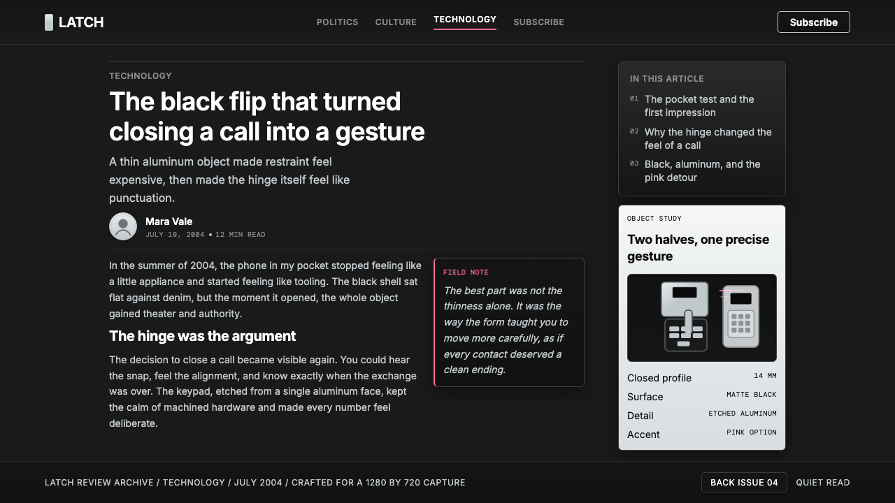
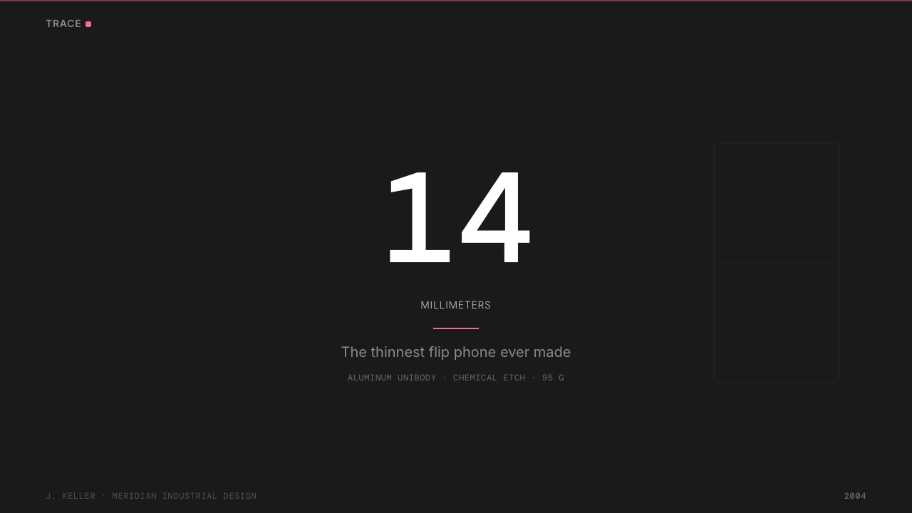
The industrial design was led by Roger Jellicoe and the Motorola Mobility design team, who set themselves a target specification that most engineers at the time considered impossible: a clamshell handset less than fourteen millimeters thick when closed. Achieving that dimension required a complete reimagination of the internal architecture. The circuit board was custom-etched to fit inside the lower shell rather than stacked in the conventional manner. The keypad was chemically etched directly into an aluminum plate — a technique borrowed from aerospace manufacturing — eliminating the raised plastic buttons that added thickness on every other phone of the era.工业设计由罗杰·杰利科与摩托罗拉移动设计团队主导,他们为自己设定了一个当时大多数工程师认为不可能实现的目标规格:翻盖合拢时厚度不超过十四毫米。为了达到这一尺寸,内部架构必须被彻底重新设想。电路板经过定制蚀刻,以贴合下壳的轮廓,而非沿用传统的叠放方式。键盘则直接通过化学蚀刻工艺刻入铝板——这一技术借鉴自航空航天制造业——彻底省去了为同时代每部手机增添厚度的凸起塑料按键。
The color system was not an afterthought. The original RAZR launched in a matte black and brushed silver palette that drew comparisons to military hardware and high-end audio equipment — a deliberate contrast to the candy-colored polycarbonate phones that dominated the market. Black was chosen as the base because it transformed under different lighting conditions: in dim environments it became almost invisible; in direct light the brushed-metal detailing emerged. This perceptual mutability was understood by the design team as a kind of product drama.色彩系统并非事后补充。最初发布的RAZR采用哑光黑与拉丝银的配色方案,令人联想到军事装备与高端音频设备——这与市场上占主导地位的糖果色聚碳酸酯手机形成了刻意的对比。黑色被选为基础色,因为它在不同光线条件下会产生感知上的变化:在昏暗环境中近乎隐形,在直射光线下则拉丝金属细节浮现而出。这种感知上的可变性,被设计团队理解为一种产品戏剧性。
The hot-pink RAZR variant — released in 2005 and associated in popular culture with Sex and the City — introduced the single saturated accent that now defines the design system as a total visual language. The pink version did not simply recolor the black phone; it substituted a single intense hue for the neutrality of the original, making explicit what the design language had always implied: that this was a fashion object with opinions. The pink variant reportedly outsold projections by several multiples, confirming that the RAZR had crossed from technology product into cultural artifact. By 2006, more than fifty million units had been sold worldwide, making it one of the best-selling consumer electronics products of its decade.2005年发布、在流行文化中与《欲望都市》紧密相连的荧粉色RAZR变体,引入了如今定义这套设计系统完整视觉语言的单一饱和强调色。粉色版本并非简单地将黑色手机重新上色,而是以一抹强烈色调替换了原版的中性色调,从而将这套设计语言始终隐含的意思明确表达出来:这是一件有立场的时尚单品。粉色版据报道销量超出预期数倍,证实了RAZR已从科技产品跨越为文化符号。到2006年,全球销量超过五千万部,使其成为那个十年中最畅销的消费电子产品之一。
What defines the Motorola RAZR Flip (2004) look?Motorola RAZR Flip (2004) 的视觉特征是什么?
Matte Black Dominance哑光黑主导
The base palette is built almost entirely on deep matte black, a finish that absorbs light rather than reflecting it. Unlike gloss black, which reads as sleek and consumer-oriented, matte black carries associations with military hardware, precision instruments, and high-end audio equipment. This choice signals seriousness and restraint at the most fundamental level of the product's surface treatment. The matte quality also means that the finish changes character under different lighting conditions — nearly disappearing in low light, revealing subtle surface texture in direct illumination.基础色板几乎完全建立在深沉的哑光黑之上——这是一种吸收光线而非反射光线的表面处理。与读起来显得时髦而大众化的亮面黑不同,哑光黑承载着军事装备、精密仪器与高端音响的联想。这一选择在产品表面处理最基本的层面上传递出严肃与克制的信号。哑光质感还意味着,这种表面处理在不同光线条件下会呈现不同的性格——在低光环境下近乎消失,在直射光线下则显露出微妙的表面质感。
Brushed-Metal Accent拉丝金属点缀
Against the matte black field, brushed-metal surfaces — typically the frame, antenna band, and keypad surround — introduce a secondary texture that reads as precision and craftsmanship. The brushing direction is consistent and orthogonal, reinforcing the rectilinear geometry of the overall form. This is not decoration added to the surface; it is the material itself made legible through controlled manufacturing process. The contrast between matte black and brushed metal is the visual heartbeat of the system, establishing a language of industrial refinement that had no precedent in mass-market phones.在哑光黑的底色之上,拉丝金属表面——通常出现在边框、天线条与键盘四周——引入了一种次级质感,传递出精密感与工艺感。拉丝方向一致且正交,强化了整体形态的直角几何关系。这不是附加在表面的装饰,而是材料本身通过受控制造工艺变得可读。哑光黑与拉丝金属之间的对比,是这套设计系统的视觉心跳,确立了一套在大众市场手机中前所未有的工业精炼语言。
Single Saturated Accent单一饱和强调色
The design system is structured to accommodate exactly one high-saturation punctuation color — most iconically, the hot pink borrowed from the variant that entered popular culture through Sex and the City. This accent is used with absolute economy: it appears where the design needs an emotional signature, not as a general highlight across multiple elements. The principle underlying this choice is that a single saturated color against a near-monochrome field has far greater visual force than multiple competing accents. The rest of the palette remains rigorously neutral so that the accent does not compete with itself.这套设计系统的结构只容纳一种高饱和度的标点符号色——最具代表性的是借自《欲望都市》中那款限定版的荧粉色。这个强调色被以绝对的经济性使用:它出现在设计需要情感签名的地方,而非作为多个元素的通用高亮色。这一选择背后的原则是:在近乎单色的底色之上,单一饱和色所具有的视觉张力,远远大于多个相互竞争的强调色的总和。其余的色板保持严格中性,使强调色不与自身竞争。
Chemically-Etched Surface Detail化学蚀刻表面细节
The keypad of the RAZR is not printed or molded in the conventional sense — its characters and grid lines are chemically etched directly into an aluminum plate, a process that removes material rather than adding it. This approach produces lettering and grid marks with razor-sharp edges and absolute consistency across the production run. The visual result is text that appears machined rather than decorated, as though information were integral to the material itself. This is the design equivalent of material honesty: the surface is doing only what the material and process honestly permit.RAZR的键盘并非以常规方式印制或注塑成型——其字符与网格线直接化学蚀刻入铝板,这是一种去除材料而非添加材料的工艺。这一方法产生了边缘无比锋利、在整个量产批次中完全一致的字母与网格纹路。视觉效果是:文字看起来像是机加工出来的,而非装饰上去的,仿佛信息本就是材料的一部分。这是设计层面的材料诚实:表面只做材料与工艺所诚实允许的事情。
Flip Mechanism as Reveal翻盖机制作为揭示仪式
The clamshell form is not incidental to the RAZR's design language — it is the primary dramatic device. In its closed state, the phone presents a compact, near-featureless slab: dark, minimal, and hard to read as a phone at all. The act of opening it — which requires a deliberate gesture, a snap, a physical commitment — reveals the illuminated keypad and screen in a moment of transformation. This theater of opening makes every use of the phone a small performance. The design team understood that the gesture itself was part of the product's identity, and the proportions and resistance of the hinge were tuned accordingly.翻盖形态之于RAZR的设计语言并非偶然——它是主要的戏剧性装置。在合拢状态下,手机呈现为一块紧凑、几乎没有特征的平板:深暗、极简,几乎无法被辨认为一部手机。打开它的动作——这需要一个刻意的手势、一声咔嗒、一种身体上的承诺——在一瞬间的变换中揭示出背光键盘与屏幕。这种开合的戏剧性使每一次使用都成为一次小型表演。设计团队深知这个手势本身是产品身份的一部分,转轴的比例与阻尼也因此被精心调校。
Hard-Cornered Rectilinear Geometry硬角直角几何
Every edge of the RAZR's form vocabulary is hard or near-hard. Corners are squared rather than softened into generous radii; transitions between planes are abrupt rather than gradual. This geometry creates an object that reads as machined and precise — something manufactured to tolerance rather than rounded for human comfort. In an era when every competing phone was softening its corners to feel friendlier, the RAZR's deliberate angularity was a form of opposition. It communicated performance and intentionality over approachability, targeting users who preferred to identify with precision tools rather than consumer products.RAZR形态语汇的每一条边缘都是硬角或近乎硬角。转角是方正的,而非软化为宽大的弧度;平面之间的过渡是突然的,而非渐进的。这种几何语言使物件看起来像是机加工出来的、精度严格的——按公差制造,而非为人体舒适度而圆润处理。在每一部竞争对手的手机都在软化转角以显得更加友好的年代,RAZR刻意的棱角分明是一种对抗姿态。它传递出性能感与意图感,而非亲和力——面向那些更愿意将自己与精密工具而非消费品相认同的用户。
Utilitarian Sans-Serif Typography实用主义无衬线字体
On-screen and on-hardware typography in the RAZR system follows the logic of industrial instrumentation: strictly sans-serif, tightly spaced, with no decorative flourishes. Labels and UI text are sized for legibility at small scale rather than for visual impressiveness at large scale. The typographic choices reinforce the overall design message — this is a precision instrument whose information display is as considered as its physical form. There is no typographic sentimentality, no reference to handwriting or warmth. Every character is a functional unit.RAZR系统中屏幕上与硬件上的字体排印遵循工业仪器显示的逻辑:严格无衬线,紧密间距,无任何装饰性花饰。标签与界面文字的大小设定以小尺寸的可读性为准,而非追求大尺寸时的视觉震撼。这些字体选择强化了整体设计信息——这是一台精密仪器,其信息显示与其物理形态同样经过深思熟虑。没有字体上的感情用事,没有对手写体或温暖感的参照。每一个字符都是一个功能性单元。
See the Motorola RAZR Flip (2004) design system查看 Motorola RAZR Flip (2004) 完整设计系统
Who shaped Motorola RAZR Flip (2004)?谁塑造了 Motorola RAZR Flip (2004)?
Frost joined Motorola as executive vice president of marketing in 2002 after a career at Nike, where he had helped build the brand's identity as an object of aspiration and self-expression. His central insight at Motorola was that the phone market had not yet been addressed as a fashion market — that consumers would pay significantly more for a device that expressed identity rather than merely performed a function. The RAZR project was shaped by this conviction, and Frost's insistence on a design-led, desire-first brief fundamentally redirected Motorola's product strategy during its most successful commercial period.弗罗斯特于2002年从耐克加入摩托罗拉担任营销执行副总裁,此前他曾帮助耐克将品牌身份塑造为渴望与自我表达的对象。他在摩托罗拉的核心洞察是:手机市场尚未被当作时尚市场来对待——消费者愿意为一部能表达身份而非仅仅执行功能的设备支付远更高的价格。RAZR项目正是由这一信念所塑造的,而弗罗斯特对以设计为主导、以渴望为优先的项目方向的坚持,在摩托罗拉最成功的商业时期从根本上重新定向了其产品战略。
Jellicoe served as the lead industrial designer on the RAZR V3 project, responsible for the form language and the key material decisions that defined the phone's distinctive character. His team's adoption of chemical etching for the keypad — a technique with no precedent in mass-market phones — and the insistence on a sub-fourteen-millimeter closed thickness required solving engineering problems that Motorola's manufacturing partners initially considered impossible. Jellicoe's work on the RAZR represents a high point of industrial design ambition in consumer electronics before software interfaces became the dominant design surface.杰利科担任RAZR V3项目的首席工业设计师,负责形态语言以及定义这部手机独特性格的关键材料决策。他的团队采用化学蚀刻工艺处理键盘——这在大众市场手机中没有任何先例——以及对合拢厚度低于十四毫米的坚持,要求解决摩托罗拉制造合作伙伴最初认为不可能完成的工程问题。杰利科在RAZR上的工作代表了消费电子领域工业设计雄心的一个顶峰——彼时软件界面尚未成为主导性的设计表面。
The RAZR was not the product of a single designer but of an integrated industrial design and engineering team at Motorola's Libertyville facility. The team's achievement was specifically in reconciling what had always been treated as competing requirements: extreme thinness and structural rigidity, fashion aspiration and manufacturing feasibility, premium material specification and mass-market unit economics. The design language they produced — matte black, brushed metal, chemical etch, and hard geometry — became a reference point for the entire consumer electronics industry and was widely imitated in the years immediately following the RAZR's commercial success.RAZR并非单个设计师的作品,而是摩托罗拉利伯蒂维尔工厂一支整合了工业设计与工程能力的团队的产物。这支团队的成就具体在于:将一直以来被视为相互竞争的要求调和到了一起——极致纤薄与结构刚性、时尚追求与制造可行性、高级材料规格与大众市场的单位经济效益。他们所创造的设计语言——哑光黑、拉丝金属、化学蚀刻与硬朗几何——成为整个消费电子行业的参照点,并在RAZR商业成功后的数年间被广泛模仿。
The pink RAZR's association with Sex and the City was not the result of a formal product placement deal but of the show's costume and props team selecting the phone as a character-appropriate accessory for its fashion-forward protagonists. The effect was more powerful than any paid placement could have achieved: the phone appeared as an object of desire within a narrative of feminine aspiration and urban sophistication, connecting the RAZR's design language to a specific and influential cultural identity. The pink variant became the lens through which the design system's single-accent principle was understood by the general public.粉色RAZR与《欲望都市》的联结并非正式产品植入协议的结果,而是剧组的服装与道具团队将这部手机作为符合角色气质的配件选给其时尚先锋主角的自然结果。其效果远比任何付费植入更为强大:这部手机作为欲望对象出现在一个关于女性追求与都市精英生活方式的叙事之中,将RAZR的设计语言与一种特定而具有影响力的文化身份连接在一起。粉色变体成为公众理解这套设计系统单一强调色原则的棱镜。
Steve Jobs's iPhone, announced in January 2007, represents the most direct historical counter-statement to everything the RAZR design language stood for. Where the RAZR was angular, the iPhone was relentlessly curved; where the RAZR privileged material texture and mechanical theater, the iPhone prioritized glass and software; where the RAZR used a physically differentiated keypad as a design centerpiece, the iPhone eliminated all physical input in favor of a single touch surface. The iPhone's commercial success effectively closed the RAZR's cultural era, but the RAZR design language has retained retrospective value precisely because it represents the apex of what was possible when hardware form, material selection, and mechanical gesture were the primary design surfaces.史蒂夫·乔布斯于2007年1月发布的iPhone,是对RAZR设计语言所代表的一切最直接的历史性反陈述。RAZR棱角分明,iPhone则无止境地圆润;RAZR优先强调材料质感与机械戏剧性,iPhone则优先选择玻璃与软件;RAZR以物理差异化的键盘作为设计核心,iPhone则取消了所有物理输入,以单一触控表面取而代之。iPhone的商业成功实际上终结了RAZR的文化时代,但RAZR的设计语言之所以保留了回溯性价值,恰恰是因为它代表了当硬件形态、材料选择与机械手势还是主要设计表面时,所能达到的顶点。
How do you use Motorola RAZR Flip (2004) today?今天怎么用 Motorola RAZR Flip (2004)?
The RAZR design system is best understood as a dark-mode industrial aesthetic built around three operating principles: matte black as the field, brushed or metallic texture as the secondary surface, and one single saturated accent color as the only expressive element. Applying it successfully requires accepting all three principles simultaneously — the system fails if the background is softened to gray rather than committed to deep black, if multiple accent colors are introduced, or if the geometry is rounded beyond what structural logic demands.RAZR设计系统最好被理解为一套围绕三项操作原则构建的深色工业美学:哑光黑作为底色场域,拉丝或金属质感作为次级表面,单一饱和强调色作为唯一表达性元素。成功运用这套系统要求同时接受所有三项原则——如果背景被软化为灰色而非彻底投入深黑,如果引入多个强调色,或者几何形态的圆角超出结构逻辑所需的程度,这套系统就会失效。
For presentation slides, the RAZR aesthetic works powerfully on cover pages and section dividers where high-contrast boldness is the communicative goal. A cover should commit to a near-black field with a single title set in clean, tight sans-serif type — ideally white or the one accent color, never both. Section covers can introduce the metallic-texture reference through a thin rule or dividing line that implies precision without adding visual noise. Content slides should maintain a strict typographic hierarchy using scale and weight alone: no colored callout boxes, no gradient fills, no decorative elements. Data slides take on the character of instrument displays — charts and graphs should use the accent color as the single data highlight against neutral bars or lines.对于演示文稿,RAZR美学在封面页与分区页上最为有力——在这些地方,高对比度的大胆感是传达目标。封面应当彻底投入近黑色的底色,标题使用简洁紧凑的无衬线字体——理想状态是白色或唯一的强调色,绝不同时使用两者。分区封面可以通过一条细规则线或分隔线引入金属质感的参照,传递精密感却不增添视觉噪音。内容页应当仅凭尺寸与字重维持严格的字体层级:没有彩色标注框,没有渐变填充,没有装饰性元素。数据页呈现仪器显示屏的特征——图表与图形应当使用强调色作为唯一的数据高亮,对应中性色的柱条或线条。
For web interfaces, this design language is particularly well-suited to dashboards, developer tools, and premium pricing pages where a dark, instrument-like aesthetic signals capability and seriousness. The approach: commit to a deep background in the darkest range of neutral — not pure black for reading comfort, but far enough from white to read as intentional — use a near-white for all body text, reserve the single accent color for primary actions, active states, and tier-marking badges. Card components should have hard or near-hard corners; borders should be visible rather than dissolved into shadow; interactive states should shift the accent color in luminosity rather than introducing new hues.对于网页界面,这套设计语言特别适合仪表板、开发者工具与高端定价页面——在这些场景中,深色的仪器式美学传递出能力感与严肃性。方法如下:投入中性色最深范围的深色背景——不必是纯黑(为阅读舒适度考量),但要足够远离白色以显得刻意为之——对所有正文使用近白色,将单一强调色保留给主要操作、激活状态与等级标记徽章。卡片组件应当有硬角或近硬角;边框应当可见而非消融于阴影之中;交互状态应当通过改变强调色的亮度来实现,而非引入新的色相。
For editorial and marketing work, the RAZR aesthetic supports a bold, fashion-forward register that works particularly well for technology brands, product launches, and premium consumer goods positioned at the intersection of performance and style. A marketing page in this system uses full-width alternating blocks: deep black field with white type, then a near-white or metallic-reference field with dark type, with the accent color appearing consistently in calls to action and feature highlights. Photography, where used, should be treated as high-contrast and directional — not soft lifestyle imagery but product-focused, lit to emphasize material texture and edge definition.对于编辑与营销内容,RAZR美学支持一种大胆、时尚前沿的表达调性,特别适合定位于性能与风格交汇处的科技品牌、产品发布与高端消费品。这套系统下的营销页面使用全宽交替区块:深黑底色配白色文字,然后是近白色或金属质感参照底色配深色文字,强调色在行动号召与功能高亮中一致出现。摄影(若使用)应当被处理为高对比度、方向感强的影像——不是柔软的生活方式图像,而是以产品为焦点、以强调材料质感与边缘清晰度为目的的打光。
A common mistake when applying this design system is overusing the accent color. Because the system is built on near-total monochrome, the accent carries enormous visual weight, and even a modest increase in its frequency rapidly depletes its impact. A second common error is substituting cool dark gray for true deep black — this collapses the contrast that the entire system depends on, producing an aesthetic that reads as merely dark rather than precision-dark. The third recurring mistake is softening geometry: adding generous corner radii or ambient shadow blurs introduces a consumer-friendly warmth that directly contradicts the design language's industrial-instrument logic. Each of these errors individually is survivable; all three together produce something that looks like a generic dark theme with no connection to the RAZR's original visual authority.运用这套设计系统时最常见的错误是过度使用强调色。由于系统建立在近乎全色调的单色基础上,强调色承载着巨大的视觉重量,即使是其出现频率的小幅增加也会迅速耗尽其冲击力。第二个常见错误是以冷深灰替代真正的深黑——这会瓦解整套系统所依赖的对比度,产生一种读起来只是「显得暗」而非「精密地暗」的美学。第三个反复出现的错误是软化几何形态:添加宽大的圆角或漫射阴影模糊会引入一种消费品式的亲和温度,与这套设计语言的工业仪器逻辑直接矛盾。这些错误中的每一个单独存在时尚可挽救;三个同时出现则会产生一个看起来像是普通深色主题的结果,与RAZR原始视觉权威毫无联系。
See the Motorola RAZR Flip (2004) design system查看 Motorola RAZR Flip (2004) 完整设计系统
Motorola RAZR Flip (2004) — FAQMotorola RAZR Flip (2004) · 常见问题
Is the RAZR aesthetic the same as generic dark mode design?RAZR美学与通用深色模式设计是同一回事吗?
No. Generic dark mode design typically inverts a light-mode system — replacing white backgrounds with dark gray and adjusting text contrast — without fundamentally changing its spatial logic, geometry, or color strategy. The RAZR design system is built from first principles as a dark-field system: the deep black is not an inversion but the intentional base, the geometry is hard-cornered and orthogonal by design conviction rather than default, and the accent color economy is strict in a way that generic dark themes almost never are. The closest analog is the instrument cluster of a high-performance vehicle — every element is calibrated to convey precision, not just legibility in dim conditions.不是。通用深色模式设计通常只是对浅色模式系统的反转——将白色背景替换为深灰色并调整文字对比度——而不从根本上改变其空间逻辑、几何形态或色彩策略。RAZR设计系统则是从第一性原理出发构建的深色场域系统:深黑不是反转结果而是刻意选择的基础,几何形态的硬角与正交是设计信念的体现而非默认设置,强调色的经济性之严格程度是通用深色主题几乎从未达到的。最接近的类比是高性能车辆的仪表盘——每一个元素都经过校准以传递精密感,而非仅仅在昏暗条件下保证可读性。
Can this design language be used with a light background instead of dark?这套设计语言能否用于浅色背景而非深色背景?
A light inversion is technically possible but produces a fundamentally different aesthetic register. The RAZR's design logic depends on the relationship between deep black and its metallic and accent counterpoints — this is what gives the system its instrument-panel authority. On a light ground, the same elements (hard geometry, single accent, sans-serif type) read as a clean industrial style rather than a precision-dark one. The result is closer to the design language of scientific instrumentation catalogues or certain Scandinavian industrial design traditions. If you need a light-background variant, the core discipline to preserve is the hard geometry, strict accent economy, and absence of decorative elements — the palette itself will necessarily shift.浅色反转版本在技术上是可行的,但会产生本质上不同的美学调性。RAZR的设计逻辑依赖于深黑与其金属色和强调色之间的关系——这正是赋予这套系统仪器面板权威性的东西。在浅色底面上,相同的元素(硬朗几何、单一强调色、无衬线字体)读起来像是简洁的工业风格,而非精密黑暗风格。结果更接近科学仪器目录或某些斯堪的纳维亚工业设计传统的设计语言。如果你需要浅色背景的变体,需要保留的核心纪律是硬朗几何、严格的强调色经济性与装饰性元素的缺席——色板本身则必然会随之改变。
How does this system handle multiple competing accent colors?这套系统如何处理多个相互竞争的强调色?
It does not — and this is a defining constraint rather than a limitation to work around. The entire visual logic of the RAZR system is predicated on monochrome discipline interrupted by a single saturated signal. As soon as a second accent color is introduced, the first loses its exclusive signal value, and both begin to read as decoration rather than punctuation. If your content genuinely requires categorical color differentiation — as in a multi-series data chart or a product tier matrix — the system's prescription is to use luminosity and neutral-tone variants of the single accent rather than introducing new hues. In contexts where this is truly insufficient, a second neutral-adjacent color (deep steel blue or warm dark bronze) can be used, but it must be calibrated to read as a structural element rather than another expressive accent.它不处理——这是一个定义性约束,而非需要绕过的局限。RAZR系统的整体视觉逻辑以单色纪律为前提,由单一饱和信号打断。一旦引入第二种强调色,第一种就会失去其独家信号价值,两者都开始被读作装饰而非标点符号。如果你的内容确实需要类别色彩区分——如多系列数据图表或产品等级矩阵——这套系统的处方是使用单一强调色的明度变体和中性色调变体,而非引入新的色相。在这真正不足的场合,可以使用第二种接近中性的颜色(深钢蓝或暖深铜色),但必须将其校准为读作结构性元素,而非另一个表达性强调色。
What makes the RAZR design system feel premium versus merely dark?是什么让RAZR设计系统感觉高端,而非仅仅显得暗?
Premium in the RAZR register comes from specificity, not from darkness alone. The key differentiators are: first, surface texture differentiation — the interplay between the matte field and the directional brushed accent creates a material complexity that flat dark designs lack entirely; second, geometric discipline — hard corners and orthogonal lines signal precision engineering rather than casual style; third, accent economy — a single high-saturation color used sparingly carries far more cultural weight than a color-rich system, because it implies that the choice was deliberate rather than defaulted; fourth, the absence of anything soft — no rounded buttons, no ambient shadows, no gradient fills, no decorative iconography. Each of these elements is individually achievable; it is their simultaneous presence and mutual reinforcement that produces the premium register.RAZR语境中的高端感来自特殊性,而非仅仅来自深色。关键区分因素是:第一,表面质感的差异化——哑光底色场域与有方向感的拉丝强调之间的交互,创造出扁平深色设计完全缺乏的材料复杂性;第二,几何纪律——硬角与正交线条传递精密工程感而非随意的风格;第三,强调色经济性——单一高饱和度色彩被节制使用,所承载的文化重量远超色彩丰富的系统,因为它暗示这个选择是刻意的而非默认的;第四,任何柔软元素的缺席——没有圆角按钮,没有漫射阴影,没有渐变填充,没有装饰性图标。这些元素中的每一个单独都是可以实现的;正是它们的同时存在与相互强化,产生出高端的调性。
Is the RAZR aesthetic suited to brand categories beyond technology?RAZR美学适用于科技以外的品牌类别吗?
Yes, but with meaningful selectivity. The design system's values — precision, restraint, material seriousness, performance over approachability — transfer well to categories where those values are desired: high-end automotive, professional audio equipment, premium wearables, performance sportswear positioned at the intersection of function and status, and certain segments of luxury goods where craft precision is a selling point. The system struggles in categories that require warmth, organic texture, or cultural specificity that conflicts with industrial neutrality: food, wellness, children's products, community-oriented services, and brands whose identity depends on approachability or playfulness. The test is whether the brand's core promise aligns with precision and controlled restraint — if it does, the RAZR aesthetic is a strong and historically grounded choice.可以,但需要有意义的选择性。这套设计系统的价值观——精密、克制、材料上的严肃性、性能优先于亲和力——能够很好地迁移到期望这些价值观的品类:高端汽车、专业音频设备、高端可穿戴设备、定位于功能与地位交汇处的高性能运动服装,以及某些工艺精密度是卖点的奢侈品细分市场。这套系统在需要温暖感、有机质感或与工业中性感相冲突的文化特殊性的品类中则力不从心:食品、健康、儿童产品、社区导向的服务,以及品牌身份依赖于亲和力或趣味性的品牌。判断标准是:品牌的核心承诺是否与精密感和受控制的克制感对齐——如果是的话,RAZR美学是一个强有力且有历史依据的选择。
Related design styles相关设计风格
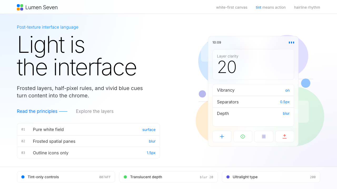 Flat Design iOS 7The day skeuomorphism died. Bright tints on white, hairline separators, frost…苹果一夜终结拟物化的革命:纯白留白、毛玻璃模糊面板、纤细到失重的字体——定义十…
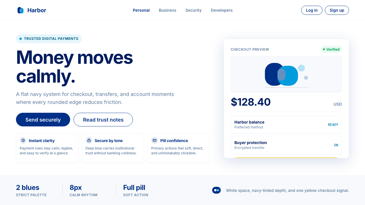 PayPalTrust without coldness. Deep navy, sky cyan, white cards, and pill checkout c…信任却不冰冷:深海军蓝与天青、白卡片和药丸结账提示。
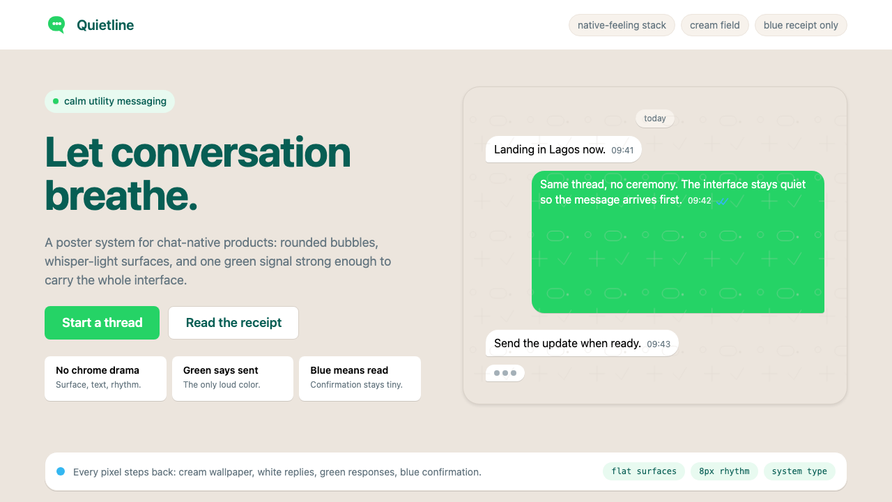 WhatsAppConversation is the interface. Cream wallpaper, green bubbles, and tiny blue…对话就是界面。奶油墙纸、绿色气泡与蓝色小勾让界面退后。
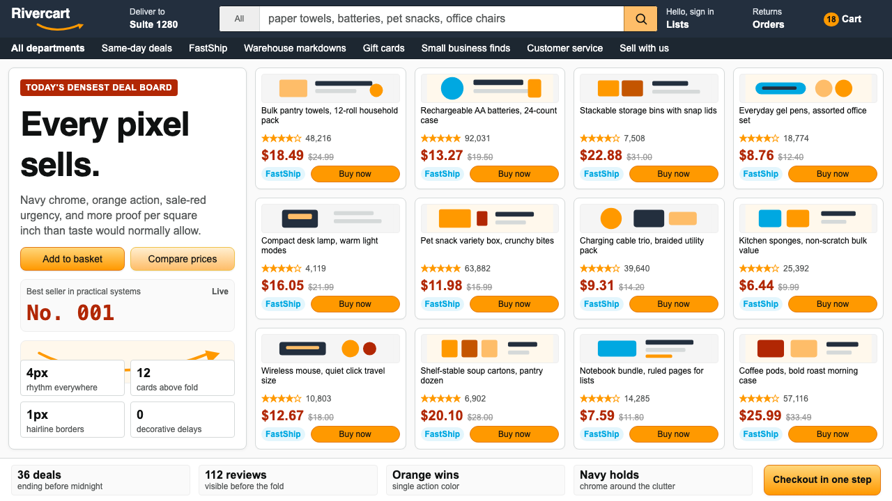 AmazonUgly sells efficiently. Navy chrome, orange buttons, red prices crowd a dense…朴素而高效:深蓝导航、橙色按钮、红价挤满密集网格。
 Android Bugdroid GreenFriendly tech, reduced to geometry. Vivid green pops from Grey 900 and rounde…友好科技化为几何:明绿从 Grey 900 与圆润字形中跃出。
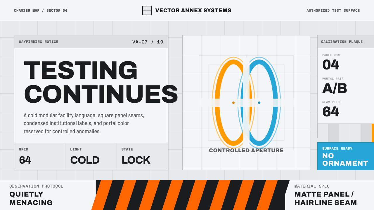 Aperture ScienceSterile authority. Cool panel seams, Archivo signage, and sparse orange-blue…冷峻权威:冷灰板缝、Archivo 标识与稀疏橙蓝光环。