What is Figma 2024?什么是 Figma 2024?
Figma 2024 is the rare brand that looks exactly like its own product — multiplayer cursors as logo, shared-file energy as identity.Figma 2024 是极少数品牌外观与产品体验高度一致的设计工具——共享光标化身标志,协作文件的能量即是视觉识别。
Figma 2024 in briefFigma 2024 速览
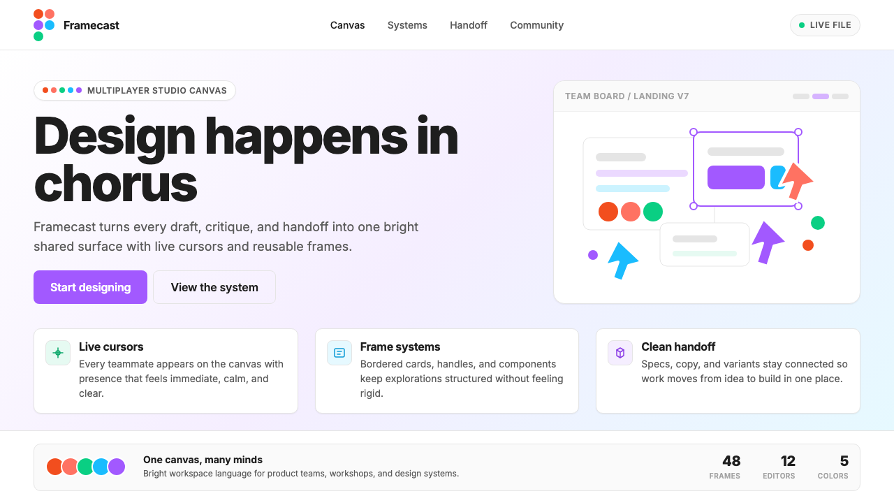
Figma 2024 is the visual identity system adopted by Figma as its brand reached maturity — a design language that treats the product's own canvas as its aesthetic source. Every marketing surface reads like an open Figma file: generous whitespace structured as frames, soft-cornered cards that echo component libraries, pill-shaped buttons in a signature purple, and decorative selection handles lifted directly from the editor UI. The five logo dots — one each in red, orange, green, blue, and purple — scatter across compositions the way multiple cursors scatter in a shared file, turning the tool's defining social metaphor into a repeatable visual motif.Figma 2024 是 Figma 品牌走向成熟时采用的视觉识别体系——一套将产品自身画布作为美学来源的设计语言。每一处营销界面都像一个打开中的 Figma 文件:以框架结构组织的大量留白、呼应组件库的柔角卡片、标志性紫色药丸按钮,以及直接从编辑器 UI 中提取的装饰性选区手柄。五枚品牌圆点——红、橙、绿、蓝、紫各一——在构图中散落的方式,与多个光标在共享文件中散布的方式如出一辙,将工具最核心的社交隐喻转化为可复用的视觉母题。
What distinguishes this identity from conventional tech branding is the degree to which the product experience and the brand experience are deliberately unified. Rather than abstracting away from the tool, Figma 2024 doubles down on it: the same rounded corners, the same soft surface quality, the same confident typographic confidence seen in the application's own interface appear in every ad, conference banner, and splash screen. The palette is simultaneously restrained and vivid — a near-white background keeps things readable and spacious, while the five dot colors provide a full chromatic range that never feels chaotic because they arrive in deliberate, scattered constellations rather than dense slabs.这套识别系统区别于常规科技品牌的地方,在于产品体验与品牌体验被刻意统一的程度。Figma 2024 没有将品牌从工具中抽象出来,而是将工具本身加倍呈现:在应用界面中看到的同款圆角、同等柔和的表面质感、同样自信的字体排印,出现在每一则广告、每一面会议展板、每一个启动画面上。色板同时兼具克制与鲜活——接近白色的背景保持可读性与空间感,而五枚圆点的色彩提供了完整的色域范围,却因以刻意散落的星座状而非密集色块出现,始终不显混乱。
The style is native to the browser-native, multiplayer SaaS era. It reflects a generation of design tools that grew up in the cloud, treating collaboration as a first-class feature rather than an afterthought. Figma 2024 communicates this ethos visually: nothing about it reads as solitary or static. The cursor-dots imply movement and presence; the open, uncluttered layouts imply room for others to join; the bright, unambiguous colors imply clarity of shared intention.这种风格天然属于浏览器原生、多人协作的 SaaS 时代。它折射出一代在云端成长起来的设计工具的面貌——将协作视为头等功能而非事后补丁。Figma 2024 用视觉传达这一精神气质:它没有任何孤立或静止的感觉。光标圆点暗示运动与在场;开阔、不杂乱的版面暗示他人随时可以加入;明亮、清晰的色彩暗示共同意图的无歧义表达。
Where does Figma 2024 come from?Figma 2024 从何而来?
Figma was founded in 2012 by Dylan Field and Evan Wallace, who met as undergraduates at Brown University. Their foundational insight was that design tools did not need to be desktop applications — a fully capable vector editor could live in the browser, enabling real-time collaboration that was structurally impossible in file-based tools like those that dominated the market at the time. The company spent its early years in San Francisco building toward a public launch in 2016, and during that period the product's identity was relatively understated, focused on communicating technical credibility rather than visual distinctiveness.Figma 由戴伦·菲尔德(Dylan Field)与埃文·华莱士(Evan Wallace)于 2012 年共同创立,两人在布朗大学就读期间相识。他们的核心洞察是:设计工具并不需要是桌面应用——一款功能完整的矢量编辑器完全可以运行于浏览器中,从而实现在当时主流的基于文件的工具中结构上不可能实现的实时协作。公司在旧金山度过了创立初期,朝着 2016 年公开发布的目标推进,那一阶段的产品视觉识别相对低调,聚焦于传达技术可信度而非视觉辨识度。
The brand's visual ambition escalated alongside the product's growth. By the early 2020s, Figma had become the dominant professional design tool, and its design team — led in the brand and product design direction by Chief Product Officer Yuhki Yamashita and the Figma Brand team — began developing an identity that could hold its own at the scale of a major platform. The shift that defines the 2022-to-2024 era is the decision to make the brand literally look like the product: to use the tool's own visual grammar as the brand's visual grammar. Selection handles appear as decorative elements. Frames and cards echo the canvas. The cursor, previously a minor UI detail, became the central brand metaphor.品牌的视觉野心随产品的成长而提升。进入 2020 年代初,Figma 已成为主流专业设计工具,其设计团队——在首席产品官山下裕树(Yuhki Yamashita)与 Figma 品牌团队的引领下——开始打造能够在主要平台层面独当一面的视觉识别。定义 2022 至 2024 年这一时期的关键转变,是让品牌从视觉上真正像产品本身的决定:以工具自身的视觉语法作为品牌的视觉语法。选区手柄作为装饰元素出现;画框与卡片呼应画布;光标这个此前不起眼的 UI 细节,成为品牌的核心隐喻。
The five-dot logo itself is the most legible expression of this philosophy. Each dot corresponds to one of the five colors in the Figma identity system, and collectively they echo the multicolored cursors that appear when collaborators are present in a shared file. This was a deliberate reversal of conventional brand logic: instead of designing a mark that represents the company and then building the product separately, Figma took the product's most characteristic visual event — five different-colored cursors moving through a shared canvas — and promoted it to the level of brand identity. The dots are not a metaphor for the product; they are the product, abstracted one level.五枚圆点构成的标志本身,是这一哲学最清晰的表达。每枚圆点对应 Figma 识别系统五种颜色之一,合在一起,它们呼应了协作者进入共享文件时出现的多色光标。这是对常规品牌逻辑的刻意颠覆:Figma 没有先设计一个代表公司的标志、再独立构建产品,而是取用了产品最具代表性的视觉事件——五枚不同颜色的光标在共享画布上移动——并将其提升至品牌识别的层面。这些圆点不是对产品的隐喻;它们就是产品本身,向上抽象了一个层级。
The typographic backbone of the system is Inter, the open-source typeface designed by Rasmus Andersson. Inter had already become a de facto standard in product UI design by the time Figma adopted it as its brand typeface — its optical consistency at small sizes, its large x-height, and its legibility on screens made it a natural fit for digital-first products. Figma's use of Inter end-to-end, from brand headlines to interface labels, reinforces the identity's core argument: the brand and the tool are the same thing, rendered in the same materials.这套系统的字体骨架是 Inter——由拉斯穆斯·安德森(Rasmus Andersson)设计的开源字体。在 Figma 采用它作为品牌字体时,Inter 已成为产品 UI 设计领域事实上的标准字体,其在小尺寸下的视觉一致性、宽大的 x 字高以及在屏幕上的清晰可读性,使它天然契合以数字为先的产品。Figma 从品牌标题到界面标签全程使用 Inter,强化了这套识别的核心论点:品牌与工具是同一件事,以同样的材料呈现。
What defines the Figma 2024 look?Figma 2024 的视觉特征是什么?
Five-Dot Color System五点色彩体系
The five signature colors — a warm red, a bright orange, a vivid green, a clear blue, and the brand's defining purple — are deployed not as a flat background palette but as discrete, movable objects. They appear most often as circular dots of varying sizes, scattered asymmetrically across a light ground, mimicking the behavior of cursors in a live collaborative session. Color is never used to fill large fields; it is used to punctuate, to indicate presence, and to give the composition a sense of animated possibility.五种标志性色彩——暖红、亮橙、鲜绿、清蓝,以及品牌的定义性紫色——不作为平铺背景使用,而以独立的、可移动的对象形式出现。它们通常以大小不一的圆点形态呈现,不对称地散布于浅色底面,模拟实时协作中光标的行为方式。色彩从不用于填充大面积区域;它用于点缀、标示在场感,以及赋予构图一种动态可能性的气息。
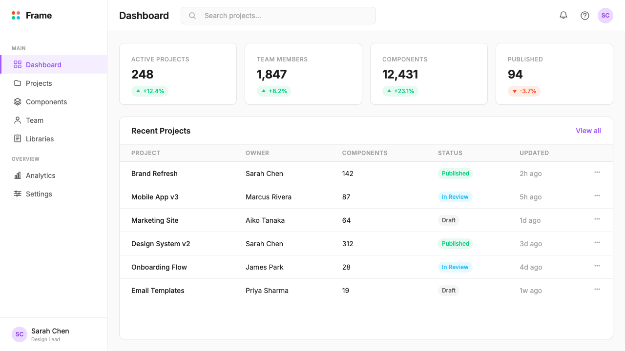
Soft Radius and Card Surfaces柔和圆角与卡片表面
Every contained element — buttons, cards, image frames, feature callout boxes — carries a generous, consistent corner radius. This softness is not accidental; it directly echoes the rounded rectangles that designers work with inside the Figma canvas daily. The result is a visual vocabulary that feels simultaneously professional and approachable. Cards sit on near-white grounds with subtle lift, suggesting the layered surface of a canvas with frames stacked in depth, without resorting to heavy shadows or strong borders.每一个有边界的元素——按钮、卡片、图像框、功能引用框——都带有充足而一致的圆角。这种柔和不是偶然的;它直接呼应了设计师每天在 Figma 画布中操作的圆角矩形。最终形成的视觉词汇既专业又平易近人。卡片置于接近白色的底面上,带有微妙的浮起感,暗示画布上框架层叠的表面纵深,但不依赖厚重阴影或强调边框。
Purple as the Anchor Hue紫色作为锚定色调
Among the five brand colors, purple carries the heaviest functional load. It is the color of primary call-to-action buttons, key interactive states, and the most important typographic accents. Its role is analogous to what primary blue does in conventional tech brands — signaling action and trust — but the choice of purple rather than blue gives the brand a slightly warmer, more creative, and less corporate register. The purple pill button is one of the most immediately recognizable UI elements in the contemporary design-tool landscape.在五种品牌色中,紫色承担着最重的功能负载。它是主要行动号召按钮、关键交互状态以及最重要的字体强调的颜色。它的作用类似于常规科技品牌中蓝色的作用——传递行动与信任——但选择紫色而非蓝色,赋予了品牌略微更温暖、更具创造力、更少企业感的语调。紫色药丸按钮是当代设计工具领域中辨识度最高的 UI 元素之一。
UI-Native Decoration原生 UI 装饰语言
Decorative elements are borrowed directly from the product interface: selection handles (the small squares at corners and midpoints of selected objects), bounding box outlines, cursor arrows in multiple colors, and layer-panel visual cues all appear as ornamental details in marketing materials. This is a highly unusual strategy — most software brands abstract away from their interfaces in marketing, presenting lifestyle imagery or abstract graphics instead. Figma's decision to foreground UI artifacts blurs the line between product and brand, making the brand feel like a continuation of the tool rather than a separate marketing construct.装饰元素直接借自产品界面:选区手柄(选中对象角落与中点处的小方块)、边界框轮廓、多色光标箭头,以及图层面板的视觉提示,都以装饰细节的形式出现在营销材料中。这是一种极不寻常的策略——大多数软件品牌在营销中会将界面抽象化,转而呈现生活方式图像或抽象图形。Figma 将 UI 元素前置的决定模糊了产品与品牌的边界,让品牌感觉是工具的延续,而非独立的营销构建物。
Open, Frame-Like Whitespace开放的画框式留白
Layouts are built around deliberate emptiness. Margins are wide, content blocks are given generous breathing room, and the composition never feels packed or rushed. This spaciousness serves a functional purpose — it makes complex feature communications easier to parse — but it also carries a metaphorical one: a Figma canvas starts empty, and the whitespace in brand materials echoes the unoccupied canvas waiting to be filled by collaborative work. The openness communicates possibility and invitation rather than authority and completeness.版面围绕刻意的空旷构建。页边距宽阔,内容块拥有充足的呼吸空间,构图从不显得拥挤或仓促。这种宽松感具有功能意义——使复杂的功能传达更易于解读——同时也承载着一种隐喻:Figma 画布从空白开始,品牌材料中的留白呼应着等待协作工作填充的未占用画布。这种开放感传递的是可能性与邀请,而非权威与完整。
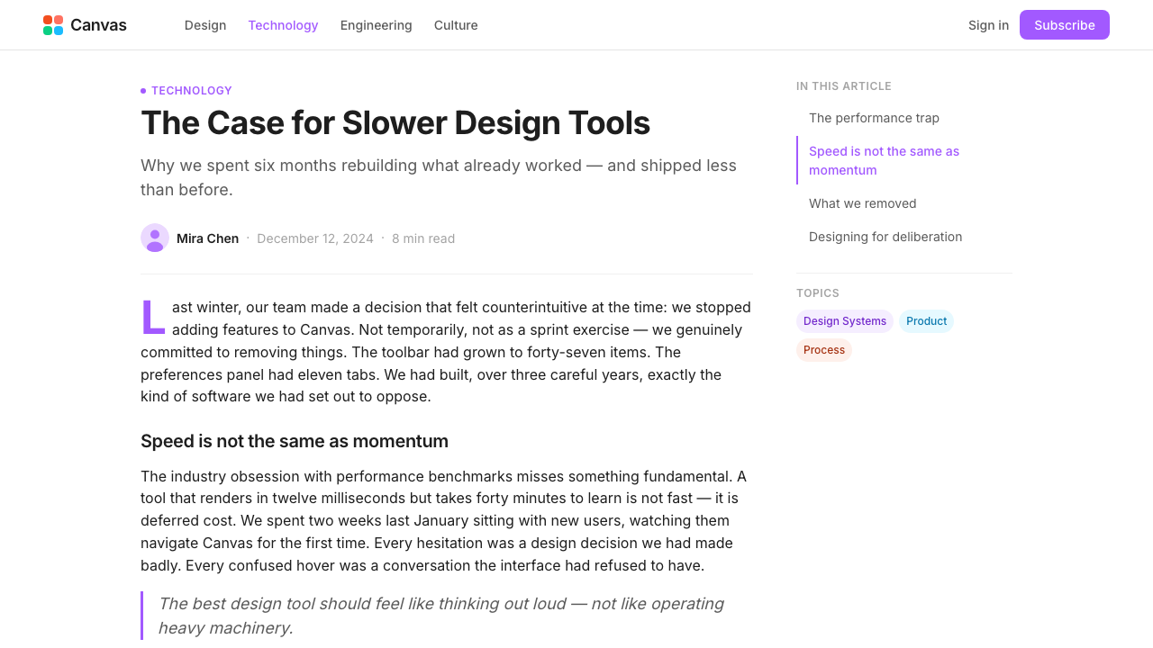
Consistent Typographic Confidence一贯的排印自信
Type is set with clear scale contrast between headline, subhead, and body levels, but without the dramatic weight extremes sometimes seen in editorial design. Headlines are large and assured without being aggressive; body text is set at a comfortable reading weight with ample line spacing. The single-typeface discipline — using one family throughout with no secondary serif or display face — creates coherence and reinforces the brand's argument that the same visual language works everywhere: in the tool, in the docs, in the ad, on the stage.排版在标题、副标题与正文层级之间设有清晰的尺度对比,但不像编辑设计中有时呈现的那种极端字重差距。标题大而笃定,却不咄咄逼人;正文以舒适的阅读字重排版,行距宽松。单一字体纪律——全程使用同一字体家族,不引入衬线副字体或展示字体——创造了连贯性,并强化了品牌的核心论点:同一套视觉语言在任何地方都能奏效——在工具中、在文档中、在广告中、在舞台上。
Multiplayer as Visual Grammar多人协作作为视觉语法
The entire system is animated by the concept of multiple simultaneous presences. Where other brands use a single hero image or a single focal point, Figma 2024 compositions tend to feature several distinct elements in dialogue: multiple dots of different colors, multiple cards at slightly different scales, multiple type elements at different hierarchy levels. Nothing is alone. The visual grammar expresses plurality, simultaneity, and co-creation — which is precisely what the product enables.整套体系被多个同时在场的概念所驱动。其他品牌使用单一主视觉或单一焦点的地方,Figma 2024 的构图倾向于呈现多个相互对话的独立元素:多枚不同颜色的圆点、多张尺度略有差异的卡片、多个不同层级的文字元素。没有什么是孤立存在的。这套视觉语法表达的是复数性、同时性与共同创作——而这正是该产品所赋能的事。
Who shaped Figma 2024?谁塑造了 Figma 2024?
Field co-founded Figma in 2012 and has served as CEO since its inception. His conviction that design should be a collaborative, browser-native activity — rather than a solitary desktop process — shaped not only the product architecture but the brand philosophy that followed. The decision to build collaboration into the tool's core, rather than bolting it on later, is ultimately the decision that made the five-cursor-dots identity possible and coherent.菲尔德于 2012 年联合创立 Figma,并自成立起担任 CEO。他坚信设计应当是一项协作性的、浏览器原生的活动,而非孤立的桌面流程——这一信念不仅塑造了产品架构,也塑造了随之而来的品牌哲学。将协作内置于工具核心而非事后追加的决定,最终使五枚光标圆点的品牌识别在逻辑上成为可能且连贯。
Wallace co-founded Figma and served as CTO, and his technical achievement of building a fully capable vector graphics engine in the browser — using WebGL before it was widely adopted — is the engineering foundation on which the entire product and brand rest. Without the proof that browser-native design tooling was technically viable, the collaborative multiplayer premise that defines both the product and the Figma 2024 identity would not have been possible.华莱士联合创立 Figma 并担任 CTO,他在浏览器中构建全功能矢量图形引擎的技术成就——在 WebGL 被广泛采用之前便已使用——是整个产品与品牌所依托的工程基础。若非证明了浏览器原生设计工具在技术上可行,定义产品与 Figma 2024 品牌识别的多人协作前提便无从实现。
Yamashita joined Figma as Chief Product Officer and has been a central force in the maturation of both the product's design and its brand expression. Under his leadership, the Figma brand team developed the visual language that most people recognize as Figma 2024 — the coherent system of dots, cards, purple CTAs, and UI-native decoration that turned a product-centric design philosophy into a legible, scalable brand identity.山下裕树以首席产品官身份加入 Figma,在产品设计与品牌表达的成熟过程中扮演了核心角色。在他的领导下,Figma 品牌团队发展出了大多数人所认知的 Figma 2024 视觉语言——由圆点、卡片、紫色行动号召与原生 UI 装饰构成的连贯体系,将以产品为中心的设计哲学转化为清晰可读、可规模化的品牌识别。
Andersson is the designer of Inter, the open-source typeface that serves as the typographic backbone of the Figma 2024 brand system. Though Andersson did not design Inter for Figma specifically, his typeface had become the dominant default of browser-based product interfaces by the time Figma adopted it, making it not just a practical choice but a culturally resonant one — Inter is, in a sense, the typeface of the era that Figma helped define.安德森是 Inter 的设计者——这款开源字体是 Figma 2024 品牌体系的字体骨架。尽管安德森并非专为 Figma 设计 Inter,但在 Figma 采用它时,这款字体已成为基于浏览器的产品界面的主流默认字体,使其不仅仅是一个务实的选择,更是一个具有文化共鸣的选择——某种意义上,Inter 是 Figma 帮助定义的这个时代的字体。
The in-house brand team at Figma — whose individual designers are rarely named publicly — deserves recognition as a collective author of the Figma 2024 system. The decision to use the product's own visual grammar as brand language, to elevate the cursor to the level of logo, and to build a scalable dot-based color system that reads as both orderly and lively across wildly different surfaces required sustained creative conviction and systems thinking. The brand is, in that sense, the most public example of what the team believes good design tooling makes possible.Figma 内部品牌团队——其中的个人设计师鲜少以公开姓名出现——作为 Figma 2024 体系的集体作者理应获得认可。以产品自身的视觉语法作为品牌语言、将光标提升至标志层面、构建一套可规模化的点状色彩体系使其在迥异的应用场景中同时呈现秩序感与生动性——这些决策需要持续的创造力信念与系统思维。从这个意义上说,这套品牌是团队相信优秀设计工具所能实现之事的最公开示例。
How do you use Figma 2024 today?今天怎么用 Figma 2024?
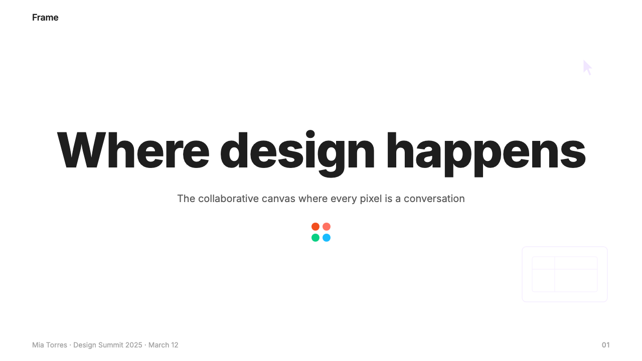
Figma 2024 translates well into presentation design because its underlying structure — clear hierarchy, generous whitespace, restrained color punctuation — is precisely what makes slides legible at scale. For a cover slide, the approach works through contrast and scatter: a large, clean headline in confident type against a near-white ground, with two or three colored dots placed asymmetrically as the only decorative elements, their arrangement suggesting motion rather than static decoration. The dots should never be perfectly centered or evenly spaced — they should feel like cursors caught mid-movement.Figma 2024 很容易移植到演示文稿设计中,因为它的底层结构——清晰层级、充足留白、克制的色彩点缀——正是使幻灯片在大屏幕上保持可读性的要素。封面幻灯片的处理方法依靠对比与散落:在接近白色的底面上,以自信的字体呈现一个大而干净的标题,以两到三枚不对称放置的彩色圆点作为唯一装饰元素,其排列应暗示运动而非静态装饰。这些圆点绝不应完全居中或等距——它们应当像被捕捉到中途的光标。
Content slides should be built as if they are Figma frames: one clear hierarchy with no more than three text levels, content organized into soft-cornered cards that visually separate sections without requiring heavy dividers or borders, and color used only for emphasis — a single purple accent on a key statistic or call to action, never multiple competing hues on the same slide. Data slides benefit from the same card treatment: charts housed in rounded containers, axis labels at a comfortable reading weight, and data series colored from the five-dot palette with restraint — typically one or two colors per chart, not five.内容幻灯片应像搭建 Figma 画框一样构建:一套清晰的层级体系,文字层级不超过三级;内容组织进柔角卡片中,以视觉方式区分各节而无需厚重分割线或边框;色彩仅用于强调——在关键数据或行动号召上使用单一紫色点缀,同一幻灯片上绝不出现多种相互竞争的色调。数据幻灯片同样适合卡片处理:图表置于圆角容器内,坐标轴标签采用舒适的阅读字重,数据系列从五点色板中取色并保持克制——通常每张图表一到两种颜色,而非五种。
For web interfaces — dashboards, pricing pages, landing pages, and feature comparison tables — the style's strength lies in its clarity hierarchy and its ability to feel modern without feeling trendy. A dashboard built in this visual language uses a light background throughout, soft-cornered cards for metric blocks, purple for interactive controls and primary actions, and the remaining brand colors used sparingly for status indicators or category differentiation. The layouts should be grid-disciplined with consistent gutters, and the navigation should be primarily typographic — wordmarks, labels, text links — with iconography kept geometric and minimal.对于网页界面——仪表板、定价页面、落地页、功能对比表——这种风格的优势在于其层级清晰度,以及在感觉现代的同时不显得短暂流行的能力。以这套视觉语言构建的仪表板全程使用浅色背景,指标模块采用柔角卡片,紫色用于交互控件与主要操作,其余品牌色彩仅少量用于状态指示或类别区分。版面应严格遵守网格、保持一致间距,导航应以字体为主——文字标识、标签、文字链接——图标保持几何形且简约。
For editorial and marketing applications — conference keynote materials, product launch pages, social cards, and event banners — the style supports high-energy compositions that remain organized. A marketing page in this system alternates between light and very slightly tinted sections rather than between dramatically different background colors; each section features one primary content element (a headline, a feature card, a testimonial block) surrounded by enough space that the element reads clearly at a glance. The colored dots appear most effectively in these contexts as accent objects near section boundaries or floating alongside key product screenshots, where they reinforce the collaborative-canvas metaphor without overwhelming the actual content.对于编辑与营销应用——会议主题演讲材料、产品发布页面、社交卡片、活动横幅——这种风格支持在保持组织感的同时实现高能量构图。这套体系下的营销页面在浅色与极轻微着色的区块之间交替,而非在颜色差异极大的背景之间切换;每个区块呈现一个主要内容元素(标题、功能卡片、用户评价模块),周围留有足够空间使该元素一眼即可识别。彩色圆点在这些场景中最有效的应用,是作为点缀对象出现在区块边界附近或与关键产品截图并列,在此处它们强化了协作画布的隐喻,而不会淹没实际内容。
A common mistake when applying Figma 2024 is distributing the five brand colors evenly across a composition — giving equal visual weight to all five simultaneously. In the source material, the dots are always in asymmetric, varied-size constellations where one or two colors dominate a given area and the others appear as secondary accents. Similarly, the rounded corner radius should be consistent throughout a given piece; mixing very rounded and barely-rounded elements within the same layout breaks the visual coherence that makes the style recognizable. The style is also sometimes misapplied to contexts that call for institutional authority — legal documents, financial reports, formal correspondence — where the playful, multiplayer energy works against rather than for the communication.应用 Figma 2024 时最常见的错误,是将五种品牌色均匀分布在构图中——同时赋予全部五种颜色相等的视觉分量。在原始素材中,圆点始终以不对称、大小不一的星座状出现,某个区域内一到两种颜色占主导,其余颜色作为次要点缀。同样,圆角半径在同一作品中应保持一致;在同一版面中混用极圆和几乎没有圆角的元素会破坏视觉连贯性,而这种连贯性正是该风格具备辨识度的原因。这种风格有时也被误用于需要机构权威感的场景——法律文件、财务报告、正式函件——在这些场景中,轻松的多人协作能量会与传达目的背道而驰。
Figma 2024 — FAQFigma 2024 · 常见问题
Is Figma 2024 a design style I can apply to any kind of project, or is it specific to design-tool branding?Figma 2024 是一种可以应用于任何项目的设计风格,还是专属于设计工具品牌?
The style is transferable, but with important caveats. Its core strengths — soft cards, clear hierarchy, restrained color punctuation, generous whitespace — work well in any product or marketing context where clarity and a modern, collaborative ethos are desired values. The UI-native decoration elements (selection handles, cursor dots) are most coherent when the product itself is software or a digital platform; applying them to, say, a food brand or a financial services firm would feel unmotivated. The underlying spatial and typographic principles, however, are broadly applicable.这种风格可以移植,但有重要前提。其核心优势——柔角卡片、清晰层级、克制的色彩点缀、充足留白——在任何期望清晰度与现代协作气质的产品或营销场景中都能奏效。原生 UI 装饰元素(选区手柄、光标圆点)在产品本身是软件或数字平台时最具合理性;若将其应用于食品品牌或金融服务机构,则会显得缺乏依据。然而,底层的空间与排印原则具有广泛适用性。
How does Figma 2024 differ from the broader category of flat design or material design?Figma 2024 与更广泛的扁平设计或 Material Design 有何不同?
Flat design and material design are primarily defined by their surface treatment — the former eliminates depth cues entirely, the latter uses a physics-inspired system of elevation and shadow. Figma 2024 sits between them: it uses soft shadows and rounded corners to create gentle depth, but never reaches the explicit elevation system of material design. Its defining characteristic is not a surface treatment but a conceptual one — the brand-product unity, the cursor-as-logo, the multiplayer metaphor embedded in the color system. These conceptual choices give it a specificity that generic flat or material design lacks.扁平设计与 Material Design 主要由其表面处理方式来定义——前者完全消除深度提示,后者使用受物理启发的高度与阴影体系。Figma 2024 介于两者之间:它使用柔和阴影与圆角创造轻微的深度感,但从不达到 Material Design 那样明确的高度体系。其定义性特征不在于表面处理,而在于概念层面——品牌与产品的统一、光标作为标志、嵌入色彩体系的多人协作隐喻。这些概念选择赋予了它通用扁平或 Material Design 所缺乏的特殊性。
Can Figma 2024 work in dark mode or on dark backgrounds?Figma 2024 能在深色模式或深色背景上使用吗?
The system was developed primarily for light backgrounds, and its five brand colors are calibrated to work against near-white grounds. A dark inversion is possible but requires rebalancing: on a dark background, the orange and yellow dots tend to become too visually loud, while the purple — which is the most functionally important color — maintains its legibility better than others. Dark-background applications work best when the dot palette is reduced to two or three colors maximum and the near-white is replaced with a very dark near-black rather than pure black, which would flatten the subtle card depth that gives the light version its sense of layered surface.这套体系主要为浅色背景开发,五种品牌色按照在接近白色底面上使用进行校准。深色反转是可行的,但需要重新平衡:在深色背景上,橙色和黄色圆点往往会在视觉上过于突出,而紫色——功能上最重要的颜色——比其他颜色保持了更好的可读性。深色背景应用最好将圆点色板缩减至最多两到三种颜色,并将接近白色的背景替换为极深的接近黑色——而非纯黑——后者会消除浅色版本赋予其层次感的微妙卡片深度。
What is the right number of colored dots to use in a composition, and how should they be positioned?一个构图中应该使用多少枚彩色圆点,它们应如何定位?
In Figma's own marketing materials, the dot count in any given composition typically ranges from three to seven, and the critical rule is asymmetry: no two dots should be the same size, and none should be evenly spaced from the others. The arrangement should suggest movement — as if each dot is a cursor that arrived at its position from a different direction and stopped mid-motion. Dots cluster loosely rather than forming geometric patterns. Too few (one or two) read as icon decoration rather than identity; too many (ten or more) risk looking like a pattern, which undermines the implied spontaneity of the cursor metaphor.在 Figma 自身的营销材料中,任何给定构图中的圆点数量通常在三到七枚之间,关键规则是不对称:没有两枚圆点应当大小相同,也没有哪枚圆点与其他圆点等距排列。排列应当暗示运动——如同每枚圆点是一个从不同方向抵达当前位置、在运动中途停下的光标。圆点松散地聚集,而非形成几何图案。太少(一两枚)会被解读为图标装饰而非品牌识别;太多(十枚或以上)则有形成图案的风险,这会削弱光标隐喻所隐含的自发性。
Is this style suitable for products competing with Figma, or would it look derivative?这种风格适合与 Figma 竞争的产品使用吗,还是会看起来像是模仿?
The UI-native decoration elements — the selection handles, the cursor dots, the bounding boxes — are so specifically associated with Figma's brand that using them in a competing design tool's marketing would read as imitation rather than inspiration. The broader spatial and typographic principles, however — soft cards, generous whitespace, single-typeface discipline, restrained color punctuation — are not proprietary to Figma and can be applied without that association. A competing product that wanted the clarity and collaborative warmth of this style without the derivative quality would do well to find its own product-specific metaphor to serve the role that the cursor dots serve for Figma.原生 UI 装饰元素——选区手柄、光标圆点、边界框——与 Figma 品牌的关联如此紧密,以至于在竞争性设计工具的营销中使用它们会被解读为模仿而非借鉴。然而,更广泛的空间与排印原则——柔角卡片、充足留白、单一字体纪律、克制的色彩点缀——并非 Figma 专有,可以在不产生该关联的情况下应用。一款希望获得这种风格的清晰度与协作温度、同时避免模仿感的竞争产品,最好找到自己特有的、来自产品本身的隐喻,承担光标圆点对 Figma 所承担的角色。
Related design styles相关设计风格
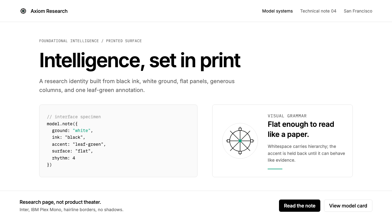 OpenAI 2024Research-grade restraint. Black-on-white Inter, flat code panels, one leaf-gr…研究级克制:黑白 Inter、扁平代码框、一枚叶绿色标记。
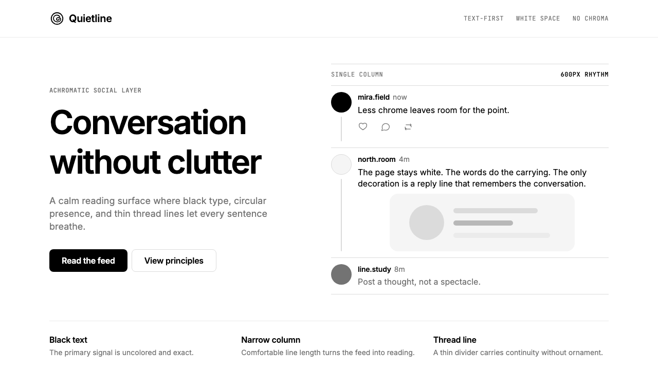 Threads (Meta)Restraint is the brand. Black Inter type, narrow feed, thin connectors, white…克制即品牌:黑白 Inter、窄栏信息流、细线串起留白。
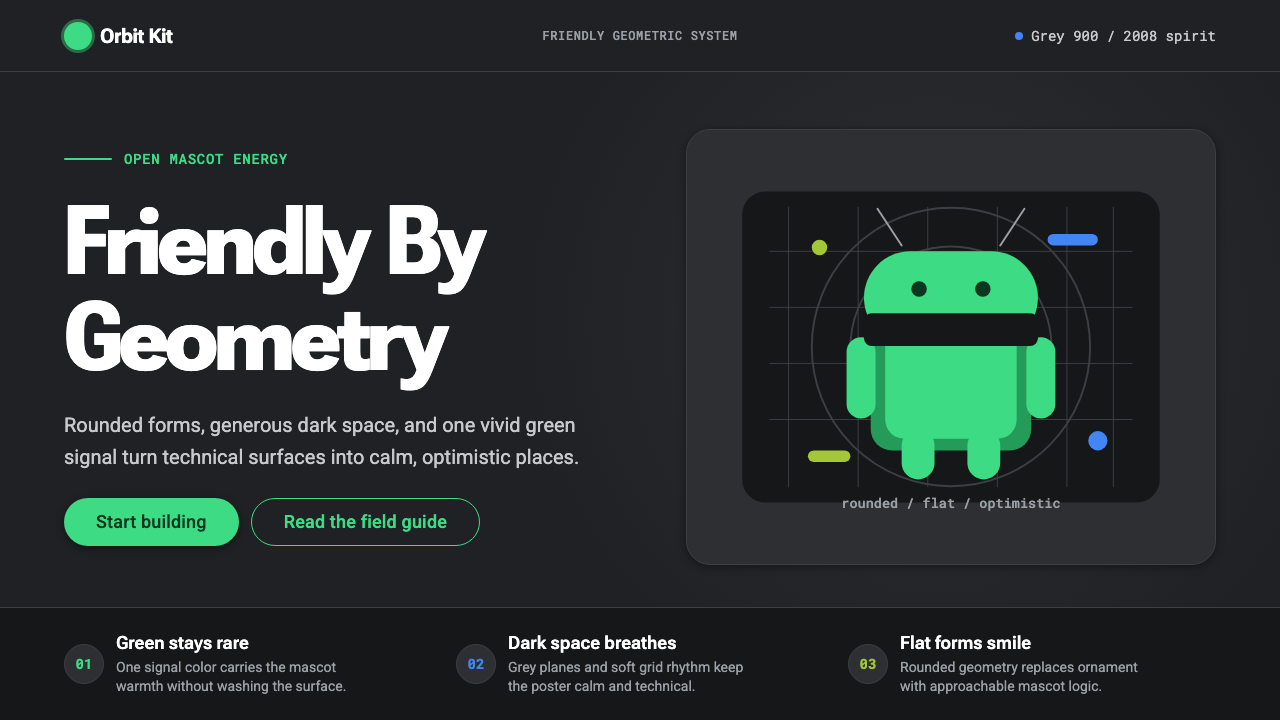 Android Bugdroid GreenFriendly tech, reduced to geometry. Vivid green pops from Grey 900 and rounde…友好科技化为几何:明绿从 Grey 900 与圆润字形中跃出。
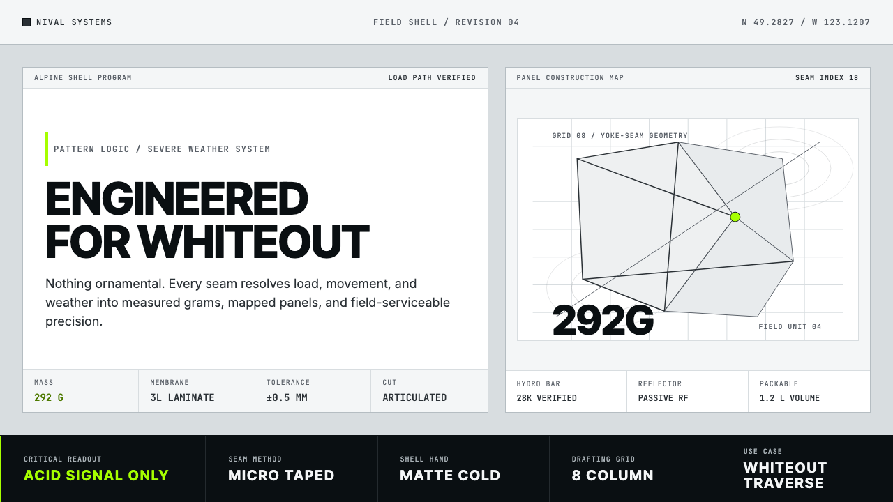 Arc'teryx Technical OutdoorEngineered, never ornamental. Glacier silver grid, mono specs, one acid-green…只讲工程,不作装饰。冰川银网格、等宽规格与一处酸绿信号。
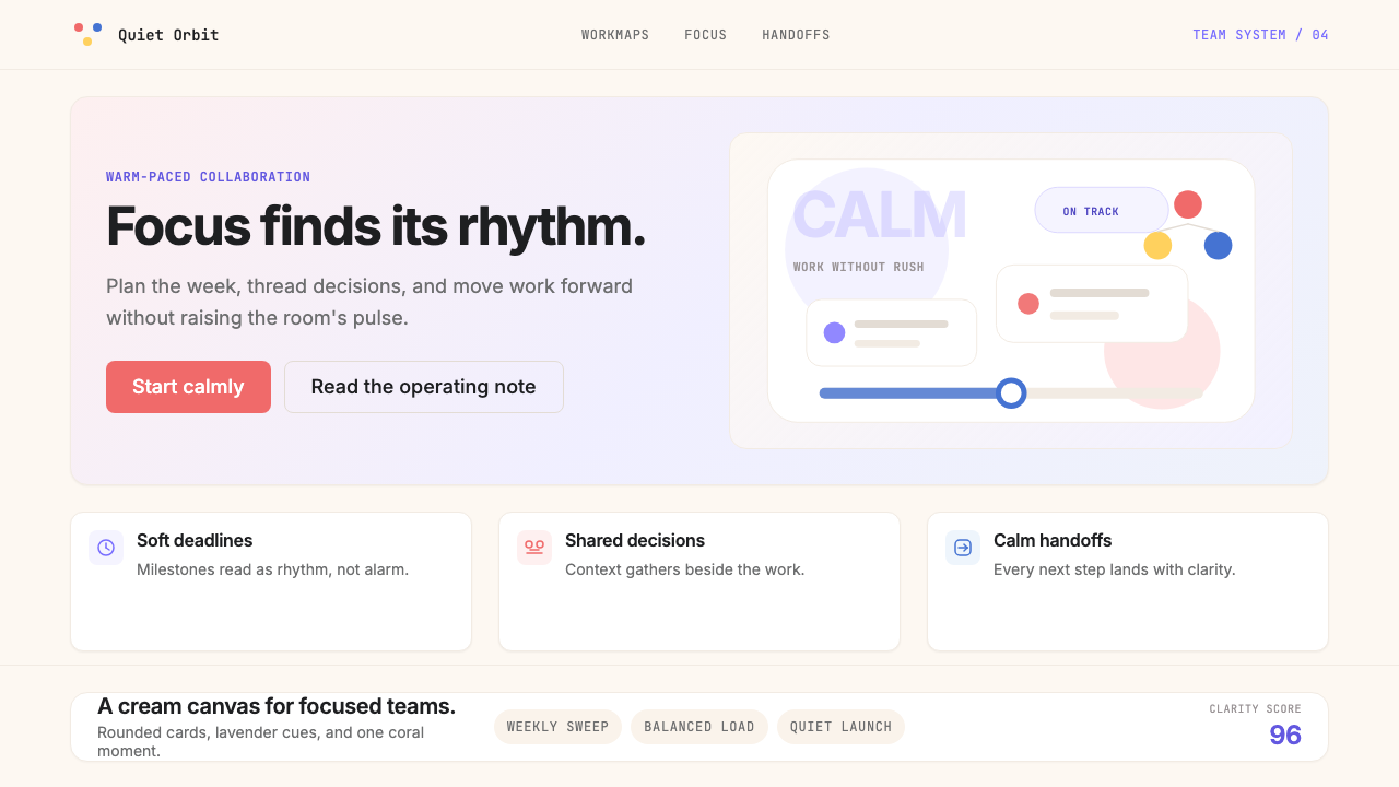 AsanaCalm productivity breathes. Cream canvas, lavender panels, coral-blue-yellow…安静生产力会呼吸:奶油画布、薰衣草面板与三色圆点。
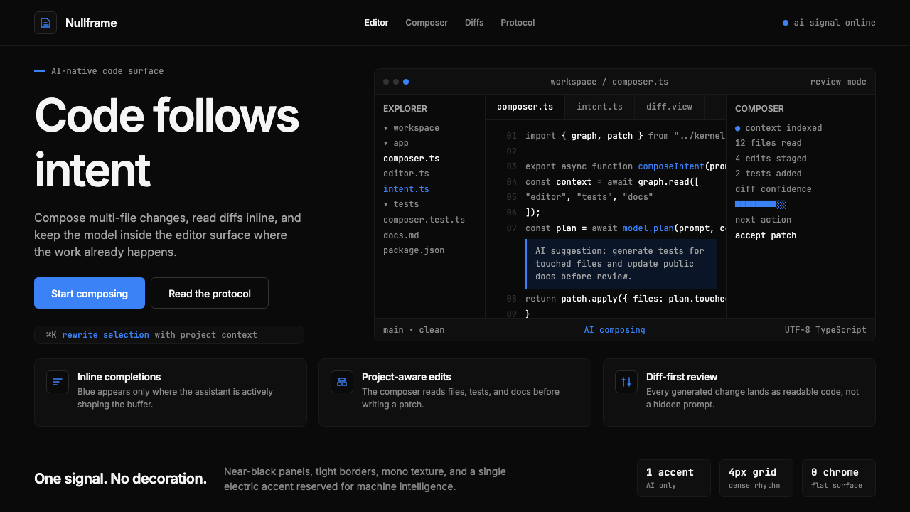 Cursor IDEAI-first code editor. Pure dark surfaces, off-white text, electric blue reser…以 AI 为核心的代码编辑器:近乎纯黑背景、柔白文字、唯一的电光蓝色专为 AI…