What is OpenAI 2024?什么是 OpenAI 2024?
OpenAI's 2024 visual identity treats restraint as a research credential — black text on white ground, a single green accent, and typography that borrows its authority from academic publishing.OpenAI 的 2024 视觉体系将克制本身当作研究资质的证明——黑字白底、一枚绿色点缀,字体排印的权威感直接借自学术出版物。
OpenAI 2024 in briefOpenAI 2024 速览
OpenAI 2024 is the visual identity system developed by the artificial intelligence research company OpenAI, reaching its most refined expression with the October 2024 rebrand that introduced the 'Blossom' logomark. The system is built on radical subtraction: pure black type on white ground, generous white space, monospace code panels, and a single leaf-green accent color that descends from the ChatGPT product identity. Everything that cannot be justified by communication or structure has been removed.OpenAI 2024 是人工智能研究公司 OpenAI 所建立的视觉识别体系,以 2024 年 10 月推出「Blossom」花瓣标志的品牌焕新为最终完成形态。这套体系建立在彻底的减法之上:纯黑文字铺于白色底面,大量留白,等宽字体代码框,以及一抹源自 ChatGPT 产品识别的叶绿色点缀。凡是无法以传达或结构目的为正当理由的元素,全部被移除。
The aesthetic philosophy positions OpenAI not as a technology consumer brand — with the gradients, glows, and visual spectacle that category typically deploys — but as a foundational research institution whose visual language should feel closer to a scientific journal than to a software storefront. The result is a design system that signals authority through what it refuses to include as much as through what it presents.这套美学哲学将 OpenAI 定位为基础研究机构,而非消费级科技品牌——后者通常惯用渐变、光晕与视觉奇观。OpenAI 的视觉语言令人感觉更接近学术期刊,而非软件商店。最终呈现的是一套通过「拒绝包含」来传递权威感的设计系统,其所省略的部分与所呈现的部分同等重要。
In practical terms, the style is characterized by wide reading columns that treat the screen like a printed page, flat surfaces with no shadows or dimensional effects, a typographic hierarchy built on weight and scale rather than color, and code blocks rendered in monospace type that appear as self-contained documentary evidence rather than decorative syntax highlighting.在实践层面,这种风格的典型特征包括:宽裕的阅读栏宽(将屏幕当作印刷页面处理)、毫无阴影或立体效果的平面表面、以字重与尺寸而非色彩构建的字体层级,以及以等宽字体渲染的代码块——这些代码块作为自足的文献证据出现,而非装饰性的语法高亮。
Where does OpenAI 2024 come from?OpenAI 2024 从何而来?
OpenAI was incorporated in San Francisco in December 2015 as a nonprofit artificial intelligence research laboratory, co-founded by Sam Altman, Greg Brockman, Ilya Sutskever, and others. The founding ambition was explicitly research-oriented: to develop artificial general intelligence in a way that would be safe and beneficial for humanity. This institutional self-conception — as a research lab with a civilizational mandate rather than a product company with a revenue mandate — shaped every subsequent design decision. The earliest visual presentations reflected academic norms: plain white documents, technical figures, and typographic hierarchy borrowed from scientific publishing conventions.OpenAI 于 2015 年 12 月在旧金山以非营利人工智能研究实验室身份注册成立,由 Sam Altman、Greg Brockman、Ilya Sutskever 等人共同创立。创立时的抱负明确指向研究导向:以安全、有益于人类的方式开发通用人工智能。这种机构自我认知——将自身视为承载文明使命的研究实验室,而非以营收为目标的产品公司——塑造了此后所有的设计决策。最早期的视觉呈现折射出学术规范:素白文档、技术图表,以及直接借用科学出版物惯例的字体层级。
Through the late 2010s and early 2020s, as the company launched the GPT model series and eventually ChatGPT in November 2022, its visual identity evolved incrementally. ChatGPT introduced the leaf-green accent that would become the single permitted color in the broader brand system — a deliberate echo of terminal-green and of the natural world, threading a connection between computational intelligence and something organic. The original hexagonal logomark, derived from a stylized letter O, served adequately but felt more like a placeholder than a considered brand statement.在 2010 年代末至 2020 年代初,随着公司陆续推出 GPT 系列模型,并于 2022 年 11 月发布 ChatGPT,其视觉识别体系也逐步演进。ChatGPT 引入了叶绿色点缀,这一色彩此后成为更宽泛品牌体系中唯一被允许存在的颜色——一种刻意的呼应,既指向终端绿,也指向自然世界,在计算智能与某种有机事物之间织入一条关联线索。最初那枚由程式化字母 O 衍生而来的六边形标志,功能尚可,却更像一个占位符,而非经过深思熟虑的品牌陈述。
The October 2024 rebrand replaced that hexagonal seal with the 'Blossom' logomark: a fluid, petal-like form derived from rotating and layering simplified curves. The name and form together signal growth, generative process, and organic complexity — aspirations that contrast deliberately with the mechanical connotations the original mark carried. Yet the surrounding identity system moved in the opposite direction of the logo's softness, becoming even more restrained: the palette shed any remaining accent colors except the inherited green, the typography leaned harder into academic-publishing weight conventions, and the layout system doubled down on generous white space and wide columns.2024 年 10 月的品牌焕新以「Blossom」花瓣标志取代了六边形徽章:一个由旋转和叠加简化曲线衍生出的流动花瓣形态。名称与形态共同传递出生长、生成过程与有机复杂性的意象——这些意涵与原始标志所携带的机械联想形成刻意的对照。然而,围绕这枚标志的整体识别体系却向与标志之柔和相反的方向运动,变得愈发克制:色板除保留继承自 ChatGPT 的绿色外,移除了其余所有强调色;字体排印更深入地倾向学术出版物的字重惯例;版面系统则加倍强化宽裕的留白与宽栏设计。
The movements that shaped OpenAI 2024 are less about graphic design history than about institutional positioning. The dominant influences are the visual languages of elite research institutions — scientific journals, university press publications, think-tank reports — where authority is conveyed through typographic restraint and the absence of commercial visual persuasion. A secondary influence is the minimalist strain of Silicon Valley product design, though OpenAI's version deliberately strips out the warmth and accessibility cues that consumer technology companies use to soften that minimalism. The resulting identity occupies a rare position: a commercial entity that visually insists it is not primarily a commercial entity.塑造 OpenAI 2024 的运动与其说源于平面设计史,不如说源于机构定位的逻辑。主导性影响来自精英研究机构的视觉语言——学术期刊、大学出版社出版物、智库报告——这些领域通过字体排印的克制与商业视觉说服的缺席来传递权威感。次要影响来自硅谷产品设计中的极简主义潮流,但 OpenAI 的版本刻意剥除了消费级科技公司用以柔化这种极简主义的温暖感与易接近性线索。最终这套识别体系占据了一个罕见的位置:一家商业实体,在视觉上坚持声称自己并非首先是一家商业实体。
What defines the OpenAI 2024 look?OpenAI 2024 的视觉特征是什么?
Monochrome Foundation黑白基底
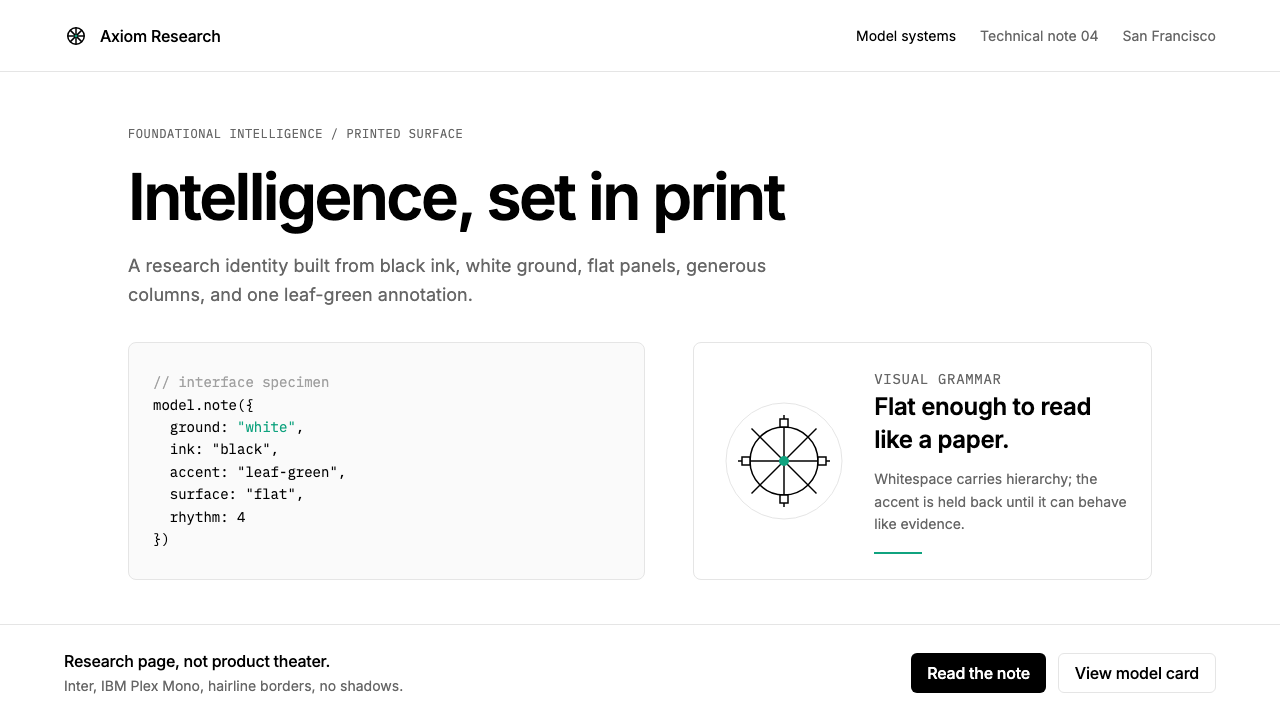
The base system operates in black and white with no intermediate grays used for decoration. Black is reserved for all text and primary structural elements; white or near-white grounds provide the field. This is not the soft warm-white of lifestyle brands or the cool blue-white of enterprise software — it is the neutral, unmodulated white of a printed academic document. The commitment to this foundation is what makes the single green accent legible as a meaningful signal rather than incidental color.基础系统以黑白运作,不使用任何灰色作为装饰。黑色保留给所有文字与主要结构性元素;白色或近白色底面构成承载场域。这不是生活方式品牌的柔和暖白,也不是企业软件的冷蓝白——而是印刷学术文档的中性、未经调制的纯白。对这一基底的坚守,正是使那一抹绿色点缀被读作有意义的信号而非偶然色彩的前提。
Single Accent Color单一强调色
Leaf green — inherited from the ChatGPT product — functions as the sole permitted accent, and its usage is disciplined to the point of scarcity. It appears in the logomark, in select interactive states, and occasionally as a marker for key terms or calls to action. Because it never competes with a second accent color, its presence carries genuine weight: any element touched by green is, by definition, important. The color sits in a range that reads as natural and alive without tipping into either the aggressive brightness of lime or the muted seriousness of forest green.叶绿色——继承自 ChatGPT 产品——作为唯一被允许的强调色存在,其使用被纪律性地控制在稀缺程度。它出现于标志、部分交互状态,偶尔用于标记关键术语或行动号召。由于它从不与第二种强调色竞争,其出现本身就承载着真实的份量:凡被绿色触及的元素,在定义上都是重要的。这个颜色处于一个既自然生动又不滑入石灰绿的侵略性明亮,也不落入深林绿的沉郁严肃的区间。
Editorial Typography编辑性字体排印
The typographic system draws its authority from the conventions of long-form publishing rather than from the display-heavy traditions of advertising or consumer technology. Text is set at reading weights — light to regular — across generous column widths that allow the eye to settle into sustained reading. Hierarchy is established through size and weight alone, with no color differentiation between heading levels. The overall effect is a page that asks to be read rather than scanned, positioning the company's communications as documents worth studying rather than messages worth glancing at.字体排印系统从长篇出版物的惯例中汲取权威感,而非广告或消费科技的大展示字体传统。文字以阅读字重——轻至常规——排布在宽裕的栏宽中,让眼睛得以安定下来进行持续阅读。层级仅通过大小与字重建立,标题各级之间无色彩区分。整体效果是一个请求被阅读而非被扫视的页面,将公司的传播内容定位为值得研究的文件,而非值得一瞥的信息。
Monospace Code Panels等宽字体代码框
Code blocks appear throughout OpenAI's communications — in research papers, product documentation, and marketing pages alike — rendered in monospace type against a lightly differentiated background panel. These panels carry a documentary function: they present the actual outputs of the company's systems as evidence rather than illustration. The flat, borderless-or-lightly-bordered treatment avoids skeuomorphic terminal simulation while maintaining clear typographic distinction from running prose. The presence of code within marketing and editorial content signals that the intended reader is technically literate — a deliberate positioning choice.代码块贯穿 OpenAI 的各类传播内容——研究论文、产品文档与营销页面均有其身影——以等宽字体渲染于轻微区分的背景面板之上。这些面板承载文献功能:它们将公司系统的实际输出作为证据而非插图加以呈现。平面的、无边框或轻量边框的处理方式,在避免拟物化终端模拟的同时,维持了与正文段落清晰的字体区分。在营销与编辑内容中出现代码,传递出一个信号:预设读者具备技术素养——这是一个刻意的定位选择。
Flat Surfaces and Zero Shadow平面表面与零投影
Every surface in the system is resolutely flat. Card components, input fields, modal overlays, and image containers carry no drop shadow, no inner glow, and no simulated material depth. This is not merely the contemporary design fashion of reducing shadows — it is a more absolute commitment. Even the subtle, diffuse shadows that remain common in most modern design systems are absent. The effect is that content appears to exist on the same plane as the page rather than floating above it, reinforcing the printed-document metaphor that structures the entire identity.系统中的每一个表面都坚决保持平面。卡片组件、输入框、模态覆盖层和图像容器均无投影、无内发光、无模拟材质深度。这不仅仅是当代设计减少阴影的流行趋势——而是更为绝对的承诺。即便是在大多数现代设计系统中仍然普遍存在的那种微妙漫射阴影,在这里也不复存在。效果是:内容看起来与页面存在于同一平面,而非漂浮于其上,强化了贯穿整套识别体系的印刷文档隐喻。
Wide-Column Layout Logic宽栏版面逻辑
Body text is set in columns that are wider than typical web convention, evoking the measure of a printed journal or book page rather than the narrow mobile-optimized columns common in consumer web design. This choice communicates that the content is intended for sustained reading, not quick mobile consumption. Margins are used for captions, footnote-style annotations, and secondary navigation — a hierarchy borrowed directly from academic book design. The wide-column approach also creates the large expanses of white space that give the identity its characteristic sense of breathing room.正文排布于比典型网页惯例更宽的栏宽中,令人联想到印刷期刊或书籍页面的行宽,而非消费级网页设计中常见的窄幅移动端优化栏宽。这一选择传递出内容旨在供持续阅读而非快速移动端浏览的信号。边距被用于图注、脚注式注释与次级导航——层级设计直接借自学术书籍排版。宽栏方式同时创造了大面积留白,赋予整套识别体系那种标志性的呼吸感。
'Blossom' Logomark「Blossom」花瓣标志
The October 2024 logomark departs from the geometric precision of the original hexagonal mark, replacing it with a form derived from overlapping and rotating petal-like curves. The visual result reads as simultaneously organic and constructed — natural in its softness, deliberate in its symmetry. In the context of an otherwise severely restrained identity, the logomark's gentle curves function as the single point of warmth. It is rendered in black or in the leaf green, never in any other color, maintaining the system's strict palette discipline while allowing the brand's central form to carry the identity's only gestural energy.2024 年 10 月推出的花瓣标志从最初六边形徽章的几何精确性中出走,以由叠加旋转花瓣状曲线衍生的形态取而代之。视觉效果读来既有机又人工——柔和中透出自然,对称中蕴含刻意。在一套其他方面极度克制的识别体系中,这枚标志的温柔曲线成为唯一一处温暖的着力点。它以黑色或叶绿色呈现,从不使用其他颜色,在维持系统严格色板纪律的同时,让品牌的核心形态承载识别体系唯一的姿态性能量。
Who shaped OpenAI 2024?谁塑造了 OpenAI 2024?
Sam Altman joined OpenAI as president in 2019 and became CEO, overseeing the company's transition from a small research nonprofit to one of the most prominent artificial intelligence organizations in the world. His public communications — interviews, blog posts, social media — became part of the brand's visual and rhetorical identity: plain, direct, and stripped of promotional language in a way that matched the identity system's own restraint. The brand's insistence on presenting itself as a research institution rather than a product company reflects Altman's consistent public framing of OpenAI's mission as civilizational rather than commercial.Sam Altman 于 2019 年加入 OpenAI 担任总裁,后成为 CEO,主导公司从小型研究性非营利机构向全球最重要的人工智能组织之一的转型。他的公开传播——访谈、博客文章、社交媒体——成为品牌视觉与修辞识别的组成部分:朴素、直接,剥除了一切促销性语言,与识别体系自身的克制相呼应。品牌坚持将自身定位为研究机构而非产品公司,折射出 Altman 将 OpenAI 使命持续公开框架为文明性而非商业性的一贯立场。
Greg Brockman co-founded OpenAI and served as president and chief technology officer through the formative years of the company's identity development. His role bridged research and engineering culture, and the technical orientation of OpenAI's visual communications — the presence of code, the monospace aesthetic, the documentary treatment of model outputs — reflects the engineering-first culture he helped establish. Brockman's public writing and presentations modeled the kind of precise, evidence-forward communication that the brand identity system was built to house.Greg Brockman 共同创立了 OpenAI,并在公司识别体系形成的关键年份担任总裁兼首席技术官。他的角色在研究与工程文化之间架起桥梁,而 OpenAI 视觉传播的技术导向——代码的出现、等宽字体美学、对模型输出的文献式处理——折射出他参与建立的工程优先文化。Brockman 的公开写作与演讲为那种精确、以证据为先的传播方式建立了范本,而品牌识别体系正是为容纳这种传播方式而构建的。
Ilya Sutskever co-founded OpenAI and served as chief scientist, leading the core research programs that produced the GPT series. His presence in the founding team anchored the company's identity as a serious research institution at a time when the artificial intelligence industry was still widely perceived as an extension of consumer software culture. The visual identity's insistence on academic-publishing conventions over consumer-technology conventions is inseparable from the research credibility that Sutskever and his colleagues established through published work.Ilya Sutskever 共同创立了 OpenAI 并担任首席科学家,主导了产出 GPT 系列的核心研究项目。他在创始团队中的存在,在人工智能行业仍普遍被视为消费软件文化延伸的时代,为公司的严肃研究机构身份提供了锚点。视觉识别对学术出版惯例而非消费科技惯例的坚守,与 Sutskever 及其同事通过已发表工作所建立的研究公信力不可分割。
Mira Murati served as chief technology officer and for a period as interim CEO during the November 2023 board crisis. Her role overseeing product development placed her at the intersection of research culture and commercial application — the same tension that the visual identity navigates by maintaining research-institution restraint while serving a product that reached hundreds of millions of users. The identity's ability to function across research papers, developer documentation, and consumer product interfaces reflects the organizational synthesis her tenure helped consolidate.Mira Murati 担任首席技术官,并在 2023 年 11 月董事会危机期间短暂担任临时 CEO。她主管产品开发的角色,使她处于研究文化与商业应用的交汇点——这与视觉识别所面临的同一张力相呼应:在维持研究机构克制感的同时,服务一款触达数亿用户的产品。识别体系能够跨越研究论文、开发者文档与消费者产品界面正常运作,折射出她任期内帮助巩固的组织整合能力。
The November 2022 launch of ChatGPT was the moment that transformed OpenAI from a research institution known primarily within the machine learning community into a global consumer brand. The ChatGPT interface — white ground, light typography, the leaf-green identity mark — established the visual conventions that would be formalized and extended in the 2024 rebrand. In this sense, the product team that designed and shipped ChatGPT made the most significant contribution to what OpenAI 2024 looks like: they established the palette, the typographic register, and the flat, generous-space layout principles that the rebrand then refined into a comprehensive identity system.2022 年 11 月 ChatGPT 的发布,是将 OpenAI 从主要为机器学习社区所知的研究机构转变为全球消费品牌的决定性时刻。ChatGPT 界面——白色底面、轻量字体、叶绿色识别标记——确立了在 2024 年品牌焕新中被正式化与延伸的视觉惯例。从这个意义上说,设计并推出 ChatGPT 的产品团队对 OpenAI 2024 外观的贡献最为根本:他们确立了色板、字体排印语调,以及平面、宽裕留白的版面原则——品牌焕新随后将这些原则提炼为一套完整的识别体系。
How do you use OpenAI 2024 today?今天怎么用 OpenAI 2024?
OpenAI 2024 is among the most imitable contemporary design systems precisely because its ingredients are so few: white ground, black text, one accent color, generous space, flat surfaces, and a typographic hierarchy derived from reading weight rather than display weight. Applying it well requires understanding the discipline behind that simplicity. The system's authority comes from what it refuses, and successful application means internalizing those refusals rather than treating them as arbitrary constraints.OpenAI 2024 是当代最易被模仿的设计系统之一,恰恰因为它的构成元素如此之少:白色底面、黑色文字、一种强调色、宽裕的留白、平面表面,以及从阅读字重而非展示字重衍生的字体层级。正确应用它,需要理解这种简洁背后的纪律。这套系统的权威感来自它所拒绝的东西,成功应用意味着内化这些拒绝,而非将其视为任意限制。
For presentation slides, the style rewards a strict separation between cover and content treatment. A cover slide should be near-empty: a large, light-weight title in the upper third, the organization name or logo in the lower third, and nothing in between except white. The leaf-green accent, if used at all, belongs on a single mark or underline — not as a background wash. Content slides should be typographic documents: a clear heading, a reading-weight body paragraph or two, and perhaps a code block or data table rendered in monospace. Avoid decorative dividers, icon grids, and image collages — every element that cannot be justified as content weakens the system. Data visualization should be flat, with chart elements colored in a single green or black without gradients.对于演示文稿,这种风格奖励封面与内容页面的严格区分。封面幻灯片应当近乎空白:一个大号轻字重的标题位于上三分之一处,机构名称或标志位于下三分之一处,中间除白色别无他物。叶绿色强调色若有使用,属于单一标记或下划线——而非背景色块。内容页面应当被当作字体排印文件处理:一个清晰的标题,一两段阅读字重的正文,或许一个以等宽字体渲染的代码块或数据表。避免装饰性分割线、图标网格和图片拼贴——每一个无法以内容为正当理由的元素都会削弱这套系统。数据可视化应当是平面的,图表元素以单一绿色或黑色着色,不使用渐变。
For web interfaces, dashboards and developer documentation pages are the natural home for this style. The approach: commit to a wide content column — wider than most web defaults — with large margins used for navigation, footnotes, or secondary metadata. Keep backgrounds pure white rather than off-white or gray. Typography should do all the hierarchical work, with heading sizes that create genuine scale contrast against body text. Pricing pages work well with the identity's spare boldness: a minimal table or tier layout in black and white, with the recommended tier marked in the leaf green. Navigation should be typographic — no icon libraries, no decorative elements beyond the logomark itself.对于网页界面,仪表板与开发者文档页面是这种风格最自然的归宿。方法:采用宽于大多数网页默认值的内容栏,宽裕的边距用于导航、脚注或次级元数据。保持背景为纯白而非米白或灰色。字体排印应当承担所有层级性工作,标题尺寸与正文形成真实的对比落差。定价页面适合这套识别体系的精简大胆感:黑白极简的表格或等级布局,推荐等级以叶绿色标注。导航应当是字体排印性质的——不使用图标库,除标志本身外无任何装饰性元素。
For editorial and marketing materials — reports, whitepapers, event materials, social cards — the style's roots in academic publishing make it especially well-suited to long-form content. An editorial layout should treat white space as structural: wide outer margins, a narrow body column, and section breaks marked by scale changes in type rather than ruled lines or color blocks. Marketing pieces can leverage the style's poster-like confidence: a full-bleed white background, large-scale type at reading weight, a single green element as focal anchor, and nothing else. The absence of photography, illustration, or decorative pattern is part of the statement.对于编辑与营销材料——报告、白皮书、活动素材、社交卡片——这种风格扎根于学术出版的基因,使其尤其适合长篇内容。编辑版面应当将留白作为结构性元素处理:宽阔的外边距,窄幅的正文栏,以字体尺寸变化而非直线或色块标记章节转换。营销素材可以借助这种风格海报式的自信:满版白色背景,阅读字重的大字号文字,一个绿色元素作为焦点锚点,别无其他。摄影、插图或装饰图案的缺席,本身就是一种声明。
A common mistake when applying this style is confusing restraint with emptiness and then compensating by adding subtle design moves that individually seem minor but collectively break the system — a soft drop shadow here, a light gray card background there, an icon set introduced for visual interest. Each of these additions represents a concession from a different design philosophy, and the accumulation destroys the identity's coherence. Another frequent error is using the green too liberally, applying it to headers, highlights, link text, borders, and backgrounds simultaneously. In the source system, green is used at most in one or two places per view. Scarcity is what gives it signal value.应用这种风格时最常见的错误,是将克制与空洞混淆,然后通过叠加看似细微实则系统性的设计动作来补偿——这里一个软投影,那里一块浅灰色卡片背景,再加入一套图标以增添视觉趣味。这些添加中的每一个都代表着来自不同设计哲学的一次妥协,积累起来会摧毁识别体系的连贯性。另一个常见错误是过度使用绿色,同时将其应用于标题、高亮、链接文字、边框和背景。在源系统中,绿色在每个视图中最多出现于一两处。稀缺性正是赋予它信号价值的原因。

OpenAI 2024 — FAQOpenAI 2024 · 常见问题
Is OpenAI 2024 just minimalism, or is there a specific philosophy behind it?OpenAI 2024 只是极简主义吗,还是背后有特定的哲学?
It shares minimalism's preference for subtraction, but the motivation is different. Contemporary minimalism in consumer design typically removes elements to feel calm, premium, or effortless. OpenAI 2024 removes elements to signal institutional seriousness — the visual language of a research laboratory rather than a lifestyle brand. The distinction matters in practice: a minimalist consumer brand might use warm off-whites, organic curves, and soft shadows to maintain approachability while reducing clutter. OpenAI 2024 uses neutral white, no curves except in the logomark, and zero shadow — choices that read as colder and more authoritative than most minimalism because authority, not warmth, is the target.它与极简主义共享对减法的偏好,但动机不同。消费设计中的当代极简主义通常通过删减元素来传递平静感、高端感或轻松感。OpenAI 2024 删减元素是为了传递机构严肃性——研究实验室的视觉语言,而非生活方式品牌的视觉语言。这一区别在实践中至关重要:极简主义消费品牌可能会使用温暖的米白、有机曲线和柔和阴影,在减少杂乱的同时维持亲切感。OpenAI 2024 使用中性白、除标志外无曲线、零阴影——这些选择比大多数极简主义读来更冷、更具权威感,因为权威而非温暖才是目标。
Can this style work for a company that is not an AI research laboratory?这种风格能适用于非 AI 研究实验室的公司吗?
Yes, with the caveat that the style works best when the brand genuinely wants to project authority, technical credibility, and intellectual seriousness rather than warmth, accessibility, or sensory pleasure. Companies in fields like scientific instruments, academic publishing, advanced engineering, professional legal or financial services, and developer tools can apply the style authentically. Consumer brands — especially in food, wellness, fashion, and entertainment — will likely find the style's coldness working against their core positioning. The test is simple: would this company's ideal customer feel reassured or alienated by a webpage that looks like a research paper?可以,但需注意这种风格在品牌真正希望传递权威感、技术可信度与智识严肃性——而非温暖、易接近性或感官愉悦——时效果最佳。科学仪器、学术出版、高端工程、专业法律或金融服务以及开发者工具等领域的公司,可以真实地应用这种风格。消费品牌——尤其是食品、健康、时尚与娱乐领域——很可能发现这种风格的冷峻感与其核心定位背道而驰。测试很简单:这家公司的理想客户,看到一个外观像研究论文的网页时,会感到安心还是疏离?
How does the 'Blossom' logomark fit an otherwise cold, typographic system?「Blossom」花瓣标志是如何融入一套其他方面冷峻、字体排印性的系统的?
The logomark functions as a deliberate contrast point — the single organic element in a system that is otherwise geometric and typographic. This contrast is not a failure of consistency but a considered design decision: a system that is uniformly severe risks feeling mechanical and inhumane. The soft petal curves of the Blossom mark introduce a suggestion of growth, creativity, and organic process that the stark typographic environment on its own would suppress. The key is that the logomark's softness is contained — it appears as a small mark, in black or green, and is never repeated as a pattern or expanded into a decorative vocabulary. One gesture of warmth, precisely placed, reads as intentional; scattered through the system, it would dissolve the identity's discipline.这枚标志作为刻意的对比点而存在——在一套其他方面均为几何性与字体排印性的系统中,唯一有机的元素。这种对比并非一致性的失败,而是经过深思熟虑的设计决定:一套均匀严峻的系统有沦为机械与非人道之嫌。Blossom 标志柔和的花瓣曲线,引入了一种生长、创造力与有机过程的暗示——这是周围那个冷峻字体排印环境自身所会压抑的东西。关键在于,标志的柔和被加以控制——它以小标记的形式出现,呈黑色或绿色,从不被重复为图案或扩展为装饰性词汇。一处温暖的姿态,精确地放置,读来是刻意的;若散布于系统各处,则会瓦解识别体系的纪律。
What distinguishes an authentic OpenAI 2024 application from a generic tech-minimal look?真实的 OpenAI 2024 应用与通用科技极简风貌之间,区别在哪里?
Several specific commitments separate this system from generic tech minimalism. First, the typographic weight register: OpenAI 2024 uses light-to-regular weights at large sizes rather than the medium-to-semibold weights that dominate most tech-minimal branding. The effect is more literary than product-like. Second, the column width: the wide reading columns are wider than typical tech interfaces, referencing publication design rather than app design. Third, the absolute exclusion of shadow: most tech-minimal systems retain at least subtle card shadows; OpenAI 2024 does not. Fourth, the presence of code: authentic applications include monospace code blocks as a natural part of the content vocabulary. Fifth, the scarcity of the green accent — not as an active interface color but as a rare signal. Generic tech-minimal looks tend to use multiple grays, rounded cards, and subtle shadows that are entirely absent from this system.几个具体承诺将这套系统与通用科技极简主义区别开来。首先是字体字重区间:OpenAI 2024 在大尺寸下使用轻至常规字重,而非主导大多数科技极简品牌的中等至半粗字重。效果更偏文学性而非产品性。其次是栏宽:宽阔的阅读栏宽超出典型科技界面,参照的是出版设计而非应用设计。第三是对阴影的绝对排除:大多数科技极简系统至少保留微妙的卡片阴影;OpenAI 2024 不保留。第四是代码的存在:真实应用将等宽字体代码块作为内容词汇的自然组成部分纳入其中。第五是绿色强调色的稀缺性——不作为活跃界面色使用,而作为罕见信号。通用科技极简风貌倾向于使用多种灰色、圆角卡片和微妙阴影,而这些在这套系统中全然缺席。
Can dark mode work within this identity system?深色模式在这套识别体系中可行吗?
Dark mode is technically supported in ChatGPT and OpenAI's products, but it operates as a functional inversion rather than an equal design expression. The canonical identity is light: black on white is the authoritative form. A dark inversion — near-black ground, white or light-gray text, green accent — can maintain the system's discipline if the same principles apply: no shadows, no gradients, no decorative elements, code panels lightly differentiated from the background. The risk in dark mode is that the leaf-green accent, which reads as restrained against white, can become more dominant against a dark ground. The solution is to use it even more sparingly in dark contexts — as a logo mark or a single key element — rather than expanding its presence to compensate for the changed contrast relationships.深色模式在 ChatGPT 及 OpenAI 的产品中在技术上受到支持,但它作为功能性反转而非等同的设计表达而运作。标准识别是浅色的:黑字白底是权威形式。深色反转——近黑色底面、白色或浅灰色文字、绿色强调——如果相同原则得以贯彻,可以维持系统的纪律:无阴影、无渐变、无装饰性元素,代码面板与背景之间轻微区分。深色模式的风险在于,在白色底面上读来克制的叶绿色,在深色底面上可能变得更为突出。解决方案是在深色语境中使用得更加稀少——作为标志标记或单一关键元素——而非为补偿对比关系的改变而扩大其出现频率。
Related design styles相关设计风格
 Mercury BankQuiet precision wins. Cream paper, charcoal Inter, and one electric-blue spar…安静精确胜出:奶油纸底、炭灰 Inter 与一抹电光蓝建立信任。
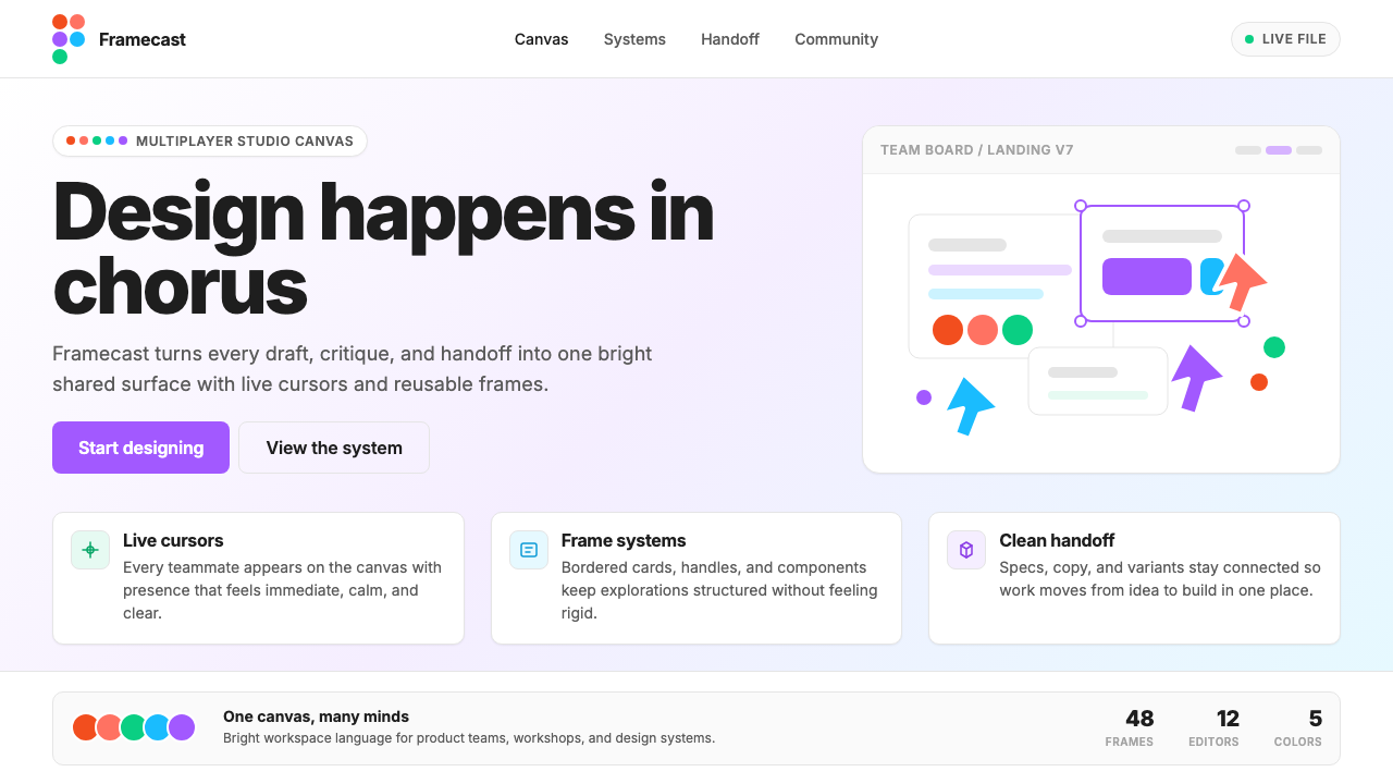 Figma 2024A brand that looks like its canvas. Five dots scatter like cursors, soft card…把产品体验直接变成品牌:五枚标志圆点如共享光标散落、柔和圆角卡片、紫色药丸按钮…
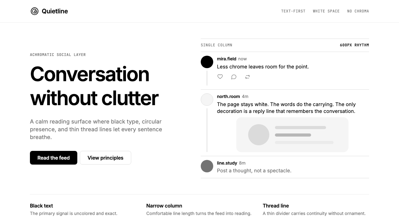 Threads (Meta)Restraint is the brand. Black Inter type, narrow feed, thin connectors, white…克制即品牌:黑白 Inter、窄栏信息流、细线串起留白。
 Android Bugdroid GreenFriendly tech, reduced to geometry. Vivid green pops from Grey 900 and rounde…友好科技化为几何:明绿从 Grey 900 与圆润字形中跃出。
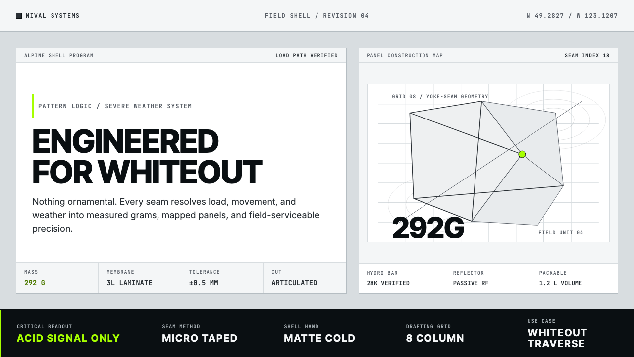 Arc'teryx Technical OutdoorEngineered, never ornamental. Glacier silver grid, mono specs, one acid-green…只讲工程,不作装饰。冰川银网格、等宽规格与一处酸绿信号。
 AsanaCalm productivity breathes. Cream canvas, lavender panels, coral-blue-yellow…安静生产力会呼吸:奶油画布、薰衣草面板与三色圆点。