What is Mercury Bank?什么是 Mercury Bank?
Mercury Bank proved that a fintech platform can earn startup trust not with neon energy or playful illustration, but with the quiet authority of a financial magazine.Mercury Bank 证明了一件事:金融科技平台无需霓虹活力或趣味插画,凭借金融杂志般的安静权威,同样能赢得初创企业的信任。
Mercury Bank in briefMercury Bank 速览
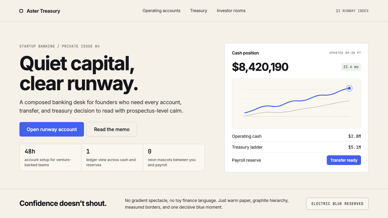
Mercury Bank is a banking platform and visual design language built for technology startups. Founded in 2017 in San Francisco, its interface pairs a warm cream background with deep charcoal typography and a single electric-blue accent reserved exclusively for primary actions. The result reads less like a typical fintech application and more like a well-edited financial magazine — editorial layouts, generous whitespace, and type set tight enough to carry the weight of a prospectus.Mercury Bank 是一个专为科技初创企业打造的银行平台与视觉设计语言。2017年创立于旧金山,其界面将温暖的奶油色背景与深炭灰字体相结合,仅用一抹电光蓝作为主要操作的专属点缀色。最终呈现出的品牌气质,与其说像一款典型的金融科技应用,不如说更像一本编辑严谨的金融杂志——编辑式排版、充裕的留白、足以承载招股书分量的紧凑字体。
The aesthetic is built on restraint as confidence. Where competitor platforms competed for attention through gradient fills, animated illustrations, and saturated palettes, Mercury chose the opposite: one near-neutral ground tone, one deep typographic color, one accent so controlled it functions almost as punctuation. Every surface earns its presence. The visual language communicates seriousness not through the trappings of traditional banking — marble textures, serif crests, gold rules — but through the self-assurance of knowing exactly what to leave out.这套美学的核心是以克制传递自信。当竞争对手的平台还在用渐变填充、动态插画和高饱和色彩争夺注意力时,Mercury 选择了相反的路径:一个接近中性的底色调、一种深色字体、一个控制得如此精确以至近乎标点符号功能的强调色。每一处视觉元素都需证明自己的存在价值。这套视觉语言所传递的严肃感,并非来自传统银行的外衣——大理石纹理、衬线徽章、金色线条——而是来自对该省略什么了然于心的那种从容自信。
Mercury's design is best understood as a bridge between two traditions: the editorial precision of financial journalism and the functional clarity of modern software interfaces. It borrows the cream-and-charcoal warmth of a print magazine while applying the systematic hierarchy and interactive logic of a digital product. The combination produces a brand that feels simultaneously established and contemporary — unhurried, but never static.Mercury 的设计最好被理解为两种传统之间的桥梁:金融新闻业的编辑精确性,以及现代软件界面的功能清晰度。它借用了印刷杂志的奶油与炭灰暖调,同时运用了数字产品的系统层级与交互逻辑。这种组合催生出一个既成熟又当代的品牌——不急不躁,却从不停滞。
Where does Mercury Bank come from?Mercury Bank 从何而来?
Mercury was co-founded in 2017 by Immad Akhund and Jason Zhang in San Francisco, California. Both founders had backgrounds in technology and had experienced firsthand the friction that early-stage startups face when opening business bank accounts — a process that in the United States often involves branch visits, paper forms, and weeks of waiting. Mercury was built to collapse that friction into a web interface that founders could navigate without a finance team.Mercury 由 Immad Akhund 与 Jason Zhang 于2017年在美国旧金山联合创立。两位创始人均有科技行业背景,并亲身经历过早期初创企业在美国开设商业银行账户时所面临的种种阻力——这一过程往往涉及网点到访、纸质表格和长达数周的等待。Mercury 的出发点,就是将这些摩擦压缩进一个创始人无需财务团队即可独立操作的网页界面。
The visual identity that Mercury developed over its first years reflected a specific cultural reading of its target audience. Startup founders — particularly those in the Y Combinator-adjacent ecosystem that Mercury served early — tend to distrust overt sales signals and respond poorly to playful or casual brand postures when significant money is involved. They are comfortable with dense information, accustomed to reading technical documentation, and receptive to a typographic seriousness that signals competence rather than approachability. Mercury's design language was built for this reader: someone who wants the platform to get out of the way and let them work.Mercury 在早期几年间发展出的视觉身份,折射出对其目标受众的一套特定文化解读。初创企业创始人——尤其是 Mercury 早期服务的 Y Combinator 周边生态中的那批人——倾向于对过度的销售信号持怀疑态度,当涉及大额资金时,对轻松或随意的品牌姿态反应也往往不佳。他们习惯处理高密度信息,熟悉阅读技术文档,对传递专业能力而非亲和力的字体严肃感有正面回应。Mercury 的设计语言就是为这类读者而生:一个希望平台退到幕后、让他们专心工作的人。
The visual language matured significantly between the company's founding and its refined form around 2022 to 2024, as Mercury expanded its product suite to include treasury management, venture debt, and tools for CFOs managing more complex finances. Each expansion increased the information density demands on the interface. The cream-and-charcoal palette, the editorial whitespace, and the restrained use of the electric-blue accent all proved extensible — they could support transaction tables, yield curves, and multi-account dashboards without requiring any new visual logic.从公司创立到2022至2024年间视觉语言的成熟,Mercury 的产品线持续扩张,陆续纳入国库管理、风险债务以及面向需要处理更复杂财务的首席财务官的系列工具。每一次扩张都对界面的信息密度提出更高要求。奶油与炭灰色板、编辑式留白、以及对电光蓝强调色的克制运用,均经受住了这种扩展的检验——它们能够支撑交易明细表、收益曲线和多账户仪表板,而无需引入任何新的视觉逻辑。
Mercury emerged within the broader neo-bank and banking-for-startups category, alongside competitors who made different aesthetic choices. Some adopted playful, consumer-facing visual languages borrowed from the consumer fintech wave; others leaned into the austere minimalism of enterprise software. Mercury's position — editorial warmth without consumer casualness — was distinctive enough to become recognizable as a specific design posture, one that has since influenced how other B2B financial products think about visual identity. In the startup ecosystem, Mercury's interface became, for many founders, the reference point for what modern business banking should look like.Mercury 诞生于更广泛的新银行与初创企业银行类别之中,与作出了截然不同美学选择的竞争对手并存。一些竞争者借用了消费级金融科技浪潮中面向大众的轻盈视觉语言;另一些则倾向于企业软件的冷峻极简主义。Mercury 的定位——编辑式温暖而无消费级随意——足够鲜明,以至于成为一种可被辨认的设计姿态,并由此影响了其他 B2B 金融产品对视觉身份的思考方式。在初创企业生态中,Mercury 的界面对许多创始人而言,成为了现代商业银行应有形态的参照基准。
What defines the Mercury Bank look?Mercury Bank 的视觉特征是什么?
Ground Tone底色调
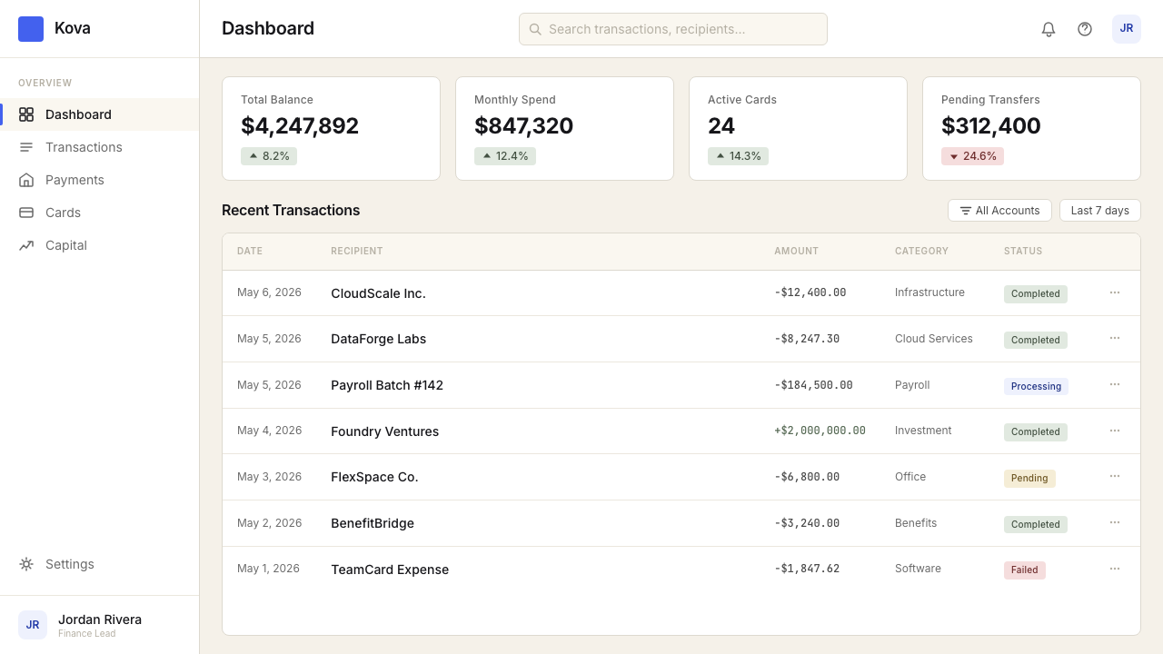
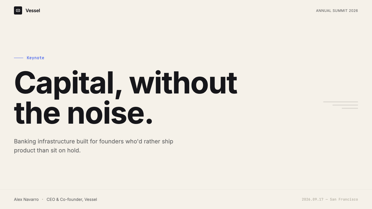
The background is a warm cream rather than pure white — close enough to neutral that it reads as a ground, warm enough that it introduces an editorial, paper-like quality. This single choice establishes the entire mood: approachable without being casual, serious without being cold. Against this ground, deep charcoal type carries full authority without the harshness that black-on-white can produce. The cream is not decorative; it is load-bearing.背景色是温暖的奶油色,而非纯白——足够接近中性以充当底色,又足够温暖以带来编辑式的纸张质感。这一个选择奠定了整体基调:亲切而不随意,严肃而不冰冷。在这个底色的衬托下,深炭灰字体带来充分的权威感,同时避免了纯黑压白色所产生的刺目感。这个奶油色并非装饰性的;它承载着结构功能。
Single Accent Control单一强调色管控
Mercury uses one accent color — a vivid electric blue — and uses it almost exclusively for primary interactive states: the main call-to-action button, active navigation indicators, and selected states. It does not appear in illustrations, backgrounds, or decorative elements. This extreme economy means the accent functions as a signal rather than a style choice: wherever electric blue appears, the user can act. The discipline requires trusting the rest of the visual system to carry hierarchy without color help.Mercury 只使用一种强调色——鲜明的电光蓝——且几乎仅将其用于主要交互状态:核心行动按钮、活跃导航指示器和选中状态。它不出现在插画、背景或装饰性元素中。这种极度的节俭使强调色发挥信号作用,而非风格选择:凡电光蓝出现之处,用户即可执行操作。这种自律要求整个视觉系统在没有色彩辅助的情况下独立承载层级。
Editorial Typography编辑式排版
Type is set with the deliberate contrast of a magazine: headlines carry significant scale and weight, body text is measured and unhurried, and the relationship between the two establishes hierarchy without relying on color or decorative ornament. Letterforms are contemporary and geometric — clean enough to read at small sizes across dense transaction data, authoritative enough to carry financial figures. Line lengths are controlled for readability rather than stretched to fill containers, and generous leading gives even dense content room to breathe.排版带有杂志般刻意营造的对比感:标题具有显著的字号与字重,正文有节制而不急促,两者之间的关系在不依赖色彩或装饰的情况下建立层级。字形当代而几何——在密集的交易数据中小字号依然清晰可读,同时足够权威以承载金融数字。行宽以可读性为准则加以控制,而非拉伸填满容器;充裕的行距让即便密集的内容也有呼吸空间。
Generous Whitespace充裕留白
Whitespace in Mercury's interface is structural rather than decorative — it is the primary mechanism by which elements are grouped and separated. Sections are separated by space, not rules or borders. Cards breathe. Navigation items do not crowd each other. This approach requires confidence: filling a screen with space rather than content is a statement that the content which does appear is worth attending to. The whitespace is also what gives the interface its editorial, almost print-like quality.Mercury 界面中的留白是结构性的而非装饰性的——它是元素进行分组与分隔的主要机制。各板块通过空间分隔,而非分割线或边框。卡片有呼吸余地。导航项目之间不相互拥挤。这种做法需要自信:用空间而非内容填充屏幕,等于是在声明出现的内容值得被关注。留白也正是赋予界面编辑式、近乎印刷品质感的关键所在。
Flat Surfaces, Subtle Depth平整表面,微妙深度
Interface elements are essentially flat: no simulated material textures, no gradient fills, no dramatic lighting effects. Depth, where it exists, is introduced through very light borders, thin shadows that are barely perceptible, or the slight warmth differential between the cream background and a slightly cooler card surface. This restraint keeps the interface from feeling decorative while allowing just enough structural differentiation for the eye to navigate content layers. The flatness also ensures that dense financial data — tables, charts, figures — is never competing with surface decoration.界面元素基本上是平整的:没有模拟材质纹理,没有渐变填充,没有强烈的光影效果。深度感(若有)来自极细的边框、几乎难以察觉的淡薄投影,或奶油色背景与略微偏冷的卡片表面之间微小的温度差异。这种克制使界面不流于装饰,同时提供足够的结构分化,让视线能够在内容层级间导航。平整表面也确保了密集的金融数据——表格、图表、数字——不必与表面装饰争夺注意力。
Information Density as Design Value信息密度作为设计价值
Mercury's interface does not hide complexity — it organizes it. Transaction histories, account balances across multiple entities, treasury yields, and wire transfer details can all coexist on a single view because the typographic and spatial system is built to handle density without becoming noisy. This is a meaningful departure from consumer fintech, which typically abstracts financial detail behind simplified views. Mercury treats its users as capable of reading a complex page, and the design reflects that respect.Mercury 的界面不刻意隐藏复杂性——它组织复杂性。交易历史、多个主体的账户余额、国库收益和电汇明细可以共存于同一视图,因为字体与空间系统是为承载密度而不产生噪音而设计的。这与消费级金融科技形成有意义的背离——后者通常将金融细节抽象隐藏在简化视图背后。Mercury 将用户视为有能力阅读复杂页面的人,而设计本身正是这种尊重的体现。
Zero Decorative Illustration零装饰插画
Mercury does not use character illustration, playful spot graphics, or decorative iconography of the kind common in consumer fintech. Where visual elements beyond type and data exist, they are functional: charts, graphs, and status indicators. Icons, where they appear, are minimal geometric marks rather than expressive pictograms. This absence of decorative illustration is one of the strongest signals the brand sends about who its audience is — people who came to manage money, not to be charmed.Mercury 不使用人物插画、轻松的装饰图形,或消费级金融科技中常见的装饰性图标语言。在字体与数据之外存在的视觉元素,均具备功能性:图表、曲线和状态指示器。图标(若出现)是极简的几何标记,而非表达性的象形符号。这种装饰性插画的缺席,是品牌向外界发出的最强信号之一——关于它的受众是谁:来此管理资金的人,而非来此被取悦的人。
Who shaped Mercury Bank?谁塑造了 Mercury Bank?
Co-founder and CEO of Mercury, Akhund brought a technical and product background from his prior experience in the startup ecosystem, including participation in Y Combinator. His understanding of what early-stage founders need from a banking relationship — speed, clarity, programmatic access — shaped Mercury's product and, by extension, its visual philosophy. The emphasis on information density over simplification reflects the founder-as-power-user model he championed.Mercury 联合创始人兼首席执行官,Akhund 携带着在初创企业生态中积累的技术与产品背景,包括参与 Y Combinator 的经历。他对早期创始人在银行关系中真正需要什么的深刻理解——速度、清晰度、编程式访问——塑造了 Mercury 的产品,进而塑造了其视觉哲学。以信息密度取代简化的设计取向,正是他所倡导的「创始人即高级用户」模型的直接体现。
Co-founder of Mercury, Zhang's background complemented Akhund's in building the technical infrastructure that allowed Mercury's product to deliver on the promise its design implied: fast account opening, real-time transaction data, and API access for finance teams. In a product where the interface is inseparable from the underlying capability, the co-founder's technical decisions are also design decisions — the responsiveness and reliability of the platform are part of what the visual language is promising.Mercury 联合创始人,Zhang 的背景与 Akhund 互补,共同构建了支撑 Mercury 产品兑现其设计承诺所需的技术基础设施:快速开户、实时交易数据,以及面向财务团队的 API 访问能力。在一个界面与底层能力不可分割的产品中,联合创始人的技术决策同样是设计决策——平台的响应速度与可靠性,正是视觉语言所许诺内容的组成部分。
The in-house brand and design team responsible for developing and extending Mercury's visual system as the product expanded from a simple business checking account to a full financial operations platform. The team's discipline in maintaining the cream-and-charcoal palette and the controlled use of the electric-blue accent across an expanding product surface — without introducing visual noise or aesthetic drift — represents a sustained editorial judgment that is itself a form of design authorship.Mercury 内部品牌与设计团队,负责在产品从简单商业支票账户扩展为完整金融运营平台的过程中,持续发展和延伸其视觉系统。该团队在不断扩大的产品界面上,始终维护奶油与炭灰色板、克制使用电光蓝强调色,且从未引入视觉噪音或美学漂移——这种持续的编辑判断本身即是一种设计作者身份的体现。
Not a single figure but a cultural context: the cluster of startups, investors, and founders concentrated around Y Combinator and similar accelerators in San Francisco created a specific audience that Mercury was built to serve. This community's design literacy — its familiarity with Stripe's typographic precision, Linear's dark-mode density, and Notion's editorial whitespace — set a high bar for what a B2B financial product's interface needed to achieve. Mercury's visual language is partly a response to, and partly a product of, this audience's expectations.这并非单一人物,而是一种文化语境:围绕 Y Combinator 及旧金山类似加速器聚集的初创企业、投资人与创始人群体,构成了 Mercury 所服务的特定受众。这个群体的设计素养——对 Stripe 字体精确度、Linear 暗色模式密度与 Notion 编辑式留白的熟悉程度——为 B2B 金融产品界面设定了很高的期望门槛。Mercury 的视觉语言,一半是对这种受众期望的回应,一半是由这种期望所塑造的产物。
How do you use Mercury Bank today?今天怎么用 Mercury Bank?
Mercury's visual language is among the most transferable contemporary fintech aesthetics for professional and business-facing design contexts, precisely because it operates through restraint rather than stylistic signature. Applying it correctly means understanding what the system is doing: using one warm near-neutral ground to signal approachability without casualness, using charcoal type to carry hierarchy without the harshness of pure black, and reserving the single electric-blue accent as a functional signal rather than a decorative choice.Mercury 的视觉语言是当代金融科技美学中可移植性最强的之一,尤其适用于专业与商业导向的设计场景——恰恰因为它依靠克制而非风格标签来运作。正确应用它,意味着理解这套系统在做什么:用一个温暖的近中性底色传递亲切感而不流于随意;用炭灰字体承载层级而不产生纯黑的刺目感;将唯一的电光蓝强调色保留为功能性信号而非装饰性选择。
For presentation slides, the Mercury approach works exceptionally well on both cover pages and content-heavy financial decks. A cover benefits from the editorial balance of the style: the title in large, measured type against a cream field, with restrained use of the electric blue for a single highlighted word or label. Avoid the temptation to add a gradient or an illustration; the confidence is in the space. Content slides should be treated as organized tables of information — clean type hierarchies defined by size and weight alone, no decorative dividers, and data presented in charts whose visual language matches the interface: clean bars and lines with the electric blue reserved for the primary series or the most important figure. Section dividers work best as bold typographic statements rather than graphic ornaments.对于演示文稿,Mercury 式方法在封面页和内容密集的金融幻灯片上均表现出色。封面适合运用这种风格的编辑式平衡感:大而克制的字体将标题置于奶油底色上,电光蓝仅用于一个突出词汇或标签。抵制添加渐变或插画的诱惑——自信体现在空间之中。内容页应被视为有组织的信息表格——仅以字号和字重定义清晰的字体层级,无装饰性分割线;数据以图表呈现,图表视觉语言与界面保持一致:干净的柱条与折线,电光蓝专门用于主要数据系列或最重要的数字。章节分隔以粗体字排印陈述效果最佳,而非图形装饰。
For web interfaces — dashboards, pricing pages, account settings, and financial operations tools — Mercury's aesthetic is nearly a direct template. Define a layout grid and commit to it. Keep the background warm but not distracting: cream rather than stark white. Use charcoal for all primary text, light gray for secondary and metadata, and electric blue only for interactive states. Card components should have minimal borders or the lightest possible elevation treatment rather than soft shadows. Tables, which are the workhorse of any financial interface, should be typographically clean: consistent row heights, clearly differentiated column headers, and figure columns that align on decimal points rather than left-aligned edges. The style's handling of data density makes it particularly well-suited to complex multi-account views that would feel cluttered in a less systematically organized visual system.对于网页界面——仪表板、定价页面、账户设置和金融运营工具——Mercury 美学几乎可以直接作为模板使用。确定一套布局网格并严格遵守。保持背景温暖而不分散注意力:奶油色而非冷硬白色。主要文本用炭灰色,次要信息和元数据用浅灰色,电光蓝仅用于交互状态。卡片组件应有极细的边框或尽可能轻的层次处理,而非软阴影。表格是任何金融界面的主力,应在字体上保持整洁:行高统一、列标题清晰区分、数字列以小数点对齐而非左对齐。这种风格对数据密度的处理方式,使其特别适合在视觉系统不够系统化时会显得杂乱的多账户复杂视图。
For editorial and marketing work — company blogs, case studies, investor-facing materials, and social cards — the Mercury visual language translates well to long-form layout. An article page in this style uses a controlled measure for body text (not full-width), with generous margins that can hold pull quotes or footnotes. Section breaks are typographic — a bold label or a horizontal space — never a decorative rule or an icon. Marketing pages benefit from the style's poster-like confidence: alternating full-width sections in cream-on-charcoal and charcoal-on-cream, with the electric blue used sparingly for a single call-to-action per screen. Social cards and open graph images work well at high typographic contrast with minimal visual elements — the design's strength is in what it does not include.对于编辑与营销内容——公司博客、案例研究、面向投资者的材料和社交卡片——Mercury 视觉语言在长篇排版中转化顺畅。这种风格的文章页使用受控行宽来排列正文(非全宽),配合宽裕的页边距以容纳引文或脚注。章节分隔是字体性的——一个粗体标签或一段空白——绝非装饰性分割线或图标。营销页面受益于这种风格的海报式自信:奶油底炭灰字与炭灰底奶油字的全宽区块交替出现,电光蓝克制地用于每屏唯一的行动号召按钮。社交卡片和开放图谱图片在高字体对比度与极简视觉元素的组合下效果出众——这套设计的力量,来自它没有包含的东西。
The most common mistake when applying Mercury-style design is importing the visual tone without maintaining the discipline that produces it. Adding a second accent color — even a subtle one — immediately fragments the signal-to-noise ratio that the single electric-blue achieves. Similarly, replacing the cream ground with pure white loses the warmth that distinguishes Mercury from colder enterprise software; replacing it with a tinted or branded color loses the editorial neutrality entirely. The style also struggles when illustration or decorative photography is introduced: these elements carry a casualness or a consumer-brand warmth that works against the financial-magazine seriousness the palette and typography are trying to establish. When in doubt, remove rather than add.应用 Mercury 风格设计时最常见的错误,是引入了视觉基调却没有维护产生这种基调的纪律。添加第二种强调色——即便是微妙的一种——会立即破坏单一电光蓝所实现的信噪比。同样地,将奶油底色替换为纯白,会失去将 Mercury 与更冷峻的企业软件区别开来的温暖感;替换为带色调或品牌色,则会彻底丧失编辑式的中立性。当插画或装饰性摄影被引入时,这种风格也会遭遇困难:这些元素携带着一种随意感或消费品牌的温暖,与色板和字体着力建立的金融杂志严肃感相互抵消。遇到疑问时,宁可删减,不要添加。
Mercury Bank — FAQMercury Bank · 常见问题
Is Mercury Bank design the same as Swiss International Style or Stripe's design language?Mercury Bank 的设计风格与瑞士国际主义风格或 Stripe 的设计语言是同一回事吗?
They share overlapping values — typographic precision, functional hierarchy, restraint — but are meaningfully distinct. Swiss International Style is historically rooted in a mathematical grid and a near-exclusive commitment to photography over illustration, with a much cooler and more neutral color temperature. Stripe's design language is cooler, more violet-inflected, and built around a dark, energetic identity that signals technical sophistication. Mercury's design is warmer — the cream ground and charcoal type introduce an editorial, paper-like quality that neither Swiss Style nor Stripe possesses. Mercury is also more restrictive in its accent use: one color, one purpose, used far more sparingly than Stripe's gradient-heavy feature marketing.三者拥有交叠的价值观——字体精确度、功能性层级、克制——但存在有意义的差异。瑞士国际主义风格历史上植根于数学网格,近乎专属地以摄影取代插画,色温更冷且更中性。Stripe 的设计语言更冷、带有紫罗兰色调,围绕一种深色而充满能量的身份构建,传递技术精密感。Mercury 的设计则更温暖——奶油底色与炭灰字体带来一种编辑式的纸张质感,是瑞士风格与 Stripe 均不具备的。Mercury 在强调色使用上也更为保守:一种颜色、一个用途,使用频率远低于 Stripe 在特性营销中惯用的渐变效果。
Can Mercury-style design work for a dark-mode or dark-background layout?Mercury 风格的设计能用于深色模式或深色背景版面吗?
Mercury's canonical identity is light-ground: the cream background is definitional, not incidental. A dark inversion is technically possible but requires rethinking several decisions. On a dark ground, the warm cream logic inverts to something closer to a warm off-white or light-gold for primary text — pure white tends to be too harsh against the softness the system relies on. The electric-blue accent holds reasonably well on dark grounds, but its signal function changes: it can no longer rely on the contrast of warm-versus-cool to draw the eye, and must earn attention through luminosity alone. A dark Mercury variant can work for data-dense night-mode interfaces, but it should be treated as a translation rather than a direct inversion.Mercury 的标准身份是浅色底面:奶油色背景是定义性的,而非偶然性的。深色反转在技术上是可行的,但需要重新审视若干设计决策。在深色底面上,温暖奶油色的逻辑反转为接近温白或浅金色的主要文本——纯白往往对这套系统所依赖的柔和感而言过于刺目。电光蓝强调色在深色底面上的保留效果尚可,但其信号功能发生了变化:它不再能依靠暖冷对比来引导视线,必须单凭亮度争取注意。深色 Mercury 变体在数据密集的夜间模式界面中有其应用空间,但应被视为一种转译,而非直接反转。
Why does Mercury avoid illustration when so many fintech brands rely on it heavily?为什么 Mercury 回避插画,而许多金融科技品牌却重度依赖它?
Illustration in consumer fintech typically serves two purposes: it humanizes abstract financial concepts, and it signals that the brand is approachable and non-intimidating. Both functions make sense for products targeting individuals who may be anxious about money or unfamiliar with financial products. Mercury's target audience — startup founders, CFOs, and finance teams — neither needs these reassurances nor responds well to them in a professional context. For this audience, illustration can signal a product that is trying too hard to be friendly, which undermines the trust that comes from matter-of-fact competence. Mercury's absence of illustration is not a stylistic austerity; it is an audience-aware decision about what trust actually looks like for its users.消费级金融科技中的插画通常服务于两个目的:将抽象的金融概念人性化,以及传递品牌亲切、不令人生畏的信号。这两个功能对于面向可能对金钱感到焦虑或对金融产品不熟悉的个人用户的产品而言,是合理的。Mercury 的目标受众——初创企业创始人、首席财务官和财务团队——既不需要这些安慰,在专业语境中对这些安慰的反应也往往欠佳。对这类受众而言,插画可能传递出一个「过于努力表现友善」的产品信号,从而削弱来自从容专业感的信任。Mercury 对插画的回避并非风格上的禁欲主义;它是一个以受众为导向的判断,关于信任对于其用户而言究竟应该是什么样子。
How does Mercury-style design handle color in data visualization and charts?Mercury 风格的设计如何在数据可视化和图表中处理色彩?
Mercury's single-accent discipline extends naturally into data visualization. In a system where electric blue is the primary action color, it is also the natural choice for the primary data series in any chart — the most important metric, the current period, the selected account. Secondary series are handled in grays and charcoal tones that recede without disappearing. This limited palette actually improves financial charts by reducing visual competition between data series: the eye goes immediately to what is blue, which is what the chart is arguing. Categorical data — multiple series at equal importance — does require some additional colors, but the Mercury approach handles this by choosing desaturated, muted tones that feel consistent with the charcoal-and-cream system rather than importing a separate bright palette.Mercury 的单一强调色纪律自然延伸至数据可视化领域。在电光蓝作为主要操作色的系统中,它也自然成为任何图表中主数据系列的首选——最重要的指标、当前时段、选中账户。次要系列以灰色和炭灰色调处理,退至背景而不消失。这种有限色板实际上通过减少数据系列之间的视觉竞争来改善金融图表:视线立即被引向蓝色所在,而蓝色正是图表所着力呈现的内容。分类数据——多个同等重要的系列——确实需要一些额外颜色,但 Mercury 式的处理方法是选择低饱和度的沉稳色调,使其感觉与炭灰奶油系统保持一致,而非引入一套独立的鲜亮色板。
Does Mercury-style design suit industries beyond fintech?Mercury 风格的设计是否适用于金融科技以外的行业?
Mercury's visual system is well-suited to any B2B professional context where authority, clarity, and information density matter more than warmth or brand expressiveness. Legal technology, enterprise analytics, investment research platforms, and professional services firms all operate in registers where Mercury's editorial seriousness reads as competence. The style adapts less well to contexts that depend on sensory warmth, cultural specificity, or consumer-facing emotion — food and hospitality, wellness products, children's platforms, or any brand where the primary emotional register is comfort or delight rather than confidence and clarity. The diagnostic question is not whether the style can be applied, but whether the values it communicates — precision, restraint, professional trust — are the values the product needs to project.Mercury 的视觉系统非常适合任何权威性、清晰度与信息密度比温暖感或品牌表达更重要的 B2B 专业场景。法律科技、企业级分析平台、投资研究工具和专业服务公司,都在一种 Mercury 的编辑式严肃感能够被解读为专业能力的语境下运作。这种风格在依赖感官温暖、文化特殊性或面向消费者情感的场景中适应性较差——食品与餐饮、健康产品、儿童平台,或任何主要情感基调是舒适与愉悦而非自信与清晰的品牌。核心诊断问题不是这种风格能否被应用,而是它所传递的价值观——精确、克制、专业信任——是否正是该产品需要投射的价值观。
Related design styles相关设计风格
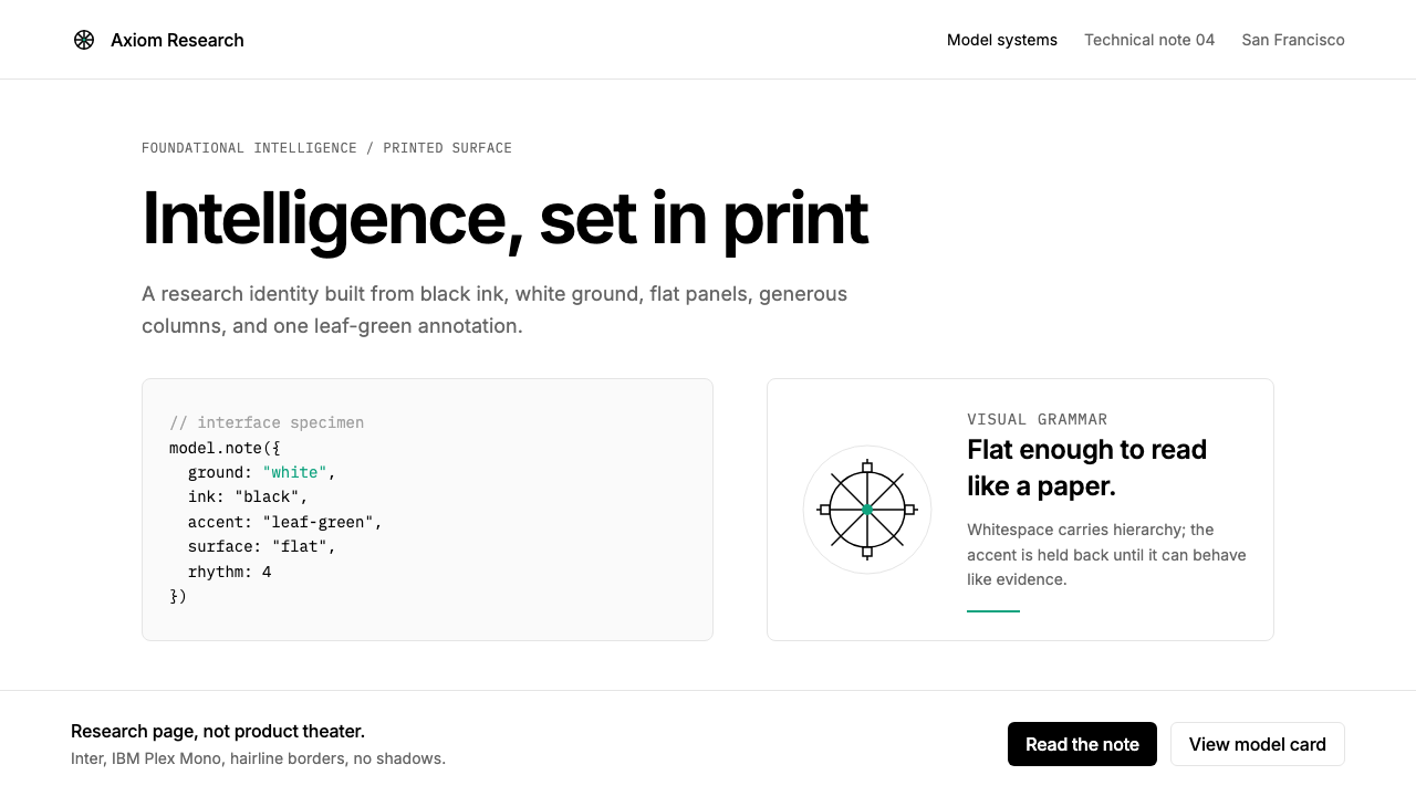 OpenAI 2024Research-grade restraint. Black-on-white Inter, flat code panels, one leaf-gr…研究级克制:黑白 Inter、扁平代码框、一枚叶绿色标记。
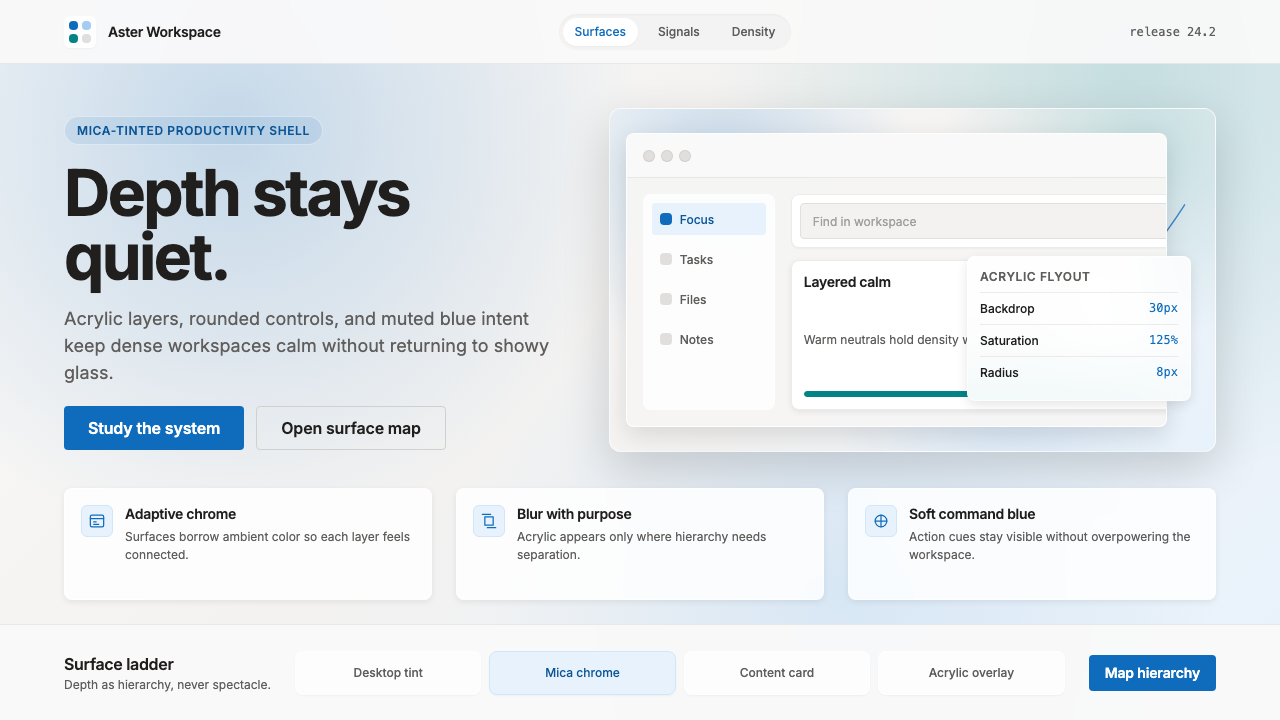 Microsoft Fluent 2Disciplined translucency. Warm Mica neutrals, acrylic blur, and muted blue cr…有纪律的半透明:暖 Mica 中性色、亚克力模糊与低调蓝营造沉稳层次。
 AsanaCalm productivity breathes. Cream canvas, lavender panels, coral-blue-yellow…安静生产力会呼吸:奶油画布、薰衣草面板与三色圆点。
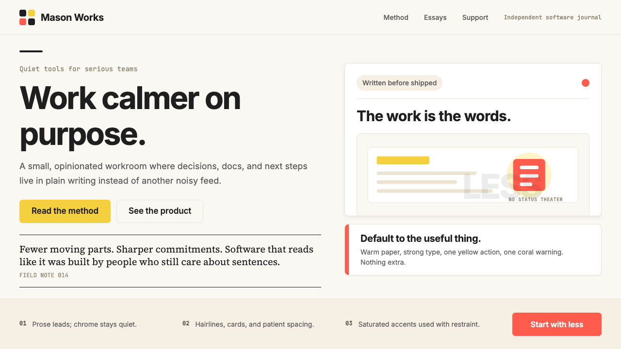 Basecamp / 37signalsQuiet craft, strong opinions. Cream paper, tight sans type, yellow and coral…安静却有主张。米色纸底、紧排无衬线、黄与珊瑚克制点题。
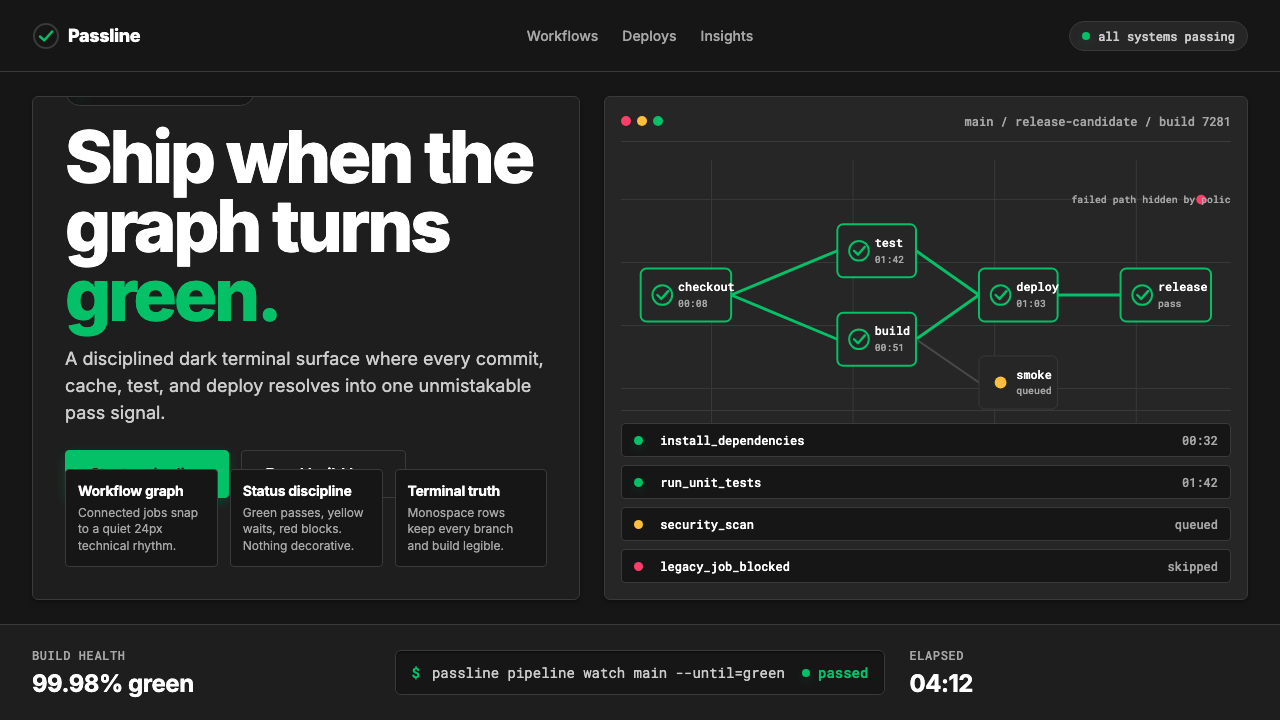 CircleCI Pipeline-GreenConfidence goes green. Emerald status lines cut through terminal-black pipeli…信心变绿。翠绿状态线切过终端黑流水线网格。
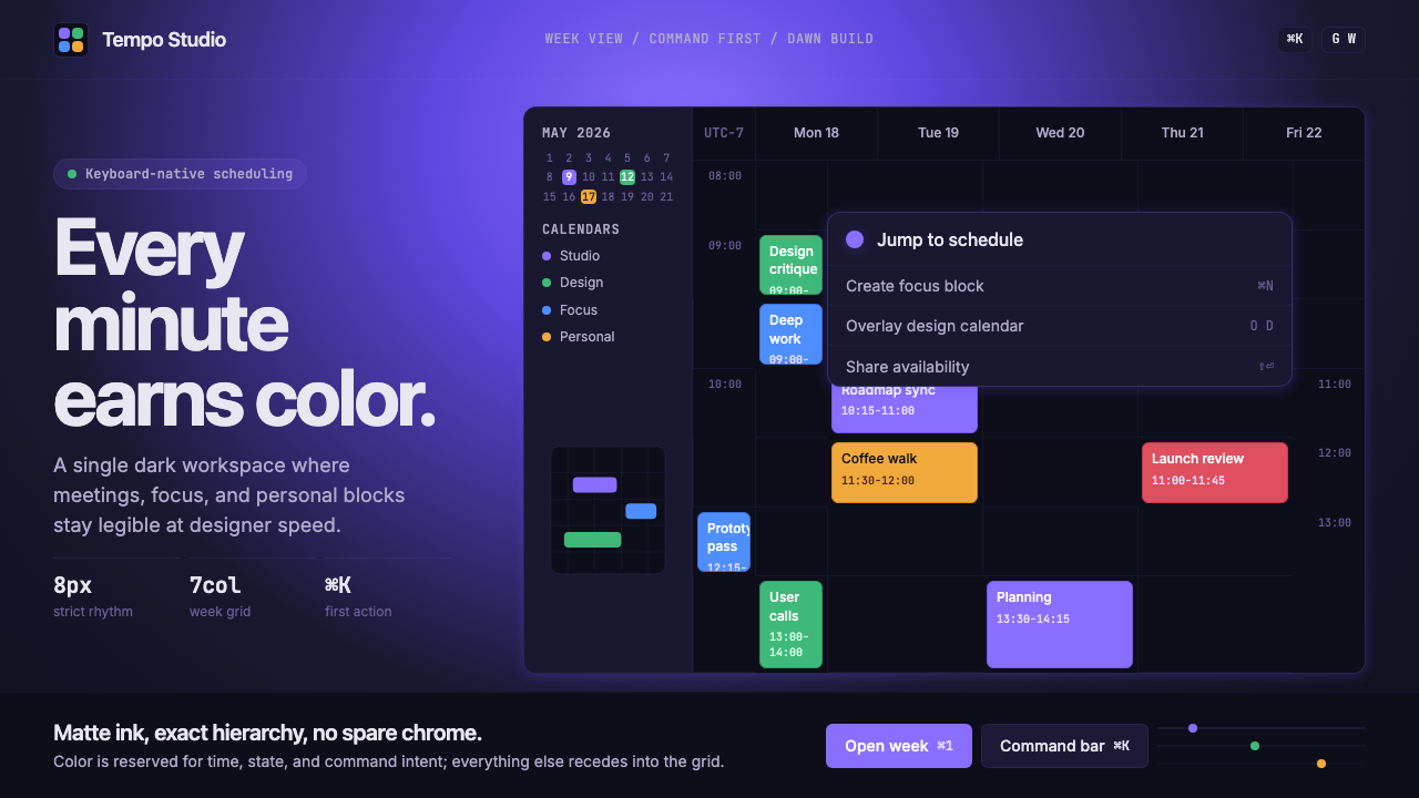 Cron CalendarDesigner-tech restraint. Purple wash, ink grid, mono shortcuts, surgical even…设计师科技的克制:紫色光晕、墨色网格、等宽快捷键与精准色块。