What is Basecamp / 37signals?什么是 Basecamp / 37signals?
Basecamp proved that software can have a point of view — quiet cream grounds, saturated yellow and coral, and type-forward layouts that say more by showing less.Basecamp 证明了软件可以有自己的立场——暖米色底、饱和的黄与珊瑚红,以及用文字主导版面的克制之道,越少越有力。
Basecamp / 37signals in briefBasecamp / 37signals 速览
Basecamp by 37signals is a project-management SaaS whose visual identity is inseparable from the company's philosophy: fewer features, sharper opinions, calmer surfaces. Where most productivity software reaches for gradients, motion, and silicon-valley blue, Basecamp reaches for warm paper tones, a tightly controlled accent palette, and long-form writing treated as the primary design medium.Basecamp 来自 37signals,是一款项目管理 SaaS,其视觉身份与公司哲学难以分割:少功能、强主张、平静的界面。当大多数生产力软件争相使用渐变、动效和硅谷蓝时,Basecamp 选择了暖色纸感、严格克制的强调色,以及将长文写作视为第一设计媒介。
The current identity — developed through a series of deliberate brand refreshes culminating around 2022 to 2024 — uses a warm-cream ground that reads more like a well-made book than a web application. Saturated yellow and coral provide the only color punctuation; everything else is neutral. The typographic system favors a humanist sans-serif with a slightly warm, mechanical character that balances modernist legibility with craft warmth.当前品牌身份——经过一系列有意为之的品牌迭代,在2022至2024年间趋于成熟——以暖米色为基底,读起来更像一本做工考究的书,而非一款网络应用。饱和的黄色与珊瑚红是仅有的色彩点睛;其余皆为中性。字体系统偏爱一款具有轻微温暖感的人文主义无衬线字体,在现代主义可读性与工匠温度之间找到平衡。
What distinguishes Basecamp's aesthetic from adjacent 'minimal' styles is its editorial confidence. The layouts are not sparse because nothing was added; they are sparse because everything unnecessary was removed with an opinion. White space is generous not as a luxury signal but as a functional commitment: the product is for thinking people who do not want to be interrupted by interface noise.将 Basecamp 美学与其他「极简」风格区别开来的,是其编辑自信。版面的留白并非因为没有添加什么,而是因为所有不必要的东西都被带着主见地移除了。留白慷慨,不是作为品质信号,而是一种功能性承诺:这款产品面向不希望被界面噪音打扰的思考者。
See the Basecamp / 37signals design system查看 Basecamp / 37signals 完整设计系统
Where does Basecamp / 37signals come from?Basecamp / 37signals 从何而来?
37signals was founded in Chicago in 1999 as a web-design consultancy by Jason Fried, along with partners including Carlos Segura and Ernest Kim. The name referenced the number of radio signals detected from space that had briefly been considered candidates for extraterrestrial intelligence — a nod to the idea that signal, not noise, was the company's business. The early studio produced client work for small businesses, and its spare, content-forward visual sensibility was evident from the start.37signals 由 Jason Fried 与包括 Carlos Segura 和 Ernest Kim 在内的合伙人于1999年在芝加哥创立,起初是一家网页设计咨询公司。公司名称来自从宇宙中探测到的、曾一度被视为外星文明候选信号的37个无线电信号——暗示公司的业务是信号,而非噪音。早期工作室为小型企业提供客户服务,内容优先、克制有力的视觉感性从一开始便清晰可辨。
In 2003, the company began building its own software tools to manage its own projects. Basecamp launched publicly in 2004 and within a year had generated enough revenue that 37signals shifted from client services to software products entirely. This transition — from service business to opinionated software company — was not just commercial; it defined the company's relationship with design. Unlike venture-backed startups that hired large design teams to compete on visual novelty, 37signals built with a small team and treated visual restraint as a competitive advantage rather than a compromise.2003年,公司开始为管理自身项目而开发内部软件工具。Basecamp 于2004年公开发布,不到一年便创造了足够的收入,使 37signals 彻底从客户服务转向软件产品。这一转变——从服务型企业到意见鲜明的软件公司——不仅仅是商业上的;它定义了公司与设计的关系。与那些雇用大型设计团队、在视觉新奇感上相互竞争的风投驱动型初创公司不同,37signals 以小团队构建产品,将视觉克制视为竞争优势而非妥协。
The publication of 'Getting Real' in 2006, followed by 'Rework' in 2010 and 'Remote' in 2013, established Jason Fried and David Heinemeier Hansson as prominent voices arguing against growth-at-all-costs software culture. The books were written in direct, unadorned prose — the same voice that informed the product's visual language. 37signals consistently positioned Basecamp not against specific competitors but against a default mode of doing business: the assumption that software should have more features, more color, more noise.2006年出版的《Getting Real》,以及随后的《Rework》(2010年)和《Remote》(2013年),使 Jason Fried 和 David Heinemeier Hansson 成为反对「不计代价增长」软件文化的重要声音。这些书以直接、朴素的散文写就——与产品视觉语言相同的腔调。37signals 始终将 Basecamp 定位为对抗一种默认商业模式,而非针对某一具体竞争对手:那种认为软件应该有更多功能、更多色彩、更多噪音的假设。
The company has undergone several name and identity transitions. In 2014, 37signals renamed itself Basecamp, collapsing the company and product into one identity. In 2022, the parent entity reverted to 37signals to accommodate new products, while Basecamp remained the flagship. Each visual refresh has moved in one direction: toward greater typographic confidence, a warmer and more restricted palette, and a more deliberate editorial presence. The current identity, with its cream grounds and controlled yellow-coral punctuation, represents the design philosophy at its most distilled.公司经历了数次名称与品牌身份的更迭。2014年,37signals 将自身更名为 Basecamp,把公司与产品合并为一个身份。2022年,母公司恢复使用 37signals 以容纳新产品,Basecamp 则继续作为旗舰产品存在。每一次视觉迭代都朝同一方向推进:更强的字体自信、更暖且更受限的色板、更有意识的编辑性存在。当前身份——米色底面与克制的黄-珊瑚点睛——代表着这一设计哲学的最提炼状态。
What defines the Basecamp / 37signals look?Basecamp / 37signals 的视觉特征是什么?
Warm-Cream Ground暖米色底面
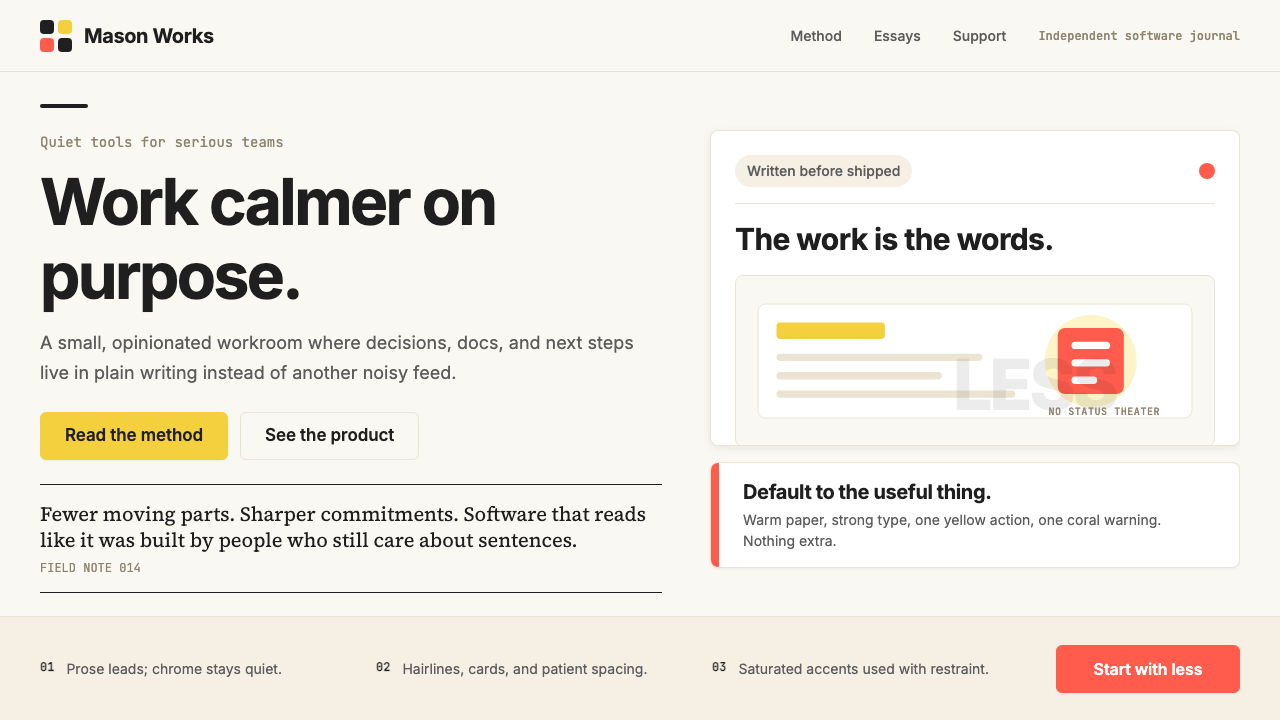
The base surface is not white but a warm, slightly yellowed cream that reads like quality paper stock. This choice shifts the entire emotional register away from the clinical brightness of most web applications and toward something that feels considered and calm. The warmth of the ground also makes the yellow accent feel less synthetic — it harmonizes rather than shocks. Against this ground, even a modest amount of dark type feels substantial and authoritative without needing weight or aggressive sizing.基础底面并非白色,而是一种温暖的、略带黄调的米色,读起来像优质纸张。这一选择将整体情感基调从大多数网络应用的临床感亮白推向了某种经过考量、沉静有序的质感。底面的温度也让黄色强调色显得不那么合成感——它是和谐共鸣,而非视觉冲击。在这一底色上,即便是适量的深色文字也能显得有分量、有权威感,而无需依赖字重或激进的字号。
Controlled Accent Palette受控的强调色板
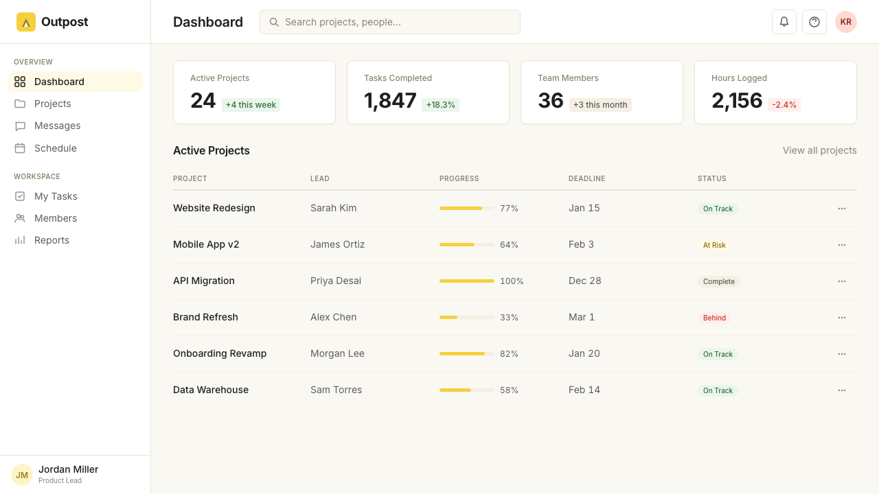
Color beyond the cream ground is used with extreme economy. Saturated yellow — vivid but not neon — marks calls to action, section anchors, and moments of brand emphasis. Coral or warm red appears as a secondary accent, used for states or contrasting modules but almost never simultaneously with yellow at the same visual weight. The result is a palette that reads as rich without being busy: each color carries weight because it is rarely deployed, and the moments where it appears become landmarks in the layout.米色底面之外的色彩被极度克制地使用。饱和的黄色——鲜明但不刺眼——标记行动号召、章节锚点和品牌强调时刻。珊瑚红或暖红色作为次要强调色,用于状态显示或对比模块,但几乎从不与黄色在同等视觉分量下同时出现。结果是一个读起来丰富却不拥挤的色板:每种颜色因罕见出现而具有分量,出现之处便成为版面的地标。
Typography as Hero字体排印作为主角
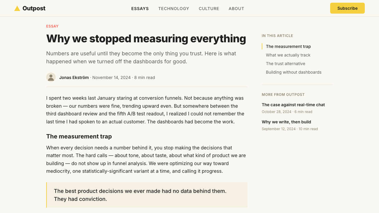
Basecamp's layouts treat text not as content to be decorated but as the primary visual material. Headlines are set large and confident, with generous line spacing that gives each line room to breathe. Body copy is set at a reading-optimized measure — neither too wide nor too narrow — with a rhythm that rewards sustained attention. The type hierarchy is simple: a headline, a subhead, body. There are no decorative dividers, no pull-quote styling boxes, no sidebars competing for attention. The writing earns its own space.Basecamp 的版面将文字不视为需要装饰的内容,而是主要的视觉材料。标题设置得大而自信,充裕的行间距让每一行都有呼吸空间。正文行宽经过阅读优化——不过宽也不过窄——节奏感足以支撑持续阅读。文字层级简洁:标题、副标题、正文。没有装饰性分隔线,没有样式化引用框,没有争夺注意力的侧边栏。写作本身赢得了它所需的空间。
Deliberate White Space有意为之的留白
Margins and padding in Basecamp's layouts are not the minimum required to prevent crowding — they are generous by design. Sections breathe. Elements have room around them. This white space is not a luxury signal but a functional commitment: it slows the visual pace, reduces cognitive load, and communicates respect for the reader's attention. In a landscape of content-dense interfaces, the refusal to fill available space is itself an opinion.Basecamp 版面中的页边距与内边距不是防止拥挤所需的最小量——而是有意慷慨的。区块之间有呼吸感,元素周围有空间。这种留白不是品质信号,而是一种功能性承诺:它放慢视觉节奏,减轻认知负担,传递对读者注意力的尊重。在内容密集的界面丛林中,拒绝填满可用空间本身就是一种立场。
No Stock Photography拒绝图库照片
Basecamp's marketing and editorial work is conspicuously free of stock photography. Where many SaaS products populate their pages with pictures of smiling people in open-plan offices or abstract architectural shots meant to connote innovation, Basecamp uses illustration, custom iconography, or simply committed typographic layouts. This absence is principled: stock photography signals generic aspiration, while a well-crafted text-only layout signals that the content itself is worth reading.Basecamp 的营销与编辑内容显著地没有图库照片。许多 SaaS 产品用开放式办公室里的微笑面孔或暗示创新感的抽象建筑图片填满页面,Basecamp 则选择插图、定制图标,或干脆以坚定的纯文字版面呈现。这种缺席是有原则的:图库照片传递泛化的愿景感,而一个精心制作的纯文字版面则传递内容本身值得阅读的信号。
Flat, Editorial Card Structures扁平的编辑性卡片结构
UI components in the Basecamp design language favor clear borders and flat surfaces over soft shadows and floating depth. Cards are defined by ruled lines or background-tone shifts rather than drop shadows. Interactive elements signal their affordance through color and border weight rather than three-dimensional lift effects. The overall effect is that the interface feels like a document rather than a physical object simulation — which aligns with the editorial values of the brand.Basecamp 设计语言中的 UI 组件偏爱清晰边框与扁平表面,而非柔和阴影与悬浮感深度。卡片通过边线或背景色调变化来界定,而非投影。交互元素通过颜色与边框粗细传递可操作性,而非三维抬起效果。整体效果是界面感觉像一份文档,而非物理对象的模拟——这与品牌的编辑性价值观一脉相承。
Opinionated Copywriting as Visual Element有主见的文案作为视觉元素
In the Basecamp aesthetic, copy is not a fill-in-the-blank placeholder — it is a primary design decision. Marketing headlines are direct, occasionally provocative, and written in a voice that takes positions. The typographic system is designed to honor this: short, punchy headlines set at generous scale, followed by longer explanatory prose set at a comfortable reading size. This interplay between bold statement and considered explanation is itself a compositional pattern that gives the layouts their rhythm and credibility.在 Basecamp 美学中,文案不是填充占位符——它是首要的设计决策。营销标题直接,偶尔带有挑衅性,以一种敢于表态的声音写就。字体系统被设计来承载这一点:简短有力的标题以慷慨的字号呈现,随后是以舒适阅读尺寸排设的更长解释性散文。这种强力陈述与深思熟虑解释之间的交织,本身就是一种构图模式,赋予版面节奏感与可信度。
See the Basecamp / 37signals design system查看 Basecamp / 37signals 完整设计系统
Who shaped Basecamp / 37signals?谁塑造了 Basecamp / 37signals?
Co-founder and CEO of 37signals, Fried has been the primary voice and editorial presence behind Basecamp's brand identity. His writing — in the company's books, blog posts, and product communications — established the direct, opinionated prose style that the visual language is designed to serve. Fried has consistently argued that the company's refusal to take venture capital and its commitment to profitability over growth is inseparable from its design philosophy: a smaller, more focused product requires a smaller, more focused visual language.37signals 联合创始人兼 CEO,Fried 一直是 Basecamp 品牌身份背后的主要声音与编辑存在。他的写作——包括公司出版的书籍、博客文章和产品沟通——确立了视觉语言所服务的直接、有主见的散文风格。Fried 始终主张,公司拒绝风险投资、坚持盈利优先于增长,与其设计哲学是不可分割的:一款更小、更聚焦的产品需要一套更小、更聚焦的视觉语言。
Co-founder and CTO of 37signals, DHH created Ruby on Rails while building Basecamp and has been as influential in shaping the company's aesthetic values as in its technical ones. His public arguments against the culture of overwork, excessive complexity, and growth-at-all-costs were co-authored with Fried in the company's books and continue to frame the brand's positioning. The design language reflects DHH's technical philosophy: do not add what you cannot maintain; remove what does not serve the core.37signals 联合创始人兼 CTO,DHH 在构建 Basecamp 时创造了 Ruby on Rails,在塑造公司美学价值观方面的影响力与其技术影响力同样深远。他与 Fried 在公司书籍中共同撰写的反对过度劳作、过度复杂和不计代价增长的公开论点,至今仍是品牌定位的框架。设计语言映照了 DHH 的技术哲学:不要添加你无法维护的东西;移除不服务于核心的东西。
For many years head of product strategy at 37signals, Singer developed the Shape Up methodology — a product development framework that rejects traditional sprint cycles in favor of six-week cycles with clearly scoped work. Shape Up was published as a free online book and became influential in product circles beyond 37signals. Singer's contribution to the design identity is largely structural: his insistence on well-bounded, clearly scoped work translates visually into layouts that have clear edges and do not try to do everything at once.作为 37signals 多年来的产品战略负责人,Singer 开发了 Shape Up 方法论——一套拒绝传统冲刺周期、转而采用范围清晰的六周工作周期的产品开发框架。Shape Up 作为免费在线书籍发布,在 37signals 之外的产品圈产生了广泛影响。Singer 对设计身份的贡献主要是结构性的:他对边界清晰、范围明确工作的坚持,在视觉上转化为边界清晰、不试图同时做所有事情的版面。
An early partner and design lead at 37signals, Kim helped establish the editorial and visual sensibility that shaped the studio's early output and, by extension, the Basecamp product identity. The spare, content-forward aesthetic of the agency's early web work — before SaaS was even a common category — anticipated the principles that would later be codified in Basecamp's visual brand. Kim's contributions represent the design lineage that connects the company's consulting origins to its product identity.37signals 的早期合伙人与设计负责人,Kim 帮助确立了塑造工作室早期成果的编辑性与视觉感性,进而影响了 Basecamp 的产品身份。该机构早期网页作品——早在 SaaS 成为普遍品类之前——所呈现的克制、内容优先的美学,预示了后来在 Basecamp 视觉品牌中被系统化的原则。Kim 的贡献代表了连接公司咨询起源与产品身份的设计传承。
How do you use Basecamp / 37signals today?今天怎么用 Basecamp / 37signals?
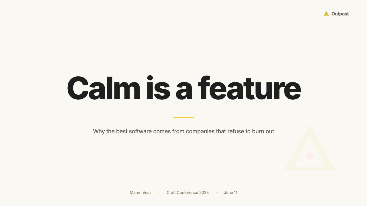
The Basecamp aesthetic is particularly well-suited to presentation slides where the speaker, not the deck, is meant to be the focus. On a cover slide, commit to the cream ground and set the title in a large, confident humanist sans-serif with generous spacing — no stock photo background, no gradient overlay, no decorative icon. A single yellow or coral horizontal bar or typographic accent is enough to signal brand. The cover should feel like a well-made book jacket: quiet, legible, authoritative.Basecamp 美学特别适合演示文稿,在那里演讲者而非幻灯片本身才是焦点。在封面页,坚持米色底面,以大号、自信的人文主义无衬线字体配慷慨的间距排设标题——不使用图库照片背景、渐变叠加或装饰性图标。一条黄色或珊瑚红的水平色条或字体强调就足以传递品牌信号。封面应当有如一本精心制作的书籍封套:安静、易读、有权威感。
For content slides, treat each slide as an editorial layout rather than a bullet-point container. One idea per slide. Headlines are short and direct. Body text, if it appears at all, is set at a comfortable reading size with only two or three lines per slide — enough to support the spoken point, not enough to replace it. Data slides should present numbers with the same typographic confidence: large numeral, a brief descriptor, and white space doing the explanatory work. Charts, if used, are rendered in the accent palette with clean, undecorated axes.对于内容页,将每张幻灯片视为编辑版面而非项目符号容器。每张幻灯片一个想法。标题短而直接。正文若出现,以舒适的阅读字号排设,每张幻灯片仅两三行——足以支撑口述要点,但不足以取而代之。数据页应以同样的字体自信呈现数字:大号数字、简短描述语、以留白完成解释性工作。图表若使用,以强调色板渲染,配清晰、无装饰的坐标轴。
For web UI applications — dashboards, pricing pages, settings panels — the Basecamp approach offers a clear alternative to shadow-heavy, gradient-rich interface conventions. Start with a near-white or cream canvas, define a strict column grid, and use ruled dividers and background-tone shifts rather than drop shadows to separate sections. Interactive states should be communicated through color (yellow for primary action, coral or muted tones for secondary) and border weight rather than elevation or animation. The interface should feel like a well-organized document rather than a three-dimensional space.对于网页 UI 应用——仪表板、定价页面、设置面板——Basecamp 方式提供了一种清晰替代方案,有别于阴影厚重、渐变丰富的界面惯例。以近白或米色为画布起点,定义严格的列网格,用分隔线和背景色调变化而非投影来区分区块。交互状态应通过颜色(黄色用于主要操作,珊瑚红或低饱和色调用于次要操作)和边框粗细传递,而非通过高度感或动效。界面应感觉像一份组织良好的文档,而非三维空间。
In editorial and marketing contexts — long-form articles, product announcement pages, pricing comparisons — the style rewards commitment to writing. Set body copy at a comfortable measure, allow generous paragraph spacing, and resist the temptation to break every section with an image or icon. Section headers can be set in the accent color sparingly; use rules or background shifts to segment longer content. Marketing hero sections should lead with a direct, opinionated headline set large against the cream ground, followed by a single line of explanatory subtext. The call to action should be unmissable — yellow button, high contrast — but not surrounded by decorative elements competing for attention.在编辑与营销场景中——长文文章、产品发布页面、定价对比——这种风格奖励对写作的投入。以舒适的行宽排设正文,保留充裕的段落间距,抵制用图片或图标打断每个区块的冲动。区块标题可以稀疏地以强调色设置;使用分隔线或背景变换来划分较长内容。营销主视觉区块应以直接、有主见的大标题领衔,在米色底面上铺开,随后是一行解释性副文字。行动号召应该清晰可见——黄色按钮、高对比度——但周围不应有装饰性元素争夺注意力。
A common mistake when applying this style is treating the warm-cream palette as permission for a generally relaxed or informal visual register. The Basecamp aesthetic is neither casual nor cozy — it is precise and opinionated, with every element present for a reason. Resist adding rounded corners on everything, whimsical illustrations, or a conversational script typeface to 'warm it up.' The warmth comes from the ground tone and the generous white space, not from decorative softening. Similarly, do not substitute the accent colors for a broader pastel range — the restricted palette is the discipline, and expanding it dilutes the system.应用这种风格时最常见的错误,是将暖米色色板理解为整体视觉基调可以随意放松或偏向非正式的许可。Basecamp 美学既不随意也不温馨——它是精确且有主见的,每个元素的存在都有其理由。不要试图通过在所有地方添加圆角、异想天开的插图或对话感手写字体来「使其更暖」。温度来自底面色调与慷慨的留白,而非装饰性柔化。同样,不要用更宽泛的粉彩色系替代强调色——受限的色板本身就是这套系统的纪律,扩展它会稀释整个体系。
See the Basecamp / 37signals design system查看 Basecamp / 37signals 完整设计系统
Basecamp / 37signals — FAQBasecamp / 37signals · 常见问题
How does Basecamp's style differ from Swiss International Style or minimal SaaS design?Basecamp 的风格与瑞士国际主义风格或极简 SaaS 设计有何不同?
Swiss International Style is mathematical, grid-obsessive, and uses photography and a broad neutral palette; it aims for universality and institutional authority. Minimal SaaS design (think early linear gradients softened into light grays and white, with blue CTAs) aims for approachability and frictionlessness. Basecamp sits between and apart from both: it is warm where Swiss style is cool, opinionated where minimal SaaS is neutral, and editorial where most interfaces are transactional. The cream ground and restrained accent palette give it a warmth that Swiss style lacks; the commitment to direct, opinion-forward copy gives it a conviction that most minimal SaaS avoids.瑞士国际主义风格讲究数学精度、痴迷网格,使用摄影与宽泛的中性色板,追求普适性与机构权威感。极简 SaaS 设计(想想那种将渐变柔化为浅灰与白色、配蓝色行动号召的早期风格)追求亲和力与无摩擦感。Basecamp 介于两者之间又与二者有别:在瑞士风格清冷之处它是温暖的,在极简 SaaS 中性之处它是有主见的,在大多数界面事务性之处它是编辑性的。米色底面与克制的强调色板赋予它瑞士风格所缺乏的温度;对直接、立场鲜明文案的坚持赋予它大多数极简 SaaS 所回避的信念感。
Can this style work for a product that is not a productivity or SaaS tool?这种风格能用于非生产力工具或非 SaaS 类产品吗?
It can, but it requires alignment between the style's implied values and the product's actual character. The Basecamp aesthetic communicates: calm authority, intellectual seriousness, craft without flash, and an implicit belief that the reader is thoughtful and unhurried. This makes it well-suited for publishing platforms, research tools, educational products, independent media, and any brand that wants to position itself against mainstream tech visual culture. It is poorly suited to food, fashion, entertainment, or any product where sensory richness, cultural specificity, or emotional immediacy are primary values.可以,但需要风格隐含的价值观与产品的实际特质之间存在对齐。Basecamp 美学传递的是:平静的权威、严肃的知识态度、不炫耀的工匠精神,以及一种隐含的信念——读者是有思想且不急不躁的。这使其非常适合出版平台、研究工具、教育类产品、独立媒体,以及任何希望将自身定位为主流科技视觉文化对立面的品牌。它不适合食品、时尚、娱乐,或任何感官丰富性、文化特殊性或情感即时性是核心价值的产品。
How should the yellow accent be used without it feeling corporate or warning-like?如何使用黄色强调色,而不让它显得企业感十足或像警示信号?
Context and proportion are everything. A yellow that reads as a warning in isolation becomes a brand signal when used consistently on primary actions, selected states, and site-level anchors. The key is to use it with restraint — as a single note that the eye learns to recognize rather than a repeated blare. The warm-cream background helps significantly: yellow against cream reads as warm and confident, not caution-tape aggressive. Avoid pairing it with dark navy or black in large areas, which pushes it toward warning territory. Keep it to interactive elements, accent bars, or key typographic moments; let the neutral ground do the heavy lifting.语境与比例是关键。单独看可能像警示的黄色,一旦一致地用于主要操作、选中状态和全站锚点,便成为品牌信号。关键在于克制使用——作为眼睛学会辨认的单一音符,而非反复响起的嘈杂。暖米色背景有显著帮助:黄色对米色读起来温暖而自信,而非警示带般的攻击性。避免在大面积区域将其与深海军蓝或黑色搭配,那会将其推向警告领域。将其保留给交互元素、强调色条或关键的字体时刻;让中性底面承担主要工作。
Is it possible to do a dark-mode version of this style?这种风格可以做深色模式版本吗?
A dark inversion is possible but challenging. The style's warmth depends heavily on the cream ground — switching to a dark surface risks losing the character that makes the aesthetic distinctive. If a dark mode is needed, prefer a very dark warm brown or charcoal over a neutral gray or pure black, to preserve some of the ground's warmth. Yellow remains usable at high contrast against dark, but coral becomes tricky — it can read as error-state red in dark contexts. The typographic system transfers well; the editorial confidence is independent of the light-dark axis. Expect the dark mode to feel more austere and slightly less immediately warm than the light version.深色反转是可行的,但颇具挑战。这种风格的温度很大程度上依赖米色底面——切换到深色表面有失去这一美学独特性的风险。若需要深色模式,优先选择非常深的暖棕色或炭灰色,而非中性灰或纯黑,以保留底面的部分温度。黄色在深色底面上仍可高对比使用,但珊瑚红变得棘手——在深色语境中它可能被读作错误状态的红色。字体排印系统移植良好;编辑性自信与明暗轴无关。预期深色模式会比浅色版本感觉更严肃、即时的温度感略低。
How do you balance the style's opinionated voice with a client or institutional context that requires perceived neutrality?如何在这种风格有主见的腔调与需要中立感的客户或机构场景之间取得平衡?
The visual system is separable from the editorial voice. You can apply the cream ground, the restrained accent palette, the generous white space, and the editorial layout discipline without writing copy in the direct, occasionally provocative style that Basecamp itself uses. Institutions that want to be seen as trustworthy and considered — universities, research bodies, policy organizations, long-form journalism platforms — can use this visual language effectively by pairing it with measured, authoritative prose rather than marketing directness. The style communicates seriousness and craft regardless of whether the copy adopts the 37signals voice.视觉系统与编辑声音是可以分离的。你可以应用米色底面、克制的强调色板、慷慨的留白和编辑性版面纪律,而无需以 Basecamp 本身所用的那种直接、偶尔带有挑衅性的风格写文案。希望被视为可信赖且经过考量的机构——大学、研究机构、政策组织、长篇新闻平台——可以有效使用这套视觉语言,方法是将其与克制、权威的散文配对,而非营销式的直接腔调。这种风格传递严肃感与工匠精神,无论文案是否采用 37signals 的声音。
Related design styles相关设计风格
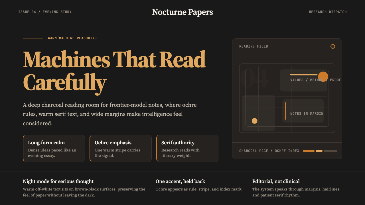 Claude / Anthropic Warm 2024Warm intelligence at night. Ochre rules and Source Serif glow on deep charcoa…夜读式温暖智能:深炭底、赭橙线与 Source Serif 发光。
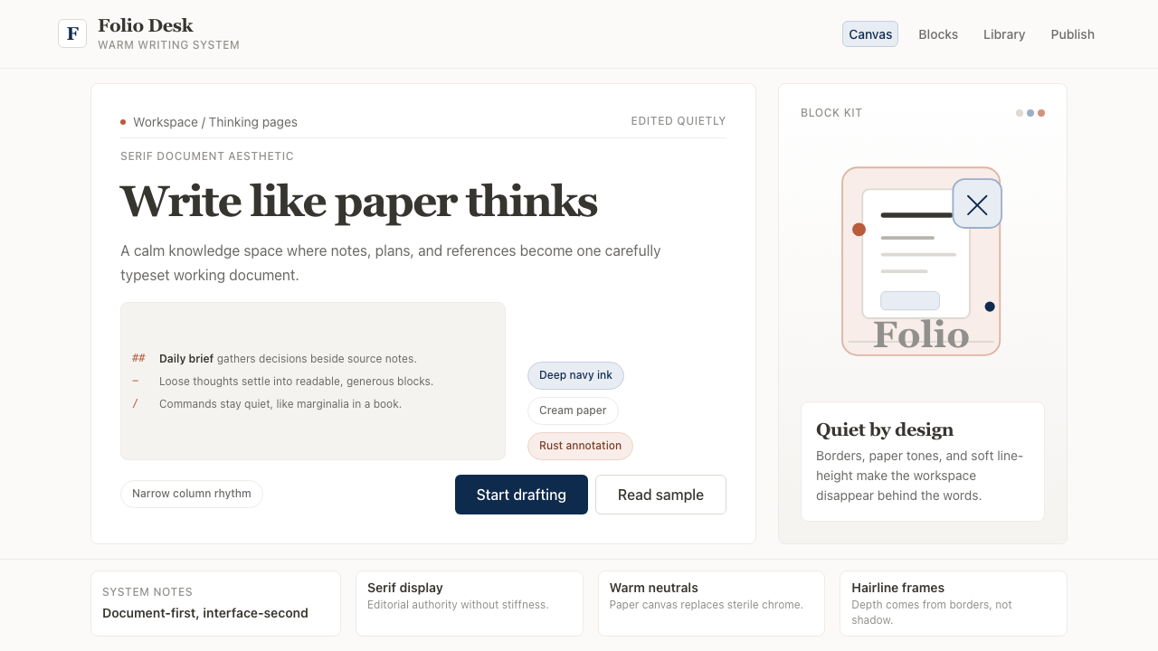 Notion ModernWriting feels papery. Source Serif on warm cream, navy ink, and hairline bord…书写像纸页:暖米白、衬线标题、深蓝墨色与细边框。
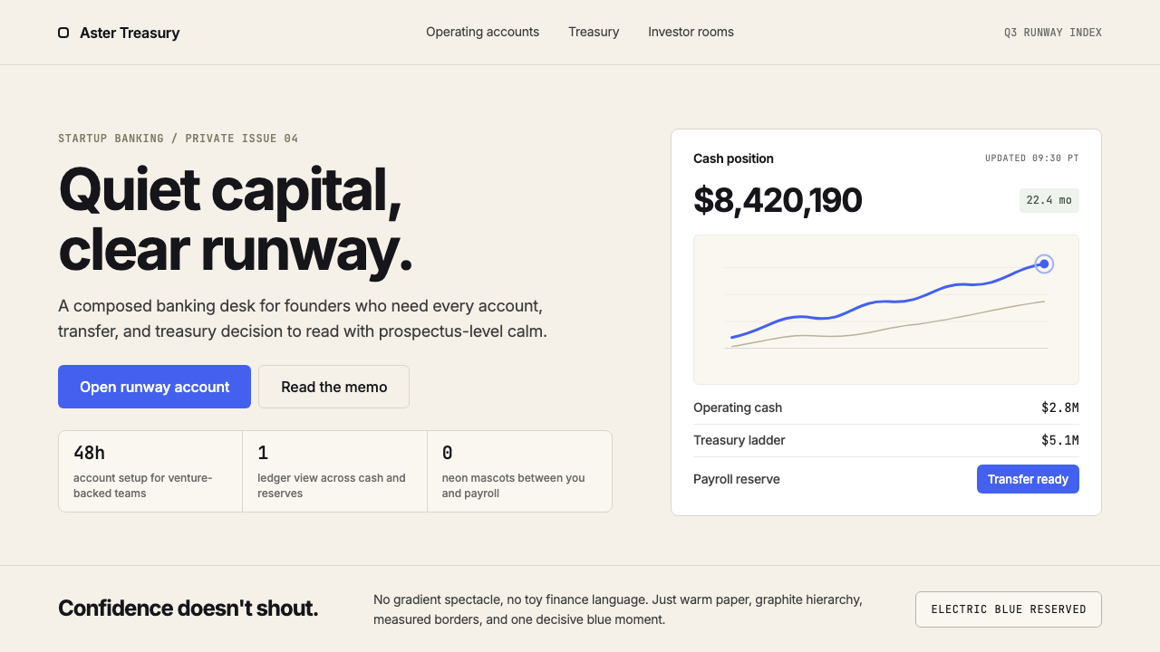 Mercury BankQuiet precision wins. Cream paper, charcoal Inter, and one electric-blue spar…安静精确胜出:奶油纸底、炭灰 Inter 与一抹电光蓝建立信任。
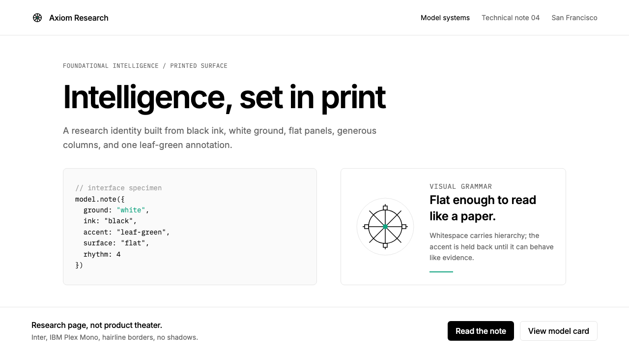 OpenAI 2024Research-grade restraint. Black-on-white Inter, flat code panels, one leaf-gr…研究级克制:黑白 Inter、扁平代码框、一枚叶绿色标记。
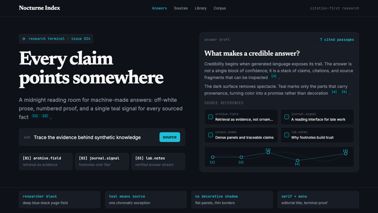 Perplexity AISerious search after midnight. Teal citations cut through black panels and de…午夜研究感:青绿色引用穿过黑色面板与密集衬线排版。
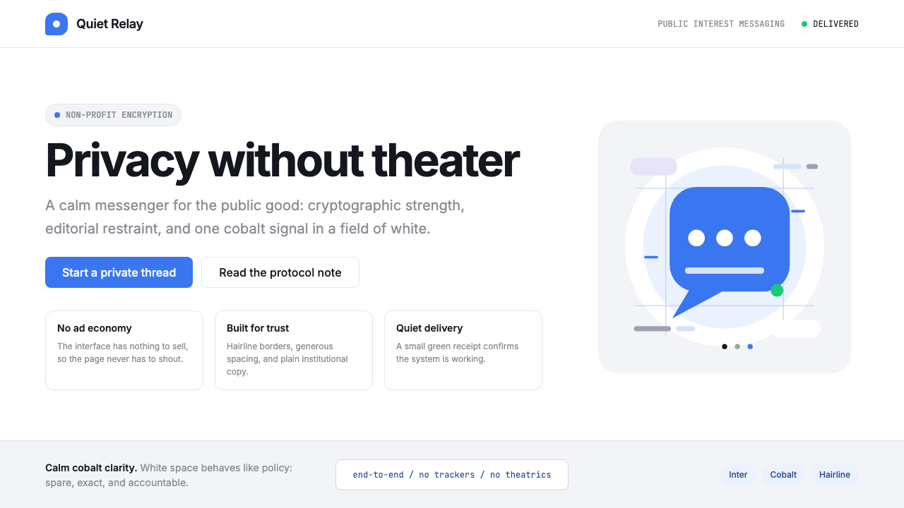 Signal Encrypted MessengerCalm privacy, plainly stated. Cobalt Inter type and white space carry the tru…冷静的隐私宣言。钴蓝 Inter 与留白托起信任。