What is Notion Modern?什么是 Notion Modern?
Notion taught a generation of SaaS designers that a screen could feel like paper — warm, quiet, and built for long reading.Notion 让整整一代 SaaS 设计师相信,屏幕也可以像纸页一样温润、安静,适合长时间阅读。
Notion Modern in briefNotion Modern 速览
Notion Modern is the design language associated with Notion, the knowledge-management and productivity platform whose visual identity — warm off-white backgrounds, serif display headings, restrained navy accents, and hairline borders — defined what writing software looks like in the 2020s. The aesthetic sits at the intersection of classical book typography and minimal digital interface design: it borrows the cream page, the generous line-height, and the quiet authority of well-set text from print, and combines them with the structural precision expected of a software product.Notion Modern 是与知识管理与生产力平台 Notion 相关联的设计语言。其视觉特征——温润的米白色背景、衬线展示字体、克制的深蓝强调色与细发丝边框——定义了 2020 年代书写软件的视觉面貌。这套美学立于古典书籍排版与极简数字界面设计的交汇处:它从印刷品中借鉴了奶油色页面、宽松的行高以及排版精良的文字所带有的静默权威,并将其与软件产品所要求的结构精确性相结合。
The system is built around a single strong idea: the interface should recede so the content can speak. Where most productivity software of the 2010s competed for visual attention with bold gradients, icon-heavy navigation, and saturated brand colors, Notion stripped all of that away. The result is an environment that feels more like an editor's desk than an application — a neutral surface that makes whatever is written on it look considered.整套系统围绕一个核心理念构建:界面应当退场,让内容发声。2010 年代的大多数生产力软件还在用大胆的渐变、充斥图标的导航栏和高饱和的品牌色争夺视觉注意力,Notion 则将这一切剥除殆尽。最终呈现的环境更像一张编辑的工作台,而非一款应用程序——一个中性的表面,让写在上面的任何内容都显得经过深思熟虑。
Notion Modern spawned an identifiable genre. After Notion popularized the warm-neutral SaaS look, dozens of tools in overlapping categories — Coda, Reflect, Tana, Linear's documentation views, Craft, Bear — adopted variations on the same vocabulary: off-white or cream canvas, a single serif or humanist typeface for headings, restrained body text in near-black, and subtle borders rather than background fills as the primary separating device. The style is now so widely reproduced that it reads as the default for a certain class of thoughtful, writing-first software.Notion Modern 催生了一个可辨认的流派。在 Notion 将温暖中性的 SaaS 美学推广开来之后,数十款同类工具——Coda、Reflect、Tana、Linear 的文档视图、Craft、Bear——都采用了相同词汇的变体:米白或奶油色画布、单一的衬线或人文主义字体用于标题、近黑色的克制正文,以及用细边框而非背景填充作为主要分隔手段。这套风格如今已被如此广泛地复制,以至于它已成为一类重视深度写作的软件的默认视觉标准。
Where does Notion Modern come from?Notion Modern 从何而来?
Notion was founded in San Francisco in 2016 by Ivan Zhao and Simon Last, with Akshay Kothari joining as COO in 2019. Ivan Zhao, who studied cognitive science and art at the University of British Columbia, brought a strong conviction about the relationship between visual environment and thinking: he believed that the tools people write in shape what they are able to write. This belief became the design philosophy of the product from its earliest days. Zhao has cited influences ranging from HyperCard, the late-1980s Apple application that let non-programmers build linked databases, to traditional Japanese aesthetics and the pared-back paper culture of certain editorial publications.Notion 由赵伊(Ivan Zhao)与 Simon Last 于 2016 年在旧金山创立,Akshay Kothari 于 2019 年加入担任 COO。曾在不列颠哥伦比亚大学攻读认知科学与艺术的赵伊,对视觉环境与思维之间的关系有着深刻的信念:他认为,人们在其中写作的工具会塑造他们所能写出的内容。这一信念从最初便成为产品的设计哲学。赵伊所提及的影响来源跨度宽广——从 1980 年代末允许非程序员构建链接数据库的苹果应用 HyperCard,到日本传统美学,再到某些编辑类出版物简练的纸质文化。
The visual language that Notion is now known for consolidated between roughly 2019 and 2021, as the product moved from a niche tool used by early adopters to a platform with millions of users. The shift coincided with a broader cultural moment: the rise of Markdown as a writing format had given technically literate users a taste for plain, structured text with minimal formatting overhead, and Notion's interface literalized that preference in pixels. The decision to use a warm off-white rather than a cool grey or pure white as the canvas color was deliberate — it brought associations of physical paper and reading comfort into the digital surface.Notion 如今为人熟知的视觉语言,在 2019 年至 2021 年间大致成型。彼时产品正从早期采用者使用的小众工具演变为拥有数百万用户的平台。这一转变恰逢一个更宏观的文化节点:Markdown 作为写作格式的兴起,让技术娴熟的用户习惯了格式开销极少的纯粹结构化文本,而 Notion 的界面将这种偏好字面地像素化了。选择温润米白而非冷灰或纯白作为画布颜色是有意为之的——它将实体纸张与阅读舒适感的联想引入了数字表面。
The serif heading was an equally significant choice. In the early 2010s, SaaS products had largely abandoned serif typefaces as relics of a pre-digital era, favoring geometric or humanist sans-serifs for their legibility at small sizes on low-resolution screens. By 2020, screen resolution had improved dramatically, and Notion's use of a display serif for headings — combined with a sans-serif for body text — reintroduced the typographic hierarchy familiar from books and newspapers. The pairing sent a signal: this is software designed around reading and writing, not around clicking and switching.衬线标题是另一个同等重要的选择。在 2010 年代初,SaaS 产品大多将衬线字体视为前数字时代的遗物而弃用,更倾向于几何或人文主义无衬线字体以确保小字号在低分辨率屏幕上的可读性。到 2020 年,屏幕分辨率已大幅提升,Notion 在标题中使用展示衬线字体——搭配正文用无衬线字体——重新引入了书籍与报纸中熟悉的排版层级。这种搭配发出了一个信号:这是一款围绕阅读与写作而非点击与切换而设计的软件。
The hand-drawn illustration style that Notion used in its onboarding and marketing materials added another dimension to the brand. These illustrations — loose, sketch-like figures in a limited palette — reinforced the analog, papery quality of the interface and positioned Notion against the slick, vector-smooth illustration style dominant in SaaS at the time. They communicated approachability and human craft in contrast to the polished abstraction of competitors. The combination of serif headings, warm canvas, hairline borders, and hand-drawn accents established a design vocabulary that became one of the most imitated in software design history.Notion 在引导流程与营销素材中使用的手绘插画风格为品牌增添了另一个维度。这些插画——在有限色板内以松散的素描风格呈现的人物形象——强化了界面的模拟纸质感,并将 Notion 与当时 SaaS 领域主流的光滑矢量插画风格区分开来。它们在对手精抛光的抽象感之中传达了亲近感与手工温度。衬线标题、暖色画布、发丝边框与手绘点缀的组合,建立起一套成为软件设计史上被模仿最多的视觉词汇之一的设计语言。
What defines the Notion Modern look?Notion Modern 的视觉特征是什么?
Warm Neutral Canvas暖中性画布
The foundational surface is a warm off-white — not the sterile white of a blank application window, not the cool grey of a system interface, but something closer to the tone of uncoated paper stock. This warmth is the first and most pervasive signal the design sends: what you are about to do here is read and write, not process and navigate. The canvas color creates a sense of ambient comfort that reduces eye strain during long sessions and gives every element placed on it a slightly analog, considered quality.基础底面是温润的米白色——不是空应用窗口那种无菌感的白,不是系统界面的冷灰,而是更接近无涂层纸张色调的颜色。这种暖意是设计所传递的第一个、也是最普遍的信号:你即将在这里做的事是阅读与写作,而非处理与导航。画布颜色营造出一种环境舒适感,减轻长时间使用时的眼部疲劳,并赋予其上每一个元素一丝模拟质感与经过考量的气质。
Serif Display Headings衬线展示标题
Headings are set in a display serif — a typeface with the full complement of serifs, optical size adjustments, and weight contrast characteristic of classic book typography. This is the system's most legible departure from the sans-serif monoculture of SaaS design. At large sizes, the serif letterforms carry visual weight and gravitas that announce hierarchy unmistakably. The contrast between a substantial serif heading and a lighter, neutral body text creates the same reading rhythm a well-designed book achieves — scanning from one section to the next feels natural rather than mechanical.标题以展示衬线字体排版——这类字体具备衬线、光学尺寸调整以及经典书籍排版特有的字重对比。这是整套系统与 SaaS 设计无衬线单一文化最显而易见的背离。在大字号下,衬线字形承载视觉分量与庄重感,明确无误地宣示层级。厚重的衬线标题与更轻盈、中性的正文之间的对比,创造出一本排版精良的书籍所具备的阅读节奏——从一个章节扫视到下一个章节感觉自然而非机械。
Navy and Near-Black Ink深蓝与近黑墨色
Rather than using pure black for text and interface elements, Notion Modern leans toward a deep navy or ink tone — a color with enough blue in it to feel deliberate and considered, like fountain pen ink on quality paper, rather than mechanical printer output. This deep ink tone has become a signature of the aesthetic: it reads as warm at scale, subtle at small sizes, and pairs naturally with the cream canvas without creating the harsh contrast of pure black on pure white. Interactive elements and accents often pick up this navy as a primary color choice.Notion Modern 并非使用纯黑作为文字与界面元素的颜色,而是倾向于深海军蓝或墨水色调——一种蓝色成分足以让人感受到刻意与考量的颜色,如同优质纸张上的钢笔墨水,而非机械打印机的输出。这种深邃的墨水色调已成为这套美学的标志:大面积看来温润,小尺寸细腻,与奶油色画布自然搭配,不会产生纯黑底纯白那种刺目对比。交互元素与强调色往往选取这种深蓝作为首选颜色。
Hairline Borders as Separators发丝边框作为分隔手段
Notion Modern separates content regions with borders so thin they read as drawn lines rather than blocks of color. This approach borrows directly from print design — the column rules and table borders of well-typeset documents — rather than from the filled-card pattern common in digital interfaces. Hairline borders allow the warm canvas to show through between content blocks, maintaining the sense of a single continuous surface rather than a stack of discrete panels. The effect is more editorial than applicational: the page breathes, and the borders are structural notation rather than visual containers.Notion Modern 使用极细的边框分隔内容区域,细到像是手绘线条而非色块。这种方式直接借鉴自印刷设计——排版精良的文件中的栏线与表格边框——而非数字界面中常见的填充卡片模式。发丝边框使暖色画布得以在内容块之间透出,维持单一连续表面的感觉,而非一叠离散面板的堆叠。效果更像编辑版面而非应用程序:页面在呼吸,边框是结构性标注而非视觉容器。
Generous Vertical Rhythm慷慨的垂直韵律
Line-height and paragraph spacing are set at values more generous than typical UI defaults, deliberately evoking the reading comfort of a well-typeset book or magazine. This vertical generosity does several things at once: it signals that the content is meant to be read slowly and attentively, it creates visual breathing room that reduces cognitive load, and it makes the hierarchy of the page scannable — headings stand out not only because they are larger but because they have space around them. The overall impression is of a layout that respects the reader's time and attention.行高与段落间距设定得比典型 UI 默认值更为慷慨,刻意唤起排版精良的书籍或杂志的阅读舒适感。这种垂直方向的慷慨同时起到多重作用:它表明内容是供缓慢、专注阅读的;它创造出视觉呼吸空间以降低认知负荷;它让页面层级易于扫视——标题之所以突出,不仅因为尺寸更大,还因为其周围有充足的留白。整体印象是一个尊重读者时间与注意力的版面。
Hand-Drawn Illustration Accents手绘插画点缀
The Notion visual system incorporates loose, sketch-like figurative illustrations as decorative accents in onboarding flows, empty states, and marketing contexts. These illustrations are deliberately imperfect — line weights vary, forms are simplified, and the palette is limited — in contrast to the smooth, precision-vectored illustrations that dominated SaaS design at the time. They function as warmth injectors: small human and organic moments in an otherwise structured digital environment. The effect is a softening of what could otherwise feel like a clinical productivity tool.Notion 视觉系统在引导流程、空状态页面与营销场景中加入了松散的素描风格具象插画作为装饰点缀。这些插画是刻意不完美的——线条粗细变化、形态经过简化、色板受限——与当时 SaaS 设计中主流的光滑精准矢量插画形成对比。它们起到注入温度的作用:在一个结构严整的数字环境中,带来微小的人性与有机时刻。效果是软化了这款工具原本可能呈现的临床式生产力感。
Structural Simplicity in Navigation导航的结构简洁性
Navigation in Notion Modern is typographic and hierarchical rather than iconic and flat. The sidebar presents a tree of pages as labeled text, indented by level, with minimal visual decoration — no large icons, no colored badges beyond functional indicators, no gradient backgrounds on active items. This treatment extends the reading-environment metaphor into navigation: moving between pages feels like turning to a new section of a document rather than switching applications. The navigation recedes into the background so that the content of whatever page is open can fill the visual field.Notion Modern 的导航是字体性与层级性的,而非图标性与扁平化的。侧边栏以标签文字呈现页面树形结构,按层级缩进,视觉装饰极少——没有大图标,功能指示符以外没有彩色徽章,激活项目没有渐变背景。这种处理将阅读环境的隐喻延伸到了导航中:在页面间移动感觉像翻到文件的新章节,而非切换应用程序。导航隐入背景,让当前打开页面的内容充满视野。
Who shaped Notion Modern?谁塑造了 Notion Modern?
Co-founder and CEO of Notion, Zhao studied cognitive science and studio art at the University of British Columbia before moving to San Francisco to build the product. His background at the intersection of cognition and visual art shaped Notion's foundational belief that visual environment influences the quality of thought and writing. Zhao has spoken publicly about influences including HyperCard, traditional Japanese design, and the editorial aesthetics of certain independent publications. His insistence on a warm, paper-like interface rather than a cool, systematic one established the design direction that defined the product and, subsequently, an entire genre of tools.Notion 联合创始人兼 CEO。赵伊在不列颠哥伦比亚大学攻读认知科学与工作室艺术后移居旧金山创立产品。横跨认知与视觉艺术的学术背景,塑造了 Notion 的核心信念:视觉环境影响思维与写作的质量。赵伊公开谈及过的影响来源包括 HyperCard、日本传统设计以及某些独立出版物的编辑美学。他坚持温润纸质感界面而非冷峻系统感界面的设计方向,定义了这款产品以及随之而来的整个工具流派。
Co-founder and COO, Kothari joined Notion in 2019 after serving as LinkedIn's India country manager and co-founding the news-reading app Pulse, which was acquired by LinkedIn in 2013. His experience building a content-consumption product informed Notion's approach to information architecture and the experience of navigating large volumes of linked content. Kothari has been a vocal advocate for Notion's design philosophy in interviews, articulating the connection between the calm visual environment and the goal of making deep work more accessible.联合创始人兼 COO。Kothari 于 2019 年加入 Notion,此前曾任 LinkedIn 印度区总经理,并联合创立了新闻阅读应用 Pulse(于 2013 年被 LinkedIn 收购)。构建内容消费产品的经历,使他在信息架构以及浏览大量关联内容的体验设计上为 Notion 提供了重要输入。Kothari 在多次采访中积极阐述 Notion 的设计哲学,清晰表达了平静视觉环境与让深度工作更易实现这一目标之间的关联。
The in-house design and brand team responsible for developing and iterating on the Notion visual system from approximately 2019 onward. This team refined the core choices — the serif heading, the warm canvas, the hand-drawn illustration voice — into a consistent and scalable design language across product, marketing, and documentation. They also maintained the discipline of restraint that is central to the aesthetic: deciding, with each release and campaign, what to leave out. The team's work is arguably more influential through the genre it spawned than through the product itself.负责从 2019 年前后开发与迭代 Notion 视觉系统的内部设计与品牌团队。该团队将核心选择——衬线标题、暖色画布、手绘插画语气——打磨成横跨产品、营销与文档的一致且可扩展的设计语言。他们还维护了这套美学核心的克制纪律:在每一次发布与活动中决定哪些东西应该省略。这个团队的工作通过其所催生的流派所产生的影响,可以说超过了产品本身。
Not a person but a technical and cultural movement that Notion's design made visible. Markdown — the lightweight markup syntax created by John Gruber and Aaron Swartz in 2004 — gave technically literate writers a way to structure plain text documents without leaving the keyboard. By the late 2010s, Markdown had become a lingua franca among developers, technical writers, and note-takers. Notion's design literalized Markdown aesthetics: the interface looked like a Markdown document rendered beautifully, which made it immediately legible to this audience and aspirational to those adjacent to it.这不是某个人,而是一种技术与文化运动——Notion 的设计使其变得可见。Markdown 是由 John Gruber 与 Aaron Swartz 于 2004 年创建的轻量级标记语法,它让技术娴熟的写作者能够在不离开键盘的情况下为纯文本文档添加结构。到 2010 年代末,Markdown 已成为开发者、技术写作者与笔记爱好者之间的共同语言。Notion 的设计将 Markdown 美学字面化:界面看起来就像一份精美渲染的 Markdown 文档,这使其对这批受众而言立刻可读,对毗邻群体而言充满吸引力。
How do you use Notion Modern today?今天怎么用 Notion Modern?
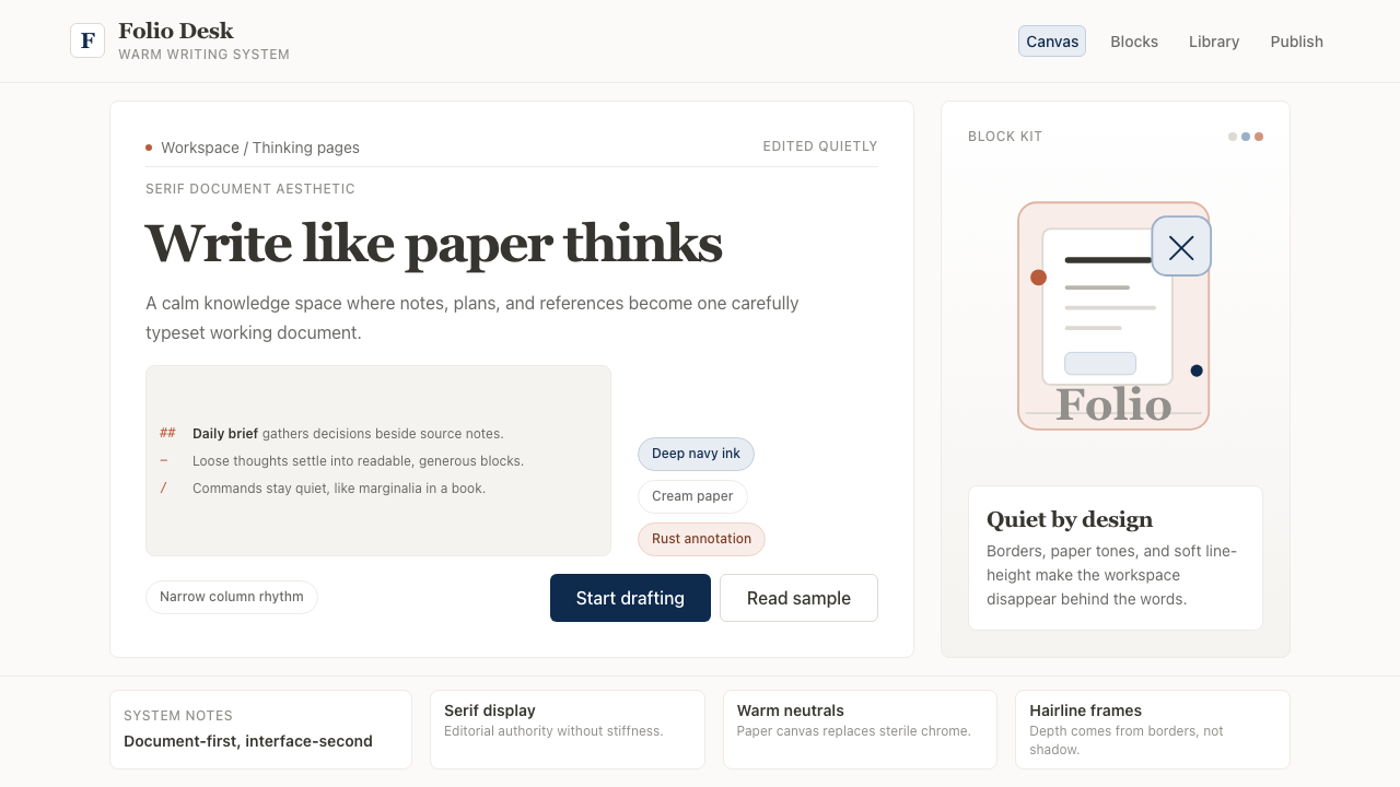
Notion Modern is one of the most immediately deployable design styles in contemporary practice because it is defined by editorial restraint rather than bold graphic gestures. Applying it well means choosing to leave things out: no unnecessary borders, no colored section backgrounds, no decorative icons where a text label will do. The baseline posture is a warm, quiet surface that makes content the foreground and everything else the background.Notion Modern 是当代实践中可部署性最强的设计风格之一,因为它由编辑性克制而非大胆图形姿态所定义。出色地运用它,意味着选择省略:没有不必要的边框,没有有色区块背景,文字标签足以胜任的地方不用装饰性图标。基础姿态是温润安静的表面,让内容成为前景,其余一切成为背景。
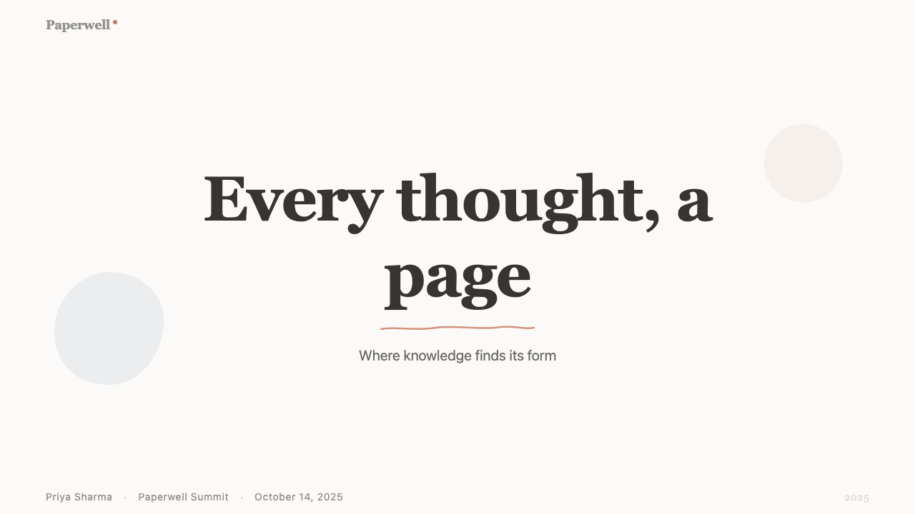
For presentation slides, the style works on every page type. A cover slide benefits from a large, display-weight serif heading set against the warm canvas, with a simple hairline underline or narrow rule as the only graphic element. The heading should feel typeset, not designed. Content slides follow the same economy: text in a clear hierarchy defined by size and weight, generous spacing between sections, and minimal use of the navy accent. Data slides work well when charts are treated as editorial graphics — clean axes, one accent color for the primary series, and labels sized to match the body text hierarchy rather than competing with it. Avoid background fills on data callouts; a simple hairline border or the accent color alone carries enough emphasis.对于演示文稿,这套风格在每种页面类型上都有效。封面页受益于在暖色画布上排设的大字号展示衬线标题,唯一的图形元素是简单的发丝下划线或细横线,标题应该感觉是被排版的,而非被设计的。内容页遵循同样的节制:以尺寸与字重定义清晰层级的文字、章节间慷慨的间距、以及对深蓝强调色的最小化使用。数据页面在图表被当作编辑性图形处理时效果最好——干净的坐标轴、主要数据系列使用一种强调色、标签尺寸与正文层级对应而非与之竞争。避免在数据标注上使用背景填充;简单的发丝边框或强调色本身就承载了足够的重点强调。
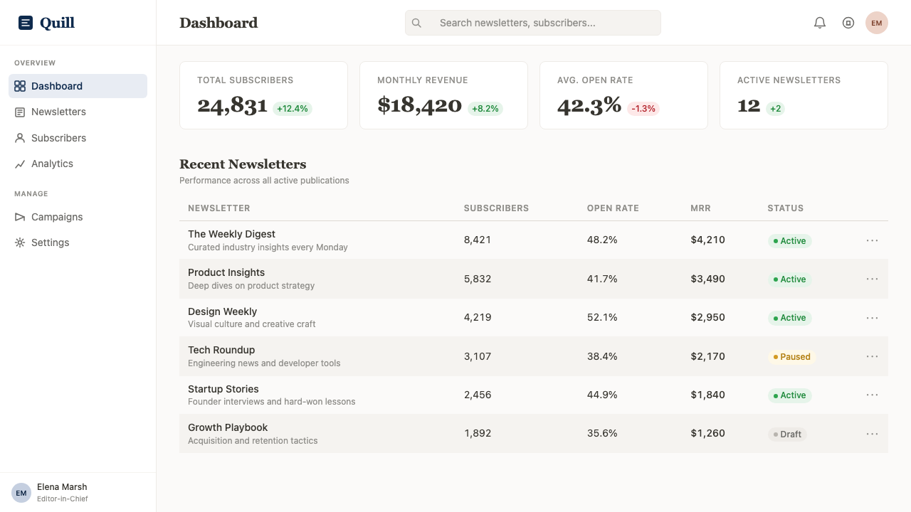
For web UI and dashboard applications, Notion Modern provides a strong vocabulary for interfaces built around reading and navigating structured content. A sidebar navigation should be typographic — page names and section labels only, with indentation as the hierarchy signal and a hairline left border or subtle weight change to mark the active state. Content areas should use the warm canvas as the base, with hairline-bordered cards or tables rather than filled backgrounds to delineate regions. Pricing pages work particularly well: the restrained palette allows the primary call-to-action to stand out with minimal visual effort, and the serif heading pairs naturally with the considered, text-forward copy that premium pricing tiers often require.对于网页 UI 与仪表板应用,Notion Modern 为围绕阅读与浏览结构化内容构建的界面提供了强有力的词汇。侧边栏导航应当是字体性的——仅呈现页面名称与章节标签,以缩进作为层级信号,以细发丝左侧边框或细微字重变化标示激活状态。内容区域应以暖色画布为底,用发丝边框的卡片或表格而非填充背景划分区域。定价页面尤其适合:克制的色板让主要行动号召以最小的视觉代价脱颖而出,衬线标题也与高端定价档位常需的深思熟虑、以文字为主的文案自然搭配。
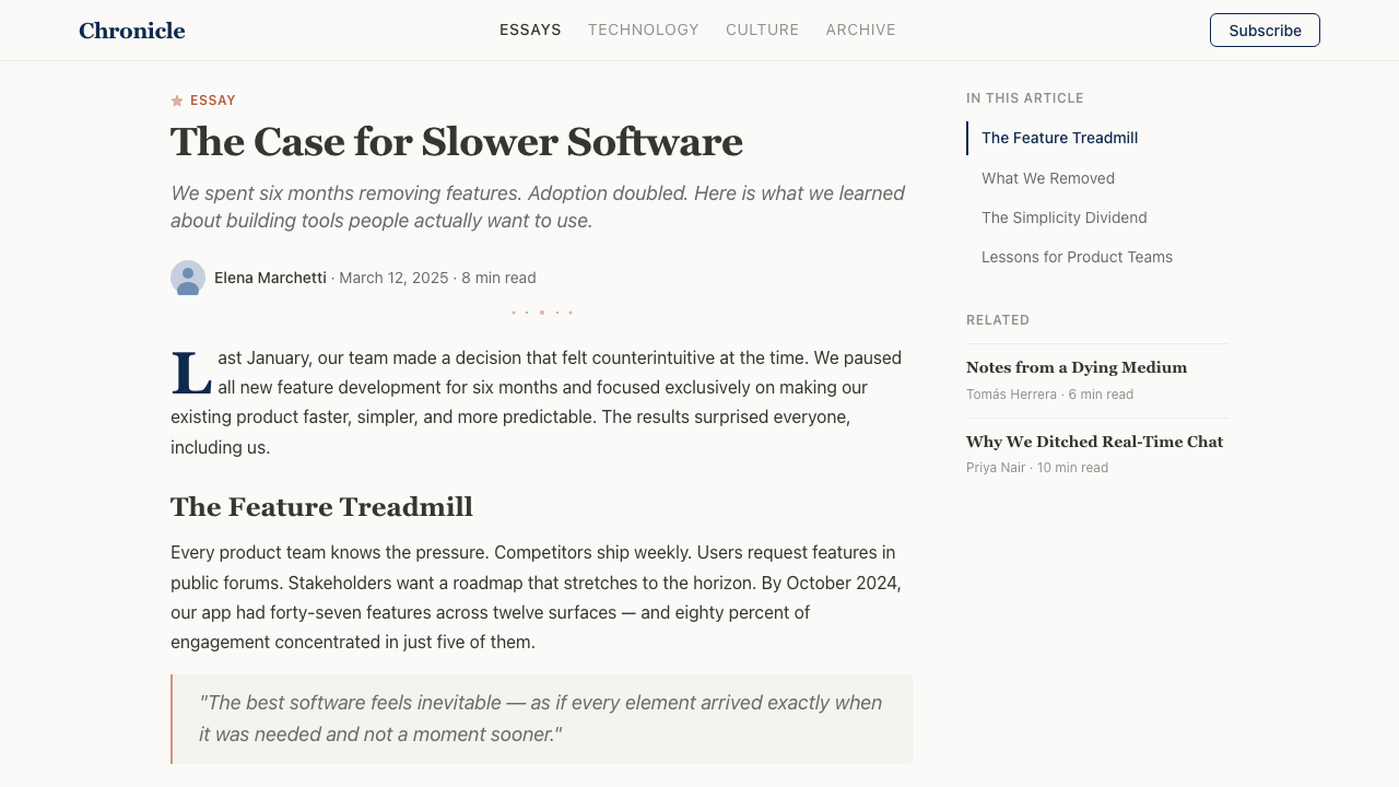
For editorial and marketing applications, the style supports long-form layouts with natural authority. An article or documentation page benefits from a narrow text column — wide enough to read comfortably, narrow enough to hold the eye across a long session — with a proportionally wide margin reserved for pull quotes, asides, or metadata. Section breaks should be marked by a hairline rule rather than increased spacing alone, borrowing the convention from print. Marketing landing pages suit the style's poster-like typographic scale: a large display serif heading in the hero, body copy set at comfortable reading size, and the accent color used once at the primary conversion point rather than scattered through the page.对于编辑与营销应用,这套风格以自然的权威感支撑长篇版面布局。文章或文档页面受益于窄文字栏——足够宽以保证舒适阅读,足够窄以在长时间阅读中锁定视线——留出相应宽度的页边空白用于引语、旁注或元数据。章节分隔应以发丝横线标记,而不仅仅依靠增加间距,这借鉴了印刷品的惯例。营销落地页适合这套风格的海报式排版尺度:英雄区域以大字号展示衬线标题,正文以舒适的阅读尺寸排版,强调色仅在主要转化点使用一次,而非散布全页。
A common mistake when applying Notion Modern is over-serializing the serif: using serif type not just for headings but for subheadings, pull quotes, captions, and body text, which collapses the hierarchy the typeface contrast is supposed to create. The serif earns its effect through contrast with the neutral body text; when everything is serif, nothing is a heading. A related mistake is adding color to content regions — tinting section backgrounds, using colored tags beyond navigation, or introducing illustration accents throughout body content. The style's warmth comes from the canvas tone and the typographic generosity, not from decorative color. Keep the palette to the canvas, the near-black ink, and a single deliberate accent, and the Notion Modern voice will be legible at any scale.应用 Notion Modern 时最常见的错误是过度序列化衬线字体:不仅在标题中使用衬线字体,还延伸到副标题、引语、图注与正文,从而瓦解了字体对比本应创造的层级。衬线字体的效果来自与中性正文的对比;当所有内容都是衬线时,就没有什么是标题了。另一个相关错误是为内容区域添加颜色——为区块背景上色、在导航以外使用彩色标签、或在正文内容中引入插画点缀。这套风格的温润感来自画布色调与排版慷慨,而非装饰性色彩。将色板保持在画布色、近黑墨色与单一刻意选择的强调色之间,Notion Modern 的声音在任何尺度下都将清晰可辨。
Notion Modern — FAQNotion Modern · 常见问题
How is Notion Modern different from generic minimalism?Notion Modern 与普通极简主义有何不同?
Generic minimalism typically means reducing the number of elements on a screen — fewer buttons, thinner UI chrome, more white space. Notion Modern is specifically about editorial warmth: the warm canvas tone, the serif heading, and the hairline border are all deliberate choices that evoke print media and reading environments rather than simply removing things. A purely minimalist interface might be cold and clinical; Notion Modern is minimal but warm, spare but legible. The typographic specificity — that serif heading paired with a neutral body — is the key distinguishing feature.普通极简主义通常意味着减少屏幕上的元素数量——更少的按钮、更薄的界面外壳、更多的留白。Notion Modern 的核心是编辑性温润感:温暖的画布色调、衬线标题与发丝边框,都是刻意唤起印刷媒体与阅读环境的选择,而非单纯的减法。纯粹的极简界面可能是冷峻而临床的;Notion Modern 是极简但温润、简练但易读的。排版的特异性——衬线标题搭配中性正文——是关键的区分特征。
Can this style work for applications with dense data, like financial dashboards?这套风格适用于金融仪表板这类数据密集的应用吗?
Yes, with adaptation. The key challenge in dense-data contexts is maintaining the warm, reading-friendly quality while accommodating tables, charts, and numerical hierarchies that require tight spacing. The approach is to keep the canvas warm and the typography quiet — use the serif only for section headings, not column headers — and treat tables as typographic objects: hairline borders between rows, the navy accent only for totals or key metrics, no colored backgrounds on data rows. The result reads as a well-typeset financial report rather than a data-heavy dashboard application, which can itself be a differentiating quality in a market full of high-density dark-mode finance tools.可以,但需要适配。在数据密集场景中,关键挑战是在容纳需要紧密间距的表格、图表与数字层级的同时,维持温润的阅读友好感。方法是保持画布温暖、排版安静——衬线字体仅用于章节标题,而非列标题——并将表格视为排版对象:行间发丝边框,深蓝强调色仅用于合计或关键指标,数据行不使用有色背景。最终效果读来像一份排版精良的财务报告,而非数据繁重的仪表板应用——在充斥高密度深色调金融工具的市场中,这本身就可以是一种差异化品质。
Is Notion Modern suited to dark mode?Notion Modern 适合深色模式吗?
Notion does offer a dark mode, and the style adapts more gracefully than many because its core logic is about contrast and typographic hierarchy rather than about the specific canvas color. A dark Notion Modern replaces the warm off-white with a deep charcoal or near-black with a warm undertone — avoiding the cool blue-black common in developer dark themes — and keeps the serif heading in a soft off-white rather than pure white to maintain the paper-like reading quality. The navy accent often becomes redundant in dark mode and can be replaced by the off-white type itself as the primary contrast element. The hand-drawn illustration accents may need to be desaturated or reduced to maintain legibility against the dark ground.Notion 确实提供深色模式,这套风格的适配比许多风格更从容,因为其核心逻辑是关于对比与排版层级,而非特定画布颜色。深色版 Notion Modern 将温润米白替换为带有暖调底色的深炭灰或近黑色——避免开发者深色主题常见的冷蓝黑——并将衬线标题保持在柔和的近白色而非纯白,以维持纸质感的阅读品质。在深色模式下,深蓝强调色往往变得多余,可以用近白色文字本身作为主要对比元素取代。手绘插画点缀可能需要降低饱和度或减少使用,以保证在深色底面上的可读性。
How do you apply Notion Modern to a brand that is not itself a note-taking or writing tool?如何将 Notion Modern 应用于一个本身不是笔记或写作工具的品牌?
The style is transferable to any product that benefits from associations with thoughtfulness, considered communication, and reading. Editorial publications, consultancy and professional services firms, educational platforms, and documentation-heavy developer tools all have natural affinity with the aesthetic. The approach is to lead with the typographic choices — the serif heading, the generous line-height, the warm canvas — and adapt the accent color from Notion's specific navy to a hue aligned with the brand's identity. The hand-drawn illustration accent is optional and should only be used where it reinforces an approachable, human brand personality. What should not be adapted away is the discipline of restraint: the style falls apart if you add colored backgrounds, drop-shadow cards, or icon-heavy navigation.这套风格可迁移至任何能从深思熟虑、审慎沟通与阅读联想中获益的产品。编辑类出版物、咨询与专业服务公司、教育平台,以及文档量大的开发者工具,都与这套美学有自然的亲和力。方法是以排版选择为主导——衬线标题、慷慨的行高、暖色画布——并将强调色从 Notion 特定的深蓝,调整为与品牌身份对齐的色相。手绘插画点缀是可选的,仅应在它强化亲近、人性化品牌个性的场景中使用。不应放弃的是克制的纪律:一旦加入有色背景、投影卡片或充斥图标的导航,这套风格便会瓦解。
What is the relationship between Notion Modern and the broader warm-neutral SaaS trend?Notion Modern 与更广泛的暖中性 SaaS 趋势之间是什么关系?
Notion Modern is the origin point — or at least the most visible early articulation — of the warm-neutral SaaS aesthetic that became widespread between roughly 2020 and 2024. Before Notion, the dominant SaaS visual language was cool, bright, and systematic: white or light-grey backgrounds, geometric sans-serif typefaces, saturated brand accent colors, and card-based layouts with soft drop shadows. Notion's decision to warm the canvas, introduce a serif, and strip the accent palette to near-nothing was a visible departure that became enormously influential. The subsequent genre — which includes Craft, Linear's documentation, Reflect, and many others — borrowed the palette and typographic approach with varying degrees of fidelity. Understanding Notion Modern specifically, rather than the genre it spawned, is useful precisely because the genre contains many diluted or incorrectly combined versions of the original principles.Notion Modern 是暖中性 SaaS 美学的起源点——或至少是最显著的早期表达——这套美学在 2020 年至 2024 年间广泛流行。在 Notion 之前,主流 SaaS 视觉语言是冷峻、明亮且系统化的:白色或浅灰背景、几何无衬线字体、高饱和品牌强调色,以及带有柔和投影的卡片式布局。Notion 决定温暖画布、引入衬线字体、将强调色板削减至近乎于无,是一次显著的背离,并产生了巨大影响。随后的流派——包括 Craft、Linear 的文档界面、Reflect 及其他许多产品——以不同程度的忠实度借鉴了这套色板与排版方式。专门理解 Notion Modern 本身,而非它所催生的流派,恰恰是有价值的,因为流派中包含了许多对原始原则的稀释或错误组合版本。
Related design styles相关设计风格
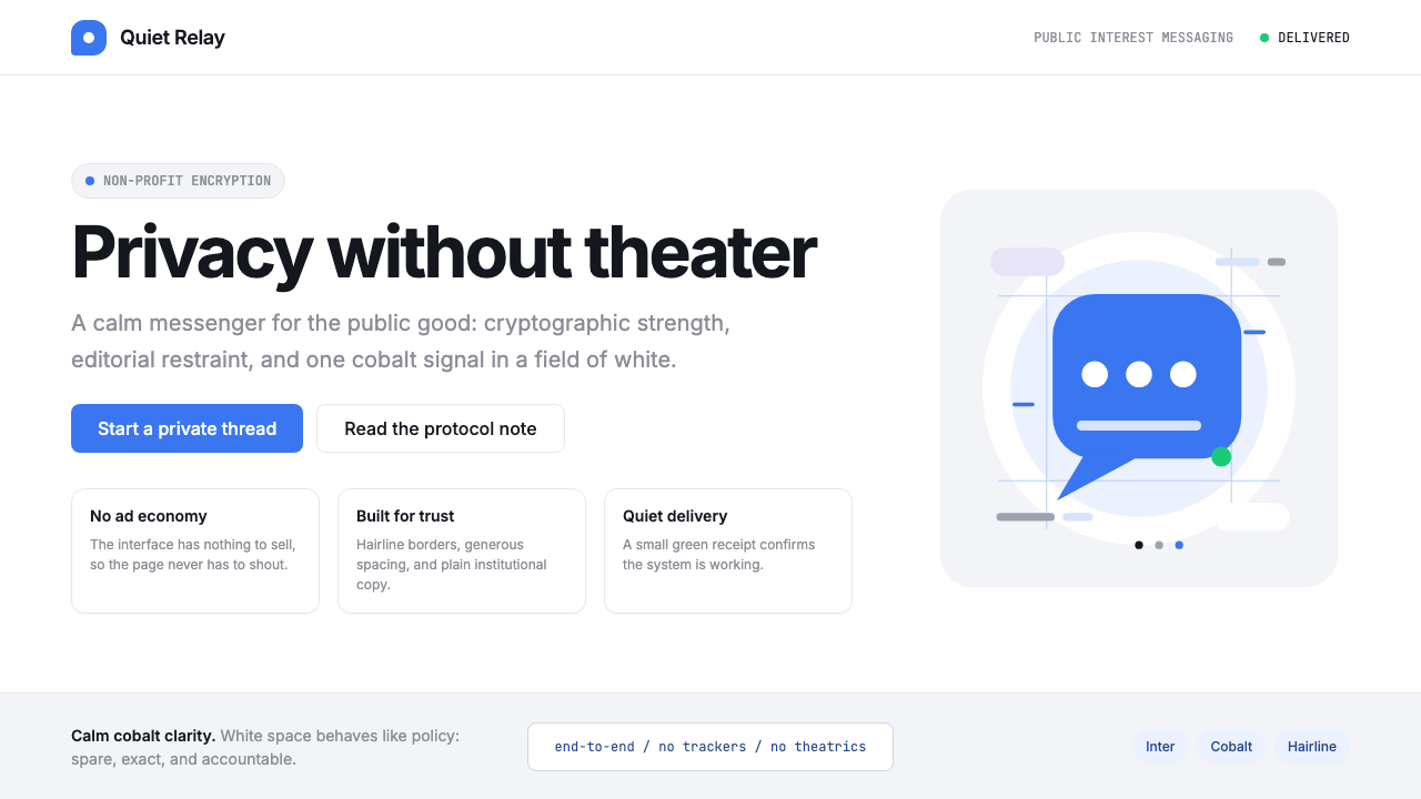 Signal Encrypted MessengerCalm privacy, plainly stated. Cobalt Inter type and white space carry the tru…冷静的隐私宣言。钴蓝 Inter 与留白托起信任。
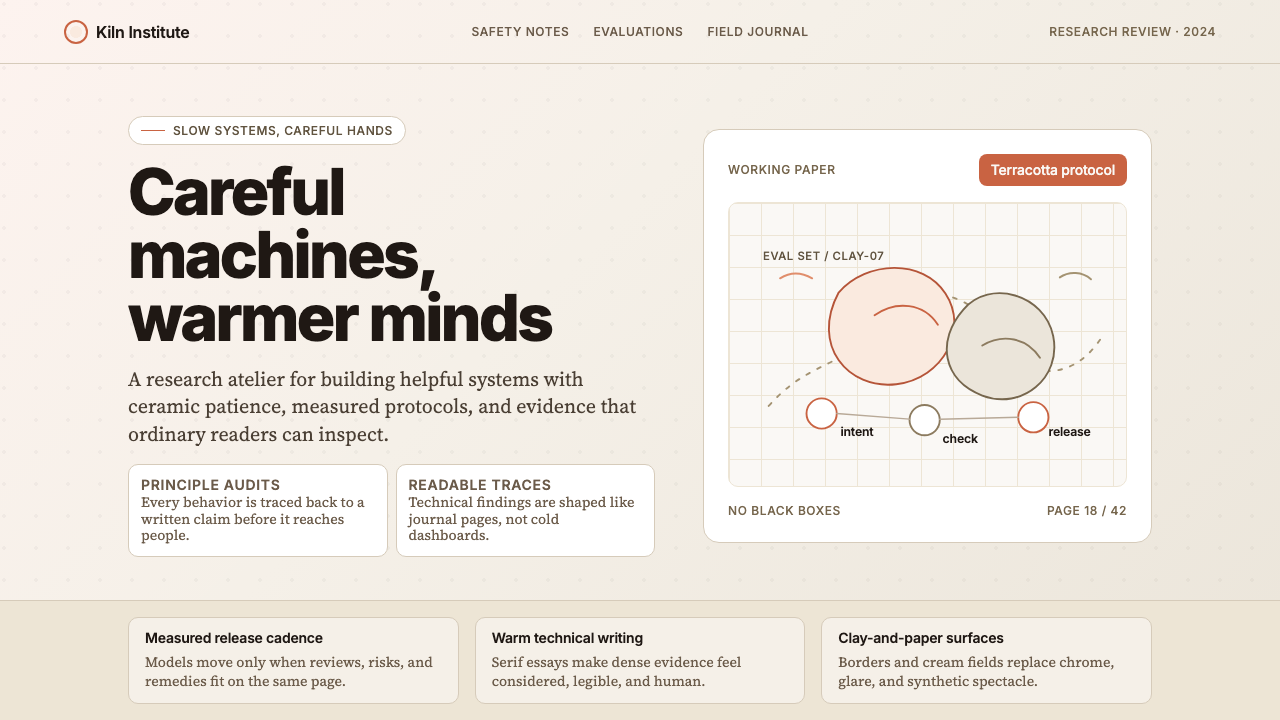 Anthropic ClayAI safety in handmade clay. Sand backgrounds, terracotta accents, serif body…用手工陶土包裹的 AI 安全感:沙色背景、赤陶点缀、衬线正文——缓慢、刻意、有…
 AsanaCalm productivity breathes. Cream canvas, lavender panels, coral-blue-yellow…安静生产力会呼吸:奶油画布、薰衣草面板与三色圆点。
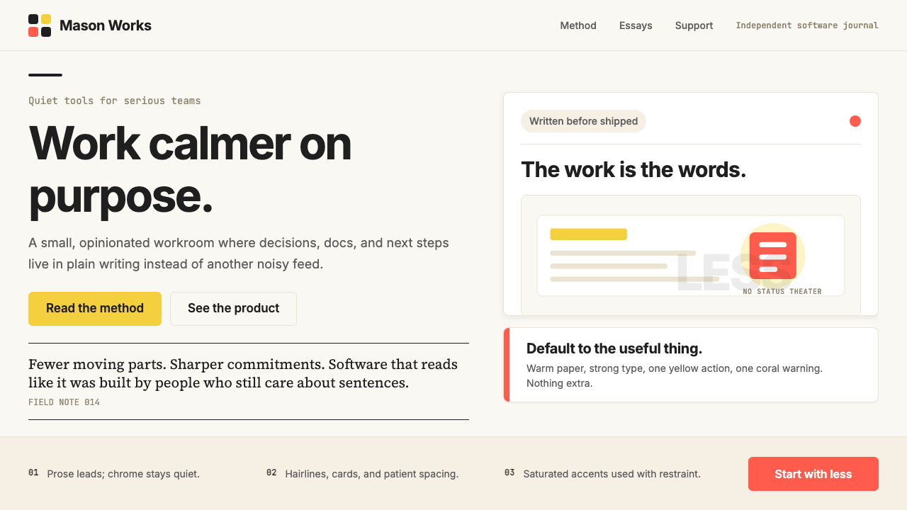 Basecamp / 37signalsQuiet craft, strong opinions. Cream paper, tight sans type, yellow and coral…安静却有主张。米色纸底、紧排无衬线、黄与珊瑚克制点题。
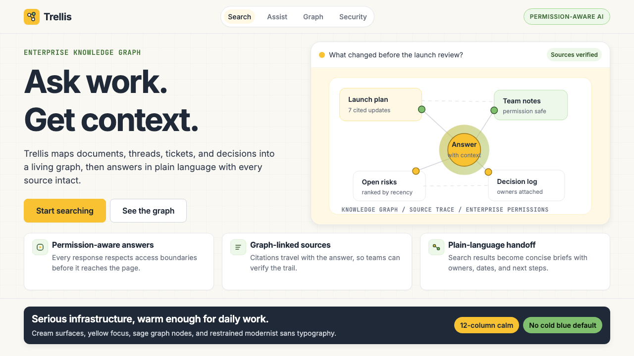 Glean Enterprise-SearchWarm enterprise AI. Cream ground, yellow focus, sage graph nodes, and sans ca…温暖的企业 AI:奶油底、黄焦点、鼠尾草节点与无衬线克制。
 1Password Purple VaultSecurity stays quiet. Vault purple, Inter type, and crisp white cards do the…安全保持安静:保险库紫、Inter 字体与白卡片完成表达。