Design style guide设计风格指南
What is 1Password Purple Vault?什么是 1Password Purple Vault?
1Password's 2023 identity proves that security software can feel calm, assured, and even beautiful — a vault-purple canvas, warm paper tones, and crisp white cards that communicate trustworthiness without a single padlock icon.1Password 2023年的品牌焕新证明了一件事:安全软件可以从容、自信,甚至美丽——保险库紫色画布、温暖纸质底色与洁白卡片,不需要一个锁头图标,就能传递出可信赖的气质。
1Password Purple Vault in brief1Password Purple Vault 速览
The 1Password Purple Vault style is the visual language that emerged from AgileBits' sweeping brand refresh in 2023. It replaced a decade of blue-gradient security-product convention with something more confident and product-forward: a deep, slightly warm purple that evokes the interior of a well-made vault, white content cards that feel clean and structured, and a warm off-white surface tone reminiscent of high-quality paper stock. Together these elements signal that the product knows what it is doing, without resorting to fear or urgency.1Password 紫色保险库风格,是 AgileBits 于 2023 年品牌全面焕新后形成的视觉语言。它以更为自信、更具产品感的方式,取代了长达十年的蓝色渐变安全产品惯例:深邃而略带暖意的紫色唤起一座精工保险库的内部感受,洁白内容卡片干净而有条理,温暖的米白色底面则令人联想到高质感纸张。这些元素共同传递出一个信号:这款产品知道自己在做什么,而无需借助恐惧或紧迫感。
The style sits at an unusual intersection — it is a security product aesthetic that actively refuses to look like one. Traditional security software reached for dark blues, hard edges, and padlock iconography to convey protection. The 1Password identity instead borrows from the calm confidence of premium consumer apps: generous whitespace, friendly but precise illustration, a warm surface palette, and type choices that prioritize readability and approachability over technocratic authority. The result is a product that feels trusted rather than guarded.这种风格处于一个不寻常的交叉点——它是一种安全产品美学,却主动拒绝“看起来像安全产品”。传统安全软件惯用深蓝、硬边与锁头图标来传达保护感。1Password 的视觉识别则借鉴了优质消费类应用的从容自信:充裕的留白、友好而精准的插画、温暖的底色系,以及优先考虑可读性与亲近感、而非技术权威感的字体选择。最终呈现出的产品让人感到被信任,而非被防范。
Central to the system is the vault-purple — a hue that reads as deep and purposeful on dark surfaces yet gives way gracefully to white card layers on top, allowing content to remain legible and light. Paired with the warmth of the paper-toned backgrounds, the purple never feels cold or corporate. The overall palette creates a consistent impression across marketing pages, in-app screens, and developer-facing documentation: secure, calm, and in control.这套系统的核心是保险库紫——这个色调在深色底面上读来深沉而有目的性,却又能在其上方的白色卡片层中优雅退让,让内容保持清晰与轻盈。搭配纸质底色的暖意,这抹紫色从不显得冷漠或商务化。整体色板在营销页面、应用内界面与面向开发者的文档之间保持一致的印象:安全、从容、尽在掌控。
See the 1Password Purple Vault design system →查看 1Password Purple Vault 完整设计系统 →
Where does 1Password Purple Vault come from?1Password Purple Vault 从何而来?
AgileBits was founded in Toronto in 2006 by Dave Teare, Roustem Karimov, and Sara Teare, originally building utilities for the Apple platform. Their password manager, first released for Mac in 2006, arrived at a moment when the Mac developer community was small, closely knit, and deeply invested in software craft. That community prized thoughtful interfaces, polished icons, and applications that felt native to the operating system — a culture that shaped the product's early aesthetic of clean, restrained design aimed at Apple professionals.AgileBits 由 Dave Teare、Roustem Karimov 与 Sara Teare 于 2006 年在多伦多创立,最初为苹果平台开发实用工具。他们的密码管理器于同年首先在 Mac 上发布,彼时 Mac 开发者社区规模不大、关系紧密,对软件工艺有着深刻投入。这个社区珍视经过深思熟虑的界面、精致的图标,以及与操作系统原生融合的应用——这种文化塑造了产品早期美学:干净、克制,面向苹果专业用户。
For most of its first decade, 1Password wore the visual conventions of the Mac security category: blue hues, vault or keychain iconography, and interfaces that communicated seriousness through formal restraint and technical precision. When the company expanded onto Windows, iOS, and Android, and then pivoted to a subscription model in 2015, the brand began signaling a broader audience — not just power users and developers, but anyone managing digital accounts. The subscriber base grew to encompass families, small businesses, and enterprise IT departments, each with different expectations of what a trustworthy software product should look like.在最初的十年里,1Password 遵循 Mac 安全类软件的视觉惯例:蓝色色调、保险库或钥匙链图标,以及通过正式克制与技术精确传达严肃感的界面。当公司扩展到 Windows、iOS 和 Android,并于 2015 年转型订阅模式后,品牌开始面向更广泛的受众发出信号——不再只是高级用户和开发者,而是所有需要管理数字账户的人。订阅用户群逐渐涵盖家庭、小型企业与企业 IT 部门,每个群体对“可信赖软件产品”的外观都有各自不同的期待。
The 2023 brand refresh, led by the design team under CEO Jeff Shiner's direction, coincided with the company's increasing visibility in the passkey and FIDO2 adoption conversation. As the web authentication ecosystem shifted — with major platforms reducing reliance on traditional passwords — 1Password repositioned itself as a broader credential management platform. The new visual identity needed to carry that larger ambition without losing the trust equity the existing brand had accumulated. The vault-purple emerged as a solution: it retained the sense of a literal vault (depth, enclosure, security) while shedding the cold corporate blue that the category had inherited from enterprise IT.2023 年的品牌焕新由设计团队在 CEO Jeff Shiner 的主导下完成,恰好与公司在通行密钥(passkey)与 FIDO2 采用议题上的曝光度不断提升同步。随着 Web 身份验证生态的演变——各大平台逐步减少对传统密码的依赖——1Password 将自身重新定位为更广泛的凭证管理平台。新的视觉识别需要承载这一更大的抱负,同时又不能失去既有品牌积累的信任资产。保险库紫由此作为解决方案浮现:它保留了字面意义上的保险库感(深度、封闭、安全),却摒弃了这个品类从企业 IT 继承来的冷漠蓝色。
The warm paper tones in the palette trace a lineage to the Mac software aesthetic of the mid-2000s through the early 2010s, where warm off-white backgrounds helped distinguish consumer-quality interfaces from the grey-on-grey utilitarian appearance of Windows enterprise software. The illustration style — rounded, geometric, and deliberately approachable — reflects a broader shift in the SaaS design landscape of the early 2020s, when companies across the security, developer-tools, and productivity categories moved away from stock photography and toward proprietary illustration systems that could convey complex concepts without defaulting to cliché.色板中的温暖纸质底色,可以追溯到 2000 年代中期至 2010 年代初 Mac 软件美学的传统——温暖的米白色背景帮助消费级品质的界面与 Windows 企业软件灰上加灰的功能主义外观区分开来。圆润、几何、刻意营造亲近感的插画风格,则反映了 2020 年代初 SaaS 设计格局中的一次更广泛转变:安全、开发工具、生产力等品类的公司纷纷告别库存摄影,转向专有插画系统,以此传达复杂概念,而不再诉诸陈词滥调。
What defines the 1Password Purple Vault look?1Password Purple Vault 的视觉特征是什么?
Vault Purple保险库紫
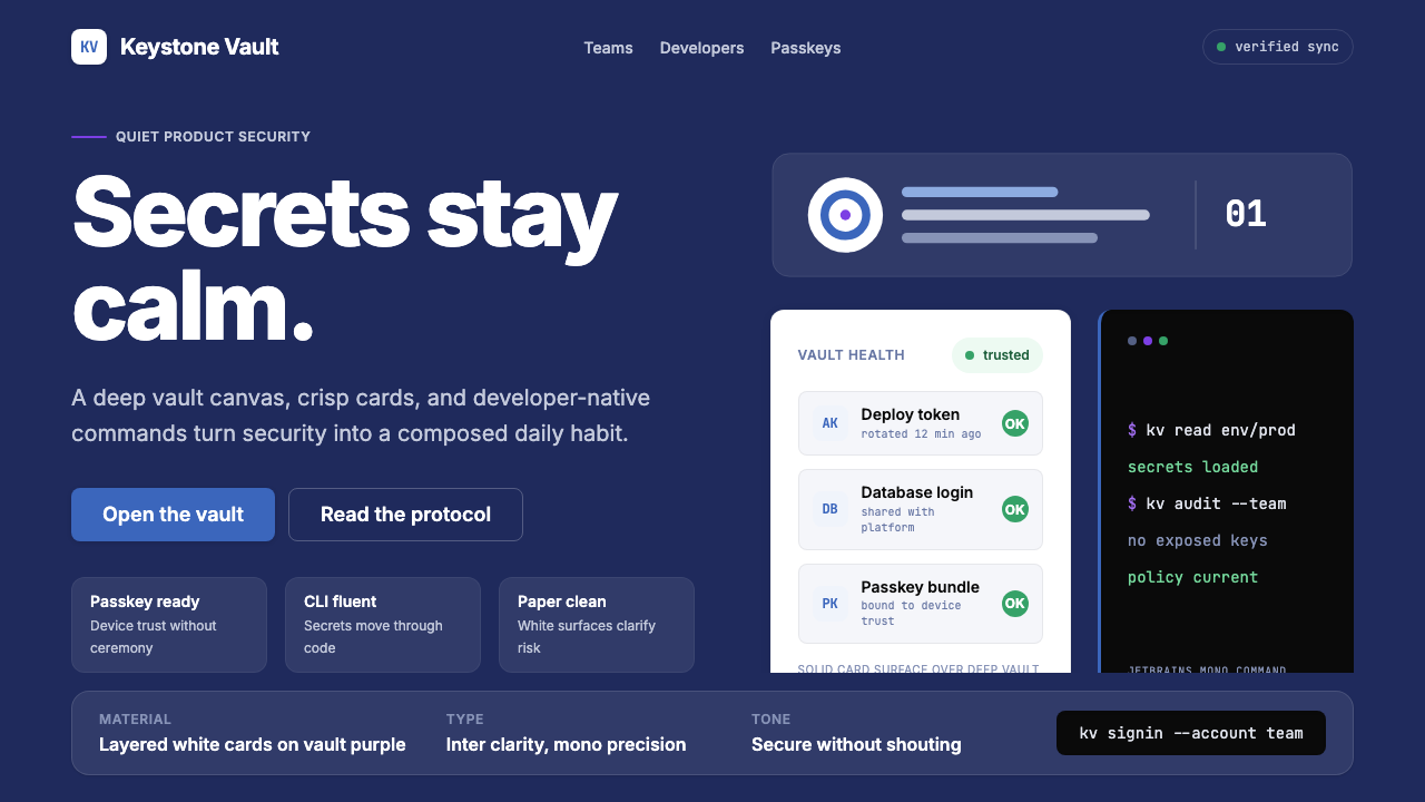
The dominant hue is a deep purple-blue that anchors the dark-mode canvas and the brand's primary identity. It reads as sophisticated and purposeful rather than playful — serious enough to communicate security credibility, yet warm enough to avoid the clinical coldness of navy or slate. On marketing surfaces and hero sections, this purple functions as the primary environment; on content surfaces, it recedes to let white cards hold the foreground.主导色调是一种深邃的紫蓝色,既锚定了深色模式的画布,也构成了品牌主体识别。它读来精致而有目的性,而非活泼——足够严肃,能传递安全可信度,却又足够温暖,不至于显得海军蓝或石板灰那般冰冷。在营销界面和英雄区块中,这抹紫色充当主要环境色;在内容界面中,它退居幕后,让白色卡片占据前景。
Warm Paper Surface温暖纸质底色
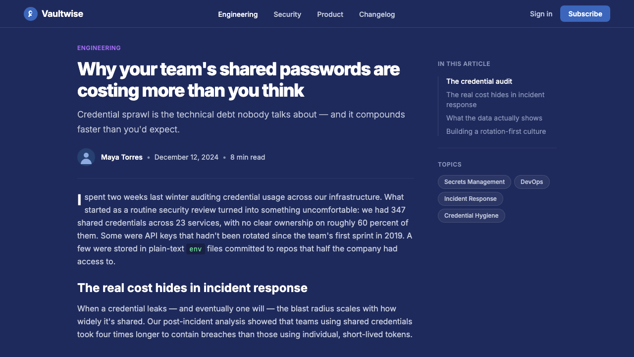
Beneath the vault purple, the secondary surface tone is a warm off-white — closer to natural paper stock than to a pure digital white. This tone appears in light-mode interfaces and in marketing layouts that alternate between dark and light sections. It distinguishes the system from the cold grey neutrals that dominate enterprise software and reinforces the sense that the product is approachable and human-crafted, even in its lightest moments.在保险库紫之下,次级底面色调是一种温暖的米白色——更接近天然纸张,而非纯粹的数字白。这一色调出现在浅色模式界面以及在深浅区块间交替的营销版面中。它使这套系统区别于企业软件中主导一切的冷灰色中性调,强化了产品的亲近感与人工质感——即便在最轻盈的视觉状态下也不例外。
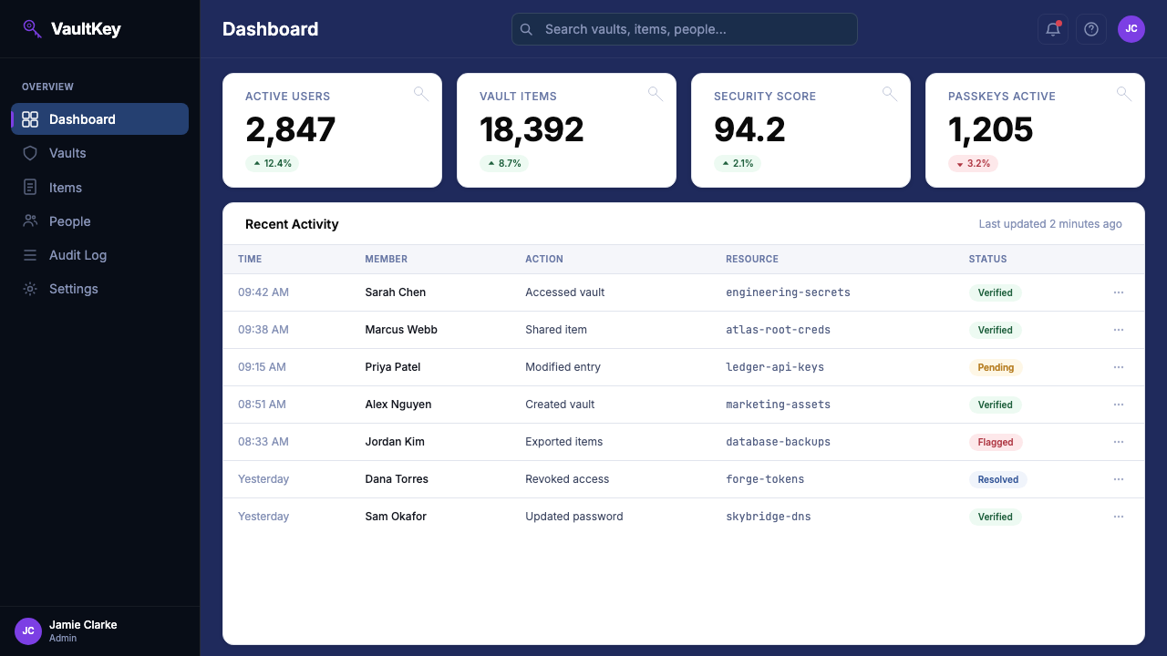
White Content Cards洁白内容卡片
Content is consistently organized into white card containers that float above both the purple and the paper backgrounds. The cards create a reliable hierarchy: the background tells you where you are in the brand experience; the cards tell you what the product contains. Their edges are clean and their corners are modestly rounded — enough to feel modern and approachable without drifting into the soft-edged visual style of wellness or social apps.内容始终被组织进洁白卡片容器中,浮于紫色底面和纸质背景之上。卡片建立起可靠的层级关系:背景告诉你身处品牌体验的哪个位置,卡片告诉你产品包含什么。卡片边缘干净,圆角幅度适度——足够现代且亲近,却不至于滑向健康类或社交类应用那种过度柔软的视觉风格。
Purposeful Typography有目的性的字体排印
The typographic system pairs a clean humanist sans-serif for product and marketing text with a monospaced typeface for developer contexts, code samples, and command-line references. The distinction is deliberate: the humanist face keeps the product accessible and warm; the monospaced face signals the developer-first heritage without imposing it on general audiences. Both faces are deployed at generous scales with clear hierarchical contrast between display and body text.排印系统将一款干净的人文主义无衬线字体(用于产品与营销文本)与一款等宽字体(用于开发者语境、代码示例和命令行引用)搭配使用。这一区分是刻意为之的:人文主义字体使产品保持亲近与温暖;等宽字体则传递出开发者优先的品牌传承,却不会将其强加给普通受众。两款字体均以充裕的字号使用,展示文本与正文之间有清晰的层级对比。
Friendly Illustration友好的插画语言
The illustration system is geometric and rounded — abstract enough to work across different cultural contexts, specific enough to communicate concepts like credential sharing, vault organization, or multi-device sync without photographic literalism. Characters and objects have a gentle, slightly whimsical quality that softens the inherently serious subject matter. Illustrations avoid hard-edged realism; they occupy a register closer to considered product iconography than to editorial or narrative illustration.插画系统几何而圆润——抽象到足以在不同文化语境中通行,具体到足以在不依赖写实摄影的前提下,传达凭证共享、保险库管理或多设备同步等概念。人物与物件具有一种温和、略带俏皮的气质,柔化了主题本身的严肃性。插画回避硬边写实主义,其气质更接近经过深思熟虑的产品图标,而非编辑插图或叙事插图。
Restrained Color Accent克制的强调色
Beyond the core purple and paper tones, accent colors are used sparingly and functionally — to mark interactive elements, signal states, or differentiate tiers in pricing and plan contexts. The system avoids palette proliferation: additional hues appear at reduced saturation and serve semantic rather than decorative purposes. This restraint ensures the vault purple retains its identity as the unambiguous brand color, rather than competing with a rainbow of secondary accents.在核心紫色和纸质色调之外,强调色的使用极为节制且功能性——用于标记交互元素、传达状态,或在定价和套餐语境中区分层级。这套系统避免色板扩张:额外色相以较低饱和度出现,服务于语义目的而非装饰目的。这种克制确保了保险库紫能够保持其明确的品牌色地位,不必与一系列次级强调色竞争。
Elevated Shadow and Depth提升感的投影与深度
The card-and-canvas model relies on subtle but meaningful depth cues. Shadows beneath white cards are soft and diffuse — they lift the content layer off the background without dramatic contrast, maintaining the overall sense of calm. This is notably different from both the flat-design conventions of the early 2010s (no shadows at all) and the skeuomorphic era (heavy, literal shadows). The shadows here serve orientation, not drama.卡片与画布并置的模型依赖于微妙但有意义的深度线索。白色卡片下方的投影柔和而漫射——它们将内容层从背景中轻轻托起,而不产生强烈对比,维护着整体的从容感。这与 2010 年代初的扁平设计惯例(完全无投影)和拟物化时代(厚重、写实的投影)都有明显区别。这里的投影服务于空间方位感,而非戏剧性效果。
See the 1Password Purple Vault design system →查看 1Password Purple Vault 完整设计系统 →
Who shaped 1Password Purple Vault?谁塑造了 1Password Purple Vault?
Co-founder of AgileBits and the original creator of 1Password, Teare built the first version as a tool for his own productivity needs while working in Toronto's Apple developer community. His orientation toward thoughtful, native-feeling software established the product's early character: meticulous attention to detail, deep integration with platform conventions, and a design ethos that prioritized the user's trust above visual trend-following. That founding sensibility persists in the brand's commitment to coherence over novelty.AgileBits 联合创始人、1Password 的最初创建者。Teare 在多伦多苹果开发者社区工作期间,将第一版作为满足自身效率需求的工具构建出来。他对深思熟虑、与平台原生融合的软件的热情,奠定了产品的早期性格:对细节的严格把控、对平台惯例的深度遵循,以及将用户信任置于视觉潮流追随之上的设计理念。这种创始感性至今仍体现在品牌对连贯性而非新奇感的坚持上。
Co-founder and long-serving CTO of AgileBits, Karimov shaped the technical architecture that made 1Password's end-to-end encryption model credible and verifiable — a foundation without which the design language would carry no authentic trust signal. His work on the Secret Key system and the secure remote password protocol established security standards that the brand has consistently communicated, and the product's visual restraint reflects the same philosophy applied to interface: nothing unnecessary, everything deliberate.AgileBits 联合创始人、长期担任 CTO 的 Karimov 塑造了技术架构,使 1Password 的端对端加密模型成为可信且可验证的现实——没有这一基础,视觉语言所携带的信任信号便无从建立。他在“密钥”(Secret Key)系统与安全远程密码协议上的工作树立了安全标准,而品牌始终在传达这些标准;产品在视觉上的克制,正是同一哲学在界面层的体现:去除一切不必要的,使一切存在的都有其意义。
CEO of AgileBits since 2012, Shiner led the company's transformation from a niche Mac utility into a multi-platform subscription business serving millions of households and enterprises. The 2023 brand refresh happened under his direction and reflects his articulated belief that security products should earn trust through transparency and clarity rather than through intimidation and technical mystification. The shift from blue-gradient security conventions to vault-purple calm was a strategic brand decision as much as a visual one, positioning 1Password for the passkey era.自 2012 年起担任 AgileBits CEO,Shiner 领导了公司从小众 Mac 工具到服务数百万家庭与企业的多平台订阅业务的转型。2023 年的品牌焕新在他的主导下完成,体现了他明确表达的信念:安全产品应当通过透明度与清晰度赢得信任,而非通过威吓与技术神秘化。从蓝色渐变安全惯例转向保险库紫的从容,既是视觉决策,也是战略品牌决策——为 1Password 在通行密钥时代的定位奠定基础。
The 2023 identity refresh was the work of the in-house AgileBits design team, working in close collaboration with brand and motion partners. Rather than outsourcing the identity to an external agency, AgileBits built the system internally — a decision consistent with the company's engineering-led culture and its preference for depth of understanding over surface polish. The result is a design system that scales from icon to billboard, from onboarding flow to command-line reference documentation, with unusual coherence.2023 年的视觉焕新是 AgileBits 内部设计团队与品牌和动效合作伙伴紧密协作的成果。AgileBits 选择在内部构建这套系统,而非将品牌识别外包给外部机构——这一决定与公司工程师主导的文化以及对深度理解胜过表面光泽的偏好一脉相承。最终呈现的设计系统以罕见的连贯性,贯穿从图标到广告牌、从引导流程到命令行参考文档的每一个尺度。
Toronto's technology community, which grew substantially through the 2010s and early 2020s, provided the cultural environment for 1Password's aesthetic evolution. The city's product studios — working at the intersection of consumer software, developer tooling, and design systems — developed a recognizable sensibility: warm, considered, technically rigorous, and deliberately distinct from the high-energy visual style of Silicon Valley. 1Password's calm, vault-purple identity is partly a product of that local culture, which prized durability and craft over attention-seeking.多伦多的科技社区在 2010 年代至 2020 年代初期大幅扩张,为 1Password 的美学演变提供了文化土壤。这座城市的产品工作室——活跃在消费软件、开发工具与设计系统的交汇处——发展出一种可辨识的气质:温暖、深思熟虑、技术严谨,并刻意有别于硅谷充满能量的视觉风格。1Password 从容的保险库紫身份认同,在一定程度上正是这种地方文化的产物——这种文化珍视耐久性与工艺,而非哗众取宠。
How do you use 1Password Purple Vault today?今天怎么用 1Password Purple Vault?
The 1Password Purple Vault aesthetic translates well to any context where trust, security, and calm expertise are the primary values being communicated. Its core logic — dark anchoring surface, white content cards, warm secondary tones, and restrained accent use — is transferable to presentation decks, web product interfaces, marketing layouts, and editorial design. The key is maintaining the hierarchy: the purple sets the stage, the white cards hold the content, and everything else serves one of those two layers.1Password 紫色保险库美学能良好迁移至任何以信任、安全与从容专业感为主要传达价值的场景。其核心逻辑——深色锚定底面、白色内容卡片、温暖次级色调与克制的强调色使用——可应用于演示文稿、网页产品界面、营销版面与编辑设计。关键在于维持层级:紫色搭建舞台,白色卡片承载内容,其余一切服务于这两个层次之一。
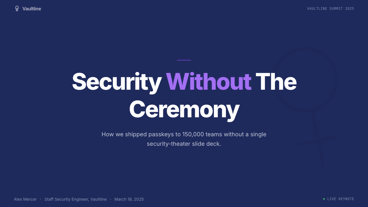
For presentation slides, the style works best when used with conviction. A cover built on the vault-purple canvas with a single, well-placed white card for the title and subtitle creates an immediate sense of authority. Content slides should lean into the card metaphor: each key point or data visualization sits in its own white container, with the purple canvas providing visual continuity between slides. For data-heavy decks, the warm paper tone works well as an alternative slide background — it provides relief from the deep purple while maintaining tonal coherence, and it allows charts and tables to sit cleanly without competing with a saturated background.用于演示文稿时,这种风格在坚定使用时效果最佳。以保险库紫画布为底、配合单张位置得当的白色卡片呈现标题与副标题的封面,能立刻建立权威感。内容页应充分利用卡片隐喻:每个关键观点或数据可视化置于各自的白色容器中,紫色画布则在幻灯片之间提供视觉连贯性。对于数据密集型演示,温暖纸质底色可作为替代背景色——它在维持整体色调一致性的同时,从深紫中提供视觉喘息,并让图表与表格清晰落座,不必与饱和背景竞争。
For web interfaces and dashboards, the style is particularly well suited to settings pages, account management interfaces, and security dashboards where calm legibility matters more than visual excitement. The white-card-on-dark-purple structure naturally creates depth and hierarchy without relying on complex visual treatments. Navigation and sidebar elements can carry the purple at reduced opacity or as a tinted surface, keeping the primary canvas color present without overwhelming interface chrome. Input fields and form elements work best as light-on-light — white fields on the paper tone, with purple reserved for active and focused states.用于网页界面与仪表板时,这种风格尤其适合设置页面、账户管理界面和安全仪表板——这些场景中从容的可读性比视觉刺激更为重要。白色卡片置于深紫底面的结构,自然地建立起深度与层级,无需依赖复杂的视觉处理。导航与侧边栏元素可以以降低透明度的紫色或着色底面呈现,在不压制界面元素的前提下延续主画布色调的存在感。输入框与表单元素最适合在浅色基础上呈现——纸质底色上的白色输入框,紫色保留给激活与聚焦状态。
In editorial and marketing applications, the style supports both long-form trust-building content and punchy feature announcements. For long-form pieces — security explainers, how-to guides, or transparency reports — the warm paper background with dark type provides a readable, unhurried reading experience. For feature launches or campaign pages, the full vault-purple canvas with white card callouts and a single accent color for calls to action delivers the confident punch the style is capable of. A useful structural move is alternating sections between purple-canvas and paper-tone backgrounds, which creates rhythm across a long marketing page without introducing new colors.在编辑与营销应用中,这种风格既支持长篇信任建立内容,也支持有力的功能发布页面。对于长篇内容——安全解说、操作指南或透明度报告——温暖纸质背景配合深色文字,提供可读且不慌不忙的阅读体验。对于功能发布或活动页面,以完整的保险库紫画布、白色卡片引文框,加上单一强调色行动号召,能呈现这种风格所具备的自信冲击力。一个实用的结构手法是在紫色画布区块与纸质底色区块之间交替,为长篇营销页面制造节奏感,同时不引入新的色彩。
The most common mistake when working with this aesthetic is treating the vault purple as merely decorative — using it as a background pattern, a border accent, or a gradient ingredient — rather than committing to it as the primary environmental layer. Another frequent error is reaching for additional colors to add visual energy: because the palette is deliberately restrained, the temptation is to supplement it. Resist this. The power of the system comes from its editorial discipline. When in doubt, add another white card, not another color.运用这种美学时最常见的错误,是将保险库紫视为纯粹的装饰元素——用作背景图案、边框强调或渐变成分——而非将其作为主要环境层去全情投入。另一个频繁出现的错误是为增加视觉活力而引入更多色彩:正因为这套色板是刻意克制的,补充它的诱惑难以抵抗。请抵抗这种诱惑。这套系统的力量来自其编辑纪律。拿不准时,再加一张白色卡片,而非再加一种颜色。
See the 1Password Purple Vault design system →查看 1Password Purple Vault 完整设计系统 →
1Password Purple Vault — FAQ1Password Purple Vault · 常见问题
Is this style only suited to security or technology products?这种风格只适合安全或科技类产品吗?
Not exclusively, though that is where it is most immediately recognizable. The vault-purple identity works for any product or service where trust, reliability, and calm expertise are the primary values. Financial products, legal services, healthcare platforms, and professional productivity tools can all adapt the aesthetic effectively. What matters is whether the core message is 'we are competent and dependable' — the style amplifies that message. It works less well for products seeking to project energy, playfulness, or youthful spontaneity, where a lighter palette and more expressive forms would be more honest.并非如此,尽管这是它最直接被辨认出来的场景。保险库紫识别系统适用于任何以信任、可靠性与从容专业感为主要价值的产品或服务。金融产品、法律服务、医疗平台与专业生产力工具都能有效采用这套美学。关键在于核心信息是否是“我们有能力且可信赖”——这种风格会放大这一信息。它不太适合试图传达活力、趣味或年轻自发感的产品,这类场景中更轻盈的色板与更富表现力的形式才是更诚实的选择。
How does this style differ from generic dark-mode design?这种风格与通用的深色模式设计有何不同?
Generic dark mode typically inverts a light-mode interface, replacing white backgrounds with near-black or very dark grey, and adjusting text and icon colors for legibility. The 1Password approach is distinct in that the dark surface is not a neutral grey but a purposeful, warm purple that carries brand identity. The white card system creates genuine layering rather than merely flipping tones. And the warm paper surface offers a counterpoint — a light-mode equivalent that shares the same palette family rather than feeling like an entirely different product. The result is a coherent dual-mode system rather than an afterthought dark toggle.通用深色模式通常是对浅色界面的反转——将白色背景替换为近黑或极深灰色,并调整文字与图标颜色以保证可读性。1Password 的方法截然不同:深色底面不是中性的灰,而是携带品牌识别的、有目的性的暖紫色。白色卡片系统创造出真实的层次感,而非仅仅翻转色调。温暖纸质底色则提供了对应的另一极——一种浅色模式,与整体色板属于同一家族,而非感觉像完全不同的产品。最终呈现的是一套连贯的双模式系统,而非事后补添的深色开关。
Can this aesthetic work for consumer audiences, or is it too serious?这种美学能面向消费者受众吗,还是太过严肃?
The 1Password identity was explicitly designed to work for consumer audiences — families, non-technical individuals, and casual users as much as developers and enterprise IT teams. The warmth of the paper tones, the friendly rounded illustration system, and the generous whitespace prevent the vault-purple from reading as austere or intimidating. The key is calibrating the balance: heavy purple coverage with tightly packed content tips into seriousness; a lighter use of the purple as a canvas accent with predominantly card-based content stays accessible. For family-oriented or onboarding contexts, favor the paper tone as the dominant surface and use purple as accent.1Password 的视觉识别被明确设计为能面向消费者受众使用——家庭用户、非技术性个体与普通用户,与开发者和企业 IT 团队同等重要。纸质底色的温暖感、友好圆润的插画系统,以及充裕的留白,防止了保险库紫被解读为严苛或令人生畏。关键在于把握平衡:大面积紫色覆盖加上紧凑内容布局会倾向严肃;以紫色为画布点缀、以卡片内容为主则保持了亲近感。对于面向家庭或引导流程的场景,以纸质底色为主要底面,将紫色用作强调色。
How should illustration be used within this style?在这种风格中应当如何使用插画?
Illustration in the 1Password system serves to explain complex or abstract concepts — vault organization, credential sharing, cross-device sync, passkey authentication — in ways that photography cannot do well without becoming either clichéd or literally inaccurate. The illustration style is geometric and approachable, with rounded forms that signal friendliness without being childish. When adapting the style, treat illustration as a clarifying layer rather than a decorative one: each illustration should answer a specific question the user might have, not simply add visual warmth. Avoid photographic imagery; it breaks the system's tonal consistency and introduces naturalistic depth that contradicts the flat card model.1Password 系统中的插画,服务于解释复杂或抽象概念的目的——保险库管理、凭证共享、跨设备同步、通行密钥验证——这些概念以摄影方式呈现,要么流于陈腐,要么字面上不够准确。插画风格几何而亲近,圆润的形态传递友好感,却不显幼稚。在应用这种风格时,将插画视为清晰化层次,而非装饰层次:每张插画都应回答用户可能提出的某个具体问题,而非单纯增添视觉温度。避免使用摄影图像;它会打破系统的色调一致性,并引入与平面卡片模型相悖的写实深度。
What is the right approach for light mode versus dark mode in this style?在这种风格中,浅色模式与深色模式应当如何各自处理?
The two modes are not mirrors of each other but siblings with a shared palette. Dark mode leads with the vault purple as the primary canvas and uses white cards as the primary content surface. Light mode leads with the warm paper tone as the primary canvas and uses white as the card surface — a subtler differentiation, but one that maintains the card-and-canvas logic. In both cases, the vault purple should appear as an accent in the opposing mode: as a background splash or section header in light mode, as a tinted surface for secondary navigation or sidebar elements in dark mode. Mixing the two modes mid-page — dark purple hero section transitioning to paper-tone content section — is a common and effective pattern in marketing contexts.两种模式不是彼此的镜像,而是共享同一色板的兄弟。深色模式以保险库紫作为主要画布,白色卡片为主要内容底面。浅色模式以温暖纸质色调作为主要画布,白色作为卡片底面——区分更为微妙,但维持了卡片与画布并置的逻辑。在两种模式中,保险库紫都应在对立模式中作为强调色出现:在浅色模式中以背景点缀或区块标题呈现,在深色模式中以着色底面用于次级导航或侧边栏元素。在营销场景中,将两种模式在同一页面内混合使用——深紫英雄区块过渡至纸质色调内容区块——是一种常见且有效的模式。
Related design styles相关设计风格
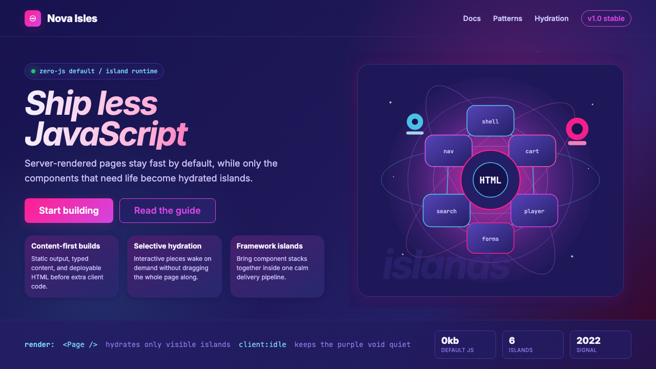 Astro Islands Architecture 2022Warm cosmic devtools. Deep violet, magenta glow, Inter clarity, and island ge…温暖的宇宙开发感:深紫底、洋红光、Inter 字体与岛屿几何。
 Stripe 2024Trust earns its glow. Indigo mesh, neutral type, and whisper cards float on n…信任自带微光:近白底上的靛蓝渐变、中性字体与轻影卡片。
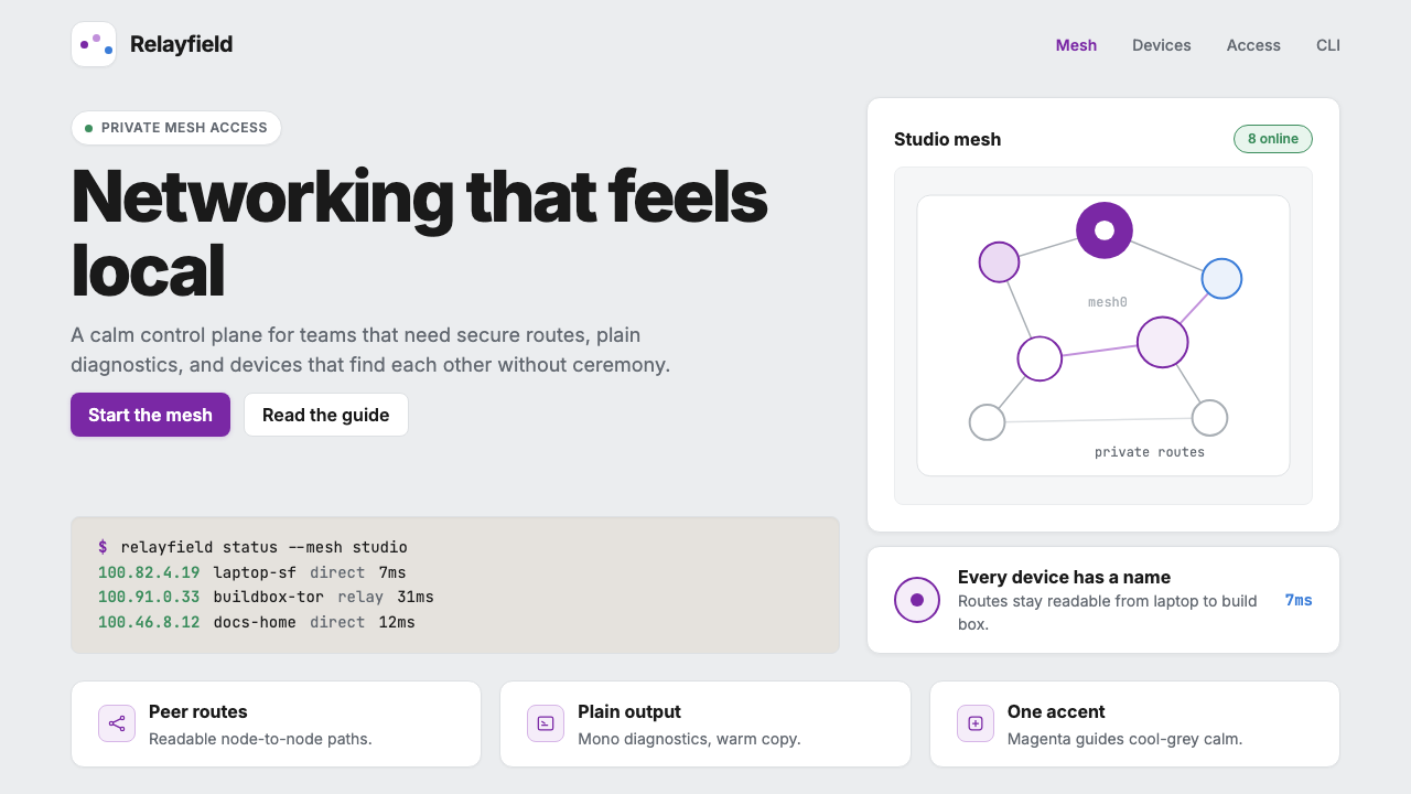 Tailscale Mesh VPN 2024Friendly infrastructure. Cool grey cards, magenta mesh nodes, and mono CLI bl…亲切的基础设施:冷灰卡片、品红节点和等宽命令行。
 AsanaCalm productivity breathes. Cream canvas, lavender panels, coral-blue-yellow…安静生产力会呼吸:奶油画布、薰衣草面板与三色圆点。
 GitLab 2023DevOps in daylight. Tanuki orange-to-purple gradient, Inter, warm enough for…DevOps 走出暗色房间:标志性狸猫橙紫渐变、宽松行高、Inter 字体——…
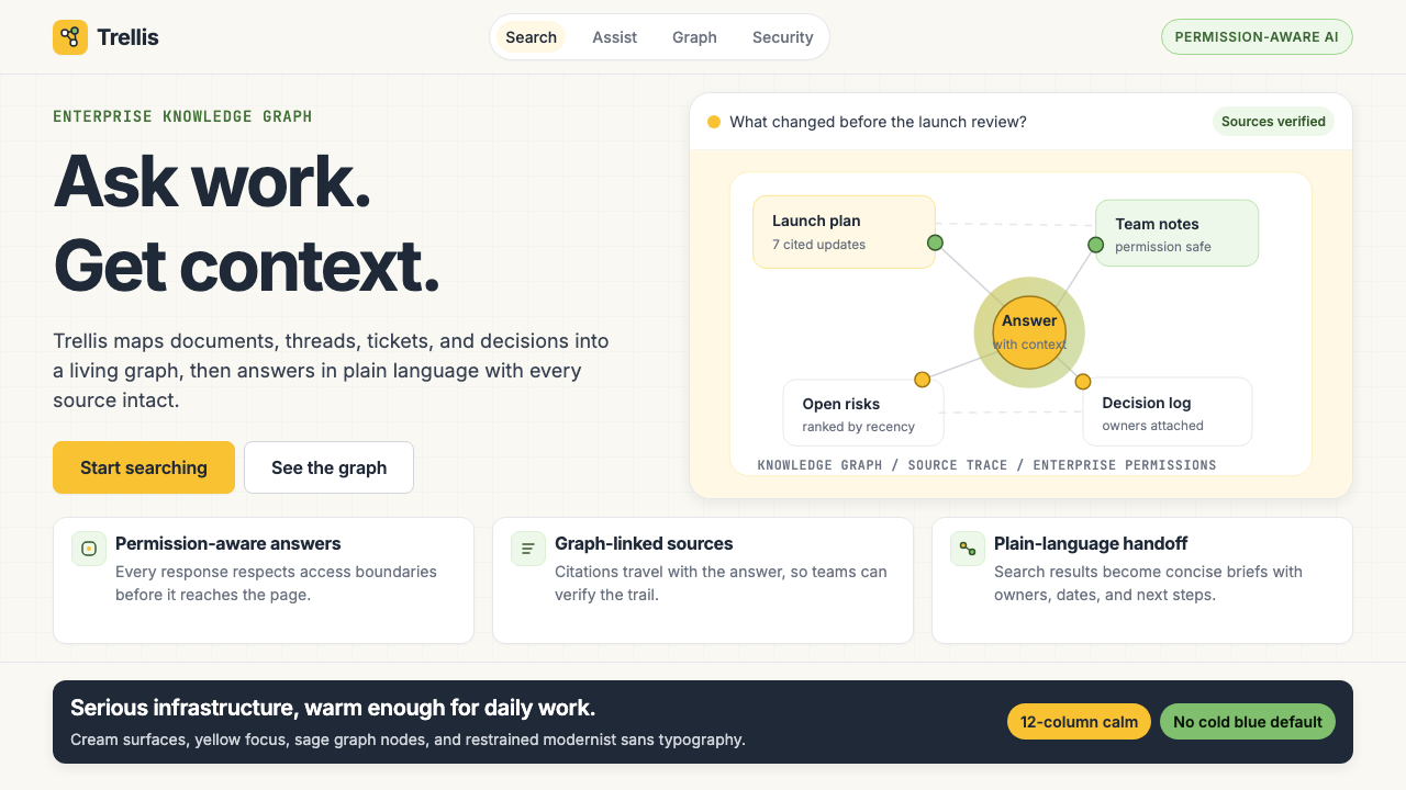 Glean Enterprise-SearchWarm enterprise AI. Cream ground, yellow focus, sage graph nodes, and sans ca…温暖的企业 AI:奶油底、黄焦点、鼠尾草节点与无衬线克制。