Design style guide设计风格指南
What is Tailscale Mesh VPN 2024?什么是 Tailscale Mesh VPN 2024?
Tailscale made networking infrastructure feel approachable — pairing a single vivid magenta accent with cool-grey calm, hand-drawn capybaras with precise terminal output, and generous whitespace with serious technical credibility.Tailscale 让网络基础设施变得亲切——一抹鲜活的品红与冷灰的平静并存,手绘水豚与精确的终端输出比邻,大量留白中藏着真正的技术分量。
Tailscale Mesh VPN 2024 in briefTailscale Mesh VPN 2024 速览
Tailscale Mesh VPN 2024 is a brand and interface visual language developed by Tailscale, a Canadian networking company that wrapped the WireGuard protocol in a consumer-friendly control plane. Its design identity emerged gradually between 2023 and 2025 as the product matured from a developer curiosity into a widely adopted zero-trust networking platform. The aesthetic result is something rare in infrastructure software: a system that reads as technically rigorous and humanly inviting at the same time.Tailscale Mesh VPN 2024 是加拿大网络公司 Tailscale 发展出的品牌与界面视觉语言。该公司在 WireGuard 协议之上架了一个面向消费者的控制平面,其设计身份在 2023 至 2025 年间随产品从开发者玩具演变为广泛采用的零信任网络平台而逐步成形。最终呈现出基础设施软件领域罕见的视觉成就:一套既严谨又亲切的视觉系统。
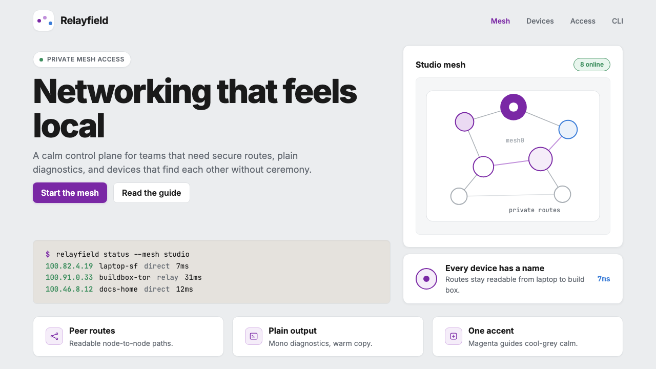
The visual system is built around a single dominant accent — a warm magenta-pink that functions as the network's pulse — set against a foundation of cool greys, off-whites, and generous negative space. Rounded cards organize information into digestible clusters. Monospaced blocks of network diagnostics and command-line output appear throughout the interface and marketing materials, treated not as intimidating technical detritus but as proof of craft. The combination signals a company that takes networking seriously and itself not too seriously.整套视觉体系围绕一个主导强调色构建——温暖的品红紫,像网络的脉搏一样跳动——以冷灰、近白和大量留白为底。圆角卡片把信息组织成易于消化的单元。等宽的网络诊断块和命令行输出贯穿界面与营销物料,但被处理成工艺的证明,而非令人望而生畏的技术废料。这种组合传递的信号是:做网络认真,做派头不认真。
What distinguishes this aesthetic from generic developer-tool branding is its tonal self-awareness. Infrastructure products typically default to enterprise navy, fortress-grey, or aggressive dark-mode opacity. Tailscale chose warmth and openness instead: light backgrounds, soft shadows, and an illustrated mascot — a hand-drawn capybara created by illustrator Maya Shavin — that appears throughout the brand without undermining its credibility. The capybara is not decoration; it is a character, and its presence communicates that the people building this product understand the difference.这套美学之所以区别于普通的开发者工具品牌,在于它有清醒的自我认知。基础设施产品通常默认企业海军蓝、堡垒灰或咄咄逼人的深色不透明风格。Tailscale 选择了温暖与开放:浅色背景、柔和阴影,以及插画师 Maya Shavin 绘制的手绘水豚吉祥物——它出现在品牌的各个角落,却没有损害产品的可信度。水豚不是装饰;它是一个角色,它的存在传达出:造这个产品的人,懂得其中的分寸。
See the Tailscale Mesh VPN 2024 design system →查看 Tailscale Mesh VPN 2024 完整设计系统 →
Where does Tailscale Mesh VPN 2024 come from?Tailscale Mesh VPN 2024 从何而来?
Tailscale was founded in Toronto in 2019 by Avery Pennarun and David Crawshaw, both formerly of Google, alongside David Carney. The core technical premise was elegant: use WireGuard, a modern cryptographic tunneling protocol, as the data plane, and build a cloud-managed control plane that handled key distribution, device authentication, and network topology automatically. The result was a mesh VPN that required no central gateway and almost no configuration. You installed it, you logged in, your devices found each other.Tailscale 由曾在谷歌任职的 Avery Pennarun、David Crawshaw 与 David Carney 于 2019 年在多伦多共同创立。其核心技术前提简洁优雅:以现代密码学隧道协议 WireGuard 作为数据平面,构建一个云端管理的控制平面,自动处理密钥分发、设备认证与网络拓扑。结果是一个无需中央网关、几乎无需配置的 mesh VPN——安装好,登录,设备自动互相发现。
The early product had minimal visual design — a functional web interface and a tray icon. As the company grew and the product expanded beyond its initial developer audience, the need for a coherent brand identity became apparent. The visual language that emerged during 2023 and 2024 was shaped partly by the product's values (simplicity, trust, openness) and partly by a deliberate rejection of the visual conventions of enterprise networking, which had long favored imagery of locked vaults, impenetrable shields, and dark command centers.早期产品几乎没有视觉设计可言——一个功能性的 Web 界面和一个托盘图标。随着公司壮大,产品受众从最初的开发者群体向外扩展,建立连贯品牌身份的需求变得迫切。2023 至 2024 年间成形的视觉语言,一半由产品价值观塑造(简洁、信任、开放),一半来自对企业网络视觉惯例的刻意背离——那个领域长期钟爱密封金库、坚不可摧的盾牌与昏暗指挥中心的形象。
Maya Shavin joined the effort as a designer and illustrator, bringing the capybara mascot to life. The capybara was not a random choice: capybaras are known for their unusual sociability — they get along with nearly every other animal, a quality that maps neatly onto a mesh networking product that connects heterogeneous devices across any network. The mascot gave the brand a face and a personality that none of its competitors had attempted.Maya Shavin 以设计师和插画师的身份加入,将水豚吉祥物带到生活中。水豚不是随意的选择:水豚以不寻常的社交性著称——几乎能与所有其他动物和平相处,这种特质与一款将各类异构设备跨网络连接在一起的 mesh 产品不谋而合。这个吉祥物赋予了品牌一张面孔和一种个性,而这是任何竞争对手都未曾尝试的。
The magenta accent color was chosen for its distinctiveness within a category dominated by blues, greens, and corporate greys. Magenta sits at the boundary between red and violet, reading as simultaneously energetic and sophisticated — qualities that suited a product trying to bridge the gap between serious infrastructure and accessible tooling. Against the cool-grey neutral foundation, a single magenta signal does all the necessary work without requiring a complex multi-color system.品红色的选择,在于它在一个被蓝色、绿色和企业灰主导的品类中具有鲜明的辨识度。品红介于红与紫之间,同时传递出活力与精致——这正是一款试图在严肃基础设施与易用工具之间架桥的产品所需的气质。在冷灰的中性底色上,一道品红信号完成所有必要的视觉引导工作,无需构建复杂的多色系系统。
What defines the Tailscale Mesh VPN 2024 look?Tailscale Mesh VPN 2024 的视觉特征是什么?
Single-Accent Color Logic单强调色逻辑
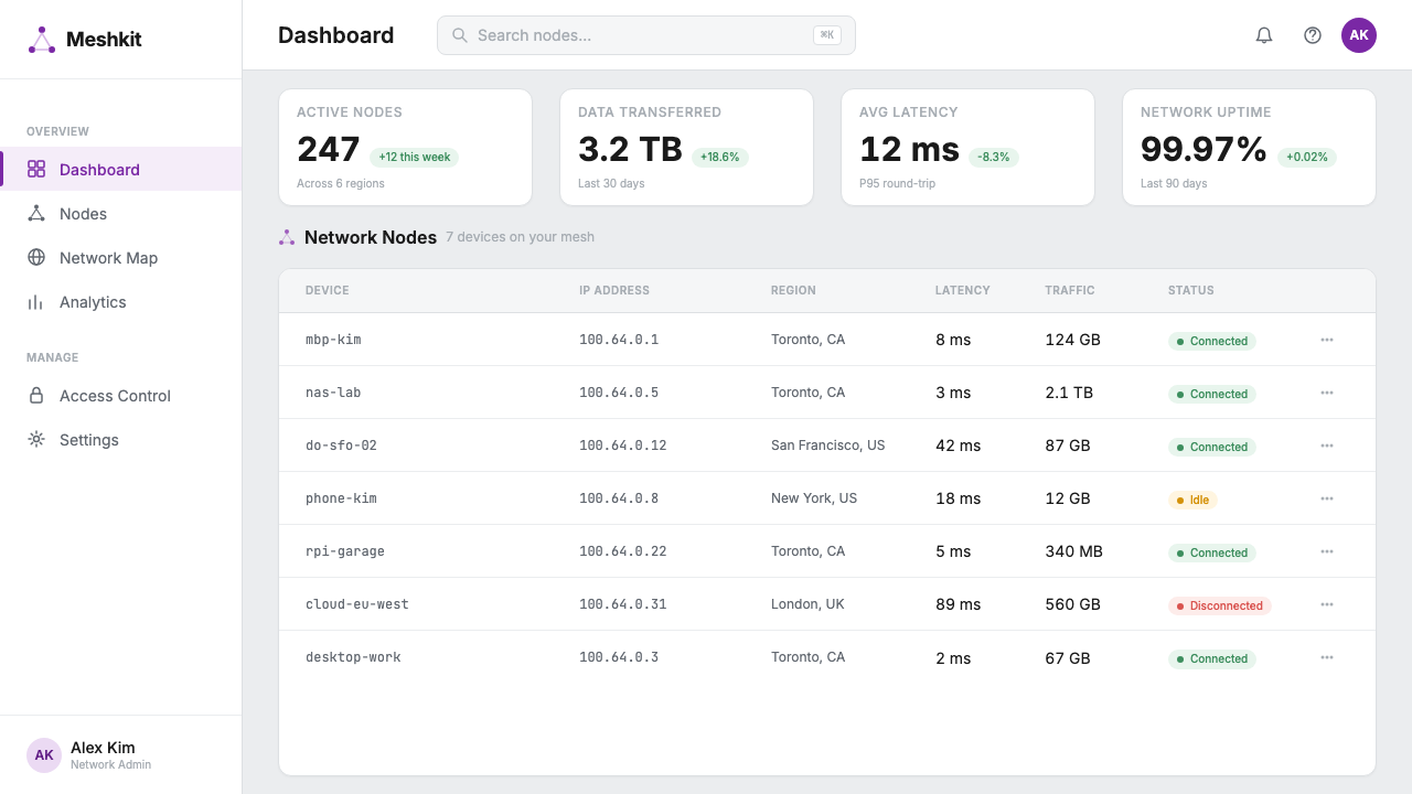
The system relies on one bold chromatic statement — a warm magenta-pink — to carry all active, interactive, and brand-forward meaning. Everything else defers to a range of cool greys, near-whites, and black. This economy of color means the accent never competes with itself; when it appears, it is always a signal, never noise. The discipline produces interfaces that feel calm at rest and responsive in action.整套系统依靠一种大胆的色彩表达——温暖的品红紫——承担所有主动的、交互的和品牌前台的意义。其余一切退让给一系列冷灰、近白与黑色。这种色彩经济学意味着强调色从不与自身竞争;当它出现时,永远是信号,从不是噪音。这种自律让界面在静止时感觉平静,在交互时感觉敏锐。
Rounded Cards and Soft Containment圆角卡片与柔性容器
Information is organized into cards with generously rounded corners and quiet drop shadows that lift the surface slightly off the background without announcing themselves dramatically. The rounding is consistent and deliberate — it softens what could otherwise be a cold, clinical grid into something that feels handled and considered. Shadow depth is restrained: just enough separation to establish hierarchy, not enough to create theatrical depth.信息被组织进圆角慷慨、投影轻柔的卡片中,卡片微微浮于背景之上,但不刻意张扬。圆角是一致而刻意的——它把原本可能显得冷漠、临床的网格柔化成有手感、经过斟酌的形态。投影深度克制:恰好足以建立层级,却不足以制造戏剧性的纵深。
Monospaced Blocks as Aesthetic Elements等宽块作为美学元素
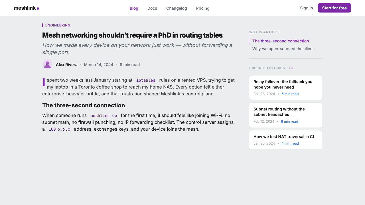
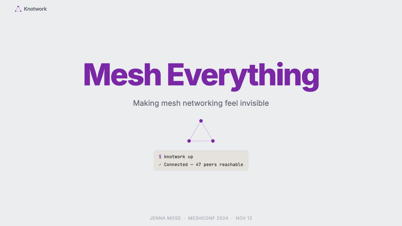
Terminal output, configuration snippets, network diagnostics, and command examples appear throughout the visual system, rendered in monospaced type against lightly tinted backgrounds. Rather than being tucked away in documentation, these blocks are treated as design features — evidence of the product's technical seriousness and a direct address to an audience that reads code. Their consistent visual treatment — distinct background, subtle border, small label — makes them immediately legible as a class of content.终端输出、配置片段、网络诊断和命令示例贯穿整套视觉体系,以等宽字体呈现在轻度着色的背景上。这些块不是被藏进文档,而是作为设计特征展示——产品技术严肃性的证据,也是对懂得读代码的受众的直接呼应。一致的视觉处理——独特的背景、微妙的边框、小号标签——让它们立刻作为一类内容被识别。
Illustrative Character Work插画角色语言
The hand-drawn capybara mascot occupies a specific tonal register: loose, warm, and slightly whimsical without becoming cartoonish or undermining trust. Maya Shavin's illustration style uses gentle line work and limited color, integrating with the cool-grey system without overwhelming it. The character appears in onboarding, empty states, error pages, and marketing — always deployed purposefully, never as filler.手绘水豚吉祥物占据一种特定的情感频道:松弛、温暖,略带奇趣,却不变成卡通风格,也不损害信任感。Maya Shavin 的插画风格线条轻柔、用色节制,与冷灰系统融合而不喧宾夺主。这个角色出现在引导流程、空状态、报错页面和营销物料中——始终有目的地部署,从不作为填充物。
Generous Whitespace and Breathing Room慷慨的留白与呼吸空间
The layouts are open and unhurried. Padding around cards, sections, and type is notably ample — the kind of spacing that communicates confidence rather than anxiety about real estate. Dense interfaces pack in maximum information per pixel; this system does the opposite, trusting that clarity at a glance is worth the space it costs. The result feels less like a control panel and more like a well-organized workspace.版面是开阔而不急促的。卡片、段落和文字周围的留白明显充裕——这种间距传递的是自信而非对空间的焦虑。密集界面追求每像素最大信息量;这套系统走的是反方向,相信一目了然的清晰度值得它所占用的空间。结果不像控制面板,更像一个整理得当的工作台。
Cool-Grey Neutral Foundation冷灰中性底色
The underlying palette is built on cool, slightly blue-shifted greys rather than warm or neutral ones. This chromatic orientation gives the system a technical, precise feeling that suits a networking product — the same quality found in precision instruments and well-calibrated monitors. Against this cool foundation, the magenta accent reads as warm and human, creating a subtle but effective tension between the technological and the approachable.底层色板建立在偏冷、略带蓝调的灰色上,而非暖灰或中性灰。这种色彩取向赋予系统精准、技术性的质感,契合一款网络产品——与精密仪器和校准良好的显示器共有同一种气质。在这片冷灰底色上,品红强调色显得温暖而人性化,在科技感与亲近感之间制造出微妙而有效的张力。
Typography as Clear Hierarchy字体排印作为清晰层级
Type is set in a clean, humanist sans-serif for all editorial and interface content, with monospaced faces reserved strictly for technical content. The scale relationship between display text, headings, body, and labels is generous and unambiguous — you always know what level of information you are reading. Labels and metadata adopt a quieter weight; calls to action are direct and short. The system avoids decorative typographic moves entirely.所有编辑和界面内容使用干净的人文主义无衬线字体排版,等宽字体严格保留给技术内容。展示文字、标题、正文和标签之间的尺度关系慷慨而明确——你始终知道自己在读哪个层级的信息。标签和元数据采用较轻的字重;行动号召简短直接。整套系统完全回避装饰性的排版动作。
See the Tailscale Mesh VPN 2024 design system →查看 Tailscale Mesh VPN 2024 完整设计系统 →
Who shaped Tailscale Mesh VPN 2024?谁塑造了 Tailscale Mesh VPN 2024?
Pennarun co-founded Tailscale and serves as CEO. His background at Google, where he worked on infrastructure networking, shaped the product's foundational premise: that the complexity of mesh VPN setup was an engineering problem with an engineering solution. His public writing — including widely-shared technical blog posts — established Tailscale's voice as thoughtful and direct, qualities that carried into the brand's visual communication.Pennarun 是 Tailscale 的联合创始人兼 CEO。他在谷歌从事基础设施网络的经历塑造了产品的核心前提:mesh VPN 的配置复杂性是一个工程问题,有工程解法。他广受传播的技术博客文章确立了 Tailscale 的声音基调——深思熟虑、直截了当——这些品质延伸进了品牌的视觉传达。
Crawshaw co-founded Tailscale and served as CTO. His engineering leadership drove the architectural decisions — particularly the choice of WireGuard as the data plane — that made the product's simplicity possible. The cleanness of the technical architecture has a direct analogue in the visual system: both favor doing less, better, over doing more with complexity.Crawshaw 是 Tailscale 的联合创始人兼 CTO。他的工程领导力推动了架构决策——特别是选择 WireGuard 作为数据平面——使产品的简洁性成为可能。技术架构的干净利落与视觉系统有直接的对应关系:两者都倾向于把少数事情做到极致,而不是用复杂度堆砌更多功能。
Shavin is the illustrator and designer responsible for the capybara mascot and the illustrated dimension of the Tailscale brand. Her work demonstrates how character illustration can operate as a genuine design system component rather than a marketing afterthought. The mascot appears consistently across product surfaces — onboarding, error states, promotional materials — with enough visual restraint to coexist with technical content without destabilizing it.Shavin 是水豚吉祥物及 Tailscale 品牌插画维度的插画师和设计师。她的工作展示了角色插画如何作为真正的设计系统组件运作,而非营销的事后补丁。吉祥物一致地出现在产品各个界面——引导流程、报错状态、推广材料——视觉上足够克制,能与技术内容共存而不破坏其稳定性。
Carney co-founded Tailscale and contributed to the company's early strategic direction. The founding team's shared background in large-scale infrastructure at major technology companies informed the product's dual audience: developers who understood what it was doing under the hood, and end users who simply wanted their devices connected. That dual-audience awareness is visible in the visual system, which communicates technical credibility and human warmth simultaneously.Carney 是 Tailscale 的联合创始人,参与塑造了公司早期的战略方向。创始团队共同的大规模基础设施从业背景,决定了产品的双重受众:理解底层机制的开发者,以及只想让设备互联的普通用户。这种双重受众意识在视觉系统中清晰可见——它同时传达技术可信度与人文温度。
How do you use Tailscale Mesh VPN 2024 today?今天怎么用 Tailscale Mesh VPN 2024?
The Tailscale visual language translates well to a specific range of presentation and interface contexts, particularly those where the audience is technically sophisticated but where building trust and reducing intimidation are equally important goals. Understanding the system's underlying logic — one warm accent against cool restraint, personality balanced with precision — is more useful than copying its surface features.Tailscale 的视觉语言适用于特定范围的演示和界面场景,尤其是受众技术上成熟、但建立信任与降低门槛同样重要的场合。理解这套系统的底层逻辑——一抹暖强调色对抗冷克制,个性与精准之间的平衡——比复制其表面特征更有用。
For presentation slides, the system works best when slide covers lead with a single strong visual statement: a full-bleed cool-grey field with the subject in clean sans-serif type, a single magenta element providing direction. Content slides benefit from the card logic: information organized into distinct, well-padded blocks that establish hierarchy without relying on decorative dividers. For technical presentations, code blocks and terminal output should be treated as first-class visual elements — given consistent container treatment and placed prominently rather than shrunk to footnote size. Data slides read cleanly when charts use the neutral palette for most values and the magenta accent to highlight the one number that matters.对于演示文稿,封面页最好以单一强视觉陈述开场:满版冷灰底面上,主题以干净的无衬线字体呈现,一个品红元素指引方向。内容页适合运用卡片逻辑:信息组织进独立、内边距充裕的块中,层级清晰而无需装饰性分割线。技术演示中,代码块与终端输出应被视为一等视觉元素——给予一致的容器处理并显著展示,而非缩成脚注大小。数据页面适合用中性色板呈现大多数数值,用品红强调色突出那一个最重要的数字。
For web interfaces — particularly dashboards, developer portals, and SaaS pricing or onboarding pages — the system's principles translate directly. Maintain a light background with cool-grey surface elevation for cards. Reserve the accent color for primary interactive states, active selections, and progress indicators. Navigation should be typographic and quiet. When technical content (logs, diagnostics, config snippets) appears in the interface, give it consistent monospaced treatment in a contained, clearly labeled block. Avoid introducing secondary accent colors; the single-accent discipline is what gives the system its coherence.对于 Web 界面——尤其是仪表板、开发者门户,以及 SaaS 的定价页或引导页——这套系统的原则可以直接迁移。保持浅色背景,卡片用冷灰表面提升层次。强调色保留给主要交互状态、活跃选中和进度指示器。导航应当字体化且安静。当技术内容(日志、诊断、配置片段)出现在界面中,给它统一的等宽处理,放在明确标注的容器块内。避免引入第二强调色;单一强调色的自律正是这套系统凝聚力的来源。
For editorial and marketing work, lean into the contrast between the warm accent and the cool-grey foundation. Section headers can carry the magenta tone as an underline or left border rather than a fill. Feature callouts work well as cards with generous padding, where the illustration character can make a brief appearance to establish warmth before handing off to technical detail. Marketing pages are most effective when they alternate between light-background sections and slightly deeper grey surfaces, keeping the overall palette cool and the magenta reserved for calls to action.对于编辑与营销内容,要善用暖强调色与冷灰底色之间的对比。段落标题可以用品红色作为下划线或左侧边线而非填充色。特性标注作为内边距充裕的卡片效果出色,插画角色可以在此短暂亮相,建立温度感后再交棒给技术细节。营销页面最有效的做法是在浅色背景区块和略深的灰色表面之间交替,保持整体色调偏冷,品红仅用于行动号召。
A common mistake when applying this aesthetic is over-using the accent color to solve visual problems that spacing and hierarchy should solve instead. If a section feels flat, the answer is rarely more magenta — it is usually more breathing room between elements and cleaner typographic contrast. A second common error is importing warm, decorative illustration styles that clash with the mascot's restrained line work. The illustrated elements in this system work because they share the same tonal register as the rest of the design; bringing in illustration that is more saturated or more detailed breaks the balance between the technical and the human.应用这套美学时最常见的错误是过度使用强调色来解决本应由间距和层级来解决的视觉问题。如果一个区块感觉平淡,答案很少是更多品红——通常是元素之间更多的呼吸空间和更清晰的字体对比。第二个常见错误是引入与吉祥物克制线条风格相冲突的温暖装饰性插画。这套系统中的插画元素之所以有效,是因为它们与设计其余部分共享同一种情感频道;引入更高饱和度或更多细节的插画,会打破技术与人文之间的平衡。
See the Tailscale Mesh VPN 2024 design system →查看 Tailscale Mesh VPN 2024 完整设计系统 →
Tailscale Mesh VPN 2024 — FAQTailscale Mesh VPN 2024 · 常见问题
Is this aesthetic only appropriate for developer or infrastructure products?这套美学只适合开发者或基础设施产品吗?
Not necessarily, but it is most naturally at home there. The cool-grey foundation, monospaced code blocks, and technical precision of the system signal expertise and seriousness — qualities that resonate with technical audiences and read as authority to less technical ones. It becomes strained in contexts that require warmth, sensory richness, or cultural expressiveness: food brands, lifestyle applications, children's products. The illustrated mascot softens the system considerably, so products that lean into the character dimension can extend the aesthetic toward slightly warmer contexts without breaking it.不一定,但在这些场景中它最自然贴切。这套系统的冷灰底色、等宽代码块和技术精准感传递出专业性和严肃性——对技术受众产生共鸣,对非技术受众则读作权威感。它在需要温暖、感官丰富或文化表达力的场景中会显得牵强:食品品牌、生活方式应用、儿童产品。插画吉祥物大幅柔化了系统,因此那些更多倚重角色维度的产品,可以在不打破整体的前提下,将这套美学向稍温暖的场景延伸。
How does the mascot work as a design system element without becoming distracting?吉祥物是怎样作为设计系统元素发挥作用而不分散注意力的?
The key is tonal matching and strategic placement. The capybara illustration shares the system's cool-grey palette and restrained line weight — it does not introduce new colors or compete with the magenta accent. It appears in specific states (onboarding, empty states, error pages) where a human touch is expected and welcome, not in data-dense interface areas where it would distract. Used this way, the character feels like it belongs to the system rather than being pasted onto it — which is the difference between a mascot that builds brand personality and one that undermines interface credibility.关键在于情感频道的匹配和战略性的部署位置。水豚插画与系统的冷灰色板和克制线条共享同一频道——它不引入新颜色,也不与品红强调色竞争。它出现在特定状态下(引导流程、空状态、报错页面),在那些场合人文触感是被期待和欢迎的,而不是在数据密集的界面区域分散注意力。以这种方式使用,角色感觉像是属于系统,而非被贴上去的——这正是能塑造品牌个性的吉祥物与那些损害界面可信度的吉祥物之间的区别。
Can this style work in a dark-mode interface?这套风格能用于深色模式界面吗?
Yes, and it adapts more gracefully than many single-accent systems because magenta holds its character across both light and dark backgrounds. On a dark surface, the cool-grey foundation shifts to deep grey or near-black, and the magenta accent continues to read as warm and active against the cool surround. The monospaced code blocks also benefit from dark mode — terminal-style dark backgrounds for code are natural and expected. The illustrated character is more delicate in dark mode; line work may need slightly heavier treatment to remain visible without inverting awkwardly.可以,而且它的适应比许多单强调色系统更优雅,因为品红在浅色和深色背景上都保持自己的性格。在深色表面上,冷灰底色转为深灰或近黑,品红强调色在冷色环境中依然读作温暖而活跃。等宽代码块在深色模式下也更自然——终端风格的深色代码背景是预期之中的。插画角色在深色模式下更脆弱;线条可能需要略微加重处理,才能在不出现尴尬反色的情况下保持可见。
What makes this different from other modern SaaS design languages?这套视觉语言与其他现代 SaaS 设计语言有什么不同?
Most contemporary SaaS visual systems converge on a shared grammar: blue or violet accent, gradient hero sections, photography of people on laptops, and a neutral Inter-based type system. Tailscale departs from this in several specific ways. The magenta accent is unusual in a category dominated by cooler hues. The illustrated mascot commits to character in a space where stock photography and iconography are standard. The explicit celebration of terminal output and technical content — rather than hiding it in documentation — directly addresses a technical audience rather than aspirationally gesturing toward one. The result is a brand that feels legible to the people actually using the product rather than designed to impress observers.大多数当代 SaaS 视觉系统趋向同一套语法:蓝色或紫色强调,渐变 Hero 区块,笔记本前的人物摄影,以及基于 Inter 的中性字体系统。Tailscale 在几个具体方面背离了这条路。在以冷色调为主的品类中,品红强调色颇为罕见。在图库摄影和图标系统当道的空间里,插画吉祥物对角色个性做出了真正的承诺。对终端输出和技术内容的主动展示——而非将其藏进文档——直接呼应技术受众,而不是装作在向技术受众致意。结果是一个对真正使用这款产品的人来说一眼读懂的品牌,而不是为了让旁观者印象深刻而设计的品牌。
How does the visual system communicate trust for a security-focused product?对于一款以安全为核心的产品,这套视觉系统如何传达信任感?
Conventional security product design communicates trust through intimidation: dark interfaces, lock iconography, fortress metaphors, and aggressive typography that implies impenetrability. Tailscale inverts this almost entirely. Trust is communicated through clarity — if you can see exactly how something works, including its diagnostic output and configuration, you have evidence that it is working correctly. The openness of the design (light backgrounds, generous padding, visible technical detail) mirrors the openness of the product's architecture. The friendly mascot signals that the company is comfortable being approachable, which in turn suggests confidence. Opacity and darkness in security design often mask complexity or uncertainty; transparency and warmth are harder to fake.传统安全产品设计通过威慑传达信任:深色界面、锁形图标、堡垒隐喻,以及暗示坚不可摧的强势字体。Tailscale 几乎完全反转了这一逻辑。信任通过清晰度传达——如果你能清楚看到某件事的运作方式,包括其诊断输出和配置,你就拥有了它正常工作的证据。设计的开放性(浅色背景、充裕的内边距、可见的技术细节)与产品架构的开放性互为镜像。友善的吉祥物传递出一种信号:这家公司对于让人亲近感到自在,而这反过来暗示了一种自信。安全设计中的不透明与阴暗往往掩盖复杂性或不确定性;透明与温暖则更难伪装。
Related design styles相关设计风格
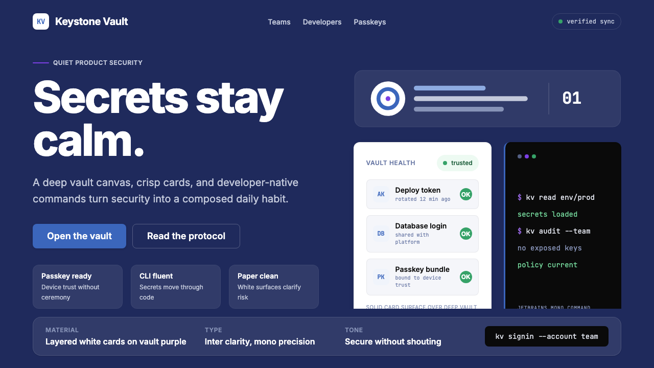 1Password Purple VaultSecurity stays quiet. Vault purple, Inter type, and crisp white cards do the…安全保持安静:保险库紫、Inter 字体与白卡片完成表达。
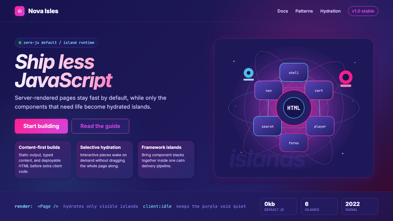 Astro Islands Architecture 2022Warm cosmic devtools. Deep violet, magenta glow, Inter clarity, and island ge…温暖的宇宙开发感:深紫底、洋红光、Inter 字体与岛屿几何。
 Stripe 2024Trust earns its glow. Indigo mesh, neutral type, and whisper cards float on n…信任自带微光:近白底上的靛蓝渐变、中性字体与轻影卡片。
 AsanaCalm productivity breathes. Cream canvas, lavender panels, coral-blue-yellow…安静生产力会呼吸:奶油画布、薰衣草面板与三色圆点。
 GitLab 2023DevOps in daylight. Tanuki orange-to-purple gradient, Inter, warm enough for…DevOps 走出暗色房间:标志性狸猫橙紫渐变、宽松行高、Inter 字体——…
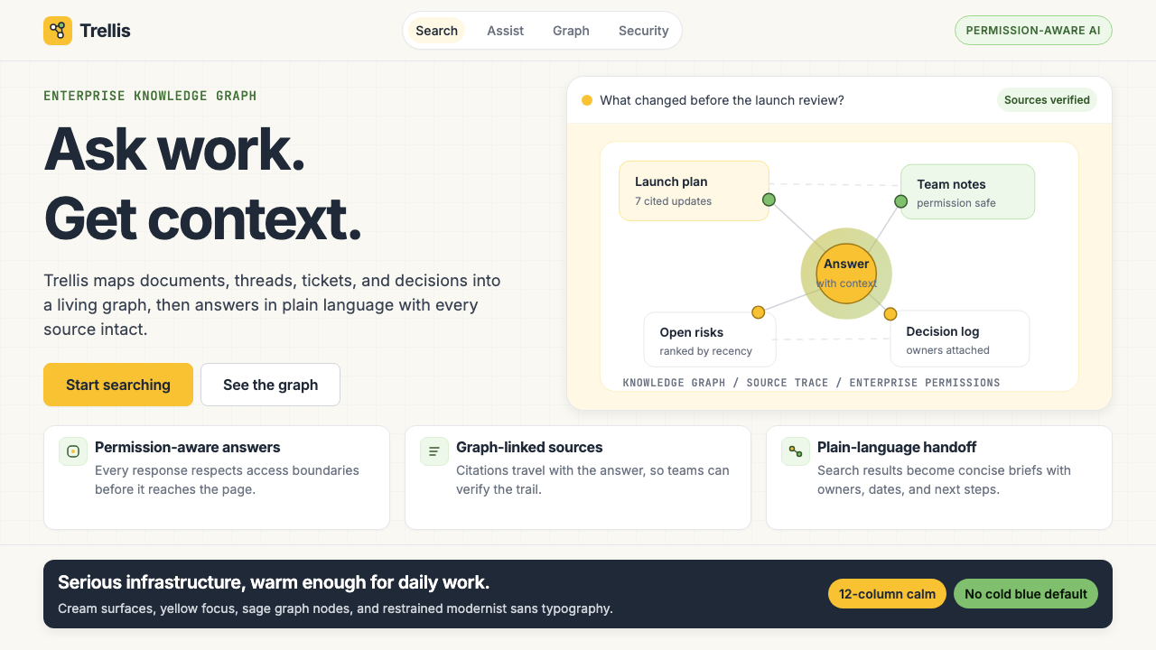 Glean Enterprise-SearchWarm enterprise AI. Cream ground, yellow focus, sage graph nodes, and sans ca…温暖的企业 AI:奶油底、黄焦点、鼠尾草节点与无衬线克制。