Design style guide设计风格指南
What is Claude / Anthropic Warm 2024?什么是 Claude / Anthropic Warm 2024?
Anthropic's 2024 brand identity translates AI safety research into a visual language that feels less like a tech product and more like a late-night reading session in a well-curated library.Anthropic 的 2024 品牌视觉将 AI 安全研究转化为一套视觉语言——它不像一款科技产品,更像是在精心布置的图书馆里度过的一个深夜阅读时光。
Claude / Anthropic Warm 2024 in briefClaude / Anthropic Warm 2024 速览
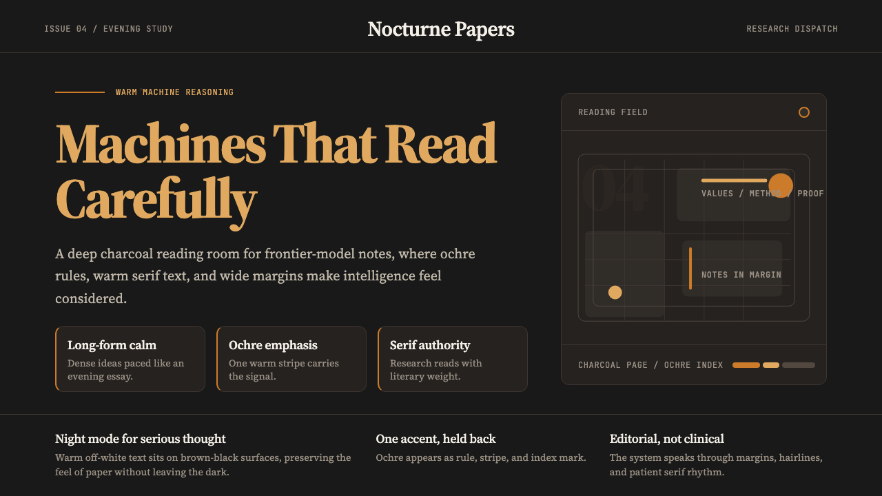
Claude / Anthropic Warm 2024 is the visual identity system behind Anthropic's Claude AI assistant, refined and codified through 2024. Where most AI brand identities lean into cold gradients, electric blues, and the visual grammar of machine intelligence, Anthropic made a deliberate counter-move: toward warmth, serif type, editorial whitespace, and an ochre-orange palette that evokes paper, lamplight, and the humanities. The result is a dark-mode interface that reads with the intimacy of a printed journal rather than the urgency of a live terminal.Claude / Anthropic Warm 2024 是 Anthropic 旗下 Claude AI 助手背后的视觉识别系统,经过 2024 年的深化与规范化而成形。大多数 AI 品牌倾向于冷峻渐变、电光蓝与机器智能的视觉语法,而 Anthropic 做出了一个刻意的反向选择:走向温暖、衬线排版、编辑性留白,以及令人联想到纸张、灯光与人文学科的赭橙色调。最终呈现出的深色界面,读起来有印刷期刊的亲密感,而非实时终端的紧迫感。
The style is built around a deep charcoal ground — not pure black, but a dark neutral that retains a sense of material weight — against which a warm ochre accent and off-white body text glow with understated authority. The typeface choices reinforce the essayist register: a serif body type drawn from the editorial tradition delivers information with the unhurried confidence of a long-form publication, while a complementary display variant handles headings and pull quotes with proportional generosity.这套风格围绕深炭灰色底面构建——不是纯黑,而是一种保留了材质重量感的深中性色。赭橙点缀与暖白正文文字在其上泛出克制而权威的光泽。字体选择强化了散文式的语调:来自编辑传统的衬线正文字体以长篇出版物的从容自信传递信息,而搭配的展示字体则以比例上的慷慨感处理标题与引言。
This is not minimalism for its own sake. The restraint is purposeful: Anthropic's public positioning centers on safety research, interpretability, and a careful, humanistic approach to AI development. The brand had to communicate seriousness without severity, intelligence without alienation. The warm dark palette achieves this by occupying a space that feels simultaneously contemporary and timeless — a brand that could appear on the cover of a university press monograph as comfortably as on a product landing page.这不是为极简而极简。克制是有目的的:Anthropic 的公开立场以安全研究、可解释性以及对 AI 发展的审慎人文主义方法为核心。品牌需要传达严肃性而不失温度,展现智识而不令人疏离。这套深暖色调的色板通过占据一个同时具有当代感与永恒感的空间来实现这一目标——一个既能出现在大学出版社专著封面上、也能出现在产品落地页上的品牌形象。
See the Claude / Anthropic Warm 2024 design system →查看 Claude / Anthropic Warm 2024 完整设计系统 →
Where does Claude / Anthropic Warm 2024 come from?Claude / Anthropic Warm 2024 从何而来?
Anthropic was founded in 2021 by Dario Amodei and Daniela Amodei, along with several colleagues who had previously worked at OpenAI. The company positioned itself from the outset around AI safety research — particularly Constitutional AI, a training methodology that encodes explicit values and behavioral guidelines into model development. This orientation toward principled, reflective AI development would eventually find its expression in the brand's visual character.Anthropic 由 Dario Amodei 与 Daniela Amodei 于 2021 年联合创立,共同创始人还包括数位此前在 OpenAI 工作过的同事。公司从一开始就以 AI 安全研究为立身之本,尤其是“宪法 AI”(Constitutional AI)——一种将明确价值观与行为准则编码进模型训练过程的方法论。这种对负责任、反思性 AI 发展的坚守,最终在品牌的视觉气质中找到了它的表达。
The visual identity evolved through the early Claude model releases — Claude 1 arrived in March 2023, followed by successive generations — and reached a particular definition point in 2024 as the brand matured and the product family expanded. The 2024 design direction, led with input from brand designer Lauren Tom among others, consolidated the ochre-and-charcoal palette and the editorial serif approach into a coherent, recognizable system. The style drew deliberately from the visual culture of serious long-form publishing: the warm page of a literary review, the cream-stock covers of academic press books, the measured typographic hierarchy of a magazine essay.视觉识别随早期 Claude 模型发布逐步演化——Claude 1 于 2023 年 3 月问世,此后数代相继迭代——并在 2024 年随着品牌成熟与产品家族扩张而到达一个清晰的定型节点。2024 年的设计方向,在包括品牌设计师 Lauren Tom 在内的团队共同参与下,将赭橙与深炭色色板以及编辑性衬线风格整合为一套连贯可辨的系统。这套风格刻意从严肃长篇出版物的视觉文化中汲取养分:文学评论的暖纸质感、学术出版社专著的奶油色封面、杂志长文的克制排版层级。
The choice of a dark variant as the primary expressive register for the Claude interface reflects both practical and philosophical considerations. Practically, many users interact with AI assistants during evening and nighttime hours, in low-ambient-light environments where a warm dark background reduces eye strain while retaining readability. Philosophically, the dark-with-warm-accents aesthetic shifts the emotional register of the interface from the active, transactional feel of a typical software product toward something more contemplative — a reading environment rather than a productivity tool.选择深色变体作为 Claude 界面主要的表达形态,既有实用层面的考量,也有哲学层面的意图。实用层面:许多用户在傍晚与深夜、低环境光的环境下与 AI 助手交互,暖色深色背景在保持可读性的同时减轻眼部疲劳。哲学层面:深底暖调的美学将界面的情绪基调,从普通软件产品那种主动、事务性的感觉,转向某种更具沉思性的东西——一个阅读环境,而非一个生产力工具。
The ochre-orange accent color carries particular symbolic weight in the context of 2024 AI brand design, which had become saturated with cool blues, purples, and gradient washes. Ochre is simultaneously a very old color — one of the earliest pigments used by humans, found in cave paintings tens of thousands of years old — and a warm, organic alternative to the synthetic palette of digital-native brands. Choosing ochre was, among other things, a declaration that this AI company considered itself part of a long humanistic tradition, not just a chapter in the history of technology.赭橙色调的点缀色在 2024 年 AI 品牌设计的语境中承载着特殊的象征重量——那一时期的 AI 品牌已被冷调蓝紫色与渐变色洗所饱和。赭色同时是一种极其古老的颜色——人类最早使用的颜料之一,在数万年前的洞穴壁画中便有踪迹——也是对数字原生品牌合成色板的一种温暖而有机的替代选择。选择赭色,在众多含义之中,也是一种宣告:这家 AI 公司认为自己是漫长人文传统的一部分,而不仅仅是科技史上的一个章节。
What defines the Claude / Anthropic Warm 2024 look?Claude / Anthropic Warm 2024 的视觉特征是什么?
Palette色调
The palette centers on a deep charcoal ground — dark enough to feel nocturnal, warm enough to avoid the coldness of pure black — paired with an ochre-orange primary accent that carries the visual weight of the brand. Off-white body text glows against the dark field with editorial warmth. Secondary tones stay within the warm spectrum: muted taupes, amber-inflected neutrals, and occasional use of near-cream for surface differentiation. Cool colors are largely absent; the entire palette reads as candlelit rather than fluorescent.色板以深炭灰色为底,足够深暗以呈现夜读感,又足够温暖以避免纯黑的冷峻——搭配承载品牌视觉重量的赭橙色主调。暖白色正文在深色底面上泛出编辑性的光泽。辅助色调保持在暖色谱内:柔化的灰褐色、琥珀感的中性色,以及偶发的近奶油色用于区分层级。冷调色彩几近缺席;整个色板读起来像烛光照明,而非荧光灯。
Typography字体排印
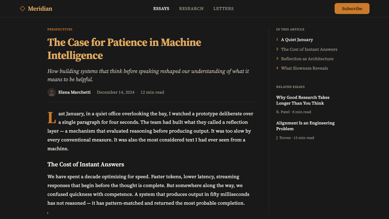
The typographic system is built around a serif body typeface from the editorial tradition — one whose letterforms carry the authority of a well-edited publication without feeling antiquarian. Body text is set generously: comfortable line height, a measure that invites sustained reading rather than scanning. Display type uses a complementary serif variant at sizes that reward careful spacing. The overall typographic register is that of a respected journal or university press: confident, unhurried, and literate. Sans-serif elements appear only in supporting roles — labels, captions, interface chrome — deferring always to the serif's intellectual authority.排版系统以编辑传统中的衬线正文字体为核心——其字形承载着一本精心编辑的出版物的权威感,却不显得古板。正文排版慷慨:舒适的行距,行宽邀请持续阅读而非扫视。展示字体使用搭配的衬线变体,字号之大令精准字距的付出物有所值。整体排版格调如同一份受人尊重的学术期刊或大学出版社出版物:自信、从容、有文化底蕴。无衬线元素仅出现于辅助角色——标签、注释、界面装饰——始终为衬线字体的知识权威让步。
Warmth and Restraint温暖与克制
Perhaps the most distinctive quality of the style is the way it balances warmth and restraint simultaneously. The warm palette — ochre, charcoal, off-white — creates an atmosphere of comfort and intimacy. But the typographic and spatial decisions are rigorously controlled: generous whitespace, no decorative flourishes, no gradient fills, no ambient glow effects for their own sake. The warmth is earned by color and material quality, not by softening or over-humanizing the interface. This combination makes the style feel intellectually serious and emotionally approachable at the same time.这套风格最鲜明的特质,或许正是它同时兼顾温暖与克制的方式。温暖的色板——赭橙、深炭、暖白——营造出舒适与亲密的氛围。但排版与空间决策是严格受控的:慷慨的留白,没有装饰性花饰,没有渐变填充,没有为视觉效果而设的光晕。温暖是通过色彩与材质质感赢得的,而非通过软化或过度人性化界面来实现的。这种组合使风格在知识层面上显得严肃,在情感层面上又令人亲近。
Editorial Whitespace编辑性留白
The style deploys whitespace — or rather, dark-space — with the generosity of a quality print publication. Elements are never crowded. Section breaks breathe. The margins are deliberately wide, giving content room to establish itself before anything else competes for attention. This spatial generosity is not empty space but structured silence: it tells the reader that what is present is there because it earned its place, and that the system is confident enough in its content not to fill every corner.这套风格以优质印刷出版物的慷慨姿态运用留白——或者说,深色空间。元素之间从不拥挤。段落之间得以呼吸。页边距刻意保持宽阔,让内容在任何竞争元素介入之前有空间自我确立。这种空间上的慷慨不是空洞,而是结构化的静默:它告诉读者,凡存在于此的元素皆因配得上这个位置而存在,而这套系统对自身内容有足够的自信,不必填满每一个角落。
Material Warmth材质温度
Even on screen, the palette evokes tactile, material qualities — the grain of warm paper, the depth of a well-aged wood surface, the quality of ochre pigment applied by hand. This is achieved not through skeuomorphic texture overlays but through the careful selection of colors that exist in the material world: a charcoal that reads like dusk, an orange that reads like terracotta. The effect is that the interface feels made rather than generated — a considered artifact rather than a template.即便在屏幕上,这套色板也唤起触觉与材质的联想——暖纸的纹理、经年木材表面的深度、手工施用赭色颜料的质感。这不是通过拟物化纹理叠加实现的,而是通过精心挑选那些在物质世界中真实存在的颜色:一种读起来像暮色的炭灰,一种读起来像赤陶的橙色。结果是界面感觉像是被制作出来的,而非被生成出来的——是一件经过深思熟虑的产物,而非一套模板。
Intellectual Seriousness知识严肃性
The overall visual effect communicates a specific kind of seriousness — not the cold authority of a financial institution or the aggressive confidence of a tech startup, but the measured, humanistic gravity of a research institution that takes its work seriously and trusts its audience to do the same. This quality comes from the combination of editorial typography, restrained decoration, and a palette that references the world of ideas rather than the world of commercial software. It is a brand that reads rather than broadcasts.整体视觉效果传递出一种特定的严肃性——不是金融机构的冷硬权威,也不是科技创业公司的进攻性自信,而是一家严肃对待自身工作、并信任受众同样认真的研究机构所具有的那种克制、人文主义的沉稳。这种品质来自编辑性排版、克制的装饰与参照思想世界而非商业软件世界的色板三者的组合。这是一个阅读而非广播的品牌。
Dark Mode as Primary深色模式作为主调
Unlike most design systems that treat dark mode as a secondary variant of a light-mode original, the Anthropic Warm 2024 system elevates dark mode to primary expressive status. The deep charcoal background is not a color-inverted afterthought but the defining canvas of the visual identity. Light surfaces appear as the variant rather than the base. This inversion signals that the primary context for the product is not daytime productivity but evening contemplation — a subtle but significant statement about who the interface is for and when they are likely to use it.与大多数将深色模式视为浅色原版次要变体的设计系统不同,Anthropic Warm 2024 系统将深色模式提升为主要表达地位。深炭灰色背景不是色彩反转后的事后补充,而是视觉识别的定义画布。浅色表面作为变体而非基础出现。这一反转传达出一个信号:产品的主要使用场景不是白天的生产力工作,而是傍晚的沉思阅读——一个关于这个界面为谁而设、他们何时使用的微妙却重要的陈述。
See the Claude / Anthropic Warm 2024 design system →查看 Claude / Anthropic Warm 2024 完整设计系统 →
Who shaped Claude / Anthropic Warm 2024?谁塑造了 Claude / Anthropic Warm 2024?
As co-founder and CEO of Anthropic, Dario Amodei — a former VP of Research at OpenAI with a background in computational neuroscience — shaped the company's intellectual character. His public communications, published essays, and long-form interviews on AI safety and development established the essayistic, humanistic voice that the brand's visual identity ultimately expresses. The mismatch between the warmth of Anthropic's brand and the gravity of its subject matter — existential AI risk — is in part a reflection of Amodei's own intellectual style: serious but not alarmist, precise but not cold.作为 Anthropic 联合创始人兼 CEO,Dario Amodei——前 OpenAI 研究副总裁,具有计算神经科学背景——塑造了公司的知识性格。他发表的文章、长篇访谈以及关于 AI 安全与发展的公开表达,确立了品牌视觉识别最终所表达的那种散文式、人文主义的声音。Anthropic 品牌温度与其主题沉重性(AI 存在风险)之间的落差,在一定程度上折射出 Amodei 本人的知识风格:严肃而不危言耸听,精确而不冷漠。
Co-founder and President Daniela Amodei — with a background in operations and business at scale — was instrumental in establishing Anthropic as a company that could translate frontier research into a commercially sustainable product. Her leadership shaped the product and brand direction in ways that made Claude not merely a capable model but a recognizable presence with a coherent identity. The business acumen she brought ensured that the warmth of the brand was not just an aesthetic preference but a strategically legible position in a crowded market.联合创始人兼总裁 Daniela Amodei——具有大规模运营与商业背景——在将 Anthropic 建设为能够把前沿研究转化为商业可持续产品的公司方面发挥了关键作用。她的领导力以多种方式塑造了产品与品牌方向,使 Claude 不仅仅是一个能力出众的模型,更成为一个具有连贯身份的可辨认存在。她带来的商业洞察力确保了品牌的温度不只是审美偏好,更是在拥挤市场中具有战略可读性的定位。
Chris Olah, Anthropic's co-founder and interpretability research lead, represents the technical and humanistic combination that underlies the brand's character. His celebrated blog writing on neural network visualization and mechanistic interpretability — recognized for making complex ideas legible to non-specialist readers — established a model of technical communication as a form of intellectual hospitality. This disposition, shared across Anthropic's research communications, informs the design's aspiration to be readable, generous, and substantive rather than impressive and opaque.Anthropic 联合创始人兼可解释性研究负责人 Chris Olah 代表了品牌性格背后技术与人文的融合。他关于神经网络可视化与机械可解释性的著名博文——以向非专业读者清晰传递复杂思想而著称——确立了将技术传播作为一种知识款待形式的范本。这种气质贯穿 Anthropic 的研究传播,并影响了设计的志向:可读、慷慨、有实质内容,而非令人印象深刻却晦涩难懂。
Brand designer Lauren Tom contributed directly to the visual crystallization of Anthropic's identity through the 2024 design direction. The work involved translating the company's intellectual and ethical commitments into a coherent visual system — a challenge that required both aesthetic sensibility and deep understanding of what the brand needed to communicate. The success of the ochre-and-charcoal system as a recognizable and emotionally coherent brand identity in one of the most competitive visual categories of 2024 reflects the quality of that translation work.品牌设计师 Lauren Tom 在 2024 年设计方向上直接参与了 Anthropic 视觉识别的结晶化工作。这项工作涉及将公司的知识与伦理承诺转化为一套连贯的视觉系统——一项既需要审美敏感度又需要深刻理解品牌传达需求的挑战。赭橙与深炭色系统作为 2024 年最具竞争力的视觉品类中一个可辨认且情感上连贯的品牌识别系统所取得的成功,正是这项转化工作质量的体现。
The broader Anthropic research team — working on Constitutional AI, interpretability, and safety-focused model development — collectively shaped the intellectual character that the visual identity needed to express. Constitutional AI, the training approach that gives models explicit value guidelines, embeds a humanistic framework into the technical process itself. The brand's warmth is not incidental to this work; it is the visual articulation of a company that believes AI development is, at its core, an ethical and human project rather than merely an engineering one.更广泛的 Anthropic 研究团队——从事宪法 AI、可解释性与以安全为导向的模型开发——共同塑造了视觉识别需要表达的知识性格。宪法 AI——为模型提供明确价值准则的训练方法——将人文主义框架嵌入技术过程本身。品牌的温度与这项工作并非偶然相关;它是一家相信 AI 发展从根本上是一项伦理与人的事业(而非单纯是工程事业)的公司的视觉表达。
How do you use Claude / Anthropic Warm 2024 today?今天怎么用 Claude / Anthropic Warm 2024?
The Claude / Anthropic Warm 2024 style translates most naturally into contexts where intellectual seriousness and human warmth need to coexist — where the product needs to feel capable without feeling cold, trustworthy without feeling institutional. This alignment makes it particularly powerful for AI-adjacent products, research tools, knowledge platforms, and any interface where sustained reading is part of the primary experience.Claude / Anthropic Warm 2024 风格最自然地适用于知识严肃性与人文温度需要共存的场景——产品需要感觉有能力而不冷漠,值得信赖而不显得机构化。这种契合使它在 AI 相关产品、研究工具、知识平台,以及任何持续阅读是主要体验组成部分的界面中尤为有力。
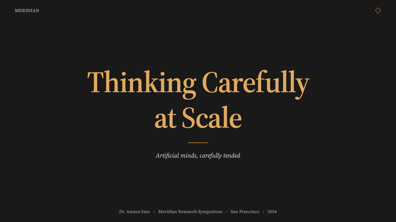
For presentation slides, the style works at its best when deployed with editorial restraint. Cover slides benefit from the full weight of the palette: a deep charcoal field with an ochre headline set in a confident serif, and generous breathing room around every element. Content slides should be treated like well-designed journal pages — one primary idea per slide, type hierarchies communicated through size and weight rather than decoration, and plenty of dark space around the content block. Data visualizations take on a warm, document-like quality when the ochre accent is used to highlight the key series while supporting data remains in the off-white and muted neutral range. Avoid filling slides to their edges; the margin is part of the design.对于演示文稿,这套风格在以编辑性克制部署时表现最佳。封面页从色板的全部分量中获益:深炭灰色底面上,一个以自信衬线字体排布的赭橙色标题,每个元素周围保留充裕的呼吸空间。内容页应当被当作设计精良的期刊页面来处理——每页一个核心想法,字体层级通过尺寸与字重而非装饰来传达,内容块周围留有充足的深色空间。数据可视化在使用赭橙色点亮关键数据系列、辅助数据保持在暖白与柔和中性色范围内时,呈现出温暖的文献感。避免把幻灯片填充到边缘;留白是设计的一部分。
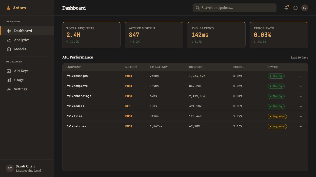
For web interfaces and digital products, the style suits knowledge-intensive contexts: documentation pages, research summaries, long-form article layouts, pricing and comparison tables where credibility matters as much as conversion. Applied to a dashboard or analytics interface, the deep charcoal background reduces visual fatigue during extended sessions, while the ochre accent provides a reliable and non-distracting focal color for key metrics and interactive states. Navigation should be typographic and restrained — the brand's authority comes from the type, not from icons or decorative chrome.对于网页界面与数字产品,这套风格适合知识密集型场景:文档页、研究摘要、长篇文章版面、可信度与转化率同等重要的定价与对比表格。应用于仪表板或数据分析界面时,深炭灰色背景在长时间使用中减轻视觉疲劳,而赭橙色点缀为关键指标与交互状态提供可靠且不分散注意力的焦点色。导航应当是排版性的且克制的——品牌的权威来自字体,而非图标或装饰性框架。
For editorial and marketing applications, the style carries immediate associative weight from Anthropic's own public communications — essays, research papers, blog posts — that have established a recognizable tone of measured, thoughtful authority. Marketing pages that adopt this visual register benefit from the same associations: the brand feels like it has already done the thinking, and is now sharing its conclusions. Long-form landing pages work particularly well: alternating full-width sections between deep charcoal and slightly lighter warm neutrals, with the ochre reserved as the single action color. Pull quotes in large serif type, generous section spacing, and the avoidance of any animation that draws attention to itself all contribute to a reading experience that feels earned.对于编辑与营销应用,这套风格从 Anthropic 自身公开传播——论文、研究报告、博文——中获取即时的联想重量,这些内容已经确立了一种可辨认的克制、深思熟虑的权威语调。采用这一视觉语调的营销页面从同样的联想中获益:品牌感觉已经完成了思考,现在正在分享其结论。长篇落地页尤为适合:深炭灰色与略浅的暖中性色全宽区块交替出现,赭橙色被保留为唯一的行动色。大尺寸衬线体引语、慷慨的区块间距,以及避免任何吸引注意的动效,共同营造出一种感觉经过充分酝酿的阅读体验。
The most common mistake when applying this style is losing the restraint that makes it distinctive. The ochre accent is powerful precisely because it appears selectively; using it as a fill color for large surface areas turns the brand identifier into decoration and erases the contrast that gives it meaning. Similarly, the editorial typography demands real typographic discipline — the serif must be deployed at appropriate text sizes and with proper leading, not just chosen as a font and dropped into a crowded layout. The warmth of the palette can also tempt designers into adding soft glows, ambient shadows, or rounded corners that were not part of the original system; the authentic version of this style is crisper and more architecturally decisive than it might initially appear.应用这套风格时最常见的错误是失去使其与众不同的克制感。赭橙色点缀之所以有力,正是因为它选择性地出现;将它用作大面积填充色,会把品牌标识符变成装饰,并抹去赋予其意义的对比。同样,编辑性排版需要真正的排版纪律——衬线字体必须在适当的正文字号下、以正确的行距部署,而非只是选择一款字体后将其扔进拥挤的版面。色板的温暖感也可能诱使设计师加入柔和光晕、环境阴影或并非原始系统一部分的圆角;这套风格的真实版本比初看起来更清晰、更具建筑决断性。
See the Claude / Anthropic Warm 2024 design system →查看 Claude / Anthropic Warm 2024 完整设计系统 →
Claude / Anthropic Warm 2024 — FAQClaude / Anthropic Warm 2024 · 常见问题
How does this style differ from other dark-mode AI brand identities?这套风格与其他深色模式 AI 品牌识别有何不同?
Most dark-mode AI brand identities in 2024 used cool color palettes — deep navy, electric violet, mid-toned gray — with gradient accents and geometric or particle-system motion graphics that signal computational power and speed. The Anthropic approach inverts almost every one of these conventions. The background is warm charcoal rather than cool gray or navy. The accent is ochre rather than blue or purple. The typography is serif rather than sans-serif. Motion, where it appears, is slow and deliberate rather than fast and generative. These inversions are not arbitrary; each one shifts the associations of the brand away from 'powerful machine' and toward 'thoughtful institution.'2024 年大多数深色模式 AI 品牌识别使用冷调色板——深海军蓝、电光紫、中灰调——配以渐变色点缀和传递计算能力与速度感的几何或粒子系统动效。Anthropic 的做法几乎颠覆了这些惯例的每一条。背景是暖炭灰而非冷灰或海军蓝。点缀色是赭橙而非蓝或紫。排版是衬线而非无衬线。动效(若有)是缓慢而审慎的,而非快速而生成感的。这些反转并非随意为之;每一个都将品牌的联想从“强大的机器”推向“有思想的机构”。
Is the ochre accent interchangeable with other warm accent colors — amber, terracotta, or gold?赭橙色调是否可以与其他暖调点缀色——琥珀、赤陶或金色——互换?
Technically substitutable, but each substitution shifts the brand register significantly. Amber reads as more golden and celebratory, closer to trophy or luxury associations. Terracotta reads as more earthen and Mediterranean, closer to artisan craft associations. Gold reads as precious and possibly financial. Ochre sits in a position that is warm and material without being precious or festive — it is the color of pigment, of autumn light, of old paper, of things made rather than things bought. This specific emotional position, combined with the depth of the charcoal ground, is what gives the palette its distinctive character and distinguishes it from generic warm-dark color combinations.技术上可以替换,但每种替换都会显著改变品牌语调。琥珀色读起来更金黄而节庆,接近奖杯或奢华的联想。赤陶色读起来更土壤感与地中海感,接近手工艺品的联想。金色读起来矜贵,可能带有金融联想。赭色处于一个温暖而有材质感、却不矜贵也不节日的位置——它是颜料的颜色,秋光的颜色,旧纸的颜色,被制作出来而非被购买来的东西的颜色。这一特定的情感位置,加上深炭底面的深度,赋予了这套色板其独特的性格,并将其从泛泛的暖深色组合中区分出来。
Does this style work for light-mode interfaces, or is it inherently a dark-mode system?这套风格适用于浅色模式界面吗?还是它本质上是一套深色模式系统?
A light-mode variant exists in Anthropic's own brand — the warm cream-page version that predated or accompanies the dark variant. When inverted to a light ground, the palette logic remains coherent: the ochre accent retains its warmth and legibility against cream or off-white backgrounds, the serif typography reads with the same editorial quality, and the generous spacing remains appropriate. However, the specific emotional quality of the dark version — that sense of evening contemplation and deep focus — does not fully transfer. The light variant reads as more open and less intimate. For applications where welcoming new users or communicating accessibility is important, the light variant may serve better; for applications where depth and sustained engagement are the goal, the dark version is the stronger choice.Anthropic 自身的品牌中存在浅色变体——先于深色版本出现或与之并存的暖奶油色版本。翻转至浅色底面时,色板逻辑仍然连贯:赭橙色点缀在奶油色或暖白色背景上保持其温度与可读性,衬线排版呈现同样的编辑品质,慷慨的间距依然适切。然而,深色版本特有的情感品质——傍晚沉思与深度专注的那种感觉——并不能完全迁移。浅色变体读起来更开放、亲密感较弱。对于欢迎新用户或传达可访问性重要的应用,浅色变体可能更合适;对于以深度参与为目标的应用,深色版本是更有力的选择。
What kinds of products would be a poor fit for this style?哪些类型的产品不适合这套风格?
The style struggles in contexts that depend on speed, energy, or sensory stimulation as primary values. Gaming interfaces, entertainment platforms, consumer e-commerce, food and beverage brands, children's products, and social media applications all rely on visual registers — bright saturation, fast motion, playful variation — that are structurally opposed to what this style is doing. The style is also less suited to applications where users need rapid orientation and quick scanning rather than sustained reading; the editorial pacing and generous spacing that make long-form content feel authoritative can make interaction-heavy utility apps feel slow. Most importantly, the style communicates a kind of institutional seriousness that fits AI research and knowledge tools perfectly but would feel incongruous or overly formal in casual or highly personal consumer contexts.这套风格在以速度、能量或感官刺激为主要价值的场景中力不从心。游戏界面、娱乐平台、消费类电商、食品饮料品牌、儿童产品以及社交媒体应用都依赖视觉语法——高饱和度、快速动效、趣味变化——这些与这套风格的核心逻辑在结构上相互对立。这套风格也不太适合用户需要快速定向与快速扫视而非持续阅读的应用;使长篇内容感觉权威的编辑节奏与慷慨间距,在交互密集的实用工具类应用中可能让人感觉迟缓。最重要的是,这套风格传递出一种机构严肃性,与 AI 研究和知识工具完美契合,但在轻松或高度个人化的消费场景中会显得格格不入或过于正式。
How should the serif typography be balanced against the need for interface legibility at smaller sizes?如何在衬线排版与小字号界面可读性之间取得平衡?
The editorial serif that anchors this style is optimized for reading sizes — the comfortable range for sustained body text consumption. At very small sizes, for labels, captions, metadata, and interface micro-copy, the serif can lose legibility on screen, and the style's own practice is to deploy a complementary sans-serif for these supporting roles. The key is maintaining a clear hierarchy: serif for anything the user is meant to read carefully (articles, explanations, headings at reading scale), sans-serif for anything the user is meant to scan or reference quickly (timestamps, tags, field labels). The transition between the two type registers should feel purposeful, not inconsistent — the sans-serif elements should share the palette's warmth and the overall layout's spatial generosity, even if the letterforms themselves are simpler.锚定这套风格的编辑性衬线字体为阅读字号优化——适合持续正文阅读的舒适范围。在极小字号下,用于标签、注释、元数据与界面微文案时,衬线字体在屏幕上可能失去可读性,而这套风格本身的实践是为这些辅助角色部署配套的无衬线字体。关键在于维持清晰的层级:衬线用于任何用户需要仔细阅读的内容(文章、解释说明、阅读尺度的标题),无衬线用于任何用户需要快速扫视或参考的内容(时间戳、标签、字段标签)。两种字体语调之间的切换应当感觉是有意为之的,而非不一致的——无衬线元素应当与色板的温度和整体版面的空间慷慨感保持一致,即便字形本身更为简洁。
Related design styles相关设计风格
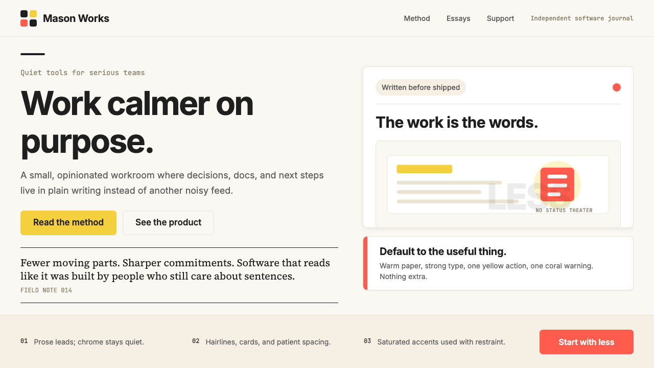 Basecamp / 37signalsQuiet craft, strong opinions. Cream paper, tight sans type, yellow and coral…安静却有主张。米色纸底、紧排无衬线、黄与珊瑚克制点题。
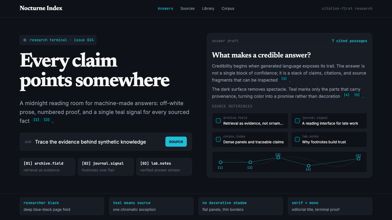 Perplexity AISerious search after midnight. Teal citations cut through black panels and de…午夜研究感:青绿色引用穿过黑色面板与密集衬线排版。
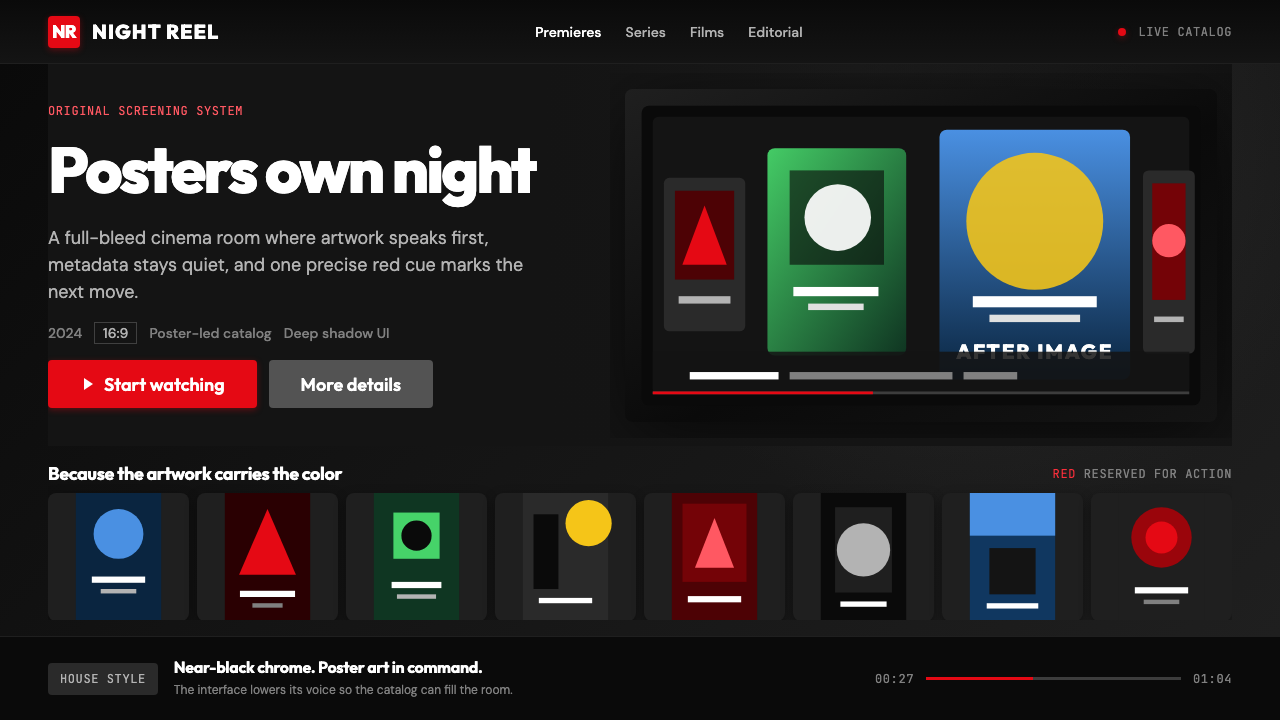 Netflix 2024Cinema UI goes dark. Near-black chrome, poster rails, and one surgical red ac…影院式暗黑界面:近黑框架、海报横排,唯一红色指向操作。
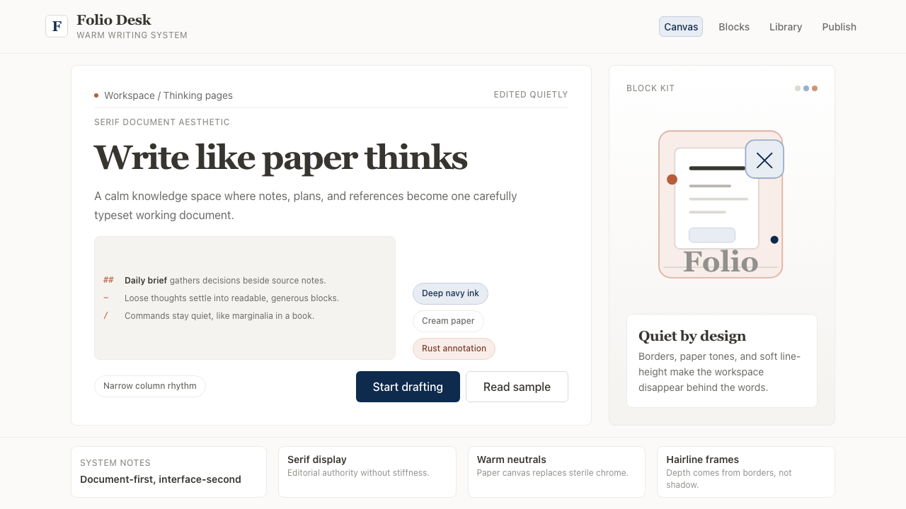 Notion ModernWriting feels papery. Source Serif on warm cream, navy ink, and hairline bord…书写像纸页:暖米白、衬线标题、深蓝墨色与细边框。
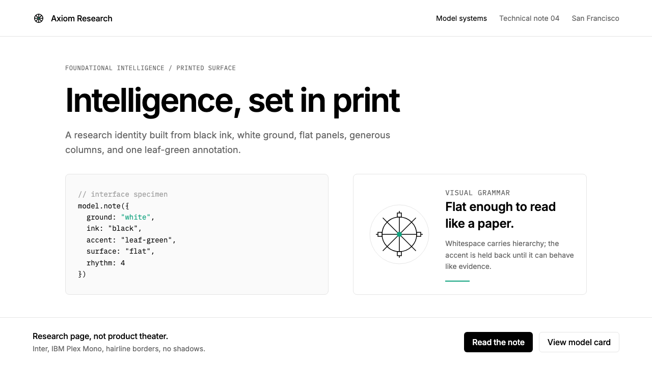 OpenAI 2024Research-grade restraint. Black-on-white Inter, flat code panels, one leaf-gr…研究级克制:黑白 Inter、扁平代码框、一枚叶绿色标记。
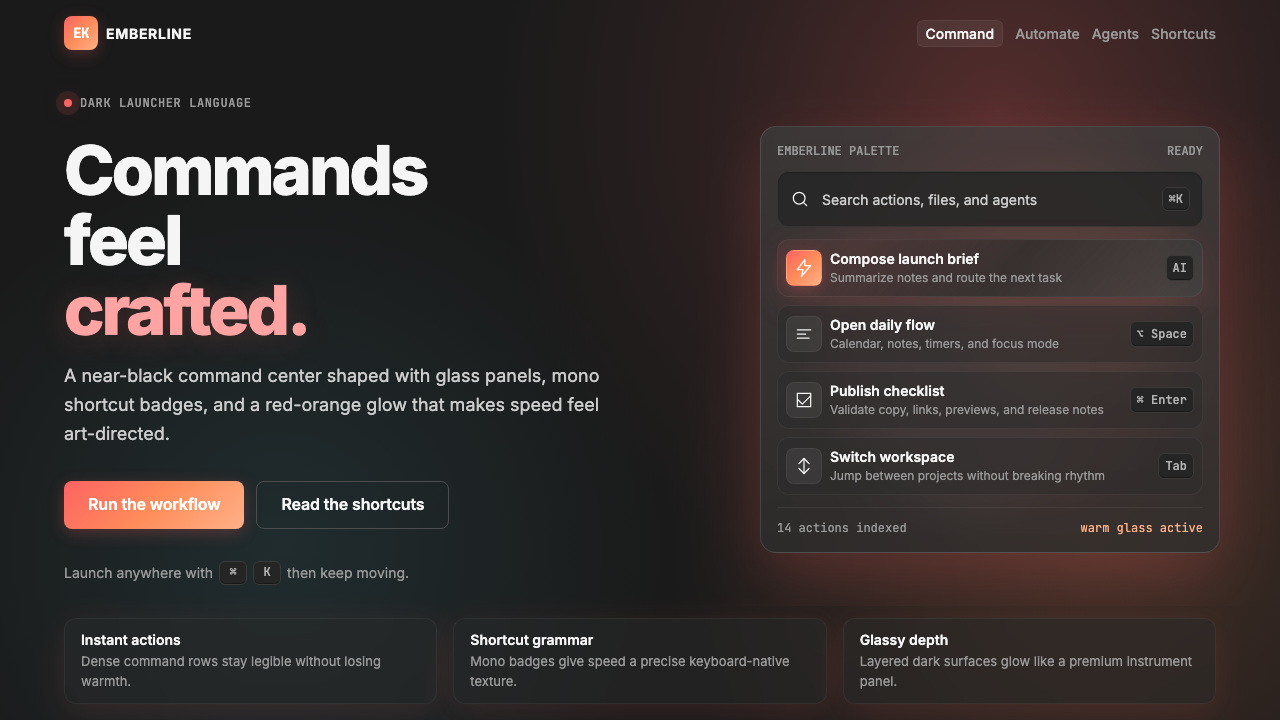 Raycast 2024Productivity feels art-directed. Red-orange glow, glass cards, and mono badge…生产力也被艺术指导:黑底红橙光、玻璃卡片与等宽快捷键。