What is Perplexity AI?什么是 Perplexity AI?
Perplexity AI dresses serious research in a library-at-midnight aesthetic — dark surfaces, electric teal citations, and the information density of an academic paper.Perplexity AI 将严肃的研究披上午夜图书馆的美学外衣——深色界面、电光青绿色引用,以及学术论文般的信息密度。
Perplexity AI in briefPerplexity AI 速览
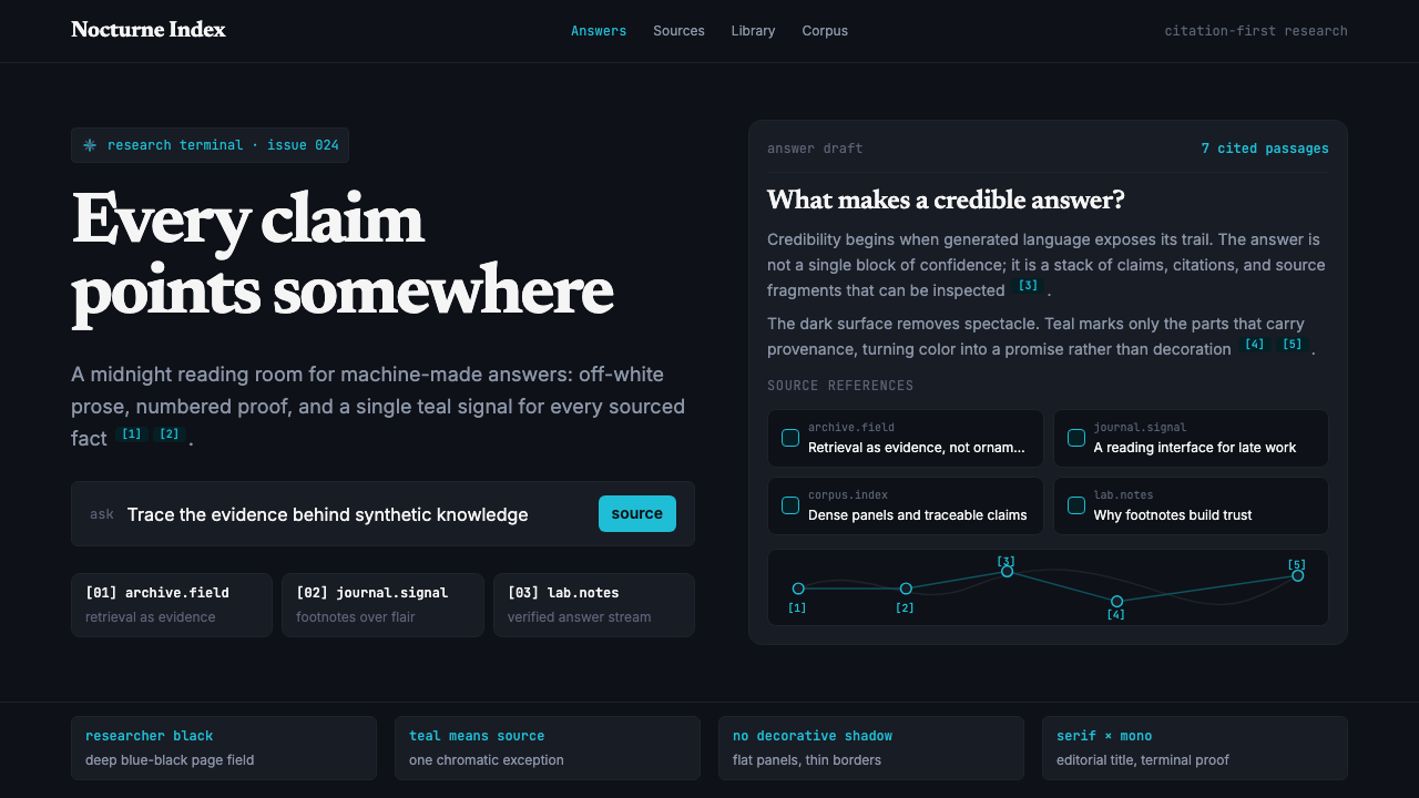
Perplexity AI is an AI-powered answer engine whose visual identity — a deep blue-black field, a single electric teal accent, monospace citation markers, and densely set text — encodes a clear cultural message: this is where serious people search now. Founded in 2022 by a team of former Google and Meta AI researchers in San Francisco, the product pairs conversational AI with real-time source retrieval, and its design makes that combination visible. Every answer arrives with numbered citations; the interface never lets the user forget that claims have sources.Perplexity AI 是一款 AI 驱动的问答引擎,其视觉标识——深蓝黑色底面、唯一的电光青绿色点缀、等宽字体的引用标记,以及密集排版的文字——传递着清晰的文化信号:这是认真的人现在搜索的方式。2022 年由一批前 Google 和 Meta AI 研究员在旧金山创立,产品将对话式 AI 与实时信源检索结合,而其设计使这种结合可见——每一条答案都附有编号引用;界面从不让用户忘记,每一个论断都有来源。
Where traditional search engines scatter color and imagery across ads, widgets, and carousels, Perplexity strips the interface to its epistemological core: a dark surface, near-white reading text, and teal hyperlinks that carry an unmistakable meaning — this fact is sourced and verifiable. The result is a design language that feels closer to an academic database or a well-maintained research terminal than to a consumer application. It is deliberately anti-playful, anti-decorative, and anti-ambient.传统搜索引擎将色彩与图像散落在广告、组件和轮播图中,Perplexity 则将界面剥离至其认识论核心:深色表面、接近纯白的阅读文字,以及承载着明确含义的青绿色超链接——这条事实有来源,可以核实。最终呈现的设计语言,比起消费级应用,更接近一个维护良好的学术数据库或研究终端。它刻意反对活泼、反对装饰、反对环境感。
The aesthetic has been called a 'library at midnight' — a phrase that captures both the darkness of the interface and the scholarly seriousness of its intent. This is not a dark mode applied as a trend; it is a complete visual position. The teal accent is not an arbitrary brand color but a semantic marker: it identifies every piece of information that has been retrieved, attributed, and linked. The design makes epistemology visible.这种美学被称为「午夜图书馆」——这个短语同时捕捉了界面的暗色调和其学术意图的严肃性。这不是作为流行趋势而采用的深色模式;这是一种完整的视觉立场。青绿色点缀并非任意的品牌色,而是一个语义标记:它标识每一条经过检索、归因与链接的信息。这套设计使认识论变得可见。
Where does Perplexity AI come from?Perplexity AI 从何而来?
Perplexity AI was founded in August 2022 by Aravind Srinivas, Denis Yarats, Johnny Ho, and Andy Konwinski — all of them researchers or engineers with deep roots in the AI research community, carrying experience from Google Brain, DeepMind, OpenAI, UC Berkeley, and Meta AI. Srinivas, who serves as CEO, had worked on reinforcement learning and generative models; Yarats on model optimization; the founding team's combined background was not in consumer product design but in the mechanics of how large language models retrieve and reason over information. That research-first background shaped everything about the product's identity.Perplexity AI 于 2022 年 8 月由 Aravind Srinivas、Denis Yarats、Johnny Ho 和 Andy Konwinski 共同创立——四人均是 AI 研究社群中有深厚根基的研究员或工程师,拥有来自 Google Brain、DeepMind、OpenAI、加州大学伯克利分校和 Meta AI 的工作经历。担任 CEO 的 Srinivas 曾研究强化学习与生成模型,Yarats 专注于模型优化;创始团队的综合背景不在于消费级产品设计,而在于大语言模型检索与推理信息的机制。这种以研究为先的背景塑造了产品身份的方方面面。
The visual identity that emerged in 2023 and solidified through 2024 was not designed by a traditional branding agency working from a mood board. It grew from the product's function: an interface that retrieves, ranks, and cites sources in real time needed a design language that could make citation legible and primary, not secondary. The decision to use a dark base — a deep blue-black rather than the flat black of generic dark modes — gave the interface a quality closer to a late-night research terminal or a Bloomberg terminal than to a consumer social product. It signals: this is for work.2023 年逐渐成形、并在 2024 年趋于稳定的视觉标识,并非由传统品牌机构基于情绪板设计而来。它从产品功能中生长出来:一个实时检索、排序并引用信源的界面,需要一套能使引用变得清晰且主要——而非次要——的设计语言。选择深色基底——深蓝黑而非通用深色模式中的平板黑——赋予界面一种更接近深夜研究终端或彭博终端的气质,而非消费级社交产品。它在说:这是用来工作的。
The teal accent color entered the design not as an arbitrary brand differentiator but as a functional choice. In the context of a dark interface saturated with near-white reading text, a warm neutral accent would blend into the typographic field. Teal — electric, cool, and unlike any ambient element on the screen — reads immediately as interactive, as sourced, as linked. It is the visual equivalent of a footnote superscript: a signal that this word or number points somewhere else. The entire citation system rests on the legibility of this single accent against the dark ground.青绿色点缀进入设计,并非作为任意的品牌差异化元素,而是一个功能性选择。在一个充满接近纯白阅读文字的深色界面中,暖中性色调的点缀会融入排版场域。青绿色——电光的、冷调的、与屏幕上任何环境元素都不相同——能立刻被读取为可交互的、有来源的、可点击的。它是脚注上标在视觉上的等价物:一个信号,告诉你这个词或这个数字指向别处。整套引用系统建立在这一单一点缀色对深色背景的可读性之上。
By 2024, Perplexity's visual system had attracted significant attention in the design community not because it was ornamental or trend-chasing but because it represented something rare: a product interface whose aesthetic was determined by epistemic function. The design says what the product does. That coherence between function and appearance — a version of 'form follows function' for the AI search era — placed Perplexity in a design tradition that values clarity of purpose above visual richness, and made its interface one of the most studied and referenced in the AI product wave of the early 2020s.到 2024 年,Perplexity 的视觉系统在设计界引发了广泛关注——不是因为它华丽或追逐潮流,而是因为它代表了一种罕见的东西:一个由认识论功能决定美学的产品界面。设计说明产品做什么。功能与外观之间的这种一致性——AI 搜索时代的「形式追随功能」——将 Perplexity 置于一个重视目的清晰性胜过视觉丰富性的设计传统之中,也使其界面成为 2020 年代初 AI 产品浪潮中被研究和引用最多的界面之一。
What defines the Perplexity AI look?Perplexity AI 的视觉特征是什么?
Dark Ground深色底面
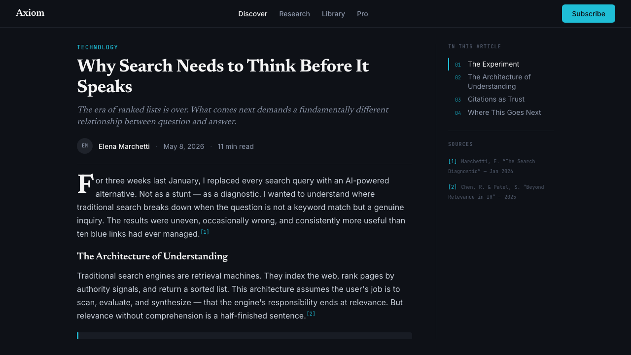
The foundational surface is a deep blue-black — not the flat black of generic dark modes, but a color with perceptible blue depth that reads as space rather than void. This choice is not cosmetic; it creates the visual context in which the teal accent achieves its maximum legibility and the near-white reading text achieves its maximum contrast without becoming harsh. The dark ground signals seriousness, focus, and the absence of ambient distraction — it is the color of a research environment, not an entertainment one.基底表面是深蓝黑——不是通用深色模式中的平板黑,而是一种带有可感知的蓝色深度的颜色,读起来像空间而非虚空。这一选择并非装饰性的;它创造了视觉语境,使青绿色点缀达到最大可读性,使接近纯白的阅读文字达到最大对比度而不显刺目。深色底面传递严肃、专注与没有环境干扰的信号——它是研究环境的颜色,而非娱乐环境的颜色。
Teal Citation Accent青绿色引用点缀
A single electric teal — cool, luminous, and impossible to confuse with any ambient element of the interface — serves as the sole accent color across the entire design system. Its function is semantic before it is aesthetic: teal marks everything that has been retrieved, attributed, and linked. Citation numbers, hyperlinks, interactive controls, and highlighted source references all share this color. Because only one accent exists, the user's eye learns immediately that teal means 'this points somewhere' — a learned visual grammar that makes the citation-first experience coherent.整个设计系统中,唯一的点缀色是一种电光青绿——冷调、发光,且不可能与界面的任何环境元素混淆。其功能在美学之前是语义性的:青绿色标记所有经过检索、归因与链接的内容。引用编号、超链接、交互控件,以及高亮的信源引用,全部共享这一颜色。因为只有一种点缀色存在,用户的眼睛会立刻学到:青绿色意味着「这里指向别处」——一种习得的视觉语法,使以引用为先的体验保持连贯。
Monospace Citation Markers等宽字体引用标记
Source numbers and inline citation markers are rendered in a monospace typeface, deliberately distinguishing them from the proportional text used for answers and prose. This typographic choice carries several simultaneous meanings: monospace has a long association with code, terminals, and technical precision; it signals that the number is a reference identifier rather than a prose word; and it creates a visual texture shift that makes citations immediately scannable. The effect is like the superscript notation of an academic paper, but larger, more legible, and system-wide.信源编号与行内引用标记使用等宽字体渲染,刻意与答案和正文所用的比例字体区分开来。这一排版选择同时承载多重含义:等宽字体与代码、终端和技术精确性有悠久的关联;它表明这个数字是引用标识符而非正文词汇;它制造了一种视觉质感的转换,使引用立即可扫描。效果如同学术论文的上标标注,但更大、更易读,且贯穿整个系统。
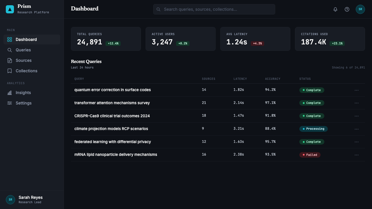
Information Density信息密度
The interface is designed to accommodate high information density without visual chaos. Text is set at a reading size that respects the length of complex answers; line spacing is calibrated to allow sustained reading rather than skimming; multiple sources, follow-up questions, and related panels can coexist in the layout without competing destructively for attention. This density is not an accident of cramped design — it is a deliberate position that says: the user who comes here is capable of reading, not just scanning.界面被设计为在不产生视觉混乱的前提下容纳高信息密度。文字以尊重复杂答案长度的阅读尺寸排版;行距经过校准,支持持续阅读而非略读;多个信源、追问问题和相关面板可以在版面中共存,而不会破坏性地竞争注意力。这种密度并非设计拥挤的意外产物——而是一种刻意的立场,它在说:来到这里的用户有能力阅读,而不仅仅是扫视。
Serif Body Type正文衬线字体
Long-form answers are rendered in a serif typeface — an uncommon choice for a technology product and a deliberate signal. Serifs have a long association with serious reading: books, academic journals, newspapers, legal documents. Deploying a serif for AI-generated answers says these answers deserve to be read as text, not skimmed as bullet points. It also creates a strong typographic contrast with the monospace citation markers, reinforcing the visual grammar that distinguishes prose from reference.长篇答案使用衬线字体渲染——对于一款科技产品而言,这是不寻常的选择,也是刻意的信号。衬线字体与严肃阅读有悠久的关联:书籍、学术期刊、报纸、法律文件。为 AI 生成的答案使用衬线字体,是在说:这些答案值得作为文本被阅读,而不是作为要点被略读。它也与等宽字体引用标记形成强烈的排版对比,强化了区分正文与引用的视觉语法。
Zero Decorative Noise零装饰噪声
The interface contains no gradients applied for visual richness, no ambient glow effects, no illustrative imagery, no decorative borders, and no color used for anything other than semantic purpose. Background regions are flat; dividers are simple lines; panels are delineated by subtle shifts in surface value rather than drop shadows or borders. This restraint is not minimalism for its own sake — it is the visual equivalent of a library rule: everything present serves a purpose, and visual noise is a kind of lie.界面中没有为丰富视觉而使用的渐变,没有环境光晕效果,没有插图图像,没有装饰边框,没有任何颜色被用于语义目的之外。背景区域是平面的;分割线是简单的线条;面板通过表面明度的细微变化而非投影或边框来划定。这种克制并非为克制而克制的极简主义——它是图书馆规则在视觉上的等价物:所有存在的元素都服务于一个目的,而视觉噪声是一种谎言。
Focus State Clarity焦点状态的清晰度
Interactive elements — input fields, buttons, citation links, source panels — have precise and consistent focus and hover states, all expressed through the teal accent and sharp edge changes rather than soft glow or opacity shifts. This precision matters for an interface used in sustained research sessions, where the user needs to know exactly what is active and what is not without visual ambiguity. The focus treatment is functional design in the strictest sense: it exists to reduce cognitive load during complex multi-step research.交互元素——输入框、按钮、引用链接、信源面板——具有精确且一致的焦点与悬停状态,全部通过青绿色点缀和锐利的边缘变化来表达,而非柔和光晕或透明度变化。这种精确性对于在持续研究会话中使用的界面至关重要——用户需要清楚地知道什么是激活状态,什么不是,没有视觉歧义。焦点处理是最严格意义上的功能性设计:它的存在是为了减少复杂多步研究中的认知负荷。
Who shaped Perplexity AI?谁塑造了 Perplexity AI?
Co-founder and CEO of Perplexity AI, Srinivas previously worked on reinforcement learning and large-scale generative models at OpenAI and Google Brain. His research background shaped the product's core proposition: AI should not just generate answers but retrieve, attribute, and surface the sources behind them. That epistemic commitment — treat every claim as something that requires a citation — is the philosophical engine behind the design system. Srinivas has consistently described the product as an 'answer engine' rather than a chatbot, a distinction that has direct visual consequences for how the interface handles information.Perplexity AI 联合创始人兼 CEO,Srinivas 此前在 OpenAI 和 Google Brain 从事强化学习与大规模生成模型研究。他的研究背景塑造了产品的核心主张:AI 不应仅仅生成答案,还应检索、归因并呈现答案背后的信源。这种认识论承诺——将每一个论断视为需要引用的东西——是设计系统背后的哲学引擎。Srinivas 始终将产品描述为「问答引擎」而非聊天机器人,这一区分对界面处理信息的方式产生了直接的视觉影响。
Co-founder and CTO, Yarats brought deep expertise in model optimization and efficiency from his time at Meta AI Research and UC Berkeley. His technical work ensured that the real-time retrieval architecture underlying Perplexity's answers could function at the latency demanded by a search-replacement product — fast enough that the interface could afford to surface multiple sources simultaneously without the user experience breaking down. The design's information density is only legible because the retrieval system behind it is fast enough to make density worthwhile.联合创始人兼 CTO,Yarats 从 Meta AI Research 和加州大学伯克利分校的工作经历中带来了深厚的模型优化与效率专业知识。他的技术工作确保了 Perplexity 答案背后的实时检索架构,能够以搜索替代产品所要求的延迟水平运行——快到足以让界面同时呈现多个信源,而不使用户体验崩溃。设计的信息密度之所以清晰可读,是因为其背后的检索系统足够快速,使密度变得值得。
Co-founder and President, Ho contributed expertise in machine learning infrastructure and systems from prior work at institutions including Quora and various research labs. His background in information retrieval systems directly influenced the product's approach to presenting sourced answers at scale. The citation-first visual grammar of the interface — where every answer is inseparable from its sources — reflects a systems-level understanding of information architecture that goes beyond surface visual design.联合创始人兼总裁,Ho 凭借在 Quora 等机构及多家研究机构的从业经历,带来了机器学习基础设施和系统方面的专业知识。他在信息检索系统方面的背景直接影响了产品大规模呈现有来源答案的方式。界面以引用为先的视觉语法——每一条答案都与其信源密不可分——反映了一种超越表面视觉设计的、对信息架构的系统级理解。
Co-founder, Konwinski brought experience from the academic and open-source AI infrastructure world — including involvement with Apache Spark and Databricks — that gave the founding team credibility with research communities and enterprise users alike. His background oriented the product toward users who have sophisticated information needs rather than casual queries, a target audience that the design reflects directly: the library-at-midnight aesthetic is not for everyone, and that is by design.联合创始人,Konwinski 带来了学术与开源 AI 基础设施领域的经验——包括参与 Apache Spark 和 Databricks——这使创始团队在研究社群和企业用户中同时获得了公信力。他的背景将产品定向于有复杂信息需求而非随意查询的用户,而设计直接反映了这一目标受众:午夜图书馆美学并非为所有人设计,这是有意为之。
How do you use Perplexity AI today?今天怎么用 Perplexity AI?
Perplexity AI's visual system is highly transferable to any context where authority, source transparency, and intellectual seriousness are core values. Applying it correctly means understanding what the system is actually doing: the dark ground creates focus; the teal accent creates a semantic layer on top of the typographic field; the information density signals competence. Reproducing the surface look — dark background, one bright color — without reproducing the underlying logic produces an interface that looks dramatic but communicates nothing specific.Perplexity AI 的视觉系统高度可移植至任何以权威性、信源透明度和知识严肃性为核心价值的场景。正确应用它,意味着理解这套系统实际上在做什么:深色底面创造专注;青绿色点缀在排版场域之上创造语义层;信息密度传递能力感。仅仅复制表面外观——深色背景、一种亮色——而不复制其底层逻辑,会产生一个看起来戏剧化但什么也没有传递的界面。
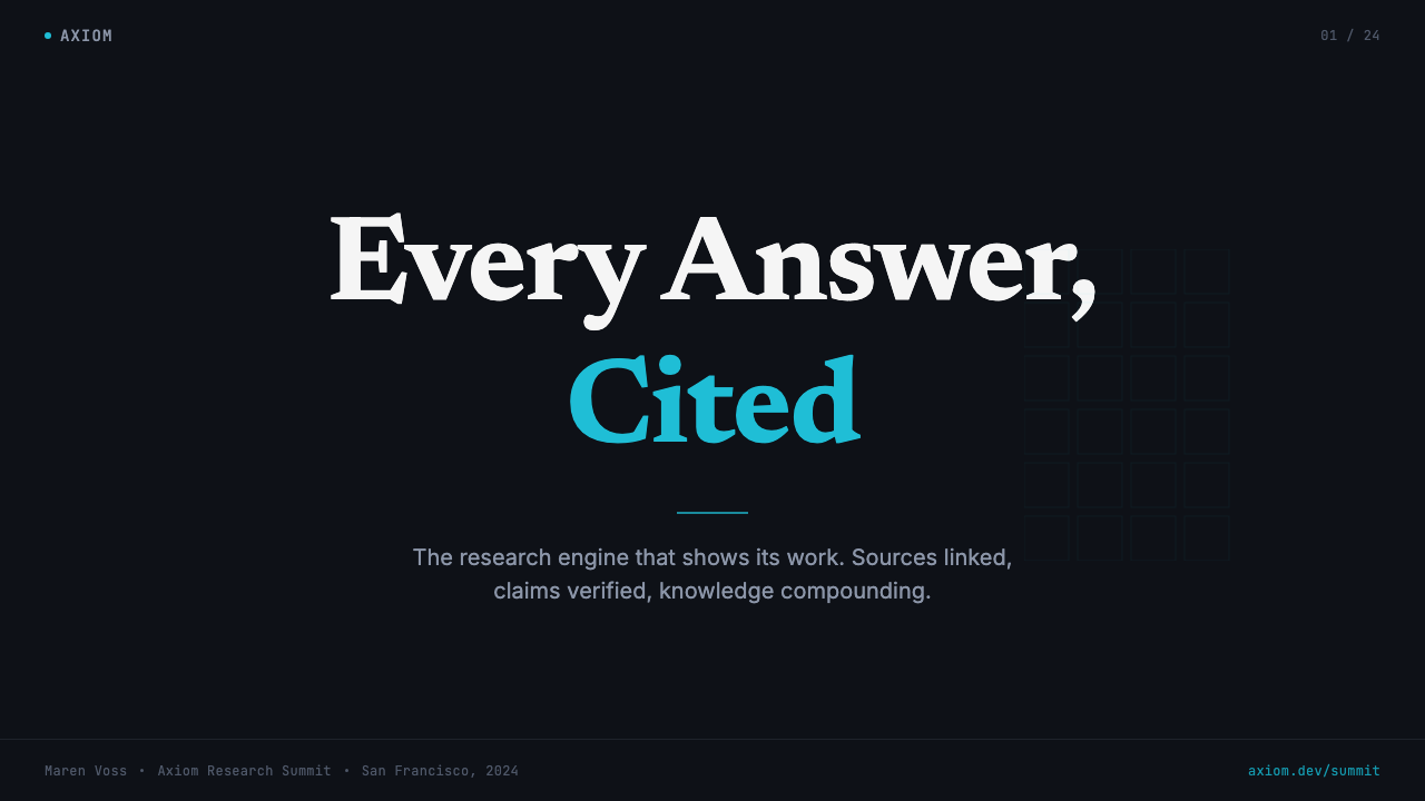
For presentation slides, the Perplexity register works best on cover pages and data-heavy content slides. A cover in this style uses the dark ground as the field, sets the title in a large serif or neutral proportional typeface, and reserves the teal accent for a single organizing element — a date, a category label, a source credit. Content slides should be treated as reading environments: text at a generous size, ample line spacing, teal used only for links or referenced sources, no decorative imagery. Data slides adopt the aesthetic of a research brief: charts are stripped to their essential geometry, source annotations appear as monospace footnotes below the visualization, and color beyond teal is used only when the data itself requires categorical distinction.对于演示文稿,Perplexity 风格在封面页和数据密集型内容页上效果最佳。这种风格的封面以深色底面为场域,以大号衬线字体或中性比例字体设置标题,青绿色点缀仅保留给单一组织性元素——日期、类别标签或信源说明。内容页应被当作阅读环境处理:充裕尺寸的文字、足够的行距、青绿色仅用于链接或引用信源,无装饰性图像。数据页采用研究简报的美学:图表被剥离至其基本几何形;信源标注以等宽字体脚注出现在可视化下方;青绿色之外的颜色仅在数据本身需要类别区分时使用。
For web interfaces — dashboards, analytics tools, documentation sites, pricing pages, and research platforms — the Perplexity system offers a strong foundation. The approach: a deep blue-black or very dark neutral as the base surface, near-white for all primary reading text, teal reserved exclusively for interactive and linked elements. Card components should use subtle surface value shifts rather than drop shadows or heavy borders to establish depth; the goal is a surface that reads as layered but never cluttered. Navigation in this register is typographic and spare — no icon-heavy sidebars, no gradient buttons, no decorative chrome around functional controls.对于网页界面——仪表板、分析工具、文档站点、定价页面和研究平台——Perplexity 系统提供了强大的基础。方法如下:以深蓝黑或极深中性色作为基底表面,所有主要阅读文字使用接近纯白;青绿色专门保留给交互和链接元素。卡片组件应通过表面明度的细微变化——而非投影或粗边框——来建立层次;目标是一个读起来有层次感但从不拥挤的表面。这种风格中的导航是字体性且简洁的——没有图标繁多的侧边栏,没有渐变按钮,功能控件周围没有装饰性镀铬效果。
For editorial and marketing contexts — long-form articles, research reports, white papers, and brand materials aimed at technical or professional audiences — the Perplexity aesthetic translates into a set of decisions about information hierarchy. Body text is set in a serif typeface with generous leading; section headers are typographic rather than decorative; pull quotes and source annotations are distinguished from body text through typeface shift rather than color. The teal accent, when it appears in editorial contexts, should be reserved for citations, footnotes, and cross-references — not used for emphasis or decoration. Marketing pages in this register communicate seriousness through restraint: full-surface dark panels alternating with near-white panels, with teal appearing only at points of functional interaction.对于编辑与营销场景——长篇文章、研究报告、白皮书,以及面向技术或专业受众的品牌材料——Perplexity 美学转化为一套关于信息层级的决策。正文以衬线字体排版,行距宽松;章节标题是字体性的而非装饰性的;引用语和信源标注通过字体切换而非颜色与正文区分。青绿色点缀在编辑场景中出现时,应保留给引用、脚注和交叉引用——不用于强调或装饰。这种风格的营销页面通过克制传递严肃性:全幅深色面板与接近纯白面板交替,青绿色仅在功能交互点出现。
A common mistake when working in this register is treating the dark palette as permission to add atmospheric visual effects — gradients bleeding from dark to light, glowing halos around UI elements, ambient color washes in the background. These effects undermine exactly what the system is designed to communicate. The library-at-midnight aesthetic is powerful because it is flat, precise, and unambiguous; every element of visual noise makes the interface read less like a research tool and more like a consumer entertainment product. Equally, designers sometimes mistake the teal accent for a general-purpose accent color and begin using it decoratively, for illustrations or visual interest, rather than exclusively as a semantic marker for sourced and interactive content. Once teal loses its singular semantic function, the entire citation grammar collapses.在此风格中工作时,一个常见错误是将深色调色板理解为添加大气视觉效果的许可——从深到浅的渐变、UI 元素周围的光晕、背景中的环境色彩渗透。这些效果恰好破坏了这套系统所设计传递的内容。午夜图书馆美学之所以强大,是因为它平面、精确、不模糊;每一点视觉噪声都使界面少一分研究工具的气质,多一分消费娱乐产品的气质。同样,设计师有时会将青绿色点缀误解为通用点缀色,开始将其用于装饰目的——插图或视觉趣味——而非专门作为有来源和可交互内容的语义标记。一旦青绿色失去其单一的语义功能,整套引用语法便会随之崩溃。
Perplexity AI — FAQPerplexity AI · 常见问题
Is this a standard dark mode, or something more specific?这只是普通的深色模式,还是有更具体的含义?
It is something more specific. Generic dark mode reverses a light interface to a dark equivalent, usually as a user preference for low-light comfort. Perplexity's dark ground is not a mode — it is the default and primary state, and it was chosen for semantic and cultural reasons, not ergonomic ones. The deep blue-black carries associations with research terminals, academic databases, and late-night focused work. The decision to build the entire visual identity around this ground rather than offering light as the primary option is a product positioning statement: this interface is for serious, focused information work, not casual browsing.这是更具体的东西。通用深色模式将浅色界面反转为深色等价物,通常作为用户在低光环境下的舒适偏好。Perplexity 的深色底面不是一种模式——它是默认且主要的状态,选择它出于语义和文化原因,而非人体工学原因。深蓝黑与研究终端、学术数据库和深夜专注工作有关联。围绕这个底面构建整个视觉标识——而非将浅色作为主要选项——是一个产品定位声明:这个界面是为严肃、专注的信息工作设计的,而非随意浏览。
Why use only one accent color across the entire interface?为什么整个界面只使用一种点缀色?
Because the accent color carries a specific semantic meaning — it marks sourced, retrieved, and linked information — and that meaning only works if the accent is singular. If a second accent color were introduced for, say, interactive controls or alert states, the user would need to learn which color means which thing, and the automatic grammar of 'teal equals citation' would be diluted. The constraint of a single accent is also what gives the interface its characteristic austerity: with only one accent against a dark near-neutral field, the design is forced to communicate hierarchy through typography, scale, and surface value alone.因为点缀色承载着特定的语义含义——它标记有来源、经过检索和链接的信息——而这种含义只有在点缀色是唯一的情况下才有效。如果引入第二种点缀色,比如用于交互控件或警示状态,用户就需要学习哪种颜色意味着什么,而「青绿色等于引用」的自动语法就会被稀释。单一点缀色的约束也是界面呈现其特有严峻感的原因:在深色接近中性的场域上只有一种点缀色,设计被迫仅通过排版、比例和表面明度来传递层级。
Can this aesthetic work for a brand that is not an AI search product?这种美学能用于非 AI 搜索产品的品牌吗?
Yes, but only if the brand's values genuinely align with the aesthetic's values. The Perplexity visual register communicates: authority, epistemic precision, research orientation, and deliberate seriousness. It works well for analytics platforms, professional research tools, financial data products, legal technology, academic publishing interfaces, and any context where the primary user relationship is with complex, sourced information. It is a poor fit for consumer-facing products that depend on warmth, approachability, or sensory richness — food, wellness, children's products, hospitality. Applying the aesthetic without alignment between visual values and product values produces an interface that feels cold and arbitrary rather than purposeful.可以,但前提是品牌的价值观与美学的价值观真正一致。Perplexity 视觉风格传递的是:权威性、认识论精确性、研究导向和刻意的严肃性。它适用于分析平台、专业研究工具、金融数据产品、法律科技、学术出版界面,以及任何主要用户关系建立在复杂、有来源信息之上的场景。它不适合依赖温暖感、亲和力或感官丰富性的面向消费者的产品——食品、健康、儿童产品、酒店。在视觉价值观与产品价值观未对齐的情况下应用这种美学,会产生一个感觉冷漠而任意而非有目的的界面。
How does this aesthetic handle data visualization?这种美学如何处理数据可视化?
Data visualizations in the Perplexity register are stripped to their structural minimum: axes are thin lines, gridlines are extremely subtle value shifts rather than visible strokes, labels are typographic and small, and the teal accent is used to highlight the primary data series or the referenced data point rather than applied to all elements. Secondary series are rendered in near-white at reduced opacity or in a muted neutral, never in a second bright accent. The overall effect is closer to a research paper figure than to a business intelligence dashboard — the visualization is subordinate to the text and citation system, not the primary carrier of meaning.Perplexity 风格中的数据可视化被剥离至其结构最小值:坐标轴是细线,网格线是极为细微的明度变化而非可见的笔触,标签是字体性的且小巧,青绿色点缀用于高亮主要数据系列或被引用的数据点,而非应用于所有元素。次要系列以降低透明度的接近纯白或以柔和中性色渲染,绝不使用第二种亮色点缀。整体效果更接近研究论文的图表,而非商业智能仪表板——可视化从属于文本和引用系统,而非意义的主要承载者。
What is the most common mistake when applying this style?应用这种风格时最常见的错误是什么?
Adding atmospheric visual effects that simulate depth, light, or richness — soft glows around cards, gradient bleeds across the background, luminous halos on interactive elements, color washes that evoke ambient environment. These effects are antithetical to what the system communicates. The power of the Perplexity aesthetic comes from its flatness and precision: every element is what it appears to be, every accent has a specific meaning, and nothing exists for visual pleasure alone. The moment atmospheric effects enter the system, the interface begins to read as decorative rather than functional, and the epistemic seriousness that the design is built to convey dissolves. If the design begins to feel like a dramatic piece of creative work, the register has been lost.添加模拟深度、光线或丰富感的大气视觉效果——卡片周围的柔和光晕、跨背景的渐变渗透、交互元素上的发光晕圈、唤起环境感的色彩渲染。这些效果与这套系统所传递的内容背道而驰。Perplexity 美学的力量来自其平面性和精确性:每个元素就是它看起来的那个样子,每种点缀色有特定的含义,没有任何东西仅为视觉愉悦而存在。一旦大气效果进入系统,界面就开始被读取为装饰性的而非功能性的,而设计所要传递的认识论严肃性就会随之消散。如果设计开始感觉像一件戏剧性的创意作品,这种风格就已经丢失了。
Related design styles相关设计风格
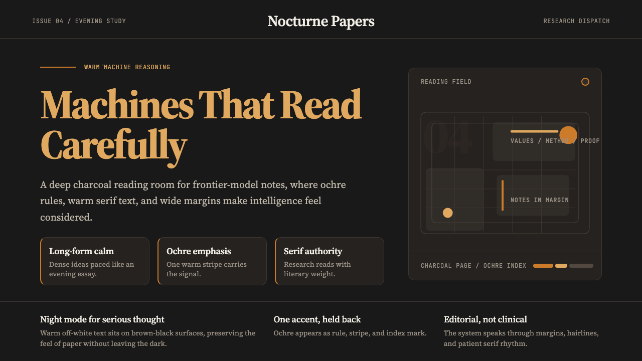 Claude / Anthropic Warm 2024Warm intelligence at night. Ochre rules and Source Serif glow on deep charcoa…夜读式温暖智能:深炭底、赭橙线与 Source Serif 发光。
 Cursor IDEAI-first code editor. Pure dark surfaces, off-white text, electric blue reser…以 AI 为核心的代码编辑器:近乎纯黑背景、柔白文字、唯一的电光蓝色专为 AI…
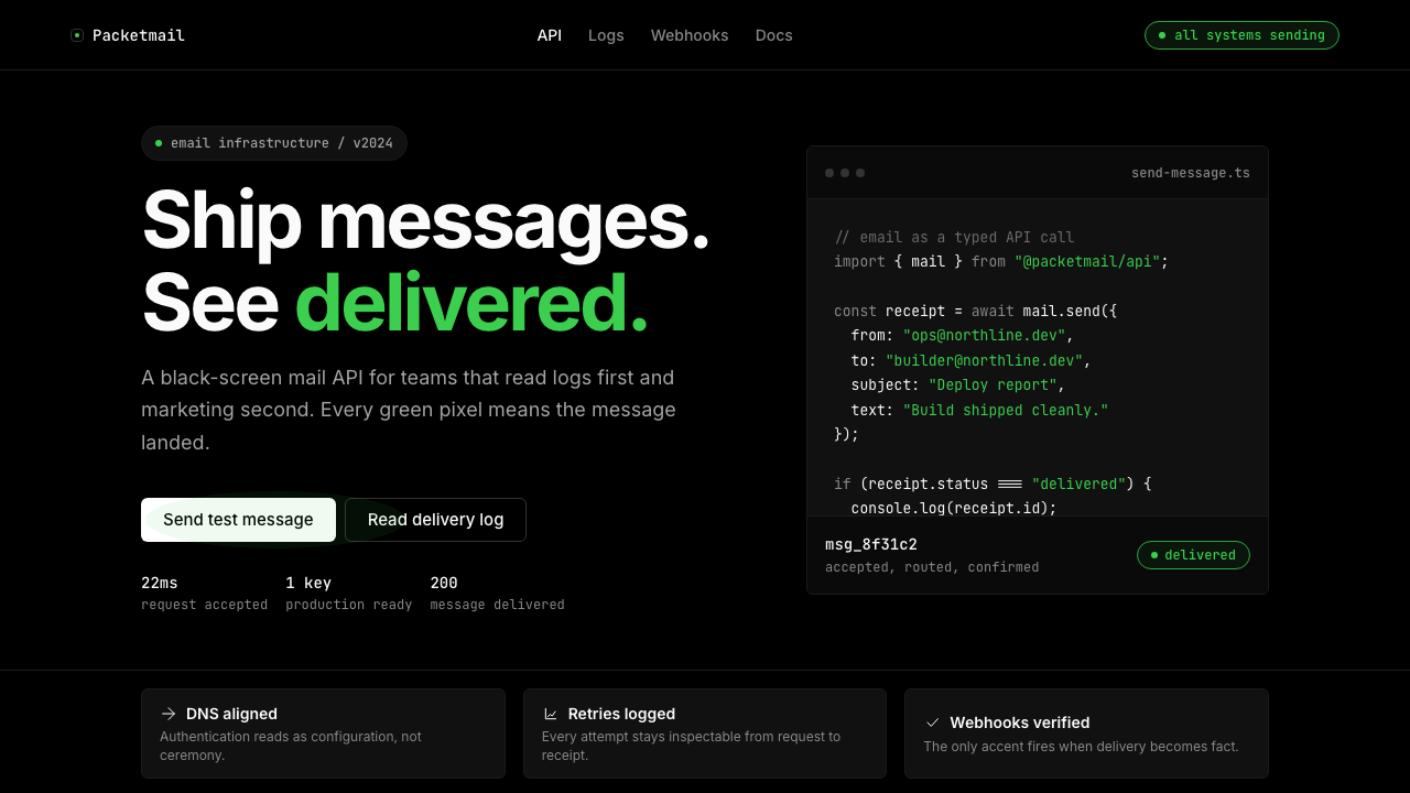 Resend 2024Clean code becomes brand. Pure black, JetBrains Mono, and one green delivered…品牌像 clean code:纯黑、JetBrains Mono、唯一送达绿。
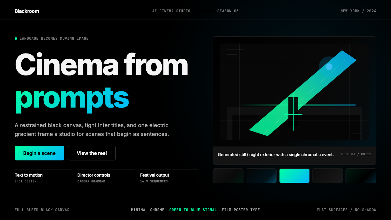 Runway MLCinema, not dashboard. Deep black frames tight Inter type and one green-blue…不是仪表盘,是电影感:纯黑画布、紧排 Inter 与绿蓝电光。
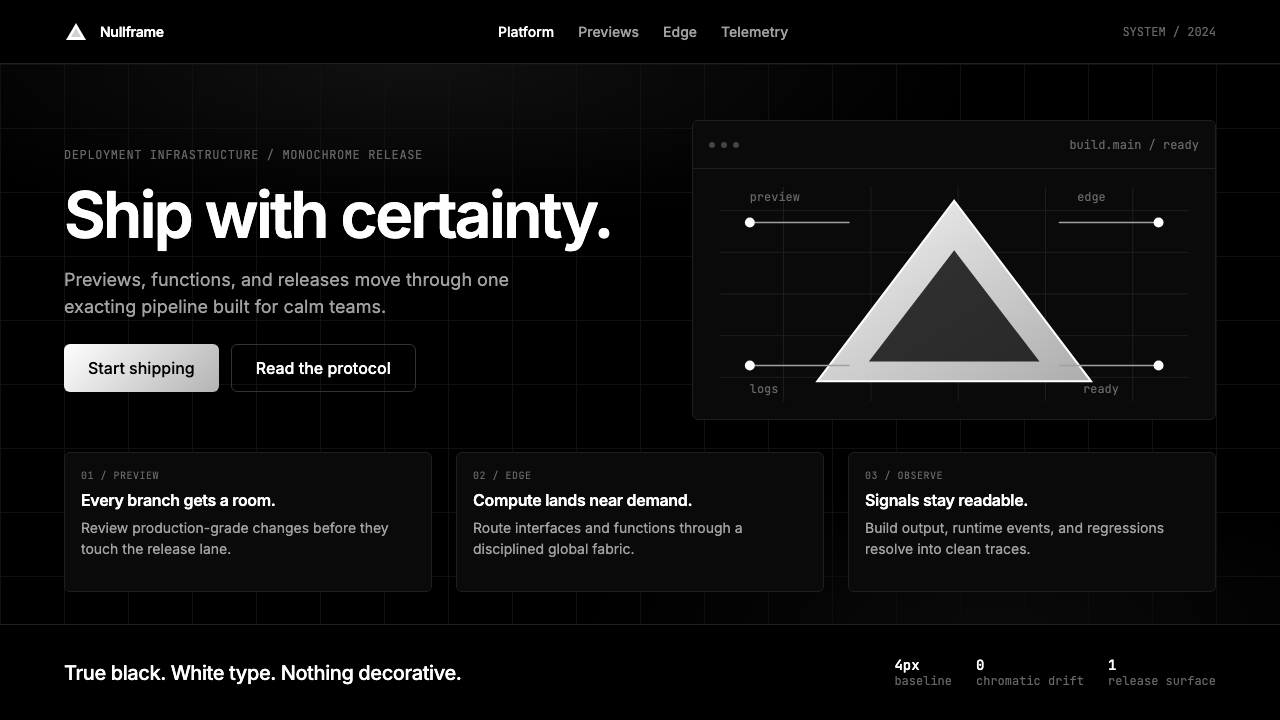 Vercel 2024Developer luxury by subtraction. Pure black, white Inter, rigid grid, triangu…以删减塑造开发者奢侈感:纯黑白、Inter 字体与刚性网格构成三角发布符号。
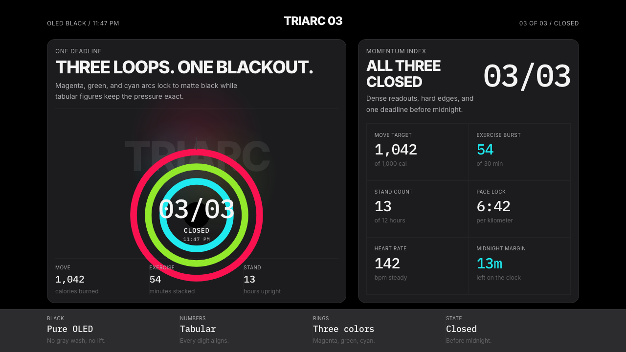 Apple Fitness Rings Closed (2024)Midnight feels exact. Magenta, green, and cyan rings lock onto OLED black.午夜像被校准。洋红、绿、青三环锁在黑底上。