What is Vercel 2024?什么是 Vercel 2024?
Vercel's 2024 brand speaks in two colors only — pure black and pure white — and says more than most identities manage with twenty.Vercel 2024 的品牌语言只用两种颜色——纯黑与纯白——却比大多数动用二十种颜色的品牌说得更多。
Vercel 2024 in briefVercel 2024 速览
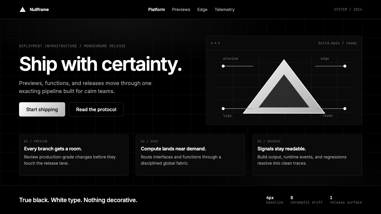
Vercel 2024 is a monochromatic design system built on radical subtraction. Every visual decision in the system — palette, typography, spacing, iconography — moves in the same direction: remove anything that does not carry meaning, then remove it again. What remains is a black-and-white identity so confident in its restraint that color appears only in the logos of the customers the platform serves.Vercel 2024 是一套建立在激进删减之上的单色设计系统。系统中的每一个视觉决策——色板、字体、间距、图标——都朝同一方向运动:移除一切不承载意义的元素,然后再移除一遍。最终留下的是一套黑白身份,自信到只需两种颜色,色彩仅在所服务客户的品牌标识中短暂出现。
The system draws its logic from Swiss typography and the long tradition of developer tooling that prizes precision over personality. But where that tradition often produces visual blandness, Vercel 2024 achieves something rarer: austerity that reads as luxury. The product language mirrors what the engineering culture prizes — no waste, no noise, no ornament that distracts from the work. The grid is tight and exposed, the type is set with an almost obsessive sense of rhythm, and the negative space is treated as an active compositional element rather than an empty accident.这套系统的逻辑来自瑞士字体排印传统,以及长期以来开发者工具文化对精确度的推崇。但后者往往产生视觉上的平庸,Vercel 2024 却实现了一种更罕见的东西:被读解为奢侈感的克制。产品语言映照着工程文化所珍视的价值——无浪费,无噪音,无干扰工作的装饰。网格严密而外露,排版节奏几近执念,负空间被当作主动的构图元素,而非偶然留出的空白。
The clearest signal of the system's ambition is the triangular release mark: a small geometric indicator, derived from the company's arrow-shaped logomark, used to mark product launches and changelog entries. That a brand would choose a pure geometric symbol — rather than color, illustration, or animation — as its primary celebratory gesture says everything about the system's values. Vercel 2024 is not minimalism as trend; it is minimalism as argument.这套系统的抱负,最清晰地体现在三角形发布标记上:一个从公司箭头形 logo 中提炼出来的小型几何符号,用于标记产品发布和更新日志条目。一个品牌选择纯几何符号——而非色彩、插图或动效——作为首要的庆典手势,这本身就说明了这套系统的全部价值观。Vercel 2024 不是作为潮流的极简主义,而是作为论点的极简主义。
Where does Vercel 2024 come from?Vercel 2024 从何而来?
Vercel was founded in 2015 under the name ZEIT by Guillermo Rauch, an Argentine-born engineer who had built a reputation in the Node.js community for obsessive attention to developer experience. The company's early visual identity was workmanlike — functional but undistinguished, typical of infrastructure startups that prioritize product over brand. That changed as the company grew into the principal steward of Next.js, the React framework that would come to define how a generation of developers builds for the web.Vercel 由阿根廷裔工程师吉列尔莫·劳赫(Guillermo Rauch)于2015年以 ZEIT 之名创立。劳赫在 Node.js 社区以对开发者体验的执念著称。公司早期的视觉形象务实有余——功能完备但缺乏辨识度,是基础设施初创公司重产品轻品牌的典型样态。随着公司逐渐成为 Next.js(定义了一代开发者构建 Web 方式的 React 框架)的主要守护者,这一状况开始改变。
The first major step in the brand's transformation came in late 2023, when Vercel released Geist — a proprietary typeface designed in collaboration with Rauno Freiberg and Basement Studio, a design collective with roots in Argentina and New York. Geist was not merely a new font choice; it was a statement of intent. The typeface carries a quality simultaneously warm and mechanical, readable at small sizes in code contexts and commanding at large display sizes on marketing surfaces. Its release marked the moment Vercel decided to treat visual design as a first-class product discipline rather than a support function.品牌蜕变的第一个重大步骤发生于2023年底:Vercel 发布了 Geist——一套与劳诺·弗莱贝格(Rauno Freiberg)及设计集体 Basement Studio 合作设计的专有字体。Geist 不仅仅是一次字体更换,而是一份意图声明。这套字体兼具温度与机械感,在代码语境的小字号下清晰可读,在营销页面的大展示尺寸下则具有统领气场。它的发布标志着 Vercel 决定将视觉设计作为一流产品学科对待,而非辅助职能。
Through 2024, the brand refresh crystallized into a complete visual system. The color palette collapsed to pure black and white — a decision that would have been commercially risky for most companies, but that Vercel executed with enough typographic and spatial conviction to make it read as authority rather than poverty of imagination. Customer logos became the only source of color in the system, a move borrowed from the luxury fashion world, where a brand's confidence is sometimes measured by what it chooses not to say.整个2024年,品牌焕新逐步凝固为一套完整的视觉系统。调色板收窄为纯黑与纯白——对大多数公司而言这是一个商业风险颇高的决定,但 Vercel 凭借足够的排印与空间说服力,使之读解为权威而非想象力的贫乏。客户 logo 成为整套系统中唯一的色彩来源,这一手法借鉴自奢侈品时尚界——在那里,一个品牌的自信有时通过它选择不说的内容来衡量。
The design direction was shaped significantly by Tom Occhino, Vercel's Head of Design, who had previously led design at Facebook and brought a disciplined systems-thinking approach to the rebrand. The involvement of Basement Studio — which had built a reputation for rigorous typographic work in the South American design scene — gave the identity an international character that departed from the Silicon Valley default aesthetic. Together, these collaborators produced a system that positioned Vercel not merely as an infrastructure provider but as a taste-maker in the developer tools industry.设计方向在很大程度上由 Vercel 设计负责人汤姆·奥基诺(Tom Occhino)主导——他此前曾领导 Facebook 的设计工作,为此次品牌重塑带来了严谨的系统思维。Basement Studio 的参与——该工作室凭借严苛的字体排印工作在南美设计界建立了声誉——赋予了这套身份一种有别于硅谷默认美学的国际气质。这些协作者共同创造出一套系统,使 Vercel 不仅仅是一家基础设施提供商,更是开发者工具行业的品味引领者。
What defines the Vercel 2024 look?Vercel 2024 的视觉特征是什么?
Monochromatic Palette单色调色板
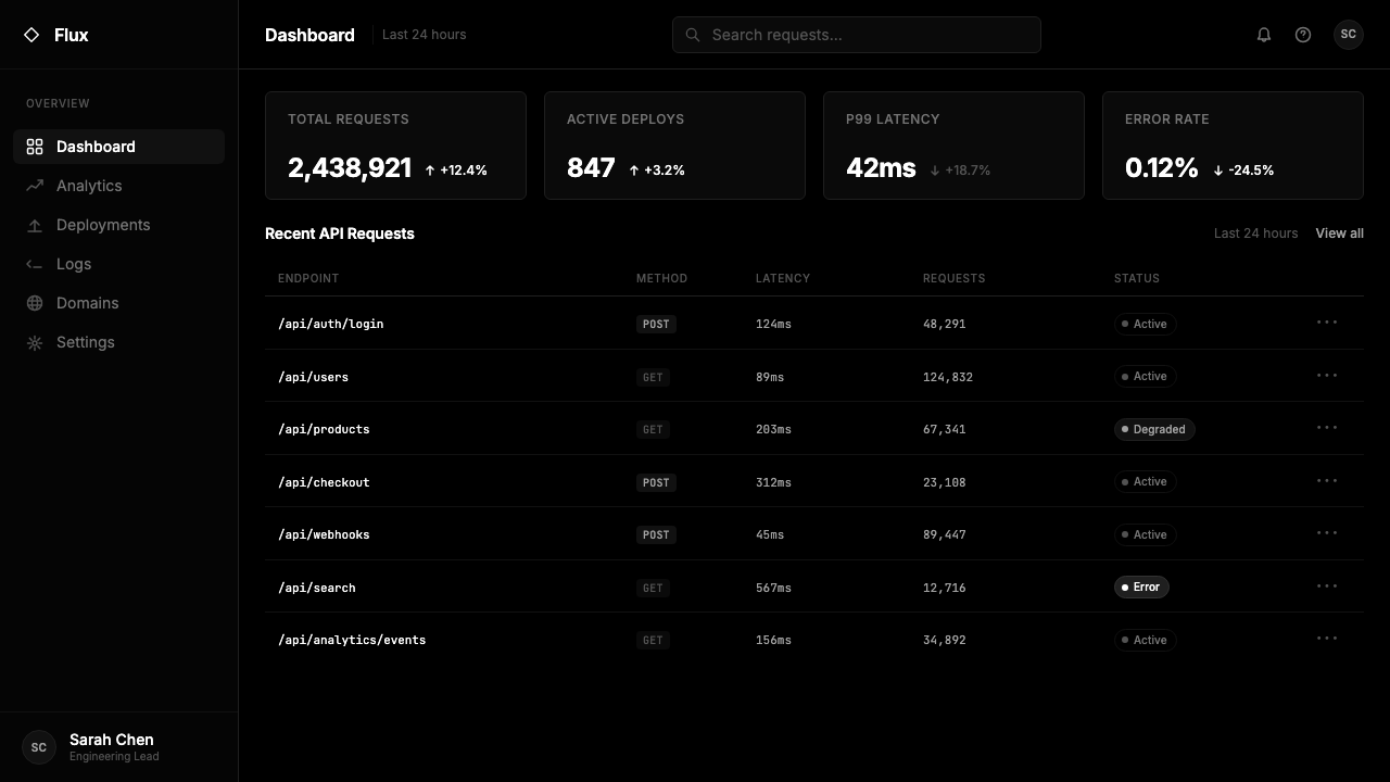
The system operates in pure black and pure white with no intermediate grays used for decoration. Tonal variation exists only where necessary to distinguish interface states — active, disabled, hovered — and even then the steps are as few as the design can sustain. Customer brand colors appear as the sole exception, isolated as deliberate color events in an otherwise achromatic field. This restraint transforms two colors into a complete design language.整套系统运作于纯黑与纯白之间,不使用任何用于装饰目的的中间灰阶。色调变化仅在区分界面状态(激活、禁用、悬停)的必要之处出现,即便如此,层级也尽量精简。客户品牌色作为唯一例外出现,在无色彩的底场中被隔离为刻意为之的色彩事件。这种克制将两种颜色转化为一套完整的设计语言。
Typographic Authority排印权威感
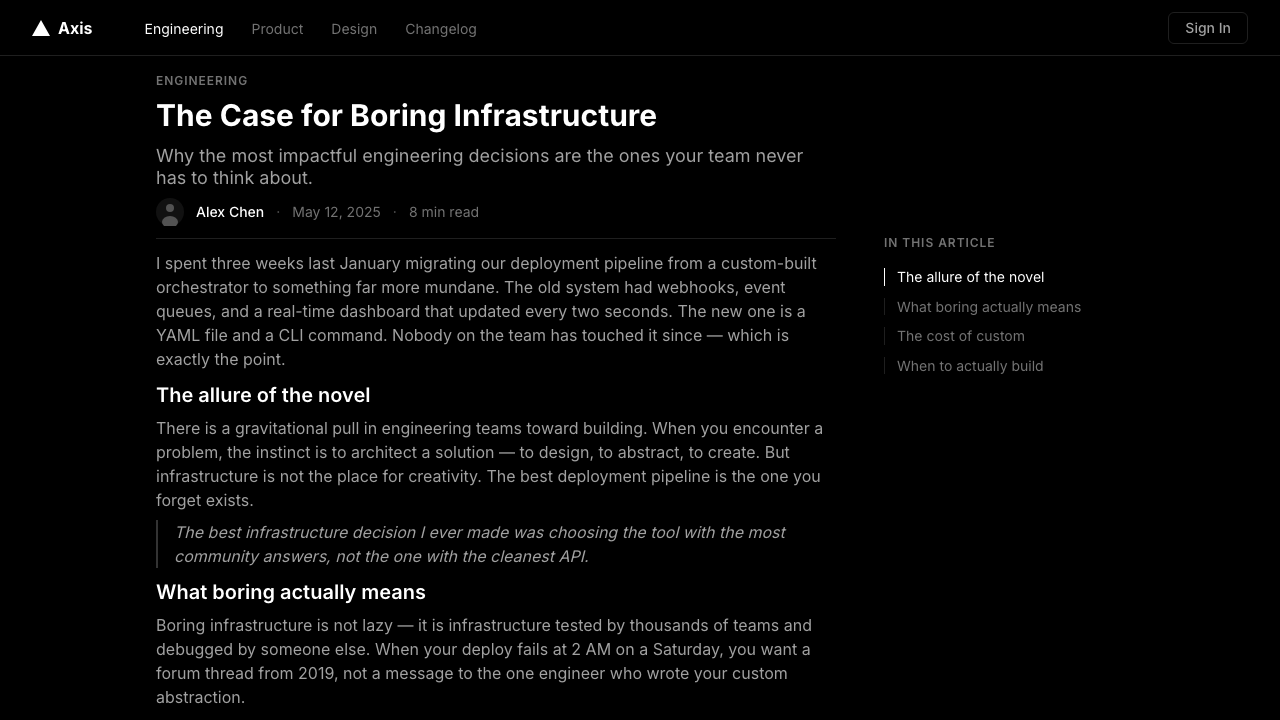
The Geist typeface — released by Vercel as open source in late 2023 — anchors the entire system. It reads as both humanist and geometric, capable of carrying technical documentation at small sizes and commanding display headings at large ones. The type scale is set with an almost mathematical sense of proportion: headings establish strong hierarchy through size alone, body text is set generously to aid reading density, and caption-level text is treated with the same care as primary copy rather than as an afterthought. Typographic rhythm does the work that other systems assign to color or illustration.Geist 字体——Vercel 于2023年底以开源形式发布——锚定了整套系统。它兼具人文主义与几何感,既能在小字号下承载技术文档,又能在大字号下统领展示标题。字型比例体系以近乎数学的方式设定:标题仅凭尺寸建立强劲层级,正文设置宽松以提升阅读密度,标注级文字被赋予与主要文案同等的细心对待,而非事后的补丁。排印节奏完成了其他系统交给色彩或插图完成的工作。
Rigid Grid Structure刚性网格结构
Every surface in the Vercel 2024 system is governed by a strict column grid. Elements align to it without exception; the grid is not a starting suggestion but a rule. This rigidity produces a sense of engineering precision — the same quality that makes a well-structured codebase feel authoritative. White space is distributed by the grid's logic rather than by feel, which means the breathing room between elements is proportional and consistent rather than intuitive and approximate.Vercel 2024 系统中的每一个界面都受严格列网格支配。元素毫无例外地对齐于此;网格不是起点建议,而是规则。这种刚性产生了一种工程精确感——与结构良好的代码库给人权威感的品质相同。空白由网格的逻辑而非感觉分配,这意味着元素间的呼吸空间是成比例且一致的,而非凭直觉和近似决定的。
Geometric Accent Mark几何强调符号
The triangular release mark — a small upward-pointing triangle derived from Vercel's logomark — functions as the system's signature celebratory gesture. Rather than using color, confetti, or illustration to signal product launches and notable updates, the system uses this single geometric form. The restraint is deliberate: a pure shape carries no noise, scales to any size, reproduces cleanly in any medium, and gains meaning through consistent repetition rather than visual complexity.三角形发布标记——一个从 Vercel logo 中提炼出来的小型向上三角形——充当这套系统的标志性庆典手势。与其使用色彩、纸屑或插图来标示产品发布与重要更新,这套系统选择这单一几何形。这种克制是刻意的:纯粹的形状不携带噪音,可以缩放至任何尺寸,在任何媒介上清晰再现,并通过一致的重复而非视觉复杂性获得意义。
Negative Space as Content负空间作为内容
In the Vercel 2024 system, emptiness is not the absence of design — it is design. Generous margins and deliberate white space between sections signal confidence: the layout trusts that readers will find the content rather than surrounding it with visual noise to capture attention. On marketing pages, this creates a quality that sits at the intersection of editorial and architectural — surfaces that feel curated rather than crowded, where each element's isolation gives it weight.在 Vercel 2024 系统中,空无不是设计的缺席——它就是设计。段落间宽裕的页边距与刻意留出的空白传递出一种自信:版面相信读者会自己找到内容,而非用视觉噪音包裹内容来捕获注意力。在营销页面上,这创造出一种编辑性与建筑性交汇的品质——界面感觉经过筛选而非拥挤,每个元素的孤立感赋予它重量。
Structured Surface Hierarchy结构化界面层级
The system distinguishes surface layers through subtle border lines and tonal step-backs rather than through shadows or elevation. Cards and panels are defined by a thin single-pixel border rather than a soft drop shadow — a choice that keeps the visual field flat and engineered rather than soft and physical. This approach is consistent with the system's refusal of naturalistic illusion: surfaces are design decisions, not lighting simulations.这套系统通过细微的边框线与色调退级来区分界面层次,而非通过阴影或高度感。卡片与面板由细单像素边框定义,而非柔和的投影阴影——这一选择使视觉场保持平面与工程感,而非柔和与实体感。这种做法与这套系统拒绝自然主义幻觉的立场一致:界面是设计决定,而非光照模拟。
Motion as Precision动效即精确
Where animation appears in the Vercel 2024 system, it is fast, directional, and purposeful. Transitions feel mechanical rather than playful — they communicate state change and directional navigation rather than delight or personality. The timing is tight enough to feel instant but long enough to be perceptible; easing is minimal. This approach treats motion as a form of information rather than a form of entertainment, consistent with the system's overall commitment to signal over noise.当动效出现在 Vercel 2024 系统中时,它是快速的、方向性的和有目的的。过渡感觉是机械的而非嬉戏的——它们传达状态变化与方向性导航,而非愉悦感或个性。时长紧凑到足以感觉即时,又长到足以被感知;缓动最小化。这种做法将动效视为一种信息形式而非娱乐形式,与这套系统对信号而非噪音的整体承诺一致。
Who shaped Vercel 2024?谁塑造了 Vercel 2024?
The Argentine-born founder and CEO of Vercel, Rauch has been the driving creative and strategic force behind the company's evolution from a Node.js deployment utility (then called ZEIT) into the platform that hosts a significant share of the modern web. His personal aesthetic — characterized by a preference for precision, restraint, and high production quality — is inseparable from Vercel's brand direction. Rauch's public communications, including his X presence and product announcements, are themselves demonstrations of the visual and tonal system the company has developed: spare, confident, and technically rigorous.Vercel 阿根廷裔创始人兼 CEO,劳赫是公司从 Node.js 部署工具(彼时称 ZEIT)演进为承载现代网络相当体量的平台背后的核心创意与战略力量。他的个人美学——以偏好精确、克制与高制作品质为特征——与 Vercel 的品牌方向不可分割。劳赫的公开传播,包括他在 X 上的发言与产品公告,本身就是公司所发展出的视觉与语调系统的示范:简洁、自信、技术严谨。
A designer with deep roots in interaction design and typographic craft, Freiberg was central to the creation of the Geist typeface and the broader 2024 visual system. His work demonstrates an unusual ability to operate across scales — from the micro-level decisions of letterform design to the macro-level architecture of a brand system. Freiberg's design sensibility aligns closely with the Vercel philosophy: remove the unnecessary, then interrogate what remains to determine whether it is truly earning its place.在交互设计与排印工艺上有深厚根基的设计师,弗莱贝格是 Geist 字体与 2024 年更广泛视觉系统创建的核心人物。他的工作展现出一种罕见的跨尺度运作能力——从字形设计的微观决策到品牌系统的宏观架构。弗莱贝格的设计感性与 Vercel 哲学高度契合:移除不必要的,然后审视剩余之物以判断它是否真正值得其位置。
As Vercel's Head of Design and a former design lead at Facebook (where he worked on React's early adoption across product surfaces), Occhino brought a rare combination of product design discipline and systems thinking to the rebrand. His experience at scale — designing for products used by billions of people — informed the Vercel system's insistence on clarity and hierarchy over expression and novelty. The 2024 visual system reflects his belief that a great design system should feel inevitable in retrospect: every decision justified, nothing arbitrary.作为 Vercel 设计负责人,以及 Facebook 前设计主管(曾主导 React 在产品界面上的早期推广),奥基诺为此次品牌重塑带来了产品设计纪律与系统思维的罕见组合。他在规模化设计上的经验——为数十亿用户使用的产品做设计——影响了 Vercel 系统对清晰度与层级的坚持,而非表达性与新奇感。2024年的视觉系统反映了他的信念:一套出色的设计系统回头看应该感觉是必然的——每一个决定有所依据,没有任何东西是随意的。
A design collective with roots in Buenos Aires and operational presence in New York, Basement Studio built its reputation on typographic rigour and a willingness to work at the intersection of editorial and digital product design. Their involvement in the Vercel brand — particularly in the development of Geist and the visual identity system — brought a Latin American design sensibility that differs from the prevailing conventions of Silicon Valley. Basement's work tends to be architecturally structured, typographically exacting, and resistant to the trends that dominate technology brand design.根植于布宜诺斯艾利斯、在纽约运营的设计集体,Basement Studio 凭借排印严谨性与在编辑性与数字产品设计交汇处工作的意愿建立声誉。他们参与 Vercel 品牌——特别是 Geist 与视觉身份系统的开发——带来了有别于硅谷主流惯例的拉丁美洲设计感性。Basement 的作品倾向于具有建筑性结构、排印上的严苛,以及对主导科技品牌设计潮流的抵抗。
How do you use Vercel 2024 today?今天怎么用 Vercel 2024?
Vercel 2024 is one of the most immediately transferable contemporary design styles for professional digital output, precisely because its rules are few and unambiguous. The system does not ask for taste judgments about which color to use or how expressive to be — it removes those decisions. Applying it well means applying its constraints rigorously: maintain the monochrome palette, commit to the typographic hierarchy, respect the grid, and treat negative space as a primary design element rather than leftover margin.Vercel 2024 是当代设计风格中可迁移性最高的之一,恰恰因为它的规则既少又明确。这套系统不要求关于使用哪种颜色或表达程度的审美判断——它移除了这些决定。出色应用它意味着严格执行其约束:维持单色色板,遵守排印层级,尊重网格,将负空间视为主要设计元素而非剩余边距。
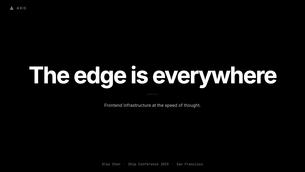
For presentation slides, the style is particularly well-suited to technical and business audiences. A cover slide in this system should be almost entirely typographic: a large, high-weight headline set flush left or centered against a black or white field, with the presenter's name or company in a substantially smaller weight below. No background imagery, no gradient fill, no illustration. Content slides follow the same logic — one typographic hierarchy per slide, one idea clearly stated, generous vertical spacing between blocks. Data slides become diagrammatic: charts are rendered with clean geometric forms, labeled in the same typeface at a consistent scale, with values communicated through size and position rather than color coding. The monochrome constraint forces visual decisions that would otherwise be avoided.对于演示文稿,这种风格特别适合技术性与商业性受众。这套系统中的封面页应当几乎完全是排印性的:一个大字重标题,左对齐或居中置于黑色或白色底面,演讲者姓名或公司名以明显更小的字重置于其下。无背景图像,无渐变填充,无插图。内容页遵循同样的逻辑——每张幻灯片一个排印层级,一个想法清晰陈述,区块间宽裕的垂直间距。数据页变得示意图化:图表以干净的几何形式呈现,在相同字体的一致比例下标注,数值通过尺寸与位置而非色彩编码来传达。单色约束迫使人做出那些原本会被回避的视觉决定。
For web interfaces — dashboards, pricing pages, documentation sites, and developer-facing tools — the system is nearly purpose-built. The approach: establish a strict column grid that governs every element, set all body text in a single weight of a geometric sans-serif typeface, and use border lines rather than shadows to define surface boundaries. Interactive states — hover, active, disabled — are expressed through tonal shifts and border changes rather than color changes. Navigation is purely typographic, with no decorative icons beyond functional indicators. The result is an interface that communicates engineering competence without requiring a single color decision.对于网页界面——仪表板、定价页、文档站点与面向开发者的工具——这套系统几乎是专为此而建的。做法是:建立支配每个元素的严格列网格,所有正文使用单一字重的几何无衬线字体,用边框线而非阴影定义界面边界。交互状态——悬停、激活、禁用——通过色调偏移与边框变化而非颜色变化来表达。导航纯粹是排印性的,除功能性指示符外无装饰图标。结果是一个传达工程能力的界面,无需作出任何颜色决定。
For editorial and marketing work — landing pages, product announcements, launch communications — the style's poster-like confidence creates strong hierarchy across long-form content. Feature sections alternate between black-ground and white-ground layouts, creating rhythm without requiring visual novelty on each surface. Pull quotes and key statements are set at a size that makes them landmarks in the layout rather than decorations. Where customer logos or partner marks appear, they become the color moments in an otherwise achromatic environment — a technique that flatters both the customer and the host brand simultaneously.对于编辑性与营销性内容——落地页、产品公告、发布传播——这种风格的海报式自信在长篇内容中创造出强劲层级。功能区块在黑底与白底版面之间交替,在每个界面无需视觉新奇感的前提下制造节奏。引语与关键陈述以能让它们成为版面地标的尺寸呈现,而非装饰。客户 logo 或合作伙伴标识出现的地方,在无色彩的环境中成为色彩时刻——这种手法同时取悦了客户与主品牌。
The most common mistake when applying Vercel 2024 is mistaking restraint for emptiness and compensating by adding visual elements that the system specifically excludes: gradient overlays, colored accent bars, ambient shadows, or decorative icons used for visual interest rather than functional communication. A second frequent error is breaking the typographic system by introducing a second typeface for variety — the style's power comes from the compression of its type choices, not from their range. When in doubt, the correct response is always to remove rather than add.应用 Vercel 2024 时最常见的错误,是将克制误读为空洞,并通过添加这套系统明确排除的视觉元素来补偿:渐变叠加层、彩色强调条、环境阴影,或以视觉趣味而非功能传达为目的使用的装饰图标。第二个常见错误是为了求变引入第二种字体,从而打破排印系统——这种风格的力量来自字体选择的压缩,而非其广度。有疑问时,正确的回应永远是删减而非添加。
Vercel 2024 — FAQVercel 2024 · 常见问题
Can Vercel 2024 work for a brand that is not a developer tools company?Vercel 2024 风格能用于非开发者工具公司的品牌吗?
Yes, but with awareness of what the style communicates. The Vercel 2024 system signals precision, technical competence, and a kind of earned restraint — qualities that read well for financial technology, professional services, enterprise software, and any brand that wants to position expertise over warmth. It works poorly for consumer brands where emotional approachability is primary, for products aimed at younger or non-technical audiences, or for any context where the absence of color reads as cold or unwelcoming rather than authoritative. The style is a values match before it is a visual match.可以,但要清楚这种风格在传达什么。Vercel 2024 系统传递精确感、技术能力与一种实至名归的克制——这些品质对于金融科技、专业服务、企业软件,以及任何希望以专业性而非温度感定位的品牌来说读感良好。它对消费者品牌效果欠佳(那里情感亲近性是首要的),对面向年轻或非技术受众的产品效果欠佳,对任何缺乏色彩会被读解为冷漠而非权威的场景效果欠佳。这种风格首先是价值观的匹配,然后才是视觉的匹配。
How do you introduce visual variety into a monochrome system without breaking its logic?如何在不破坏单色系统逻辑的前提下引入视觉变化?
Variety in the Vercel 2024 system comes from scale contrast, density contrast, and compositional rhythm — not from color or illustration. A page gains visual interest when a large-scale typographic element sits beside a dense text block, or when a full-black section follows several white-ground sections. The grid itself can be varied by choosing different column spans for different content types. Motion — when used — provides another dimension of variety. The rule is that every source of variety must be structural: if removing the varied element would break the layout's logic, it belongs; if it is purely decorative, it should not be there.Vercel 2024 系统中的变化来自尺度对比、密度对比和构图节奏——而非色彩或插图。当大尺度排印元素与密集文本块并置,或当纯黑色块接续几个白底区块时,页面获得视觉趣味。通过为不同内容类型选择不同的列跨度,网格本身也可以变化。动效——在使用时——提供变化的另一个维度。规则是:每一个变化来源都必须是结构性的——如果移除这个变化元素会破坏版面逻辑,它就属于这里;如果它纯粹是装饰性的,它就不应该在那里。
Is it appropriate to use photography in a Vercel 2024-style layout?在 Vercel 2024 风格的版面中使用摄影图像合适吗?
Photography can work, but it must be treated consistently with the system's values. The most compatible approach is high-contrast imagery where subject matter is graphic and geometric — architectural details, close-up product shots, or abstract technical surfaces. Natural scenes, portraits with soft lighting, and lifestyle imagery all import visual warmth that conflicts with the system's cool authority. When photography appears in the Vercel system itself, it is typically used to show product interfaces (which are themselves achromatic) or customer faces in testimonial contexts where warmth serves a deliberate purpose. Color photographs of people function as the same controlled color-event logic that applies to customer logos.摄影图像可以使用,但必须与系统价值观保持一致。兼容性最高的做法是使用高对比度图像,其题材具有图形感和几何感——建筑细节、产品特写或抽象技术表面。自然场景、柔和光线人像和生活方式图像都引入了与系统冷峻权威感相冲突的视觉温度。当摄影图像出现在 Vercel 系统本身中时,通常用于展示产品界面(它们本身也是无色彩的)或在客户评价语境中展示人脸(那里温度感服务于刻意目的)。人物彩色照片的运作逻辑与客户 logo 的受控色彩事件逻辑相同。
How does Vercel 2024 relate to Swiss International Style?Vercel 2024 与瑞士国际主义风格有何关系?
Vercel 2024 is a contemporary descendant of Swiss International Style filtered through the specific demands of developer-product design. Both systems share a commitment to the mathematical grid, typographic hierarchy as the primary organizational tool, and the rejection of ornament. Where they diverge is in palette and cultural register. Swiss International Style developed within a tradition of color photography and broad-spectrum color use; Vercel 2024 goes further into strict monochrome. Swiss Style carries a universalist, institutional aspiration; Vercel 2024 carries a specific subcultural aspiration — the values of engineering excellence translated into visual form. Think of Vercel 2024 as Swiss Style with a product manager's discipline applied to the brand layer.Vercel 2024 是瑞士国际主义风格经由开发者产品设计特定需求过滤后的当代后裔。两套系统都对数学网格、排印层级作为首要组织工具以及拒绝装饰有着共同的承诺。它们的分歧在于色板与文化语调。瑞士国际主义风格在彩色摄影与宽谱色彩使用的传统中发展;Vercel 2024 则走得更远,进入严格的单色领域。瑞士风格承载一种普世主义、机构性的抱负;Vercel 2024 承载一种特定亚文化抱负——工程卓越的价值观被翻译为视觉形式。可以将 Vercel 2024 理解为:在品牌层应用了产品经理纪律的瑞士风格。
What is the biggest risk when a team tries to apply Vercel 2024 style without deep familiarity?团队在缺乏深入了解的情况下尝试应用 Vercel 2024 风格时,最大的风险是什么?
The biggest risk is producing something that looks empty rather than disciplined — a design that removes color and decoration but fails to replace them with the spatial and typographic precision that makes the Vercel system feel confident rather than sparse. The system's visual power comes from the quality of its spacing decisions, the exactness of its typographic scale, and the intelligence of its compositional rhythm. Without those qualities in place, monochrome restraint reads simply as effort not yet applied. The solution is to over-invest in the typographic and spatial decisions — to treat the typeface choice, the scale steps, and the grid definition as the high-stakes design decisions they are in this system, rather than treating color restraint as the only work that needs doing.最大的风险是产出一个看起来空洞而非有纪律的东西——一个移除了色彩和装饰,却未能以使 Vercel 系统感觉自信而非稀疏的空间与排印精确性来替代它们的设计。这套系统的视觉力量来自其间距决策的品质、排印比例的精确性以及构图节奏的智慧。如果没有这些品质,单色克制读来不过是尚未投入的努力。解决方案是在排印与空间决策上过度投入——将字体选择、比例层级和网格定义视为它们在这套系统中本来的高风险设计决定,而非将色彩克制视为唯一需要完成的工作。
Related design styles相关设计风格
 Cursor IDEAI-first code editor. Pure dark surfaces, off-white text, electric blue reser…以 AI 为核心的代码编辑器:近乎纯黑背景、柔白文字、唯一的电光蓝色专为 AI…
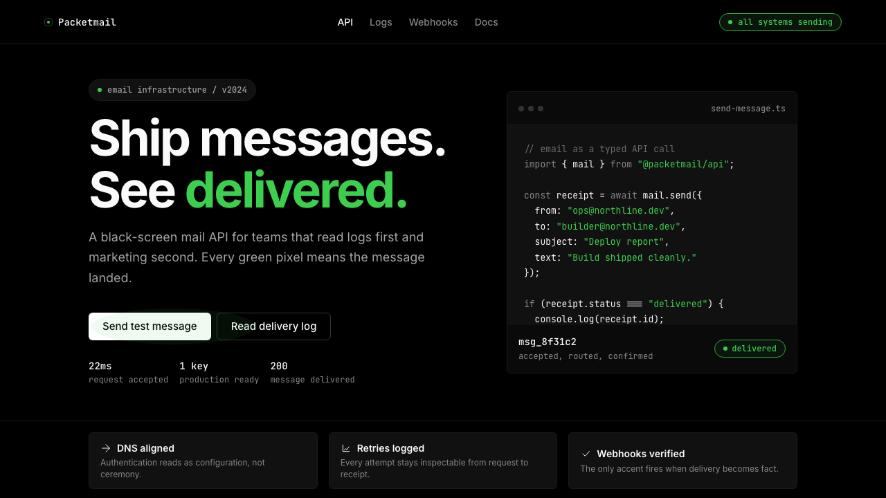 Resend 2024Clean code becomes brand. Pure black, JetBrains Mono, and one green delivered…品牌像 clean code:纯黑、JetBrains Mono、唯一送达绿。
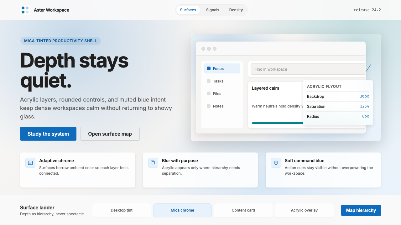 Microsoft Fluent 2Disciplined translucency. Warm Mica neutrals, acrylic blur, and muted blue cr…有纪律的半透明:暖 Mica 中性色、亚克力模糊与低调蓝营造沉稳层次。
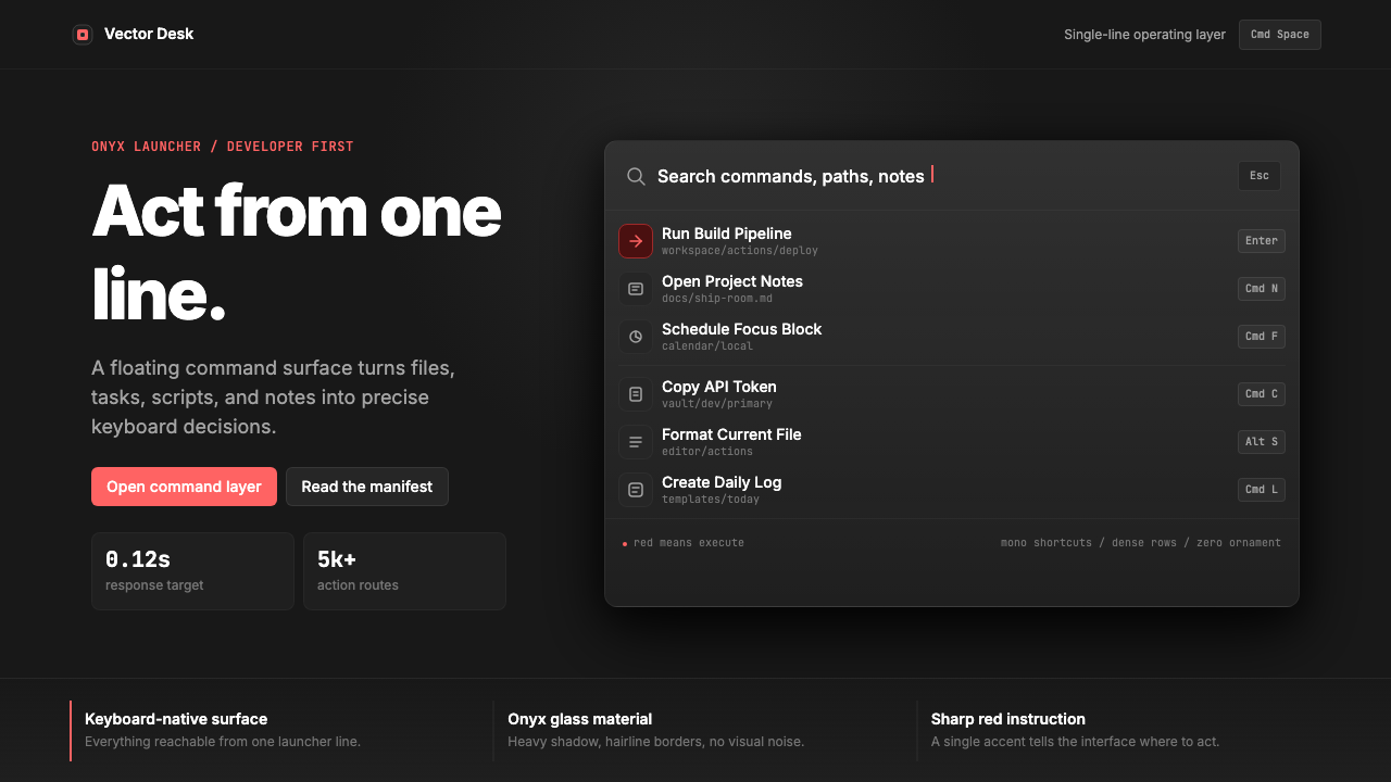 Raycast Spotlight Launcher (2023)Obsidian confidence. Sharp red cuts through Inter rows and mono shortcut chip…黑曜石般自信。锐红切过 Inter 行与等宽快捷键。
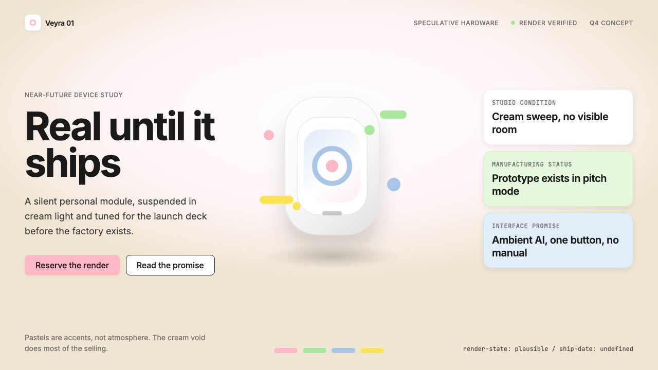 Vaporware Future Product RenderExpensive unreality. Cream sweep, Inter restraint, and pastel chips orbit a f…昂贵的失真感。奶油棚景、Inter 克制排版与粉彩芯片围绕悬浮渲染。
 Android Bugdroid GreenFriendly tech, reduced to geometry. Vivid green pops from Grey 900 and rounde…友好科技化为几何:明绿从 Grey 900 与圆润字形中跃出。