Design style guide设计风格指南
What is Raycast Spotlight Launcher (2023)?什么是 Raycast Spotlight Launcher (2023)?
Raycast reimagined the humble application launcher as a statement of developer confidence — obsidian surfaces, surgical red accents, and information density that treats the command palette as the entire operating environment.Raycast 将朴素的应用启动器重新定义为开发者自信的宣言——黑曜石表面、精准的红色强调,以及将命令面板视为完整操作环境的信息密度。
Raycast Spotlight Launcher (2023) in briefRaycast Spotlight Launcher (2023) 速览
The Raycast Spotlight Launcher design system is the visual language of a macOS productivity application that, by 2023, had evolved from a simple command runner into a full developer operating environment. Its aesthetic is instantly recognizable: near-black glass surfaces with barely perceptible depth, a single sharp brand-red accent that cuts through the darkness with surgical precision, and monospaced shortcut chips that treat keyboard shortcuts as first-class typographic citizens.Raycast Spotlight Launcher 设计体系是一款 macOS 效率应用的视觉语言——到 2023 年,这款应用已从简单的命令运行器演化为完整的开发者操作环境。它的美学一眼可辨:近乎纯黑的玻璃质感表面,带有隐约可感的深度层次;一抹锐利的品牌红色以手术般的精准划破黑暗;等宽快捷键标签将键盘快捷键视为第一等级的排版公民。
At its core, the system belongs to the command-palette renaissance of the early 2020s — a moment when developer tooling collectively decided that the fastest interface is the one that surfaces any action through a single, keyboard-first search field. Raycast's particular contribution to this genre was to build that philosophy into an intensely refined visual system: one where darkness is not moodiness but substrate, where red is not decoration but signal, and where every pixel of spacing communicates that the designer has thought about the cognitive cost of every element.从本质上看,这套体系属于 2020 年代初期命令面板复兴运动的一部分——那个时代,开发者工具集体决定:最快的界面,是能通过单一键盘优先的搜索框调出任何操作的界面。Raycast 对这一流派的独特贡献,在于将这种哲学融入了一套极度精炼的视觉系统:在这里,黑暗不是情绪渲染而是基底材质,红色不是装饰而是信号,每一个像素的间距都传达着设计者对每个元素认知成本的深思。
The style sits within the broader developer-tool design movement alongside Linear and Arc, sharing their commitment to information density and emotional restraint. What distinguishes Raycast is its almost terminal-like commitment to the command-line aesthetic — the sense that this interface was designed for people who think in keystrokes, and who would find visual noise not just unpleasant but professionally insulting.这种风格与 Linear、Arc 同属更广泛的开发者工具设计运动,共享着对信息密度和情感克制的承诺。Raycast 的独特之处在于它对命令行美学近乎终端机式的坚守——这个界面给人的感觉是专为以击键思考的人而设计,那些人不仅觉得视觉噪音令人不快,更视之为对专业能力的冒犯。
Where does Raycast Spotlight Launcher (2023) come from?Raycast Spotlight Launcher (2023) 从何而来?
Raycast was founded in 2020 by Thomas Paul Mann and Petr Nikolaev, two former Facebook engineers based between London and Berlin. The company launched into a competitive landscape already occupied by Alfred, the long-standing macOS launcher, and by Apple's own Spotlight. What differentiated Raycast from the start was not just functionality but aesthetic ambition: the founders wanted to build something that felt like a professional tool, not a utility.Raycast 由 Thomas Paul Mann 与 Petr Nikolaev 于 2020 年创立,这两位前 Facebook 工程师往来于伦敦与柏林之间。公司进入的是一个已被 Alfred(macOS 资深启动器)和苹果自家 Spotlight 占据的竞争市场。从一开始,Raycast 的差异化不仅在功能,更在于美学抱负:创始人想打造一款感觉像专业工具而非实用程序的产品。
The visual identity that would define the 2023 era of Raycast was shaped significantly by Marin Smiljanic and the design team that coalesced around the product. The key aesthetic decisions — the dark glass panel, the Inter typeface system, the monospaced shortcut chips, the single red accent — were established in the product's early years and then refined rather than reinvented as the company grew. By 2022 and 2023, Raycast had expanded from a launcher into an extensions platform, and the design system had to scale to accommodate third-party extensions while maintaining the coherence of the core experience.定义 Raycast 2023 年代视觉面貌的,是 Marin Smiljanic 以及围绕产品聚拢的设计团队。核心美学决策——暗色玻璃面板、Inter 字体系统、等宽快捷键标签、单一红色强调——在产品早期便已确立,随着公司成长,这些元素经历的是精炼而非重塑。到 2022 至 2023 年,Raycast 已从启动器扩展为插件平台,设计体系必须在容纳第三方扩展的同时保持核心体验的一致性。
The historical context matters. Raycast emerged during a period when the command-palette paradigm was being rediscovered across professional software. VS Code had demonstrated that keyboard-first interfaces could be primary rather than supplementary. Figma had shown that web-based tools could match the performance expectations of native applications. Linear, founded in 2019, was building its reputation on a similarly dense, dark, and restrained aesthetic. Raycast's design team absorbed and synthesized these influences into something distinctly their own: darker, more terminal-adjacent, and more willing to let the keyboard-shortcut notation system become a visible design element.历史背景至关重要。Raycast 诞生于命令面板范式在专业软件中被重新发现的时期。VS Code 证明了键盘优先的界面可以成为主界面而非辅助工具;Figma 展示了基于 Web 的工具能达到原生应用的性能预期;Linear 创立于 2019 年,正凭借同样密集、深色、克制的美学建立口碑。Raycast 的设计团队吸收并综合了这些影响,提炼出属于自己的独特风格:更深沉、更接近终端美学,并且更愿意将键盘快捷键标记系统转化为可见的设计元素。
The macOS-native launcher genre also carries its own heritage. Apple's Spotlight interface — which Raycast's panel deliberately invokes through its central positioning and keyboard invocation pattern — had established certain expectations: a floating panel, a search field, results below. Raycast honored this ergonomic grammar while completely rewriting the visual vocabulary. Where Spotlight is neutral and system-toned, Raycast is branded and developer-opinionated. The choice of dark-mode-first design was particularly significant: at a time when dark mode was still optional in many applications, Raycast made it the default and built the entire visual system around it, treating darkness not as a preference but as a product value.macOS 原生启动器流派本身也承载着自己的传承。苹果的 Spotlight 界面——Raycast 的浮动面板通过居中定位和键盘唤起方式有意致敬它——建立了某些固定期待:浮动面板、搜索框、下方结果。Raycast 尊重这套人体工程学语法,却彻底重写了视觉词汇。Spotlight 是中性的系统色调,Raycast 是有品牌主张的开发者立场。优先深色模式的设计选择尤为重要:在深色模式对许多应用仍属可选项的时代,Raycast 将其设为默认,并围绕它构建整套视觉系统,把黑暗视为产品价值而非偏好设置。
By 2023, Roy Marmelstein had joined the product team, and Raycast was attracting meaningful investment and a growing community of extension developers. The design system by this point had become not just the visual language of a launcher but something closer to a design brand — cited in design communities, referenced in developer blogs, and recognizable enough to inspire imitation. The aesthetic had earned the cultural weight that only comes when a visual system is genuinely better at what it does than the alternatives.到 2023 年,Roy Marmelstein 加入产品团队,Raycast 获得了可观的投资与日益壮大的插件开发者社区。此时的设计体系已不仅仅是一款启动器的视觉语言,更接近于一个设计品牌——被设计社区引用、被开发者博客参考、具有足够辨识度以至于引发模仿。这套美学赢得了文化分量,而这种分量只有当一套视觉系统在其所做的事情上真正优于替代方案时才会到来。
What defines the Raycast Spotlight Launcher (2023) look?Raycast Spotlight Launcher (2023) 的视觉特征是什么?
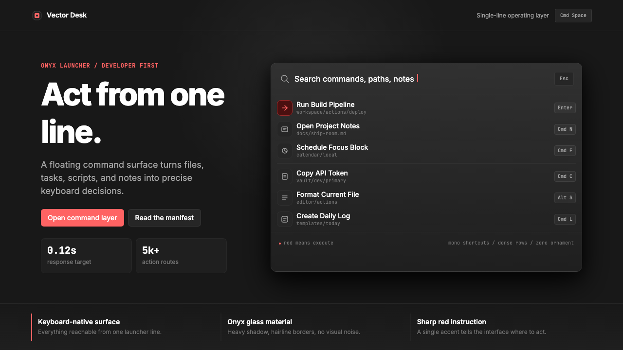
Obsidian Surface黑曜石表面
The foundation of the entire system is a near-black background that stops just short of pure black — a dark glass quality that implies depth without resorting to explicit layering or shadow theatrics. This obsidian material language gives the interface a sense of premium materiality while keeping cognitive load low. Foreground elements emerge from this darkness with high contrast, treating legibility not as a concern to manage but as the primary design act.整套体系的基础是一种近乎纯黑却未触底的背景色——一种暗色玻璃质感,隐含深度却不诉诸显式分层或阴影戏剧。这种黑曜石材质语言赋予界面高级材质感,同时保持低认知负荷。前景元素从这片黑暗中以高对比度浮现,将易读性不作为需要管理的顾虑,而作为首要的设计行为。
Surgical Red Accent外科手术式红色强调
A single sharp red serves as the entire accent system — no secondary accent colors, no warm or cool variants, just one deliberate brand red used with strict economy. This red marks active states, selected items, and interactive highlights, functioning like a cursor blinking in a terminal: it tells you exactly where attention should go and nowhere else. The restraint with which it is applied amplifies its signal strength every time it appears.整套强调体系只用一种锐利的红色——没有次要强调色,没有冷暖变体,只有一种经过严格克制使用的品牌红。这种红色标记活跃状态、选中项目和交互高亮,功能如同终端中闪烁的光标:精确告诉你注意力应去往何处,且只去往那里。每次出现时,它被施用的克制反而放大了其信号强度。
Monospaced Shortcut Chips等宽快捷键标签
Keyboard shortcuts are rendered as distinct visual chips using a monospaced typeface, treating key notation as a first-class typographic element rather than a secondary annotation. These chips carry their own visual grammar — consistent sizing, subtle surface differentiation from the background, and precise spacing — that makes them readable at a glance while reinforcing the interface's keyboard-first identity. In a real sense, they are the punctuation of this design language.键盘快捷键以等宽字体渲染为独特的视觉标签,将按键标记视为第一等级的排印元素,而非次要注解。这些标签承载自己的视觉语法——一致的尺寸、与背景的微妙表面区分、精确的间距——使其一瞥即可辨读,同时强化界面的键盘优先身份。从某种意义上说,它们是这套设计语言的标点符号。
Inter Typography SystemInter 字体系统
The typeface choice is Inter — a typeface designed specifically for screen legibility at small sizes, with letterforms optimized for the kind of dense information display that a command palette demands. The system uses Inter with deliberate typographic hierarchy: search input text at a commanding scale, result labels at reading size, metadata and shortcuts at smaller informational sizes. This scale system communicates hierarchy without resorting to color differentiation beyond the core dark-and-light contrast.字体选用 Inter——一款专为小字号屏幕易读性而设计的字体,字形针对命令面板所要求的密集信息展示进行了优化。这套体系以有意为之的排版层级使用 Inter:搜索输入文字占据主导尺度,结果标签位于阅读尺度,元数据与快捷键位于更小的信息尺度。这种尺度系统在无需超越核心明暗对比之外的色彩差异的情况下,传达出清晰的层级关系。
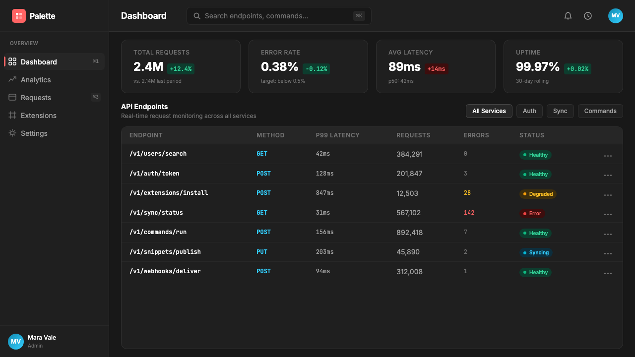
Maximum Information Density极致信息密度
The interface is configured to display the maximum amount of useful information in the minimum visual footprint — a direct expression of respect for the user's time and cognitive bandwidth. Row heights are tight, icon sizes are controlled, and metadata appears at the periphery of attention rather than competing with primary labels. Negative space is used strategically at the boundaries of the panel and between sections, not as decoration but as cognitive segmentation.界面被配置为在最小的视觉占用面积内显示最大量的有用信息——这是对用户时间和认知带宽的直接尊重。行高紧凑,图标尺寸受控,元数据出现在注意力的外围而非与主要标签竞争。留白在面板边界和区块之间被策略性使用,不是装饰,而是认知分割。
Zero Decorative Noise零装饰噪音
There are no gradient fills applied for visual interest, no ambient glows or bloom effects, no decorative borders, no illustration or iconographic embellishment beyond the functional application icons that the launcher necessarily displays. Every element earns its presence by doing work. This restraint is not austerity for its own sake — it is the recognition that in a high-frequency-use tool, every decorative element becomes fatigue over time.没有为增添视觉趣味而施加的渐变填充,没有环境光晕或辉光效果,没有装饰性边框,没有超出启动器必然显示的功能性应用图标之外的插图或图形点缀。每个元素通过做实事来证明自己存在的必要性。这种克制不是为了克制而克制——而是认识到:在高频使用的工具中,每一个装饰元素都会随时间积累成疲劳。
Glass Panel Floating Presence玻璃面板悬浮感
The command panel is conceived as a floating object in space — summoned by keyboard, dismissed by keyboard, never fully integrated into the operating system chrome. This floating quality is expressed through subtle shadow and surface differentiation from the desktop behind it, creating the impression of a discrete interface layer that exists above rather than within the operating environment. The panel's dark surface acts as a portal: productive, focused, and fully reversible.命令面板被构想为空间中的悬浮对象——由键盘唤起,由键盘消退,从未完全融入操作系统的外壳之中。这种悬浮质感通过微妙的阴影与其身后桌面的表面区分来表达,营造出一个存在于操作环境之上而非之内的独立界面层的印象。面板的暗色表面如同一扇门户:高效、专注、且完全可逆。
Who shaped Raycast Spotlight Launcher (2023)?谁塑造了 Raycast Spotlight Launcher (2023)?
Co-founder and chief executive of Raycast, Mann brought the engineering perspective that shaped Raycast's fundamental product philosophy: that a launcher should be a platform, not just a utility. His background at Facebook informed the product's ambition to handle complex integrations while maintaining a simple, fast surface. The product values he established — speed above all, keyboard-first interaction, zero tolerance for latency — are directly visible in every interaction design decision.Raycast 联合创始人与首席执行官,Mann 带来了塑造 Raycast 根本产品哲学的工程师视角:启动器应是平台,而非仅仅是实用程序。他在 Facebook 的背景赋予了产品在维持简洁快速表面的同时处理复杂集成的抱负。他所确立的产品价值观——速度至上、键盘优先交互、零延迟容忍——在每一个交互设计决策中都直接可见。
Co-founder and chief technology officer, Nikolaev was responsible for the engineering architecture that made the Raycast design system's density aspirations achievable. A command palette that holds as much information as Raycast displays, while remaining instantaneously responsive, requires performance engineering that invisibly underpins the design. The visual system's credibility depends on its speed; Nikolaev's engineering ensured the design never made promises the implementation could not keep.联合创始人与首席技术官,Nikolaev 负责使 Raycast 设计体系密度追求得以实现的工程架构。一个展示 Raycast 如此大量信息的命令面板,同时保持即时响应,需要无形支撑设计的性能工程。视觉系统的可信度依赖于它的速度;Nikolaev 的工程工作确保设计从不做出实现无法兑现的承诺。
A key member of the design team who helped shape the visual language that came to define the Raycast aesthetic. The specific combination of decisions that makes the system instantly recognizable — the obsidian surface quality, the calibration of the red accent, the typographic hierarchy — reflects design authorship of significant coherence. Smiljanic's work on the system helped transform a functional productivity tool into something recognized as a design reference point in the developer community.设计团队核心成员,帮助塑造了定义 Raycast 美学的视觉语言。使这套体系一眼可辨的特定决策组合——黑曜石的表面质感、红色强调的校准、排版层级——体现出高度一致的设计作者性。Smiljanic 在这套体系上的工作,帮助将一款功能性效率工具转变为开发者社区中公认的设计参考点。
A later addition to the Raycast team who contributed to the product's evolution during the period when the application was scaling from a launcher into a full developer platform. As the design system had to accommodate an expanding extensions ecosystem while protecting the coherence of the core experience, Marmelstein's work helped navigate the tension between platform openness and visual consistency — a design challenge as much as a product one.Raycast 团队的后期成员,在应用从启动器扩展为完整开发者平台期间为产品演进做出了贡献。当设计体系必须在容纳不断扩展的插件生态系统的同时保护核心体验的一致性时,Marmelstein 的工作帮助在平台开放性与视觉一致性之间——这同样是设计挑战,不只是产品挑战——找到平衡。
How do you use Raycast Spotlight Launcher (2023) today?今天怎么用 Raycast Spotlight Launcher (2023)?
The Raycast Spotlight Launcher style is best understood as a confidence-first design language — one that works when the product it is applied to genuinely merits the authority the aesthetic projects. It is at home in tools built for users who operate at high frequency and expect their tools to keep up. When used in this register, the style produces interfaces that feel immediate, trustworthy, and professionally serious without tipping into cold or alienating.Raycast Spotlight Launcher 风格最好被理解为一种以自信为先的设计语言——它在被应用于真正值得这套美学所投射之权威感的产品时才会奏效。它在为高频操作且期待工具跟上节奏的用户所构建的工具中如鱼得水。在这个语境下使用,这种风格产出的界面感觉即时、可信、专业庄重,而不会滑入冷漠或疏远。
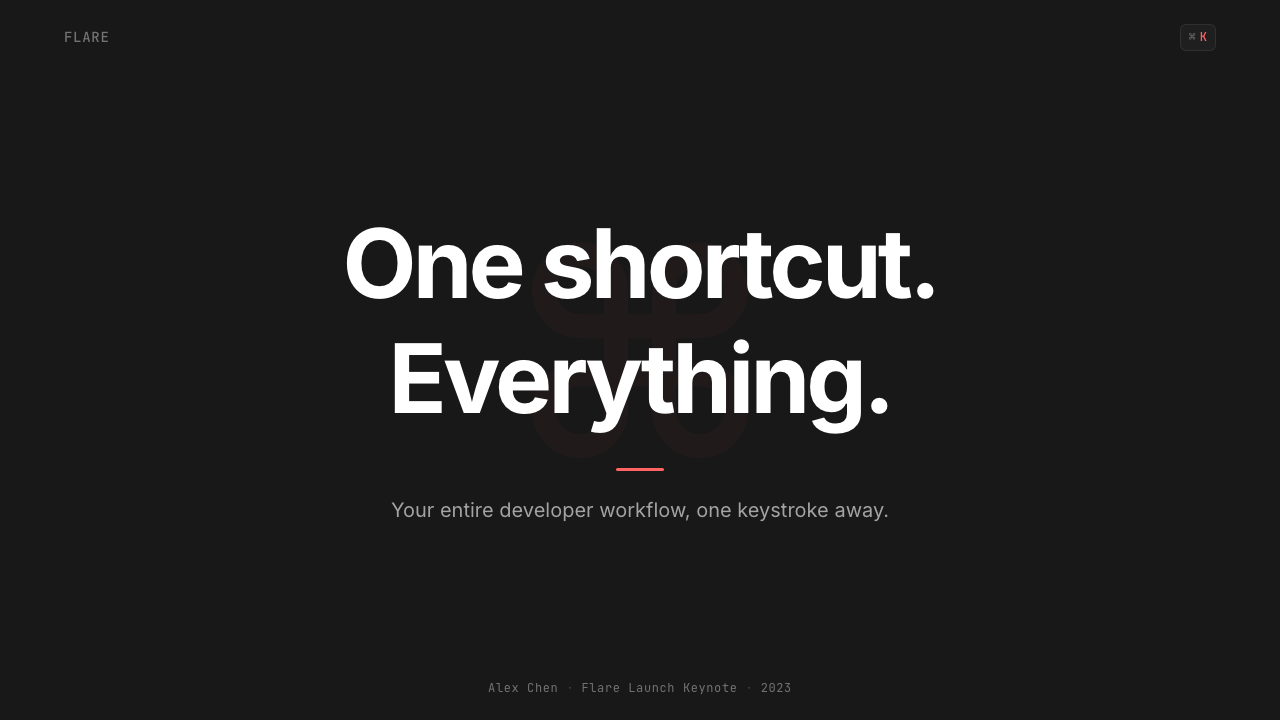
For presentation slides, the system performs best on covers and transition slides rather than dense content pages. A cover page in this style works through high contrast and deliberate restraint: a near-black field, a title set in a clean geometric sans-serif at confident scale, and a single accent element — perhaps a geometric shape or a highlighted keyword — in the brand's red. Content slides should be treated as typographic structures rather than visual compositions: tight line heights, generous column gutters, and a strict typographic hierarchy where scale alone communicates importance. Data slides in this aesthetic work well with high-contrast chart treatments where data points and axes are legible at a glance, backgrounds stay dark, and accent color is reserved for the one data series that matters most.在演示文稿中,这套体系在封面与过渡页上的表现优于密集内容页。这种风格的封面页通过高对比度与刻意克制发挥作用:近乎纯黑的底面,以干净几何无衬线字体以自信尺度排列的标题,以及一个单一强调元素——或许是几何形状或高亮关键词——以品牌红色呈现。内容页应被视为排版结构而非视觉构图:紧凑的行高,宽松的栏间距,以及严格的排版层级,仅靠尺度传达重要性。这种美学下的数据幻灯片适合高对比度图表处理,数据点和坐标轴一目了然,背景保持深色,强调色专门留给最重要的那条数据系列。
For web UI, dashboards, and SaaS products, this style is especially effective for developer-facing tools, command palettes, keyboard-shortcut-heavy interfaces, and any product where power users represent the primary audience. The approach translates directly: dark backgrounds with near-black surface colors, a single accent color for interactive states and active selections, monospaced type for code or shortcut notation, and information density calibrated to the highest-frequency use cases rather than the average. Navigation and wayfinding should be typographic and keyboard-accessible, with visual affordances that reward mouse interaction but never require it.对于网页界面、仪表板和 SaaS 产品,这种风格对于面向开发者的工具、命令面板、键盘快捷键密集型界面,以及任何以高级用户为主要受众的产品尤为有效。这套方法可以直接转化:深色背景配近乎纯黑的表面色,单一强调色用于交互状态和活跃选择,等宽字体用于代码或快捷键标记,信息密度依照最高频使用场景而非平均场景来校准。导航与路径指示应是排版性和键盘可达的,视觉可见度奖励鼠标交互,但从不要求它。
For marketing and editorial applications, the style requires some translation. The intensity that makes it feel authoritative in a live tool can read as severe in a marketing context where warmth and approachability are also needed. The most effective approach is to use the aesthetic system's core vocabulary — dark surfaces, typographic precision, single accent — while allowing more generous spacing and slightly softer surface materials than the application would use. Hero sections work well with this style's confidence: bold typographic statements against dark grounds, product demonstrations with the actual interface as the hero image, and an accent color that marks the primary call to action consistently throughout.对于营销与编辑应用,这种风格需要一定程度的转化。使它在实时工具中显得权威的那种强烈感,在需要温暖与亲切感的营销语境中可能显得严苛。最有效的方法是使用这套美学体系的核心词汇——深色表面、排版精确性、单一强调——同时允许比应用本身更为宽松的间距和略微柔和的表面材质。英雄区块在这种风格的自信感下表现良好:深色底面上的大胆排版陈述,以实际界面作为英雄图像的产品演示,以及在全篇始终如一标记主要行动召唤的强调色。
A common mistake when applying this style is treating the dark surface as interchangeable with any dark color, or the red accent as one element among many. The system's character depends on the specific combination: the darkness must be near-black without being absolute, implying depth rather than void; the red must be used with the same economy a terminal uses its cursor — appearing rarely enough that every appearance carries full signal weight. Designers who apply this style and then add a second accent color, soften the backgrounds into mid-tone grays, or introduce decorative gradients will find the aesthetic dissolves into generic dark-mode design. The power is in the commitments, not the color choices alone.应用这种风格时常见的错误,是把深色表面视为任何深色都可替换,或把红色强调视为众多元素之一。这套体系的性格依赖于特定的组合:黑暗必须近乎纯黑而非绝对,暗示深度而非虚空;红色必须以终端使用光标的同等节制来施用——出现得够少,使每次出现都承载完整的信号重量。设计师若在应用这种风格时添加第二种强调色、把背景柔化为中灰调,或引入装饰性渐变,会发现这套美学溶解为普通的深色模式设计。它的力量在于那些承诺,而非单独的色彩选择。
Raycast Spotlight Launcher (2023) — FAQRaycast Spotlight Launcher (2023) · 常见问题
How is this style different from generic dark mode design?这种风格与普通深色模式设计有何区别?
Generic dark mode design typically inverts a light-mode system — swapping white backgrounds for dark grays and black text for light — while keeping the same decorative elements, gradient accents, and multiple colors. The Raycast style is not a dark mode; it is a dark-first design system where the darkness is the intended substrate, the single red accent is structural rather than decorative, and the entire information architecture is built around keyboard-first, high-density interaction. The diagnostic question is: if you removed the dark background and placed the same layout on white, would it still make sense? Generic dark mode says yes; this system says no — the darkness is load-bearing.普通深色模式设计通常是对浅色模式系统的反转——将白色背景换成深灰,将黑色文字换成浅色——同时保留相同的装饰元素、渐变强调和多种颜色。Raycast 风格不是深色模式;它是一套以黑暗为先的设计系统,在这里黑暗是预设的基底材质,单一红色强调是结构性而非装饰性的,整个信息架构围绕键盘优先、高密度交互构建。检验问题是:如果去掉深色背景,将同样的布局放在白色上,它还有意义吗?普通深色模式回答是;这套体系回答否——黑暗是承重结构。
Can this style work on a light background?这种风格能用在浅色背景上吗?
A light-background variant is technically possible but requires significant reinterpretation. The style's signature — the obsidian quality, the red-cutting-through-darkness effect, the terminal-adjacent atmosphere — depends on the dark surface. On a light ground, the brand red reads differently, the monospaced shortcut chips lose their contextual meaning, and the system starts to resemble other precise, minimalist design languages rather than retaining its own character. If a light version is needed for accessibility or context reasons, the approach should be to treat it as a distinct design layer rather than a simple inversion, preserving the typographic precision and single-accent discipline while accepting that the atmospheric quality will be different.浅色背景变体在技术上可行,但需要大幅度重新诠释。这种风格的标志性特征——黑曜石质感、红色划破黑暗的效果、接近终端的氛围——依赖于深色表面。在浅色底面上,品牌红色的呈现方式不同,等宽快捷键标签失去上下文意义,这套体系开始接近其他精准极简主义设计语言,而非保留自身性格。如果因可及性或语境原因需要浅色版本,正确的方法是将其视为独立的设计层,而非简单的反转——保留排版精确性和单一强调纪律,同时接受氛围质量将会不同这一事实。
Is this style appropriate for consumer-facing products?这种风格适合面向消费者的产品吗?
The style's strengths — authority, density, keyboard-centricity, professional seriousness — are aligned with professional and developer audiences more than consumer audiences. Consumer products often require warmth, sensory invitation, and visual narrative that this aesthetic deliberately suppresses. That said, the style works in consumer contexts where the user's relationship with the product is tool-like rather than experiential: a personal finance tracker used daily, a writing tool for professional writers, a task manager for knowledge workers. The question is not demographic but relational: is the user here to accomplish a specific task quickly, or to inhabit an experience? The Raycast style is optimized entirely for the former.这种风格的优势——权威感、密度、键盘中心性、专业严肃感——与专业和开发者受众的契合度高于消费者受众。消费者产品通常需要温暖感、感官邀请和这种美学刻意压制的视觉叙事。话虽如此,这种风格在用户与产品关系为工具性而非体验性的消费者语境中仍能奏效:每日使用的个人财务追踪工具、职业写作者的写作工具、知识工作者的任务管理器。问题不在于人口属性,而在于关系:用户在这里是为了快速完成特定任务,还是为了沉浸于某种体验?Raycast 风格完全针对前者而优化。
What are the most common mistakes when adapting this style?改编这种风格时最常见的错误是什么?
Three mistakes appear most frequently. First, adding a second accent color — the system's character depends entirely on the discipline of using one red and using it rarely. Second, softening the surface into mid-tone grays rather than maintaining the near-black depth; mid-tones produce a different atmosphere and undermine the contrast ratio that makes the accent land with full force. Third, treating the monospaced chip notation as a decorative element rather than a functional one — applying monospaced type or chip styling to elements that are not actually keyboard shortcuts introduces visual confusion and undermines the system's semantic clarity. Each of these mistakes points to the same underlying misread: the system's power comes from commitment, not from borrowing its surface characteristics.最常出现的是三种错误。第一,添加第二种强调色——这套体系的性格完全依赖于只使用一种红色且谨慎使用的纪律。第二,把表面柔化成中灰调而非维持近乎纯黑的深度;中性调产生不同的氛围,并破坏使强调色以全力落地所需的对比比率。第三,将等宽标签标记视为装饰元素而非功能性元素——将等宽字体或标签样式应用于实际上并非键盘快捷键的元素,引入视觉混乱并破坏体系的语义清晰度。这三种错误指向同一个根本性误读:这套体系的力量来自承诺,而非借用其表面特征。
How does this style relate to the broader developer-tool design movement?这种风格与更广泛的开发者工具设计运动有何关联?
The Raycast style is one of the defining statements of the developer-tool design movement of the early 2020s, alongside Linear's issue-tracker aesthetic and Arc's browser reinvention. What unites these systems is a shared conviction that professional tools should be visually serious, information-dense, and calibrated to expert users rather than designed down to the median. Where they differ is in character: Linear's system is cooler and more systematic, Arc's is warmer and more expressive, and Raycast's is the most terminal-adjacent and keyboard-committed. Understanding this context helps when adapting the style — it works best when it is understood as a position statement about the relationship between designer and user, not just as a set of visual characteristics to be borrowed.Raycast 风格是 2020 年代初开发者工具设计运动的定义性陈述之一,与 Linear 的议题追踪器美学和 Arc 的浏览器革新并列。统一这些体系的是一个共同信念:专业工具应在视觉上严肃、信息密集,并针对专家用户校准,而非向中等用户设计妥协。它们的区别在于性格:Linear 的体系更冷静、更系统化,Arc 的更温暖、更有表现力,Raycast 的则最接近终端美学,对键盘的承诺最为彻底。理解这一背景在改编这种风格时大有裨益——它在被理解为关于设计者与用户关系的立场声明而非一套可借用的视觉特征时,才能发挥最大效果。
Related design styles相关设计风格
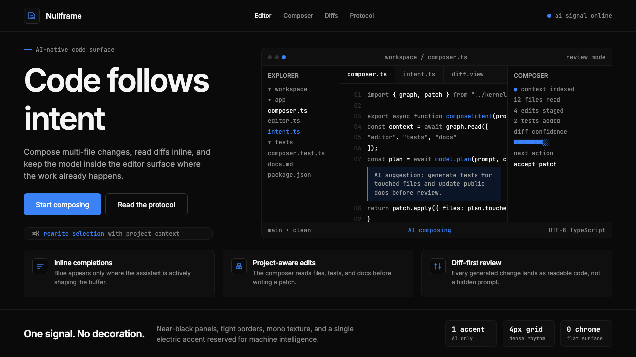 Cursor IDEAI-first code editor. Pure dark surfaces, off-white text, electric blue reser…以 AI 为核心的代码编辑器:近乎纯黑背景、柔白文字、唯一的电光蓝色专为 AI…
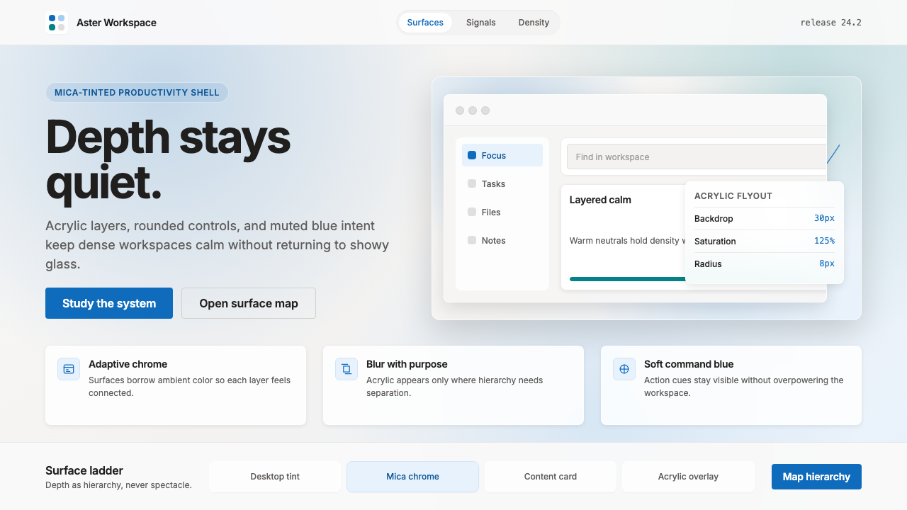 Microsoft Fluent 2Disciplined translucency. Warm Mica neutrals, acrylic blur, and muted blue cr…有纪律的半透明:暖 Mica 中性色、亚克力模糊与低调蓝营造沉稳层次。
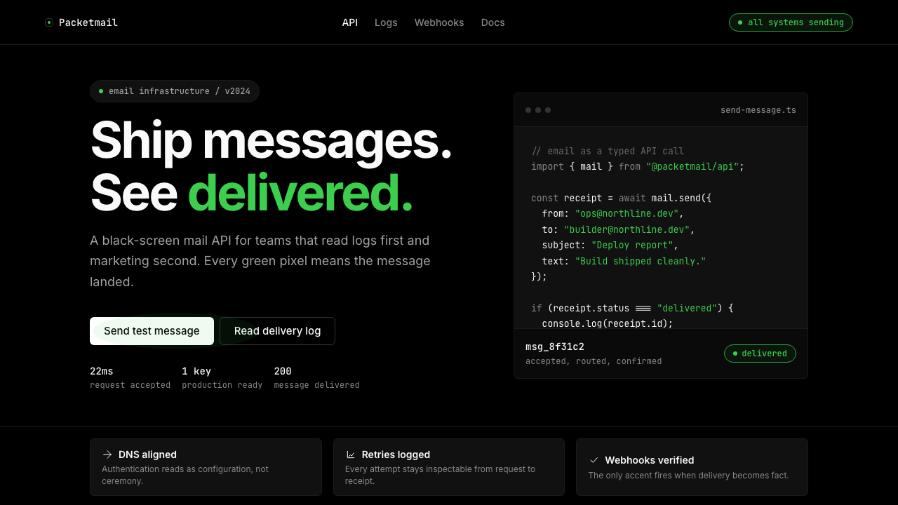 Resend 2024Clean code becomes brand. Pure black, JetBrains Mono, and one green delivered…品牌像 clean code:纯黑、JetBrains Mono、唯一送达绿。
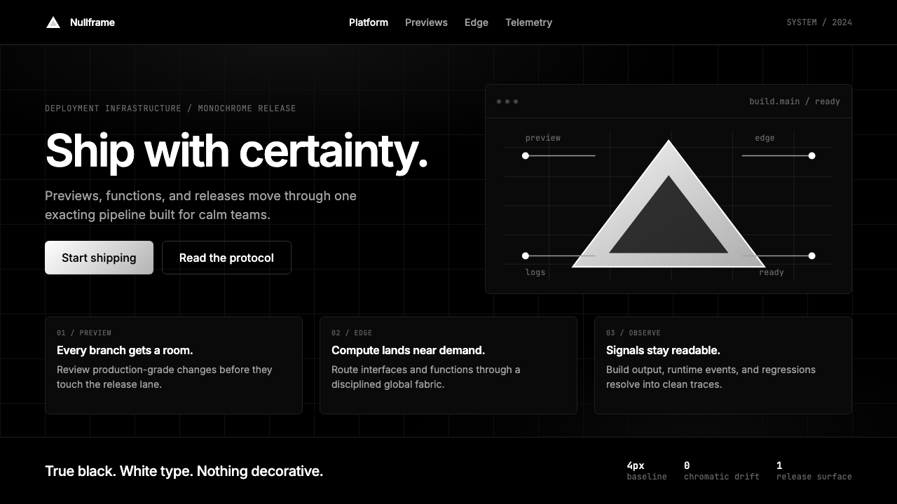 Vercel 2024Developer luxury by subtraction. Pure black, white Inter, rigid grid, triangu…以删减塑造开发者奢侈感:纯黑白、Inter 字体与刚性网格构成三角发布符号。
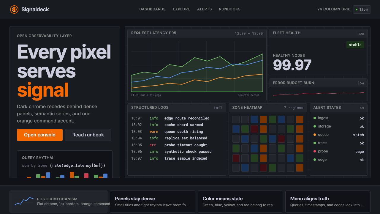 GrafanaData first, chrome last. Orange accent cuts through dense dark panels and sem…数据优先,界面退后:橙色强调穿透深色密集面板与语义图表。
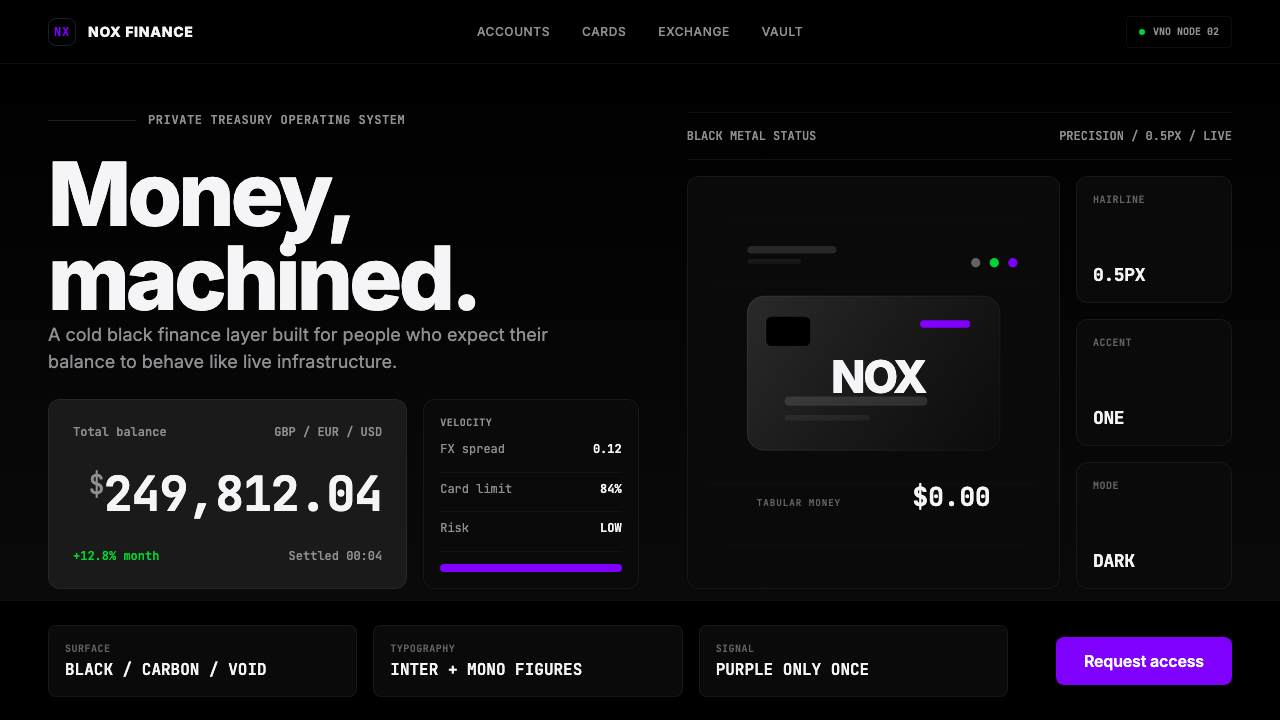 Revolut Black FinanceBanking as instrument. Pure black, hairline borders, and one electric purple…银行如仪器:纯黑底、发丝线边框,一抹电光紫。