Design style guide设计风格指南
What is Revolut Black Finance?什么是 Revolut Black Finance?
Revolut turned the black metal card into a design manifesto — cold monochrome surfaces, a single electric accent, and typography that reads like a precision instrument rather than a bank.Revolut 把黑色金属卡变成了一份设计宣言——冷冽的单色表面,一抹电光强调色,字体读起来像精密仪器,不像银行。
Revolut Black Finance in briefRevolut Black Finance 速览
Revolut Black Finance is the visual identity system codified by the London-based neobank around 2020, defining how a new generation of financial products could present itself: without the warm greens, rounded mascots, or reassuring pastels that traditional retail banking had trained consumers to expect. In their place: pure black grounds, hairline dividers, large-format numeric displays, and a single electric purple accent — every choice calibrated to read as a precision instrument rather than a friendly institution.Revolut 黑色金融风格是这家伦敦新银行于2020年前后确立的视觉识别体系,它回答了一个问题:新一代金融产品应该呈现什么面貌——而答案彻底推翻了传统零售银行用来安抚消费者的那套视觉习惯:温暖的绿色、圆润的吉祥物、令人放心的柔和色调。取而代之的是:纯黑底面、发丝线分隔、大字号数字显示,以及一抹电光紫强调色——每个选择都经过校准,读起来是精密仪器,而不是亲切机构。
The aesthetic sits at the intersection of European fintech minimalism and the culture of the black metal card. Before Revolut, the matte black card was a luxury signal reserved for elite-tier credit products. Revolut democratized that status object, issuing it as a standard feature, and built an entire design language around the same values the card communicates: control, seriousness, and the expectation that your money deserves the same visual rigour as professional software.这套美学坐落于欧洲金融科技极简主义与黑色金属卡文化的交汇点。Revolut 之前,哑光黑卡是精英信用产品的专属奢侈符号。Revolut 将这个身份物件大众化——把它作为标准功能发放给用户——并围绕这张卡所传递的同一价值观建立了完整的设计语言:掌控感、严肃性,以及「你的钱值得获得与专业软件同等级别的视觉严谨度」这一潜台词。
What distinguishes this system from generic dark-mode design is its restraint in the accent. Where many dark interfaces scatter color liberally across buttons, states, and decorative elements, Revolut's approach isolates the electric purple as a single signal — pointing, not decorating. Everything else is resolved in the monochrome range, from deep black through structured grays, with hairline borders replacing shadows as the primary spatial device.让这套系统区别于普通深色模式设计的,是它对强调色的极端克制。许多深色界面把色彩随意散落在按钮、状态和装饰性元素上,而 Revolut 的做法是把电光紫隔离为唯一的信号——它指向某物,而不是装饰某物。其余一切都在单色范围内消解,从深黑穿越结构性灰阶,以发丝线边框替代阴影作为主要的空间划分手段。
See the Revolut Black Finance design system →查看 Revolut Black Finance 完整设计系统 →
Where does Revolut Black Finance come from?Revolut Black Finance 从何而来?
Revolut was founded in London in 2015 by Nikolay Storonsky and Vlad Yatsenko, two former finance-industry engineers who built their first product — a multi-currency prepaid card with no foreign transaction fees — in months rather than years. The company was incorporated with a Lithuanian banking license, a deliberate structural choice that allowed it to passport services across the European Economic Area without separately negotiating with each national regulator. From the beginning, the brand presented itself as a technology company that happened to hold a banking license, not a bank that happened to build an app.Revolut 由尼克·斯托罗斯基和弗拉德·亚岑科于2015年在伦敦创立。这两位前金融行业工程师在短短数月内便造出了第一款产品——一张无外币手续费的多币种预付卡。公司以立陶宛银行牌照注册,这是一个经过深思熟虑的架构选择,使其能够通过欧洲经济区护照机制跨境提供服务,而无需逐一与各国监管机构谈判。从一开始,这个品牌便以「碰巧持有银行牌照的科技公司」而非「碰巧做了App的银行」自我定位。
The early Revolut identity was relatively conventional for the fintech wave of the mid-2010s: a gradient-heavy wordmark, a purple that leaned toward violet, and visual language broadly shared with the Monzo and N26 generation of challenger banks. The design language hardened significantly as the company scaled. By the time the 2020 brand system was consolidated, the gradient was gone. The palette had collapsed to its essential components: pure black, pure white, and a single electric purple that had been cooled and brightened into something closer to a neon signal than a brand color.早期的 Revolut 视觉识别在2010年代中期金融科技浪潮中属于相对常规的风格:渐变感强的字标,偏向紫罗兰的紫色,以及与 Monzo、N26 等挑战者银行大体共享的视觉语言。随着公司规模扩大,设计语言显著收紧。到2020年品牌体系成形之时,渐变已经消失。色板压缩至其本质成分:纯黑、纯白,以及一抹经过冷却和提亮的电光紫——它更接近霓虹信号,而非品牌色。
The metal card itself was central to this evolution. Revolut introduced the black metal card as a premium tier product around 2018, and the physical object shaped the digital design language as much as any screen did. A matte black metal card has no room for gradient or warmth; it succeeds precisely because of its severity and material honesty. The 2020 digital system read the same lesson into every interface: surfaces should behave like the card — flat, cold, uncompromising.金属卡本身是这场演变的核心。Revolut 于2018年前后将黑色金属卡作为高级会员权益推出,这件实物产品对数字设计语言的塑造力不亚于任何一个界面屏幕。一张哑光黑金属卡没有容纳渐变或温暖感的余地——它的成功恰恰来自它的严肃性与材料诚实。2020年的数字系统从这件物品中读出了同一堂课,并将其写入每一个界面:表面应当像那张卡一样——平坦、冷峻、毫不妥协。
The movement context was the broader European neobank wave, a cluster of well-funded challenger banks — Monzo, N26, Starling, Wise — that emerged from 2015 onward to compete against incumbent retail banks on user experience rather than branch count. Within this wave, each brand staked out distinct visual territory. Monzo chose hot coral and friendly roundedness; N26 chose Helvetica rigor and cool grey; Revolut chose the most severe position — the one that spoke not to the friendly novice but to the financially self-serious user who thought of their money as a tool to optimize.这套风格的运动背景是更广泛的欧洲新银行浪潮——Monzo、N26、Starling、Wise 等一批资金充裕的挑战者银行从2015年起相继涌现,以用户体验而非网点数量与传统零售银行竞争。在这股浪潮中,每个品牌都占据了不同的视觉领地:Monzo 选择了热珊瑚色与友善的圆润感;N26 选择了黑体严谨与冷灰色;Revolut 则选择了最严苛的位置——说话对象不是友善的新手,而是把自己的钱视为需要主动优化的工具、对财务高度自我严肃的用户。
What defines the Revolut Black Finance look?Revolut Black Finance 的视觉特征是什么?
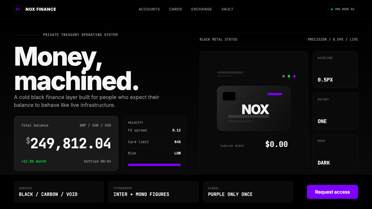
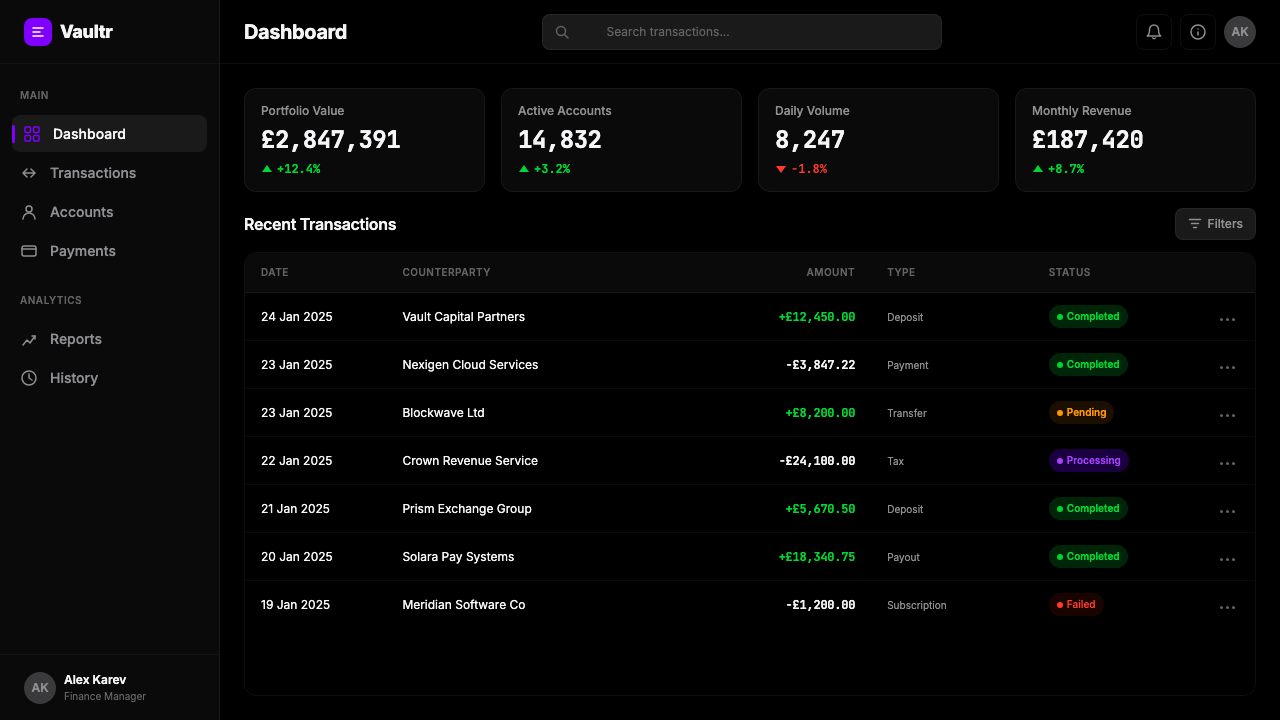
Pure Black Ground纯黑底面
The foundational surface is absolute black — not charcoal, not dark navy, not off-black, but a total absence of surface color. This choice immediately separates the brand from the warm-dark palettes that consumer apps often use to soften the dark mode experience. The pure black ground asks nothing of the user emotionally; it simply declares that what appears on it will be precise.基础底面是绝对的黑色——不是炭灰,不是深海军蓝,不是近黑,而是表面色彩的彻底缺席。这个选择让品牌与许多消费类应用为软化深色模式体验而采用的暖黑色系彻底区分开来。纯黑底面对用户毫无情感索取——它只是宣告:出现在其上的一切将是精确的。
Single Electric Accent唯一电光强调色
The electric purple operates as the sole color signal in the system. It appears sparingly — on a call-to-action, a balance highlight, an alert indicator — never as decoration. The hue has been pushed toward the cooler, more energized end of the violet range, reading closer to ultraviolet than to traditional purple. Because it appears against pure black, it carries maximum contrast with minimal area. One color, one meaning: pay attention here.电光紫在系统中充当唯一的色彩信号。它出场克制——落在行动号召、余额高亮、提示指示符上——从不作为装饰。这个色相被推向紫罗兰范围中更冷、更富活力的一端,读起来更接近紫外线而非传统紫色。因为它出现在纯黑底面上,以最小的面积承载最大的对比度。一种颜色,一个含义:请注意这里。
Hairline Borders as Spatial Logic发丝线边框作为空间逻辑
Where conventional interfaces rely on shadows or background color shifts to define component boundaries, Revolut Black Finance uses hairline borders — borders so thin they barely register as physical lines, yet they partition the space with absolute precision. The effect is architectural: a floor plan rather than a landscape. Sections are divided by lines, not by air.传统界面依赖阴影或背景色变化来划定组件边界,而 Revolut 黑色金融风格使用发丝线边框——细到几乎不以实线呈现,却以绝对的精确度切割空间。效果是建筑性的:平面图,而非风景。区段由线条分隔,而非由空气分隔。
Tabular Numeric Display等宽数字显示
Numbers are treated as the primary visual content, not as secondary data. Balance figures, transaction amounts, and exchange rates are set at large scale in tabular-figure typefaces — where each numeral occupies the same horizontal space, ensuring that columns align precisely regardless of digit combination. This typographic choice is lifted directly from financial terminal culture and signals that the interface is built for reading numbers, not for reading prose.数字被当作主要视觉内容处理,而非次级数据。余额数字、交易金额和汇率以大字号等宽数字字型排版——每个数字符占据相同的水平空间,确保无论数字组合如何,列都能精确对齐。这个排版选择直接取自金融终端文化,传达出这个界面是为阅读数字而建的,不是为阅读文字。
Instrumentation Typography仪器感字体排印
The typeface system reads as instrumentation — clean, geometric sans-serifs chosen for legibility at all sizes rather than for warmth or personality. Labels are concise, uppercase in many contexts, and set with tight letter-spacing that evokes a cockpit readout or a trading terminal more than it evokes a consumer banking app. Hierarchy is established through scale and weight alone; color is not used for typographic differentiation.字体系统读起来像仪器——简洁、几何感的无衬线体,以各尺寸下的易读性而非温暖感或个性为选择标准。标签简洁,许多场景下采用大写,字间距紧凑,唤起的是驾驶舱读数或交易终端,而不是消费银行应用。层级仅通过字号和字重建立,色彩不用于字体层级的区分。
No Decorative Layer零装饰层
Illustration, icon art, mascots, and ambient background textures are absent by design. The interface contains only what is necessary for navigation, information, and action. This is not simply a stylistic choice — it is a values statement. Decoration in a financial product implies that the provider needs to work to earn your trust. Revolut Black Finance operates from the assumption that the numbers speak for themselves.插图、图标艺术、吉祥物和环境背景纹理均在设计上缺席。界面只包含导航、信息和操作所必需的元素。这不只是风格选择——而是一个价值观陈述。金融产品中的装饰意味着提供方需要努力赢得你的信任。Revolut 黑色金融风格的前提是:数字自己会说话。
Monochrome Structural Hierarchy单色结构层级
Between the pure black ground and the white foreground typography, a structured range of grays carries all secondary and tertiary information — metadata, timestamps, secondary labels, disabled states. The range is narrow enough to maintain visual unity but wide enough to create clear reading hierarchy. No single gray is arbitrary; each occupies a specific position in the system's logic of importance.在纯黑底面与白色前景文字之间,一套结构性灰阶承载全部次级和三级信息——元数据、时间戳、次级标签、禁用状态。这个范围足够窄以维持视觉统一,又足够宽以建立清晰的阅读层级。没有哪个灰色是随意的——每一级都在系统重要性逻辑中占据特定位置。
See the Revolut Black Finance design system →查看 Revolut Black Finance 完整设计系统 →
Who shaped Revolut Black Finance?谁塑造了 Revolut Black Finance?
Co-founder and long-serving CEO of Revolut, Storonsky shaped the company's positioning as a technology platform first and a financial institution second. A former derivatives trader at Lehman Brothers and Credit Suisse, he brought a quantitative sensibility to product philosophy that is legible in the design system: performance is the message, decoration is waste. His insistence on speed of iteration and numerical transparency established the cultural conditions in which the stark visual language could emerge and persist.Revolut 联合创始人及长期 CEO,斯托罗斯基将公司定位塑造为技术平台优先、金融机构其次。曾在雷曼兄弟和瑞士信贷担任衍生品交易员,他将定量思维带入了产品哲学,这在设计系统中清晰可见:性能是信息,装饰是浪费。他对快速迭代和数字透明度的坚持,建立了让这套严苛视觉语言得以出现并延续的文化条件。
Co-founder and long-serving CTO, Yatsenko was responsible for the engineering architecture that made Revolut's real-time multi-currency infrastructure possible. The design language's emphasis on live data — balance figures updating in real time, exchange rates displayed at market precision — reflects a product philosophy shaped by engineers for whom the live number is the primary unit of meaning. The interface is built around the data feed, and the visual system serves that feed without distraction.联合创始人及长期 CTO,亚岑科负责了使 Revolut 实时多币种基础设施成为可能的工程架构。设计语言对实时数据的强调——余额数字实时更新,汇率以市场精度显示——反映了一种由工程师塑造的产品哲学,在他们眼中,实时数字是意义的首要单位。界面围绕数据流构建,视觉系统服务于这条数据流,毫无干扰。
Credited as a key figure in the brand and design direction during the formative period of the Revolut identity, Khrenov was part of the team that moved the brand away from the warmer, gradient-heavy visual language of the early years toward the harder-edged, monochrome system associated with the post-2020 era. The consolidation of the palette, the decision to anchor the identity in the metal card aesthetic, and the adoption of the instrumentation typography register are associated with this period of leadership.被认为是 Revolut 视觉识别形成期中品牌与设计方向的关键人物,赫列诺夫是推动品牌从早年较为温暖、渐变感强的视觉语言转向2020年后时代那套更硬朗、单色系系统的团队成员之一。色板的收敛、将识别锚定于金属卡美学的决策,以及仪器感字体排印风格的采用,均与这一领导时期相关联。
Revolut's design language did not emerge in a vacuum — it was defined partly in opposition to the other members of the European challenger-bank generation. Monzo's hot coral and friendly illustration style, N26's cool rational Helvetica system, Starling's teal and rounded approachability: each brand staked out a position, and Revolut's position was the most severe. The collective movement created the design discourse within which Revolut's choices read as deliberate rather than arbitrary — a statement made against a backdrop of known alternatives.Revolut 的设计语言并非在真空中诞生——它的定义部分来自对欧洲挑战者银行这代同行的对照。Monzo 的热珊瑚色与友善插画风格、N26 冷静理性的 Helvetica 体系、Starling 的蓝绿色与圆润亲和力:每个品牌都占据了一个位置,而 Revolut 的位置最为严苛。这股集体运动创造了一种设计对话,在这个语境中,Revolut 的选择读起来是深思熟虑的而非随意的——一个在已知备选方案的背景下发出的声明。
Before Revolut, the heavy matte-black metal payment card was a symbol reserved for premium tier products — American Express Centurion, high-limit travel cards issued to frequent flyers and corporate accounts. Revolut issued it as a tier-two or tier-three product, putting the status object into more hands while retaining its aesthetic vocabulary. This redistribution of the metal card was a product insight with direct design consequences: if the card that represents your brand is severe and instrumental, the app that represents the same brand cannot be warm and playful.Revolut 之前,厚重的哑光黑金属支付卡是专属于高端产品的符号——美国运通百夫长黑卡、发放给常旅客和企业客户的高额度旅行卡。Revolut 将其作为二档或三档产品发放,把这件身份物件送到更多人手中,同时保留了它的美学词汇。这场金属卡的再分配是一个具有直接设计后果的产品洞见:如果代表你品牌的那张卡是严苛而工具性的,代表同一品牌的App就不能是温暖而轻松的。
How do you use Revolut Black Finance today?今天怎么用 Revolut Black Finance?
Revolut Black Finance is a disciplined system that transfers well to any context where precision, control, and financial seriousness are the primary values the design needs to communicate. Applying it correctly requires resisting the temptation to soften it — every accommodation toward warmth or playfulness degrades the core signal. Start from the pure black ground and add only what the content demands.Revolut 黑色金融风格是一套严谨的系统,能良好迁移到任何以精确、掌控感和金融严肃性为设计核心价值的场景中。正确应用它需要抵制软化它的诱惑——任何向温暖或轻松感的妥协都会削弱核心信号。从纯黑底面出发,只添加内容本身要求的元素。
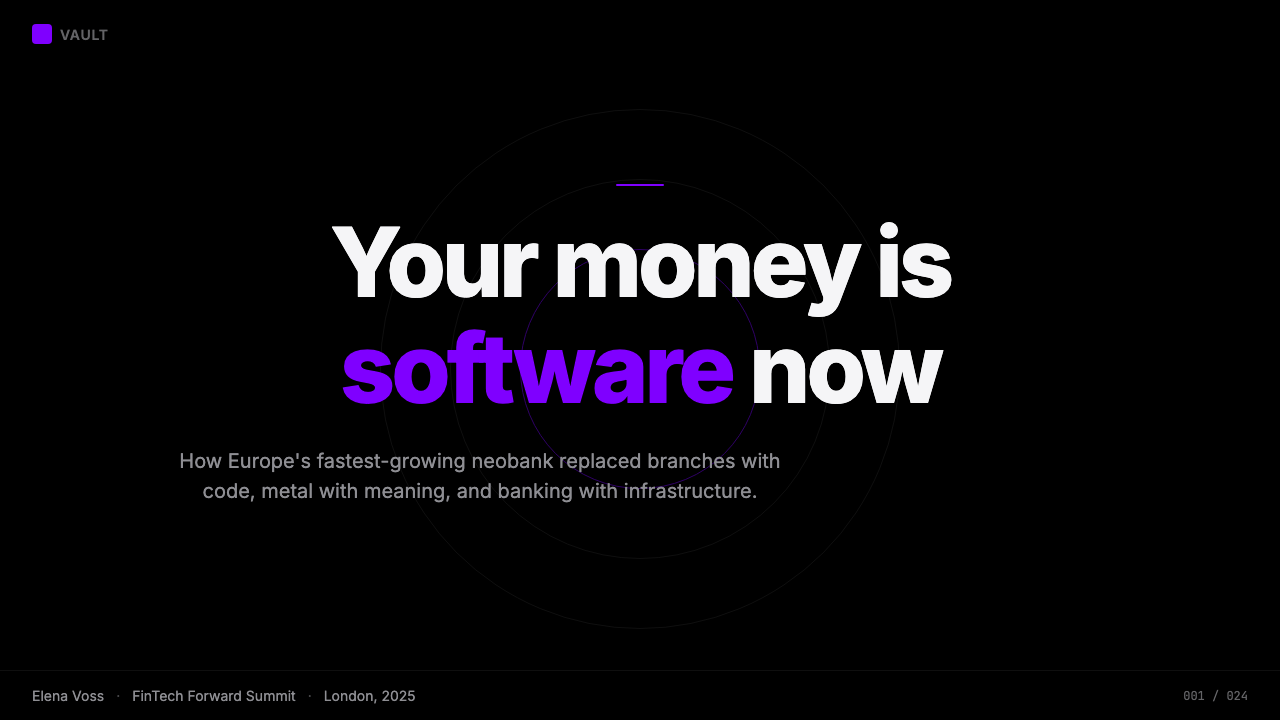
For presentation slides, the style excels on both cover and data pages. A cover built in this register uses a single large typographic element — a figure, a short phrase, a key metric — set in white against pure black, with the electric accent appearing once as a structural punctuation. Content slides should treat every number as a visual headline: set financial figures at the largest scale the slide permits, subordinate all prose labels, and use the accent color to indicate the one figure that matters most in the current argument. Data visualization slides take on a terminal quality — charts without rounded corners, bar fills in pure white or electric purple, gridlines rendered as hairlines rather than colored bands.在演示文稿中,这套风格在封面页和数据页上均表现出色。用这套语言制作的封面,使用一个大型字体元素——一个数字、一个短语、一个关键指标——以白色呈现于纯黑底面,电光强调色仅一次作为结构性标点出现。内容页应将每个数字视为视觉标题:以幻灯片允许的最大字号展示财务数字,将所有文字标签置于从属位置,用强调色标示当前论点中最关键的那个数字。数据可视化页面呈现出终端品质——无圆角的图表,以纯白或电光紫填充的柱条,以发丝线而非彩色色带呈现的网格线。
For web interfaces and dashboards, this system is purpose-built. Dashboard panels defined by hairline borders rather than card shadows; typography that scales down to metadata size while retaining the monochrome palette; interactive states signaled by the electric accent rather than by background fills. Pricing pages work particularly well: tier names set in large capitals, feature lists in tight prose, and the recommended tier distinguished by an electric accent border rather than a colored background card. Navigation should be wordmark-led with no decorative iconography.对于网页界面和仪表板,这套系统是为此而生的。以发丝线边框而非卡片阴影定义的仪表板面板;字体缩小至元数据尺寸时仍保持单色色板;以电光强调色而非背景填充传达交互状态。定价页面尤为适合:等级名称以大号大写字体排版,功能列表以紧凑文字呈现,推荐等级以电光强调色边框而非彩色背景卡片加以区分。导航应以文字标识为主,无装饰性图标。
For editorial and marketing applications, the style supports a poster-like boldness that reads well at large format. A marketing layout in this register alternates between full-bleed black panels with white type and white panels with black type, with the electric accent appearing only on the most important call-to-action per section. Photography, where used, should be treated as a flat element — high-contrast, tightly cropped, never overlaid with texture or gradient. The tone of copy should match the visual register: declarative, numeric where possible, no hedging language.对于编辑和营销应用,这套风格支持海报式的大胆感,在大幅面下效果显著。用这套语言制作的营销版面,在满幅黑色面板配白色文字与白色面板配黑色文字之间交替,电光强调色每段只出现在最重要的行动号召上。摄影图片若使用,应作为平面元素处理——高对比度、紧凑裁切,绝不叠加纹理或渐变。文案语调应与视觉语系匹配:陈述式,尽可能使用数字,没有模糊措辞。
The most common failure when applying this system is importing warmth through the back door — soft shadows where hairlines belong, off-black backgrounds that read as gray rather than black, or multiple accent colors introduced to relieve visual monotony. The monotony is the point. A second accent color collapses the logic that makes the electric purple carry meaning. Similarly, rounded corners at large radius undermine the instrumental severity that the system communicates; corners should be minimal or absent. If the pure black ground feels too extreme for the context, consider whether this system is the right fit rather than diluting it.应用这套系统时最常见的失败,是从后门引入温暖感——在本应是发丝线的地方使用柔和阴影,近黑的背景读起来像灰色而非黑色,或引入多种强调色以缓解视觉单调感。单调本就是意义所在。第二种强调色会瓦解让电光紫得以承载意义的那套逻辑。同样,大弧度圆角会破坏系统传递的工具性严肃感;圆角应最小化或缺席。如果纯黑底面对当前语境感觉过于极端,请考虑这套系统是否与该语境匹配,而不是通过稀释它来妥协。
See the Revolut Black Finance design system →查看 Revolut Black Finance 完整设计系统 →
Revolut Black Finance — FAQRevolut Black Finance · 常见问题
Is Revolut Black Finance a dark mode, or something different?Revolut 黑色金融风格是深色模式,还是别的什么?
Dark mode is a display preference — it inverts a light interface to reduce eye strain in low-light conditions. Revolut Black Finance is a design identity: black is the designed ground, not an alternative to a light default. The distinction matters in practice. Dark mode systems maintain a light-mode equivalent and often make compromises that keep both versions functional — softer blacks, reduced contrast, accommodated shadows. The Revolut identity makes no such compromise; it was designed from black and has no comfortable light inversion. When adapting this style, treat the black ground as the primary surface and design everything to work against it.深色模式是一种显示偏好——它反转浅色界面以减少低光条件下的眼睛疲劳。Revolut 黑色金融风格是一套设计识别:黑色是设计好的底面,而不是浅色默认的替代选项。这个区别在实践中很重要。深色模式系统会保持一个浅色模式等效版本,并经常做出让两个版本都能正常工作的妥协——更柔和的黑色、降低的对比度、保留的阴影。Revolut 的识别没有做这样的妥协;它从黑色出发设计,没有舒适的浅色反转版本。改编这种风格时,请将黑色底面视为主要表面,并将所有设计建立在与它对照的前提上。
How should data visualization work within this style?这套风格中的数据可视化应该如何处理?
Data visualization in this system should look like it belongs on a trading terminal, not in a consumer dashboard. Bar charts and line charts are the most appropriate forms; pie charts and donut charts risk becoming decorative. Fills should be white or electric accent, never a spectrum of colors. Grid lines are hairline, not colored bands. Axis labels are compact and typographically consistent with the rest of the interface. Animation, if used at all, should be linear and fast — a loading state that sweeps across the chart rather than one that bounces or eases in a way that implies playfulness.这套系统中的数据可视化应该看起来属于交易终端,而不是消费者仪表板。柱状图和折线图是最合适的形式;饼图和环形图有变成装饰性的风险。填充色应为白色或电光强调色,绝不是一组色谱。网格线是发丝线,而不是彩色色带。坐标轴标签紧凑,与界面其余部分保持字体一致性。动画效果若使用,应为线性且快速——加载状态在图表上扫过,而不是以暗示轻松感的方式弹跳或缓入。
Can this style work for a non-finance product?这套风格能用在非金融产品上吗?
Yes, but the context needs to share the underlying values the style communicates — precision, control, and the idea that the product is a serious tool rather than an entertainment experience. Developer tools, data analysis platforms, professional productivity software, and enterprise security products are all plausible fits. Consumer entertainment, food and beverage brands, children's products, wellness applications, and anything that depends on warmth, approachability, or sensory pleasure is a poor fit. The style will work against those products' goals regardless of how skillfully it is executed, because the visual language actively signals coldness and severity.可以,但语境需要与这套风格所传递的底层价值观共享——精确、掌控感,以及「这款产品是严肃工具而非娱乐体验」的认知。开发者工具、数据分析平台、专业生产力软件和企业安全产品都是合理的适配场景。消费娱乐、食品饮料品牌、儿童产品、健康应用,以及任何依赖温暖感、亲和力或感官愉悦的场景都是糟糕的适配。这套风格无论执行多么精湛,都会与这些产品的目标背道而驰,因为这套视觉语言主动传递的是冷峻和严肃。
What is the relationship between this style and luxury design?这套风格与奢侈品设计之间是什么关系?
Revolut Black Finance borrows the material vocabulary of luxury — matte black surfaces, restrained palette, absence of visible effort — but deploys it with a different intent. Luxury design communicates exclusivity, craft, and sensory richness through restraint; the restraint itself becomes a form of abundance. Revolut Black Finance communicates instrumentation and precision; the restraint is a statement of function over feeling. In practice, the two can look similar at a glance but diverge in texture and editorial rhythm. Luxury design uses generous white space and slow typographic pace; Revolut Black Finance uses tight information density and fast scanning rhythm. One says 'rare'; the other says 'precise'.Revolut 黑色金融风格借用了奢侈品的材料词汇——哑光黑表面、克制的色板、不可见的刻意感——但以不同的意图加以部署。奢侈品设计通过克制传递排他性、工艺感和感官丰富性;克制本身成为一种丰盛的形式。Revolut 黑色金融风格传递的是仪器感和精确性;克制是功能优先于感受的声明。在实践中,两者乍看可能相似,但在质感和编辑节奏上分道扬镳。奢侈品设计使用大量留白和缓慢的字体节奏;Revolut 黑色金融风格使用紧凑的信息密度和快速的扫描节奏。一个说「稀有」;另一个说「精确」。
How does the electric purple accent keep its meaning if it is used across many interface elements?如果电光紫强调色被用在许多界面元素上,它如何保持自己的意义?
It keeps its meaning by being used as a state rather than as a category. The accent does not mark a type of information — it marks the currently active, currently important, or currently actionable element in any given view. When the view changes, the accent moves with the focus of attention. This is why using the accent decoratively — as a background fill, a pattern element, or a visual theme for a section — destroys the system's coherence. Once users learn that the accent means 'this is what matters now,' they rely on that mapping throughout the experience. Violating it, even once, introduces ambiguity that is difficult to recover.它通过被用作状态而非类别来保持意义。强调色不标记某种信息类型——它标记当前视图中当前活跃、当前重要或当前可操作的元素。视图改变时,强调色随注意力焦点移动。这就是为什么以装饰性方式使用强调色——作为背景填充、图案元素或某个区段的视觉主题——会破坏系统的连贯性。一旦用户学会强调色意味着「这是当下最重要的事」,他们就会在整个体验中依赖这种映射关系。违反它,哪怕只有一次,也会引入难以恢复的歧义。
Related design styles相关设计风格
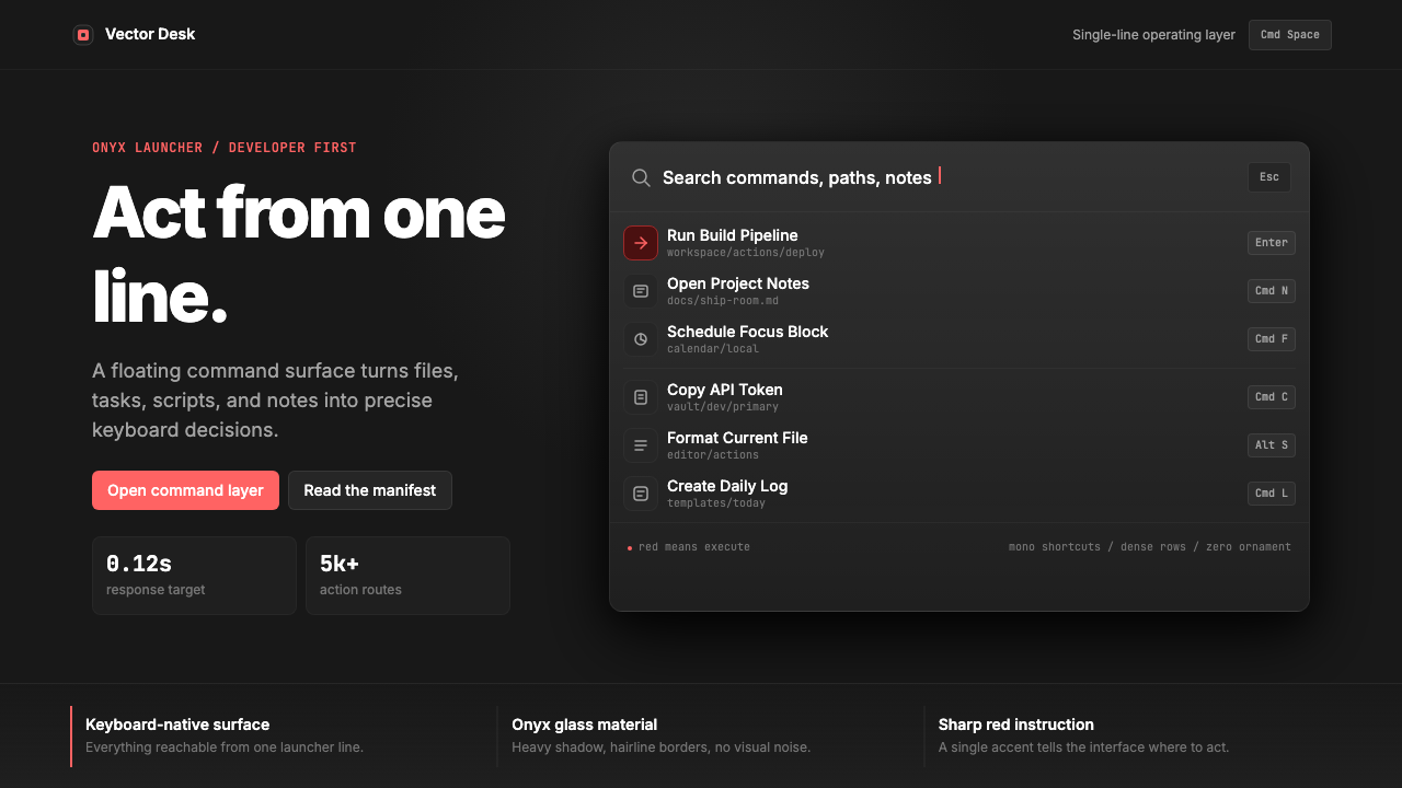 Raycast Spotlight Launcher (2023)Obsidian confidence. Sharp red cuts through Inter rows and mono shortcut chip…黑曜石般自信。锐红切过 Inter 行与等宽快捷键。
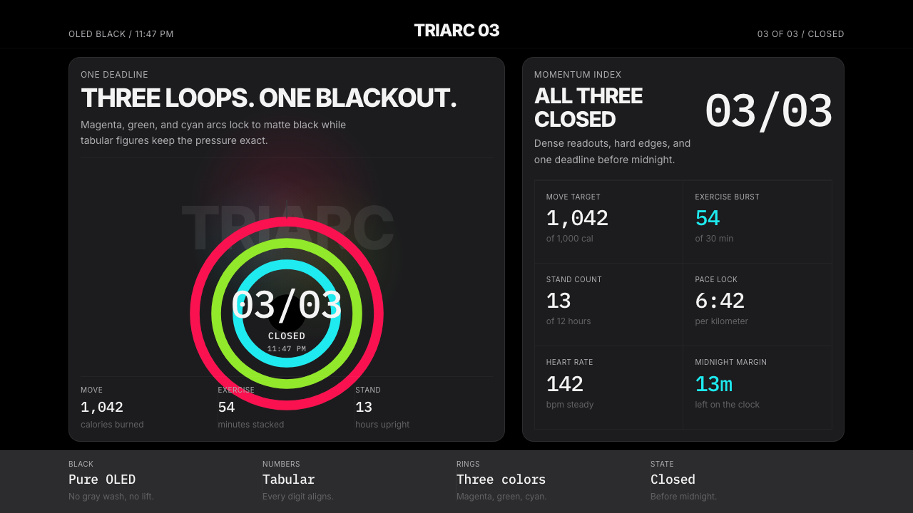 Apple Fitness Rings Closed (2024)Midnight feels exact. Magenta, green, and cyan rings lock onto OLED black.午夜像被校准。洋红、绿、青三环锁在黑底上。
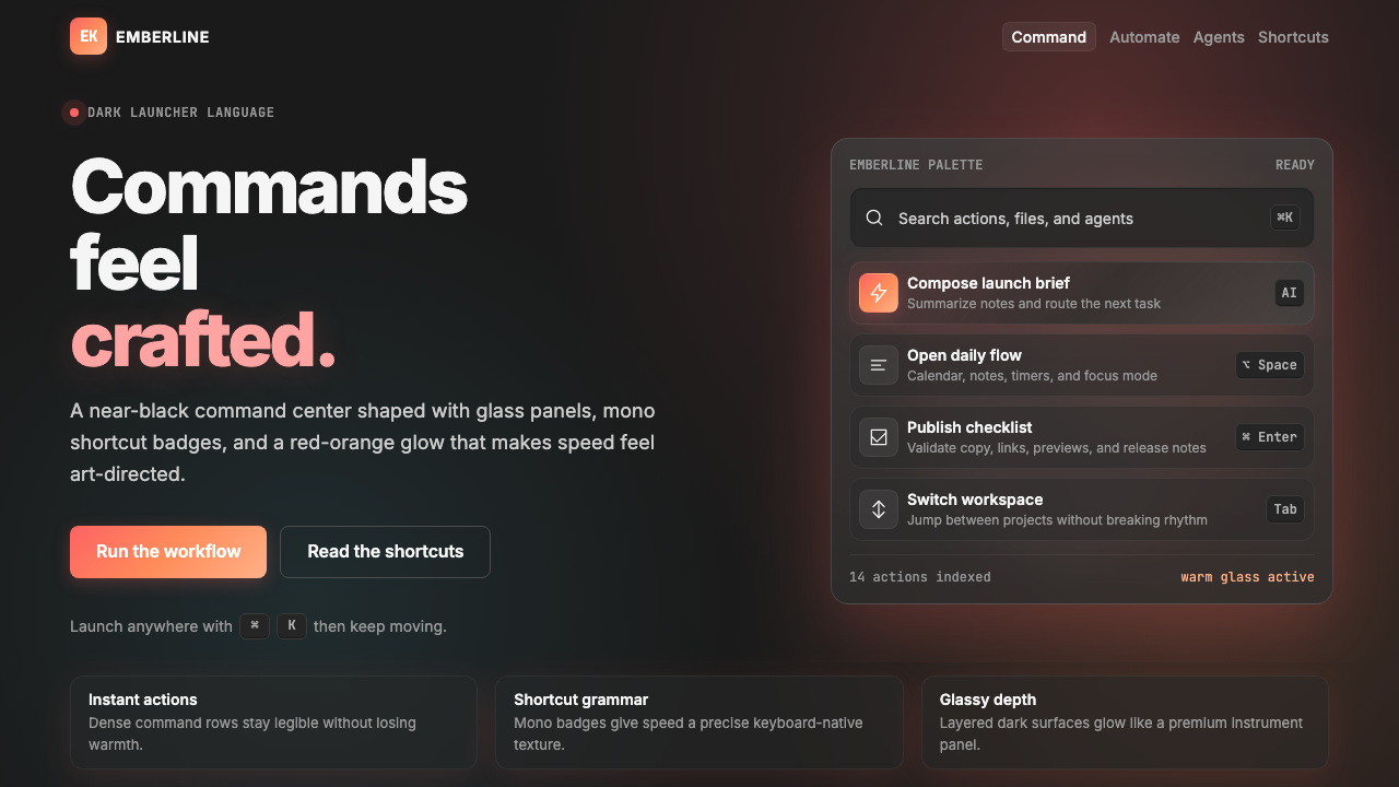 Raycast 2024Productivity feels art-directed. Red-orange glow, glass cards, and mono badge…生产力也被艺术指导:黑底红橙光、玻璃卡片与等宽快捷键。
 Cursor IDEAI-first code editor. Pure dark surfaces, off-white text, electric blue reser…以 AI 为核心的代码编辑器:近乎纯黑背景、柔白文字、唯一的电光蓝色专为 AI…
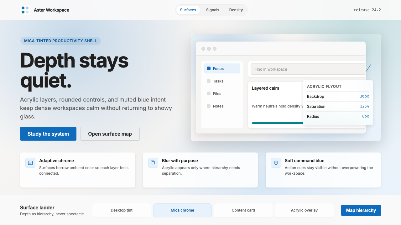 Microsoft Fluent 2Disciplined translucency. Warm Mica neutrals, acrylic blur, and muted blue cr…有纪律的半透明:暖 Mica 中性色、亚克力模糊与低调蓝营造沉稳层次。
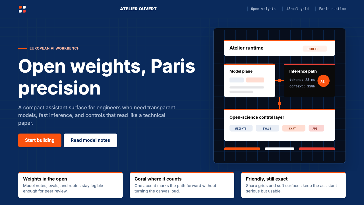 Mistral Le Chat French AIOpen science feels engineered. Navy panels, Inter grids, and coral stripes ke…开放科学也很精密:海军蓝面板、Inter 栅格与珊瑚橙细线定调。