What is Netflix 2024?什么是 Netflix 2024?
Netflix turned the streaming browser into a cinema lobby — near-black canvas, horizontal poster rails, and one precise red action cue that every rival promptly copied.Netflix 把流媒体浏览器变成了电影院大厅——近黑画布、横向海报轨道,以及一个精准的红色操作指示,之后几乎所有对手都在模仿。
Netflix 2024 in briefNetflix 2024 速览
Netflix 2024 is the visual design language that defines the world's most recognized streaming interface. Built on a near-black canvas, horizontal rows of poster cards, a proprietary typeface drawn for the platform, and a single signature red reserved exclusively for primary interactive actions, it is simultaneously a product design system and a cultural template that reshaped how the entire streaming industry presents itself.Netflix 2024 是定义全球最具辨识度流媒体界面的视觉设计语言。它建立在近黑画布、横向海报卡片轨道、一款为平台定制的专属字体,以及唯一只用于主操作的标志性红色之上,既是一套产品设计系统,也是一种重塑了整个流媒体行业自我呈现方式的文化模板。
The system is built around a deliberate imbalance: the interface is intentionally quiet so that the content artwork can be loud. Background surfaces stay deep and neutral, typographic elements stay restrained in weight and size, and the signature red appears only at moments of decisive action — play buttons, progress bars, the logo itself. Everything else is handled by the colors the movie posters and thumbnail artwork themselves bring to the screen.这套系统建立在一种刻意的不平衡之上:界面有意压低音量,只为让内容本身大声说话。背景表面保持深沉中立,字体元素在字重与尺寸上保持克制,标志性红色只在决定性的操作时刻出现——播放按钮、进度条、品牌标志本身。其余一切,都由电影海报与缩略图本身带来的色彩填满。
What makes Netflix 2024 distinctive as a design language is not any single element but the discipline with which every element is subordinated to content visibility. It is a service design in the truest sense: the interface recedes so that the catalogue can advance. This principle — the UI as cinema lobby rather than destination — is what separates it from streaming competitors who allowed their own brand color systems to compete with the artwork they were commissioned to showcase.Netflix 2024 作为设计语言的独特之处,不在于任何单一元素,而在于每个元素都被训练有素地服从于内容可见性这一总目标。它是最真正意义上的服务设计:界面退后,目录向前。这一原则——UI 是电影院大厅而非目的地——正是它与其他流媒体竞争对手的根本区别,后者往往让自身的品牌色彩体系与所展示的影片作品相互竞争。
Where does Netflix 2024 come from?Netflix 2024 从何而来?
Netflix was founded in Los Gatos, California in 1997 as a DVD-by-mail rental service under Reed Hastings and Marc Randolph. The visual identity that defined it globally did not crystallize until the streaming era arrived in earnest. When Netflix launched its streaming service in 2007, the platform inherited interface conventions from early web video — light backgrounds, standard web typography, and generic navigation patterns borrowed from e-commerce. Nothing about this early presentation hinted at the design confidence that would later define the brand.Netflix 由里德·黑斯廷斯与马克·兰道夫于1997年在美国加州洛斯加托斯创立,最初是一家 DVD 邮寄租赁服务。其在全球范围内确立的视觉身份,直到流媒体时代真正到来后才逐渐成形。2007年 Netflix 推出流媒体服务时,平台延续了早期网络视频的界面惯例——浅色背景、标准网络字体,以及借鉴自电子商务的通用导航模式。早期呈现中没有任何迹象预示日后定义这一品牌的设计自信。
The critical transformation came in stages across the 2010s. Netflix invested in a proprietary typeface, commissioning the London-based type foundry Dalton Maag to design Netflix Sans, which was completed and deployed around 2018. The decision to own a custom typeface was partly economic — licensing fees for widely used commercial fonts at Netflix's global scale are substantial — but it was also a signal of design seriousness. A platform that commissions its own letterforms is declaring that its visual identity is a long-term strategic asset, not a vendor selection.关键的转变在2010年代分阶段完成。Netflix 投资了一款专属字体,委托伦敦字体设计工作室 Dalton Maag 设计 Netflix Sans,约于2018年完成并正式启用。委托定制字体的决定一部分出于经济考量——以 Netflix 的全球规模授权广泛使用的商业字体费用相当可观——但同时也是一种设计严肃性的宣示。一个为自己定制字形的平台,是在声明其视觉身份是一种长期战略资产,而非一次供应商筛选。
The dark interface emerged from observation rather than artistic preference. Netflix's internal research showed that users watching video content in living room environments — on television screens, in dimly lit rooms — found light interfaces jarring and contrast-breaking. A near-black canvas allowed the luminous poster artwork and video previews to appear as natural extensions of the viewing experience rather than interruptions to it. By the mid-2010s, the dark-canvas, poster-rail layout had become so strongly associated with Netflix that competitors including Amazon Prime Video, Disney Plus, and Apple TV Plus all adopted variants of the same template.暗色界面的出现源于观察,而非艺术偏好。Netflix 内部研究发现,在客厅环境中——电视屏幕前、光线昏暗的房间里——使用浏览器观看视频内容的用户发现浅色界面令人不适且破坏对比感。近黑画布让发光的海报图像和视频预览得以作为观看体验的自然延伸呈现,而非一种打断。到2010年代中期,暗色画布与海报轨道布局已如此强烈地与 Netflix 相关联,以至于包括亚马逊 Prime Video、迪士尼 Plus 和苹果 TV Plus 在内的竞争对手都采用了同一模板的变体。
The design language reached its most refined and influential form between roughly 2018 and 2024, the period the style name references. During this time, the signature red action color became more precisely deployed — appearing only at primary interactive moments rather than as a general brand application. The horizontal scroll mechanic, the autoplay hover behavior, the modal detail card, and the progressive disclosure of metadata were all refined into what became industry-standard patterns. What Netflix 2024 represents, historically, is the moment a streaming platform's UX conventions became so universally adopted that they effectively defined a genre of interface design.这套设计语言在大约2018年至2024年间达到最精炼、最具影响力的形态,这也是该风格名称所指涉的时期。在此期间,标志性红色操作色的使用变得更加精准——只在主操作时刻出现,而非作为泛化的品牌应用。横向滚动机制、悬停自动播放行为、模态详情卡片,以及元数据的渐进式披露,都被打磨成行业标准交互模式。Netflix 2024 在历史上的意义,正是一个流媒体平台的用户体验惯例被如此普遍地采纳,以至于实际上定义了一种界面设计类型的时刻。
What defines the Netflix 2024 look?Netflix 2024 的视觉特征是什么?
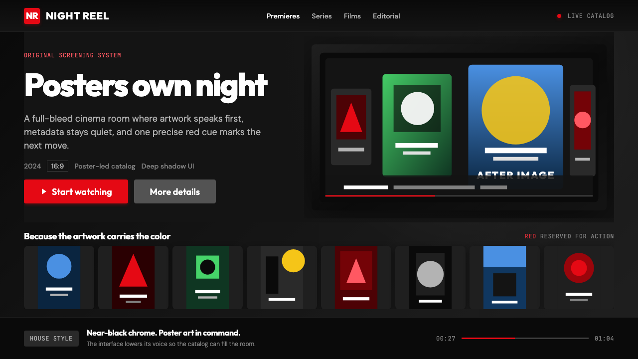
Near-Black Canvas近黑画布
The foundational surface is not true black but a very deep, slightly warm dark tone that absorbs ambient display light without creating the harsh contrast of a pure black background. This depth serves a functional purpose: it allows luminous poster artwork and video thumbnails to appear to glow rather than simply sit on a surface. The near-black also reduces eye strain during extended browsing sessions in darkened viewing environments, aligning the interface with the physical context in which most users encounter it.基础底面并非纯粹的黑色,而是一种极深、略带暖意的深色调,在不产生纯黑背景刺眼对比的同时吸收了环境显示光线。这种深度具有功能性意义:它让发光的海报图像和视频缩略图看起来像在发光,而非仅仅贴附于某个表面。近黑色也减少了用户在昏暗观看环境中长时间浏览时的眼部疲劳,使界面与大多数用户接触它的物理场景相契合。
Single Signature Red唯一标志红
One strong red — the same hue used in the Netflix wordmark — carries every primary interactive action across the entire interface. Play buttons, progress bars, loading indicators, and selected states all share this single color. Its power comes entirely from discipline: because nothing else in the interface is red, the color functions as an unambiguous action signal that requires no label or explanation. When the red appears, the user knows something is interactive or in progress. The color is never used decoratively.一种强烈的红色——与 Netflix 文字标志使用的色调相同——承载了整个界面中所有的主操作。播放按钮、进度条、加载指示器和选中状态都共享这一种颜色。它的力量完全来自于纪律性:因为界面中没有其他任何东西是红色的,这种颜色作为明确无误的操作信号运作,无需任何标签或解释。红色出现时,用户便知道某物是可交互的或正在进行中。这种颜色从不用于装饰目的。
Horizontal Poster Rails横向海报轨道
Content is organized into named horizontal rows — genre rails, mood rails, personalized recommendation rows — that extend beyond the visible viewport and invite lateral scrolling. Each rail presents uniform-sized poster or landscape cards that foreground the artwork. This structure accomplishes two things simultaneously: it allows the platform to display a very large catalogue without pagination, and it puts the visual identity of individual titles — their poster design, color palette, and photography — in direct contact with the user. The interface shape is a container; the content fills the color.内容被组织成命名的横向行列——类型轨道、情绪轨道、个性化推荐行——延伸至可见视口之外,邀请侧向滚动。每条轨道呈现统一尺寸的海报卡片或横幅卡片,突出展示图稿本身。这种结构同时完成两件事:让平台得以在无翻页的情况下展示海量目录,同时将各个片名的视觉身份——其海报设计、色彩搭配与摄影图像——与用户直接接触。界面的形状是一个容器;内容填充了色彩。
Proprietary Neutral Typeface专属中性字体
Netflix Sans, the custom typeface designed by Dalton Maag and deployed from around 2018, is built for legibility across the full range of display contexts the platform serves — mobile screens, tablet browsers, television displays, and desktop monitors. The letterforms are clean and geometrically informed without being overtly geometric; they carry no distinctive stylistic personality that would compete with the content alongside which they appear. The typeface is an instrument of neutral functionality, designed to recede so that titles and descriptions can communicate clearly at any size.Netflix Sans 是由 Dalton Maag 设计、约自2018年起部署的定制字体,专为平台所服务的所有显示场景的可读性而构建——手机屏幕、平板浏览器、电视显示器与桌面显示器。字形简洁、具有几何感但不过于几何;它不带有任何鲜明的风格个性,不会与并排出现的内容形成竞争。这款字体是中性功能性的工具,被设计为退到后台,使标题与描述文字在任何尺寸下都能清晰传达。
Content-Forward Depth Hierarchy内容优先的深度层级
Netflix 2024 uses subtle depth cues — gentle scaling of cards on hover, layered modal panels for detail views, fading edge gradients on rails — to create a sense of spatial depth without ever using skeuomorphic surfaces or decorative shadows. The depth hierarchy is always in service of directing attention toward content: the focused or hovered item grows slightly, while surrounding items recede. This creates a sense of cinematic focus pull — the interface behaves like a camera lens, keeping the selected content sharp while letting everything else blur to background.Netflix 2024 使用细腻的深度线索——悬停时卡片的轻微放大、详情视图的分层模态面板、轨道边缘的渐隐——来营造空间深度感,同时不使用任何拟物化表面或装饰性阴影。深度层级始终服务于将注意力引向内容:被聚焦或悬停的项目略微放大,周围项目则退缩至后景。这制造出一种电影式焦点拉伸感——界面表现得像一个相机镜头,让选中内容保持清晰,而让其余一切模糊至背景。
Progressive Metadata Disclosure渐进式元数据披露
In the default browsing state, each card shows only artwork — no title text, no rating, no genre tags overlay the image. Information is revealed progressively: a hover or focus state surfaces the title, year, rating, and a brief description; selecting an item opens a full detail modal with cast, synopsis, and related content. This layering keeps the default visual state clean and poster-like while ensuring that users who want information can access it without navigating away. It is a pacing decision as much as a design decision.在默认浏览状态下,每张卡片只显示图稿——没有标题文字、没有评分、没有类型标签叠加在图像上。信息被渐进式披露:悬停或聚焦状态浮现标题、年份、评级和简短描述;选择某个项目打开完整的详情模态框,显示演职人员、剧情简介和相关内容。这种分层保持了默认视觉状态的整洁与海报感,同时确保想要信息的用户无需导航离开即可获取。这既是一个节奏决定,也是一个设计决定。
Dark Surface Gradient Transitions深色表面渐变过渡
Unlike classic design systems that treat gradients as decoration to be avoided, Netflix 2024 uses gradients instrumentally: to transition between a full-bleed hero image and the dark content rails below it, to fade rail edges to signal that more content exists beyond the visible frame, and to create a vignette effect on autoplay video previews that keeps the overlay text legible. These gradients are always directional and functional — they solve a readability or attention problem — rather than applied for aesthetic richness. The discipline of purposeful gradient use distinguishes this system from interfaces that use gradients as decoration.与将渐变视为需要避免的装饰的经典设计系统不同,Netflix 2024 将渐变工具性地使用:用于在全出血英雄图像与其下方深色内容轨道之间过渡,用于淡化轨道边缘以提示可视区域之外还有更多内容,以及用于在自动播放视频预览上制造晕影效果以保持叠加文字的可读性。这些渐变始终是有方向性且功能性的——它们解决的是可读性或注意力问题——而非为美学丰富性而施加。有目的地使用渐变的自律性,将这套系统与将渐变用作装饰的界面区分开来。
Who shaped Netflix 2024?谁塑造了 Netflix 2024?
Co-founder and longtime CEO of Netflix, Hastings oversaw the company's transformation from a DVD-by-mail service into the world's dominant streaming platform. His strategic decisions — including the pivotal 2007 streaming launch and the sustained investment in original content beginning around 2013 — created the commercial context within which Netflix's design language evolved. The platform's willingness to invest in custom typography and a research-driven dark interface reflects a design culture shaped at the executive level by the belief that the viewing experience, not the interface, should be the product.作为 Netflix 联合创始人及长期 CEO,黑斯廷斯主导了公司从 DVD 邮寄服务到全球主导流媒体平台的转变。他的战略决策——包括2007年的关键性流媒体业务上线,以及约自2013年起对原创内容的持续投入——创造了 Netflix 设计语言得以演化的商业环境。平台对定制字体与研究驱动暗色界面的投入,反映了一种在高管层面形成的设计文化:观看体验而非界面本身才是产品。
The London-based type design studio commissioned to create Netflix Sans, the proprietary typeface that replaced licensed fonts across Netflix's global interface around 2018. Dalton Maag has a broad portfolio of corporate typeface commissions — including work for Ubuntu and BMW — and is known for designing letterforms that perform across the full range of digital display sizes. Netflix Sans was designed to be legible from a mobile thumbnail caption to a television title card at viewing distance, making it one of the more technically demanding multi-context typeface briefs in contemporary streaming design.受委托创作 Netflix Sans 的伦敦字体设计工作室——这款专属字体约于2018年在 Netflix 全球界面中取代了授权字体。Dalton Maag 拥有广泛的企业字体定制委托作品集——包括为 Ubuntu 和宝马所做的工作——以其设计能在全尺寸数字显示设备上表现良好的字形而著称。Netflix Sans 被设计为从手机缩略图说明文字到观看距离下的电视片名字卡都清晰可读,使其成为当代流媒体设计中技术要求最为苛刻的多场景字体任务之一。
Referenced in the context of Netflix's visual identity evolution, Carbonell represents the broader creative ecosystem that influenced the platform's approach to content presentation and visual atmosphere. Netflix's design decisions during the 2018–2024 period were shaped by collaboration between product designers, brand designers, and the broader creative community — reflecting a design culture that treats visual environment as an extension of the editorial and artistic sensibility of the content it hosts.卡波内尔在 Netflix 视觉身份演化的语境中被提及,代表着影响该平台内容呈现方式与视觉氛围的更广泛创意生态系统。Netflix 在2018至2024年间的设计决策,由产品设计师、品牌设计师与更广泛创意社群的协作共同塑造——体现了一种将视觉环境视为所承载内容的编辑与艺术感性延伸的设计文化。
Netflix 2024 did not emerge from a single designer or a single manifesto but from the iterative refinement of a platform serving hundreds of millions of users across every screen type. The UX conventions it codified — dark canvas, content-rail browsing, single-action color, progressive metadata disclosure — became the shared vocabulary of an industry. The streaming platform UX movement represents the first time a digital product's interface conventions spread so completely across competitors that they constituted a recognizable design genre, in the same way that physical retail store layouts or print magazine grids became recognizable genres before it.Netflix 2024 并非源自某位单一设计师或某份单一宣言,而是来自一个为数亿用户在所有屏幕类型上服务的平台的迭代精炼。它所编码的用户体验惯例——暗色画布、内容轨道浏览、单操作色、渐进式元数据披露——成为了整个行业的共同词汇。流媒体平台用户体验运动,代表着数字产品界面惯例首次如此完整地蔓延至竞争对手,以至于构成了一种可辨识的设计类型——就像实体零售店铺陈列或印刷杂志网格版面在此之前成为可辨识类型一样。
How do you use Netflix 2024 today?今天怎么用 Netflix 2024?
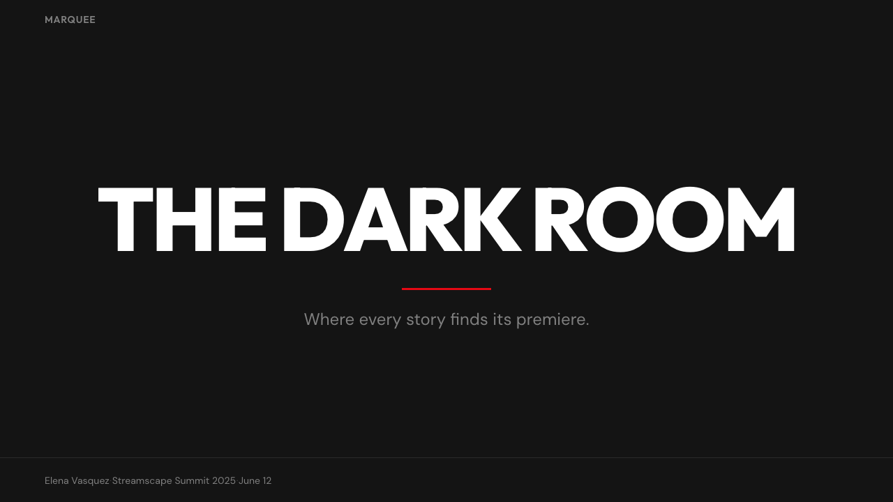
Netflix 2024 translates well to slide decks when the content being presented has strong visual assets — photography, product screenshots, video stills, data visualizations — that can carry the slides the way movie posters carry the streaming interface. A cover slide in this style uses a full-bleed dark background, a single large title in a clean neutral typeface, and one precise red element — an underline, a geometric shape, a highlighted word — to mark the primary focus. The darkness should feel intentional and atmospheric, not like a default dark mode toggle.当所呈现的内容拥有强大的视觉资产——摄影图像、产品截图、视频静帧、数据可视化——能够像电影海报支撑流媒体界面那样支撑幻灯片时,Netflix 2024 风格在演示文稿中的迁移效果极佳。这种风格下的封面页使用全出血深色背景,简洁中性字体呈现的单一大标题,以及一个精准的红色元素——下划线、几何形状、高亮词语——标记主要焦点。深色应当感觉刻意而有氛围,而非默认暗黑模式开关的效果。
Content slides work best when they treat the slide as a stage rather than a document page. Text is reduced to the minimum needed — a short headline, a three-to-five point list, a pull quote — and positioned with generous breathing room against the dark ground. Data slides benefit from treating charts as poster objects: bars and lines rendered in muted neutrals with a single strong red accent marking the most important data point. Gridlines and axis labels stay light and secondary; the data speaks at high contrast against the dark field.内容页在被当作舞台而非文档页面处理时效果最佳。文字精简至所需最少——简短标题、三到五点列表、引用段落——并在深色底面上留有充裕的呼吸空间。数据页面受益于将图表当作海报对象处理:柱状图与折线图以静默中性色渲染,用单一强烈红色标记最重要的数据点。网格线和坐标轴标签保持浅淡和次要地位;数据在深色底面上以高对比度自己说话。
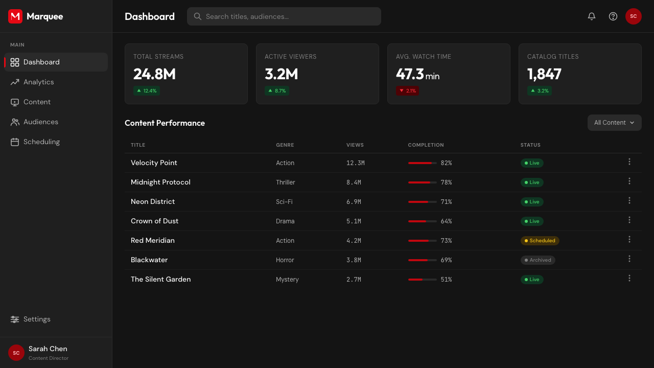
For web UI applications — dashboards, admin panels, content management interfaces, pricing pages — the Netflix 2024 approach translates to a strict dark-surface layout where the primary red marks only interactive states: active navigation items, primary call-to-action buttons, selected filters, progress indicators. All other interactive elements — secondary buttons, input fields, toggles — live in neutral dark tones without color accent. The discipline is the same as the streaming interface: if everything is red, nothing is red.对于网页 UI 应用——仪表板、管理面板、内容管理界面、定价页面——Netflix 2024 方法转化为一种严格的深色底面布局,主操作红色只标记可交互状态:活跃导航项、主行动按钮、已选筛选器、进度指示器。所有其他可交互元素——次级按钮、输入框、开关——居于中性深色调之中,没有色彩强调。纪律性与流媒体界面相同:如果所有东西都是红色,那么红色便失去意义。
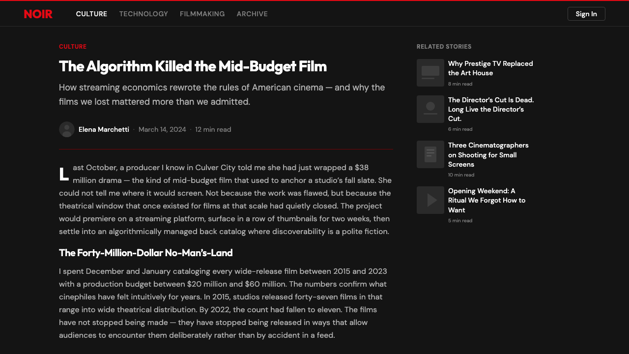
Editorial and marketing work in this style works best when images are given maximum real estate. A Netflix-style editorial layout uses full-width image headers that bleed to the edges of the container, with title text overlaid using a dark-to-transparent gradient that ensures readability without obscuring the image. Marketing pages use alternating full-width sections — dark content sections with light text, occasionally punctuated by a single red call-to-action that functions as the page's only color moment. The overall pace should feel cinematic: slow, confident, letting each element land before introducing the next.这种风格的编辑与营销内容在图像获得最大展示空间时效果最佳。Netflix 风格的编辑版面使用铺满容器边缘的全宽图像标题,标题文字以深色至透明的渐变叠加,在不遮挡图像的情况下保证可读性。营销页面使用交替的全宽板块——带浅色文字的深色内容板块,偶尔以单一红色行动号召点缀,作为页面唯一的色彩时刻。整体节奏应感觉电影般:缓慢、自信,让每个元素落地后再引入下一个。
A common mistake when applying Netflix 2024 is using the dark canvas as permission to add multiple accent colors — a teal for secondary actions, a gold for premium tiers, an orange for warnings. The original system's power comes from absolute color discipline: one red, everything else neutral. Adding a second accent color immediately breaks the signal value of the first. If tier differentiation or state differentiation is needed, it should be handled through brightness, scale, and typographic weight within the neutral palette rather than by introducing new hues.应用 Netflix 2024 时最常见的错误,是将深色画布理解为添加多种强调色的许可——青绿色用于次级操作、金色用于高级层级、橙色用于警示。原始系统的力量来自绝对的色彩纪律:一种红色,其余一切中性。加入第二种强调色会立即破坏第一种的信号价值。如果需要层级区分或状态区分,应在中性色板内通过亮度、尺度和字重的变化来处理,而非引入新的色调。
Netflix 2024 — FAQNetflix 2024 · 常见问题
Can Netflix 2024 work for brands outside the entertainment industry?Netflix 2024 风格能用在娱乐行业之外的品牌上吗?
Yes, but with important caveats. The style works well for any product where the primary visual content is rich imagery — real estate platforms, photography portfolios, food delivery with strong food photography, travel services. It struggles for products with sparse visual assets, because the dark canvas depends on luminous content to feel intentional rather than empty. It also needs genuine color discipline: if a brand has an established multi-color identity, forcing it into a single-accent system will either look incomplete or require abandoning too much of the existing brand language. The style is a strong fit for products positioning themselves as premium, cinematic, or content-first.可以,但需要重要的前提条件。这种风格适用于任何主要视觉内容是丰富图像的产品——房地产平台、摄影作品集、拥有强大食物摄影的外卖服务、旅行服务。它不适合视觉资产稀疏的产品,因为深色画布依赖发光的内容来显得刻意而非空洞。它同样需要真正的色彩纪律:如果一个品牌有既定的多色彩身份,强行压缩为单一强调系统要么看起来不完整,要么需要放弃太多现有品牌语言。这种风格对于将自身定位为高端、电影感或内容优先的产品而言是强有力的选择。
How does Netflix 2024 differ from generic dark mode design?Netflix 2024 风格与普通深色模式设计有何不同?
Generic dark mode is a light interface inverted: the same layout, hierarchy, and color system reproduced on a dark ground. Netflix 2024 is built dark from the ground up, with every compositional decision made in the context of a dark environment. The difference shows in the poster rail structure — which only makes visual sense against a dark background — in the single-accent color discipline, and in the gradient transitions that manage the boundary between dark surface and luminous content. A dark mode toggle applied to a standard web interface produces a version of the interface; Netflix 2024 produces a specific atmosphere.普通深色模式是浅色界面的反转:相同的布局、层级与色彩系统在深色底面上重现。Netflix 2024 从一开始就是为深色环境构建的,每一个构图决策都在深色环境的背景下做出。差异体现在海报轨道结构上——这一结构只在深色背景下才具有视觉意义——体现在单一强调色纪律上,以及管理深色表面与发光内容之间边界的渐变过渡上。应用于标准网页界面的深色模式开关产生的是该界面的一个版本;Netflix 2024 产生的是一种特定的氛围。
What kind of typography hierarchy works best in this style?哪种字体排印层级在这种风格中效果最好?
Netflix 2024 uses a flat, scale-driven typographic hierarchy: very few type levels, distinguished primarily by size and weight rather than by style variation or color. In practice, this means a large display or title level in medium or semibold weight, a smaller subtitle or metadata level in regular weight, and body text kept to a minimum — often replaced entirely by visual thumbnail content. Color is almost never used for typographic differentiation; the signature red appears only on interactive labels or critical status text. The discipline of restricting typographic variety forces the layout to rely on space and scale for hierarchy, which tends to produce cleaner results at the display sizes the platform targets.Netflix 2024 使用一种扁平的、以尺度为驱动的字体排印层级:类型层级极少,主要通过尺寸与字重而非风格变化或颜色加以区分。实践中,这意味着中等或半粗字重的大型展示或标题层级,较小的副标题或元数据层级使用常规字重,正文文字保持在最低限度——通常完全被视觉缩略图内容取代。颜色几乎从不用于字体排印区分;标志性红色只出现在可交互标签或关键状态文字上。限制字体排印多样性的纪律迫使版面依赖空间与尺度建立层级,这在平台目标显示尺寸下往往产生更为简洁的结果。
Is the horizontal scroll rail pattern transferable to non-streaming contexts?横向滚动轨道模式能迁移到非流媒体场景中吗?
The poster rail is highly effective in any context where the primary content unit is a rich visual card and the catalogue is large enough to justify non-paginated browsing: e-commerce with strong product photography, app stores, news and article aggregators, portfolio platforms, and course libraries. It works less well for text-primary content, for small catalogues where pagination would be more efficient, or for contexts where users need to compare items across rows rather than browse sequentially within rows. The key transferable element is not the horizontal scroll itself but the named-row categorization — grouping content into editorially meaningful rails that give users multiple entry points into a large catalogue simultaneously.海报轨道在任何主要内容单元是丰富视觉卡片、且目录大到足以证明非翻页浏览合理的场景中都非常有效:拥有强大产品摄影的电商、应用商店、新闻与文章聚合器、作品集平台以及课程库。它在文字为主的内容、翻页会更高效的小型目录,或用户需要跨行比较项目而非在行内顺序浏览的场景中效果较差。真正可迁移的核心元素不是横向滚动本身,而是命名行分类——将内容分组至具有编辑意义的轨道中,同时为用户提供进入大型目录的多个入口点。
How should the signature red be used when the brand's primary color is not red?当品牌主色不是红色时,应如何使用标志性红色的原则?
The underlying principle is not specifically about red — it is about single-accent discipline. Any strong, saturated color can serve the same structural function that red serves in the Netflix system, provided it is used with equal exclusivity. Choose one accent color from the brand's existing palette, assign it exclusively to primary interactive actions and critical status signals, and remove it from every decorative or secondary use. The resulting system works by the same logic: users learn that the accent color means action, because it appears nowhere else. The failure mode is selecting a color that is already used extensively in the brand's marketing materials, because users will not learn to read it as an interactive signal if it appears decoratively throughout the interface.底层原则并非专门关于红色——而是关于单一强调纪律。任何强烈的饱和色都可以在 Netflix 系统中承担红色所承担的结构功能,前提是以同等的排他性使用它。从品牌现有色板中选择一种强调色,专门分配给主操作和关键状态信号,并从所有装饰性或次级用途中移除它。由此产生的系统依照同样的逻辑运作:用户学会将强调色理解为操作信号,因为它在其他任何地方都不出现。失败模式是选择一种已在品牌营销材料中被广泛使用的颜色,因为如果它在界面中装饰性地到处出现,用户就不会学会将其解读为可交互信号。
Related design styles相关设计风格
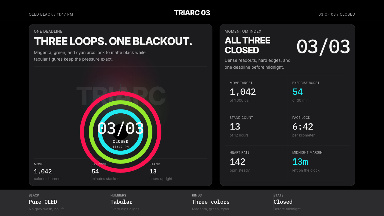 Apple Fitness Rings Closed (2024)Midnight feels exact. Magenta, green, and cyan rings lock onto OLED black.午夜像被校准。洋红、绿、青三环锁在黑底上。
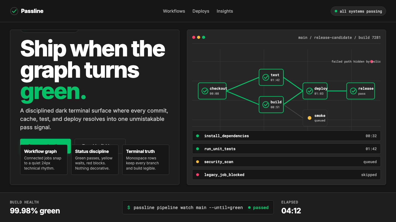 CircleCI Pipeline-GreenConfidence goes green. Emerald status lines cut through terminal-black pipeli…信心变绿。翠绿状态线切过终端黑流水线网格。
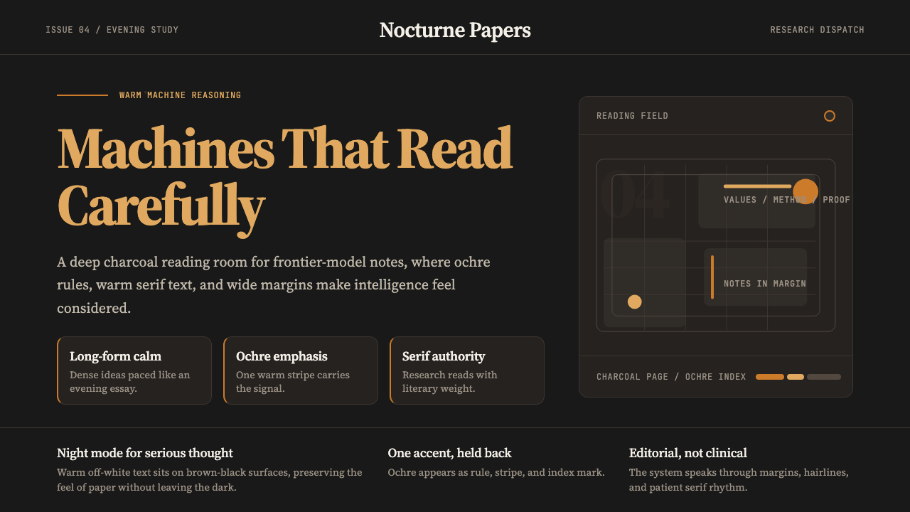 Claude / Anthropic Warm 2024Warm intelligence at night. Ochre rules and Source Serif glow on deep charcoa…夜读式温暖智能:深炭底、赭橙线与 Source Serif 发光。
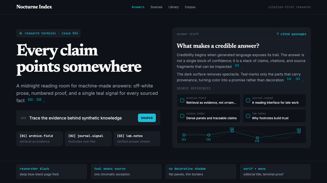 Perplexity AISerious search after midnight. Teal citations cut through black panels and de…午夜研究感:青绿色引用穿过黑色面板与密集衬线排版。
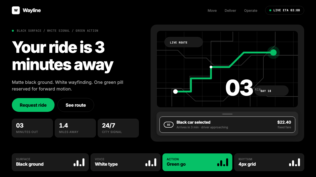 Uber 2024Motion made severe. Black surfaces, white Inter, one green pill turns the who…移动被压到极简:黑底白字,一枚绿色胶囊启动全局。
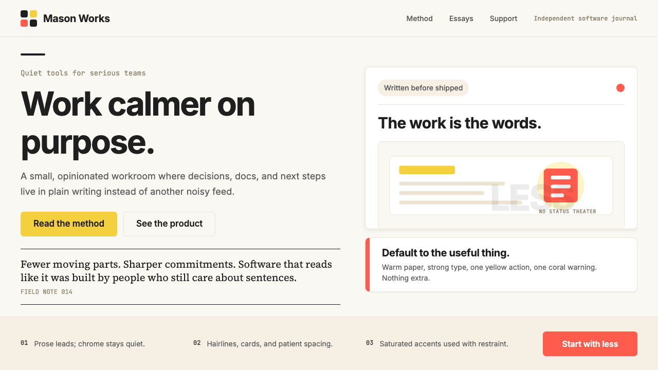 Basecamp / 37signalsQuiet craft, strong opinions. Cream paper, tight sans type, yellow and coral…安静却有主张。米色纸底、紧排无衬线、黄与珊瑚克制点题。