What is Uber 2024?什么是 Uber 2024?
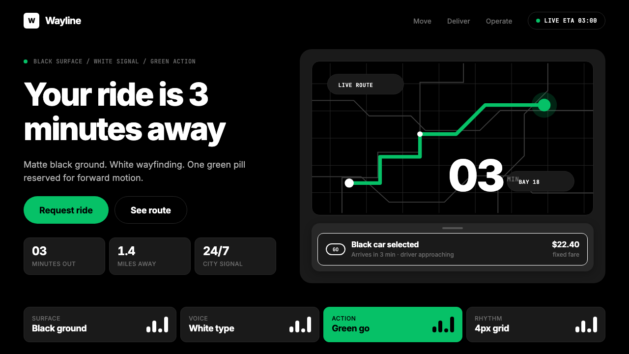
Uber's 2018 redesign compressed an entire mobility platform into three ruthless ingredients: a near-black surface, white wayfinding type, and one green pill that says go.Uber 2018年的品牌重塑将整个出行平台压缩为三个冷酷要素:近乎纯黑的底面、白色导向文字,以及一枚代表「出发」的绿色胶囊按钮。
Uber 2024 in briefUber 2024 速览
Uber's visual identity — as it crystallized through the 2018 Wolff Olins rebrand and evolved into its current form — is one of the most uncompromising dark-first systems in consumer product design. Its palette is a near-binary: deep matte black grounds, white text, and a single vivid green reserved exclusively for the primary call-to-action. Everything else is subordinated to this hierarchy. There are no secondary accent colors competing for attention, no decorative gradients softening the edges, no illustrative flourishes softening the interface.Uber 的视觉体系——经由 2018 年 Wolff Olins 主导的品牌重塑,逐步演变为如今的形态——是消费产品设计中最不妥协的深色优先系统之一。其色板近乎二元对立:深哑光黑色底面、白色文字,以及唯一的一抹鲜明绿色,专门保留给主要行动按钮。其他一切都服从于这一层级。没有第二种彩色抢夺注意力,没有渐变软化边缘,没有插画装饰点缀界面。
At the center of the system is the custom Uber Move typeface, designed specifically to perform at the miniature scale of ETA counters and map labels. Where other mobility apps relied on adopted system fonts or generic geometric sans-serifs, Uber Move was tuned for wayfinding clarity — the kind of legibility demanded when a passenger glances at a screen for half a second to confirm their driver is two minutes away. The letterforms are rational and neutral, carrying no personality beyond precision.这套体系的核心是自研字体 Uber Move,专为在到达时间计数器和地图标签的极小字号下表现出色而设计。其他出行应用依赖系统字体或通用几何无衬线字体,而 Uber Move 则专门为导向清晰度调校——那种乘客只需瞥一眼屏幕、确认司机还有两分钟到达时所要求的可读性。字形理性而中性,除精确度之外不携带任何额外个性。
The result is a visual proposition about speed and reliability rather than warmth or delight. The system communicates one thing: your ride is coming, and here is exactly when. This single-mindedness is what makes the Uber 2024 aesthetic coherent — and transferable. Stripped of its brand marks, the underlying logic of a dominant dark field, a restrained typographic hierarchy, and a single reserved signal color is a design system applicable well beyond ride-hailing.最终呈现的是一套关于速度与可靠性的视觉主张,而非温度或愉悦感。整套系统传达一件事:你的车正在赶来,这是确切的到达时间。正是这种专一性使 Uber 2024 美学具有内在连贯性——也使其可以被迁移复用。剥去品牌标志,深色主场域、克制的排版层级、以及一个保留信号色,这套设计逻辑远不止适用于打车场景。
Where does Uber 2024 come from?Uber 2024 从何而来?
Uber was founded in San Francisco in 2009 by Travis Kalanick and Garrett Camp. Its earliest visual identity was informal and startup-rough — an era when the company was more focused on regulatory battles and geographic expansion than on design coherence. The brand changed repeatedly through the early years, tracking the company's shift from a luxury black-car service to a mass-market global platform. By the mid-2010s, Uber had accumulated a fragmented visual identity that reflected its chaotic growth rather than any coherent design philosophy.Uber 由 Travis Kalanick 和 Garrett Camp 于 2009 年在旧金山创立。早期视觉形象随意而粗糙——那是一个公司更专注于监管博弈和地理扩张而非设计连贯性的年代。品牌在早期数年间多次变更,折射出公司从豪华黑头车服务向大众化全球平台的转型。到2010年代中期,Uber 已积累出一套碎片化的视觉形象,映照的是混乱的增长史,而非任何连贯的设计哲学。
The decisive change came in 2018, when incoming CEO Dara Khosrowshahi commissioned the London consultancy Wolff Olins to lead a comprehensive rebrand. The brief was effectively a reset: Uber needed to shed the reputation for cultural toxicity that had accumulated under Kalanick and project a new identity — disciplined, global, and operationally serious. Wolff Olins, known for identity work that prioritizes systemic thinking over surface decoration (their earlier clients include the 2012 London Olympics and Orange telecom), delivered a system built around reduction. The new logomark became a simple wordmark. The color system was collapsed to black, white, and the distinctive green action color. The Uber Move typeface was commissioned as a proprietary wayfinding tool.决定性的转变发生在 2018 年。新任 CEO Dara Khosrowshahi 委托伦敦咨询公司 Wolff Olins 主导一次全面品牌重塑。简报实质上是一次重置:Uber 需要摆脱 Kalanick 时代积累的文化毒性形象,呈现一个新身份——自律、全球化、在运营上认真严肃。Wolff Olins 以系统性思维而非表面装饰著称(其早期客户包括 2012 年伦敦奥运会和 Orange 电信),交付了一套以减法为核心的系统。新标志回归为简洁的文字商标,色彩系统被压缩为黑、白与独特的绿色行动色,Uber Move 字体作为专有导向工具被委托设计。
Michael Gough, who joined Uber as Vice President of Design, was instrumental in translating the Wolff Olins brand foundation into the product design system that users interact with daily. The challenge was applying a radically simplified brand language to a highly complex product — a map-centric interface that had to communicate driver location, route, price, estimated arrival time, and safety information simultaneously, across hundreds of regional markets and multiple operating conditions. The design system that emerged from this process was not minimalism as aesthetic preference but minimalism as functional necessity.加入 Uber 担任设计副总裁的 Michael Gough 在将 Wolff Olins 的品牌基础转化为用户每日交互的产品设计系统方面发挥了关键作用。挑战在于将极度简化的品牌语言应用于高度复杂的产品——一套以地图为中心的界面,必须同时传达司机位置、路线、价格、预计到达时间和安全信息,跨越数百个区域市场和多种运营条件。由此浮现的设计系统,并非出于美学偏好的极简主义,而是出于功能必要性的极简主义。
Between 2020 and 2024, the system refined itself iteratively. The dark-mode-first approach, which had been a differentiator in 2018, became increasingly legible as the broader design industry shifted toward dark interfaces. The green action color became one of the most recognizable single-use accent colors in consumer product design — not through variety, but through absolute consistency. Every time a user sees that particular shade of vivid green in the Uber app, it means exactly one thing: tap here to start your ride. This trained association, built over years of consistent application, is itself a design achievement distinct from the visual system's surface qualities.2020 至 2024 年间,这套系统在迭代中自我精炼。深色优先的方案在 2018 年曾是差异化特征,随着整个设计行业向深色界面转移,它变得越来越清晰可读。那抹绿色行动色逐渐成为消费产品设计中辨识度最高的单一用途强调色——不是因为变化多端,而是因为绝对一致。每次用户在 Uber 应用中看到那个特定的鲜明绿色,它只意味着一件事:点这里开始你的行程。这种经由多年一致性应用而形成的条件反射,本身就是一项独立于视觉系统表面品质之外的设计成就。
What defines the Uber 2024 look?Uber 2024 的视觉特征是什么?
Dark-First Surface深色优先底面
The foundational decision of the Uber system is to treat deep matte black not as a dark-mode variant but as the canonical ground state. Every other visual element is designed against this dark field first and adapted to light contexts secondarily. The darkness is not a stylistic preference — it serves the map-centric interface, where a dark surround recedes and allows the map's geographic data to read as the primary layer. On dark grounds, the white type hierarchy achieves maximum contrast with minimal visual noise.Uber 系统的基础决策是将深哑光黑色视为规范基态,而非深色模式的变体。所有其他视觉元素首先针对这个深色场域设计,再酌情适配浅色场景。深色并非风格偏好——它服务于以地图为中心的界面:深色环境退隐,让地图地理数据作为主层级清晰呈现。在深色底面上,白色排版层级以最少的视觉噪声实现最大对比度。
Single Reserved Signal Color单一保留信号色
The vivid green that Uber applies exclusively to its primary action — the go button, the confirm button, the ride-request trigger — is a lesson in color discipline. It appears nowhere else in the interface. No secondary UI elements share this hue; no data visualizations borrow it; no decorative accents approximate it. This absolute reservation transforms the color from a palette choice into a semantic signal: green means exactly one thing, and that thing is the core transaction of the entire product.Uber 专门用于主要行动(出发按钮、确认按钮、叫车触发)的鲜明绿色,是色彩自律的一堂示范课。它在界面其他任何位置都不出现:没有次级 UI 元素共享这一色调,没有数据可视化借用它,没有装饰性强调色接近它。这种绝对保留将颜色从调色板选择转化为语义信号:绿色精确地只意味着一件事,而那件事是整个产品的核心交易动作。
Wayfinding Typography导向性字体排印
The Uber Move typeface was designed from the outset for legibility at the smallest practical sizes — the kind of text that appears on map pins, ETA counters, and driver name labels. Its letterforms are rationally constructed: strokes are consistent in weight, apertures are open to prevent crowding at small sizes, and the overall texture is neutral enough that it does not compete with the geographic data it labels. Type hierarchy in the system is established through scale and weight contrast rather than color or decorative differentiation.Uber Move 字体从一开始就为最小实用字号下的可读性而设计——地图图钉、到达时间计数器、司机姓名标签上的那种文字。字形构造理性:笔画粗细均匀,字腔开放以防小字号时拥挤,整体质感足够中性,不与它所标注的地理数据竞争。系统中的字体层级通过尺度与字重对比建立,而非依赖色彩或装饰性区分。
Map-Centric Spatial Logic以地图为中心的空间逻辑
Unlike interfaces designed around content feeds or card layouts, the Uber product is organized around a persistent geographic layer. All UI panels — bottom sheets, overlays, action surfaces — are understood as additions to the map rather than replacements of it. This spatial logic disciplines the entire component system: panels appear from edges, overlays are kept shallow and semi-transparent where possible, and the dominant visual hierarchy is always the geographic data beneath the UI chrome. The design system is literally a frame around live geographic reality.与围绕内容流或卡片布局设计的界面不同,Uber 产品以持久的地理图层为核心组织。所有 UI 面板——底部弹窗、覆层、操作面板——都被理解为地图的补充,而非替代。这种空间逻辑规训了整个组件系统:面板从边缘升起,覆层尽可能保持浅层和半透明,主导性视觉层级始终是 UI 界面之下的地理数据。设计系统字面意义上就是围绕实时地理现实的一个框架。
Zero Decorative Ornamentation零装饰性点缀
The Uber visual system contains no decorative elements that exist for aesthetic enrichment alone. There are no illustrative icons rendered in a distinctive artistic style, no gradient washes applied for visual warmth, no patterned backgrounds adding texture, no animated transitions that extend beyond their functional purpose. Every visual element justifies its presence through function. This constraint is not a creative limitation — it is the mechanism by which the system achieves its distinctive severity and clarity, and it is what allows a single green button to carry the entire emotional weight of the interface.Uber 视觉系统不包含任何仅为美学丰富而存在的装饰元素。没有以独特艺术风格渲染的插画图标,没有为视觉温度涂抹的渐变色,没有增添质感的图案背景,没有超出功能目的的动态过渡。每个视觉元素都以功能为自身存在辩护。这一限制并非创意束缚——它是系统实现其独特严肃感与清晰度的机制,也是让一枚绿色按钮承担整个界面情感重量的原因。
Operational Information Hierarchy操作性信息层级
In the Uber interface, the information hierarchy is entirely determined by operational urgency rather than by content interest or brand storytelling. The most operationally critical data — your driver's name and arrival time — is the largest and most prominent. Secondary data — vehicle type, license plate, rating — appears at a reduced scale. Tertiary information — support links, trip history — is tucked into secondary navigation. This hierarchy is strictly maintained and never compromised for promotional content, partnership messaging, or brand personality expression.在 Uber 界面中,信息层级完全由操作紧迫性决定,而非由内容趣味或品牌叙事决定。操作上最关键的数据——司机姓名和到达时间——是最大且最突出的。次要数据——车型、车牌、评分——以较小的尺度呈现。第三级信息——支持链接、行程历史——隐入次级导航。这一层级被严格维持,从不为促销内容、合作伙伴信息或品牌个性表达而妥协。
Component Austerity组件简约性
The component library of the Uber design system tends toward the architecturally minimal. Cards are flat or near-flat, using defined borders or subtle elevation rather than soft diffuse shadows. Inputs are clearly bounded and never ghost-styled. Bottom sheets and modals use sharp-edge containment rather than rounded-corner softening. This austerity creates a consistent material grammar across the interface — every component feels like it belongs to the same system, because they all share the same commitment to hard edges, high contrast, and functional presence over decorative finish.Uber 设计系统的组件库倾向于建筑式的极简。卡片扁平或接近扁平,使用明确边框或细微层次感,而非柔和的漫射阴影。输入框边界清晰,从不使用幽灵样式。底部弹窗和模态框使用硬边收纳,而非圆角软化。这种简约性在界面中创造了一致的材料语法——每个组件都感觉属于同一个系统,因为它们共享着同样的信念:硬边、高对比度,以及功能性存在优于装饰性完成。
Who shaped Uber 2024?谁塑造了 Uber 2024?
The London-based brand consultancy was engaged by Uber in 2018 to lead the comprehensive visual rebrand that defines the current identity system. Wolff Olins brought their characteristic approach of systemic reduction — building brand identity from a small number of strongly defined principles rather than from surface visual richness. Their work with Uber compressed the brand into black, white, and green, established the Uber Move typeface as a proprietary wayfinding tool, and created a framework rigorous enough to operate coherently across hundreds of markets and multiple product lines including Uber Eats.这家总部位于伦敦的品牌咨询公司于 2018 年受 Uber 委托,主导了定义当前形象体系的全面品牌重塑。Wolff Olins 带来了其标志性的系统性减法方式——从少量强定义原则而非表面视觉丰富性出发构建品牌形象。他们为 Uber 所做的工作将品牌压缩为黑、白、绿三元,确立 Uber Move 字体为专有导向工具,并创建了一套足够严格的框架,能够在数百个市场和多个产品线(包括 Uber Eats)上连贯运作。
The CEO who commissioned the 2018 rebrand, Khosrowshahi came to Uber from Expedia in 2017 following the turbulent departure of founder Travis Kalanick. His mandate was to professionalize and stabilize the company, and the visual rebrand was a direct expression of this agenda. The decision to invest in a comprehensive design system — including a proprietary typeface — signaled that Uber intended to operate as a mature global brand rather than a growth-stage startup. Khosrowshahi's operational priorities shaped the system's defining characteristic: reliability and clarity over personality.委托 2018 年品牌重塑的 CEO,Khosrowshahi 于 2017 年从 Expedia 加入 Uber,接替了在动荡中离任的创始人 Travis Kalanick。他的使命是将公司专业化并稳定下来,而视觉品牌重塑正是这一议程的直接表达。投资于完整设计系统——包括专有字体——的决定表明 Uber 有意以成熟的全球品牌而非成长期初创公司的姿态运营。Khosrowshahi 的运营优先级塑造了系统的决定性特征:可靠性与清晰度优先于个性表达。
As Uber's Vice President of Design during the critical post-rebrand implementation period, Gough was responsible for translating the Wolff Olins brand foundation into the operational product design system that users encounter in the app. This translation work — from brand identity to product design language — is where most rebrands succeed or fail, and Gough's team's work is notable for maintaining the system's austerity principles under the intense complexity of a real-time mobility product. His background included significant experience in interaction design systems at scale, which shaped the rigor of the component and pattern library.作为品牌重塑后关键实施期间的 Uber 设计副总裁,Gough 负责将 Wolff Olins 的品牌基础转化为用户在应用中实际体验到的产品设计系统。这项从品牌形象到产品设计语言的转化工作,是大多数品牌重塑成败的关键,而 Gough 团队的工作值得关注之处在于:在实时出行产品的高度复杂性压力下,依然维持了系统的简约原则。他在大规模交互设计系统方面的丰富背景,塑造了组件与模式库的严格程度。
Uber's founding CEO from 2009 to 2017, Kalanick built the company's original visual identity during a period of hypergrowth in which design coherence was secondary to market capture. The fragmented, informal visual language of the Kalanick era — which went through at least two significant rebrands during his tenure — was as much a product of the company's chaotic culture as of any deliberate aesthetic choice. Paradoxically, the severity of the eventual Wolff Olins system can be understood partly as a reaction against the instability and informality of the founding era.Uber 从 2009 年至 2017 年的创始 CEO,Kalanick 在超高速增长时期构建了公司的原始视觉形象——那是一个设计连贯性次于市场占领的年代。Kalanick 时代碎片化、随意的视觉语言——在他任期内经历了至少两次重大品牌重塑——与其说是刻意的美学选择,不如说是公司混乱文化的产物。矛盾的是,最终 Wolff Olins 系统的严肃性,某种程度上可以理解为对创始时代不稳定性与随意性的反拨。
Uber Move is the proprietary typeface commissioned as part of the 2018 rebrand, designed specifically for the performance demands of a mobility product rather than general editorial or marketing use. Its design parameters prioritized legibility at very small display sizes, optical consistency across the range from map label scale to display headline scale, and neutrality of personality — qualities that allow the typeface to recede behind the content it labels. The decision to develop a proprietary typeface, rather than license an existing geometric sans-serif, reflects the degree to which the 2018 rebrand treated design as operational infrastructure rather than surface decoration.Uber Move 是 2018 年品牌重塑中委托设计的专有字体,专为出行产品的性能需求而设计,而非通用编辑或营销用途。其设计参数优先考虑极小显示字号下的可读性、从地图标签尺度到展示标题尺度的视觉一致性,以及个性上的中性——这些品质使字体能够退隐在它所标注的内容背后。选择开发专有字体而非授权现有几何无衬线字体的决定,反映出 2018 年品牌重塑将设计视为运营基础设施而非表面装饰的程度。
How do you use Uber 2024 today?今天怎么用 Uber 2024?
The Uber 2024 aesthetic is one of the most directly transferable dark-interface design systems for professionals working on mobility, logistics, or operational dashboards. Its core logic — a dominant dark ground, a single reserved signal color, a restrained typographic hierarchy, and zero decorative elements — is a structural system, not a brand imitation. Applying it correctly means internalizing why each decision was made, not just reproducing its surface appearance.Uber 2024 美学是专业人士在出行、物流或操作仪表板领域工作时最易直接迁移的深色界面设计系统之一。其核心逻辑——主导性深色场域、单一保留信号色、克制的排版层级、零装饰元素——是结构性系统,而非品牌模仿。正确应用它,意味着内化每个决策背后的原因,而非仅仅复制其表面外观。
For presentation slides, the system works powerfully on both cover and content pages. A cover slide in this idiom uses deep near-black as the full-bleed background, white as the primary type color for the title, and the reserved signal color for a single highlighted word or action phrase. The composition is often asymmetric and spare: a large numeral, a minimal rule line, or a small logo mark may anchor a corner while the primary title occupies a clean horizontal band. Content slides treat the dark field as a precision grid: information is placed with deliberate whitespace (or rather dark-space) between elements, type hierarchy is established through size contrast alone, and no slide should contain more visual elements than its information strictly requires. Data slides benefit from the system's binary clarity — charts and graphs plotted against dark grounds with the signal color used exclusively for the primary data series or the key insight bar.对于演示文稿,这套系统在封面页和内容页上都具有强大的表现力。这种语汇下的封面页以深近黑色作为全出血背景,白色作为标题的主文字色,保留信号色用于单个高亮词或行动短语。构图通常不对称而简洁:一个大数字、一条极细的规则线,或一个小标志可能锚定一个角落,主标题占据一条整洁的水平带。内容页将深色场域视为精确网格:信息以刻意的留白(或者说,深色空间)在元素之间排布,字体层级仅通过尺度对比建立,每张幻灯片不应包含超过其信息所严格需要的视觉元素。数据页从系统的二元清晰度中受益——图表绘制在深色底面上,信号色专门用于主数据系列或关键洞察柱。
For web interfaces and dashboards, the Uber approach is well-suited to operational tools, analytics platforms, and any product where the user's primary mode is scanning and acting rather than reading and reflecting. Define a strict grid — either a fixed-column layout or a modular unit system — and hold it rigidly. Keep the background deep and matte. Use the primary signal color for one and only one element type: the primary call-to-action button, the active state indicator, or the primary metric highlight. All other interactive states — hover, focus, selected — should be expressed through tonal variation within the dark palette rather than through additional hues. For pricing pages and tier differentiation, the system works by using the signal color as the tier-highlight marker, with all other tiers presented in high-contrast neutral type.对于网页界面和仪表板,Uber 的方式非常适合操作工具、分析平台,以及任何用户主要以扫描和行动而非阅读和思考为模式的产品。定义严格的网格——固定列布局或模块化单元系统——并严格遵守。保持背景深沉而哑光。将主信号色用于且仅用于一种元素类型:主要行动按钮、激活状态指示器,或主要指标高亮。所有其他交互状态——悬停、聚焦、选中——应通过深色调色板内的色调变化来表达,而非引入额外色调。对于定价页面和等级区分,该系统以信号色作为等级高亮标记,其他所有等级以高对比度中性文字呈现。
For editorial and marketing applications, the style's severity is both its strength and its constraint. Editorial layouts benefit from the system's typographic discipline: a narrow body measure, generous lateral margins, section breaks marked by a minimal horizontal rule rather than decorative ornament, and a typographic hierarchy that never requires a second typeface. The dark ground allows photography to be integrated as high-contrast, near-silhouetted images rather than full-color windows — a treatment that unifies photographic and typographic elements within the same visual grammar. Marketing pages work well with the poster-like quality of the system: full-width sections alternating between dark-ground and light-ground, with the signal color appearing no more than twice per page view to preserve its impact.对于编辑和营销应用,这种风格的严肃性既是优势也是约束。编辑版面受益于系统的排版自律:窄正文行宽、宽阔的侧边留白、以极简水平线而非装饰性元素标记段落分隔,以及永远不需要第二种字体的排版层级。深色底面允许摄影以高对比度、近剪影的方式整合,而非全色彩窗口——这种处理将摄影与排版元素统一在同一视觉语法中。营销页面适合系统的海报式质感:全宽区块在深色底与浅色底之间交替,信号色每页视图出现不超过两次,以保持其冲击力。
A common mistake when adapting this aesthetic is misidentifying the signal color as a general accent color and applying it liberally to icons, link text, decorative rules, and secondary interactions. In the Uber system, the signal color derives its meaning entirely from its exclusivity. The moment it appears on a decorative element, it loses its semantic force and the entire hierarchy collapses. Equally, the temptation to soften the system by adding a secondary warm accent — a muted orange, a dusty gold — undermines the near-binary logic that gives the aesthetic its distinctive character. If a design problem seems to require a second accent color, that is a signal to reconsider the information architecture rather than to expand the palette.适配这套美学时最常见的错误是将信号色误认为通用强调色,随意应用于图标、链接文字、装饰性规则线和次级交互。在 Uber 系统中,信号色的意义完全来源于其排他性。一旦它出现在装饰性元素上,便失去语义力量,整个层级随之崩溃。同样,通过添加第二种暖色调强调色——柔和的橙色、陈旧的金色——来软化系统的诱惑,会破坏赋予这套美学独特性格的近二元逻辑。如果一个设计问题看似需要第二种强调色,那正是重新审视信息架构的信号,而非扩展调色板的信号。
Uber 2024 — FAQUber 2024 · 常见问题
Is the Uber 2024 aesthetic the same as generic dark mode design?Uber 2024 美学与通用深色模式设计是同一回事吗?
No. Generic dark mode design typically inverts a light-mode system — swapping light backgrounds for dark ones while preserving the same color palette, component styles, and interactive patterns. The Uber system was designed dark-first from the ground up, which means its spatial logic, component geometry, and color system were all conceived for dark grounds rather than retrofitted. The most significant difference is the single-signal-color discipline: generic dark interfaces routinely use multiple accent colors for different semantic purposes, while the Uber system reserves its green exclusively for the primary action. This difference alone produces a fundamentally different visual experience.不同。通用深色模式设计通常是对浅色模式系统的反转——将浅色背景换成深色,同时保留相同的色彩调色板、组件样式和交互模式。Uber 系统从一开始就以深色为先设计,这意味着其空间逻辑、组件几何和色彩系统都是为深色底面构想的,而非改装而来。最显著的区别在于单一信号色自律:通用深色界面通常为不同语义目的使用多种强调色,而 Uber 系统将绿色专门保留给主要行动。仅这一区别就产生了根本不同的视觉体验。
Can this aesthetic work for a product that is not in the mobility or logistics space?这套美学能用于非出行或物流领域的产品吗?
Yes, but the fit is not universal. The system works best where the user's primary goal is operational — executing a transaction, monitoring a status, acting on information — rather than exploratory or emotional. Financial trading platforms, developer tools, real-time analytics dashboards, and command-line-adjacent interfaces all benefit from the system's severity. It works less well for consumer products where warmth, personality, or delight are core values — food brands, creative tools, social applications, and wellness products will likely need a different base aesthetic even if they borrow individual components from the system.可以,但适配并非普遍。这套系统最适用于用户主要目标是操作性的产品——执行交易、监控状态、根据信息采取行动——而非探索性或情感性的场景。金融交易平台、开发者工具、实时分析仪表板和接近命令行的界面都能从系统的严肃性中受益。对于温暖感、个性或愉悦感是核心价值的消费产品——食品品牌、创意工具、社交应用和健康产品——即便借用系统的单个组件,也可能需要不同的基础美学。
How should the signal color be treated when adapting this system to a different brand?将这套系统适配到不同品牌时,信号色应如何处理?
Choose a single color that is visually distinct from the dark background — high in saturation and lightness — and assign it exclusively to the primary action in the interface. The specific hue matters less than the exclusivity rule. The color should not appear in any decorative context, any secondary interactive state, or any data visualization. If your brand has an established primary color, evaluate whether it has sufficient contrast against a very dark background before committing to it; some brand colors that read well on white grounds become murky or low-contrast on near-black. Consider whether the hue reads as active and urgent at small sizes — this is where Uber's green performs well, and where some cooler or darker brand colors struggle.选择一种在视觉上明显区别于深色背景的颜色——饱和度高、亮度高——并将其专门分配给界面中的主要行动。具体色调不如排他性规则重要。这种颜色不应出现在任何装饰性场景、任何次级交互状态或任何数据可视化中。如果你的品牌有既定主色,在确定使用前评估它在深色底面上是否有足够对比度——一些在白色底面上表现良好的品牌色在近黑色上会变得混浊或低对比度。考虑这种色调在小尺寸下是否传达出主动和紧迫感——这正是 Uber 绿色表现出色之处,也是某些较冷或较深的品牌色力不从心之处。
Why does the Uber system avoid illustrative icons in favor of minimal geometric markers?为什么 Uber 系统回避插画图标,偏好极简几何标记?
Illustrative icons carry inherent cultural specificity — they are drawn in a style that communicates personality, era, and cultural register. In a product operating across hundreds of markets and cultural contexts, any stylistic specificity in iconography risks reading as foreign or inappropriately playful in some markets while feeling natural in others. Minimal geometric markers — circles, chevrons, simple glyphs — have no stylistic personality to clash with local expectations. They are also more legible at the small sizes demanded by a mobility interface. The trade-off is expressiveness for universality, and for a product like Uber, universality wins.插画图标天然携带文化特殊性——它们以传达个性、时代感和文化语调的风格绘制。在跨越数百个市场和文化背景运营的产品中,图标中的任何风格特殊性都有可能在某些市场被解读为陌生或不恰当的轻浮,在另一些市场却感觉自然。极简几何标记——圆形、箭头、简单字形——没有风格个性与本地期望冲突。它们在出行界面所要求的小尺寸下也更易辨认。这是以表现力换取普适性的权衡,而对于 Uber 这样的产品,普适性胜出。
How does this system handle data visualization without introducing additional colors?这套系统如何在不引入额外颜色的情况下处理数据可视化?
The Uber visual system handles data visualization through tonal range within the dark palette rather than through multiple hues. A primary data series uses the signal color; secondary series use progressively lighter or more muted tonal steps within the white-to-dark range; tertiary data becomes near-invisible, used for context rather than emphasis. When categorical distinction is required between several data series, the system relies on pattern fill and weight variation rather than color variety. This approach limits the number of categories that can be cleanly distinguished — approximately three to four at most — which is itself a design discipline: if a chart requires more than four distinguishable categories, that is usually a sign the data needs to be restructured rather than the palette expanded.Uber 视觉系统通过深色调色板内的色调范围处理数据可视化,而非通过多种色调。主要数据系列使用信号色;次要系列使用白色到深色范围内逐渐变浅或更柔和的色调步骤;第三级数据接近不可见,用于提供背景而非强调。当多个数据系列需要类别区分时,系统依赖图案填充和粗细变化,而非色彩多样性。这种方式限制了可以清晰区分的类别数量——最多大约三到四个——这本身就是一种设计自律:如果图表需要超过四个可区分的类别,通常是数据需要重新结构化的信号,而非扩展调色板的信号。
Related design styles相关设计风格
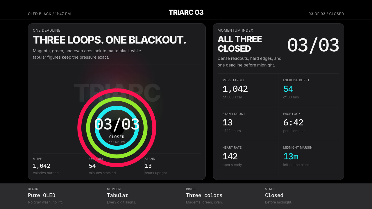 Apple Fitness Rings Closed (2024)Midnight feels exact. Magenta, green, and cyan rings lock onto OLED black.午夜像被校准。洋红、绿、青三环锁在黑底上。
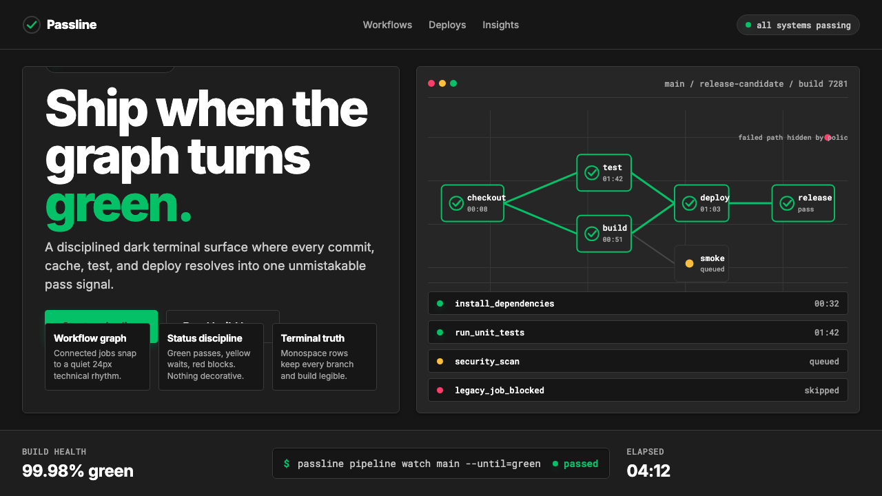 CircleCI Pipeline-GreenConfidence goes green. Emerald status lines cut through terminal-black pipeli…信心变绿。翠绿状态线切过终端黑流水线网格。
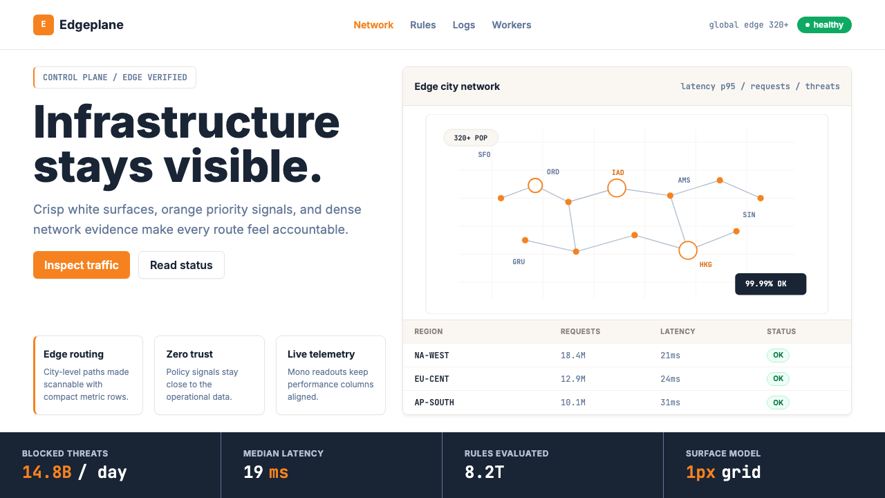 Cloudflare Orange EdgeOperational clarity wins. Orange accents, hairline grids, and mono metrics ma…运维清晰取胜。橙色强调、发丝网格与等宽指标让边缘数据利落。
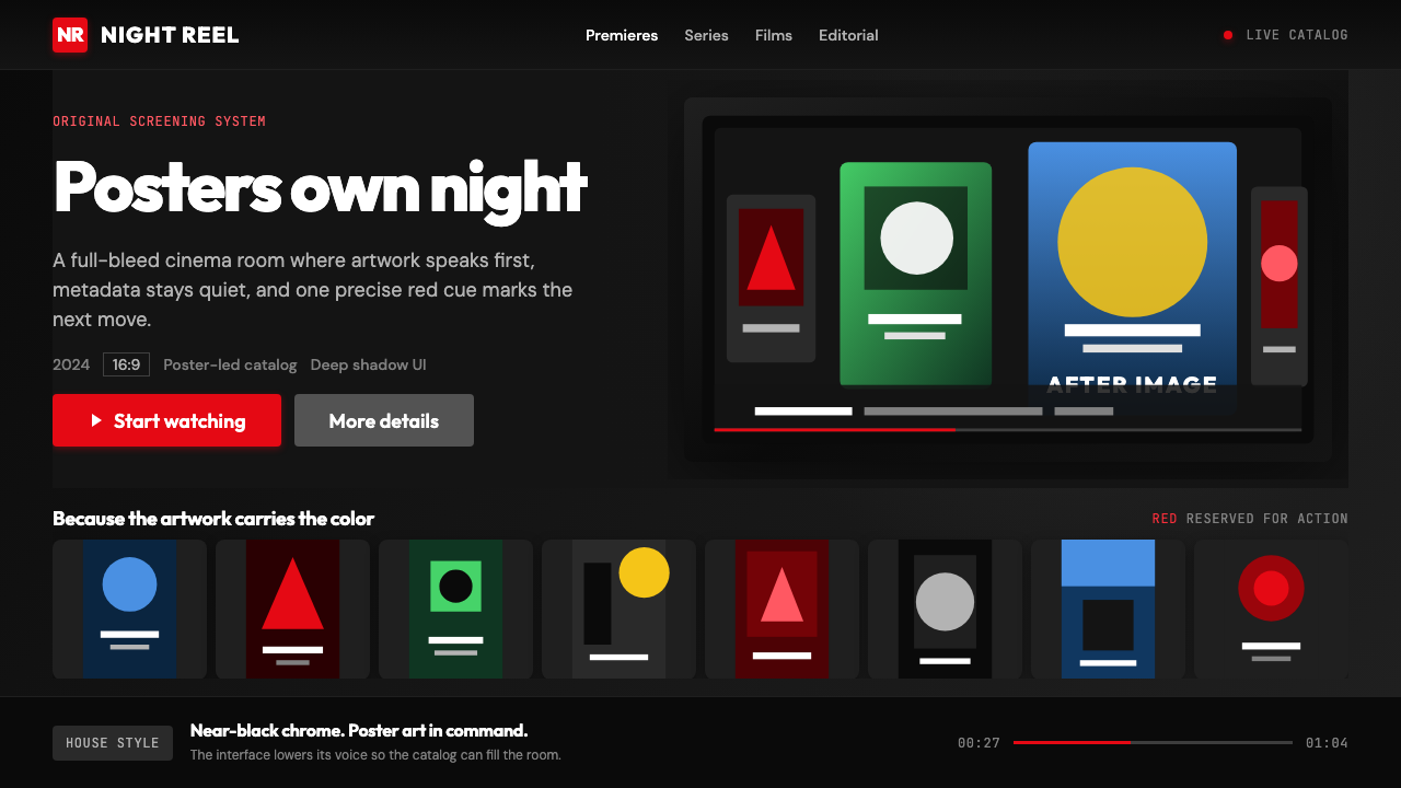 Netflix 2024Cinema UI goes dark. Near-black chrome, poster rails, and one surgical red ac…影院式暗黑界面:近黑框架、海报横排,唯一红色指向操作。
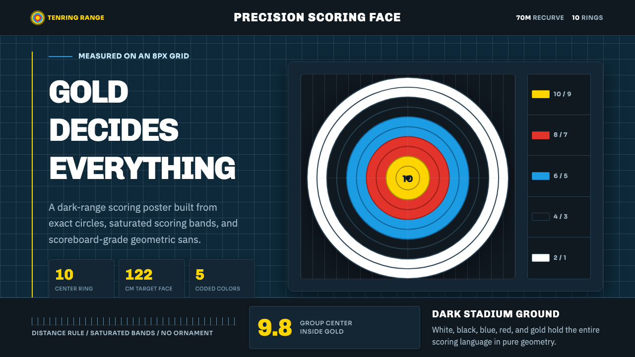 Olympic ArcheryPrecision is the drama. Gold-red-blue rings snap from a dark stadium grid.精准就是戏剧:金红蓝环从深色赛场网格中跃出。
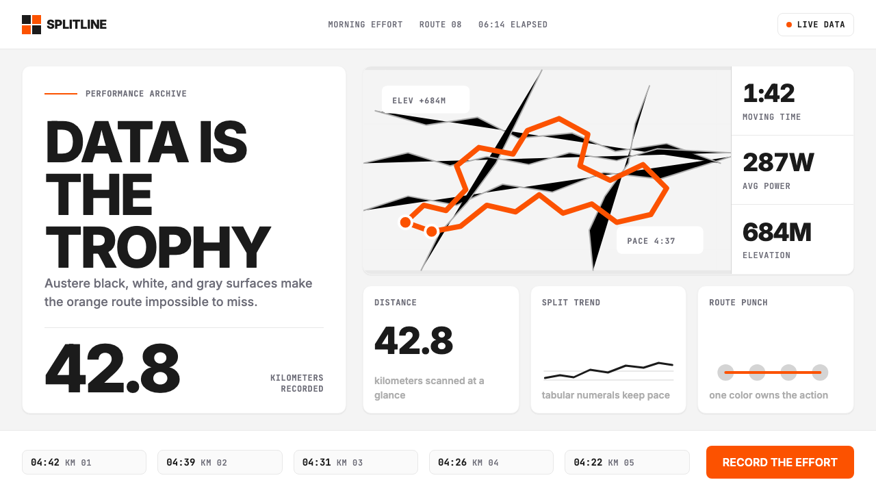 Strava Orange FitnessData becomes trophy. Inter numerals, gray metric grids, and one orange route…数据即奖杯:Inter数字、灰色指标网格与一条橙色路线。