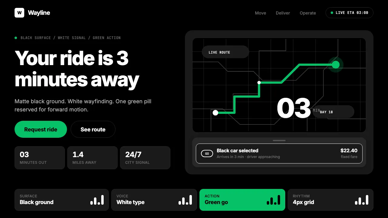
About Uber 2024
Uber's post-2018 identity, forged by Wolff Olins, compresses ride-hailing into three values: Uber Black, white text, and a single green go-button. The custom Uber Move typeface replaced decorative flourishes with wayfinding clarity at ETA-counter scale.
The result is a dark-first, map-centric system built around one proposition — *your ride is 3 minutes away*. No warmth, no ornament, no competing accents. Just a pill of #06C167 on a matte black surface, confidently waiting to be tapped.
- Origin
- San Francisco, California / global
- Era
- 2009 founded; 2018 Wolff Olins rebrand; current visual 2020–2024
- Key figures
- Travis Kalanick · Dara Khosrowshahi · Wolff Olins · Michael Gough
- Movements
- On-demand economy · Mobility-as-a-service · Map-centric UI
Uber 2024 design spec
Colors
Background
Surface
Primary
Secondary
Accent
Text
Typography
InterHeadings
JetBrains MonoMono
Unlock for 1 credit
The other 11 sections — buttons, cards, spacing, motion, techniques and more — open once you unlock. Download the DESIGN.md or send it to your AI in one click. Unlock once, yours forever.
Sign up nowHave an account? Sign in
Styles similar to Uber 2024
Also inspired by brands & products, with a close feel.
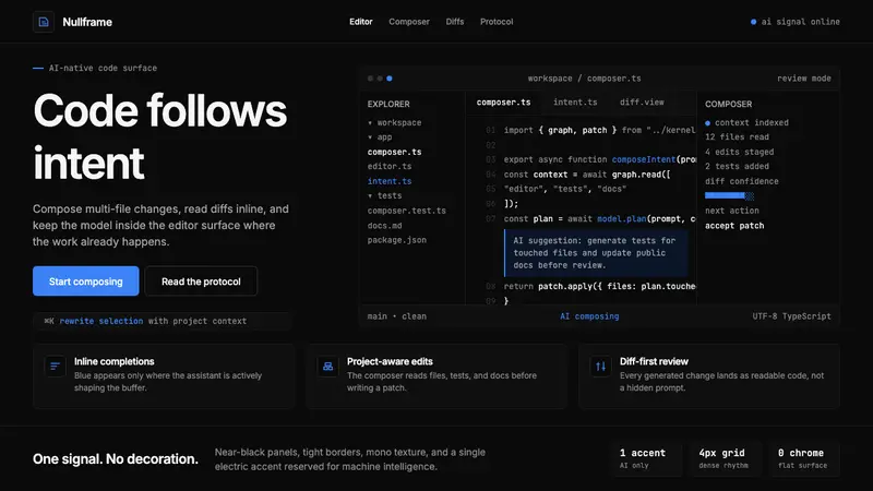 Cursor IDEAI-first code editor. Pure dark surfaces, off-white text, electric blue reserved for AI alone.
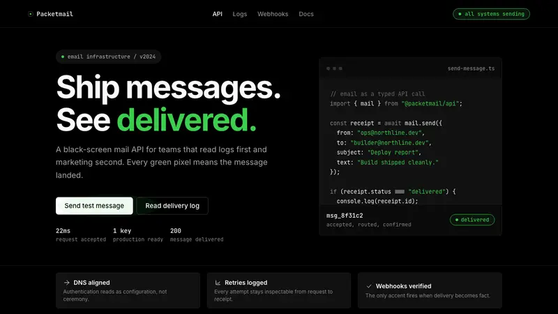 Resend 2024Clean code becomes brand. Pure black, JetBrains Mono, and one green delivered signal.
 Dark Mode UICalm night interfaces. Charcoal layers rise by overlay lightness, not shadow.
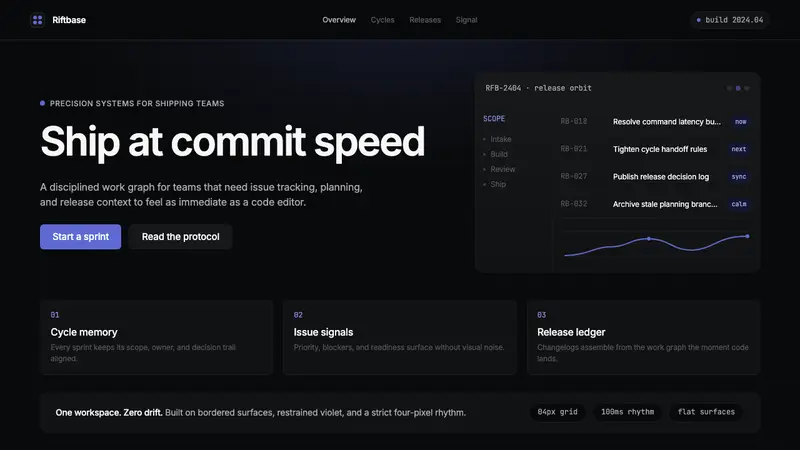 Linear 2024Precision down to the millisecond. Near-black, indigo-violet accents, Inter Display, no decoration.