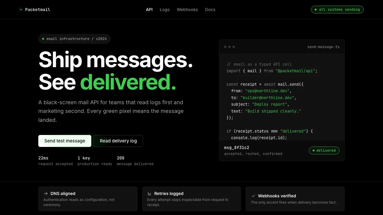
About Resend 2024
Resend strips email infrastructure down to its API-shaped bones: a pure-black canvas, off-white monospace type, and exactly one chromatic color — a deliverability green that fires only when a message lands. The visual language borrows the spartan confidence of a well-formatted terminal session and refuses every ornament that doesn't ship bytes.
The result is a brand that reads like clean code. Cards are bordered, never shadowed. Buttons are pills or rectangles, never gradients. Typography toggles between Inter for interface and JetBrains Mono for everything that matters — which, in Resend's world, is most things.
- Origin
- San Francisco, California (remote-first)
- Era
- 2022 founded; design language stable from 2023–2024
- Key figures
- Zeno Rocha · Bu Kinoshita
- Movements
- developer-first infrastructure · email-as-API · Vercel-adjacent dev marketing
Resend 2024 design spec
Colors
Typography
The other 11 sections — buttons, cards, spacing, motion, techniques and more — open once you unlock. Download the DESIGN.md or send it to your AI in one click. Unlock once, yours forever.
Sign up nowStyles similar to Resend 2024
Also inspired by brands & products, with a close feel.
 Dark Mode UICalm night interfaces. Charcoal layers rise by overlay lightness, not shadow.
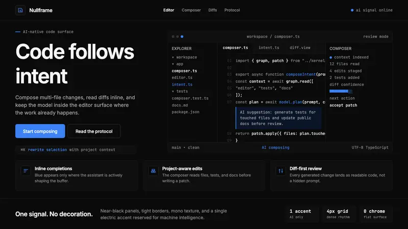 Cursor IDEAI-first code editor. Pure dark surfaces, off-white text, electric blue reserved for AI alone.
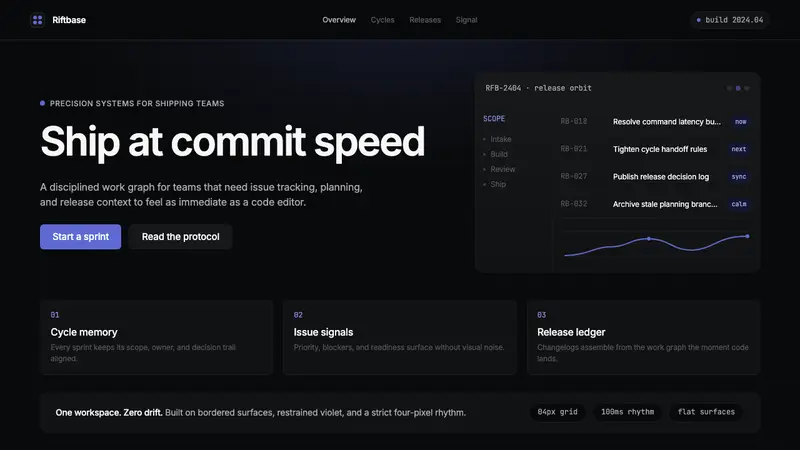 Linear 2024Precision down to the millisecond. Near-black, indigo-violet accents, Inter Display, no decoration.
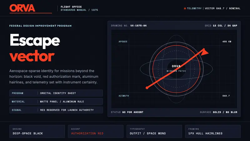 NASA Worm Logo (1975)Engineering reaches orbit. Black void, worm red, mono telemetry, and aluminum hairlines.