About Dark Mode UI
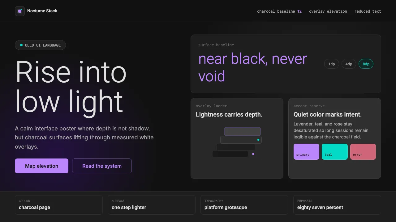
Dark Mode UI is the mainstream dark-theme interface language codified by Google's Material Design. Its baseline is a near-black charcoal of #121212 — deliberately not pure black — chosen to reduce eye strain and let elevation read. Depth is communicated not by drop shadows but by compositing semi-transparent white overlays over the ground: the higher an element rises, the lighter its surface becomes.
Accents are desaturated — a soft lavender, a muted teal, a dusty error rose — reserved for interactive emphasis. Body text rides on white at reduced opacity (87% / 60% / 38%), never full strength, so the interface stays calm, legible, and easy on OLED screens at night.
- Origin
- Global / internet (Android & cross-platform UI)
- Era
- 2010s onward; Material Design dark-theme spec consolidated ~2018–2019
- Key figures
- Google Material Design team · Matías Duarte
- Movements
- Material Design · System-wide dark mode (OLED-era OS theming)
Dark Mode UI design spec
Colors
Typography
The other 11 sections — buttons, cards, spacing, motion, techniques and more — open once you unlock. Download the DESIGN.md or send it to your AI in one click. Unlock once, yours forever.
Sign up nowStyles similar to Dark Mode UI
Also inspired by brands & products, with a close feel.
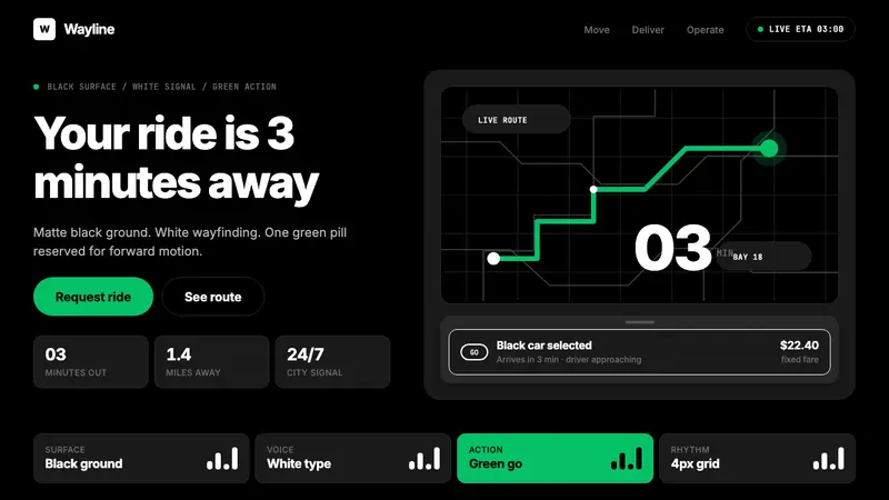 Uber 2024Motion made severe. Black surfaces, white Inter, one green pill turns the whole system on.
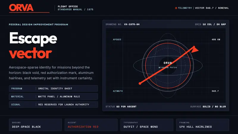 NASA Worm Logo (1975)Engineering reaches orbit. Black void, worm red, mono telemetry, and aluminum hairlines.
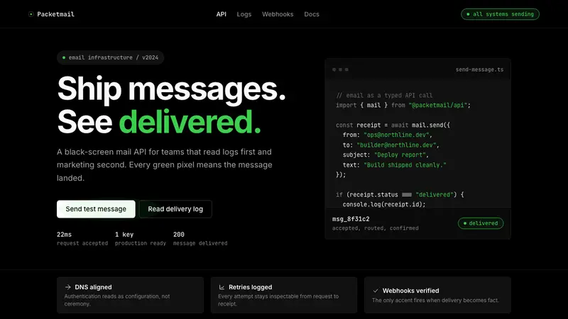 Resend 2024Clean code becomes brand. Pure black, JetBrains Mono, and one green delivered signal.
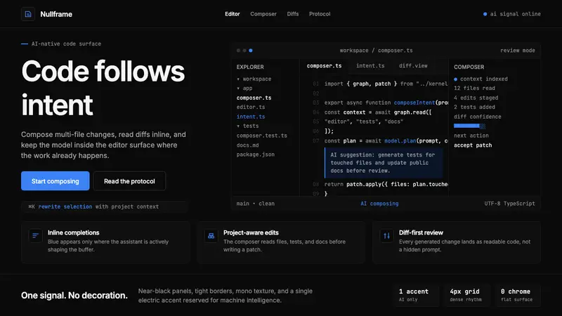 Cursor IDEAI-first code editor. Pure dark surfaces, off-white text, electric blue reserved for AI alone.