What is Dark Mode UI?
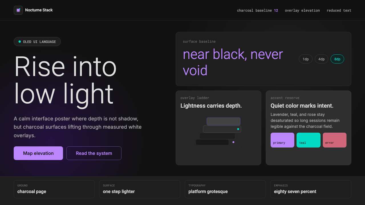
Dark Mode UI turns the screen into a calm night landscape, where charcoal surfaces rise through lightness and muted accents guide attention without glare.
Dark Mode UI in brief
Dark Mode UI is the mainstream dark-theme interface language codified by Google’s Material Design and adopted across Android and cross-platform products. Its foundation is near-black charcoal rather than absolute black. This small but consequential distinction softens the visual field, reduces harsh contrast, and leaves room for surfaces to become visibly lighter as they rise above the background.
Its defining idea is that elevation should be expressed through composited light rather than conventional drop shadows. A resting surface remains close to the dark ground; a raised card, menu, or dialog receives more light and therefore appears slightly brighter. Depth emerges as a controlled progression of charcoal tones, preserving spatial hierarchy even when shadows would be difficult to perceive.
Color and text are deliberately restrained. Soft lavender, muted teal, and dusty rose appear as functional accents rather than decoration, marking actions, selections, status, or errors. White text is softened according to importance instead of being displayed at full intensity everywhere. The result is not simply a light interface with its colors inverted, but a separate system calibrated for calm nighttime reading and dark OLED screens.

Where does Dark Mode UI come from?
Dark Mode UI emerged within the wider expansion of digital interfaces during the 2010s. As applications spread across phones, tablets, and cross-platform services, dark presentation moved beyond specialist software and became a mainstream interface option. The rise of OLED-era system theming further established the expectation that an operating system and its applications could share a coherent night-oriented appearance.
Google’s Material Design provided the framework that turned scattered dark-interface practices into a repeatable system. Its dark-theme specification was consolidated around 2018–2019, defining a near-black charcoal ground, lightened surfaces for elevation, softened white text, and desaturated functional color. These rules addressed a central problem: a dark interface still needed to communicate hierarchy, state, and depth without reproducing the bright surfaces of its light counterpart.
The decisive conceptual move was to treat darkness as a layered material. In a light interface, shadows can separate a raised object from a pale background. Against a dark ground, those shadows lose visibility. Material Design answered by reversing the cue: elevation introduces light. Semi-transparent white overlays make higher surfaces progressively brighter, allowing the interface to retain a readable spatial model while remaining predominantly dark.
This codification helped Dark Mode UI travel beyond Android. Because its principles concern relationships rather than a single platform-specific appearance, they can be applied to web products and other cross-platform interfaces. Near-black foundations, restrained accents, softened text, and lightness-based elevation together formed a recognizable global language for calm, legible night interfaces.
What defines the Dark Mode UI look?
Charcoal Ground
The base is near-black charcoal, deliberately held away from absolute black. This reduces the severity of white-on-black contrast and creates a tonal floor beneath elevated surfaces. The background should feel deep and quiet, not empty or visually crushed.
Lightness as Elevation
Raised elements become lighter through translucent white overlays. Cards, menus, and dialogs therefore separate from the ground by receiving more apparent light, not by casting prominent shadows. A coherent interface maintains a restrained progression from deep background to brighter foreground surfaces.
Softened Text
Text begins with white but is reduced in intensity according to hierarchy. Primary information remains clear, supporting copy becomes quieter, and unavailable content recedes further. This prevents every label from competing at maximum contrast and keeps long reading sessions visually calm.
Muted Functional Accents
Accent colors are softened before entering the dark field. Lavender, teal, and dusty rose can identify actions, selections, success-like feedback, or errors without glowing aggressively. Their scarcity gives them authority: color signals that something matters or can be acted upon.
Calm Contrast
Contrast is organized rather than maximized. Important text and controls are clearly legible, but secondary surfaces and labels remain subdued. The interface avoids both muddy sameness and dazzling separation, producing a stable visual rhythm suited to nighttime use.
Shadow Restraint
Drop shadows are not the primary depth cue because darkness offers them little room to remain visible. When surface lightness already explains elevation, heavy shadow becomes redundant and can make the interface murky. Separation comes from tonal layering, boundaries, and controlled contrast.
Who shaped Dark Mode UI?
The Google Material Design team codified Dark Mode UI as a systematic extension of Material Design rather than a simple color inversion. Its specification connected charcoal foundations, lightness-based elevation, softened text, and muted accents into a portable framework for Android and cross-platform products.
Matías Duarte is identified with the design leadership surrounding Material Design and its broader interface language. Within the history of Dark Mode UI, his significance lies in the effort to make digital surfaces behave as a coherent material system whose depth, hierarchy, and interaction cues remain understandable across products.
System-wide dark mode transformed dark theming from an isolated application choice into an operating-system-level expectation. In the OLED era, it encouraged applications to participate in a shared nighttime environment and made consistency between platform surfaces and individual products increasingly important.
How do you use Dark Mode UI today?
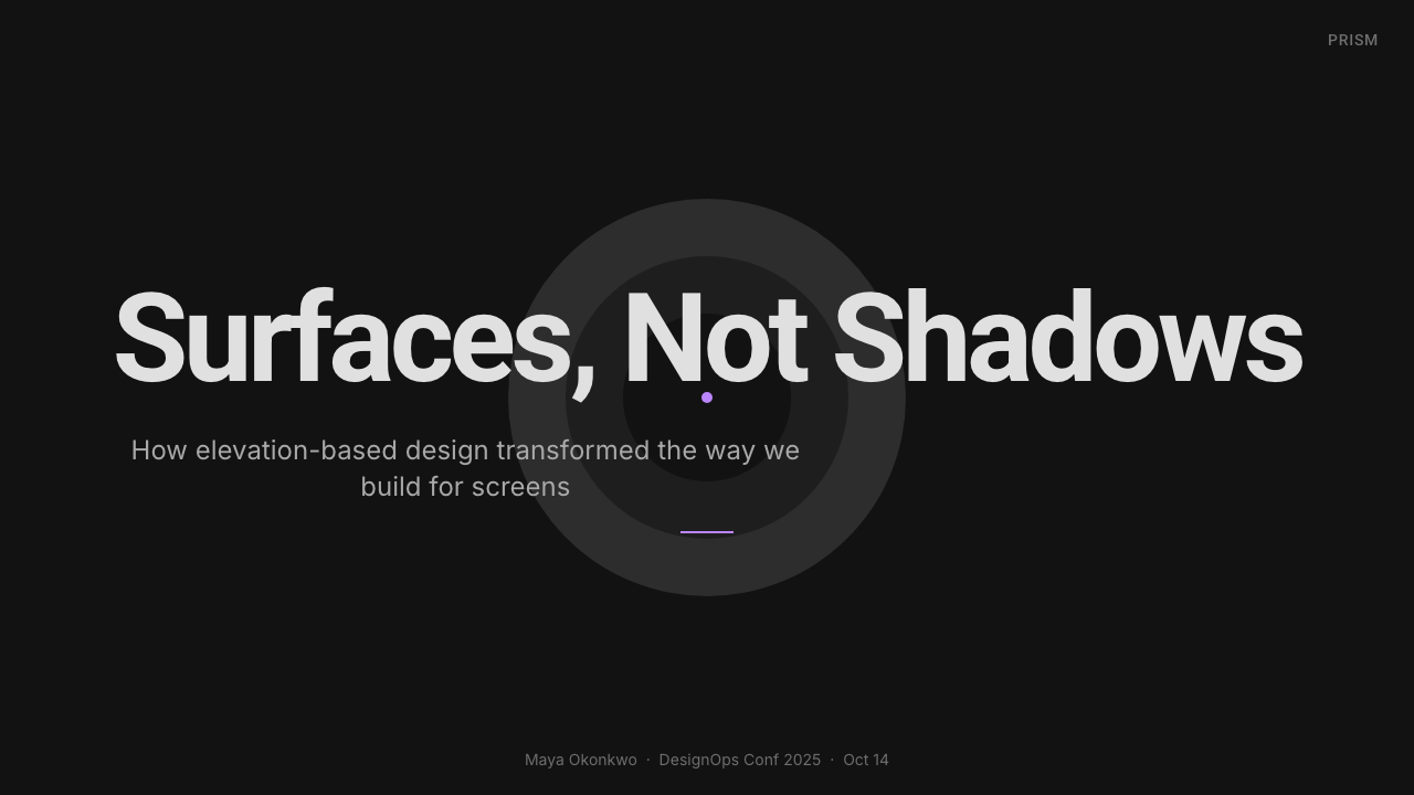
For presentation covers, Dark Mode UI creates a composed, cinematic field without requiring decorative imagery. Use a deep charcoal ground, a restrained title, and one muted accent to establish focus. Content slides should separate sections through subtly lighter surface panels and clear text hierarchy rather than heavy borders or dramatic shadows.
Data slides benefit from the style’s controlled contrast. Keep the plotting field close to the background, lift important summaries onto lighter surfaces, and reserve accent color for the active series, selected category, or critical exception. Supporting grid lines and labels should recede, allowing the structure of the data to remain visible without turning the slide into a glowing control panel.
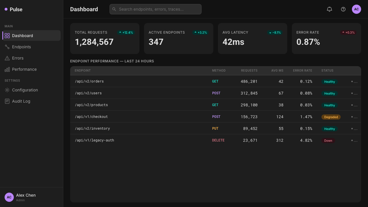
For web dashboards and pricing interfaces, treat elevation as a shared grammar. The page ground should be darkest, persistent navigation slightly lifted, and temporary or decision-critical surfaces brighter still. Pricing tiers can be differentiated through surface emphasis and a single accent, while controls use color primarily for interaction, selection, and status.
Editorial and marketing layouts should preserve generous dark breathing room and avoid filling every section with competing panels. Long-form articles need a calm reading column, clearly softened metadata, and sparing accent links. Marketing pages can alternate grounded and raised sections, using brighter charcoal surfaces to frame product claims or calls to action without abandoning the night-oriented atmosphere.
The common mistake is to invert a light design and call the result dark mode. Pure black backgrounds, brilliant white text everywhere, saturated accents, and unchanged shadows create fatigue and flatten hierarchy. Authentic Dark Mode UI requires retuning every relationship: the ground must leave room for elevation, text must vary by importance, and color must remain scarce enough to communicate.
Dark Mode UI — FAQ
Is Dark Mode UI simply an inverted light theme?
No. Inversion preserves the original relationships even though those relationships behave differently on a dark ground. A considered dark interface uses near-black charcoal instead of absolute black, reconstructs elevation through lighter overlays, softens white text by hierarchy, and desaturates accents. Every surface relationship must be recalibrated.
Why does the background avoid pure black?
Near-black charcoal reduces the harshness of bright text against the ground and preserves room for tonal depth. If the base becomes an absolute visual void, surface distinctions can feel abrupt. Charcoal allows elevated elements to brighten gradually while the overall composition remains unmistakably dark.
How should elevation be shown without visible shadows?
Elevation is shown by compositing light onto the surface. Elements close to the page ground remain dark, while cards, menus, and dialogs become progressively lighter as their perceived height increases. Boundaries and contrast can support this distinction, but surface lightness carries the main spatial message.
Why are accent colors muted in a dark interface?
Bright saturated color can appear unusually intense against charcoal and compete with text or controls. Softer lavender, teal, and dusty rose retain their functional identity while integrating with the night environment. Because accents are reserved for interaction and status, they remain noticeable without dominating the whole screen.
Does dark mode eliminate the need for hierarchy?
Dark mode makes hierarchy more important, not less. When many surfaces share closely related charcoal tones, lightness, text intensity, and accent color must work together with unusual discipline. Primary content should advance, supporting information should recede, and temporary elevated surfaces should be immediately distinguishable from the persistent page structure.
Related design styles
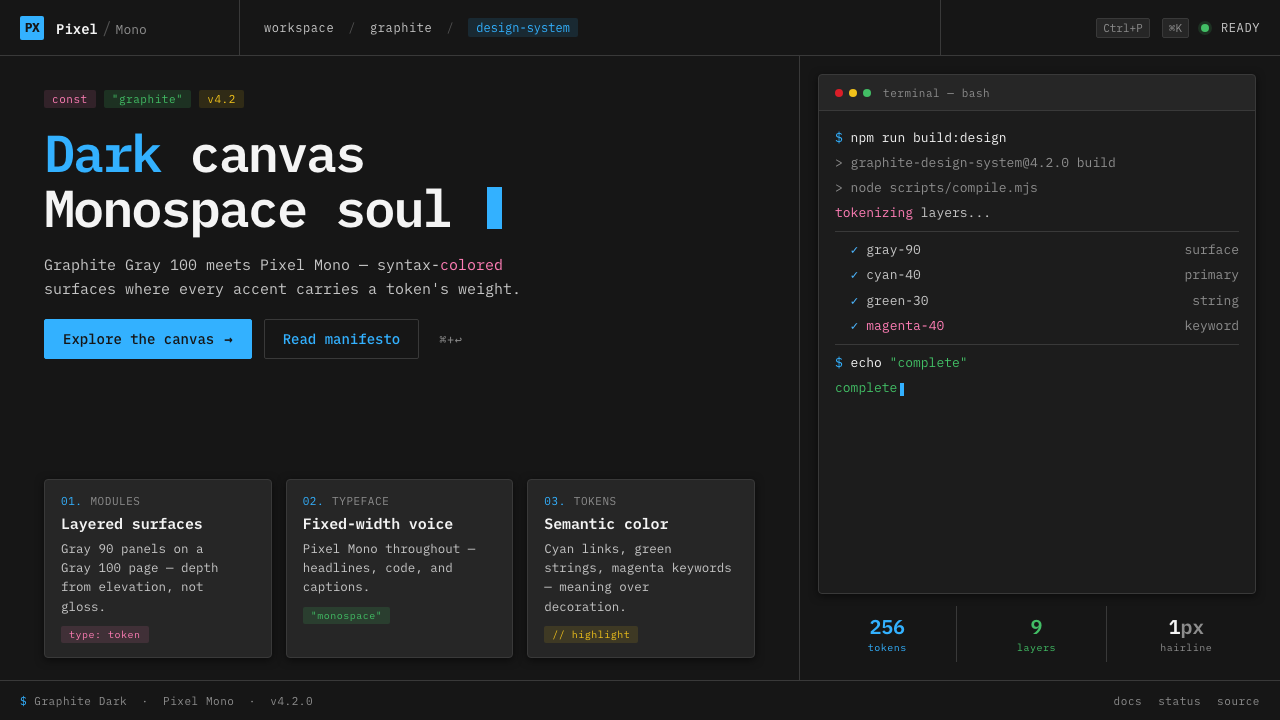 IBM Plex Mono DevColor used like syntax highlighting. Carbon Gray 100 canvas, IBM Plex Mono th…
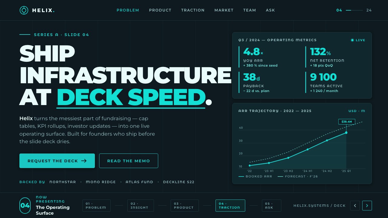 Montserrat StartupSeries-A on a projector. Black Montserrat on charcoal-teal, lit by one bright…
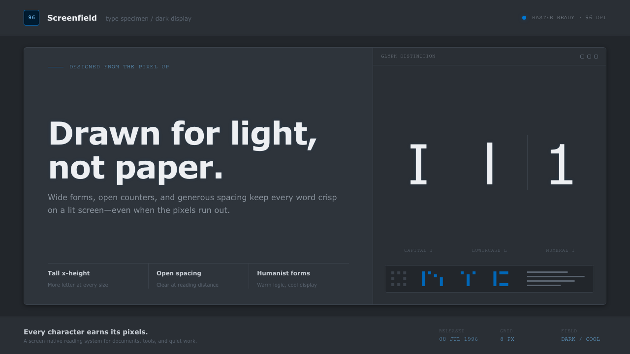 Verdana Screen SansBorn digital, built for clarity. Wide humanist letters glow in cool grey on a…
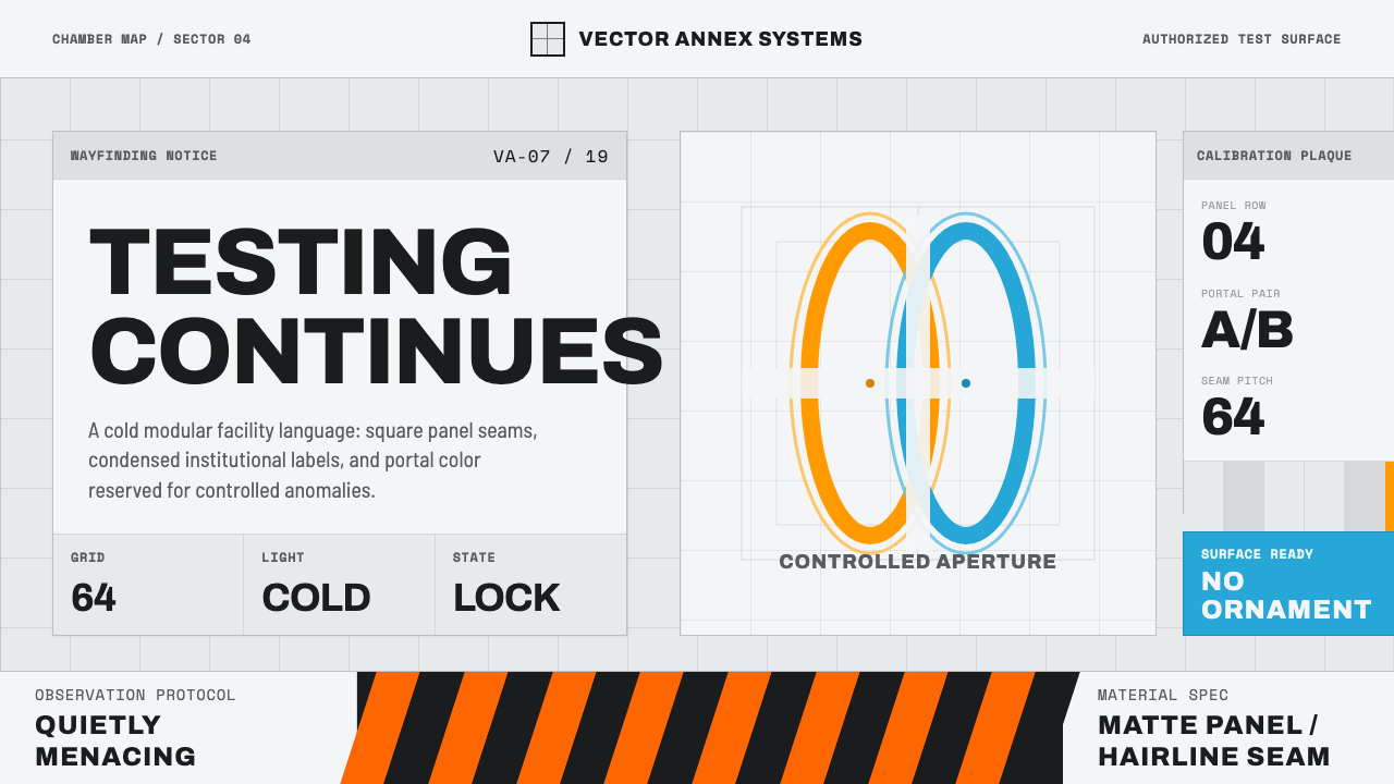 Aperture ScienceSterile authority. Cool panel seams, Archivo signage, and sparse orange-blue…
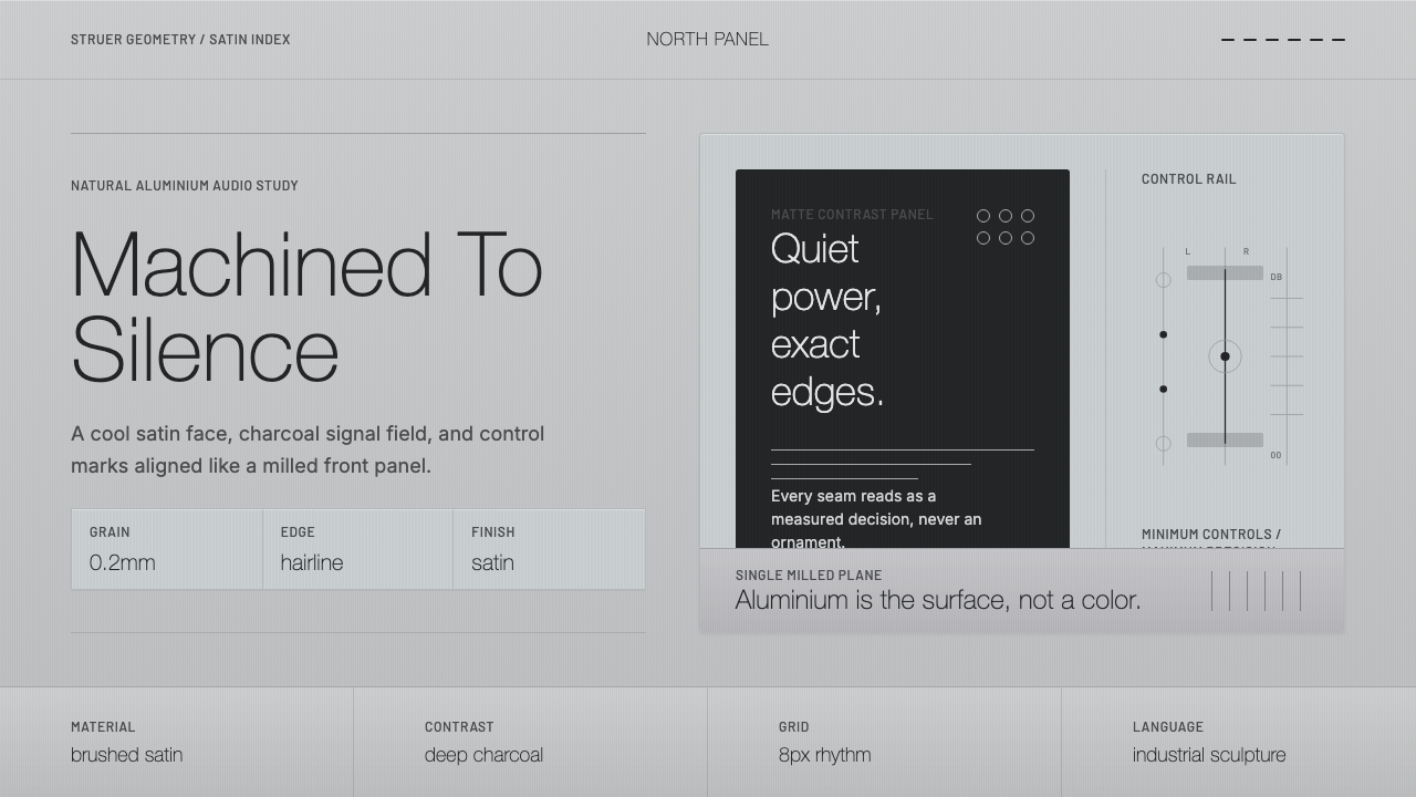 Bang & Olufsen AluminiumQuiet luxury, machined flat. Satin aluminium grain, hairlines, thin charcoal…
 Circular FintechFinance feels light. Lilac-white space, rounded cards, and one vivid purple g…