What is IBM Plex Mono Dev?
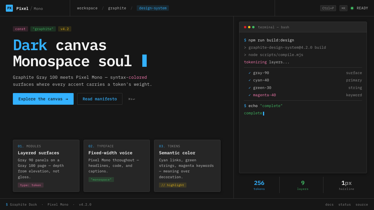
IBM Plex Mono Dev turns the developer tool into a reading surface: a near-black Carbon canvas, monospaced language, and color that behaves like syntax rather than decoration.
IBM Plex Mono Dev in brief
IBM Plex Mono Dev is the contemporary developer-tool dark aesthetic anchored in IBM’s Carbon design language. Its visual field begins with a near-black code-editor canvas, then builds darker panels through gray-on-gray layering. IBM Plex Mono carries the entire interface, while bright cyan links and syntax-style color tokens provide the moments of emphasis. The result is technical, quiet, and immediately legible.
Color behaves as it does inside a code editor: it communicates role. Cyan can identify links or active pathways, while restrained green, magenta, and yellow distinguish syntax-like categories, states, or semantic layers. These colors are not scattered around the interface to create liveliness. They are introduced when a difference needs to be seen, giving the palette an informational rather than ornamental character.
The aesthetic rejects the theatrical side of dark interface design. There is no glossy surface, simulated material, or luminous effect pretending to be depth. Matte fields, darker panels, elevation, and hairline borders do the structural work. IBM Plex Mono Dev therefore feels less like a futuristic command center than a carefully organized working environment: dense enough for technical information, calm enough for sustained attention.
Where does IBM Plex Mono Dev come from?
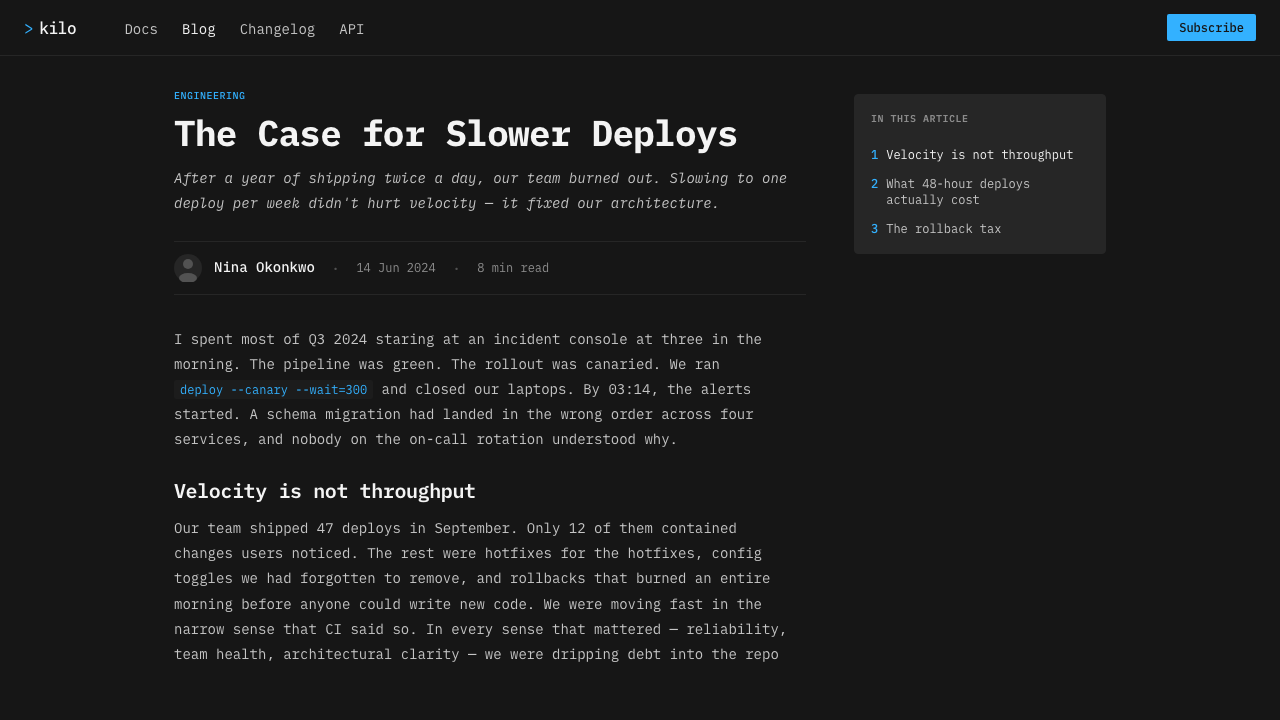
IBM Plex Mono Dev belongs to a design culture that emerged from 2010 onward, in North America, where IBM Brand Experience and Design and the open-source developer-tooling ecosystem increasingly met around shared systems. Its background is not a single historical school but the convergence of corporate-open-source typography, the design-systems movement, and modern dark-mode developer UI. The style inherits from all three: institutional clarity, reusable structure, and a dark surface suited to technical work.
IBM Plex shipped in 2017, giving this aesthetic its defining typographic voice. In IBM Plex Mono Dev, the monospaced face is not confined to code blocks. It establishes one register for navigation, labels, metadata, controls, and technical content. That decision makes the interface feel like one continuous language rather than a collection of screens assembled from unrelated parts. Alignment, repetition, and the visible rhythm of characters become part of the visual identity.
Carbon dark themes consolidated in the late 2010s, when dark developer interfaces became a mature design environment rather than a niche visual preference. The Carbon influence appears in the disciplined treatment of surfaces: the base canvas remains near black, panels are differentiated through restrained gray shifts, and depth is expressed by elevation and fine borders. The system is dark without becoming atmospheric. Its darkness is a working condition, not a mood effect.
The open-source dimension is essential to the style’s character. IBM Plex Mono Dev combines the authority of a corporate design language with the practical vocabulary of developer tools, where interfaces are read, inspected, and reused. Syntax highlighting supplies the central metaphor: color should mark meaning, and structure should remain stable around it. The result is a contemporary visual system that feels deliberately engineered, yet open enough to belong to a wider tooling ecosystem.
What defines the IBM Plex Mono Dev look?
Color as Syntax
The palette begins with a near-black field and introduces cyan, green, magenta, and yellow with restraint. Each accent should feel assigned to a role, as though it were marking a token in code. Cyan has the clearest presence because it carries links and primary emphasis; the other colors should appear only when a semantic distinction warrants them. Saturation is useful precisely because it is controlled.
Monospaced Voice
IBM Plex Mono is used throughout rather than reserved for snippets. Its fixed character rhythm gives labels, navigation, metadata, and prose a shared technical register. Text feels measured and inspectable, with alignment becoming a visible part of hierarchy. The typeface should not be treated as a novelty layer placed over an ordinary interface; it is the system’s continuous voice.
Matte Canvas
The background is a near-black matte surface, closer to an editor workspace than to a theatrical backdrop. Its lack of shine keeps attention on text and structure. The darkness also provides the contrast required for cyan links and syntax-like tokens to remain legible without surrounding decoration. The canvas is quiet by design, allowing meaning-bearing elements to carry the visual energy.
Layered Surfaces
Panels are differentiated through gray-on-gray relationships rather than bright fills or dramatic contrast. A darker surface can hold a secondary workspace, while a slightly lifted surface can signal a focused area or contained tool. The hierarchy remains subtle and cumulative. It should be felt as an ordered stack of working planes, not read as a collection of decorative cards.
Semantic Accents
Cyan, green, magenta, and yellow function as a compact vocabulary of distinction. They can separate kinds of information, identify active states, or echo the logic of syntax highlighting. Their value comes from recurrence and consistency: a color that marks one role should not casually become a background ornament elsewhere. The palette is strongest when users learn what each accent means.
Depth Without Gloss
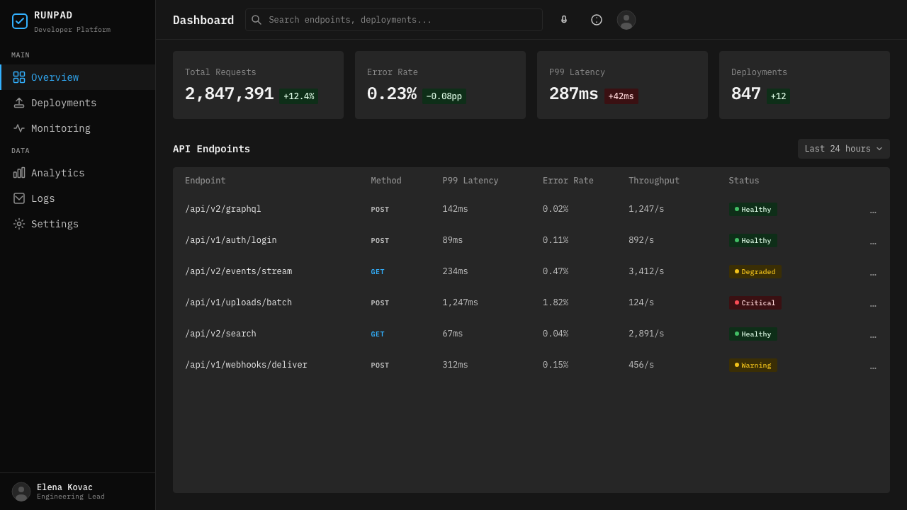
Depth comes from elevation and hairline borders, not from glow, blur, or simulated lighting. A panel may appear nearer because it sits above the canvas, while a border can clarify its edge without becoming a decorative frame. This treatment keeps the interface flat, matte, and inspectable. Every shift in surface should explain organization or interaction rather than manufacture atmosphere.
Who shaped IBM Plex Mono Dev?
Mike Abbink is one of the key figures associated with IBM Plex Mono Dev. His presence belongs to the typographic foundation of the system: the aesthetic requires a monospaced voice capable of carrying code, interface labels, metadata, and technical prose without changing registers. In this context, typography is not a finishing choice. It is the organizing material through which the developer-tool environment becomes coherent.
Bold Monday is named among the key figures behind the IBM Plex story. Its significance within this aesthetic lies in the connection between corporate identity and open-source typography. IBM Plex Mono Dev depends on a type family that feels systematic enough for an institutional design language, yet practical enough to live inside a broad developer-tooling ecosystem. That balance is central to the style’s credibility.
The IBM Carbon Design team provides the design-language context in which IBM Plex Mono Dev makes sense. Carbon contributes the disciplined treatment of dark surfaces, panel relationships, elevation, and restrained borders. The team’s role is therefore larger than supplying a visual palette. It establishes the grammar that lets color, type, and surface hierarchy work together as a reusable system for modern developer interfaces.
How do you use IBM Plex Mono Dev today?
IBM Plex Mono Dev is most effective when the product already values technical clarity, inspection, and sustained focus. Its principles transfer well because they are structural: establish a near-black working canvas, use IBM Plex Mono as the shared voice, and assign accent colors to meaning. The style should make information easier to parse, not merely make a familiar interface look darker.
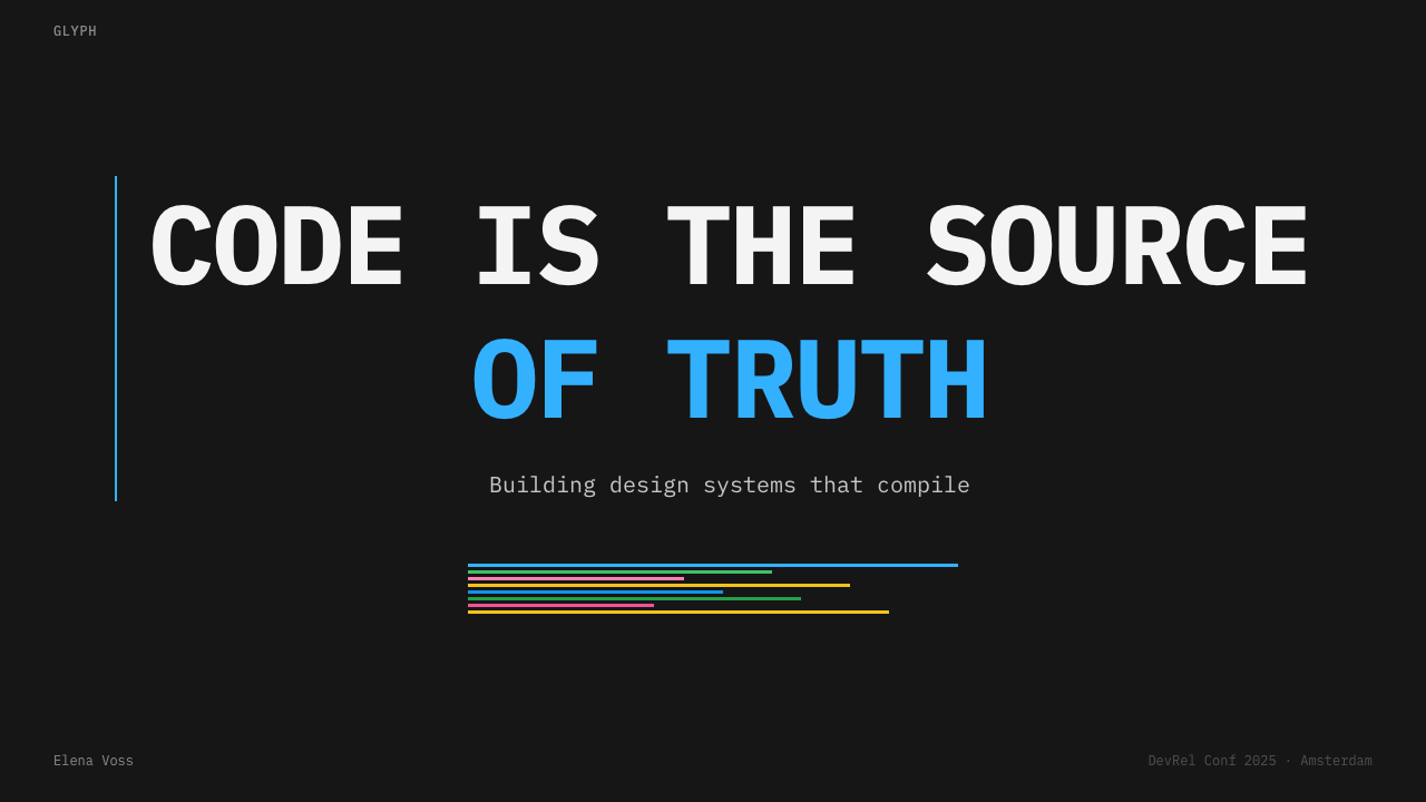
For presentation slides, the cover can treat the near-black canvas as a quiet field for a large monospaced title, with cyan providing the decisive point of emphasis. Content slides should use darker and lighter panel relationships to separate explanation from supporting material, while syntax-style colors mark key terms or states. Data slides benefit from a code-editor logic: colors identify categories or conditions, labels remain typographically consistent, and visual energy comes from information rather than illustration.
For web interfaces, the style suits developer dashboards, infrastructure tools, analytical workspaces, and pricing pages for technical products. Keep the base surface matte and near black, use gray-on-gray panels to organize regions, and reserve cyan for links, actions, or the most important pathway. Green, magenta, and yellow should clarify semantic differences or states. Borders and elevation should establish containment without turning every panel into a glowing object.
For editorial and marketing work, IBM Plex Mono Dev can give technical reports, product announcements, developer documentation, and campaign pages a credible working tone. A strong article layout can use monospaced headings, compact metadata, dark reading fields, and syntax-like color markers for pull quotes or navigational cues. Marketing pages should let the system’s restraint carry the message: a decisive cyan link, a carefully separated panel, or a short highlighted token can be more persuasive than a field of competing effects.
The common mistake is to confuse a dark canvas with the entire style. Adding neon colors everywhere, applying glow to every control, mixing unrelated typefaces, or creating dramatic panel contrast breaks the syntax metaphor. Another mistake is to use green, magenta, and yellow as decoration after assigning them semantic roles. IBM Plex Mono Dev works when the palette stays sparse, the mono voice remains continuous, and every visible difference helps the user understand the interface.
IBM Plex Mono Dev — FAQ
Is IBM Plex Mono Dev simply a dark mode?
No. Dark mode describes a change in surface brightness, while IBM Plex Mono Dev is a complete visual system. Its identity depends on the relationship between the near-black canvas, gray-on-gray panels, IBM Plex Mono, cyan links, and syntax-style accent colors. Remove those relationships and the result may still be dark, but it no longer has the disciplined developer-tool character of the style.
Why use IBM Plex Mono throughout the interface?
Because the style treats the interface as a continuous technical language. Using the mono face for navigation, labels, metadata, controls, and content makes the relationship between code and interface visible. It also gives the system a stable rhythm and shared register. If monospace appears only in code snippets, it becomes a decorative reference; used throughout, it becomes the architecture of the visual voice.
Should cyan, green, magenta, and yellow all appear equally often?
No. Their purpose is semantic distinction, not palette completeness. Cyan has the strongest association with links and primary emphasis, while the other syntax-like colors should be introduced when they clarify a category, condition, or state. If every surface carries an accent, users lose the ability to read color as information. Restraint is what makes the highlights meaningful.
Can the style be used outside a coding interface?
Yes, provided the product benefits from technical clarity and an inspectable tone. It can support dashboards, analytical tools, developer documentation, technical presentations, and marketing for infrastructure or software products. It is less convincing when the experience depends primarily on softness, organic texture, or ornamental warmth. The key question is whether the product’s values align with a matte, systematic, syntax-minded visual language.
How does the style create depth without gloss or glow?
It uses surface relationships rather than lighting effects. A near-black canvas can recede behind darker or slightly lifted panels, while fine borders clarify where one working plane ends and another begins. Elevation supplies hierarchy, and gray-on-gray variation supplies separation. Because the treatment remains matte and restrained, depth explains structure instead of competing with the content.
Related design styles
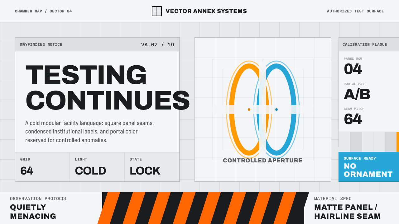 Aperture ScienceSterile authority. Cool panel seams, Archivo signage, and sparse orange-blue…
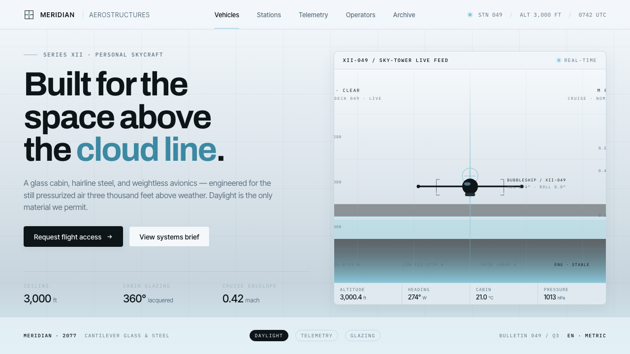 Oblivion Sky TowerSterile daylight futurism. Cool sky-grey glass, hairline steel mullions, a si…
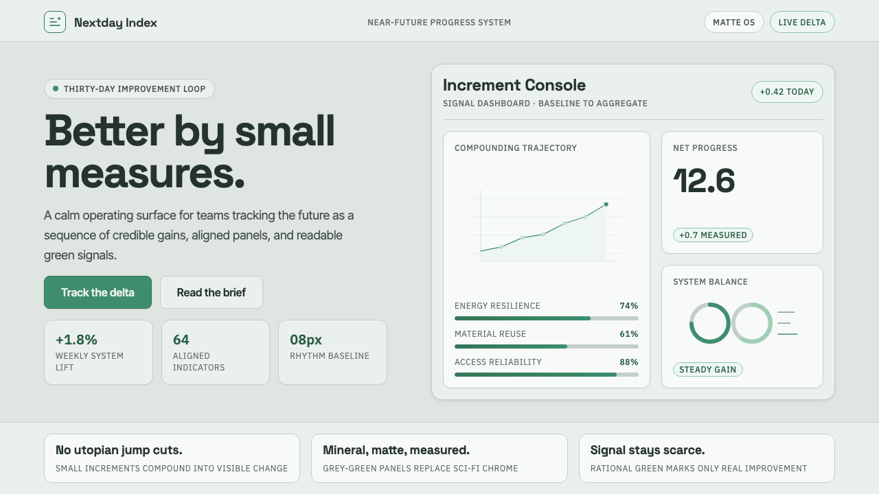 ProtopiaCalm progress, not sci-fi hype. Mineral grey-green grids make every small gai…
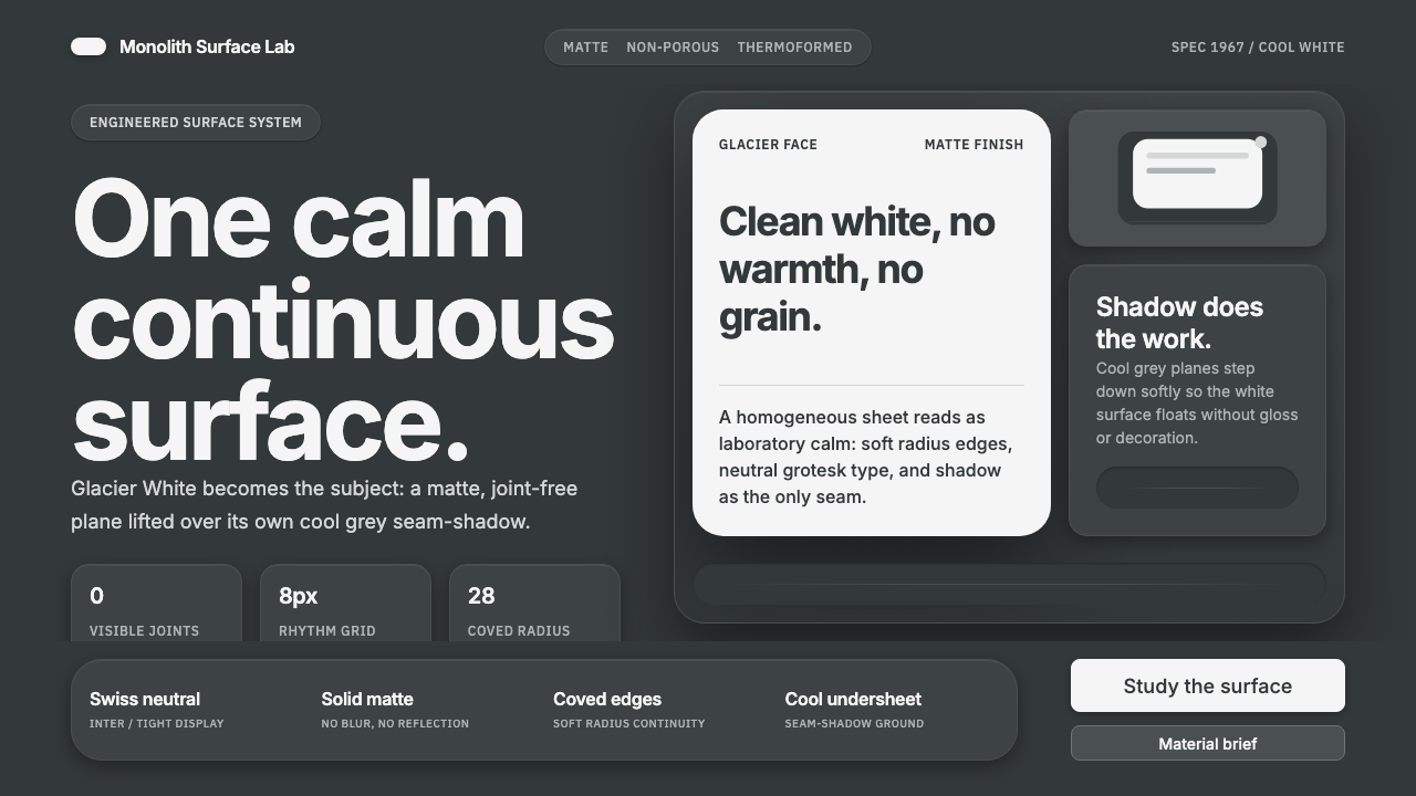 Corian Solid SurfaceSeamless matte calm. Glacier White floats over cool grey shadow with neutral…
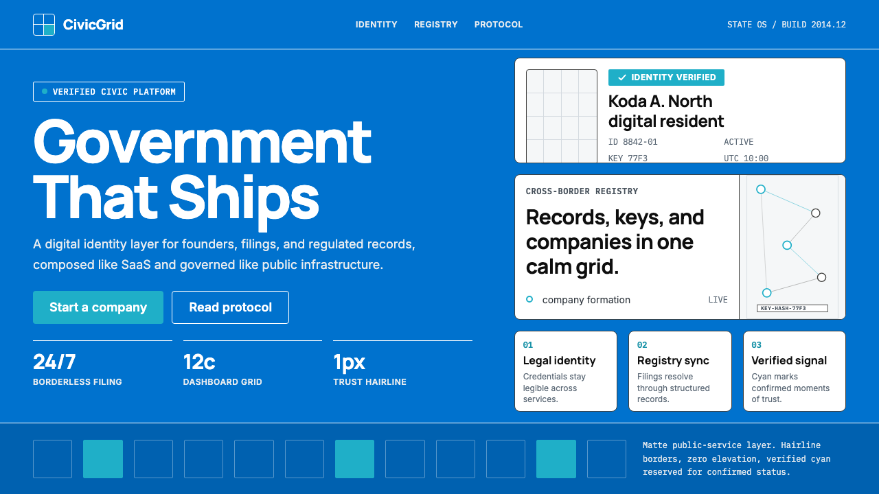 Estonia e-Residency Digital (2014)Trust without weight. Cornflower blue, 12-column grids, and cyan verified sig…
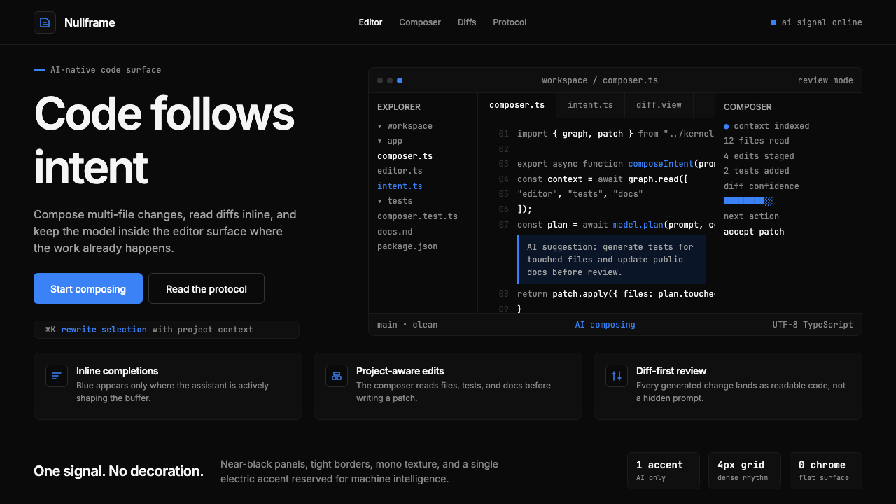 Cursor IDEAI-first code editor. Pure dark surfaces, off-white text, electric blue reser…