What is Protopia?
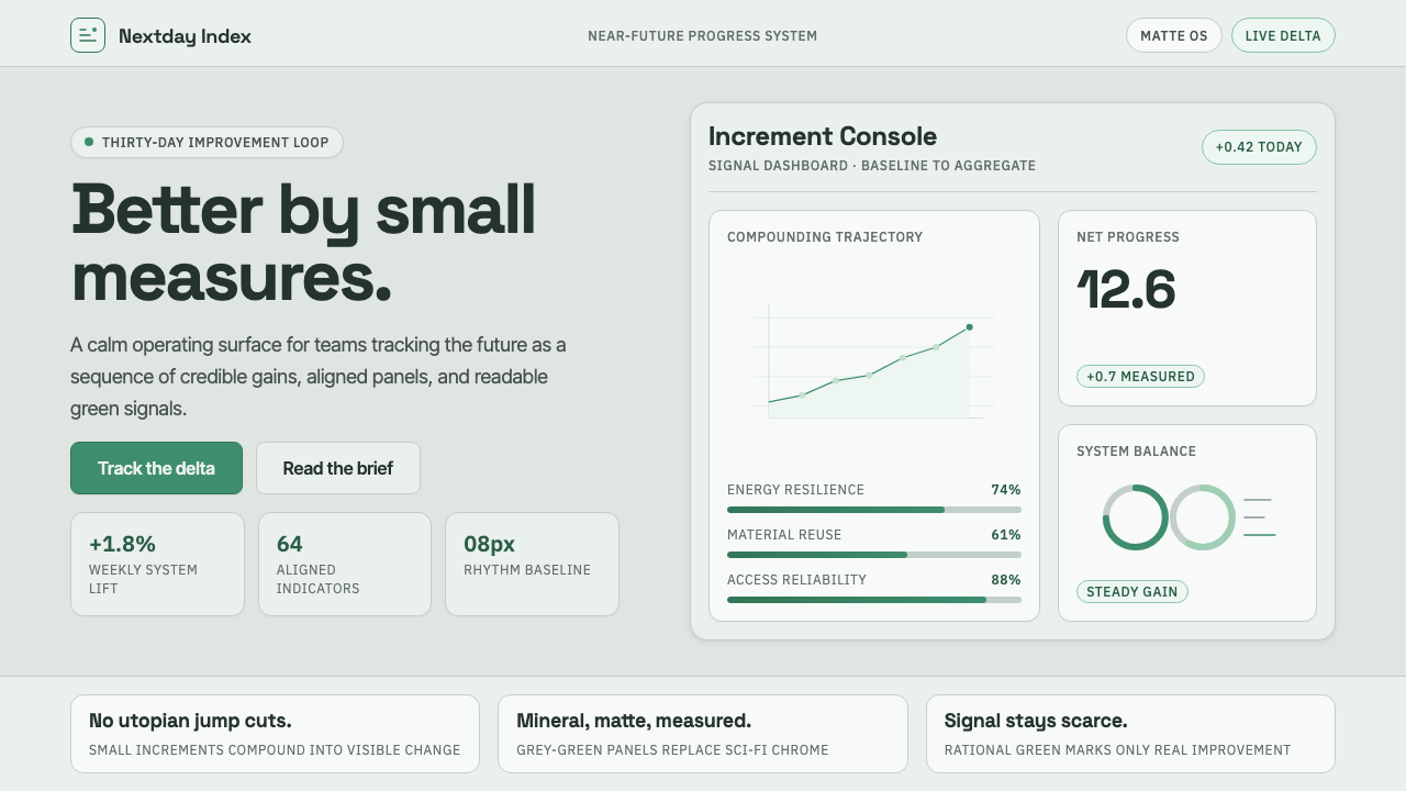
Protopia imagines progress without spectacle: a future made calmer, clearer, and measurably better through gains small enough to trust.
Protopia in brief
Protopia is Kevin Kelly’s term for a future positioned between utopia and dystopia. It does not promise a flawless destination, nor does it assume that technology inevitably produces collapse. Instead, it describes a condition in which ordinary systems become slightly more capable, sustainable, legible, and useful over time. Its optimism is practical: progress matters because it can be noticed in the daily experience of work, care, learning, infrastructure, and decision-making.
As a visual language, Protopia rejects two familiar future clichés. It avoids the glossy chrome, theatrical light, and frictionless fantasy of conventional sci-fi futurism; it also avoids cyberpunk’s grime, alarm, surveillance dread, and urban overload. The result is neither sterile nor nostalgic. It is a composed, systems-minded aesthetic that treats the future as something administered, maintained, measured, and improved rather than merely unveiled.
Its visual register draws from the polished operating-system dashboard associated with the WIRED era: cool mineral grey-green surfaces, rational signals of growth and sustainability, modular grids, and restrained matte finishes. The sense of refinement comes from order. Alignment, proportion, hierarchy, and breathing room do the expressive work that gloss, dramatic gradients, or decorative effects might perform elsewhere. Protopia makes progress feel credible by making information feel calm.
Where does Protopia come from?
The term Protopia entered Kevin Kelly’s work through What Technology Wants, published in 2010. Kelly framed it as a useful alternative to the all-or-nothing futures that dominate public imagination. Utopia suggests a finished ideal; dystopia suggests an inescapable failure. Protopia leaves room for repair, trade-offs, uneven improvement, and continued responsibility. Its future is not perfected. It is better than the present in enough concrete ways to justify continued effort.
The idea belongs to a global conversation but is rooted in the Silicon Valley and West-Coast tech-optimist intellectual tradition. In that context, technology is understood less as a singular event than as an accumulating set of tools, networks, institutions, and habits. The relevant question is not whether innovation saves or destroys society in one decisive motion. It is whether a system can create small improvements that compound while remaining visible enough to evaluate.
WIRED-era pragmatic futurism provides the aesthetic backdrop. Its interest was not simply novelty, but the encounter between technological capability and everyday life: interfaces, networks, environmental systems, tools for coordination, and emerging ways of understanding complex change. Protopia inherits this near-future orientation. It favors evidence of functioning systems over cinematic prophecy, and it treats a well-organized dashboard as a more persuasive image of progress than a glowing skyline.
P2P Foundation and Big Think appear among the figures and platforms associated with the concept’s wider intellectual setting. Their presence underscores that Protopia is not a closed visual movement with a fixed canon. It is a framework for thinking about incrementalism as a middle path: neither the fantasy that every problem disappears nor the certainty that every advance conceals disaster. That openness is central to the style’s tone. It must feel optimistic enough to invite participation, yet measured enough to remain accountable.
What defines the Protopia look?
Mineral Calm
Protopia favors cool grey-green fields that feel mineral, durable, and low-drama rather than luxurious or clinical. The surface should suggest a maintained instrument panel or a public system in good working order. Green functions as a rational signal of growth, continuity, and sustainability, not as an emotional burst of optimism.
Modular Grid
The grid is the style’s principal argument. Cards, measures, labels, charts, and status fields align as parts of one intelligible system. Modules should feel repeatable without becoming monotonous: their shared structure communicates that small improvements can be compared, accumulated, and understood together.
Measured Signals
Protopia gives visual priority to evidence of movement: a changing status, a directional marker, a compact chart, a clear comparison, or an updated system reading. Information is not displayed for spectacle. It is arranged to make improvement perceptible without overstating what the data can support.
Matte Restraint
Polish lives in precision rather than shine. Surfaces remain matte and quiet; decorative gloss and theatrical depth would turn a functional system into a fantasy object. The visual finish should imply care, consistency, and material sobriety, keeping attention on structure and content.
Quiet Typography
Typography is clear, orderly, and service-oriented. Hierarchy should emerge through deliberate contrast, grouping, and space rather than decorative display. Headlines can be firm and concise, while supporting text remains readable and unhurried. Type behaves like interface infrastructure: it guides, names, compares, and confirms.
Near-Future Realism
The style should feel advanced without becoming speculative theater. It does not need chrome machinery, neon drama, or dystopian decay to signal technology. Its future is recognizable because it grows from familiar interfaces and systems, then makes them more coherent, more responsible, and more capable.
Who shaped Protopia?
Kelly introduced Protopia in What Technology Wants in 2010. His formulation defines the concept as an alternative to both utopian completion and dystopian fatalism: a future made incrementally, through improvements that are real enough to measure and modest enough to sustain.
P2P Foundation is listed among the key figures and platforms in Protopia’s intellectual setting. Its inclusion situates the concept within a wider conversation about systems, participation, and alternatives to totalizing future narratives rather than within a narrowly defined graphic-design school.
Big Think is also identified among the key figures and platforms surrounding the idea. In the Protopia context, it represents the public-facing intellectual environment in which pragmatic near-future optimism can be discussed without reducing the future to either technological salvation or technological dread.
How do you use Protopia today?
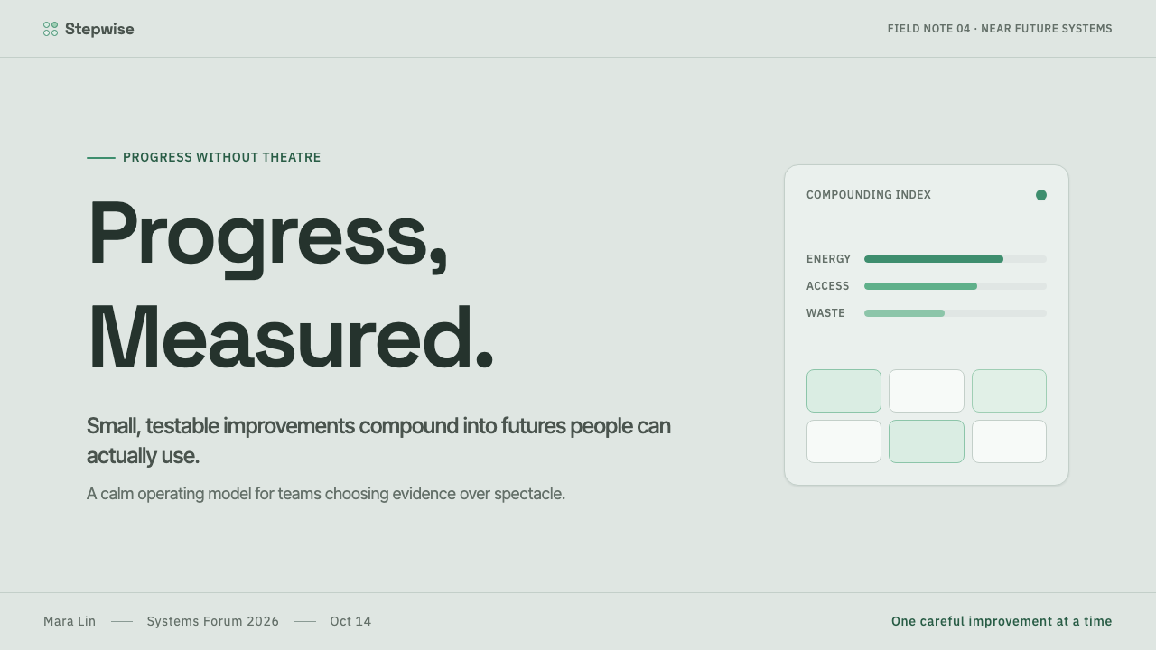
For presentation covers, Protopia works best when the composition feels like a clear opening reading rather than a promise of technological spectacle. Use a calm mineral field, a disciplined grid, a concise title, and one or two controlled signals of progress. On content slides, let modules organize information into comparable units. The audience should feel that the presentation has a system before they begin reading its details.
Data slides are a natural fit because the style treats measurement as part of its emotional language. Charts, progress indicators, status summaries, and directional comparisons should be sparse, legible, and easy to audit. Avoid turning every number into celebration. The strongest Protopia data page communicates that movement is occurring, that it can be examined, and that further improvement remains possible.
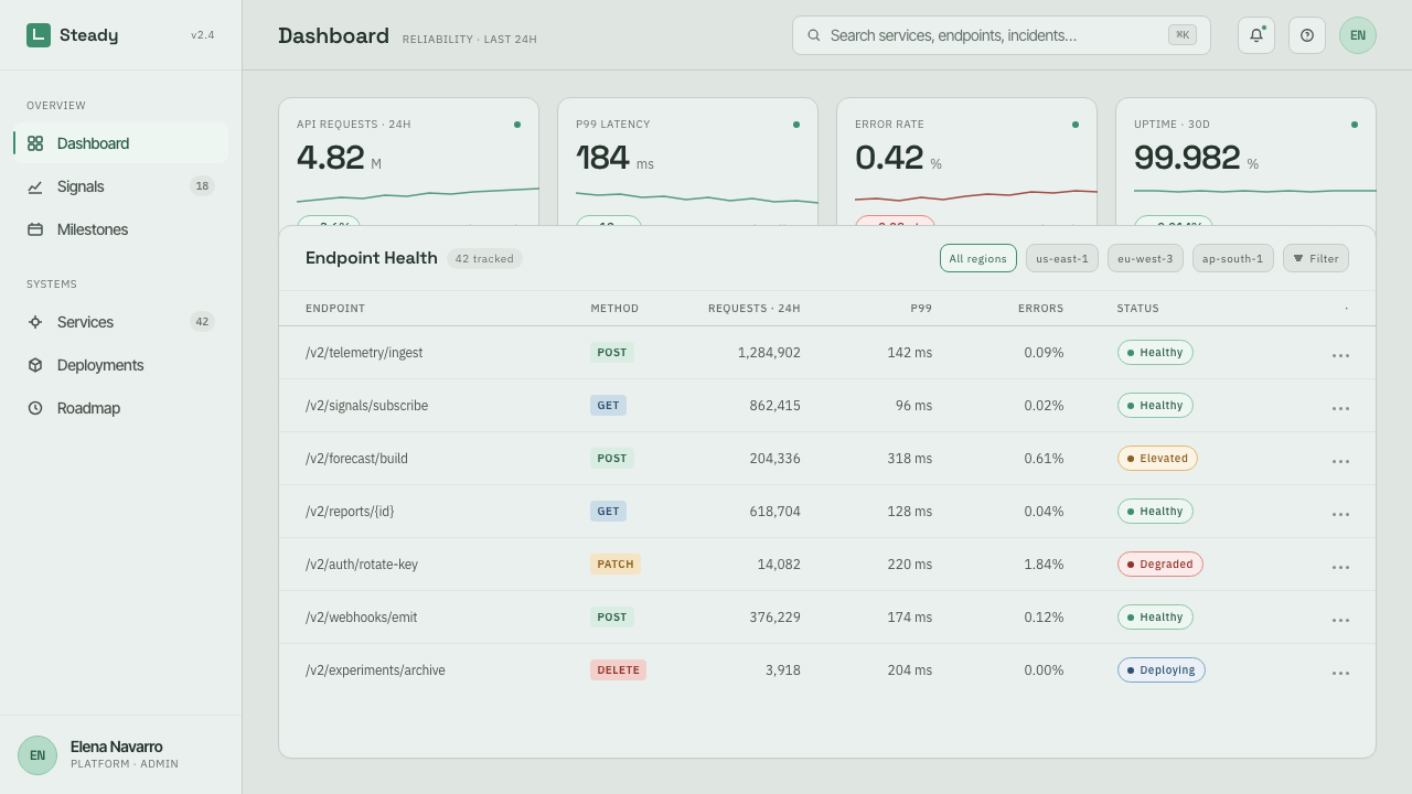
For web interfaces, the style is especially suited to dashboards, planning tools, sustainability reporting, service operations, and pricing pages where trust depends on clarity. Build the interface from consistent modules and stable navigation. Reserve green signals for meaningful positive states or sustainable direction, so they retain their informational force. A pricing page can use the same restraint: tiers should read as structured choices, not as aggressively illuminated sales objects.
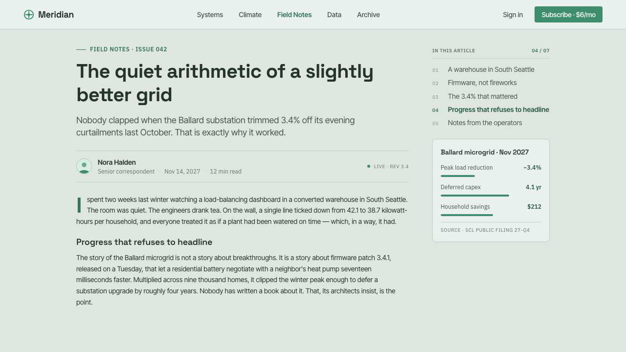
In editorial and marketing work, Protopia supports explainers, research reports, product narratives, and public-interest communications that need to make complexity approachable. Editorial layouts should pair calm reading space with compact system annotations, progress markers, and carefully grouped side information. Marketing should emphasize credible outcomes, useful capability, and steady momentum rather than language or imagery that implies sudden transformation.
The common mistake is confusing Protopia with generic green technology branding or polished sci-fi. Filling every surface with environmental symbols makes the style sentimental; adding luminous effects, chrome, or dramatic futuristic imagery makes it speculative. Protopia’s optimism must be earned by structure. If the grid does not clarify, the signals do not mean anything, and the information cannot be compared, the design is borrowing the mood without practicing the underlying discipline.
Protopia — FAQ
Is Protopia simply another version of utopian design?
No. Utopian design often imagines completion: a harmonious state in which contradiction and failure have been resolved. Protopia is explicitly less absolute. It accepts that systems remain imperfect and that improvements may be partial, uneven, and ongoing. Its visual language therefore values readable evidence, stable structure, and modest progress signals over idealized imagery.
How is Protopia different from cyberpunk?
Both can address technology and complex systems, but their emotional assumptions differ sharply. Cyberpunk foregrounds dread, overload, decay, and technological power detached from human control. Protopia foregrounds maintenance, legibility, and incremental capability. It does not deny difficulty; it refuses to make difficulty the entire visual atmosphere.
Why are grids so important to the style?
Because Protopia is concerned with compounding gains. A grid turns separate observations into a system of comparison: one status can sit beside another, one change can be read against a prior condition, and small improvements can become visible as part of a larger pattern. The grid is not decorative background. It is the visual structure that makes progress accountable.
Can Protopia be used for consumer marketing?
Yes, when the product can credibly speak about usefulness, continuity, or responsible improvement. It is effective for services that help people organize, monitor, learn, plan, or make better decisions. It is less suitable when the brand depends on excess, fantasy, or immediate emotional intensity. The style should support a promise that can be demonstrated, not merely dramatized.
Does Protopia require a sustainability theme?
No. Sustainability is one natural association because green can signal continuity and responsible growth, but the concept is broader. Protopia can describe improvement in knowledge systems, public services, product workflows, personal tools, or organizational coordination. What matters is not the topic itself, but whether the design makes modest, meaningful progress feel visible and credible.
Related design styles
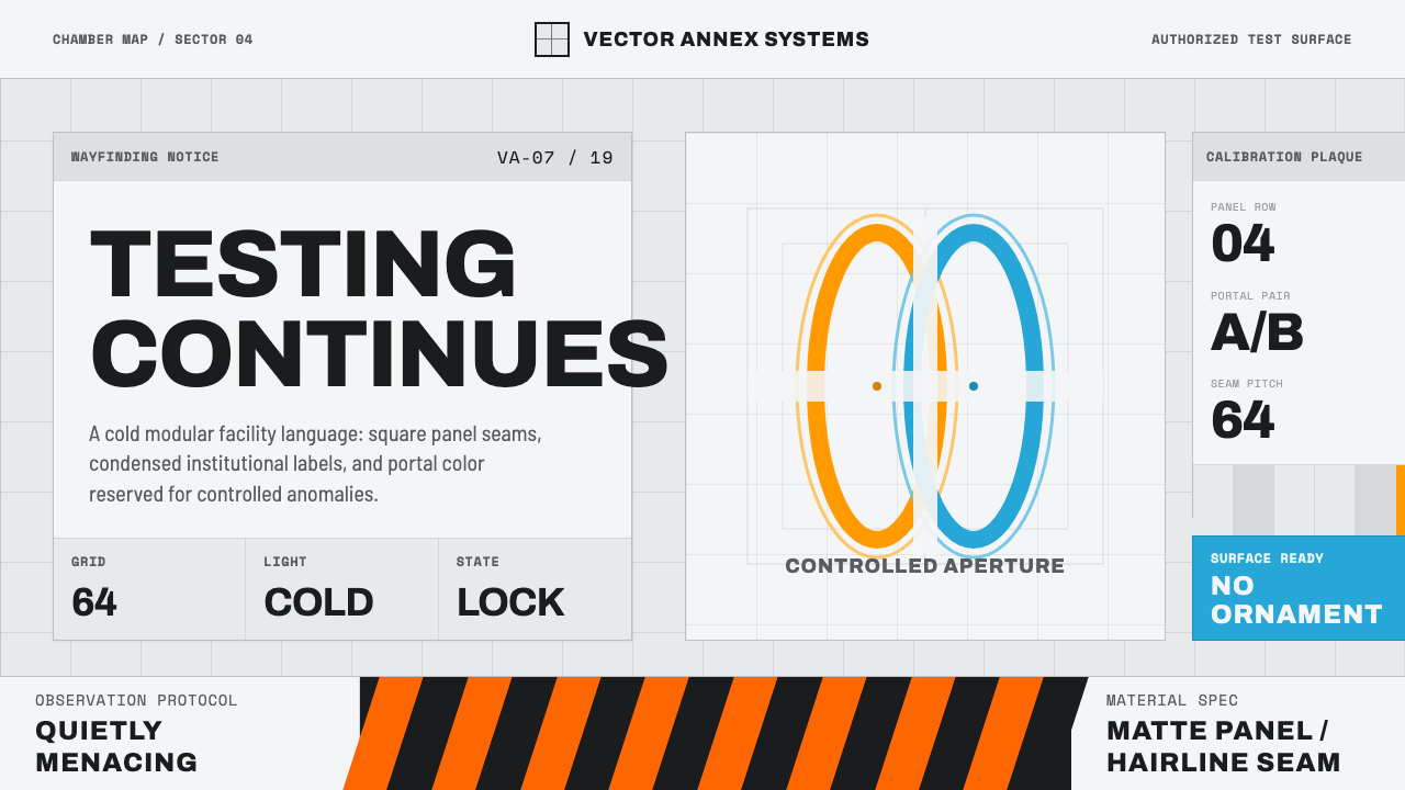 Aperture ScienceSterile authority. Cool panel seams, Archivo signage, and sparse orange-blue…
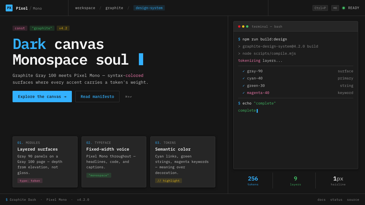 IBM Plex Mono DevColor used like syntax highlighting. Carbon Gray 100 canvas, IBM Plex Mono th…
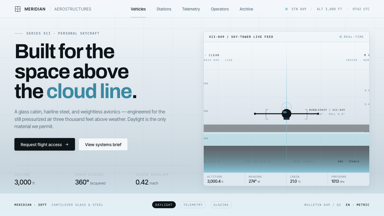 Oblivion Sky TowerSterile daylight futurism. Cool sky-grey glass, hairline steel mullions, a si…
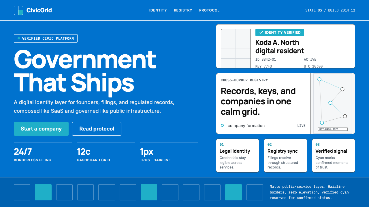 Estonia e-Residency Digital (2014)Trust without weight. Cornflower blue, 12-column grids, and cyan verified sig…
 Corian Solid SurfaceSeamless matte calm. Glacier White floats over cool grey shadow with neutral…
 Microsoft Fluent 2Disciplined translucency. Warm Mica neutrals, acrylic blur, and muted blue cr…