What is Estonia e-Residency Digital (2014)?什么是 Estonia e-Residency Digital (2014)?
Estonia turned a small Baltic nation into the world's first digital state — and its visual language makes institutional trust feel as clean and immediate as a well-designed SaaS dashboard.爱沙尼亚将一个波罗的海小国打造为全球首个数字国家——其视觉语言让制度信任感像一款设计精良的SaaS仪表盘那样清晰而直接。
Estonia e-Residency Digital (2014) in briefEstonia e-Residency Digital (2014) 速览
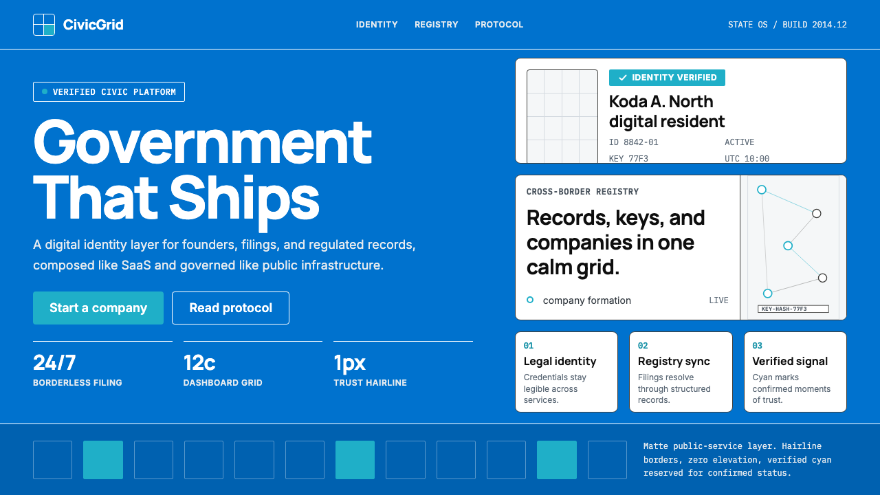
Estonia e-Residency Digital is the civic-technology design language developed alongside Estonia's groundbreaking e-Residency program, launched in December 2014. It draws its palette from the Estonian national flag — a distinctive cornflower blue paired with matte white and a verified-signal cyan — and organizes every interface around dense twelve-column grids, hairline borders, and type that handles Estonian diacritics and Latin characters with equal precision. The result reads as government infrastructure reimagined by a Nordic co-working studio: authoritative without being bureaucratic, structured without being cold.爱沙尼亚电子居民数字风格,是伴随爱沙尼亚开创性的电子居民计划(于2014年12月正式推出)而发展起来的公民科技设计语言。它从爱沙尼亚国旗中汲取色板——独特的矢车菊蓝与哑光白及验证信号青色相配——并以密集的十二栏网格、发丝线边框和能够同时精准呈现爱沙尼亚变音字符与拉丁字母的字体组织每一个界面。最终效果如同由北欧联合办公工作室重新诠释的政府基础设施:有权威感而不沉重官僚,有结构感而不冰冷疏离。
The system is built on a single governing conviction: institutional trust can be communicated through visual discipline rather than visual weight. Where traditional government design reached for heavy seals, ornate crests, and thickly shadowed panels, e-Residency Digital reaches for restraint — thin ruled borders instead of drop shadows, flat card surfaces instead of embossed panels, generous whitespace that signals precision rather than emptiness. The aesthetic owes debts to Scandinavian public-sector design and to the broader tradition of Nordic civic minimalism, but it grafts onto that tradition a startup-era legibility suited to a government that ships software updates.这套体系建立在一个核心信念之上:制度信任可以通过视觉纪律而非视觉重量来传达。传统政府设计惯于诉诸厚重印章、繁复徽章与深色阴影面板,电子居民数字风格则选择克制——以细线边框取代投影,以平面卡片取代浮雕面板,以充裕留白传递精准感而非空洞感。这套美学借鉴了斯堪的纳维亚公共部门设计与更广泛的北欧公民极简主义传统,但将这一传统嫁接到了创业时代的易读性之上,适合一个像发布软件更新一样迭代治理的政府。
Visually, the style is immediately recognizable by its combination of cornflower blue as the primary identity hue, matte white dashboard cards as the dominant surface, and a secondary cyan that appears specifically to signal verified or active states — the digital equivalent of a green checkmark, but rendered with more graphic sophistication. Typography is clean and functional, chosen for its ability to render both Estonian-specific characters and English-language interface copy without compromise. The overall impression is of a carefully maintained design system: internally consistent, purposefully limited in its palette and decorative vocabulary, and unmistakably associated with the promise of frictionless digital governance.在视觉上,这种风格极易辨认:以矢车菊蓝作为主要品牌色,以哑光白仪表盘卡片作为主导界面底面,以青色专门标示验证或激活状态——这是绿色勾选标记的数字等价物,但以更具图形精致感的方式呈现。字体选择干净实用,能够毫无妥协地同时呈现爱沙尼亚特有字符与英文界面文案。整体印象是一套精心维护的设计系统:内部一致、色板与装饰词汇有意克制,并与无摩擦数字治理的承诺密不可分。
See the Estonia e-Residency Digital (2014) design system查看 Estonia e-Residency Digital (2014) 完整设计系统
Where does Estonia e-Residency Digital (2014) come from?Estonia e-Residency Digital (2014) 从何而来?
The roots of Estonia's digital ambitions stretch back further than the e-Residency program itself. When Estonia regained independence in 1991 after the Soviet collapse, it was one of the poorest countries in Europe, with a public administration infrastructure that was largely pre-digital. Rather than treating this as a disadvantage, the new government — guided in part by Prime Minister Mart Laar, who took office at age thirty-two in 1992 — decided to leapfrog traditional bureaucratic infrastructure entirely. By the late 1990s, Estonia had already established a national digital identity system, a paperless cabinet, and the X-Road data exchange platform that would eventually underpin the entire digital state. The X-Road infrastructure, which went live in 2001, allowed government databases to talk to one another without centralizing data — a distributed trust architecture that became the technical backbone for everything that followed.爱沙尼亚数字抱负的根源比电子居民计划本身要深远得多。1991年苏联解体后爱沙尼亚重获独立时,它是欧洲最贫穷的国家之一,公共行政基础设施几乎完全处于数字化之前的状态。新政府——在一定程度上受到1992年以三十二岁之龄出任总理的马尔特·拉尔指引——并未将此视为劣势,而是决定彻底跨越传统官僚基础设施阶段。到1990年代末,爱沙尼亚已经建立了全国数字身份系统、无纸化内阁,以及最终将支撑整个数字国家的X-Road数据交换平台。于2001年上线的X-Road基础设施允许政府数据库在不集中存储数据的前提下相互通信——这种分布式信任架构成为此后一切建设的技术支柱。
The e-Residency program was proposed and championed by Taavi Kotka, then Estonia's Chief Information Officer, and Kaspar Korjus, who became the program's first managing director. The core concept was audacious: extend Estonian digital identity — and with it access to the European Union's legal and business infrastructure — to anyone in the world, regardless of physical location. President Toomas Hendrik Ilves, himself a technology advocate with deep roots in the Estonian diaspora, threw his personal support behind the initiative. When e-Residency officially launched on December 1, 2014, Estonia became the first country in history to offer digital residency as a government service.电子居民计划由时任爱沙尼亚首席信息官塔维·科特卡提出并倡导,卡斯帕·科尔尤斯成为该计划首任总监。核心理念大胆而创新:将爱沙尼亚数字身份——以及随之而来的欧盟法律和商业基础设施访问权限——延伸至全球任何人,不受物理位置限制。时任总统托马斯·亨德里克·伊尔韦斯是一位深深植根于爱沙尼亚海外侨民群体的科技倡导者,他亲自为这一倡议背书。2014年12月1日,电子居民计划正式上线,爱沙尼亚成为历史上首个将数字居留权作为政府服务提供的国家。
The visual identity that accompanied e-Residency was shaped by the necessity of communicating credibility to an inherently skeptical international audience. A government program inviting foreigners to register businesses remotely had to overcome profound trust deficits — it needed to signal legitimacy, security, and institutional reliability through every design touchpoint. The choice to anchor the palette in the Estonian flag's cornflower blue was deliberate: it grounded the program in national identity without resorting to heraldic elaboration. The supporting language of clean grids, hairline borders, and verified-state cyan was drawn from the visual vocabulary of trusted financial and technology platforms — the aesthetic grammar that, by 2014, had become associated with reliability in the digital economy.伴随电子居民计划而生的视觉识别体系,是在必须向本质上持怀疑态度的国际受众传达公信力的现实需要中塑造的。一个邀请外国人远程注册企业的政府计划必须克服深重的信任赤字——需要通过每一个设计接触点传递合法性、安全感与制度可靠性。选择将色板锚定于爱沙尼亚国旗的矢车菊蓝是刻意为之的:它将计划扎根于国家认同,同时避免诉诸纹章式的繁复。干净网格、发丝线边框与验证状态青色的配套语言,则汲取自可信金融和科技平台的视觉词汇——这套美学语法到2014年已与数字经济中的可靠性紧密相连。
The design system also reflected Estonia's broader civic-technology philosophy, sometimes called the digital-state-building movement. Estonian designers and public servants operated in a space between post-Soviet pragmatism and Nordic design idealism, acutely aware that the interface between citizen and government was itself a political statement. A cluttered, heavy, opaque government interface communicated power-over; a clean, open, readable interface communicated service. This philosophical alignment between the program's governance model — radically transparent, API-first, built on distributed trust — and its visual language gave e-Residency Digital a coherence that many government design systems lack. The style was not applied as a cosmetic layer but grew directly from the values the program was trying to instantiate.这套设计系统同样折射出爱沙尼亚更广泛的公民科技哲学,有时被称为数字国家建设运动。爱沙尼亚设计师与公职人员在后苏联务实主义与北欧设计理想主义之间的空间中工作,深知公民与政府之间的界面本身就是一种政治表述。杂乱、沉重、不透明的政府界面传达的是权力凌驾;干净、开放、易读的界面传达的是服务意识。计划治理模式——根本性透明、API优先、建立在分布式信任之上——与其视觉语言之间的这种哲学对齐,赋予了电子居民数字风格许多政府设计系统所缺乏的内在一致性。这套风格不是作为装饰层叠加上去的,而是直接从计划试图落实的价值观中生长出来的。
What defines the Estonia e-Residency Digital (2014) look?Estonia e-Residency Digital (2014) 的视觉特征是什么?
Cornflower Blue as Identity Anchor矢车菊蓝作为身份锚点
The signature blue is drawn directly from the Estonian national flag and functions as the single non-negotiable identity color across the entire system. It appears on primary action buttons, key navigation elements, and brand-facing surfaces where the program must assert its official character. The hue is cool and mid-range in saturation — present enough to read as authoritative, restrained enough not to overwhelm matte white card surfaces. In layouts with significant white space, this blue does most of the trust-signaling work without additional decoration.这一标志性蓝色直接取自爱沙尼亚国旗,是整套体系中唯一不可商量的品牌色。它出现在主要行动按钮、关键导航元素以及需要彰显官方性质的品牌界面上。这一色调冷静、饱和度适中——足够存在感以传达权威,又足够克制以不压制哑光白卡片底面。在留白充裕的版面中,这一蓝色在无需额外装饰的情况下承担了大部分信任信号的工作。
Verified-State Cyan验证状态青色
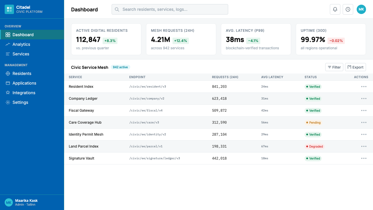
A secondary cyan appears specifically to communicate verification, activation, and confirmed trust — the visual equivalent of a digital signature stamp. Unlike the cornflower blue, which carries brand identity, the cyan is a semantic color: it means something has been checked, validated, or granted. This deliberate separation of brand color from status color creates a clear visual grammar that users can learn quickly. The cyan is never used decoratively; every instance of it carries informational weight.第二主色青色专门用于传达验证、激活与确认信任——相当于数字签章的视觉等价物。不同于承载品牌身份的矢车菊蓝,青色是一种语义色:它意味着某事已被核查、确认或批准。品牌色与状态色的这种刻意区分,创造了用户能够快速习得的清晰视觉语法。青色从不用于装饰;它的每一次出现都承载着信息重量。
Twelve-Column Grid Discipline十二栏网格纪律
All layouts are organized around a dense twelve-column grid, which allows complex dashboard information — status panels, document summaries, application progress trackers — to be arranged with spatial precision. The grid is never violated for decorative reasons; it is the structural spine of every page. This density is a deliberate choice for a system handling real bureaucratic complexity: more columns permit finer information hierarchies without resorting to nested tables or visually chaotic lists.所有版面围绕密集的十二栏网格组织,使复杂的仪表盘信息——状态面板、文件摘要、申请进度追踪器——得以以空间精确性排列。网格从不因装饰原因被打破;它是每个页面的结构脊梁。这种密度对于处理真实官僚复杂性的系统而言是刻意的选择:更多栏位允许更精细的信息层级,而无需诉诸嵌套表格或视觉混乱的列表。
Hairline Borders Over Shadows发丝线边框取代阴影
The system uses thin ruled borders — barely visible at ordinary viewing distances — rather than drop shadows or blur effects to define card boundaries and section separations. This is both a stylistic choice and a philosophical one: shadows simulate physical depth and imply a world of stacked paper; borders define boundaries without implying physicality. The hairline aesthetic reads as precise, digital-native, and deliberately opposed to the skeuomorphic government documents it was designed to replace.这套系统使用细线边框——在正常观看距离下几乎难以察觉——而非投影或模糊效果来定义卡片边界与区块分隔。这既是风格选择,也是哲学选择:阴影模拟物理深度,暗示叠放纸张的世界;边框定义边界而不暗示物理性。发丝线美学读起来精准、数字原生,并刻意与它被设计来取代的拟物化政府文件相对立。
Functional Sans-Serif Typography功能性无衬线字体排印
The type choices prioritize precision and internationalization over personality. The selected faces handle Estonian's diacritical characters — letters carrying accent marks not present in the standard Latin alphabet — with the same visual balance as standard English characters, a technical requirement that eliminates most display-oriented typefaces from consideration. Type hierarchy is established through size and weight contrast rather than color variation, keeping the palette reserved for structural and semantic purposes. Letterforms are clean and open, avoiding both the coldness of narrowly engineered grotesques and the warmth of humanist serifs.字体选择优先考虑精准性与国际化,而非个性表达。所选字体能够以与标准英文字符同等的视觉平衡呈现爱沙尼亚的变音字符——这一技术要求排除了大多数以展示为导向的字体。字体层级通过尺寸与字重对比而非色彩变化来建立,将色板保留用于结构性与语义性目的。字形干净开放,既避免了工程感过强的格罗特斯克字体的冰冷,也避免了人文主义衬线字体的温情。
Matte White Dashboard Surfaces哑光白仪表盘底面
The dominant surface throughout the system is a flat, near-white or pure white background — not cream, not off-white with warmth, but a clean, screen-native white that reads as contemporary and precise. Dashboard cards float against this ground without soft-shadow depth effects, relying instead on thin borders or subtle background-tone shifts to create containment. This whiteness is not blank emptiness; it is the negative space that makes the blue identity color and the cyan verification signals immediately legible.整套系统的主导底面是平整的近白或纯白背景——不是奶油色,不是带暖意的米白,而是干净、屏幕原生的白色,呈现出当代感与精准感。仪表盘卡片在这一底面上漂浮,不依赖柔和阴影的深度效果,而是依靠细线边框或微妙的背景色调变化来实现容纳感。这种白色不是空洞的留白;它是使蓝色品牌色和青色验证信号立即可读的负空间。
Zero Bureaucratic Ornament零官僚装饰
Official seals, ornamental crests, ribbon banners, and other trappings of traditional government visual communication are entirely absent. In their place, the system relies on precise information architecture — well-labeled sections, clear status indicators, consistent iconography — to communicate authority. This is a principled design choice with a political dimension: the aesthetic signals that this government communicates through clarity and competence rather than through the symbolism of accumulated institutional history.官方印章、装饰性徽章、绶带横幅及其他传统政府视觉传达的惯用元素完全缺席。取而代之的是精确的信息架构——标注清晰的区块、明确的状态指示、一致的图标语言——来传达权威。这是一个带有政治维度的原则性设计选择:这套美学表明,这个政府通过清晰与能力而非累积制度历史的象征意义来进行沟通。
See the Estonia e-Residency Digital (2014) design system查看 Estonia e-Residency Digital (2014) 完整设计系统
Who shaped Estonia e-Residency Digital (2014)?谁塑造了 Estonia e-Residency Digital (2014)?
As Estonia's Chief Information Officer during the critical period of e-Residency's development, Kotka was the primary architect of the program's technical and institutional vision. He brought the mindset of a technology startup founder to a government initiative — thinking in terms of user acquisition, product-market fit, and scalable infrastructure rather than traditional policy frameworks. His insistence that the e-Residency program function like a well-engineered software product directly shaped the design philosophy that emerged: precise, functional, continuously iterable.在电子居民计划发展的关键时期担任爱沙尼亚首席信息官,科特卡是该计划技术与制度愿景的首要设计者。他将科技初创公司创始人的思维方式带入了政府倡议——以用户获取、产品市场契合度和可扩展基础设施的视角思考,而非套用传统政策框架。他坚持让电子居民计划像一款精心工程化的软件产品一样运作,这直接塑造了由此涌现的设计哲学:精准、功能导向、持续可迭代。
Korjus served as the first managing director of the e-Residency program and was responsible for translating the initiative's technical vision into a brand and communication strategy that could persuade global audiences. He effectively operated as both product manager and chief brand steward, making decisions about how the program presented itself — its tone of voice, its visual posture, its promise to the world — during the years when the design system's fundamental character was being established. His international communication work gave the visual identity its audience-first orientation.科尔尤斯担任电子居民计划首任总监,负责将该计划的技术愿景转化为能够说服全球受众的品牌与传播策略。他实际上同时扮演产品经理与首席品牌守护者的角色,在设计系统基本性格形成的那些年间,决定着该计划如何呈现自身——语调、视觉姿态、对世界的承诺。他的国际传播工作赋予了这套视觉识别以受众优先的导向。
Estonia's president from 2006 to 2016, Ilves was an unusual head of state: a technologist and long-time advocate for digital governance who wore bow ties, maintained an active presence on social media, and routinely engaged with researchers and entrepreneurs building the digital state. His personal embodiment of the program's values — thoughtful, internationally minded, deliberately unstuffy — influenced the tone of its visual communication. He served as the public face of a government that wanted to be seen as a serious-but-approachable digital partner.伊尔韦斯于2006至2016年担任爱沙尼亚总统,是一位不寻常的国家元首:一位打领结、活跃于社交媒体、定期与构建数字国家的研究人员和创业者互动的技术专家与数字治理倡导者。他对计划价值观的个人体现——深思熟虑、具有国际视野、刻意去除官腔——影响了其视觉传播的基调。他是一个希望被视为严肃而可接近的数字伙伴的政府的公众面孔。
As Prime Minister in the early 1990s, Laar made the foundational policy decisions that set Estonia on the path to becoming a digital state. His government liberalized the economy, invested in telecommunications infrastructure, and established the legal and institutional frameworks within which the digital state was later built. While Laar's direct involvement with e-Residency came before the program's launch, the culture of rapid, pragmatic, ideology-driven reform he established in the 1990s is the deep historical reason Estonia was able to develop such an ambitious digital governance initiative at all.作为1990年代初的总理,拉尔做出了奠基性的政策决定,使爱沙尼亚走上了成为数字国家的道路。他的政府自由化了经济,投资于电信基础设施,并建立了后来在其上构建数字国家的法律与制度框架。虽然拉尔与电子居民计划的直接关联发生在该计划启动之前,但他在1990年代确立的快速、务实、理念驱动的改革文化,是爱沙尼亚能够发展出如此雄心勃勃的数字治理倡议的深层历史原因。
How do you use Estonia e-Residency Digital (2014) today?今天怎么用 Estonia e-Residency Digital (2014)?
Estonia e-Residency Digital is most effective in contexts that need to communicate institutional credibility, digital-native precision, and the specific emotional register of trustworthy-but-not-stuffy. It performs well for government and civic-tech products, compliance and legal platforms, financial infrastructure tools, and any service where the user must feel confident that the system is both authoritative and rigorously designed. The style is less well-suited to contexts requiring warmth, sensory richness, or consumer-facing delight — it communicates competence more readily than it communicates joy.爱沙尼亚电子居民数字风格在需要传达制度公信力、数字原生精准感以及「可信而不古板」这一特定情感基调的场景中最为有效。它在政府与公民科技产品、合规与法律平台、金融基础设施工具,以及任何用户必须感到系统既有权威性又经过严格设计的服务中表现出色。这种风格不太适合需要温暖感、感官丰富性或面向消费者愉悦感的场景——它传达能力感比传达快乐感更为容易。
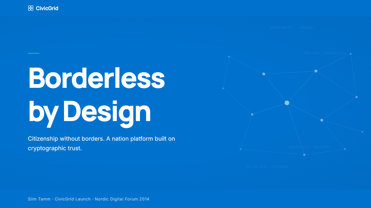
For presentation slides, the style excels on both cover and content pages. A cover benefits from placing the cornflower blue in a large, purposeful block — occupying a major portion of the slide — with the title set in clean, weight-contrasted type against white. Avoid centering everything; instead anchor the composition to one edge or corner and let white space carry the rest of the slide. Content slides should be treated as dashboard panels: a clear section label at the top in reduced type, the main information in a generous center column, and metadata or supporting notes in a narrow secondary column to the right. Data slides work particularly well in this style — bar charts, status indicators, and progress trackers all fit naturally within the visual vocabulary of verified-state signals and clean grid organization.在演示文稿中,这种风格在封面页和内容页上均有出色表现。封面适合将矢车菊蓝置于一个大面积、目的明确的色块中——占据幻灯片的主要区域——同时将标题以干净、有字重对比的字体置于白色底面上。避免居中对齐一切;而是将构图锚定于一条边缘或一个角落,让留白承载幻灯片的其余部分。内容页应当被当作仪表盘面板处理:顶部以缩小字号的清晰区块标签,主要信息置于宽阔的中央栏,元数据或支撑性注释置于右侧的窄次要栏。数据页在这种风格下尤其出色——柱状图、状态指示器和进度追踪器都自然地契合验证状态信号与干净网格组织的视觉词汇。
For web interfaces, the style is exceptionally well-suited to dashboards, administrative portals, document management systems, and pricing pages. Use the twelve-column grid as a genuine organizing constraint, not a suggestion — every panel, card, and form element should snap to it. Keep the page background at pure or near-white; reserve the cornflower blue for primary call-to-action elements and top navigation. Use the cyan exclusively for positive confirmation states: verified badges, completed steps, active subscriptions. Replace soft-shadow cards with thin-bordered panels; replace ghost buttons with clearly bordered alternatives. If the interface includes data visualization, treat charts as grid-aligned geometric objects rather than decorative illustrations.对于网页界面,这种风格极为适合仪表盘、行政门户、文件管理系统和定价页面。将十二栏网格作为真正的组织约束,而非建议——每个面板、卡片和表单元素都应对齐到网格。保持页面背景为纯白或近白;将矢车菊蓝保留用于主要行动号召元素和顶部导航。仅将青色用于积极确认状态:验证徽章、已完成步骤、有效订阅。以细边框面板取代柔和阴影卡片;以清晰有边框的替代方案取代幽灵按钮。如果界面包含数据可视化,应将图表视为网格对齐的几何对象,而非装饰性插图。
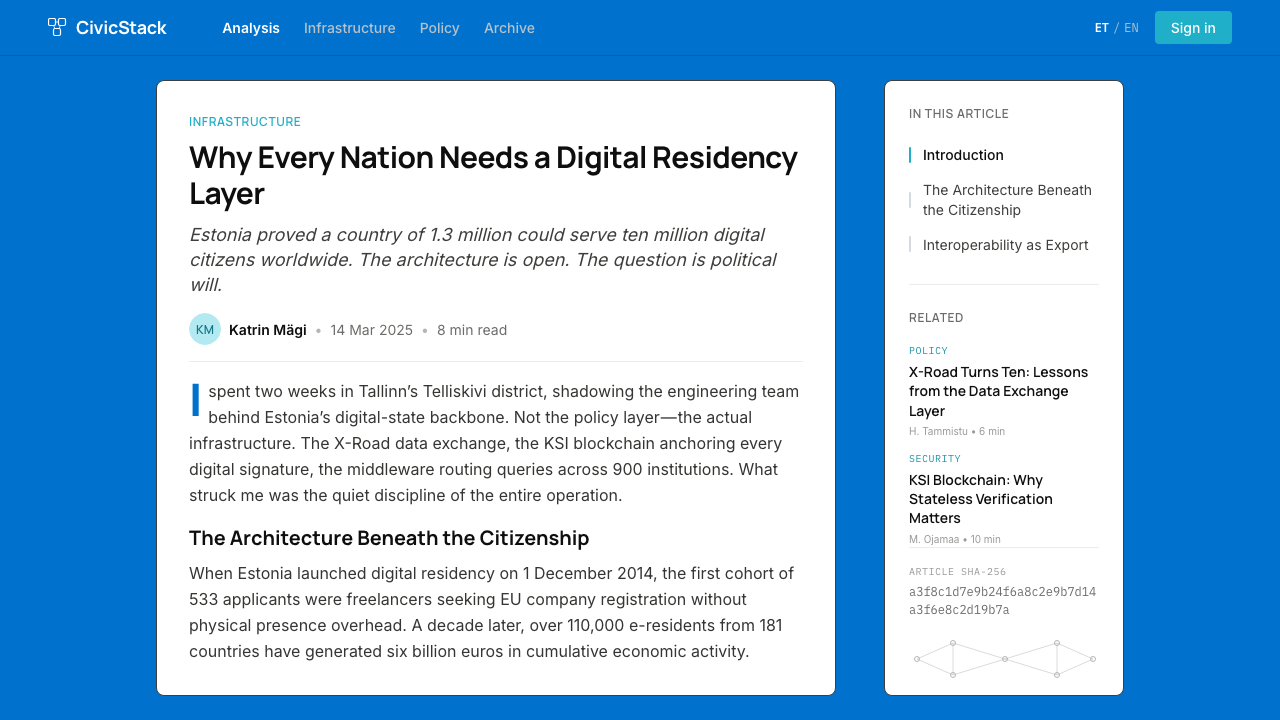
For editorial and marketing work, the style supports strong information hierarchy with a civic-technology inflection. An article or report layout should use a narrow, high-legibility text column with a generous margin reserved for pull quotes, captions, or reference notes. Section breaks should be marked with a thin horizontal rule and a typographic label rather than decorative imagery. Marketing pages work best when they lean into the style's poster-like discipline: full-width feature blocks in alternating cornflower-blue-on-white and white-on-blue, with the cyan appearing only at the moment of a confirmed action or verified claim. Headlines should be set with deliberate scale contrast — significantly larger than body text — and no gradient or shadow treatment.对于编辑与营销内容,这种风格以公民科技的气质支持强劲的信息层级。文章或报告版面应使用窄幅、高可读性的文字栏,并为引用语、说明文字或参考注释保留充裕的边距。区块分隔应以细水平线和字体标签标记,而非装饰性图像。营销页面在充分发挥这种风格的海报式纪律时效果最佳:全宽特性区块在矢车菊蓝底白字与白底矢车菊蓝字之间交替,青色仅在确认行动或验证声明的时刻出现。标题应以明显的尺寸对比来排印——显著大于正文——且不使用渐变或阴影处理。
A common mistake when applying this style is treating the cornflower blue as a background fill for large decorative areas, which can make the result feel heavy and institutional in the negative sense rather than trustworthy. The blue is most effective as an accent and action color against a dominant white ground. A related error is introducing a third or fourth color — neutrals, warm grays, or additional accent hues — that dilute the deliberate simplicity of the two-color semantic system. The style's credibility depends on the restraint of its palette; every additional color requires a justified semantic role, not a decorative one.应用这种风格时常见的错误,是将矢车菊蓝用作大面积装饰区域的背景填充,这会让结果感觉沉重、制度化——但是是负面意义上的沉重,而非可信意义上的。蓝色在主导白色底面上作为强调色和行动色时最为有效。一个相关错误是引入第三或第四种颜色——中性色、暖灰色或额外的强调色——稀释了双色语义系统刻意追求的简洁性。这种风格的公信力依赖于色板的克制;每增加一种颜色都需要一个合理的语义角色,而非装饰性角色。
See the Estonia e-Residency Digital (2014) design system查看 Estonia e-Residency Digital (2014) 完整设计系统
Estonia e-Residency Digital (2014) — FAQEstonia e-Residency Digital (2014) · 常见问题
Is this style appropriate only for government or civic-tech products?这种风格只适合政府或公民科技产品吗?
Not exclusively, though that is where it is most naturally at home. Any product that needs to signal institutional reliability, regulatory compliance, or trust in handling sensitive personal or financial information can benefit from the visual grammar of this style. Legal technology platforms, accounting and payroll tools, digital identity services, and financial compliance dashboards have all successfully adopted similar visual languages. The key is that the product's core promise must align with the style's values — precision, transparency, and competence — rather than with warmth, playfulness, or sensory richness.并非如此,尽管那是它最自然的归属地。任何需要传达制度可靠性、法规合规性或处理敏感个人或财务信息之信任感的产品,都能从这种风格的视觉语法中受益。法律科技平台、会计与薪酬工具、数字身份服务和金融合规仪表盘都成功采用了类似的视觉语言。关键在于,产品的核心承诺必须与这种风格的价值观——精准、透明与能力——对齐,而非与温暖感、趣味性或感官丰富性对齐。
How does this style differ from generic Nordic minimalism or fintech design?这种风格与通用北欧极简主义或金融科技设计有何不同?
The distinction lies in the semantic specificity of its color system and the civic rather than commercial orientation of its visual posture. Generic Nordic minimalism tends toward warmth — cream tones, humanist typefaces, organic textures used sparingly. Generic fintech design often uses a darker, more dramatic palette with strong green-and-dark contrasts to signal financial authority. Estonia e-Residency Digital is specifically about verified trust — the cornflower blue is a national identity marker, and the cyan carries a precise meaning of confirmation that most commercial styles use more loosely. The overall effect is institutional precision, not lifestyle aspiration or financial aggression.区别在于其色彩系统的语义特定性,以及其视觉姿态的公民导向而非商业导向。通用北欧极简主义倾向于温暖——奶油色调、人文主义字体、节制使用的有机质感。通用金融科技设计通常使用更暗、更戏剧性的色板,以强烈的绿色与深色对比来传达金融权威。爱沙尼亚电子居民数字风格专注于经过验证的信任——矢车菊蓝是国家身份标记,青色承载着大多数商业风格更为松散使用的确认精确含义。整体效果是制度性精准,而非生活方式的向往或金融的攻击性。
Can the style work with dark mode or dark-background layouts?这种风格能在深色模式或深色背景版面中使用吗?
A dark variant is possible but requires careful recalibration. On a dark background, the cornflower blue shifts in perceived character — it can read as recessive rather than assertive, and the hairline border system that works crisply against white may need to be thickened or replaced with subtle background-tone differences. The cyan verification color adapts more readily to dark surfaces because it is inherently higher-contrast. If building a dark variant, it is worth treating it as a distinct design system that shares color values and typographic principles with the light version, rather than a simple inversion — the spatial logic needs to be rebuilt around the reversed ground.深色变体是可行的,但需要仔细重新校准。在深色背景上,矢车菊蓝的感知性格会发生变化——它可能呈现退缩感而非断言感,而在白色底面上清脆呈现的发丝线边框系统可能需要加粗,或以微妙的背景色调差异取代。青色验证色更容易适应深色底面,因为它本身具有更高的对比度。在构建深色变体时,值得将其视为与浅色版本共享色彩值与排版原则、但独立的设计系统——而非简单的反转——空间逻辑需要围绕反转的底面重新构建。
What is the X-Road platform and why does it matter for understanding this design style?X-Road平台是什么?为何它对理解这种设计风格至关重要?
X-Road, operational since 2001, is the distributed data exchange infrastructure that connects all Estonian government databases without centralizing them in a single repository. Every time an Estonian citizen or e-resident interacts with a government service, X-Road is brokering the data exchange in the background. Understanding X-Road matters for the design style because it explains why verified-state signaling is so central to the visual vocabulary: the entire technical architecture is built on the question of who has the right to access what, and when something has been confirmed. The design language's specific emphasis on confirmation signals — the cyan, the check-state indicators, the clear separation between pending and verified — is a direct translation of the underlying distributed-trust technical philosophy into visual communication.X-Road自2001年起运行,是连接所有爱沙尼亚政府数据库而不将其集中于单一存储库的分布式数据交换基础设施。每当爱沙尼亚公民或电子居民与政府服务互动,X-Road都在后台代理数据交换。理解X-Road对于理解这种设计风格至关重要,因为它解释了为何验证状态信号在视觉词汇中如此核心:整个技术架构建立在「谁有权访问什么,以及何时某事已被确认」这一问题之上。设计语言对确认信号的特定强调——青色、勾选状态指示器、待处理与已验证之间的清晰区分——是将底层分布式信任技术哲学直接转译为视觉传达的结果。
How should imagery and photography be used within this style?在这种风格中,图像与摄影应如何使用?
Imagery in e-Residency Digital contexts tends toward the documentary and the architectural rather than the aspirational or lifestyle-oriented. Photography of actual places — Tallinn's medieval old town alongside its glass-and-steel tech district, co-working spaces in digital nomad hubs — is used to ground the program's promise in physical reality. When photography appears in interfaces, it is cropped tightly and treated as a contained visual element within the grid rather than a full-bleed atmospheric backdrop. Abstract or decorative illustration is largely absent; information graphics — maps, process diagrams, status flows — are preferred when visual explanation is needed, and these are rendered in the two-color palette of blue and cyan against white.电子居民数字语境中的图像倾向于纪实性与建筑性,而非向往性或生活方式导向。真实地点的摄影——塔林中世纪老城与其玻璃钢铁科技区并存,数字游民中心的联合办公空间——用于将计划的承诺落地于物理现实。当摄影出现在界面中时,它被紧密裁切并作为网格内的容纳视觉元素处理,而非全出血的氛围性背景。抽象或装饰性插图基本缺席;当需要视觉解释时,首选信息图形——地图、流程图、状态流——并以蓝色和青色在白色底面上的双色色板呈现。
Related design styles相关设计风格
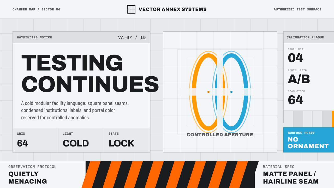 Aperture ScienceSterile authority. Cool panel seams, Archivo signage, and sparse orange-blue…冷峻权威:冷灰板缝、Archivo 标识与稀疏橙蓝光环。
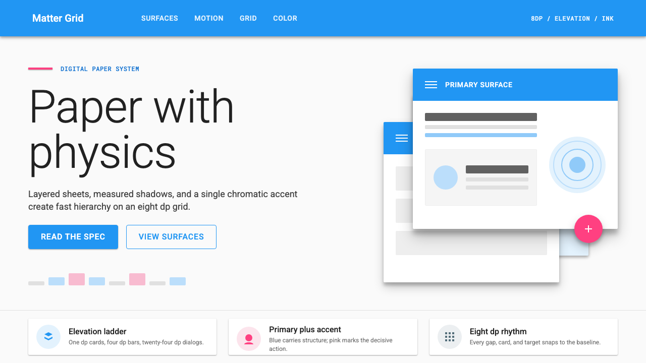 Material Design 1.0Depth made flat usable. Blue app bars, pink FABs, 8dp grids, and crisp paper…让扁平拥有深度:蓝色应用栏、粉色FAB、8dp网格与纸张投影。
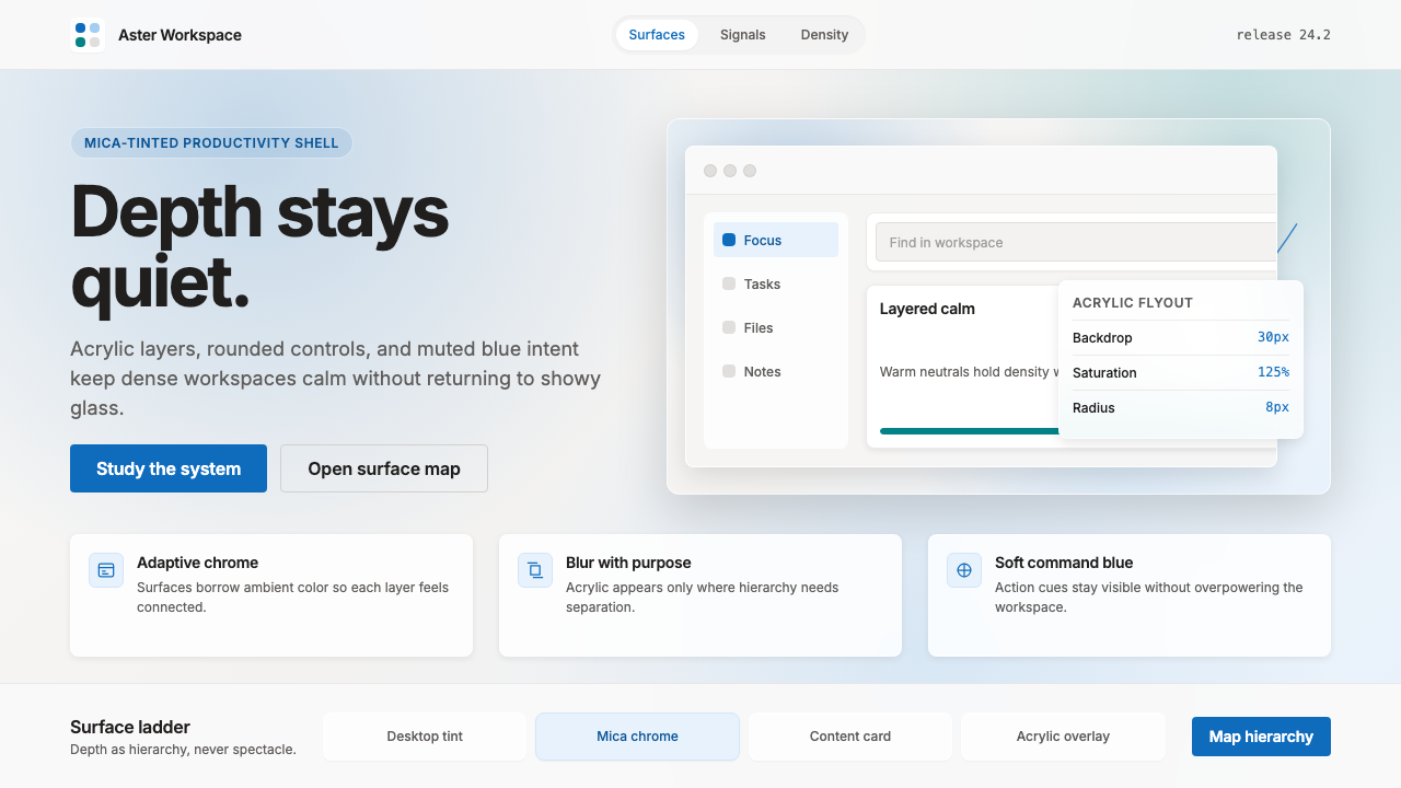 Microsoft Fluent 2Disciplined translucency. Warm Mica neutrals, acrylic blur, and muted blue cr…有纪律的半透明:暖 Mica 中性色、亚克力模糊与低调蓝营造沉稳层次。
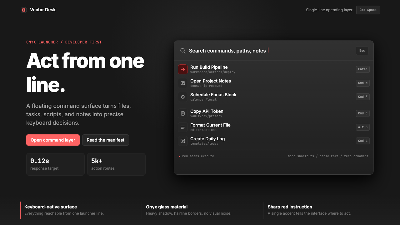 Raycast Spotlight Launcher (2023)Obsidian confidence. Sharp red cuts through Inter rows and mono shortcut chip…黑曜石般自信。锐红切过 Inter 行与等宽快捷键。
 Cursor IDEAI-first code editor. Pure dark surfaces, off-white text, electric blue reser…以 AI 为核心的代码编辑器:近乎纯黑背景、柔白文字、唯一的电光蓝色专为 AI…
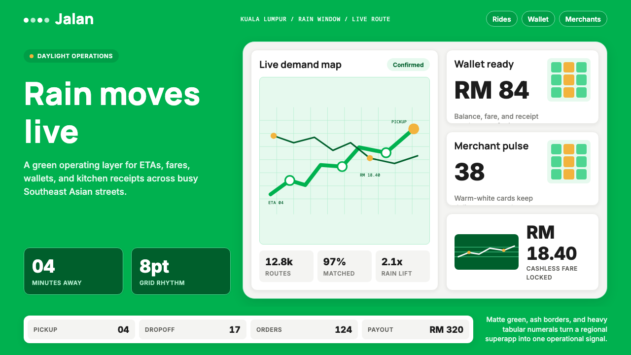 Grab SEA Superapp 2018Operational warmth. Saturated green, Inter numerals, and tight dashboard card…高效而温暖。饱和绿、Inter数字与紧密卡片塑造实时感。