What is Oblivion Sky Tower?
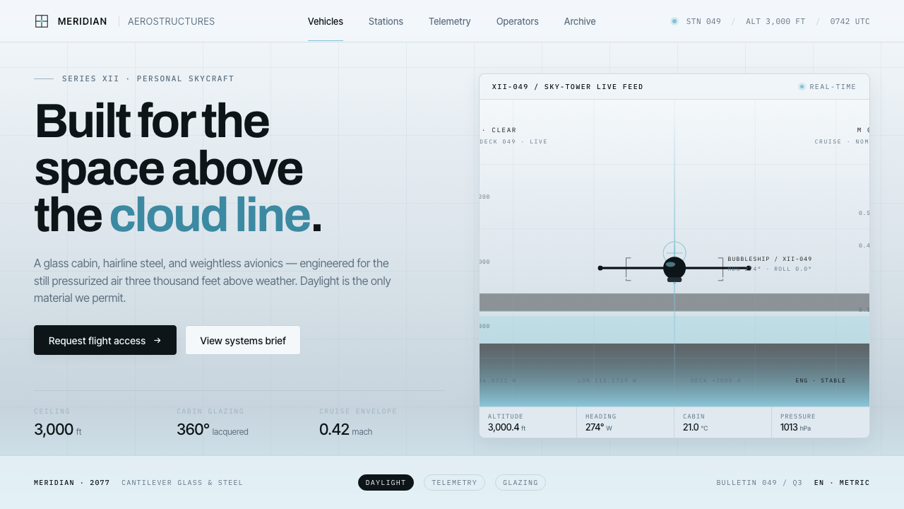
Oblivion Sky Tower turns daylight into a futuristic material: a sterile cloud-sea of pale glass, steel precision, and one controlled cyan signal.
Oblivion Sky Tower in brief
Oblivion Sky Tower is the visual world associated with Joseph Kosinski’s Oblivion, released in 2013 and set in a post-war 2077. Its defining setting is a Sky Tower suspended above an endless cloud deck: a clinical residence made from bright lacquered surfaces, glass, and steel. The result is futurism without darkness. Rather than imagining the future as a neon city, a bunker, or an industrial machine room, it imagines a carefully protected altitude where reflected daylight removes almost every trace of visual noise.
The style can be understood as Mies-van-der-Rohe minimalism projected into a clean-tech future. The surfaces are cool, pale, and exacting; the architecture reads through planes, seams, transparent boundaries, and slender structural lines. It is deliberately sterile, but not hostile. The atmosphere depends on high-key brightness, broad open space, and the suggestion that the cloud layer below is both landscape and blank canvas.
As an interface language, Oblivion Sky Tower treats a cool blue-grey near-white field as its primary environment. Glass-steel grey becomes the supporting material, thin mullion-like borders organize content, and a cloud-cyan glow acts as the singular active signal. Black is exceptional rather than foundational: it belongs to screens, deep apertures, and the bubbleship, creating contrast through rarity. The style is neither warm nor purely white; its restraint comes from cold reflected light.

Where does Oblivion Sky Tower come from?
The style begins with Oblivion’s Sky Tower, a Hollywood vision of an orbital home above Earth. The film’s setting establishes the central visual contradiction: it is a post-war future, yet the domestic environment is not visibly scarred or overloaded with equipment. Instead, the tower isolates its inhabitants above the cloud deck, making distance, cleanliness, and controlled observation part of the aesthetic. The apparent calm is inseparable from its altitude.
The source material identifies Mies and International Style minimalism as one of the system’s principal influences. That connection appears in the authority given to glass, steel, open planes, and structural division. Nothing needs decorative camouflage. A border can read as a mullion, a pale panel can read as lacquered architecture, and an empty field can read as the cloud sea beyond the tower. The visual language gains its force by allowing construction-like order to remain visible.
A second influence is Apple-era clean-tech futurism. This is not a reference to consumer branding so much as an operational mood: immaculate surfaces, reduced interfaces, smooth technological confidence, and a belief that complex systems should appear calm. In Oblivion Sky Tower, technology is not made legible through exposed mechanics or dense controls. It is framed as a pristine service environment, lit by pale daylight and relieved by rare dark display surfaces.
Joseph Kosinski, Claudio Miranda, and Darren Gilford are named as key figures in the source material. Together, those names anchor the style in a film-specific visual system rather than a generic futuristic category. The resulting vocabulary is narrow by design: sky-grey glass, steel-grey structure, bright cloud-like grounds, and a cyan glow with unusual visual responsibility. Its strength lies in sustaining that limited world without introducing warmth, ornament, or conventional sci-fi clutter.
What defines the Oblivion Sky Tower look?
Cloud-Sea Light
Brightness is the environment, not a finishing effect. Pale reflected daylight fills the composition so that panels, backgrounds, and open space appear to belong to the same aerial atmosphere. The ground should feel cool and near-white rather than blank or clinical in isolation. This high-key treatment makes darkness feel purposeful whenever it appears.
Glass and Steel
Glass-steel grey accents provide the system’s material vocabulary. They should suggest transparent architecture, lacquered panels, and precise structural joints rather than heavy industrial hardware. The visual temperature remains cool throughout. Surfaces are clean and restrained, with separation achieved through subtle material contrast instead of decorative pattern.
Hairline Mullions
Fine borders act like steel mullions in a glazed facade. Their role is architectural: they divide space, establish alignment, and give pale fields enough tension to remain legible. They should never become a decorative frame around everything. A small number of disciplined seams is more faithful than a dense web of card outlines.
Single Cyan Signal
Cloud-cyan is the style’s most concentrated accent. It is not a general-purpose decorative color; it marks activation, focus, connection, or a point of technological energy. Because the surrounding world is pale and steel-toned, one crisp cyan glow can organize attention without competing with the layout. Repeating many unrelated accent colors breaks this logic immediately.
Rare Black
Black belongs to exceptional objects: screens, deep apertures, and the bubbleship. Used this way, it creates a decisive interruption inside an otherwise luminous system. It should read as a technological void or a reflective display surface, not as a default background. Large dark regions can be effective, but only when they preserve the sense that black is an intrusion into daylight.
Sterile Precision
The tower’s cleanliness is compositional as much as material. Elements appear carefully placed, surfaces are free from visual debris, and every division seems intentional. Sterility here does not mean lifelessness; it means that the interface avoids incidental texture, nostalgic warmth, and expressive clutter. The resulting calm should feel maintained, monitored, and slightly unreal.

Who shaped Oblivion Sky Tower?
Kosinski is named as a key figure for Oblivion Sky Tower. The source material locates the system in his 2013 film Oblivion, whose Sky Tower provides the style’s central spatial image: a bright, clinical glass-and-steel home above the cloud deck. That film setting gives the design language its unusual combination of domestic calm, orbital distance, and controlled futurism.
Claudio Miranda is identified in the source material as a key figure associated with the theme. Within the approved visual description, the important contribution is the image world itself: pale daylight reflected across lacquered glass-and-steel surfaces, an expansive cloud-ground, and contrast reserved for exceptional dark screens or vehicles. The style depends on this disciplined relationship between light and scarcity.
Darren Gilford is also listed as a key figure in the source material. The Sky Tower vocabulary associated with the theme is notable for how little it needs to communicate futurity: glass, steel, bright planes, and a single cyan glow are enough. This economy keeps the setting from becoming a general sci-fi collage and makes its minimalism feel designed rather than merely empty.
How do you use Oblivion Sky Tower today?
For presentation covers, use the Sky Tower atmosphere as a field of controlled altitude. A cool near-white ground should carry most of the page, while a dark screen-like plane or a precise glass-grey division establishes the main focal structure. Place the title with generous surrounding air and reserve the cyan glow for one consequential point: a key word, directional cue, or small luminous interface element. The cover should feel observed through clear glass, not decorated for spectacle.
For content slides, treat pale space as an active organizing surface. Build hierarchy with careful alignment, restrained type contrast, and a limited number of mullion-like rules. A dark module can contain a video, image, or decisive metric, while surrounding pale panels preserve the daylight world. Data slides are especially effective when charts are rendered as quiet technical displays: steel-grey structure, dark information wells, and cyan used only to identify the current series, selected condition, or central reading.
For web interfaces, Oblivion Sky Tower suits dashboards, control rooms, monitoring products, and pricing pages that need to project calm technical confidence. Use the cloud-like ground to prevent dense information from becoming oppressive. Group content through fine borders and broad spacing rather than soft decorative containers. Screens, code views, media windows, or high-consequence status areas can turn dark, but the larger application should retain the impression of a bright glass environment surrounding them.
For editorial and marketing work, the style is strongest when the page behaves like an architectural sequence. A pale opening section can establish atmosphere, a dark visual interruption can introduce the product or story, and subsequent sections can return to glass-grey divisions and open cloud-like space. Marketing imagery should be cropped or framed as a view through a controlled system rather than as expressive lifestyle decoration. The language works well for products that value precision, observation, clean technology, or high-trust operational clarity.
The common mistake is to translate the theme into generic icy sci-fi: dark backgrounds everywhere, many electric accents, glowing borders on every component, and decorative technical noise. That reverses the source system. Oblivion Sky Tower is bright first, cool second, and luminous only at selected points. Another mistake is making the background pure white or adding warm cream, beige, or gold details; both erase the specific sensation of reflected blue-grey daylight. The style succeeds through controlled scarcity, not through visible futurist excess.

Oblivion Sky Tower — FAQ
Is Oblivion Sky Tower a dark sci-fi style?
No. Its contrast can include black screens and the bubbleship, but the governing condition is high-key reflected daylight. The defining field is a cool sky-grey near-white cloud environment, supported by pale glass and steel. If dark surfaces begin to dominate the page, the result moves away from Sky Tower and toward a more conventional sci-fi interface.
Why is cyan used so sparingly?
The source system specifies a single crisp cloud-cyan glow against a pale, steel-toned world. Its power comes from concentration. When cyan is reserved for focus, activation, or a technological point of energy, it can direct attention immediately. When it is scattered through badges, links, borders, and backgrounds, it becomes ambient decoration and loses the controlled clarity that defines the style.
How should borders behave in this style?
Borders should behave like hairline steel mullions in a glass structure. They establish alignment, separate functional regions, and make pale surfaces legible without making the interface feel boxed in. Use them as a small architectural vocabulary, not as a universal card treatment. If every object receives the same outline, the system becomes diagrammatic in the wrong way and loses its aerial calm.
Can the style work for data-heavy dashboards?
Yes, provided the dashboard preserves broad pale space and a clear contrast hierarchy. The style is well suited to monitoring and control contexts because thin structural divisions can organize information without adding decorative mass. Let dark display areas contain the densest readings, use steel-grey structure for secondary information, and reserve cyan for the selected or consequential state. The aim is a calm instrument panel, not a neon command center.
What most quickly breaks the Oblivion Sky Tower mood?
Warmth and visual accumulation are the fastest ways to break it. Warm neutrals, gold-like accents, textured surfaces, crowded icon systems, or repeated colorful glows all conflict with the approved vocabulary of cold daylight, glass-steel restraint, and a single cyan signal. Pure white can also fail, because the style’s light has a sky-grey cast. The essential test is simple: does the interface feel suspended above clouds, or merely minimal?
Related design styles
 Aperture ScienceSterile authority. Cool panel seams, Archivo signage, and sparse orange-blue…
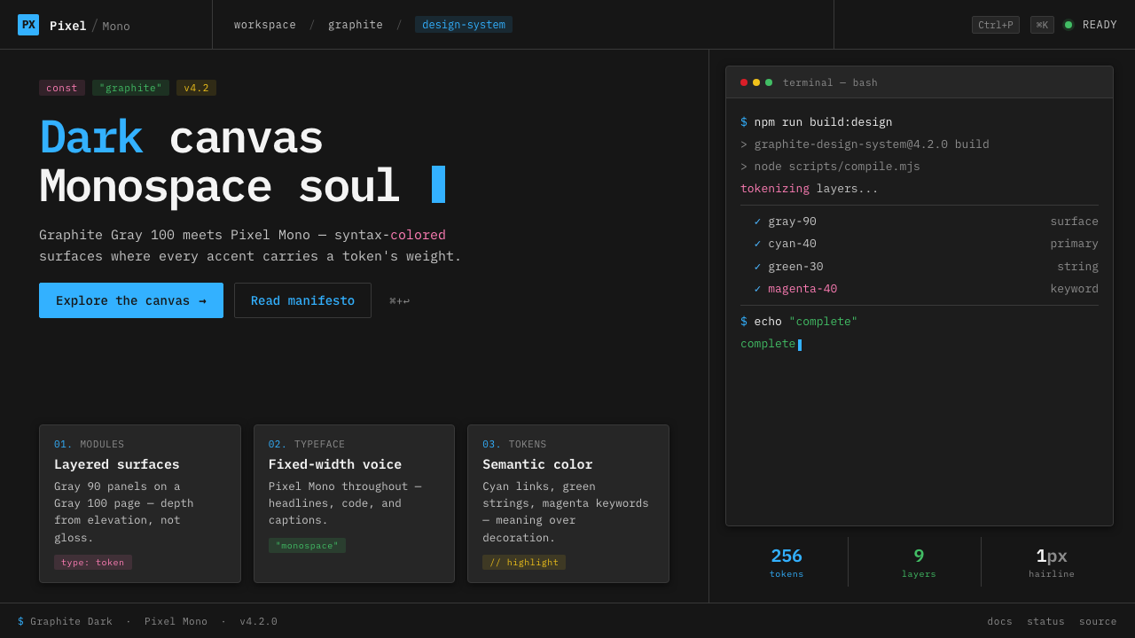 IBM Plex Mono DevColor used like syntax highlighting. Carbon Gray 100 canvas, IBM Plex Mono th…
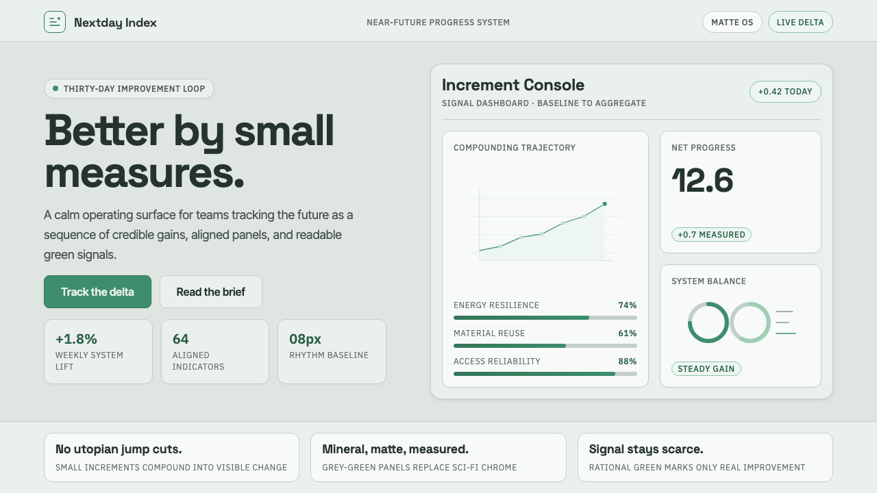 ProtopiaCalm progress, not sci-fi hype. Mineral grey-green grids make every small gai…
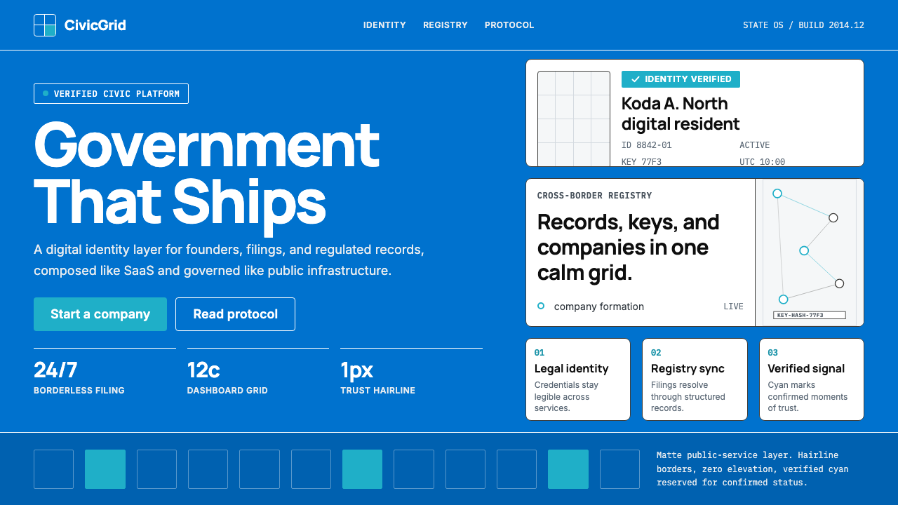 Estonia e-Residency Digital (2014)Trust without weight. Cornflower blue, 12-column grids, and cyan verified sig…
 Corian Solid SurfaceSeamless matte calm. Glacier White floats over cool grey shadow with neutral…
 Microsoft Fluent 2Disciplined translucency. Warm Mica neutrals, acrylic blur, and muted blue cr…