What is Cryosleep Transit Ward?
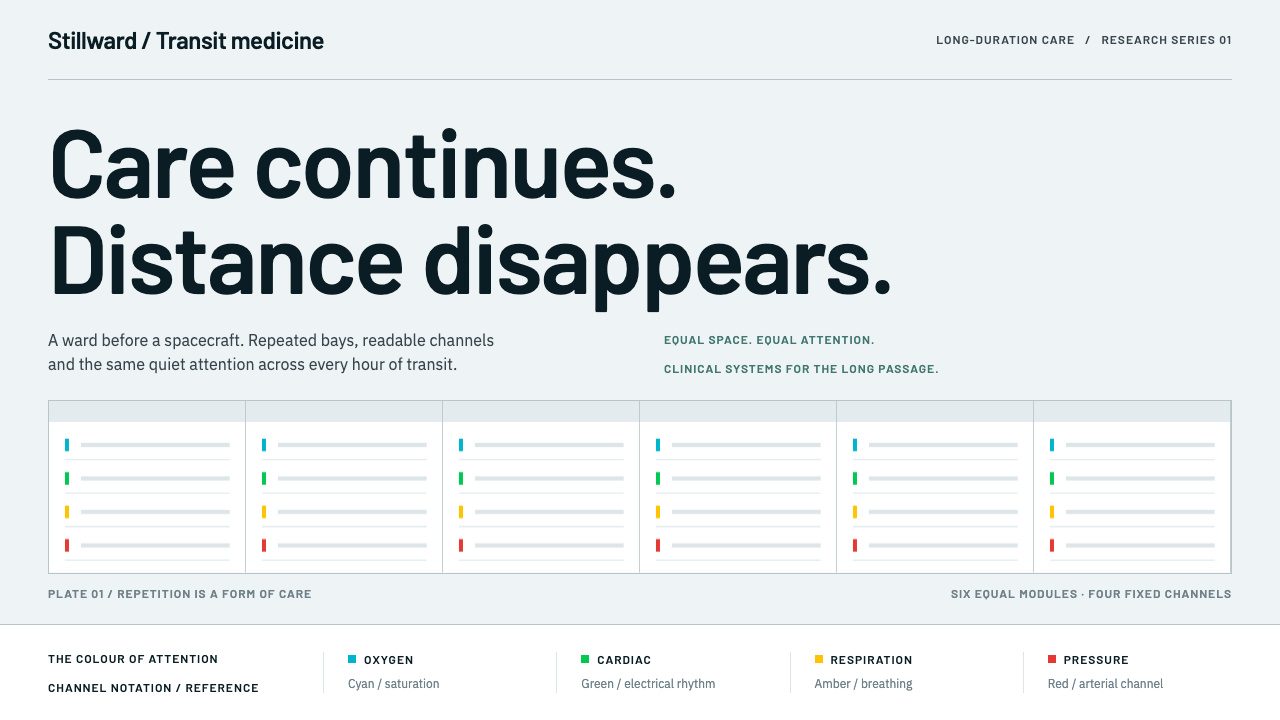
Cryosleep Transit Ward is care without spectacle — clinical white, identical bays in even rows, and the fixed colors of patient monitors, borrowed from a hospital ward rather than from science fiction.
Cryosleep Transit Ward in brief
Cryosleep Transit Ward is a design system for a ward that happens to be aboard a spacecraft. It starts from a simple observation: a torpor ward is a ward before it is a spacecraft. The image it builds is not a glowing cryo-pod from a film, but rows of matte white pod shells in identical bays, under diffuse, shadowless light, with a monitor beside each bed reporting in the same four colors every time.
The surface language comes from the equipment, not the fiction. Core temperature is lowered gradually, and every number along that descent is read off a monitor whose colors are convention: cyan for blood-oxygen saturation, green for the heart trace, amber for respiration, red for pressure and alarms. The design lifts those conventions directly and treats them as a fixed alphabet. A color that means one thing on one monitor means the same thing everywhere on the page.
The result reads like a ward chart: legible, evenly lit and quiet about itself. It does not try to make the viewer feel awe or fear. It tries to make them feel looked after, and to let a trained eye find the one number that has changed. For designers, it is a lesson in how much authority comes from consistency, and how little decoration clinical clarity needs.
Where does Cryosleep Transit Ward come from?
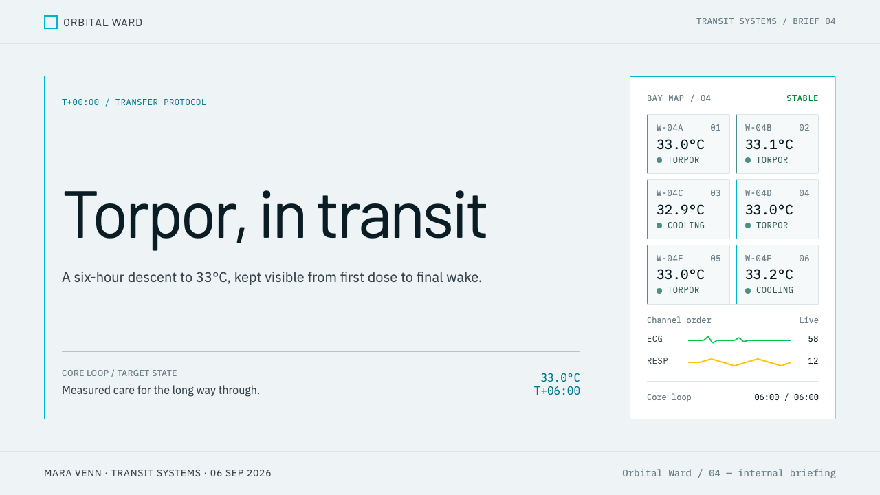
The theme takes its starting point from a piece of aerospace engineering. SpaceWorks' 2013 study for NASA's NIAC program, which funds early-stage advanced concepts, imagined a Mars crew placed in torpor for ninety days to six months. The saving is physical: the habitat shrinks from roughly 8.2 by 9 meters to 4.3 by 7.5 meters, and its mass falls from about 31 tonnes to about 15. What that buys, visually, is rows. A crew that sleeps can be stored in identical bays, and the interior becomes a pattern of matte white pod shells under diffuse, shadowless light.
Behind the study lies a clinical lineage that the source dates from the 1960s to the present: therapeutic hypothermia, now often called targeted temperature management. In intensive-care and operating-theatre practice, a patient's core temperature is deliberately lowered and held. In the torpor concept it is walked down by about one degree Celsius per hour to between 32 and 34 degrees. Systems such as the Medivance and later BD Arctic Sun, named in the source, represent the equipment side of that practice. The theme looks like a ward because it is descended from wards.
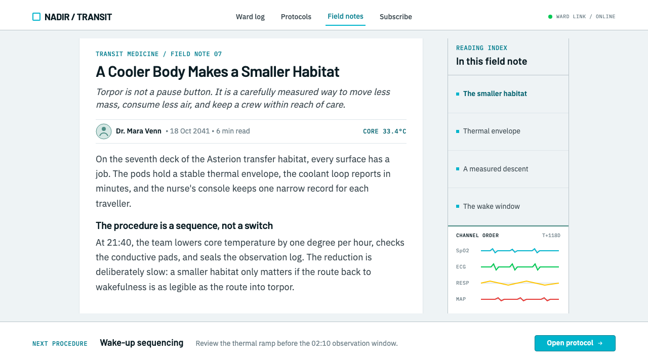
The color vocabulary is the most distinctive thing the theme inherits. Patient monitors follow a convention that nurses and doctors read without thinking: cyan for SpO2, green for the ECG, amber for respiration, red for pressure and alarms. The source adds a detail about surgical green. Green sits opposite red on the color wheel, so the red afterimage left by blood and tissue sinks into green fabric and does not wander across white walls. A muted green therefore appears in operating theatres for a physiological reason, and the theme keeps it as a supporting tone.
The typographic lineage is stated just as precisely: Swiss medical-device labelling in the tradition of Frutiger and Univers, the neutral grotesque sans-serifs designed to be read quickly and without ambiguity on equipment. Together with therapeutic hypothermia, they are the two movements the source names. Its region is aerospace medicine in the United States, together with the ICU and the operating theatre. John Bradford and SpaceWorks stand for the torpor concept, and Medivance and BD Arctic Sun for the clinical devices. The theme combines them into a single look: a ward chart set in a spacecraft.
What defines the Cryosleep Transit Ward look?
Clinical White
The surface is matte white, like the shell of a pod or the wall of a ward. It is a plain, even white without warmth or texture, so that the colors of the monitors can be read precisely against it. White here is not an absence of design but a working condition: it keeps the page clean enough for a single changed number to be noticed.
Equal Bay Grid
Layouts are built from identical bays arranged in rows. Every module is the same size, with the same internal structure and the same spacing. This repetition is the source of the system's calm and also its practicality: because the bays are equal, a viewer can compare them at a glance and see the one that differs.
Shadowless Light
Illumination is diffuse and even. There are no cast shadows, no dramatic highlights and no glowing edges. Depth is conveyed by structure and overlap, not by lighting effects. The visual impression is of a room lit from everywhere at once, which is exactly what a ward needs so that nothing hides.
Monitor Colors
Four colors are fixed by convention: cyan for SpO2, green for ECG, amber for respiration, and red for pressure and alarms. Their assignments never change from one place to the next. In use, this means each data channel keeps its color throughout, and red is reserved for what needs urgent attention, never for decoration.
Surgical Green
A muted green plays a supporting role as a surface tone, the color of drapes and cloth. It exists because green sits opposite red on the color wheel, absorbing the afterimage of blood and tissue. It must stay clearly different from the brighter ECG green so that decoration and signal cannot be confused.
Ward-Chart Typography
Type follows the Swiss medical-labelling tradition of Frutiger and Univers: neutral, open and highly legible grotesque sans-serifs, with numerals that line up in columns. Hierarchy is created by size and weight within a single family, and tables are treated as the main content, because the page is something to be read at a glance and checked.
Quiet Hierarchy
The system never raises its voice. Headings are modest, spacing is generous and emphasis is rare, so that a real alert has force when it appears. The tone is the tone of care without spectacle: attentive, even and unhurried, with the information, not the interface, as the thing that matters.
Who shaped Cryosleep Transit Ward?
John Bradford is named in the source in connection with SpaceWorks and its torpor-habitat work. As a figure he represents the engineering imagination behind the idea of putting a Mars crew to sleep, and the practical discipline of asking what that would change in a habitat. The theme borrows that practicality rather than the romance of the idea.
SpaceWorks' 2013 study for NASA's NIAC program is the concrete starting point of the theme. By working out how torpor would shrink a Mars habitat in volume and mass, it turned a science-fiction trope into an engineering plan with dimensions. That is why the theme looks like a floor plan of identical bays and not like a film set.
Arctic Sun is a patient temperature-management system used in intensive care, named in the source to represent the clinical equipment behind therapeutic hypothermia. Its place in the list roots the theme in real hospital practice: lowering and holding body temperature is a routine medical procedure with its own devices, displays and labelling, and that is what the design imitates.
How do you use Cryosleep Transit Ward today?
Cryosleep Transit Ward suits any product or message where trust, calm and legibility matter more than excitement: health technology, monitoring, infrastructure, logistics, safety communication and anything that has to report on many similar things at once. Its signature move is repetition. If your content can be expressed as a row of equal units, each with a small set of readings, this is the system to reach for.
For presentation slides, a cover can be an even field of white with a row of identical bays and a quiet title, no illustration needed. Content slides work as ward charts: a grid of equal modules, a small set of labeled readings in each and a single highlighted exception. Data slides are the strongest case, because the four monitor colors give a ready scheme for multi-series charts. Keep each series in its assigned color across every slide and use red only for the point that needs a decision.
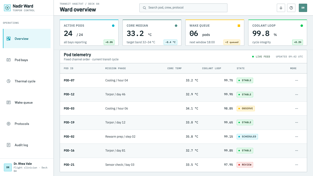
For web interfaces, the style is a natural fit for monitoring dashboards, patient or fleet status boards, device consoles, uptime pages and admin tools. Build the layout from equal cards on a pale ground, with no shadows, set values in a neutral grotesque with aligned numerals, and let color indicate channel or state in the same fixed way everywhere. Alert states should be rare and unmistakable. Avoid decorative gradients, glassy panels and animated glows that would add noise to a surface designed to be calm.
For editorial and marketing work, the style gives a trustworthy, explanatory voice. It suits longform pieces about medicine, spaceflight, systems design and the human side of technology, where diagrams of identical units can carry the argument. A campaign for a health or safety product can use the quiet ward-chart look to say that care is dependable. Captions should be plain, factual and brief, in the register of a clinical note.
The most common mistake is to treat the subject as science fiction and add the clichés: icy blue gradients, glowing capsules, mist and neon. That throws away the one thing the theme is built on, which is that it looks like equipment and not like a film. The second mistake is to use the four monitor colors loosely, for example making cyan a brand accent or using red for emphasis. Once the colors stop meaning something fixed, the whole page loses its clinical clarity.
Cryosleep Transit Ward — FAQ
Is this a science-fiction style?
No. Its subject is a spacecraft, but its look is borrowed from hospital equipment, not from film. The surface language comes from patient monitors, ward labelling and the clinical practice of lowering body temperature. If a visual element would not appear in an intensive-care unit, it probably does not belong in this style.
Why are the monitor colors fixed to specific meanings?
Because they are conventions that clinicians read without thinking: cyan for SpO2, green for ECG, amber for respiration, and red for pressure and alarms. A fixed mapping lets the eye find a channel instantly and trust a color to mean the same thing everywhere. Reassigning them for aesthetic reasons would turn a legible code into decoration.
What is the muted green for?
It is the surgical green of drapes and fabric. Green sits opposite red on the color wheel, so the red afterimage left by blood and tissue sinks into it instead of drifting across white walls. In the theme it plays a supporting role as a surface tone, and it should stay clearly distinct from the brighter ECG green.
Can I use a dark background?
It is not recommended. The theme is built on matte white shells under diffuse, shadowless light, and the monitor colors are read against that clean field. A dark ground would push the design toward the glowing cryo-pod cliché that the style avoids. If you must work dark, keep the equal bays and the fixed colors, but expect to lose some of the clinical feel.
Where does the style struggle?
It struggles where warmth, play or strong emotion are the point: children's products, food and lifestyle brands, entertainment and anything that depends on personality. Its quiet, even tone can read as impersonal there. It works best where the reader wants reassurance, precision and the sense that someone has checked every number.
Related design styles
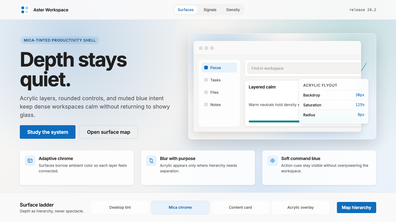 Microsoft Fluent 2Disciplined translucency. Warm Mica neutrals, acrylic blur, and muted blue cr…
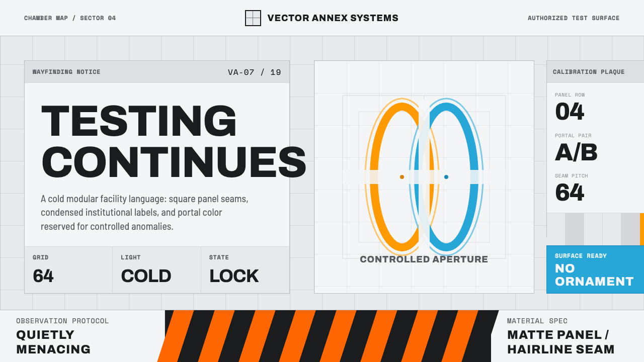 Aperture ScienceSterile authority. Cool panel seams, Archivo signage, and sparse orange-blue…
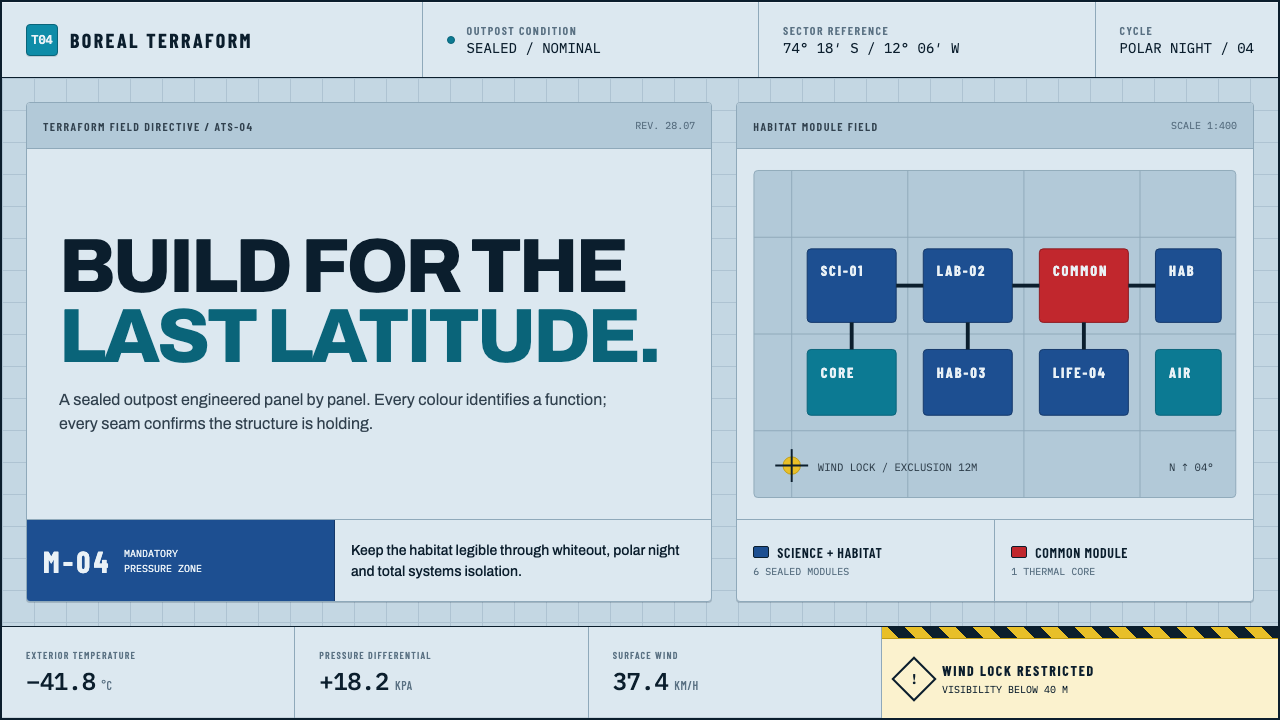 Arctic Terraform StationEvery colour carries a duty. Sky-blue panels, coded modules and hard seams en…
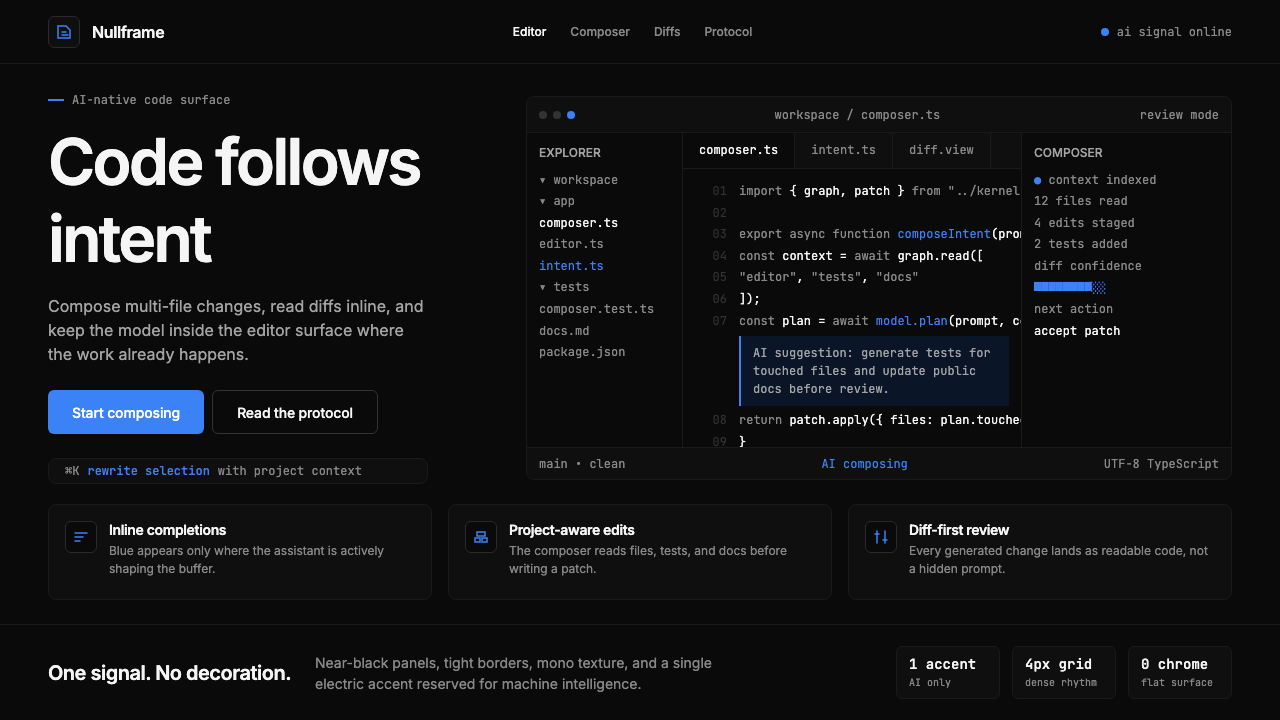 Cursor IDEAI-first code editor. Pure dark surfaces, off-white text, electric blue reser…
 Ex MachinaClinical control, made visible. Concrete gray, cyan glass, LED seams, one woo…
 Oblivion Sky TowerSterile daylight futurism. Cool sky-grey glass, hairline steel mullions, a si…