What is Arctic Terraform Station?
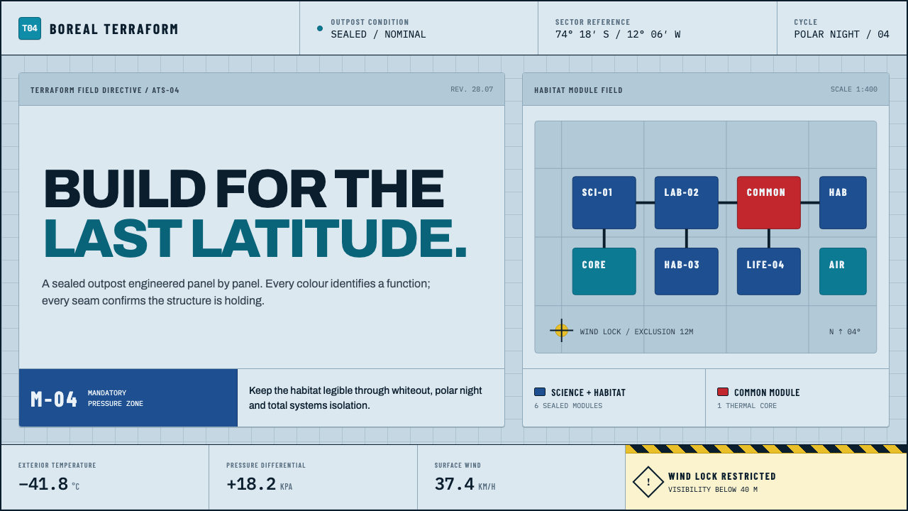
In Antarctica, color is not decoration — it is a safety spec and a treatment for the dark, and this system borrows both duties without softening either.
Arctic Terraform Station in brief
Arctic Terraform Station is a design language drawn directly from how real polar research stations are actually built and painted, rather than from any artist's impression of the far south. Antarctic buildings are assembled from sealed, insulated composite panels, and the colors applied to those panels are specified by engineers and behavioral scientists for reasons that have nothing to do with taste: UV-stable pale blue steel cladding at Rothera's Discovery Building, blue science modules and a single red social module at Halley VI, chosen specifically to counter the psychological weight of months of continuous darkness.
This system treats that logic as its foundation. The page ground is a pale, specified sky-blue — the exact hue a polar-station cladding contractor would order, not a soft tint of white and not a decorative pastel. Interface and content modules are distinguished by hard color blocking the way physical station modules are color-coded for orientation, and a single alert yellow is reserved exclusively for elements that signal real hazard, echoing the international safety-color conventions used on the ice itself.
The overall effect reads as engineered rather than styled: seams stand in for shadows, joints stand in for grid lines, and every color choice can be traced back to a functional justification — visibility in whiteout conditions, psychological relief during polar night, structural legibility of one module against another — rather than an aesthetic preference applied after the fact.
Where does Arctic Terraform Station come from?
The reference point for this system is the British Antarctic Survey's network of research stations, most directly Rothera Research Station on Adelaide Island and Halley VI on the Brunt Ice Shelf. Rothera's Discovery Building, a modern hub for the station, is clad in UV-stable steel panels finished in a specified sky-blue — a color chosen for durability against the polar light regime and for visibility against snow and ice, not for any decorative reason.
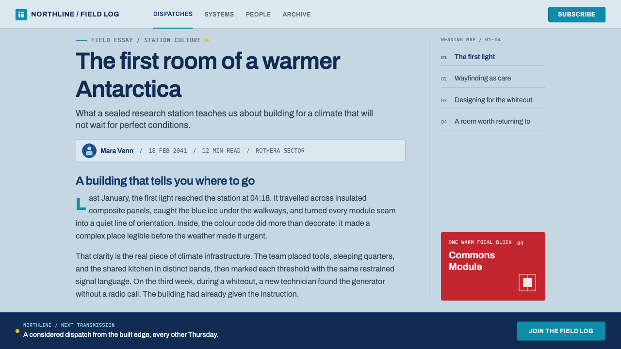
Halley VI, designed by Hugh Broughton Architects with engineering by AECOM, took the color logic further by folding it directly into the psychology of overwintering. The station is built as a chain of relocatable modules — since the Brunt Ice Shelf itself moves and calves, the whole structure sits on hydraulic legs and skis so it can be towed to a new position. Most of these modules, which hold laboratories and sleeping quarters, are painted blue. One module, the one built specifically for communal life, dining, and recreation during the long polar night, is painted red. The choice was deliberate: red was selected to counter seasonal affective disorder among a crew facing months without sunrise, a fact that made Halley VI as much a piece of applied color psychology as it is a piece of architecture.
The specific color specification behind these choices — working with a professional color house, Colour Effects, among the consultants credited with the station's palette — situates the project within a broader tradition of modular polar architecture that dates from the early 2000s onward, when relocatable, panelized construction replaced older, fixed Antarctic buildings that could be buried or crushed by accumulating snow and ice.
The same instinct toward color-as-function connects this architecture to the internationally recognized ISO 3864 system of safety colors, which assigns specific hues to specific categories of hazard and instruction across industrial and institutional settings worldwide. A polar station operating at the edge of survivable conditions has no room for a color palette chosen by taste; every hue earns its place by helping a crew member read the environment correctly, quickly, and without ambiguity.
What defines the Arctic Terraform Station look?
Specified Sky-Blue Ground
The base surface is a pale, cool blue that reads as a specified engineering material — the exact panel color a polar-station contractor would order — rather than a soft decorative tint of white. It carries the same UV-stable, high-visibility logic that governs real Antarctic cladding.
Hard Color-Coded Modules
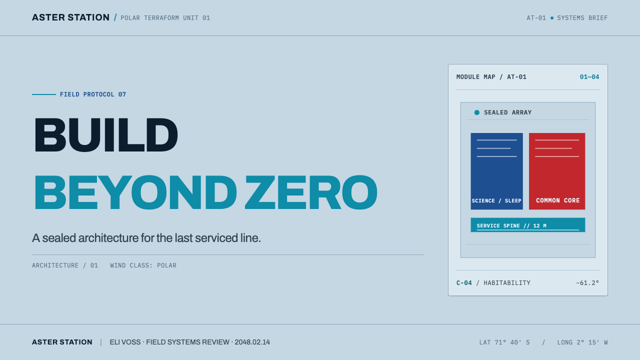
Content and interface areas are distinguished by solid, unblended blocks of color rather than gradients or soft tonal shifts, mirroring the way physical station modules are painted distinct colors for orientation and function. Each block reads as a self-contained unit, the way a shipping-container-style module reads as one sealed piece.
Signal Yellow, Reserved
A single hard yellow appears only where something can genuinely cause harm — an alert, a warning, a critical action — and nowhere else. It is never used decoratively or for routine emphasis, which is exactly what preserves its meaning as a hazard signal on the ice.
Seam as Structure
Where most interfaces use a soft, diffuse drop shadow to separate elements, this system uses a hard line that reads as a pressed panel joint — a seam, not a glow. Depth is implied by the logic of sealed composite panels bolted together, not by simulated lighting.
Grid as Panel Joint
The underlying layout grid is presented as if it were the visible joint lines between physical composite panels, giving structure a literal, material justification rather than an abstract compositional one. Sections align to these joints the way real modules bolt together at their seams.
Instrument-Grade Monospace
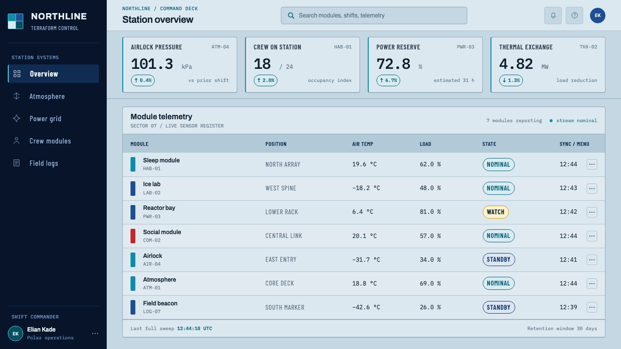
Numerical readouts and data are set in a monospaced face that reads as calm, verifiable, and instrument-like — the way a gauge or a dashboard display presents numbers meant to be checked against reality rather than admired.
No Ambient Softness
Nothing fades, blurs, or glows ambiently. Every edge is a decision, consistent with a physical environment where soft edges — fog, whiteout, a blurred horizon — are actively dangerous rather than atmospheric.
Who shaped Arctic Terraform Station?
This practice designed Halley VI, the relocatable Antarctic research station whose color scheme — blue science and sleeping modules answered by a single red social module — is one of the direct real-world references behind this system's module-based, function-coded color blocking.
AECOM provided the engineering behind Halley VI's hydraulic-legged, ski-mounted modules, which must be relocatable because the Brunt Ice Shelf they sit on is itself in slow motion. The engineering discipline behind a building that has to survive and move across an ice shelf underlies this system's insistence on hard seams and sealed, panel-based construction logic.
The organization operates both Rothera and Halley VI, and its practical requirements — UV-stable cladding, whiteout-visible colors, psychological support for overwintering crews — are the source of the functional color logic this system borrows directly, rather than reinterprets.
Named among the consultants behind the specified palette used on these stations, the involvement of a dedicated color house underlines that every hue on an Antarctic building has been through a specification process as rigorous as any structural material choice — precisely the standard this system holds itself to.
How do you use Arctic Terraform Station today?
This system is unusually well suited to presentation decks that need to communicate operational seriousness — infrastructure reports, engineering reviews, safety briefings, scientific field updates. A cover slide works best built from a single large color-coded block against the pale sky-blue ground, with a hard seam line rather than a shadow separating title from supporting detail. Content slides should organize around the same module logic: each slide, or each section within a slide, reads as one sealed panel, with signal yellow reserved exclusively for a genuine warning or a critical number, never for routine emphasis. Data-heavy slides benefit from the instrument-grade monospace treatment — tables and readouts that look checked, not decorated.
For web interfaces, the style is a natural fit for operational dashboards, monitoring tools, logistics platforms, and any product where the user needs to trust that color means something specific. Define a small, fixed set of hard color blocks for distinct functional zones of the interface — navigation, primary content, alerts — and hold the line on yellow appearing only for genuine warnings; diluting that discipline for a promotional banner or a marketing callout breaks the entire premise of the system. Card and panel components should use seam-style borders rather than soft shadows, and hover or active states should shift a block to a harder, more saturated version of itself rather than introducing a glow.
In editorial and long-form content, the approach supports pieces about infrastructure, exploration, climate science, or any subject where precision and functional honesty are part of the story's credibility. Pull quotes and callouts can be treated as their own sealed module, bordered by a seam rather than floated on a shadow, and photography — where used — reads best cropped hard and rectangular, like a panel itself, rather than vignetted or softly framed.
Marketing and landing pages for technical, scientific, or infrastructure-adjacent products can borrow the module-block layout directly: a grid of distinct, hard-edged color panels, each announcing one capability or fact, replaces the more common soft-card, drop-shadow layout common to consumer software. The effect reads as engineered credibility rather than polish for its own sake.
The most common mistake is using the signal yellow decoratively — as an accent color for a call-to-action button, a highlight, or a brand flourish. That single misuse collapses the entire logic of the system, because the yellow's power depends entirely on its scarcity and its exclusive association with real hazard. A second common error is softening the sky-blue ground into a pastel or adding a gradient behind it; the color needs to read as a specified, durable material, not a decorative wash.
Arctic Terraform Station — FAQ
Why is yellow used so sparingly in this system?
Because in the real Antarctic stations this system draws from, safety colors like yellow follow international conventions such as ISO 3864, where a color's meaning depends on it appearing only in genuine hazard contexts. If yellow were used freely for decoration or routine emphasis, it would lose its ability to instantly signal danger — the same reason a real polar station would never paint a decorative mural in hazard yellow.
Why is the base color blue rather than white, given the setting is icy and snowbound?
Because the reference material is specific: real station cladding, such as Rothera's Discovery Building, is painted a specified UV-stable sky-blue, not left white. White would blend into snow and reduce visibility, and it would also read as a generic neutral rather than a deliberately chosen engineering color. The pale blue is closer to what a contractor would actually order for a polar building's exterior panels.
Why is the red module in Halley VI not part of this system's color scheme?
Because this system's core identity is built around the pale sky-blue module logic, with signal yellow reserved for hazard. Halley VI's red social module is a specific, isolated design choice made for one particular function — countering seasonal affective disorder in a single communal space — rather than a recurring structural color across the whole station. Borrowing it as a general accent would dilute both the blue-and-yellow logic and the red's own specific psychological purpose.
Does this system suit consumer-facing products, not just technical ones?
It can, but selectively. Its strength is projecting operational trust and functional honesty, which works well for logistics, monitoring, outdoor and expedition brands, or any product where users want to feel that the interface is being run with engineering rigor. It is a poor fit for products built around warmth, playfulness, or emotional comfort, where the system's cool, hard-edged, safety-first character would read as sterile rather than reassuring.
How literally should the panel-seam motif be applied?
Fairly literally, but as a structural cue rather than a decorative texture. The seam should appear where a real composite panel joint would logically fall — at the boundary between two distinct functional modules — rather than scattered across a layout as a repeating pattern. Overusing it as ornament undermines the same principle that keeps the yellow meaningful: the seam works because it corresponds to something real.
Related design styles
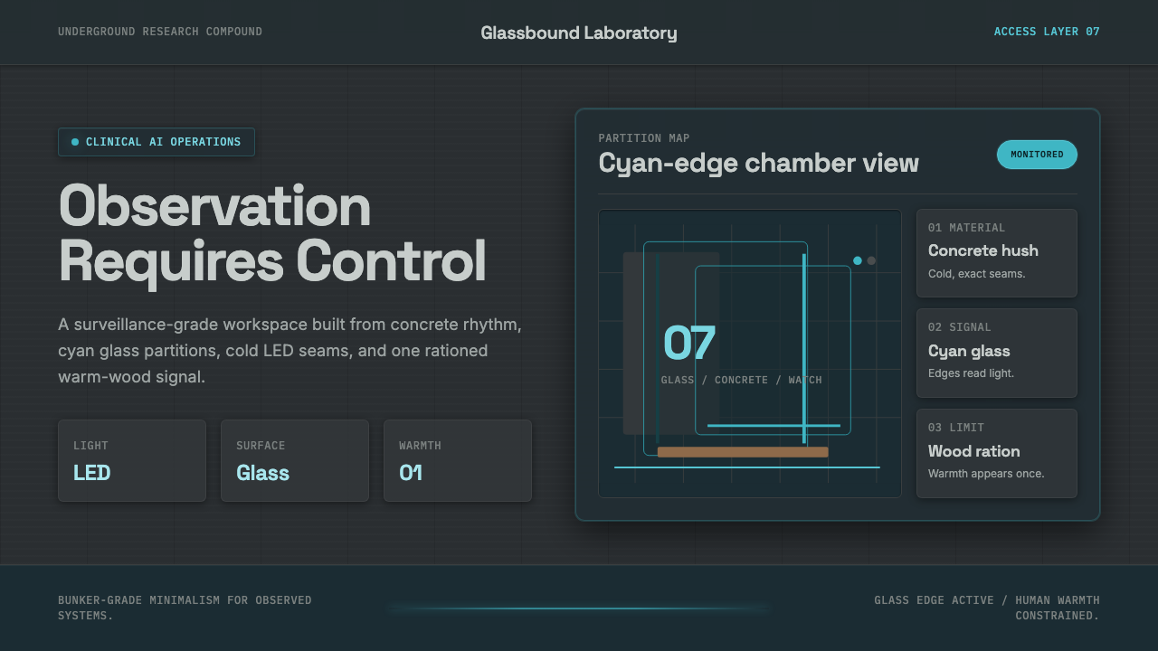 Ex MachinaClinical control, made visible. Concrete gray, cyan glass, LED seams, one woo…
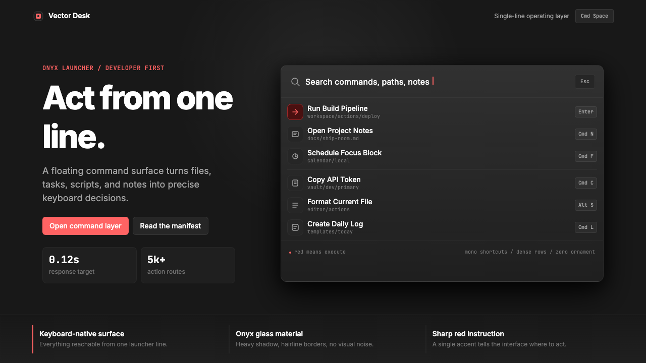 Raycast Spotlight Launcher (2023)Obsidian confidence. Sharp red cuts through Inter rows and mono shortcut chip…
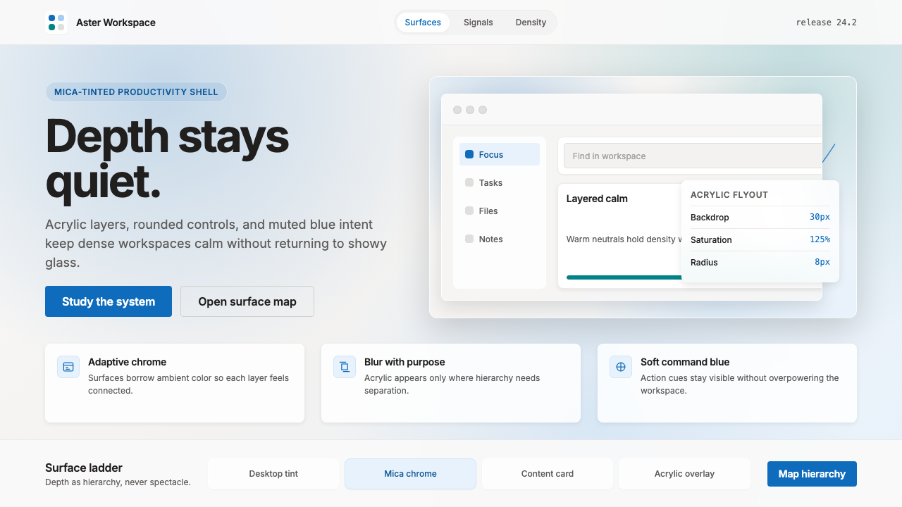 Microsoft Fluent 2Disciplined translucency. Warm Mica neutrals, acrylic blur, and muted blue cr…
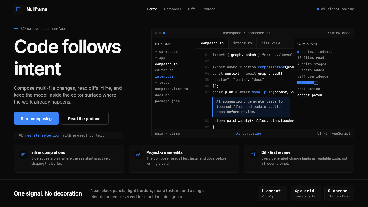 Cursor IDEAI-first code editor. Pure dark surfaces, off-white text, electric blue reser…
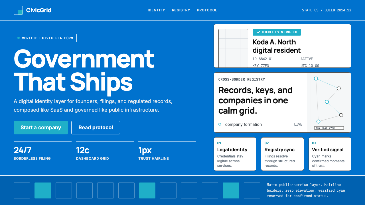 Estonia e-Residency Digital (2014)Trust without weight. Cornflower blue, 12-column grids, and cyan verified sig…
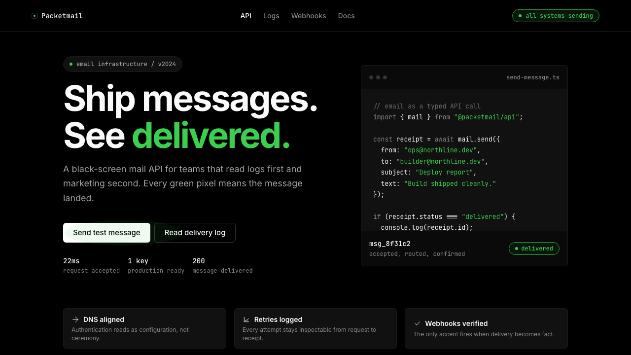 Resend 2024Clean code becomes brand. Pure black, JetBrains Mono, and one green delivered…