What is Ex Machina?
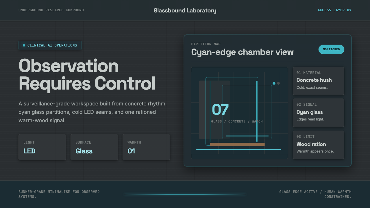
Ex Machina turns clinical control into an atmosphere — concrete gray, cyan glass, cold LED seams, and a single trace of wood enclosing intelligence under observation.
Ex Machina in brief
Ex Machina is a dark visual system distilled from the 2014 contemporary AI thriller and its buried bunker-laboratory. Its defining environment is windowless and controlled: board-formed concrete establishes a severe gray field, cyan-tinted glass divides rooms without granting privacy, and recessed LED light cuts through the architecture with clinical precision. Warm wood appears deliberately and rarely, making comfort feel allocated rather than natural.
The style belongs to the minimalist techno-thriller tradition while drawing its physical authority from brutalist-modernist interiors. It does not portray technology through decorative futurism or crowded machinery. Instead, intelligence is suggested by immaculate surfaces, restricted access, transparent barriers, and spaces that appear to measure every movement. The environment feels advanced because nothing seems accidental.
Translated into graphic or interface design, Ex Machina becomes an instrument-like language of dark concrete grounds, translucent cyan planes, narrow light seams, reflective surfaces, and tightly controlled warmth. Its central tension is visibility without freedom: glass reveals what lies beyond, yet still functions as a wall. The resulting aesthetic is elegant, unsettling, and inseparable from surveillance.
Where does Ex Machina come from?
The style originates in Ex Machina, released in 2014 as a contemporary AI and science-fiction thriller. Its drama unfolds inside Nathan's buried bunker-lab, a setting that converts questions about artificial intelligence, ownership, and observation into architecture. The laboratory is not merely a neutral container for events. Its locked, windowless character makes control spatial, while its polished order gives that control an appearance of rational necessity.
The production belongs to a Western European context: it was a UK production, with the Juvet Landscape Hotel in Norway serving as an exterior location. This geographical combination produces an important contrast. The surrounding landscape suggests openness and elemental nature, while the underground interiors replace horizon, weather, and daylight with concrete, glass, and artificial illumination. Nature remains nearby but psychologically inaccessible.
Three linked tendencies define the source language: the minimalist techno-thriller, clinical brutalist-modernist interiors, and a rule favoring hard, shiny surfaces. Minimalism removes visual noise, allowing every door, partition, reflection, and seam of light to acquire narrative force. Brutalist concrete gives the bunker mass and permanence; modernist glass introduces apparent openness; glossy surfaces make bodies and rooms available to inspection.
Alex Garland, Mark Digby, Rob Hardy, and Asa Shoul are identified among the source's key figures. Within the approved account, their collective creative context is expressed through a remarkably coherent environment rather than through isolated decorative motifs. Concrete gray, cyan glass, cold recessed LEDs, and restrained wood operate as one system. That coherence is what makes the film's atmosphere transferable to contemporary design: it can be reconstructed through relationships among surface, light, separation, and control.
What defines the Ex Machina look?
Concrete Gray
Gray is the environmental field rather than a neutral fallback. It should feel mineral, dense, and slightly varied, recalling board-formed concrete without becoming a decorative texture sample. Dark and mid-tone grays establish depth through planes, while near-black areas imply sealed rooms or inactive systems. The palette suppresses emotional color so that every illuminated or warm element appears deliberate.
Cyan Glass
Cyan is used as transmitted light, tinted glass, or a cool optical layer rather than as cheerful surface color. It works best in restrained planes that reveal content while preserving separation. Reflections and overlaps can suggest thickness, but the glass must remain architectonic: a partition, enclosure, lens, or observation window. Its beauty should never erase its function as a barrier.
Cold LED Seams
Light arrives in narrow, controlled seams, recessed bands, or precise indicators. It does not wash the composition with ambient glow. Each source appears installed for a reason: defining a threshold, exposing a chamber, marking system status, or directing attention. The discipline of the lighting matters more than brightness; cold illumination should make the surrounding gray feel cleaner, harder, and more closely monitored.
Hard, Shiny Surfaces
Surfaces are smooth enough to reflect but too severe to feel luxurious. Glass, polished planes, and sealed finishes communicate sterility and maintenance rather than indulgence. Highlights should be crisp and localized, revealing edges or reflecting nearby structures. Soft, cloudy depth weakens the style; the preferred surface language makes every contact point feel cleanable, inspectable, and resistant to human trace.
Restricted Warmth
Wood is the sole warm accent and must remain scarce. A single wood plane, inset, or object can suggest habitation inside the laboratory, but repetition turns the bunker into comfortable hospitality. Its role is psychological: warmth appears as a controlled exception that reveals how cold everything else is. The wood should feel natural and quiet, never rustic, ornamental, or nostalgically domestic.
Instrument Typography
Typography should read like labeling on a controlled apparatus: concise, orderly, and emotionally neutral. A restrained sans-serif voice suits headings, navigation, status information, and measured annotations. Hierarchy comes from contrast in scale, density, placement, and illumination rather than expressive lettering. Generous silence around short labels makes them feel authoritative, while tightly organized data suggests a system designed to observe rather than converse.
Who shaped Ex Machina?
Alex Garland is identified as a key figure in the source context of Ex Machina. The design language associated with that context binds the film's AI drama to a buried, controlled environment where transparency and confinement coexist. Its strongest lesson for designers is conceptual unity: architecture, illumination, and material restriction all reinforce the same atmosphere of measured intelligence and unequal observation.
Mark Digby appears among the approved key figures connected with the film. The visual system surrounding that credit is notable for turning a limited material vocabulary into a complete world. Concrete, glass, recessed light, and isolated wood are not treated as independent style cues; they form a hierarchy in which cold structure dominates and warmth survives only by permission.
Rob Hardy is named as another key figure in the source material. The environment associated with Ex Machina depends on controlled visibility: cold illumination clarifies surfaces, reflective planes multiply lines of sight, and cyan partitions reveal occupants without dissolving enclosure. This treatment gives the bunker its hard, surveilled quality and provides the clearest model for translating the film into screen-based design.
Asa Shoul completes the set of key figures supplied for the theme. Within the resulting visual language, color behaves less like decoration than environmental grading: concrete gray governs the field, cyan identifies optical and technological zones, and wood carries nearly all available warmth. The balance is memorable because each color family has a narrow, stable role.
How do you use Ex Machina today?
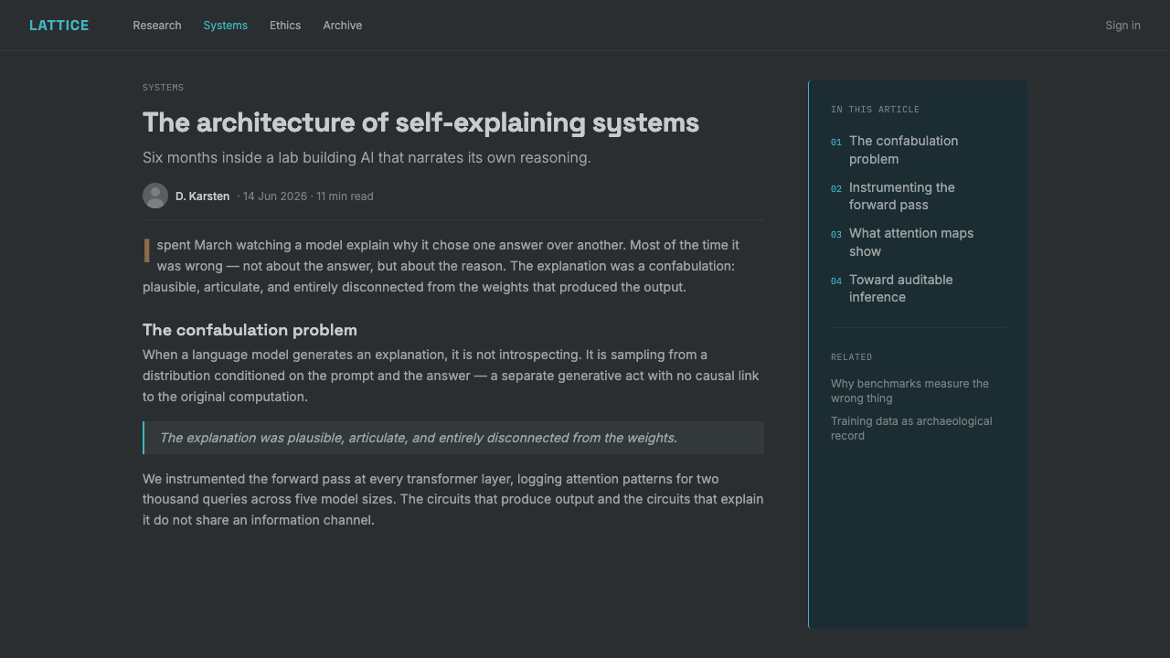
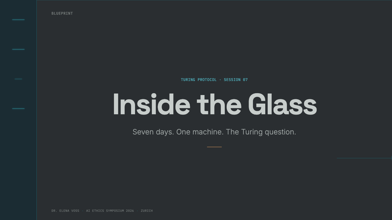
For presentation covers, establish the bunker before presenting information. A broad concrete-gray field can be interrupted by one cyan glass plane or a narrow cold light seam, with the title positioned like a room label or system designation. A small wood accent may humanize the cover, but it should remain visibly subordinate. The result should feel like entry into a restricted facility, not a generic science-fiction poster.
Content and data slides should behave like laboratory instruments. Divide information with translucent panels, sharp rules, or illuminated thresholds, and let headings remain concise. Tables, charts, and metrics benefit from pale cyan highlights against layered gray, while alerts can be made visible through increased luminosity rather than unrelated accent colors. Keep reflections restrained so that the data remains legible and the glass effect continues to imply separation.
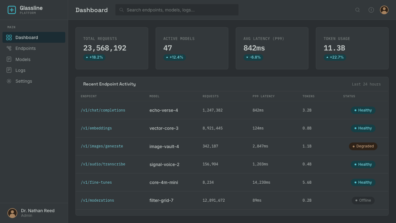
For web dashboards and pricing interfaces, the system is especially effective when products involve AI, monitoring, security, analysis, or controlled access. Navigation can resemble a facility directory, cards can read as observation chambers, and selected states can appear illuminated from within. Pricing tiers should be differentiated through enclosure, visibility, and light intensity, with wood reserved for the one decision or plan that requires a trace of human invitation.
Editorial and marketing layouts should preserve narrative tension rather than flattening the style into a dark theme. Use wide areas of gray silence around tightly framed copy, place imagery behind or beside cyan-tinted partitions, and alternate exposed information with deliberately sealed sections. Marketing calls to action should feel like access points or authorization controls. A single warm editorial moment can carry more emotional force than repeated decorative accents.
The most common mistake is adding every familiar sign of futuristic design: glowing grids, numerous neon colors, busy circuitry, floating holograms, and diffuse atmospheric haze. Ex Machina is convincing because its technology is quiet and materially disciplined. Another error is distributing wood evenly to make the interface friendlier; this destroys the essential imbalance between institutional coldness and scarce warmth. If every surface glows or comforts, none of them carries narrative meaning.
Ex Machina — FAQ
Is Ex Machina simply a dark minimalist style?
No. Darkness and minimalism are only the foundation. The style is defined more precisely by controlled visibility, hard reflective surfaces, concrete mass, cyan-tinted separation, cold recessed illumination, and warmth restricted to one material family. A generic dark interface may feel sleek, but Ex Machina must also feel enclosed, observed, and governed by an unseen system.
Why is cyan glass more important than neon color?
Because cyan performs an architectural role. It marks a transparent barrier, optical layer, or illuminated enclosure, so it changes how elements relate in space. Neon used as general decoration merely announces futurism. Cyan glass creates the more specific Ex Machina tension: the viewer can see through the boundary and may therefore mistake visibility for access, even though the separation remains intact.
Can the style use photography or natural scenery?
Yes, particularly when scenery establishes contrast with the bunker interior. The Norwegian exterior location supplies a useful model: nature can appear open, irregular, and elemental while the designed layer remains sealed and controlled. In layouts, photography works best when framed through glass, cropped as a monitored view, or isolated against concrete gray. It should represent an outside world, not dissolve the interface into organic softness.
How should warmth be introduced without weakening the atmosphere?
Use wood once, in a location with psychological importance. It might support a primary decision, identify a human-centered area, or interrupt a sequence of cold chambers. Avoid adding several warm colors or spreading wood across every component. Warmth is effective here because it is scarce: it indicates that comfort exists, while the surrounding concrete and glass make clear that comfort is controlled.
Where does Ex Machina work poorly?
It struggles where openness, playfulness, intimacy, or abundant sensory warmth must dominate. The system naturally communicates surveillance, restricted access, institutional authority, and emotional distance. Those qualities can support analytical tools, AI products, security systems, and controlled presentations, but they may feel hostile in child-focused, celebratory, domestic, or care-oriented settings. The style should be chosen when its psychological pressure supports the message rather than merely making it look advanced.
Related design styles
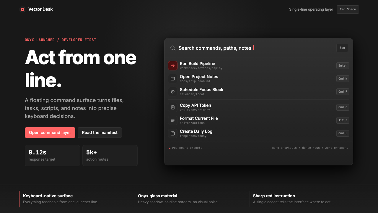 Raycast Spotlight Launcher (2023)Obsidian confidence. Sharp red cuts through Inter rows and mono shortcut chip…
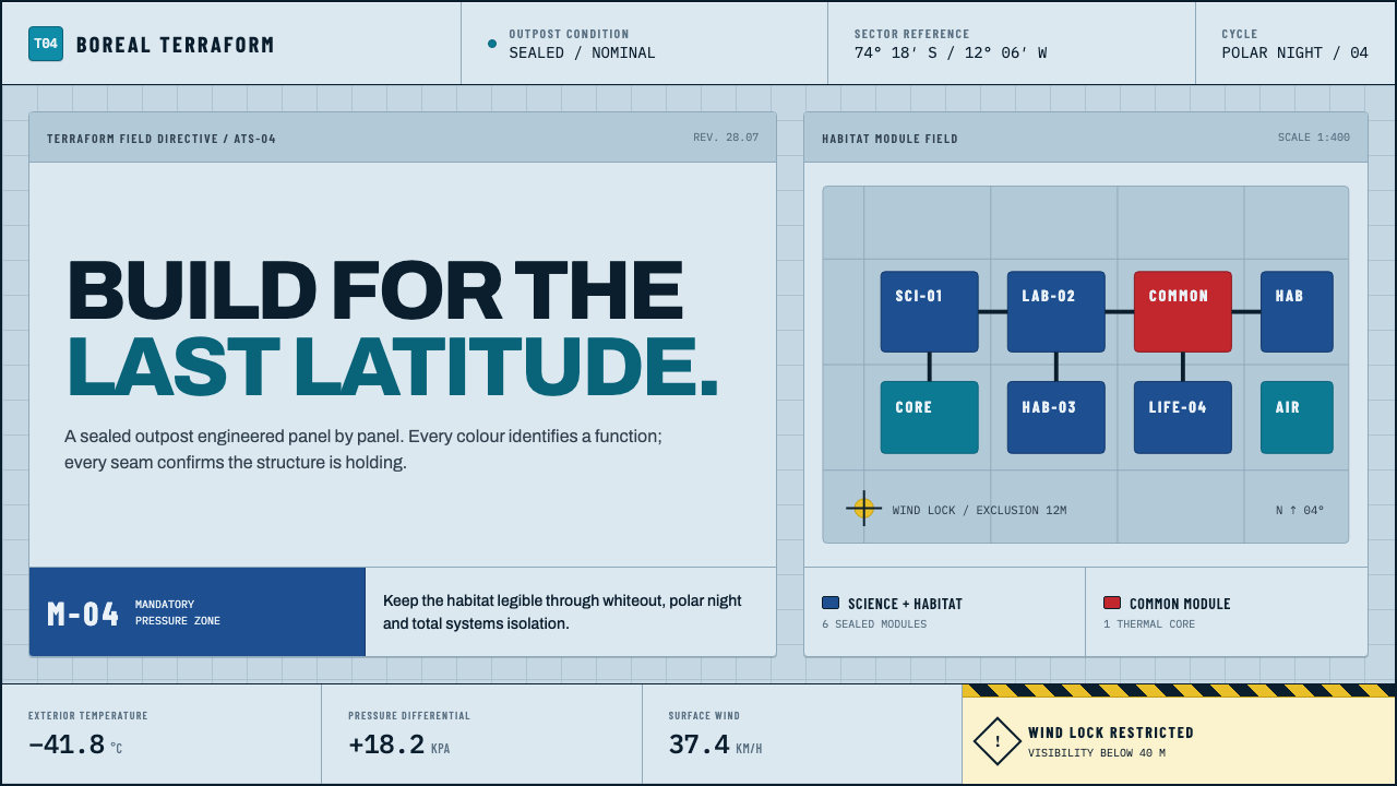 Arctic Terraform StationEvery colour carries a duty. Sky-blue panels, coded modules and hard seams en…
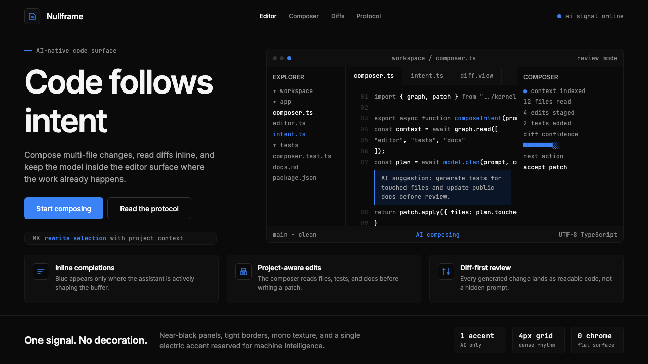 Cursor IDEAI-first code editor. Pure dark surfaces, off-white text, electric blue reser…
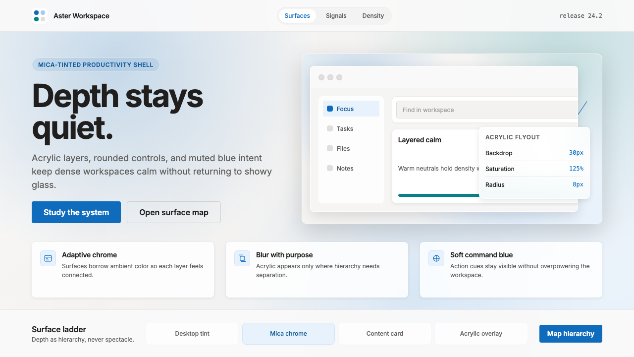 Microsoft Fluent 2Disciplined translucency. Warm Mica neutrals, acrylic blur, and muted blue cr…
 Resend 2024Clean code becomes brand. Pure black, JetBrains Mono, and one green delivered…
 Vercel 2024Developer luxury by subtraction. Pure black, white Inter, rigid grid, triangu…