What is Transcontinental Maglev?
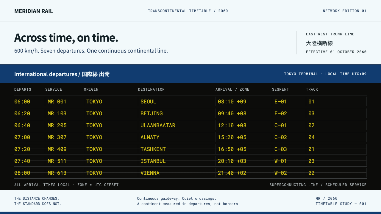
Transcontinental Maglev borrows a bullet-train livery — cool white with a single blue band — and hands all of its density to one dark, clattering split-flap departure board.
Transcontinental Maglev in brief
Transcontinental Maglev is a design style drawn from Japanese high-speed rail: the pale livery of JR Central's L0 Series superconducting maglev, the blue band that has marked the Tokaido Shinkansen since 1964, and the split-flap boards that announce departures in stations. Its subject is a timetable set in an imagined future, with long-distance maglev services crossing time zones, rendered in the visual language of a real railway.
The page itself is quiet. A cool, bluish white ground stands in for the painted body of the train. A full-width blue band runs across it like a row of windows. Hairline rules separate one service from the next, and headings carry the sturdy, even weight of station signage. Nothing is ornamental. The surface of the system is the surface of a railway car: flat, cool, clean and precise.
Against that high-key calm sits one dark object, the departure board. Near-black flaps carry chartreuse-yellow characters, and the board is the only place where the system permits mechanical texture — seams between flaps, characters sitting slightly out of true, the shadow of a hinge. All the density of the page is handed to this board so that everything else can stay calm. The overall impression is engineered, rapid and orderly: the aesthetic of a network in which everything arrives on time.

Where does Transcontinental Maglev come from?
The lineage begins in 1964, when Japan's first Shinkansen, the 0 Series, entered service in a white livery with a blue band along its windows. The blue is known as Blue No. 20 in the standard colour registry of Japanese National Railways (青20号), and Tokaido Shinkansen trains have carried it ever since. A colour with a registry number is a colour with discipline: it is specified, reproduced and kept constant across decades, which is exactly the trait this system borrows for itself.
The second reference point is the L0 Series, the superconducting maglev (SCMaglev) of 2013 developed by JR Central. JR Central paints it mainly white, on the stated reasoning that white reads as light, and keeps the blue window band, so that the newest train quotes the oldest. The L0 Series is associated with the Yamanashi Maglev Line, a test line, and with the Chūō Shinkansen, whose construction is aimed at the Tokyo–Nagoya–Osaka corridor. The style's imagined timetable extends that corridor into something transcontinental, set decades ahead.
Railway signage is the third strand. Japanese railway signage systems are built for crowds moving at speed: bold Gothic letterforms, a restrained set of colours, and rules and grids that make rows of times scannable at a glance. The Shin Go–weight lettering used here comes from that tradition, as do the hairline rules between lines of a timetable. The signage is not decoration laid over the train; it is the same discipline of specification that produced the livery.
The last strand is the split-flap board itself, a technology associated with the Italian maker Solari di Udine, whose mechanical displays became part of the visual furniture of railway stations. Such boards update by rotating printed leaves, which is why they clatter and why their characters never align quite perfectly. Curio's style keeps that imperfection on the board and nowhere else. The overlap of a rationalised livery, a signage tradition and one mechanical object gives the style its central tension between cool order and tactile density.
What defines the Transcontinental Maglev look?
Livery White
The ground is a cool, bluish white, the colour of a painted train body rather than of paper. It is high-key and slightly chilled; warm creams do not belong. White is also the system's argument for lightness: the reasoning behind the real train is that white reads as light, and the page inherits that sense of weightlessness. Large areas of it are the norm, and it is never decorated.
The Blue Band
A single full-width band of deep blue crosses the page at window height, the way the livery crosses the train. It is a structural device: it divides header from body, anchors the layout and supplies the brand colour. It reads best as a band and not as a fill for every button and tile; keeping it linear is what keeps it recognisable as livery, rather than as generic corporate blue.
Hairline Rules
Between each service in a list runs a very fine line, finer than anything else in the system. Hairlines carry structure without weight, letting dozens of rows sit together without the page growing heavy. They are the visual equivalent of the printed rule on a paper timetable, and they keep the reader's eye on the correct row from left to right.
Signage Type
Headings and labels use a sturdy Gothic with the evenness of station signage: clear letterforms, consistent in weight, built to be read by someone walking quickly. Hierarchy comes from size and placement, not from decorative variation. Numerals — times, platform numbers, durations — are treated as the main content and given room accordingly.
The Dark Board
Near-black with chartreuse-yellow characters, the departure board is the single dark object in the system. Contrast is high and the colour is unmistakable: yellow-green on near-black cannot be confused with anything else on the page. The board is where the information that must be scanned lives — times, destinations, status — and it earns its darkness by carrying the load.
Reserved Mechanical Texture
Only the board is allowed to feel physical. Flap seams, characters that sit a little off true and the shadow cast by a hinge give it a tactile, clattering presence. Everywhere else the surface is flat and painted. This division is the key discipline of the style: texture is confined to a single object so that, when it appears, it means something.
Quiet Around Density
The rest of the page is deliberately empty. Generous margins, restrained colour and calm spacing leave the board to carry density. This is how the style handles heavy information: concentrate it in one well-bounded place and keep everything else quiet, so that the eye always knows where the data is. The calm is not blank space but a deliberate counterweight.

Who shaped Transcontinental Maglev?
The operator of the Tokaido Shinkansen and developer of the L0 Series maglev. It chose the mostly white livery on the reasoning that white reads as light, and it keeps the blue window band running across new generations of trains. Its Yamanashi Maglev Line and the Chūō Shinkansen are the practical settings behind this style's speculative timetable.
The Japanese National Railways colour standard that gave Blue No. 20 its number. Not a person but a system of record: by fixing colours by number, it made a colour into a reproducible piece of infrastructure, which is the attitude this style takes toward its own blue.
The Italian maker of mechanical split-flap displays, whose boards are the model for this style's departure board. The tactile, clattering character of the board, and its tolerance for slight misalignment, is a trace of that mechanical tradition and the reason texture is allowed only there.
The broader tradition of station and train signage, built for crowds in motion: heavy Gothic lettering, a narrow palette and strict grids. This style borrows its signage weight, its hairline timetable rules and its respect for numerals from that tradition rather than from any one designer.
How do you use Transcontinental Maglev today?
This style fits anything built around schedules, status and movement: timetables, travel booking, logistics, mobility and infrastructure. Its governing principle — keep the page calm and concentrate density in one dark, well-defined object — transfers to many other kinds of content, and it is most convincing wherever the reader is meant to scan quickly and act.
A cover slide can be nothing more than cool white with the blue band across it and a title in sturdy signage type; the departure board appears as a small dark element carrying a date or a route. Content slides work as timetables: rows separated by hairline rules, times and names aligned in columns, one key figure per slide. Data slides can put the main series on a dark board — chartreuse figures on near-black — while surrounding axes and notes stay pale.
In dashboards, keep the page pale and quiet and put live data — departures, statuses, alerts — in a board component, allowing flap-style transitions only there. Pricing pages can present service classes as rows of a timetable rather than as floating cards, with the blue band as the header. Navigation should be minimal and typographic. Avoid scattering the dark board across a view; one or two instances keep it special, while a dozen turn it into wallpaper.
In editorial work, the style suits explainers about transport, infrastructure and the future of travel, as well as speculative or near-future storytelling. Keep long text on the pale ground with plain, strong headings and rules between sections. Marketing pages can use the blue band as a recurring section divider and the dark board as a single focal graphic — a countdown, a route, a headline figure — which gives the page a confident, engineered voice without any ornament.
A common mistake is spreading mechanical texture across the whole interface: flap effects on every heading, hinge shadows on every card. That destroys the contrast between calm and dense on which the style depends. A second is warming the palette — cream grounds, orange accents and rounded friendly shapes pull the result away from its cool, engineered tone. A third is using the chartreuse as a general brand colour; it belongs on the board, where it reads as light on a dark flap, not as an accent for buttons and links.

Transcontinental Maglev — FAQ
Why is the page white when the signature object is a dark board?
Because the contrast is the whole idea. The livery is white and the board is a single dark object, so the page reads as light and calm with density concentrated in one place. Making the whole page dark would remove the contrast and spread the board's mechanical character across everything, which is the opposite of the style's discipline.
Is this an official JR Central design?
No. It draws on publicly visible conventions — a white livery, a standard blue band, station signage and split-flap boards — as a design language. It does not reproduce logos or official marks and is not an identity of JR Central or of any railway. It should be read as a tribute to a design lineage and an invented future timetable, not as a corporate template.
What does the future timetable setting add?
It frames the style as speculative fiction: an imagined service set decades from now, so that the board can show long-haul routes, very high speeds and time-zone changes that real lines do not yet run. The visual language stays tied to existing livery and signage, which keeps the future believable instead of fantastical.
How many departure boards should a page have?
Very few, usually one or two in a view. The board works because it is the only dark, textured object; if it multiplies, the calm ground stops being calm and the contrast that gives the board meaning is lost. If more information needs a home, add rows to the existing board or use pale rows with hairline rules instead.
When does the style struggle?
It struggles where warmth, play or emotional intimacy is wanted, such as children's products, hospitality, food and wellness, because its tone is cool, exact and engineered. It also fits poorly where everything on the page is equally urgent, since the style depends on one place carrying the density while the rest stays quiet.
Related design styles
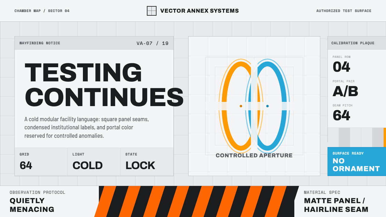 Aperture ScienceSterile authority. Cool panel seams, Archivo signage, and sparse orange-blue…
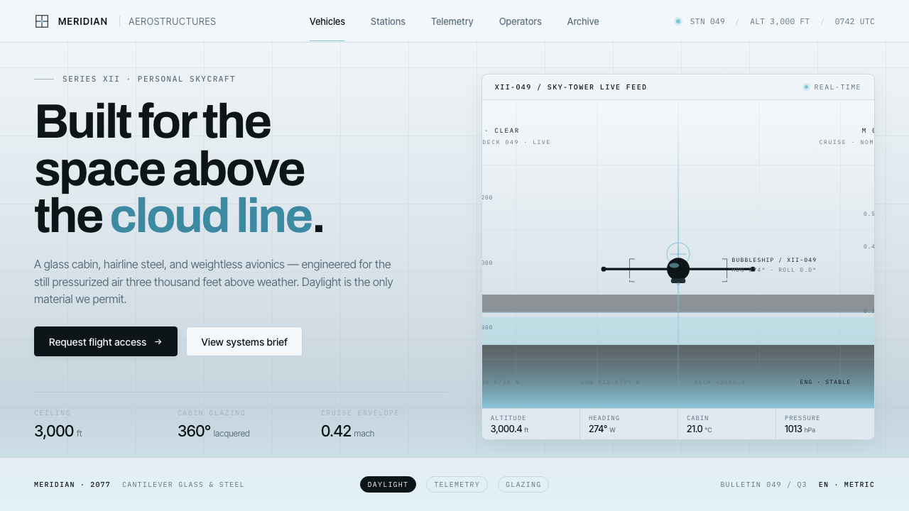 Oblivion Sky TowerSterile daylight futurism. Cool sky-grey glass, hairline steel mullions, a si…
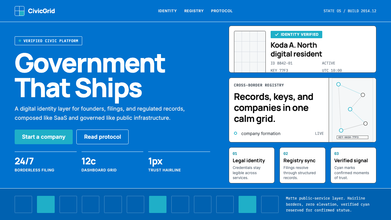 Estonia e-Residency Digital (2014)Trust without weight. Cornflower blue, 12-column grids, and cyan verified sig…
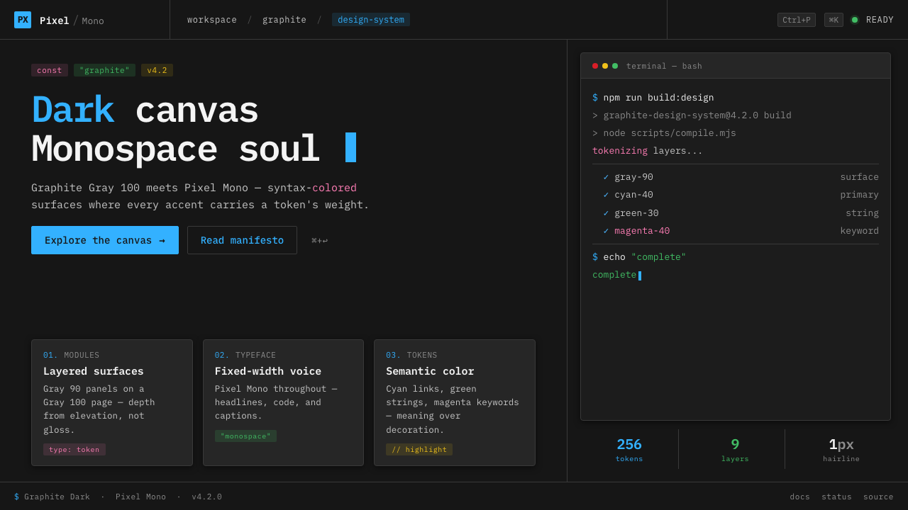 IBM Plex Mono DevColor used like syntax highlighting. Carbon Gray 100 canvas, IBM Plex Mono th…
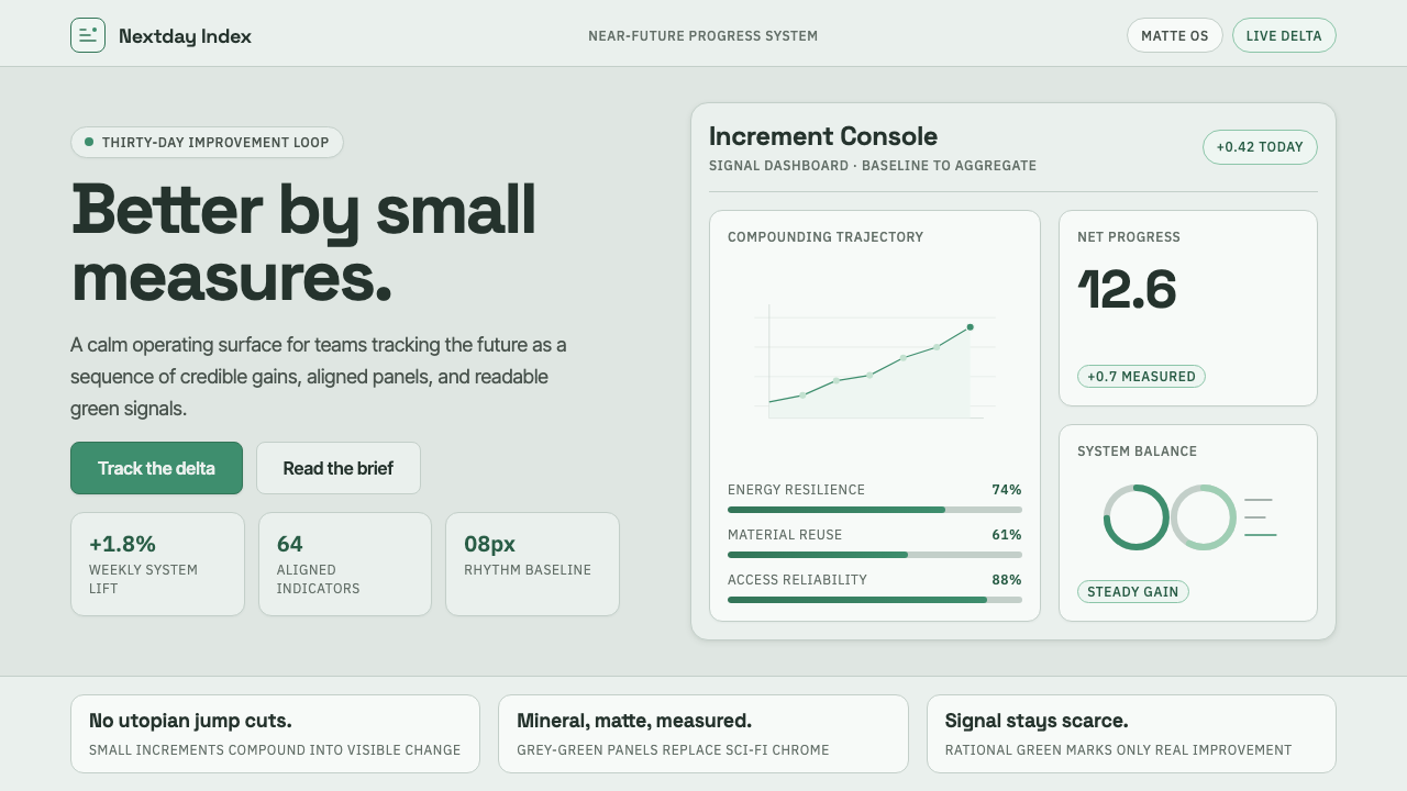 ProtopiaCalm progress, not sci-fi hype. Mineral grey-green grids make every small gai…
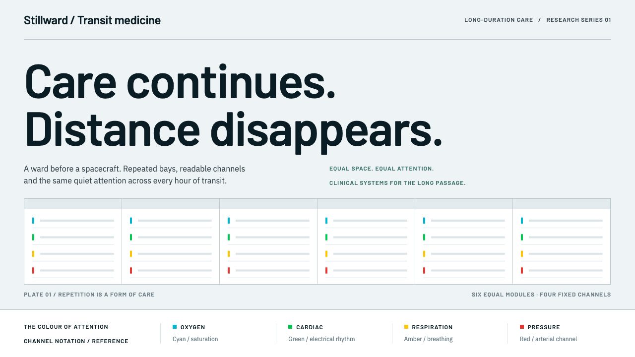 Cryosleep Transit WardCare without spectacle. Clinical white, equal bay grids and the fixed colours…