What is Corian Solid Surface?
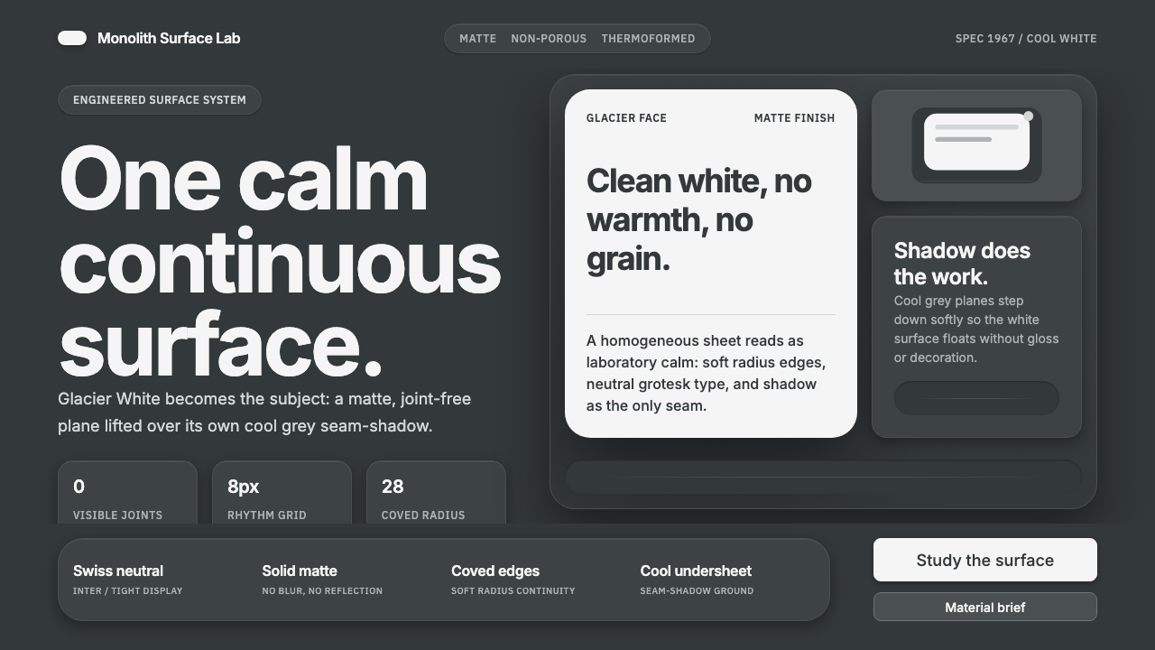
Corian Solid Surface turns material restraint into a visual language—seamless matte white, cool engineered shadow, and calm geometry with nothing ornamental to interrupt the surface.
Corian Solid Surface in brief
Corian Solid Surface is DuPont’s matte, non-porous acrylic solid-surface material, invented in Delaware in 1967. Its signature Glacier White is a clean, faintly cool snow-white with no warmth, turning the material’s face into the primary visual subject. The resulting aesthetic is not decorative minimalism but material calm: a surface that appears continuous, quiet, and deliberately resolved.
The defining idea is seamlessness. Corian is imagined as one continuous plane rather than a collection of assembled parts, with visible joints removed and edges softened into coved or thermoformed curves. Its visual language therefore depends on continuity, not contrast: the eye should move across a field without being stopped by seams, ornament, gloss, or simulated texture.
The system places the white face over cool grey, using the material’s own seams and undersheet shadow as a restrained grounding layer. Neutral grotesk typography, soft engineered shadows, rounded edges, and a dark surrounding field create a sense of medical and laboratory-grade composure. Nothing is warm, glossy, or theatrical; every element supports the impression of a clean manufactured surface.

Where does Corian Solid Surface come from?
Corian belongs to the period of industrial-modern materials design associated with the mid-century United States. The material was invented by DuPont in Delaware in 1967, and its identity formed around a proposition that was both physical and visual: a solid surface should read as an uninterrupted whole. This origin places Corian within a design culture interested in engineered clarity rather than applied ornament.
The material’s defining qualities establish its aesthetic vocabulary. Matte treatment removes spectacle from the surface; non-porosity suggests a controlled, sealed plane; and Glacier White gives the system its cool chromatic center. These qualities are not separate embellishments. They reinforce one another until the material reads as a single calm field, with the character carried by surface continuity and edge treatment.
Seamless solid-surface architecture extends that logic into space. A countertop, panel, or interface-like plane is understood through the way it joins, bends, and meets its surroundings. The absence of visible joints becomes a positive design decision, while cool grey seams and undersheet shadows provide just enough evidence of construction to keep the surface from appearing weightless or artificial.
Within the broader history of 1960s industrial-modern materials design, Corian represents a disciplined form of modernity: clean but not sterile, engineered but not aggressive, and expressive through restraint. The approved origin record names Donald Slocum as its key figure. Together, the material, its Glacier White identity, and the language of seamless solid-surface architecture define a system whose authority comes from consistency rather than ornament.
What defines the Corian Solid Surface look?
Seamlessness
The central visual rule is continuity. Surfaces should read as one uninterrupted plane, with joints concealed and transitions resolved through gentle curves. In interfaces, this becomes a preference for connected panels, quiet boundaries, and components that appear formed from the same material rather than assembled from unrelated parts.
Glacier White
Glacier White is clean, faintly cool, and deliberately free of warmth. It acts as the subject rather than a neutral backdrop. White space should therefore feel substantial and material, allowing the page or object to breathe while keeping attention on the surface itself.
Cool Grey Ground
Cool grey provides the supporting field beneath the white face. It can suggest a seam, an undersheet, or the quiet shadow cast by construction. The grey should remain subordinate: its purpose is to ground the white, not to compete with it as a second visual subject.
Engineered Shadow
Shadows are soft but intentional, describing how a plane lifts, overlaps, or meets another surface. They should feel manufactured rather than atmospheric. A restrained shadow gives depth without introducing drama, preserving the material’s clinical composure.
Rounded Geometry
Geometry is simple, but never harsh. Rounded-radius edges and coved transitions translate the material’s ability to bend into a recognizable formal language. Shapes should feel molded and continuous, with curves used to soften construction without becoming decorative.
Neutral Typography
Inter or another neutral grotesk should support the material without competing with it. Typography is calm, legible, and evenly voiced, with hierarchy created through scale, spacing, and placement. Type should feel attached to the surface, not pasted on as a decorative layer.
Matte Restraint
Matte treatment is a principle, not merely a finish. It prevents reflections from becoming the composition and keeps attention on form, continuity, and shadow. Gloss, decorative texture, and warm visual effects weaken the system because they make the surface perform instead of simply exist.

Who shaped Corian Solid Surface?
Donald Slocum is the key figure named in the approved origin record for Corian Solid Surface. His inclusion anchors the material’s history in a human act of invention while the system itself remains deliberately material-led, defined by matte continuity, Glacier White, and engineered calm.
Glacier White is the signature visual identity of Corian: a clean, slightly cool snow-white without warmth. It is not background decoration but the surface around which the entire language is organized.
Seamless solid-surface architecture names the spatial ambition of the material. It treats the removal of visible joints, the continuity of planes, and the softening of edges as architectural decisions rather than technical afterthoughts.
Cool grey shadow is the supporting figure in the composition. It gives the white surface a grounded underside and makes construction perceptible without exposing it as visual clutter.
How do you use Corian Solid Surface today?
Corian works best when the entire visual system behaves like one continuous manufactured surface. On presentation covers, let the white face occupy the field while cool grey shadow defines its underside or edge. Content slides should use calm blocks, rounded containers, neutral Inter type, and generous breathing room. Data slides should make charts feel like formed panels: clear, quiet, and grounded by subtle depth rather than decorative color.
For web interfaces, the style suits dashboards, pricing pages, and other products that need composure and legibility. Use a dark surrounding field to make the white surface feel suspended, then establish hierarchy through surface elevation, cool grey separation, and restrained type. Cards should feel molded rather than outlined with visual noise. Controls benefit from rounded edges, matte fills, and shadows that explain state or grouping without becoming glossy effects.
For editorial and marketing work, Corian provides a strong contrast between a dark environment and a clean white information plane. Articles can place the title and body copy on broad matte surfaces, with metadata or call-outs sitting in cooler supporting panels. Marketing pages can use the material’s seamlessness as a narrative device: sections flow into one another, edges curve instead of fracture, and product claims are presented with quiet authority rather than emotional warmth.
The style is also effective for material-led product stories, architectural presentations, laboratory-facing communications, and identity systems that want to suggest precision without aggression. Its strongest compositions give the white surface room to remain the subject. A single change in elevation, a rounded transition, or a cool grey underside can do more work than a collection of badges, ornaments, or expressive illustrations.
A common mistake is treating Corian as generic white minimalism. A blank white page without cool grounding, engineered shadow, or material continuity feels unfinished rather than calm. The opposite mistake is adding warmth, gloss, decorative texture, or dramatic contrast. The system depends on a specific balance: the surface must feel clean but substantial, soft-edged but engineered, and quiet without becoming visually empty.

Corian Solid Surface — FAQ
What makes Corian Solid Surface different from generic white minimalism?
Generic white minimalism treats white as empty background. Corian treats Glacier White as a material subject with weight, continuity, and a cool relationship to shadow. The white face needs a grounded underside, softened edge, and matte surface language to feel intentional rather than unfinished.
Why is seamlessness the central principle?
Seamlessness expresses the material’s identity as one continuous surface. Visible joints would turn the composition into an assembly of parts, while concealed transitions preserve calm and continuity. In a digital system, the same principle means that panels, controls, and content areas should feel related rather than arbitrarily stacked.
Can the Corian aesthetic work with a dark background?
Yes. A dark surrounding field can make the Glacier White surface feel suspended and give the composition a clear sense of depth. The contrast should remain quiet and engineered: cool grey grounding, soft shadow, and neutral type should support the white rather than turn the layout into a dramatic dark theme.
How should shadows and edges be handled?
Edges should be rounded or gently coved, echoing the material’s ability to be formed into curves. Shadows should be soft, restrained, and explanatory: they show where a surface lifts or meets another plane. Hard outlines, glossy highlights, and theatrical depth weaken the sense of seamless material calm.
Where does this style struggle?
It struggles when a product depends on warmth, gloss, expressive texture, or visual abundance. Corian is strongest where cleanliness, material control, and quiet precision are valued. In emotionally warm contexts, its cool restraint may feel distant unless the surrounding content supplies the human tone.
Related design styles
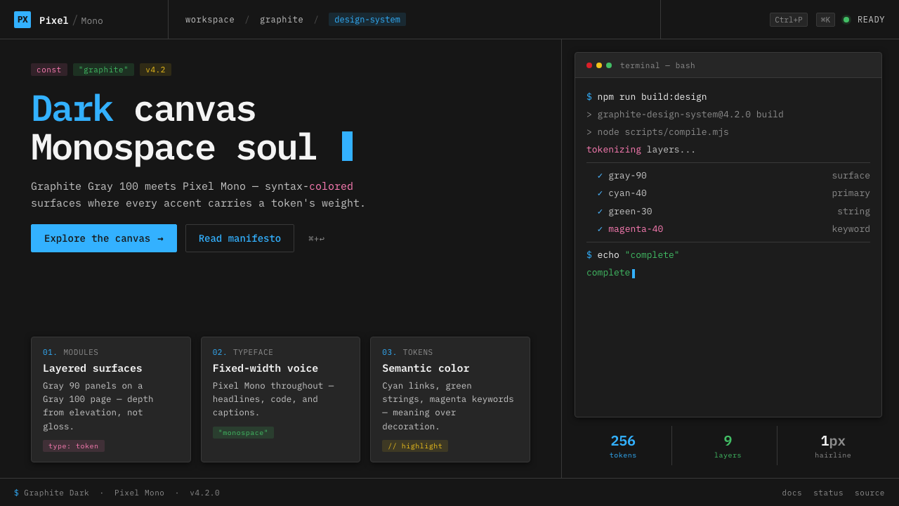 IBM Plex Mono DevColor used like syntax highlighting. Carbon Gray 100 canvas, IBM Plex Mono th…
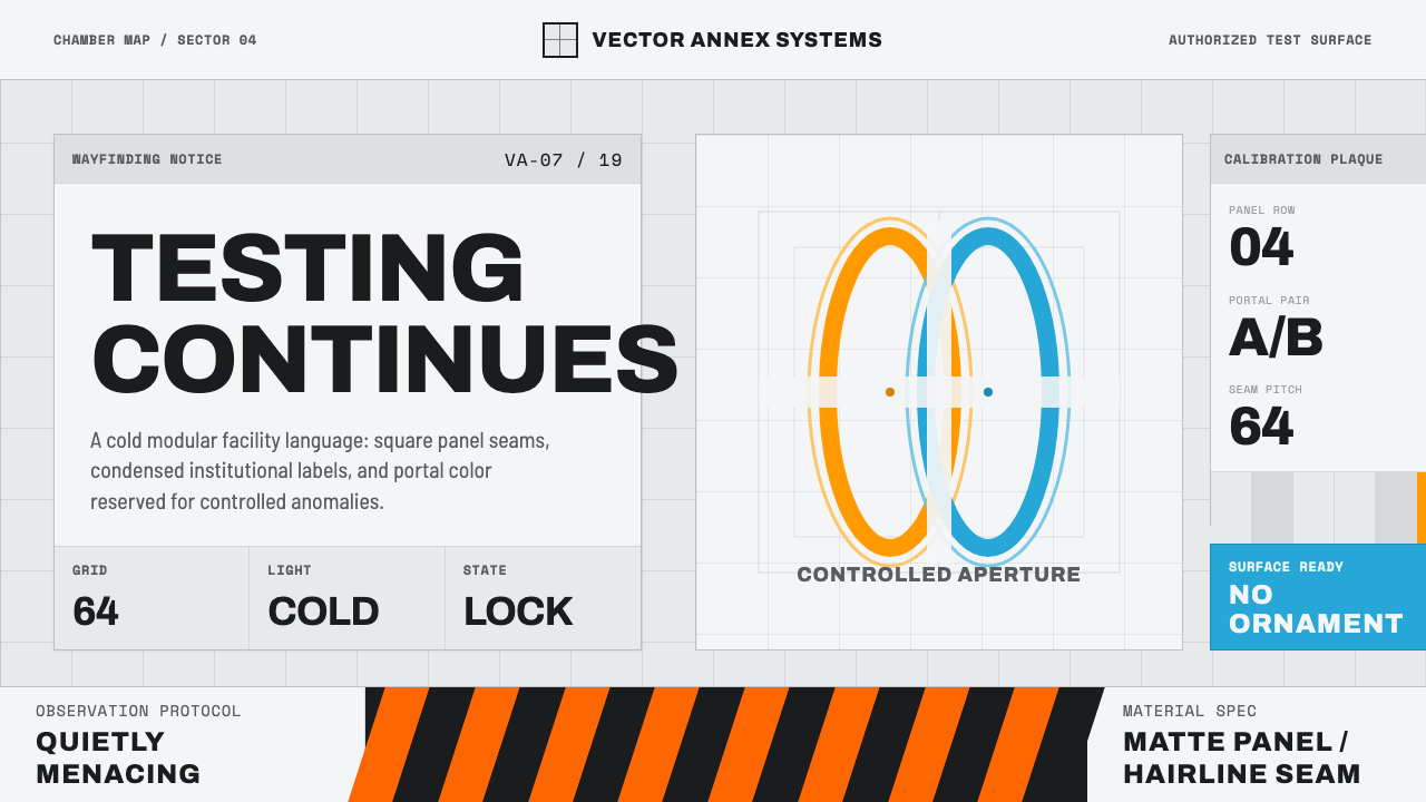 Aperture ScienceSterile authority. Cool panel seams, Archivo signage, and sparse orange-blue…
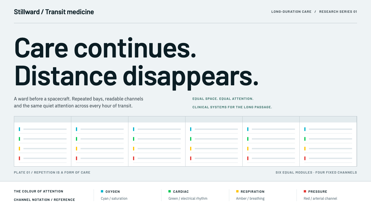 Cryosleep Transit WardCare without spectacle. Clinical white, equal bay grids and the fixed colours…
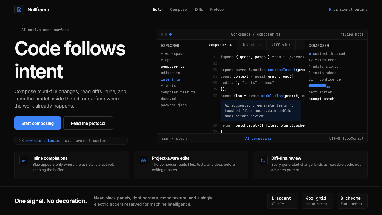 Cursor IDEAI-first code editor. Pure dark surfaces, off-white text, electric blue reser…
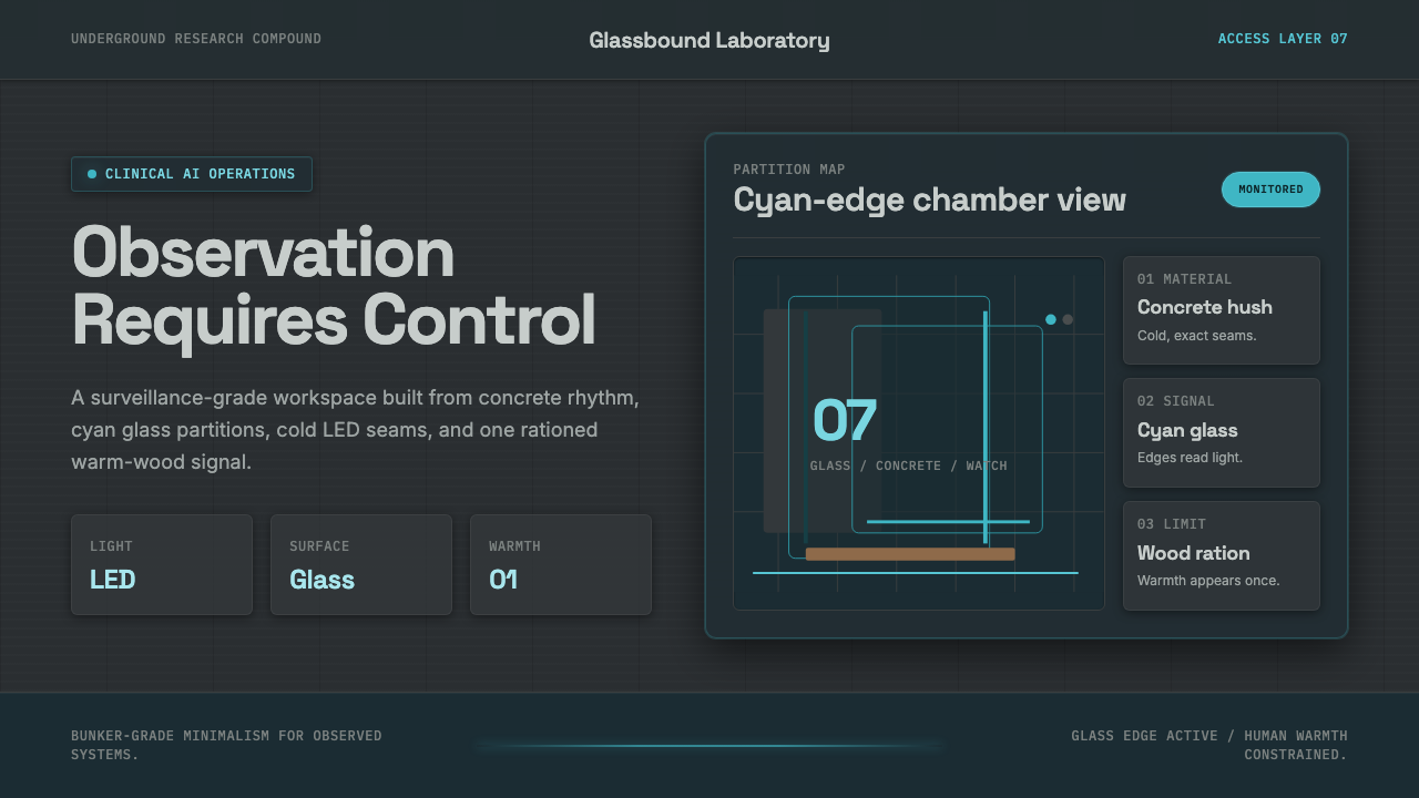 Ex MachinaClinical control, made visible. Concrete gray, cyan glass, LED seams, one woo…
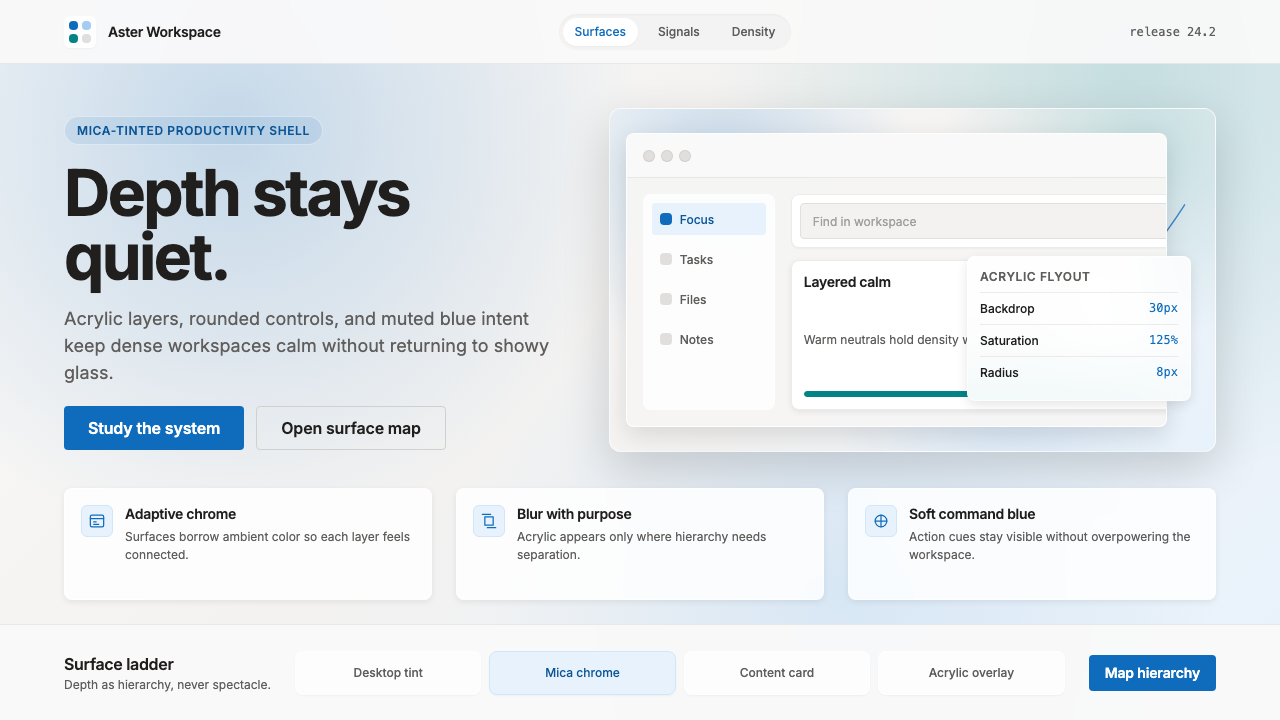 Microsoft Fluent 2Disciplined translucency. Warm Mica neutrals, acrylic blur, and muted blue cr…