What is Circular Fintech?
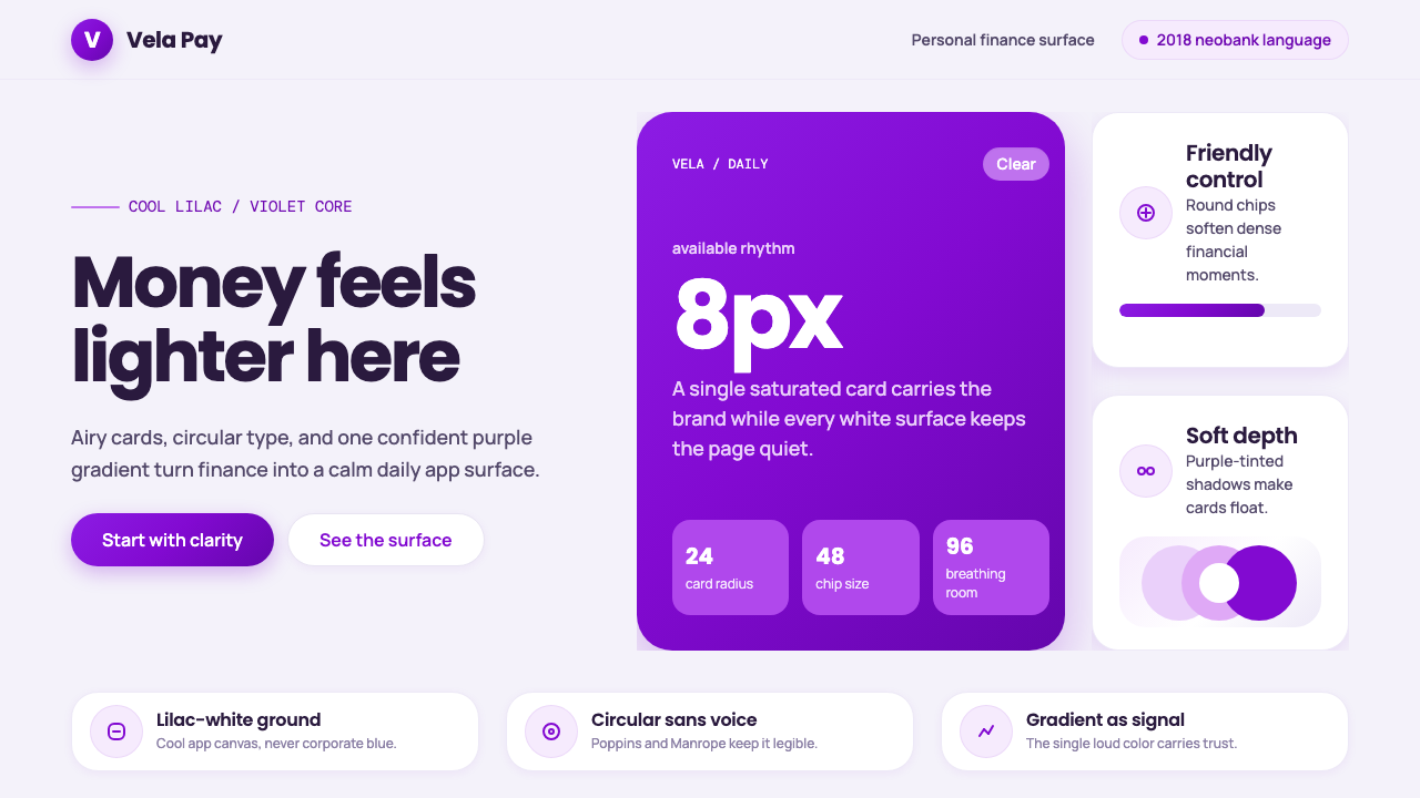
Circular Fintech is the moment banking apps stopped looking like banks — a wave of 2018-era neobanks traded navy, red, and dense tables for lilac-white space, rounded cards, and one confident violet-to-purple gradient.
Circular Fintech in brief
Circular Fintech is the visual language of the app-native neobank: a large, airy, near-white canvas with a cool lilac cast, populated by rounded-corner cards that appear to float rather than sit inside boxes or borders. A vivid violet-to-purple gradient is the system's single signature device, reserved for a hero balance card, a key call-to-action, or a featured plan — never spread across the whole screen. Geometric, circular-bowled sans-serif type, generous negative space, and circular icon chips complete the picture: everything in the interface is rounded, nothing is sharp.
The style exists in direct opposition to what came before it. Legacy banking apps were, visually, digitized paper statements: dense tables of tabular figures, small serif or default system type, and a palette of navy blue and institutional red inherited from decades of print branding, print passbooks, and bank-branch signage. Security was signaled through visual weight — thick borders, padlock and shield iconography, dense disclaimers — because trust, in that older grammar, meant looking serious and official.
Circular Fintech argues the opposite: that trust, for a mobile-native generation checking their balance daily rather than visiting a branch quarterly, comes from feeling light, legible, and unintimidating. Purple does the work that navy and red used to do, but it does it once, boldly, and sparingly — a single hero hue rather than a corporate palette — while roundness and whitespace do the rest, making the app feel closer to a well-designed consumer product than to a financial institution.
Where does Circular Fintech come from?
Digital banking's visual language changed very little in the first years of the smartphone era. Early bank apps of the early 2010s were, functionally and visually, mobile ports of online-banking websites, which were themselves digitized versions of paper statements and passbooks: dense tabular figures, small default system type, and a palette of navy blue, gray, and institutional red carried over from decades of branch signage and print collateral. Security was communicated through visual seriousness — heavy borders, lock and shield icons, dense legal disclaimers — a grammar built for a customer who visited a branch, not one who checked a balance between subway stops.
That grammar broke in Brazil. Nubank, founded in São Paulo in 2013, built a fully digital credit product with no physical branches at a time when the country's banking sector was widely seen as dominated by a small number of large, slow-moving incumbents charging steep fees. Beyond the product itself, the founding team's decision to make the card and the app purple — a color with no prior association with banking anywhere — was a genuinely disruptive design statement. It signaled, before a customer read a single feature, that this was not another bank dressed in the category's unspoken uniform of blue, red, or gold.
By around 2018, the visual grammar Nubank had popularized — a single bold accent hue, rounded-corner cards, generous whitespace, geometric sans-serif type — had spread well beyond one company into a broader wave of app-only neobanks and consumer fintech startups across Latin America and Western Europe. Geometric sans-serif families with soft, circular letterforms, of the kind associated with typefaces like Circular and Poppins, became the era's typographic voice, displacing both the narrow system fonts of early smartphone apps and the ledger-style serif type of legacy banking. Digital-product design consultancies, including large multinational practices such as Pentagram, were active across this period shaping the broader visual conventions of app-first financial branding — bold single-hue identities built to work at interface scale rather than on a printed logo mark.
By the early 2020s, the look had matured from disruptive signal into near-default expectation: a violet-purple gradient, rounded cards, and a friendly geometric sans became such a common convention for any consumer finance app that newer entrants increasingly had to design away from it to stand out. That maturation is exactly what makes it identifiable today as a specific period style — '2018-era neobank' — in the same way flat design and skeuomorphism are now recognizable as belonging to their own distinct eras of interface history.
What defines the Circular Fintech look?
Color
The canvas is a pale, cool near-white with a faint lilac cast — never warm cream, never stark clinical white. Against it, a single vivid gradient running from violet toward purple functions as the system's one hero hue, reserved for a small number of load-bearing elements rather than spread across the interface. There is no supporting palette of secondary brand colors; restraint on color count is itself the discipline.
Typography
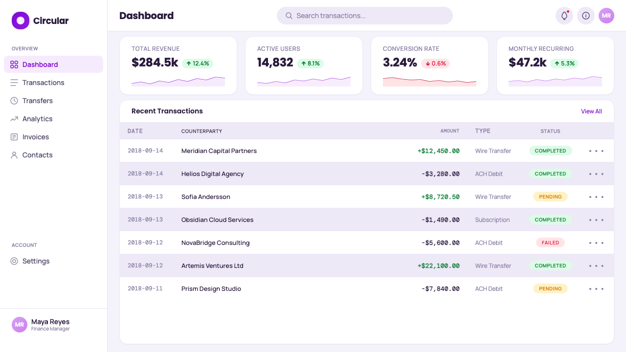
Type is geometric sans-serif with soft, circular letter bowls — of the family associated with typefaces like Circular and Poppins — chosen specifically because rounded terminals on lowercase letters read as friendly rather than authoritative. Headings are set with generous, open spacing; body text stays plain and legible rather than dense. Where legacy banking apps used tightly packed tabular figures to signal precision, this style keeps key numbers large, sparse, and isolated on the page.
Roundedness
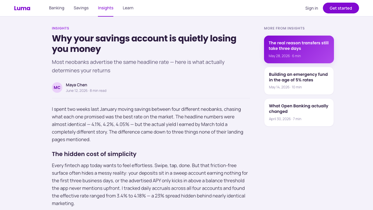
A single geometric idea — the rounded rectangle and the circle — repeats at every scale: card corners, button shapes, avatar and icon chips, even the curve of a chart line. This is not decorative roundedness applied inconsistently; it is a shape grammar deployed system-wide, so that no sharp right angle appears anywhere the user's eye lands. The consistency is what makes the softness read as intentional rather than accidental.
Gradient Use
The violet-to-purple gradient is deployed sparingly and with discipline — typically on one hero card (a balance display, a featured plan, a primary button) rather than as a background wash. The rest of the interface stays calm, flat, and near-monochrome, so the gradient reads as a deliberate signature accent rather than one gradient among many competing for attention. Overusing it anywhere else in the layout dilutes exactly the effect it is meant to create.
Whitespace & Density
Cards are separated from one another by generous negative space rather than by ruled lines or heavy borders — spacing itself does the work of division. Data is presented sparse rather than tabular: a single large balance figure rather than a dense grid of numbers, one clear metric per card rather than several competing for the same space. This is a deliberate departure from the spreadsheet density of legacy banking interfaces.
Iconography
Icons are simple, single-line, and rounded, housed inside circular chips rather than square tiles. There is no skeuomorphic banking iconography here — no vaults, no padlocks rendered with shading and highlight, no shields. Where an older banking app used a locked-safe icon to say 'your money is secure,' this style relies on the overall softness of the interface itself to communicate approachability rather than institutional seriousness.
Who shaped Circular Fintech?
Founded in São Paulo in 2013, Nubank built a fully digital credit-card and banking product with no physical branches and became the company most associated with this style. Its choice to brand the product purple, in a category that had never used the color, is the single decision most often credited with kicking off the wider 2018-era neobank aesthetic.
Co-founder and chief executive of Nubank, credited with the founding decision to build a fully app-native banking product with no physical branches and to pursue a visual identity deliberately unlike any incumbent bank's — a bet that legibility and warmth, not institutional seriousness, would build trust with a mobile-first customer.
The multinational design consultancy was active across this period in shaping the broader visual conventions of app-first, digital-native branding — bold, single-hue identity systems designed to work at interface scale rather than as a printed logo mark — conventions that came to typify late-2010s consumer fintech design more broadly.
Beyond any single company, the broader 2010s–2020s wave of app-only banks across Latin America and Western Europe adopted a closely related visual grammar — one bold accent color, rounded cards, generous whitespace — following the pattern Nubank popularized, until the look became a genre convention rather than any one brand's signature.
The broader shift toward circular, geometric sans-serif type families as the default voice of consumer software was itself a defining force of this era, displacing both the narrow default system fonts of early smartphone apps and the ledger-style serif type long associated with legacy banking print collateral.
How do you use Circular Fintech today?
Circular Fintech reads as approachable, modern, and consumer-friendly by design, which makes it especially well suited to any product handling money, budgeting, or personal finance for an everyday audience that wants reassurance without intimidation. Applying it well means treating purple and roundness as scarce, deliberate signals rather than a full brand palette to fill every surface with.
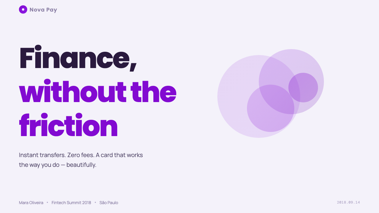
On presentation slides, a cover works well as a near-blank lilac-white field with a single large rounded gradient card floating on it, carrying the title — closer to an app screen than a corporate title slide. Content slides should keep the plain lilac-white ground and use small rounded card chips to group related bullet points, resisting the pull toward dense, bordered tables. Data slides should isolate one number per card and render it large — a single balance-style figure communicates more in this system than a crowded multi-column chart, and the gradient should highlight only the one metric that matters most on a given slide.
For web interfaces, this is a natural fit for dashboards, account pages, and pricing pages that want to feel light rather than institutional. On a pricing page, the discipline shows clearly: plan cards sit on the lilac-white ground with rounded corners and generous spacing, and only the recommended plan receives the purple gradient treatment, pulling the eye there without needing a badge or heavy border. Give every plan the gradient and the hierarchy trick collapses; the whole point is that the accent is rare.
In editorial and marketing contexts, the style suits lifestyle-finance content and consumer app landing pages particularly well. Hero sections work best with a large rounded card or device mockup floating over the lilac-white ground rather than a full-bleed photographic background, and pull quotes read naturally inside a soft rounded chip rather than a plain block of italic text.
The most common mistake is applying the gradient everywhere — every button, every card, every section background — until it stops functioning as a signature and starts reading as noise, which also undercuts the calm, airy feeling the whole system depends on. A second common error is mixing in sharp right-angle elements, dense tabular numerals, or a second accent color; any of these breaks the soft, single-hue discipline that makes the style legible as itself.
Circular Fintech — FAQ
Is this the same as the generic 'purple gradient' look seen across tech more broadly?
Related but not identical. Plenty of consumer software from the same decade used a purple or violet gradient somewhere. What makes Circular Fintech specific is the combination: a cool lilac-white base rather than a dark or warm one, rounded financial-card grammar rather than generic app chrome, and sparse, disciplined gradient use rather than a gradient wash covering large surfaces. Strip out the rounded cards and the lilac ground, and it becomes generic startup branding rather than this style specifically.
Does this style work in dark mode?
Not without real rethinking. The style's historic ground is explicitly light — a pale, cool lilac-white — and much of its 'airy, unintimidating' feeling comes directly from that light, open canvas. A dark inversion is possible, but the whitespace effect vanishes, and the gradient has to carry a much larger share of the visual identity on its own since it can no longer contrast against a near-white field. Done carelessly, a dark version reads as a generic dark-mode dashboard rather than this specific style.
How many accent colors should a Circular Fintech layout use?
One. The discipline of the style depends on purple functioning as a singular hero hue rather than the lead color in a larger secondary palette. Supporting elements should stay neutral — grays, blacks, the lilac-white ground itself — rather than introducing a second or third accent color for variety. Adding more colors doesn't make the system richer; it dilutes the one signal the whole style is built around.
What kinds of products suit this style, and where does it struggle?
It suits consumer-facing finance, budgeting, and lifestyle-subscription products aimed at an everyday audience that benefits from feeling less intimidated by money. It struggles in institutional or enterprise-facing fintech — treasury tools, banking infrastructure, compliance dashboards — where the audience expects and values a more serious, authoritative visual register, and in highly regulated, high-stakes contexts like mortgages or insurance, where too much softness can read as glossing over consequential decisions rather than simplifying them.
How does this relate to flat design or Material Design more broadly?
It descends from the same post-skeuomorphism lineage — flat surfaces, honest shapes, no fake textures or embossed effects — but narrows and specializes that lineage considerably. Flat design and Material Design are broad interface systems covering an entire operating system's worth of components in a wide palette; Circular Fintech restricts itself to one accent hue, one shape language built entirely from roundedness, and a specific cool lilac-white ground, purpose-built for a single category of product. It's best understood as a narrow, branded dialect within the broader flat-design family rather than a system in its own right.
Related design styles
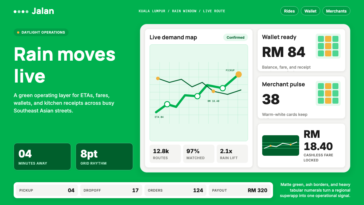 Grab SEA Superapp 2018Operational warmth. Saturated green, Inter numerals, and tight dashboard card…
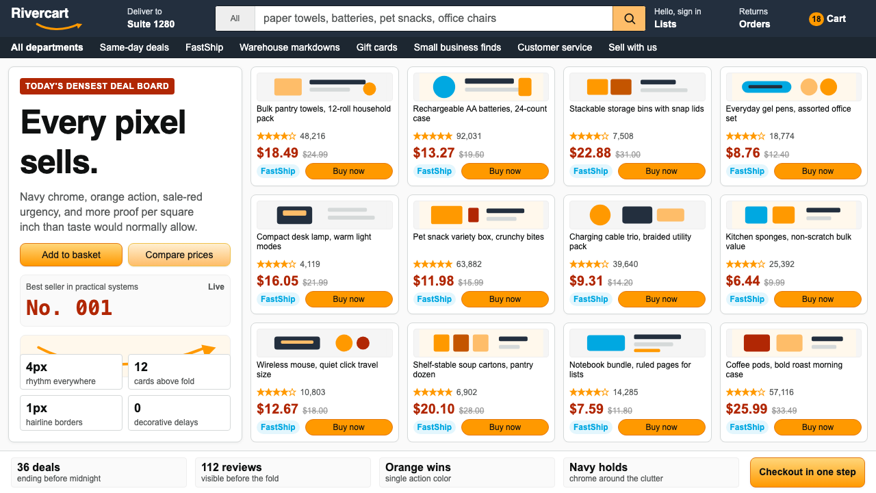 AmazonUgly sells efficiently. Navy chrome, orange buttons, red prices crowd a dense…
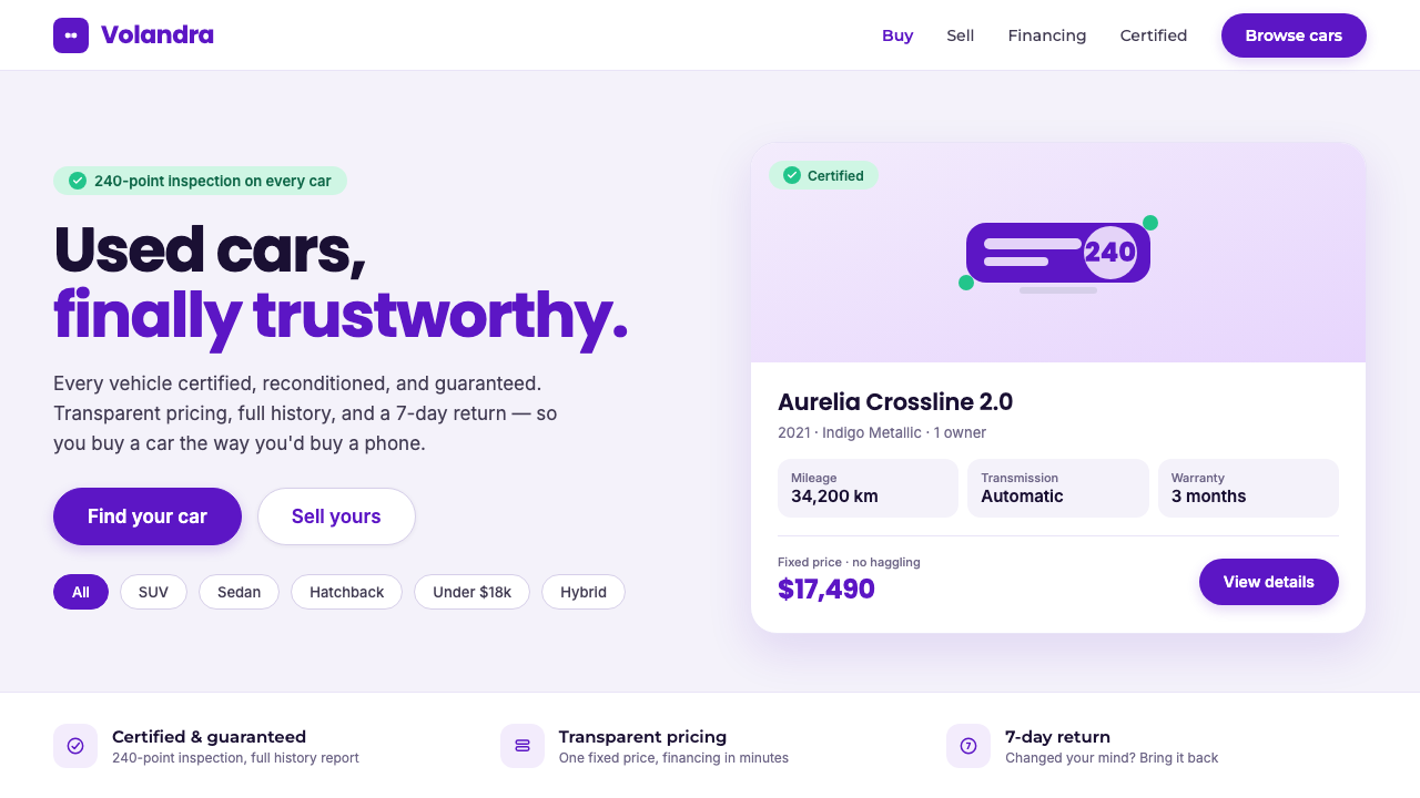 Kavak MarketplaceUsed cars, finally trustworthy. Kavak Purple on violet-tinted white, green ce…
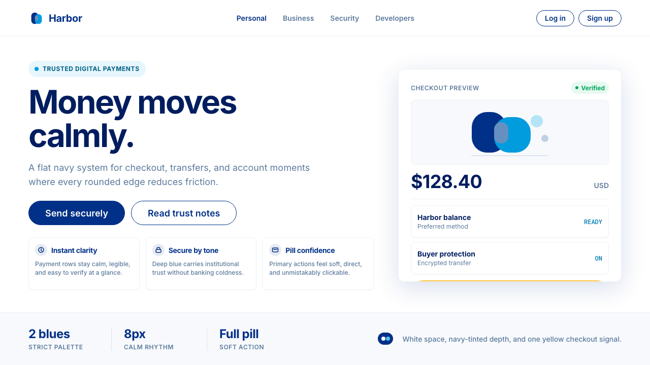 PayPalTrust without coldness. Deep navy, sky cyan, white cards, and pill checkout c…
 WhatsAppConversation is the interface. Cream wallpaper, green bubbles, and tiny blue…
 GrafanaData first, chrome last. Orange accent cuts through dense dark panels and sem…