What is Kavak Marketplace?
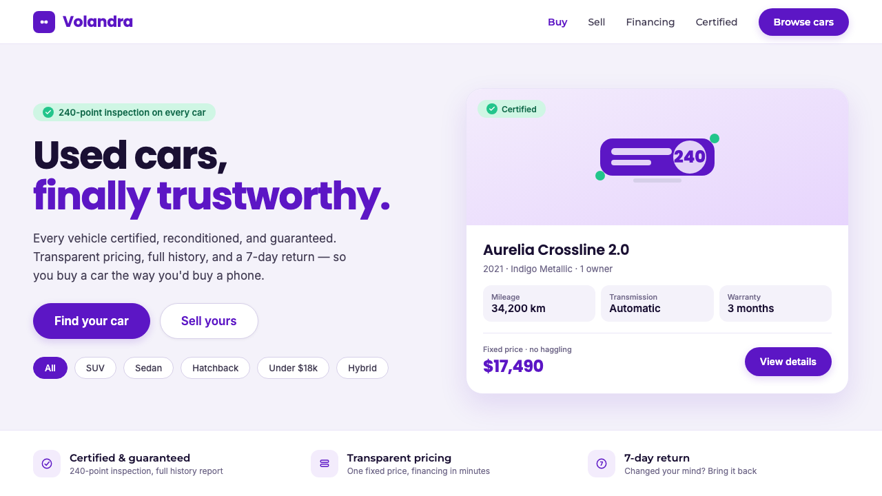
Kavak turns the used-car marketplace into a calm digital showroom, where violet signals confidence, certification creates reassurance, and every rounded surface lowers the anxiety of a high-stakes purchase.
Kavak Marketplace in brief
Kavak Marketplace is the visual language of a Latin American used-car platform founded in Mexico City in 2016 to make a distrusted market feel transparent and dependable. Its interface resembles a carefully organized showroom rather than a classifieds board: a near-white, violet-tinted ground; deep indigo-violet accents known as Kavak Purple; clean vehicle photography; certification badges; and generous space around every decision.
The style is trust-first e-commerce. It does not rely on urgency, visual noise, or aggressive promotional color. Rounded geometric sans-serif type, pill-shaped controls, filter chips, specification tables, and calm spacing make the transaction feel inspectable. The user is encouraged to compare, verify, and proceed with confidence.
Kavak's visual character comes from the relationship between reassurance and precision. Purple provides a distinctive brand anchor, green certification pills make proof visible, and the light ground keeps the experience open and showroom-like. Nothing is ornamental for its own sake. Each element either explains the vehicle, confirms its status, guides a choice, or gives the eye room to evaluate.
Where does Kavak Marketplace come from?
Kavak was founded in Mexico City in 2016 against a specific commercial problem: used-car transactions were associated with distrust, uncertainty, and incomplete information. Its design language therefore begins with a service promise rather than a decorative reference. Transparency has to be made visible in the product surface. The interface acts as a visual translation of that promise, turning inspection and certification into calm, legible signals.
The company belongs to the intersection of Latin American fintech and marketplace startup design, combined with trust-driven direct-to-consumer used-car commerce. That combination explains the balance in the system. It needs the efficiency of a marketplace, the clarity associated with financial products, and the persuasive confidence of a consumer brand. The result is neither a bare database nor a glossy automotive advertisement; it is a controlled environment for a consequential purchase.
The origin story continued through regional expansion and brand consolidation around 2019. The wider footprint included Brazil and Argentina, with later expansion toward the Gulf region. As the platform grew across markets, a recognizable visual grammar became increasingly important: Kavak Purple could carry brand identity, while consistent badges, tables, filters, and rounded controls could make the experience feel familiar wherever the marketplace appeared.
The current visual expression is associated with the 2022–2024 period: a crisp near-white showroom canvas, a calm violet cast, confident indigo-violet accents, clean car imagery, and visible certification. The named figures in Kavak's origin account include Carlos García Ottati, Roger Laughlin, and Loreanne García. Their presence situates the style within a company and expansion story rather than presenting it as the invention of a single stylist.
What defines the Kavak Marketplace look?
Violet Confidence
Kavak Purple is a deep indigo-violet used as the principal brand anchor. It feels more distinctive than a conventional automotive blue and more composed than an alarm-oriented red. Against the pale ground, it gives the interface authority without making the transaction feel aggressive. Purple is not scattered everywhere; it concentrates attention around identity, action, and important points of orientation.
Violet-Tinted Ground
The background is near-white rather than starkly clinical, with a restrained violet tint that turns empty space into part of the brand atmosphere. This ground keeps vehicle images prominent and gives dense marketplace information a breathable setting. It feels like a clean showroom wall: present enough to establish mood, quiet enough to leave the product in charge.
Certified Green
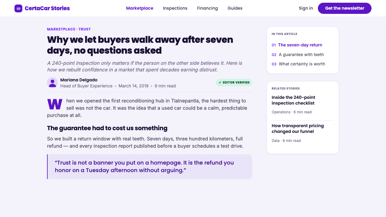
Green appears in certification pills and related trust signals. Its role is functional and immediate: it marks a vehicle or claim as approved, checked, or safe to consider. Because green is reserved for proof rather than general decoration, the badge carries more weight. The rounded container softens the authority of the message while keeping its status easy to scan.
Rounded Geometry
The typography and controls use rounded geometric forms. Pill buttons, filter chips, and softened containers make a complex purchase journey feel approachable without becoming playful or childish. The geometry communicates order through repetition: the same softened logic appears in type, controls, labels, and status elements, creating a coherent product surface.
Inspectable Information
Kavak treats specifications, filters, and certification as primary content rather than secondary metadata. Tables clarify comparison, chips expose the user's criteria, and badges bring verification close to the vehicle itself. The design is persuasive because it makes evaluation easier. Trust is built through visible structure, not through decorative claims or exaggerated imagery.
Clean Automotive Imagery
Vehicle photography is clean, controlled, and product-led. Images should present the car as an object that can be inspected, not as a lifestyle fantasy surrounded by distracting scenery. The restrained visual field supports comparison across listings and lets the certification system, specifications, and price-related information remain part of the same decision.
Reassuring Space
Generous whitespace is not emptiness; it is a confidence signal. A crowded interface can make a marketplace feel opaque, while open spacing suggests that information has been organized and nothing important is being hidden. Kavak uses space to slow the visual rhythm just enough for users to inspect a listing, understand its status, and continue without pressure.
Who shaped Kavak Marketplace?
Carlos García Ottati is named as one of the key figures in Kavak's origin account. His inclusion places the visual system within the company's larger attempt to make used-car commerce transparent and dependable. The relevant design lesson is that brand expression follows the marketplace problem: color, certification, and information structure work together to reduce doubt.
Roger Laughlin is identified among Kavak's key figures, within a story shaped by Latin American marketplace growth and regional expansion. The style associated with that story must remain recognizable while carrying practical information across a broad platform. Its disciplined palette and repeated rounded components provide continuity without making the experience feel bureaucratic.
Loreanne García is named as a key figure in the same company context. Her presence reinforces that Kavak Marketplace is not merely an automotive image style; it is a trust-driven D2C system. The visual language succeeds when its friendly geometry supports serious inspection, making reassurance feel earned rather than theatrically promised.
How do you use Kavak Marketplace today?
Kavak Marketplace works best when design decisions are treated as trust infrastructure. Use the violet identity color to establish recognition and guide important actions, use green only where certification or approval needs to be understood, and let the pale ground support comparison. The system should feel composed, transparent, and product-led from the first view to the final decision.
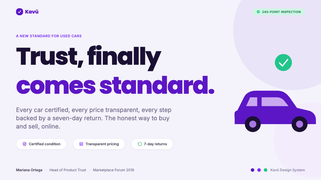
For presentation slides, the cover can behave like a quiet showroom: a clean vehicle image, a confident violet title treatment, and generous open space create immediate credibility. Content slides should prioritize specifications, comparisons, and process explanations through rounded labels, clear tables, and strong typographic hierarchy. Data slides should feel inspectable rather than theatrical, with violet for the main story and green reserved for verified or positive status.
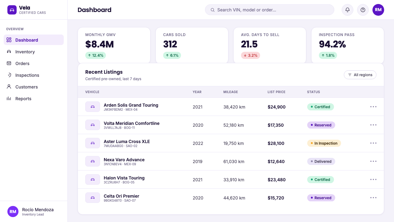
For web interfaces, the style suits vehicle dashboards, inventory browsers, comparison tools, and pricing pages where users need to evaluate choices without pressure. Keep the background near-white or softly violet, use rounded geometric sans-serif type, and make filters, specification tables, and certification badges easy to find. Pricing should be calm and explicit; violet can distinguish primary action, while green should clarify what has been checked rather than imply a discount.
For editorial and marketing work, Kavak's visual language supports explainers about buying, certification, inspection, and ownership. Use clean product photography, short sections, spacious composition, and visible proof points. Marketing pages can alternate pale showroom fields with concentrated violet moments, but the message should remain informational. The strongest campaign voice is reassuring and direct: it explains why the transaction is dependable instead of merely declaring that it is.
The common mistake is copying the surface cues while losing the trust logic. An interface covered in purple, green badges, rounded cards, and car photos can still feel suspicious if specifications are buried, certification is vague, or every element competes for attention. Avoid using green as a general accent, avoid turning pills into decoration, and avoid filling the pale ground with unnecessary panels. The style works when reassurance is supported by visible structure.
Kavak Marketplace — FAQ
What makes Kavak Marketplace different from a generic automotive style?
A generic automotive style often sells aspiration through dramatic photography, dark surfaces, and performance-oriented language. Kavak Marketplace is built around reassurance. Its near-white showroom ground, certification green, visible specifications, rounded controls, and restrained violet identity make the transaction easier to inspect. The subject is not only the car; it is the credibility of the marketplace around the car.
Why is the background not simply pure white?
The violet-tinted near-white ground gives the interface a subtle atmosphere without competing with vehicle imagery or information. Pure white could feel more clinical and interchangeable. The restrained tint makes the product surface feel branded and calm, while the generous space preserves clarity. It is a quiet distinction, not a decorative backdrop.
How should green certification pills be used?
Green should remain tied to certification, approval, or another clearly defined trust signal. Its meaning depends on scarcity and consistency. If every button, link, or decorative label is green, users can no longer tell which element represents verified status. The pill shape should make the signal approachable, while the accompanying language must explain what has actually been checked.
Can this style work with dark backgrounds?
It can be adapted, but the light showroom ground is more faithful to the source character. A dark treatment would shift the experience toward automotive drama and away from calm inspection. If a dark variant is necessary, keep the certification meaning distinct, use violet selectively, and preserve the rounded geometry and information clarity. The darker the atmosphere becomes, the more deliberately the marketplace must communicate transparency.
Does Kavak Marketplace suit products outside used-car commerce?
Its strongest transfer is to trust-driven marketplaces and direct-to-consumer services where users compare meaningful options and need visible proof. The system is less suitable for products that depend on exuberance, sensory richness, or theatrical luxury. The transferable principle is not the violet color alone. It is the combination of calm presentation, inspectable information, recognizable status signals, and enough space for a consequential decision.
Related design styles
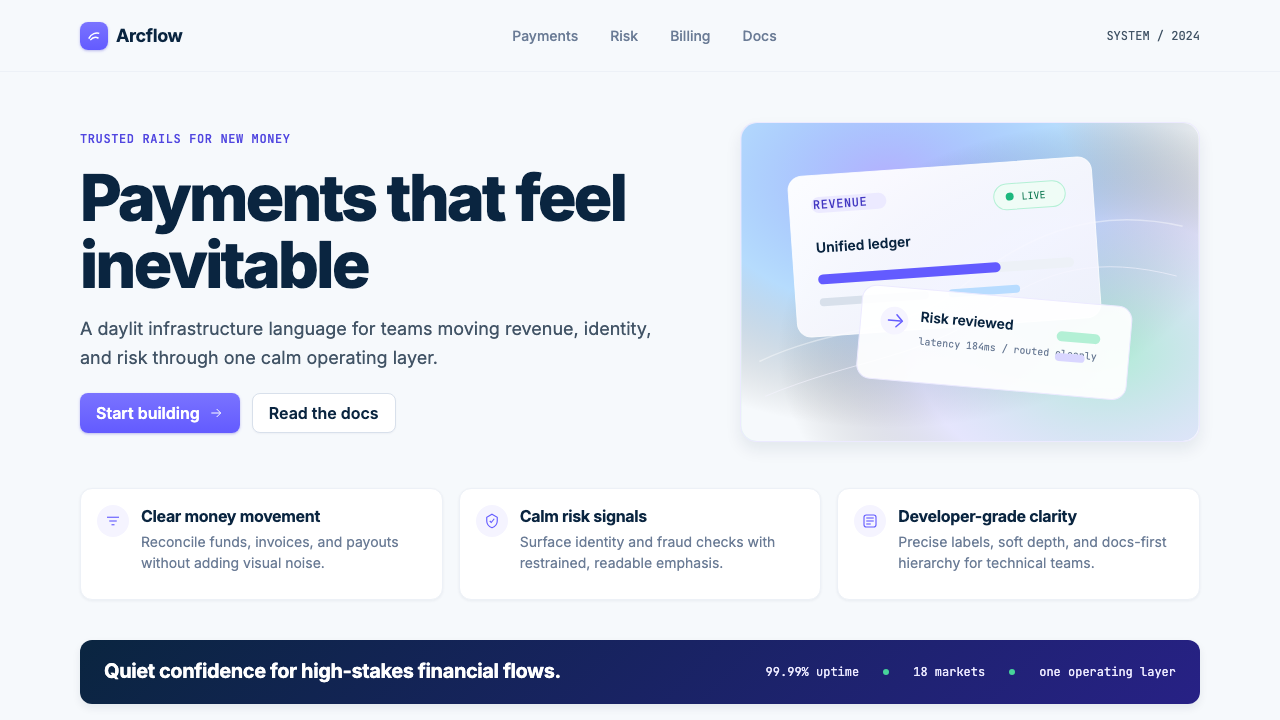 Stripe 2024Trust earns its glow. Indigo mesh, neutral type, and whisper cards float on n…
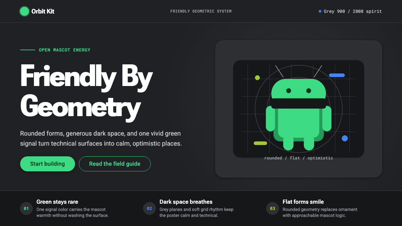 Android Bugdroid GreenFriendly tech, reduced to geometry. Vivid green pops from Grey 900 and rounde…
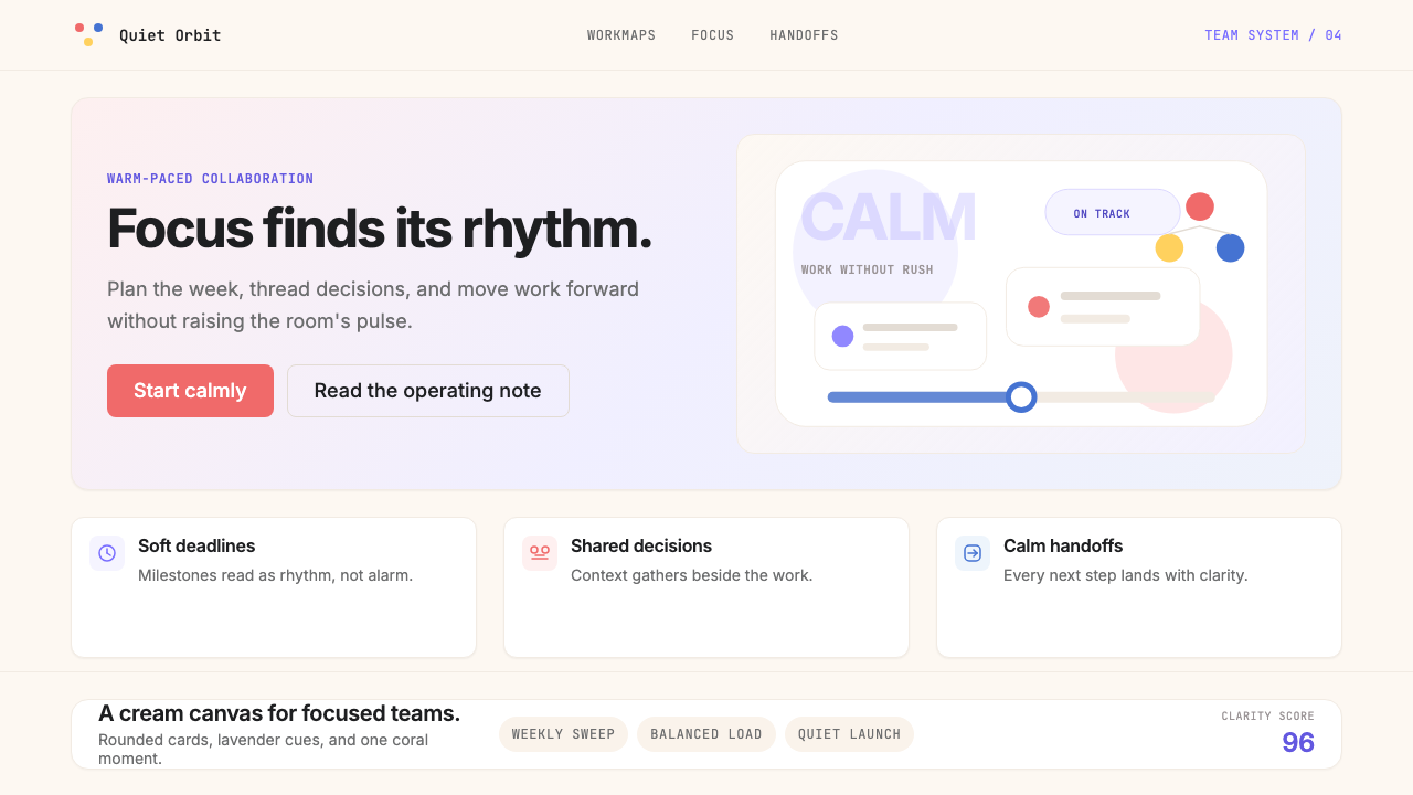 AsanaCalm productivity breathes. Cream canvas, lavender panels, coral-blue-yellow…
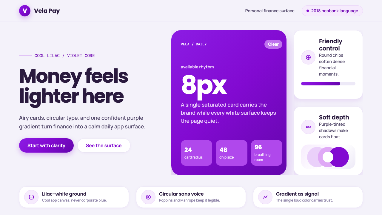 Circular FintechFinance feels light. Lilac-white space, rounded cards, and one vivid purple g…
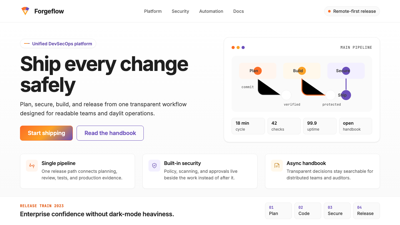 GitLab 2023DevOps in daylight. Tanuki orange-to-purple gradient, Inter, warm enough for…
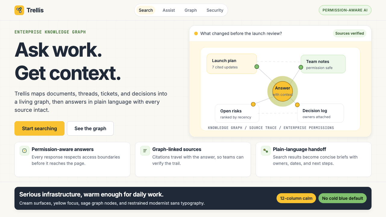 Glean Enterprise-SearchWarm enterprise AI. Cream ground, yellow focus, sage graph nodes, and sans ca…