What is Montserrat Startup Deck (2016)?
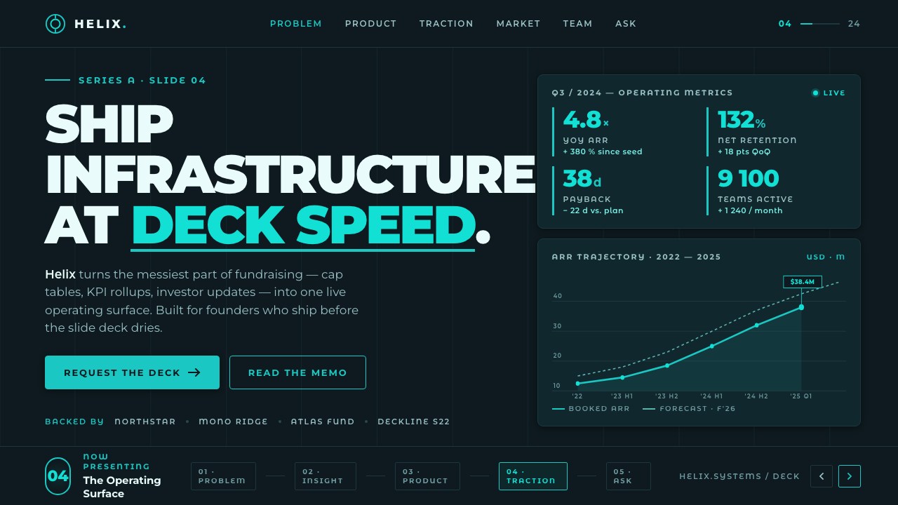
Montserrat Startup turns a 2010s Latin American pitch deck into a dark-stage language: monumental type, charcoal-teal fields, and one cyan line that makes the proposition feel ready for projection.
Montserrat Startup Deck (2016) in brief
Montserrat Startup is a dark presentation language shaped by the pitch decks of 2010s Latin American startups. Its foundation is Montserrat, a geometric sans-serif reconstructed by Julieta Ulanovsky from the painted lettering once found on shopfronts, posters, and café awnings in the Montserrat barrio of Buenos Aires. That origin gives the typeface an unusually public character: it feels made for signage, announcement, and distance rather than private reading.
The visual system puts oversized, bold Montserrat on a charcoal-teal ground, then uses a bright cyan accent as its principal source of emphasis. Flat dark panels hold information in clean blocks; geometric strokes divide, underline, or connect; metric callouts arrive as large, crisp facts. The result is direct and screen-minded. It does not try to create the atmosphere of a printed report or a bright editorial page.
Its confidence comes from reduction. A slide normally has one dominant statement, one supporting argument, and a limited number of visual signals telling the audience where to look next. The dark field makes the headline feel illuminated without requiring decorative effects. Cyan is not ambient color: it is an instrument for focus, marking the line, number, label, or moment that carries the pitch forward.
Where does Montserrat Startup Deck (2016) come from?
Montserrat Startup belongs to the period from 2010 to the present, while its typeface foundation was developed in 2010–11. Its regional anchor is Buenos Aires, Argentina, specifically the Montserrat barrio. The style therefore begins with a local lettering record rather than with an abstract corporate type brief: painted letters from everyday commercial surfaces became the basis for a contemporary geometric sans-serif.
Julieta Ulanovsky reconstructed Montserrat from lettering on shopfronts, posters, and café awnings that were at risk of disappearing as the barrio changed. The reconstruction matters to the later slide language because it preserves the broad, clear, outward-facing energy of painted public letterforms. When scaled into a headline, Montserrat does not merely become large text; it retains the sense of a sign intended to claim space.
By the middle of the 2010s, that typeface entered the visual conventions of Latin American startup presentation design. The presentation setting shaped its use: a projector rewards contrast, large words, flat fields, and immediate metrics. Montserrat Startup consolidates those conventions into a repeatable language of dark charcoal-teal backgrounds, oversized weighty type, cyan emphasis, geometric strokes, and sharply legible callouts.
Its stated movements are geometric humanist revival lettering and tech/startup presentation design. The combination is important. The first supplies the human trace of reconstructed neighborhood lettering; the second imposes the discipline of a fast, public business argument. The style is neither nostalgic signage nor generic technology branding. It uses a revived letterform to make contemporary claims feel clear, forceful, and visible across a room.
What defines the Montserrat Startup Deck (2016) look?
Dark Projection Ground
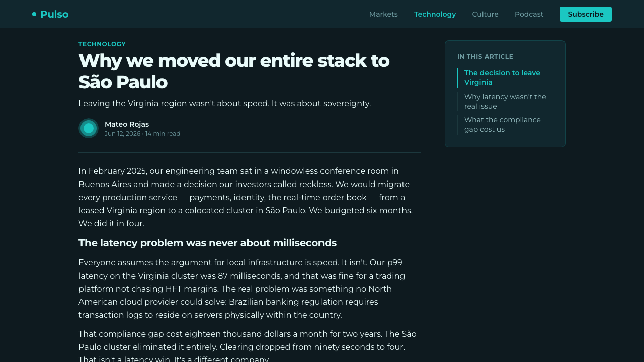
The ground is charcoal-teal throughout. It is not a neutral backdrop waiting to be filled; it is the stage that gives the whole system its theatrical contrast. The style explicitly avoids cream, ivory, and pure white grounds. Dark space allows large letterforms, cyan marks, and data to appear as deliberate signals rather than as content floating on a conventional document page.
Oversized Montserrat
Montserrat is set large and bold, often carrying the primary idea by itself. Its geometric construction keeps a headline firm and legible at projection distance, while its reconstructed lettering heritage prevents the result from feeling anonymous. A successful headline behaves like a sign: short, spatially decisive, and able to hold the room before supporting copy begins.
Cyan as a Keyline
Bright cyan is the singular activating accent. It works best as a keyline, an underline, a metric marker, or a restrained directional cue. Its scarcity is central to its force. If cyan becomes a broad decorative fill, it stops functioning as the light that organizes the dark stage and becomes merely another background competing with the message.
Flat Dark Panels
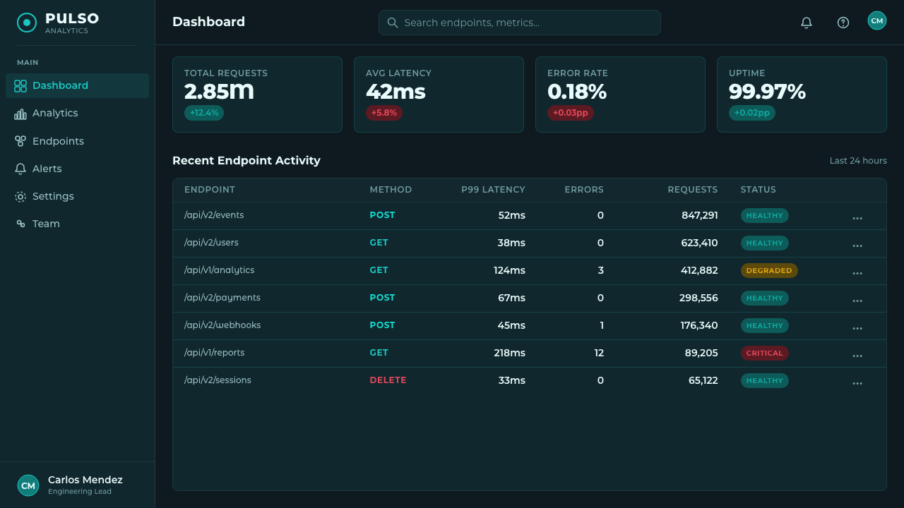
Information sits in flat dark panels rather than in luminous cards or simulated surfaces. Panels create readable zones without breaking the overall night-stage mood. Their job is organizational: separating a proof point, comparison, or supporting argument from the main statement. Depth comes from hierarchy and adjacency, not from pictorial lighting or ornamental texture.
Geometric Strokes
Clean geometric strokes are structural marks. They may connect a claim to a metric, divide one block from another, or give a headline a precise axis. They should remain crisp and intentional, never becoming a decorative frame system. A line in this language carries momentum: it directs attention through the slide with the economy expected from a live pitch.
Metric Callouts
Metrics are treated as visual events, not buried as secondary evidence. A number, short label, or compact comparison can become the most prominent object after the headline. This makes the deck feel crisp and accountable: the audience can immediately locate the measurable proof within the proposition. Supporting explanation remains present, but it should clarify the metric rather than dilute it.
Who shaped Montserrat Startup Deck (2016)?
Ulanovsky is the key figure named in the source material. She reconstructed Montserrat from painted lettering found on shopfronts, posters, and café awnings in Buenos Aires's Montserrat barrio. Her work supplies the typeface that gives this presentation language its distinct public, geometric voice.
Montserrat is the typeface at the center of the style. Developed in 2010–11, it translates reconstructed neighborhood lettering into a geometric sans-serif suited to large, bold statements. In Startup Deck use, it is the principal carrier of hierarchy, confidence, and projection-scale readability.
The painted lettering of the Montserrat barrio is the visual source rather than a decorative reference. Shopfronts, posters, and café awnings supplied the letterform record from which Montserrat was reconstructed. This source explains why the style can feel both polished for technology and rooted in a visible urban vernacular.
How do you use Montserrat Startup Deck (2016) today?
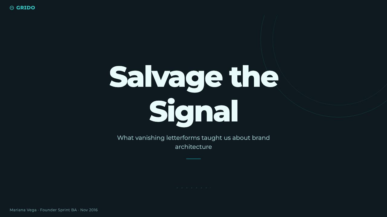
For a presentation cover, treat the slide as a dark announcement board. Put one concise headline in oversized bold Montserrat on the charcoal-teal field, then use a single cyan keyline or small cue to establish the entry point. Supporting information should stay subordinate. The cover succeeds when it can be understood from the back of a room before the presenter speaks.
For content slides, retain the same stage but organize the argument into flat dark panels. Let a large statement lead, then place evidence and explanation in clearly separated zones. Use geometric strokes to establish relationships rather than adding ornamental dividers. The goal is not to make every element equally visible; it is to make the sequence of attention unmistakable.
For data slides, allow the metric callout to become the visual center after the headline. A large number, compact label, and cyan marker can make a proof point immediately scannable. Comparisons should remain geometric and crisp, with surrounding copy answering what the measure means for the business argument. A projected deck benefits when a result is visible before its methodology is explained.
For web interfaces, the language is especially useful for dashboards and pricing pages, where a dark operational atmosphere and strong hierarchy support fast scanning. Use dark panels to separate states, plans, or data areas; reserve cyan for selected actions, important status, or the primary comparison. Montserrat can carry navigation and key labels, but body copy still needs enough restraint to remain readable over sustained use.
For editorial and marketing work, use the style when the message needs a campaign-like sense of conviction: a launch, a founder story, a product position, or a concise market narrative. The common mistake is to copy the dark background and cyan accent while filling every surface with oversized type and glowing decoration. The system works only when cyan remains rare, panels remain flat, and each giant word has a clear job in the argument.
Montserrat Startup Deck (2016) — FAQ
Is Montserrat Startup simply a dark version of a generic startup deck?
No. Its identity depends on the combination of a specific typeface origin, a charcoal-teal projection ground, oversized bold hierarchy, cyan keylines, flat panels, and metric-led proof. Removing those relationships leaves a generic dark interface. The style is a presentation language with a particular visual ancestry, not a color treatment applied at the end.
Why is cyan used so sparingly?
Cyan is described as the bright accent that lights the composition. Its role is therefore directional and selective: it identifies the active line, decisive metric, or key action. If it spreads across the whole slide, the contrast between dark stage and illuminated signal disappears. The audience then loses the visual priority that makes the language effective in a pitch.
Can this style use a light background?
A light ground would change the language fundamentally. The source description is explicit that this is always a dark pitch stage and does not use cream, ivory, or pure white backgrounds. A light layout may still use Montserrat, but it no longer carries the defining dark-stage contrast of Montserrat Startup.
Does the style work for dense explanatory content?
It can, provided density is organized rather than merely reduced. Use flat panels to separate supporting material, keep the headline as the primary anchor, and let geometric strokes show relationships. The style is strongest when a viewer can first grasp the proposition and metric, then choose to read the explanatory layer without having to decode a crowded visual field.
Where does Montserrat matter most in this system?
Montserrat is more than a convenient geometric sans-serif here. Its reconstruction from Buenos Aires neighborhood lettering gives the system its connection to a public visual culture, while its geometric clarity supports bold projection-scale headlines. Replacing it changes both the silhouette of the deck and the cultural thread linking startup presentation design back to the Montserrat barrio.
Related design styles
 Material Design 1.0Depth made flat usable. Blue app bars, pink FABs, 8dp grids, and crisp paper…
 CircleCI Pipeline-GreenConfidence goes green. Emerald status lines cut through terminal-black pipeli…
 Aluminium Flight CaseRoadproof and exact. Diamond-plate gray, stencil type, black frames, blue-red…
 Circular FintechFinance feels light. Lilac-white space, rounded cards, and one vivid purple g…
 Climbing Topo GuideBeta at a glance. Red route telemetry cuts across near-black stone and conden…
 Dark Mode UICalm night interfaces. Charcoal layers rise by overlay lightness, not shadow.