What is Verdana Screen Sans?
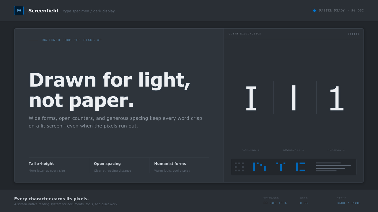
Verdana Screen Sans treats the interface as its native habitat: wide humanist letters, cool grey clarity, and the quiet authority of a lit dark screen.
Verdana Screen Sans in brief
Verdana is a screen-oriented humanist sans-serif created for legibility on the illuminated, low-resolution displays that defined early personal computing. Its visual identity begins with proportion rather than flourish: letters are generously spaced, the x-height is tall, and familiar character shapes remain visibly distinct even when text is small. The result is not typographic delicacy in the print tradition, but dependable recognition at a glance.
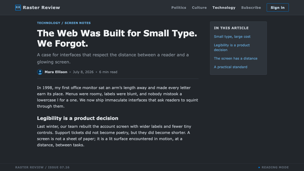
Verdana Screen Sans extends that origin into a dark-interface language. The page is conceived as a screen field rather than a sheet of paper: deep surroundings hold cool grey and near-white text, while Microsoft blue is reserved for links, actions, and points that ask for attention. Panels, list rows, and compact body copy make the system feel operational, as though content belongs inside a useful application rather than on a decorative poster.
The style is practical without becoming sterile. Its humanist construction gives words an open, conversational rhythm, while the dark ground supplies focus and visual containment. Instead of making every element compete for brightness, the system lets readable text do most of the work. The interface gains character through spacing, contrast, and familiar software-era restraint.
Where does Verdana Screen Sans come from?
Verdana was designed in 1996 for Microsoft by Matthew Carter and released on 8 July 1996. Its premise was unusually direct: the font was drawn from the pixel up for the conditions of the computer screen. That framing matters because it places rendering before display prestige. Verdana was meant to remain clear where pixels, glow, and limited resolution could easily make conventional type look cramped or ambiguous.
Tom Rickner hand-hinted every size, making the behavior of the type on screen part of its design rather than an afterthought. Hinting helped letterforms align cleanly to the available pixel structure, preserving the distinctions on which reading depends. The system’s broad spacing and tall x-height belong to the same logic: they are not ornamental gestures, but decisions made to protect recognition under difficult display conditions.
One of Verdana’s most consequential traits is its deliberate separation of easily confused forms. The uppercase I, lowercase l, and numeral 1 were shaped to remain unmistakable. This is a small detail with a large interface consequence: menus, lists, labels, filenames, forms, and dense informational text all depend on users being able to scan without pausing to decode individual characters.
The dark-UI treatment developed from roughly 2015 onward, translating Verdana’s screen-first clarity into a later interface context. It does not turn the typeface into a nostalgic artifact. Instead, it treats its original strengths as still useful: generous letterforms, legible compact copy, restrained emphasis, and a visual system that understands a glowing display as the primary reading surface.
What defines the Verdana Screen Sans look?
Dark Screen Field
The background behaves like an illuminated display viewed in a dim room, not like dark ink printed on paper. Its depth gives cool grey text room to emerge without the glare of a fully bright surface. Large quiet areas are essential: the dark field is a functional reading environment, not an empty backdrop waiting to be filled.
Wide Humanist Forms
Verdana’s letters have a broad, open stance that favors recognition over compression. Their humanist character prevents the system from feeling mechanically severe, especially in paragraphs and list-heavy layouts. Text should appear stable and approachable, with enough internal air that words remain readable during rapid scanning.
Character Distinction
Clear separation between I, l, and 1 is more than a historical curiosity. It establishes a culture of explicitness: identifiers, codes, navigational labels, and compact interface copy should never rely on ambiguity for visual elegance. The style values immediate recognition over visual compression or ornamental uniformity.
Cool Grey Reading
Body text lives in cool grey and near-white tones rather than harsh, featureless brightness. This creates a hierarchy inside the reading surface: ordinary information can recede slightly, while titles, selected rows, or key values can become brighter. Contrast is used to guide attention, not to turn every sentence into an alert.
Blue as Action
Microsoft blue is reserved for links and actions. Because the surrounding palette remains restrained, blue reads as an instruction rather than a decorative accent. It should identify the next useful move, an active destination, or a state that deserves response; spreading it indiscriminately weakens the interface’s vocabulary.
Panel and List Logic
Panels and rows organize information as parts of a working interface. Boundaries should be calm and legible, separating tasks without giving every container a theatrical presence. Repeated rows support scanning; panels group related decisions; small body copy remains a first-class element rather than a compromise made for density.

Who shaped Verdana Screen Sans?
Matthew Carter designed Verdana for Microsoft in 1996. The typeface’s wide spacing, tall x-height, and clearly differentiated character forms express a screen-first approach to typography: readability is established through the construction of the letters themselves, not added later through interface decoration.
Tom Rickner hand-hinted every size of Verdana. That work made rendered clarity inseparable from the font’s identity, helping its forms remain clean on the displays for which it was made. In this style, his contribution is reflected in the insistence that small text deserves genuine legibility.
Microsoft commissioned Verdana in Redmond, United States, and released it in 1996. The association is visible in the style’s interface-minded discipline: clear text, working panels, list-based organization, and blue used with purpose for links and actions rather than scattered visual novelty.
Screen/UI typography is the movement context named for Verdana’s origin. It treats the display as a distinct reading medium with its own constraints and opportunities. The design task is therefore not to imitate print, but to make information readable, navigable, and unambiguous on a lit screen.
How do you use Verdana Screen Sans today?
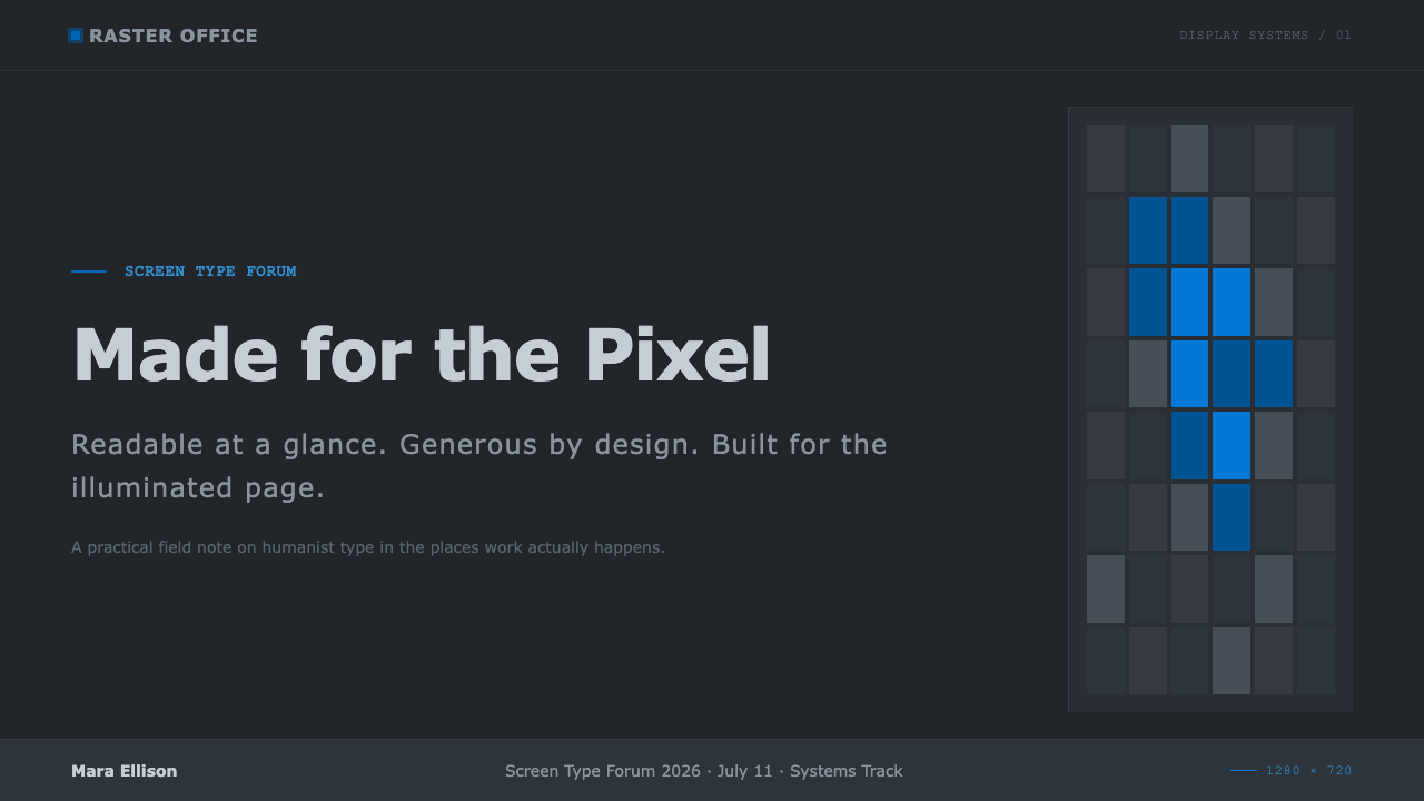
For presentation covers, use the dark screen field as a focused stage rather than a dramatic void. Set the title in bright, clearly spaced Verdana and let supporting information remain cooler and quieter. A single blue action-like detail can establish direction, but the cover should still feel like an interface opening to useful information, not a neon entertainment surface.
Content and data slides benefit from Verdana’s ability to keep compact copy legible. Organize material into calm panels or list rows, distinguish headings through brightness and scale, and let repeated alignment create the rhythm. Charts should favor direct labels, readable values, and restrained emphasis; blue is most effective when it identifies the currently important series, link, or decision.
For web interfaces, the style is especially suited to dashboards, account areas, settings views, tables, and pricing pages. Use the dark ground to contain dense information, then give text, rows, and controls enough separation to scan without effort. Pricing tiers should read as comparable interface states, with blue identifying the actionable path rather than turning every plan into a separate visual campaign.
For editorial and marketing work, Verdana Screen Sans works best when the content has an informational promise: product updates, technical explainers, feature comparisons, documentation, and service pages. Use short sections, clear list structures, and visible links to make reading feel navigable. The voice can be warm, but the visual system should remain disciplined enough that readers always know where to look next.
A common mistake is to treat dark UI as an excuse for dim, crowded, or decorative design. Verdana’s clarity depends on open letterforms, visible separation, and purposeful contrast; collapsing text into dense blocks defeats the typeface’s reason for being. Another mistake is using blue everywhere. When blue becomes ambient decoration instead of an action signal, links and controls lose their immediate meaning.
Verdana Screen Sans — FAQ
Is Verdana Screen Sans a retro style?
Its source is historically specific, but the style should not be treated as a period costume. Verdana was designed for screen clarity, and the dark-UI interpretation continues that purpose in a later interface environment. The useful reference is its discipline around readable text, distinct characters, and purposeful actions, not nostalgia for old software chrome.
Why is Verdana suitable for small interface copy?
Its wide spacing, tall x-height, and deliberate distinction between similar characters support recognition when space is limited. Tom Rickner’s hand-hinting also made screen rendering central to the design. Small copy still requires care in composition, but the typeface begins from a stronger legibility foundation than one designed primarily for print.
Should every interactive element be Microsoft blue?
No. Blue is most useful when it remains scarce enough to communicate intent immediately. Use it for links, actions, and states that require a response, while allowing neutral cool greys to carry ordinary reading and structural information. If blue becomes the dominant ambient color, the system loses one of its clearest navigational signals.
Can this style work for long-form editorial content?
Yes, provided the dark field is treated as a reading environment rather than a visual effect. Long-form pages need short sections, visible hierarchy, comfortably separated paragraphs, and links that are easy to identify. Verdana’s open forms can support sustained reading, but dense unbroken text will make even a screen-focused typeface feel tiring.
What most often makes a Verdana dark interface feel wrong?
Usually, it is a loss of the original priorities: too little separation, too much decorative color, or text treated as an afterthought. The style works when users can recognize words, scan rows, understand links, and identify actions without effort. If visual atmosphere interferes with those tasks, the design has borrowed the appearance while abandoning the underlying screen-first logic.
Related design styles
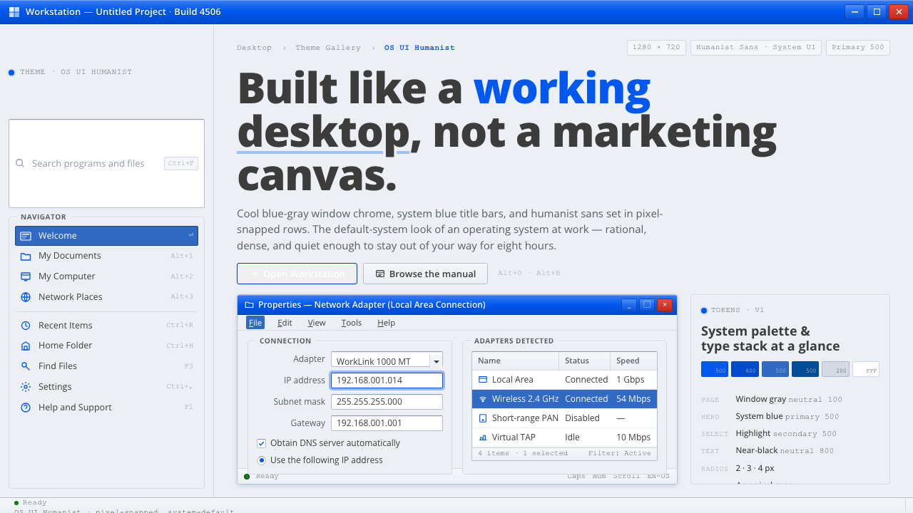 OS UI HumanistBuilt like a working desktop, not a brand. Window-gray ground, system-blue ch…
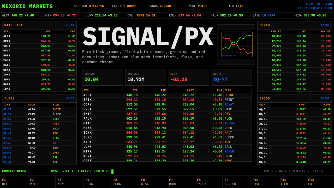 Financial Terminal MonoMaximum signal per pixel. Pure black, IBM Plex Mono, green-red ticks, amber-b…
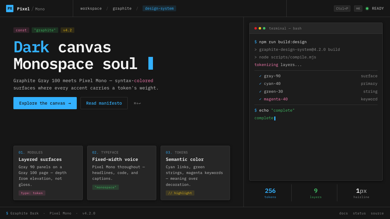 IBM Plex Mono DevColor used like syntax highlighting. Carbon Gray 100 canvas, IBM Plex Mono th…
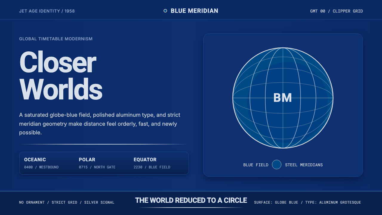 Pan Am Jet AgeJet-age confidence. Globe-blue field, steel type, meridian circle on a strict…
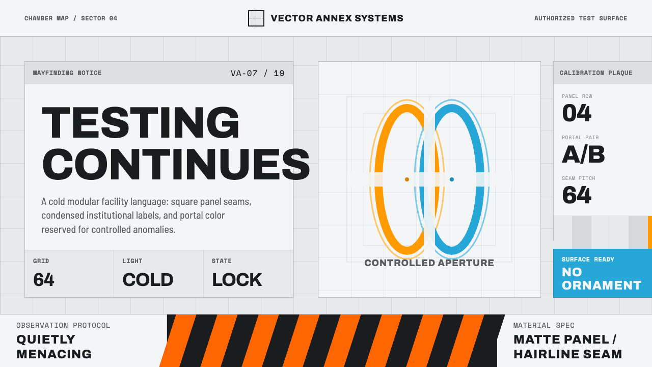 Aperture ScienceSterile authority. Cool panel seams, Archivo signage, and sparse orange-blue…
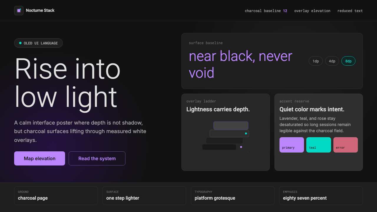 Dark Mode UICalm night interfaces. Charcoal layers rise by overlay lightness, not shadow.